
mattmilesviscom
Matt Miles
AUB Visual Communications Sep 2017- June 2020
729 posts
Don't wanna be here? Send us removal request.
Last Seen Blogs
wasmatheus
xoxo

333n
Untitled

sin-avenue
Where The Monsters Play

googleschoogle
googleschoogle

jereviendrai
les remords ont faim
Text
FMP Evaluation
This project has pushed me more than any other project I have done throughout uni. Type and motion design have not been a strong point for me so this was a challenging project, yet a rewarding one.
Overall I am really pleased with how the project turned out. I feel that the style and personality which I strove for when creating the animations can be seen throughout the project. Along with learning a lot more about motion design & Cinema 4D, I also learnt a lot more about Arduinos and processing code. These are both good skills to develop and have for the future. I do feel that I initially was managing my time well and still continued to balance it well compared to previous projects however, I am unsure if my time management was still slightly off due to the current situation that the UK is in slightly off setting my schedule or if that is still very much something which I need to still work on.
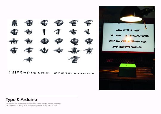
If I was to carry this on after the hand in then I would like to develop more characters and numbers into the animation. I would also like to see if it is possible to make this into a font which people can use normally with variables which can be edited, rather than needing software such as processing and an Arduino.
0 notes
Photo

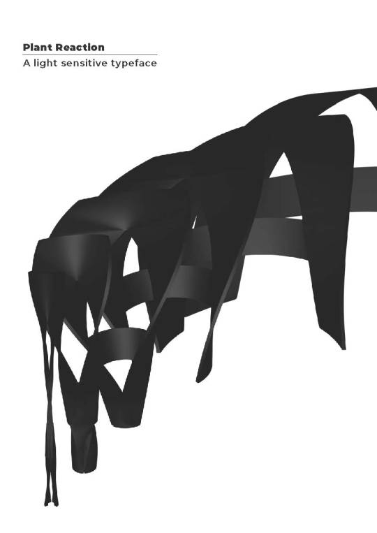
FMP 4 x Portfolio Sheets
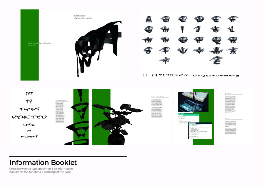
For the portfolio sheets I split them up into an informative initial page, followed by the main product then the two support pages with the information booklet and the two videos.
0 notes
Video
Functionality Video
Alongside the fancy showcase video I also created a simple functionality video which is slow paced and shows how the type reacts to light when the light is pointed at the photo resistor.
0 notes
Photo

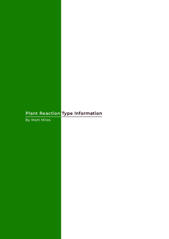
Type Spec/Information Booklet
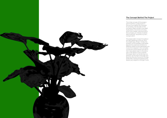
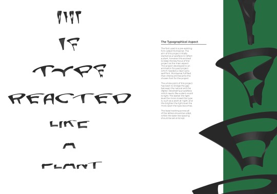
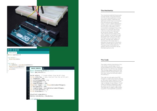
For the booklet I worked with the green which I have used within the design for the buttons. I also aimed to keep this throughout as a splash of colour which has relevance to the main concept of plants. When exporting from PDF to JPEG to upload the colour on two of the pages have changed the mechanics pages is the right colour of the darker green. The focus on this was to be about the movement and concept which the type provides more so than the specifications of the actual type.
0 notes
Link
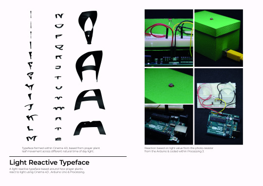
A type specimen is something which I need to look into possibly developing. However the type specimen seems to focus a lot around the anatomy of the type. As I am using a Montserrat as the font this isn’t relevant to me. Therefore I will create an information booklet/spec which will include some areas such as spacing but will focus on the functionality and the behind the scenes of the product.
0 notes
Video
This is the animation with the music behind it. I feel that this works well, however a more tailored piece of music which was designed around the animation would have worked better.
Music: https://www.youtube.com/watch?v=xiSk3siLf3g (Prod, by ThatKidGoran & MSXII Sound Design)
Full Reference Video:
https://drive.google.com/drive/folders/1l4eFJl1H2_ATZsL7diJYHKhM9FCVLWKH?usp=sharing
(Reference code #0002 within the Final Pieces folder)
*All videos are linked in a google drive folder as the videos are too large for tumblr or vimeo.*
0 notes
Video
youtube
For Music I looked at a range of instrumental music, however I couldn’t find much that worked. I am using this instrumental as it has a good tone to the sound and the pace of the music works well with the pace of my video.
- Rappers (Artists): All of my beats are free to use in your videos/songs if and only if you credit me.
All free beats can only be used for non-profitable, non-commercial projects and nothing besides that.
0 notes
Video
Aiming to create a showcase of my type I wanted to create an animation which could capture the type and the meaning within the video. The concept of the type unfolding and closing up is displayed at first in a showcase of the whole type as one. The second part goes into the concept of how it reacts having it open when the background becomes light and closed when the background goes dark. I feel that this works really well, however it feels like it needs sound to add that extra bit to keep attention.
Full Reference Video:
https://drive.google.com/drive/folders/1l4eFJl1H2_ATZsL7diJYHKhM9FCVLWKH?usp=sharing
(Reference code #0001 within the Final Pieces folder)
*All videos are linked in a google drive folder as the videos are too large for tumblr or vimeo.*
0 notes
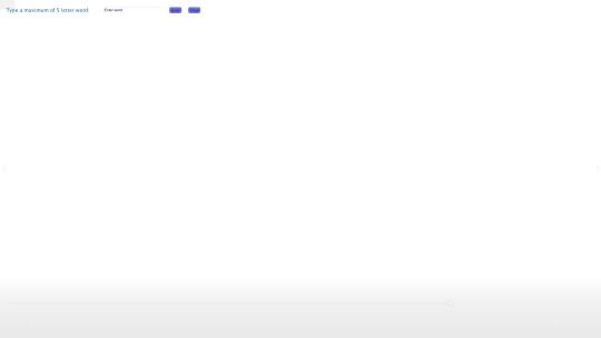
Photo
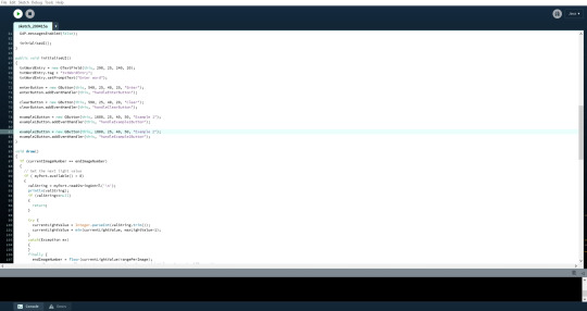

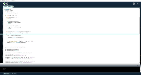
Button & Text Colours and Positioning changes
For the colour of the buttons I began trying different shades of different types of colours but I settled on green as it provides the right connotations for my project and can be used as a splash of colour within all my work whilst still maintaining the right connotations. I also changed the type to black and moved the example buttons to be positioned separately saying for people that they can also see one of the examples.
Full Reference Video:
https://drive.google.com/drive/folders/1l4eFJl1H2_ATZsL7diJYHKhM9FCVLWKH?usp=sharing
(Reference code #0018 within the coding folder)
*All videos are linked in a google drive folder as the videos are too large for tumblr or vimeo.*
0 notes
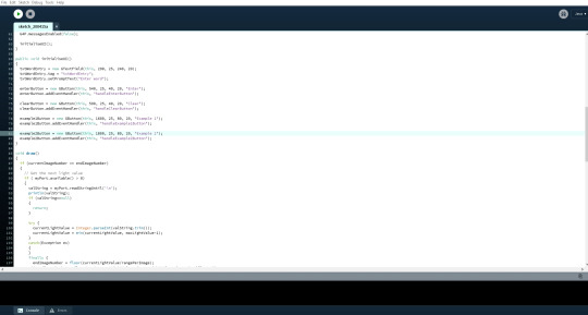
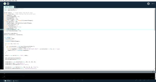
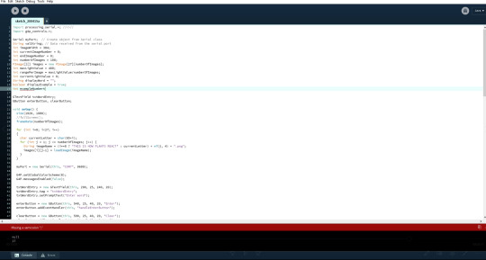
Photo

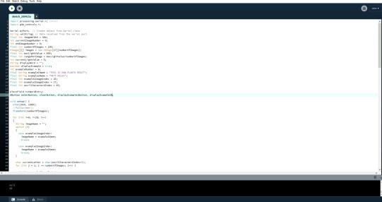
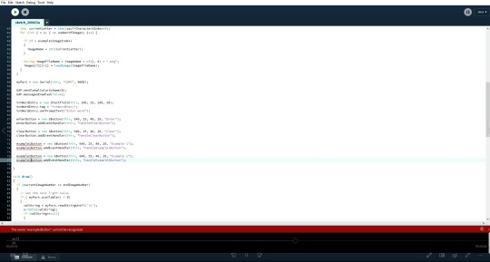
Button colour test
After researching how to change the g4p button colours I found that there was a colour map which relates the lines on an image to a number value. Therefore I changed this a few times before I looked at possibly using a green.
Full Reference Video:
https://drive.google.com/drive/folders/1l4eFJl1H2_ATZsL7diJYHKhM9FCVLWKH?usp=sharing
(Reference code #0017 within the coding folder)
*All videos are linked in a google drive folder as the videos are too large for tumblr or vimeo.*
0 notes
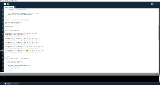
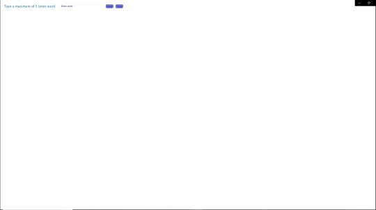
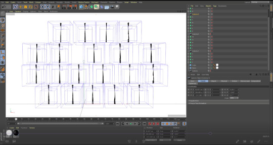
Photo
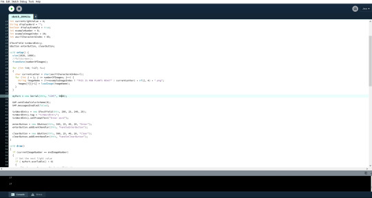
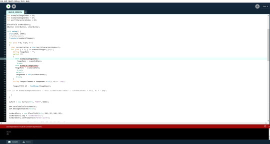
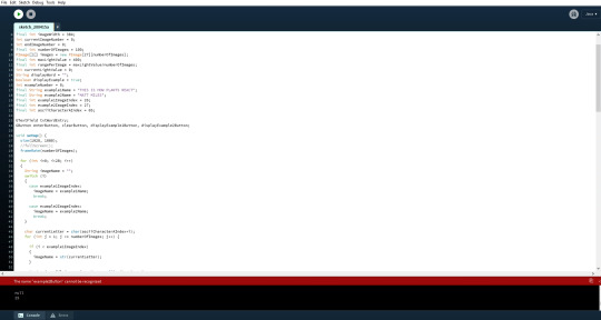
Full Screen Examples & Buttons
After considering the examples I chose to code in the second example as well. I had a few issues with the numbers as I tried to have an example at 0 but A was already at 0 so it replaced the image. Therefore I worked around that and put both examples at 26 and 27 so they didn’t clash. I also created two more buttons which show the examples. The text box when enters clears the example and inputs the letters entered as well so it all runs smoothly.
Full Reference Video:
https://drive.google.com/drive/folders/1l4eFJl1H2_ATZsL7diJYHKhM9FCVLWKH?usp=sharing
(Reference code #0016 within the coding folder)
*All videos are linked in a google drive folder as the videos are too large for tumblr or vimeo.*
0 notes
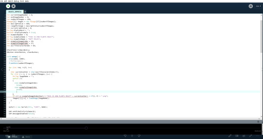
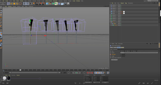
Photo
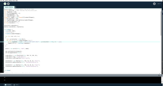
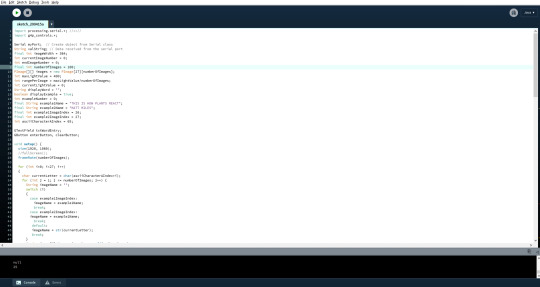
Full Screen Example
Coding in the examples I was unsure if I was going to use both or just one example. Therefore I began by coding in the first example and making sure that all loaded and worked smoothly.
Full Reference Video:
https://drive.google.com/drive/folders/1l4eFJl1H2_ATZsL7diJYHKhM9FCVLWKH?usp=sharing
(Reference code #0015 within the coding folder)
*All videos are linked in a google drive folder as the videos are too large for tumblr or vimeo.*
0 notes
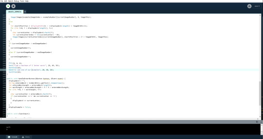
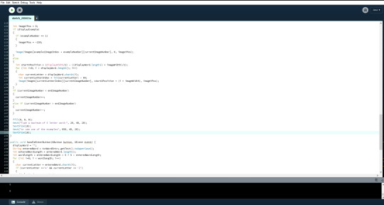
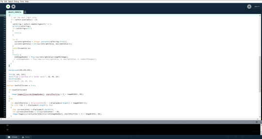
Text
Editing the look
After creating the functionality of the project I began to edit the positioning of the type and the buttons.

Initially I looked into just typing what I wanted to be said and then having an even distance between all the functions and type. The first test wan’t quite right and needed more spacing between each as they look a little bunched and uneven.
I then tried making these changes and managed to create even more of an uneven spacing as I had to reload the project every time I wanted to check the positioning, therefore not being able to see it in real time.
The second edit I made felt too close spacing between the buttons and the type box.
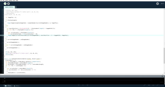
I then tried to type and enter to see the spacing with the images too and realised that the images were set at max height now and evidently overlap the type.

I made an initial edit to the code to change the Z axis value of the type in the top left corner. This however didn’t work.

I then re positioned the type within the code so the type was drawn after the letters and this worked. I also had a problem with just one of the words being overlapped and needed to figure out what this was about. This happened to be that the code still wasn’t in the right position. So after changing the code again I managed to get it all positioned correctly.
0 notes
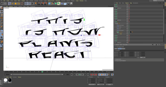
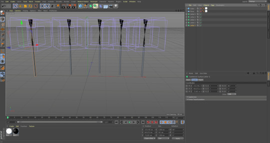
Photo

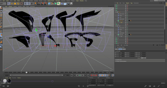

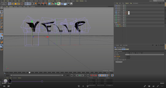
Full Screen Example 2
For a second example I chose to look at using a name. I used my own name so people could see what a name would look like. In consideration that people see this at the degree show then it would also allow people to know who created it.
Full Reference Video:
https://drive.google.com/drive/folders/1l4eFJl1H2_ATZsL7diJYHKhM9FCVLWKH?usp=sharing
(Reference code #0021 within the Cinema 4D folder)
*All videos are linked in a google drive folder as the videos are too large for tumblr or vimeo.*
0 notes
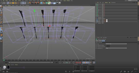
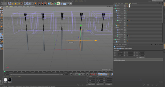
Photo
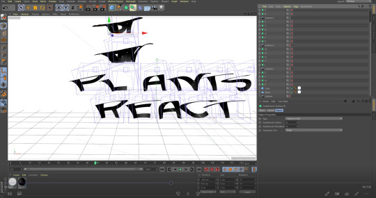

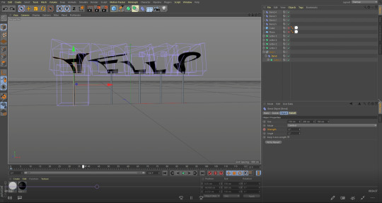
Full Screen Example
After trying the stems I chose to go for a more simple style and just have multiple words demonstrating how the type would look in a larger setting. It also allows people to see the concept on a larger scale and get a better understanding.
Full Reference Video:
https://drive.google.com/drive/folders/1l4eFJl1H2_ATZsL7diJYHKhM9FCVLWKH?usp=sharing
(Reference code #0020 within the Cinema 4D folder)
*All videos are linked in a google drive folder as the videos are too large for tumblr or vimeo.*
0 notes
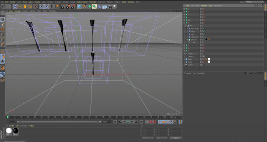
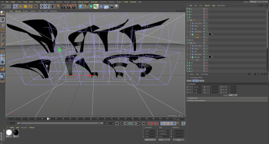
Photo
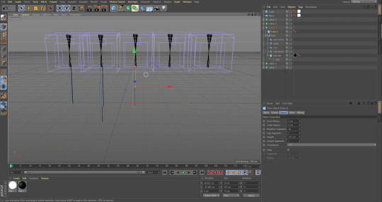

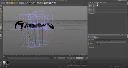
Creating a full screen example
I tried to create a full screen example of the type and I aimed to make it look as if it was a digital plant. This however didn’t work at all as the connection between the letter as a leaf and the stems didn’t fit right with some of the letters such as the H due to the gap in the middle.
Full Reference Video:
https://drive.google.com/drive/folders/1l4eFJl1H2_ATZsL7diJYHKhM9FCVLWKH?usp=sharing
(Reference code #0018 & #0019 within the Cinema 4D folder)
*All videos are linked in a google drive folder as the videos are too large for tumblr or vimeo.*
0 notes