mapledecidueye
Maple Decidueye
I Fix Pokémon!
151 posts
Last active 2 hours ago
Don't wanna be here? Send us removal request.
Last Seen Blogs
nyxabird
Nyx's Space
theartofjournalling
Mason Williams
karenfordonte
Caring For Donte

irlgregorsamsa
anastasija🕯

fastandfurious-1327
FastAndFurious_1327_
Text
Here comes a set of wonderfully round fellas, Quilladins! This set and the next one have honestly been giving me a little bit of trouble, but I think I managed to make them pretty nice!

First up is our lovely, classic Quilladin. It reminds me of the black walnuts from a tree near my house, just a lovely round green boy with a nice dark brown body. Just a sweet little guy. I wanna give him a hug.

Next up is a little sweetheart, water type Quilladin! I really wanted to make it invoke waves and sea life while also just being a cute little fella, and I think it looks nice. For the shell, I actually thought of a shark egg case that I saw once, and I think turned out well.

Finally, we have our flamboyant wonder, fire type Quilladin! This is my favorite of the set, I just really like how the colors turned out, and the way that I did the fire-like fur. This one looks a touch more armored than the other two, which I think looks really nice for the design.
1 note
·
View note
Text
Finally, I'm back from the shadow realm! This time, I brought with me some sweet baby Chespin designs. I honestly designed these months ago but I hit a wall with my brain and had to spend the next month in the void.
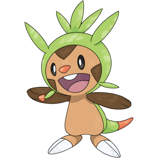
The first is a classic grass type Chespin. Chespin is such a cutie, just a fluffy, leafy little guy who is so excited to see you! I want to give him a hug and a little kiss on the head. Also, his little hood <3.

Next up is my personal favorite, water type Chespin. I gave it fluffy cheeks to look a little bit like waves, and a stripe of fur on its head to mimic the fins of a fish. I also gave it little scale-shaped markings to make it seem more aquatic. I think it looks really cute and soft.
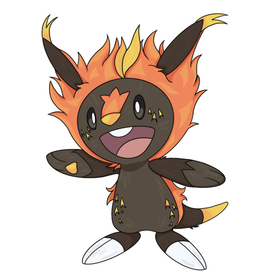
Finally, we have our floofy fire type Chespin! It has a fluffy mane of flame and a little blaze on its face to differentiate it from the others (a blaze is the stripe right above the nose). It also has some cute ember freckles on its face and body.
5 notes
·
View notes
Text
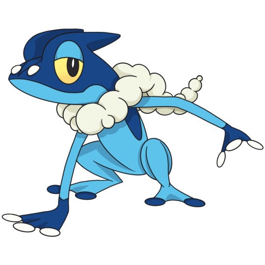
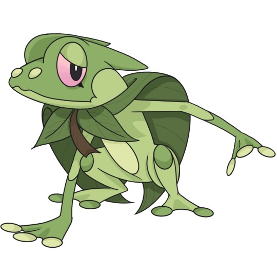
The final frogs are here! Gotta say, I struggled with this one a little bit, just because Greninja has a very specific shape, but I wanted to make each variant look special, and not just color swap them.

First, we have our classic slippery rogue, water type Greninja. This is honestly one of my favorite Pokémon, it just has a very sleek design and gives me good vibes. I love the scarf that looks like a tongue, very cute. Fun fact to notice, unlike the previous evolutions, Greninja's eyes are pink, so I had to choose new eye colors for the other two variants as well.

Next up is our little leaf warrior, grass type Greninja! I struggled on this one the most, since I wanted to find a way to make the horns more natural-looking. I eventually decided on horns that masquerade as branches, which I do think looks nice. This version of Greninja has more of a cloak than a scarf, and has kneepads that look like insects.

Finally, we have our flashy fighter, fire type Greninja. It took me a bit to decide on the design of the scarf, as I wanted to go one step above fire type Frogadier's fire scarf, and I eventually came to blue fire as an interesting expansion on that idea. I think it looks really nice in the end. For the kneepads, I went with gemstones, since I think that works nicely with a fire Pokémon.
Next on the docket is the Chespin line, which I'm just a bit nervous for (I have no idea what I'm going to do with Chesnaught). I'll see you soon!
1 note
·
View note
Text
MORE FROGS! This one took a while since I've been busy with life stuff recently, but it's been nice to take my mind off of things and draw some Frogadiers.
First up is our classic, water type Frogadier. I think that this design is objectively cool and sleek, it almost looks like it could be a final evolution all its own, though I am very happy for Greninja's existence. My favorite part is the little frog face, its just so cute!
Next up is grass type Frogadier! I wanted to give each version a different vibe, so grass type has a bit of an anxious, gentle look. I gave it a big leaf for a cloak, with a couple more leaves in front to make a little bow. I really like this design, I think its cute and looks unique.

Finally, we have fire type Frogadier! This one might be my favorite of the three, and I gave it a more playful expression. I decided to make the scarf out of fire, which I think looks really nice for the design. I also gave it flame-like markings down the legs. I think it turned out really great, I'm really proud of it.
1 note
·
View note
Text
I think I may have fallen into a rabbit hole of drawing. For some reason, my brain is just really in a drawing mood recently, so feast your eyes on the gains of my obsession. Its Froakie time!

First off, we have our classic, water type Froakie. I love this little man, he's so round and cute and he always looks a little bit thoughtful. I've always loved the vibes that water type Pokémon have, its especially evident with Froakie and Sobble, they're just little guys that feel.

Next up is fire type Froakie! This little frog is gonna have some real Naruto vibes when it grows up, but for now, it's just an excitable sprog. I went with flame designs on the legs and stripes on the cheeks for the details, and a fluffy-looking ruff on the neck, instead of the bubbly one on classic Froakie. I went with pale, almost teal eyes to look a little bit like blue fire, since I'm hoping to bring that color out in later evolutions.

Finally, we have the shyest little baby in the whole world, grass type Froakie! This frog is gentle natured and calm, spending much of their time perched on leaves and soaking up sunlight. They have details on their cheeks, knees, hands, and stomach, and a cloak made out of a leaf around their neck. For the eyes, I went with pink/magenta, since I think it brings out the more calm vibes I wanted to bring with this one.
See you next time!
6 notes
·
View notes
Text
FINALLY I'M DONE! Experience the beautiful Delphoxes that I spent way too long drawing (4.5 hours). I was honestly a little bit nervous going into this one, since Delphox has such thin lineart, which is a style I am not particularly used to. I think they actually turned out really nice, and now I'm going to try using thin lineart more often, it works pretty well with my style.
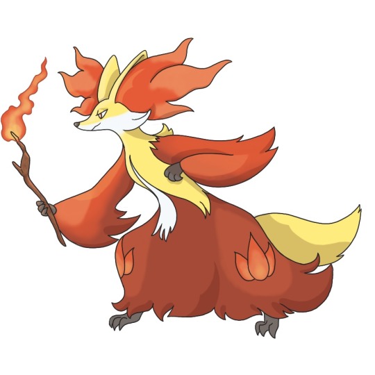
The first one, obviously, is my version of the classic, fire type Delphox. I decided to play with this one's design a little more than I had with the previous two fire types, just messing with some gradients and shading/lighting to look a little bit more of my style and aesthetic. You have absolutely no idea how much I love this one, it just turned out so cute and I love it so much.
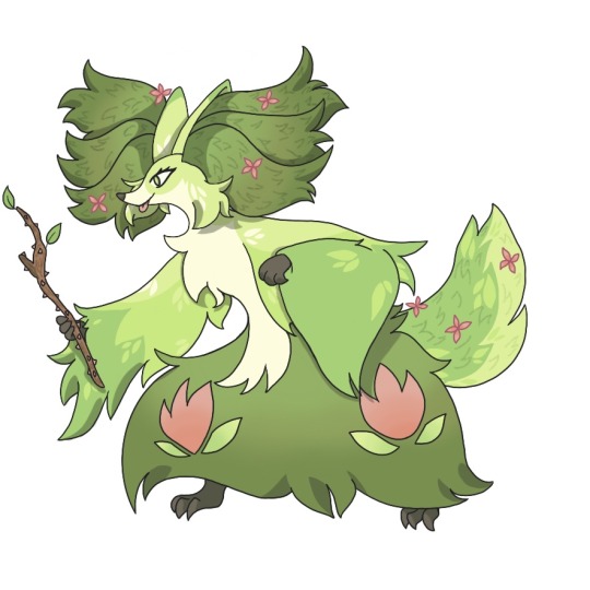
Next up, as always, is grass type Delphox. I wanted this one to look really fluffy and unkempt, like a shrub thats overgrown. To really give it a final feeling, I added little flowers on the ear fluffs and tail, finishing the blossom cycle I had tried to bring out in the previous two evolutions. Instead of the flame patterns on the legs, I went with little flower decals, making sure to match the aesthetic of the original flame shapes. For the wand, I went with a thorny rose branch, just to bring out the grass type feeling.
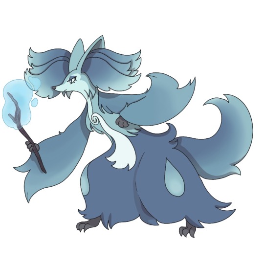
Finally, my precious baby, water type Delphox. I wanted to make this one feel like a splashing wave, or like ocean currents, which I think came out somewhat in the design. I went with a raindrop shape for the decoration on the legs, making sure to match the aesthetic to the original flame design. For the wand, I went with a dark purple color for the wood, which I hoped would look a little bit like a waterlogged branch. I also gave it a water bubble on top, just to bring out the water type vibes.
I have no idea what Pokémon I'm gonna do next, but I've been having a lot of fun with this. Whatever catches my fancy, I guess.
13 notes
·
View notes
Text
Another three hours of drawing for your viewing pleasure! I loved my type swaps of Fennekin so much that I decided to go through Braixen and Delphox before anything else.

First up is the original, fire type Braixen. Honestly, Braixen is such a cutie, this design is one of my favorite middle evolutions of all! It looks like it could be a complete Pokémon all by itself, which is sometimes lacking in the middle evolutions. I love the Fennekin line so much.

For the first type swap, we have grass type Braixen! I wanted to make this design much more fluffy to make it look like an overgrown shrub. I changed the simple, speckled fur design from my grass type Fennekin into a larger leaf design to really emphasize the growth aspect of the design. I also wanted to make the ear fluff look a little bit like opening flower buds, although I'm not sure how well it worked.
Finally, we have my favorite design, water type Braixen. I added a few more colors to the gradient on the ear fluff and tail, hoping that the wave aesthetic would come through a bit more. I also made the body a little less fluffed up to try and enhance the raindrop shape that Braixen's body shape naturally has. I just think it turned out really cute (probably because I'm using my favorite colors on it, to be honest).
16 notes
·
View notes
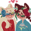
Text
I'm back with something new! Type Swaps are really fun, I think you can do a lot of interesting things with the simple base designs of Pokémon. For my first one, I wanted to do Fennekin, mostly because I absolutely love this little fox baby and its evolutions. It is my absolute favorite starter from X and Y, only managing to get above Greninja because I like all of its evolutions.

I did this first one just to draw normal Fennekin with my style. It's obvious that I'm using the original illustration for the basic shapes and the size of the character. I love this design a lot, it's really cute and fluffy, just plain enough for a first evolution.
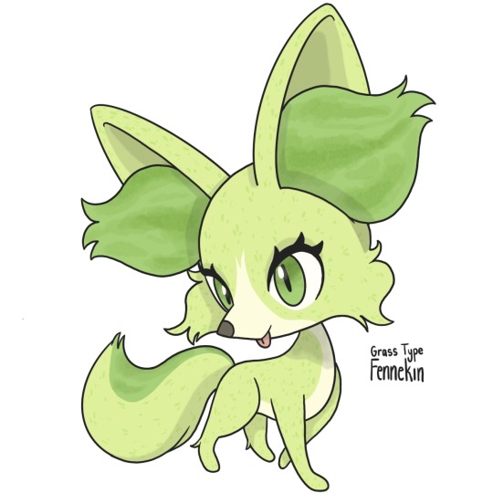
For my first swap I went with grass, since I wanted to go through the types by weakness (not sure why anymore, lmao). I tried to make the ear fluff look more like buds, and gave it a more curly tail and face fluff. I also added a texture to the fur to make it more like the texture of grass.

The water type swap is honestly my favorite. I wanted to make the ear fluff and tail look a little bit like waves using a gradient. I also changed the blaze and face lighter areas into a mask-like shape, as well as adding a dark stripe down the back to connect in the color of the tail to the main body.
13 notes
·
View notes
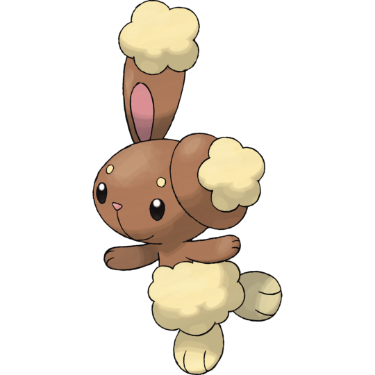
Text
Original :
Shiny :
Fixed :

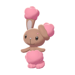
I'm sure it's obvious how much I love the shiny design for Lopunny (as well as the one for Buneary). I think it really accentuates the cute design that it has, while making it feel different from the original. For my version, I went with a lighter base tone and a paler, more red-leaning shade of pink. I just think it makes the design feel a little lighter and softer.
7 notes
·
View notes
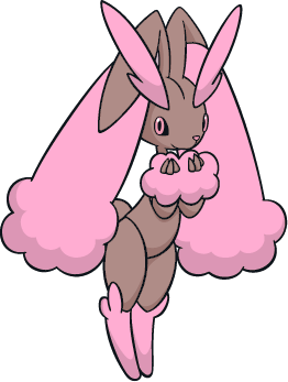
Text
Original :
Shiny :
Fixed :

I adore the shiny design for Buneary, it's cute and bright and meshes really well with a little bunny aesthetic. For my version, I went with a slightly lighter tan for the main body, with a rosey color for the inside of the ears and the nose. I made the fluff a paler pink than the original design, which makes it look a little bit like cherry blossoms to me. I just wanted to give it a slightly lighter feeling than the original shiny design had.
8 notes
·
View notes
Text
Original :

Shiny :

Fixed :
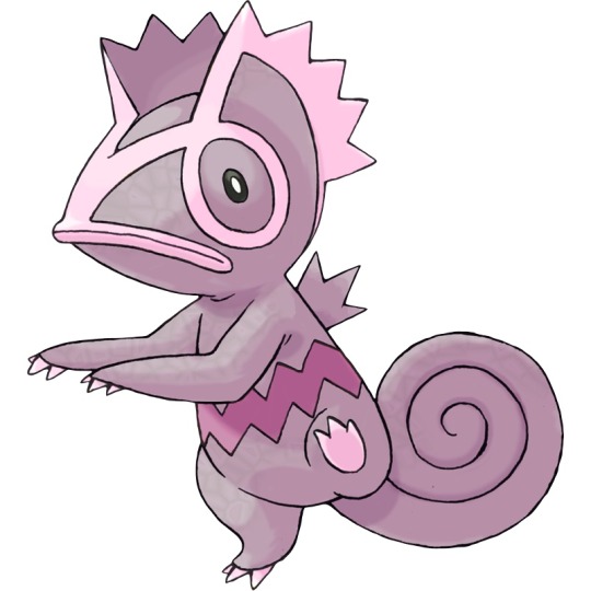
I actually didn't know that there was some discourse surrounding Kecleon's shiny design until I decided just randomly to work on it. I was originally planning to do a teal version, something that looked like the color that chameleons naturally are. I decided to try my hand at a version of the purple shiny, based a little bit on the Kecleon brothers from Mystery Dungeon. I didn't follow the purple design exactly, as there were some minor issues with the coloration of the more basic Kecleon (the green one) in Mystery Dungeon.
My version is a pale grey purple with light pink highlights and a more violet stripe along its middle. I think the design turned out really cute, and it reminded me that I need to get one of the Mystery Dungeon games.
5 notes
·
View notes
Text
Original :

Shiny :
Fixed :

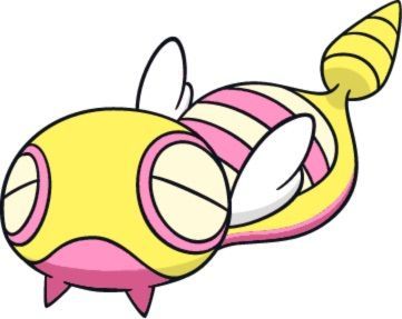
Dunsparce deserves better. I love this little man. I also really like its shiny, but I wanted to make one with colors that were a little more different. My version has a pale pink main body with teal and aqua for the detail colors.
4 notes
·
View notes
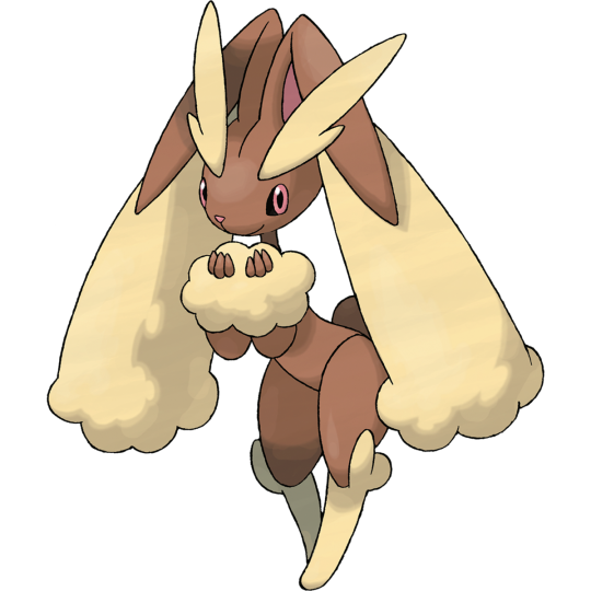
Text
Original :

Shiny :

Fixed :

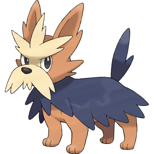
I think there are some really nice elements to the shiny design for Stoutland. In particular, I am really fond of the golden color used for the moustache fluff. For my version, I went with a darker, more violet toned brown for all of the colors, taking some inspiration from other colors of Yorkshire terriers.
4 notes
·
View notes
Text


I actually like the shiny design for Herdier, though it is a little on the boring side. For my version, I went with a series of slightly darker, more violet versions of the existing colors, taking after some other colors of Yorkshire terriers.
3 notes
·
View notes
Text
Original :
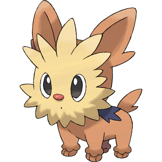
Shiny :
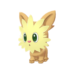
Fixed :
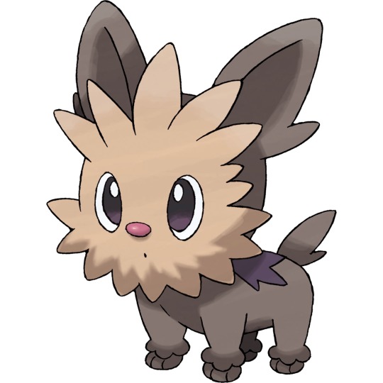
Although the shiny versions for Lillipup and its evolutions aren't particularly upsetting to the eyes, they are a little boring. For my version of shiny Lillipup, I went with a darker, more violet brown color for all of its parts. I wanted to make sure that it still looked like a Yorkshire terrier, so I referenced some other colors that Yorkies can be for my design.
3 notes
·
View notes
Text
Original :

Shiny :
Fixed :
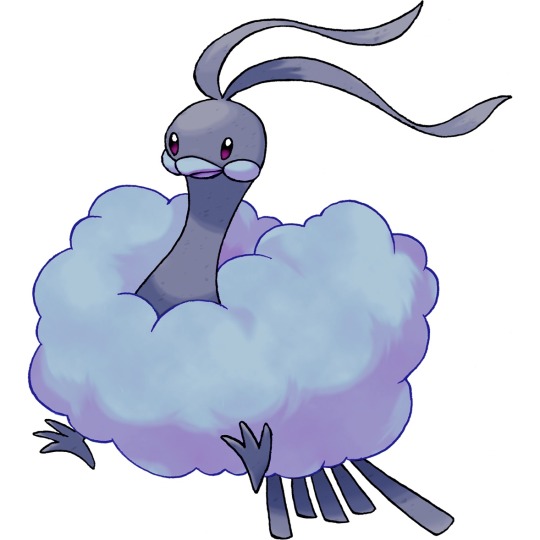
I really like the shiny design for Altaria, I think that the yellow that they used for it is actually really nice on the design.
For my version, I went with a stormy grey version of Altaria, since I really love its cloudy shape. I think it looks really pretty on the design, and fits the theming a little more than the yellow does.
5 notes
·
View notes
Text

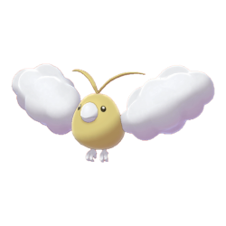

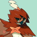
I actually love the shiny designs for Swablu and its evolution. Like a lot of bird Pokémon, its a yellow shiny, although this was in the era after the original shinies, so it was probably done by a designer.
For my version, I went with a stormy grey version of Swablu for my shiny design, just because I thought it looked really nice with the cloudy design that both of these Pokémon already have.
5 notes
·
View notes