Last Seen Blogs

haimsource
Haim Source

aranytomb-blog
All About Gold Investment
withered-demon
Can I fix this, am I too far gone?
aerknight
chill

ponydirectioner49476
Fallen Angels
Text
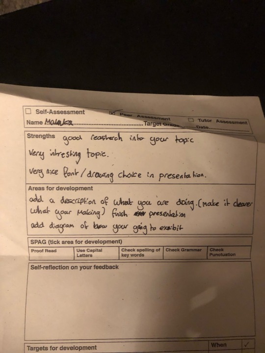
EVALUATION
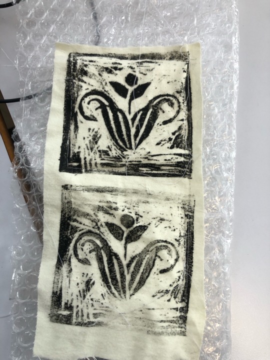
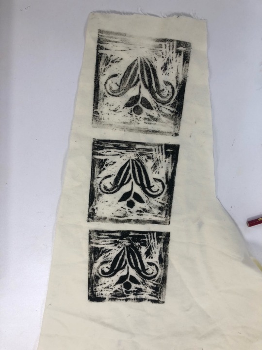
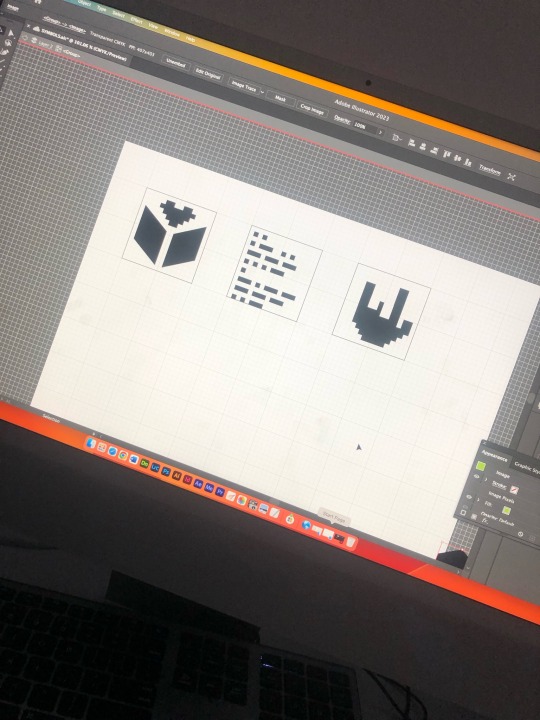
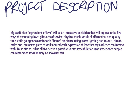
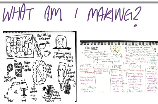
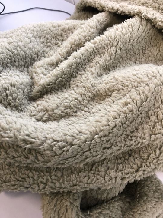
The theme of my unit is love more specifically the different ways of expressing love, the whole point of the exhibition is it being something the audience can experience and feel loved by but also allowing them to explore and ask themselves how they best express their love. The outcomes I had to make were at least one thing to do with the 5 ways of expressing love (touch, quality time, gifts, words of affirmation and actions) so for touch I wanted to make a blanket, this blanket also having symbols that represent each love expression. For gifts I would have stickers to give out. For quality time I’d have a clay hand made cup to represent the special time taken to make and let it dry. For words of affirmation there would be audio that you can listen to of people talking about their loved ones and why they’re so special to them. And for actions I’ll be giving my audience paper for them to write for me what their way of expressing love is which would be an act of kindness to me. Giving a rough break down on how I managed my time I’d say I could’ve handled it better, I underestimated how much I needed to do and found myself leaving a lot of things to last minute because I thought it was just small stuff I could complete quickly, which may have altered some initial concepts. I did my research by just generating ideas and finding artist who I think captured that idea well I looked at a lot of technique stuff by looking into very different ways of expressing a message I found myself refining my ideas. I experimented a lot with my symbols and coming up with how I would be printing onto my fabric this helped me narrow down what kind of look I was going for and what to avoid like colours clashing or too much ink, including how I can use the negative space to add more depth to my symbols, experimenting sparked new ideas which I developed my work. When developing ideas around the theme of expressions of love I kept in mind that I wanted to have my exhibition be very interactive and most importantly broad. I avoided any type of specification to one type of person to prevent the exhibition from feeling too specific I did this by keeping my idea vague and short being only 5 expressions of love and not specifying what kind of love or pushing any bias towards one way. I did the same with making the exhibition interactive starting with the idea of having my audience vote for what they like the most to just giving them the opportunity to write about what they think is most important to them, I think this is a less complicated more effective way of participation because it allows them to reflect on the question which is exactly my goal while also allowing them to become part of the exhibition. I faced a lot of challenges with managing work load I found myself working heavily on one thing and neglecting others which forced me to cut corners on certain ideas, also lack of materials was a problem because I found myself spending a lot of time gathering materials and reassessing everything I had bought to avoid this when planning for what I’m making I should also write a detailed list of what I’ll need to avoid future confusion.
0 notes
Text
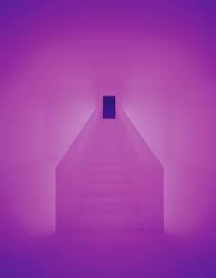

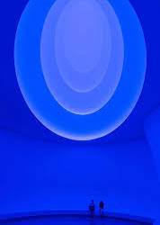
JAMES TURRELL
James Turrell is known for his exploration of light and space through installation art, sculpture, and photography. He uses light and color to create immersive environments, blurring the boundaries between the artwork and the viewer's surroundings. Turrell's innovative techniques involve precise manipulation of light and architectural elements. His works encourage contemplation and heightened awareness. Turrell's contributions to experiential art have pushed boundaries and redefined perception.
0 notes
Text

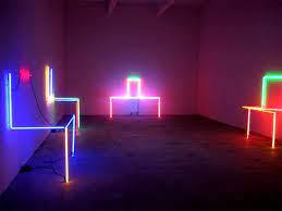
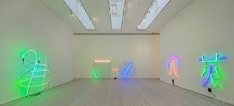
KEITH SONNIER
Keith Sonnier is a renowned contemporary artist who delves into the realms of light and space. Through sculpture, installation art, and neon, he employs inventive techniques to craft immersive experiences. Sonnier adeptly manipulates light and color to shape environments, creating a seamless fusion of art and its surroundings. His works frequently incorporate neon lighting, infusing them with vitality and dynamism. Sonnier's innovative approach to light-based art has revolutionized perception and pushed artistic boundaries.
1 note
·
View note


Text

LUCIAN RADU
Lucian Radu is an accomplished logo and brand identity designer, recognized for his exceptional work. As the founder and art director of UNOM, he has garnered accolades for his innovative approach. Radu's logo designs feature distinct imagery, often employing a clever use of negative space and a limited color palette. By skillfully leveraging negative space, he invites viewers to actively engage with the design, allowing their minds to complete the image and perceive its full impact.
0 notes
Text


MARIAN BANTJES
Marian Bantjes is a highly acclaimed graphic artist known for her intricate and ornamental designs. With meticulous attention to detail and a vibrant color palette, she blends typography, illustration, and ornamentation to create visually captivating works. Bantjes' innovative approach and incorporation of narrative elements set her apart in the field of graphic design, inspiring designers worldwide.
0 notes
Text
SHO SHIBUYA AND KAREL MARTENS COMPARISON
Karel Martens and Sho Shibuya are both highly influential graphic designers known for their unique approaches and contributions to the field. However, their styles and artistic focuses differ in several ways.
Martens is recognized for his experimental and minimalist approach to design. He often employs clean lines, bold forms, and restrained color palettes in his work. Typography plays a central role in Martens' designs, and he pushes the boundaries of traditional design conventions, creating compositions that are visually captivating and conceptually engaging.
On the other hand, Shibuya's style is characterized by a blend of typography, illustration, and innovative compositions. He skillfully combines traditional and modern techniques, incorporating hand-drawn elements with digital manipulation. Shibuya's designs often convey movement, energy, and a sense of narrative. He pays meticulous attention to color, using it to evoke emotions and enhance the overall visual impact of his work.
While both Martens and Shibuya are highly regarded for their craftsmanship and attention to detail, they differ in their artistic approaches. Martens leans towards minimalism and experimentation, while Shibuya's work incorporates a fusion of different techniques and emphasizes storytelling. Both designers have left a significant impact on the field of graphic design, inspiring fellow designers with their distinct styles and pushing the boundaries of visual communication.
Although I admire Shibuya’s unique thought process and story telling colours in the context of my own work and how my aim is to visually intrigue my audience, Martens experimental use of overlaying multiple layers is something I find much more visually exciting and something I can utilise in my work.
0 notes
Text

SHO SHIBUYA
Sho Shibuya is a celebrated graphic artist known for his distinct style and creative approach. With a keen eye for detail and a unique blend of typography, illustration, and graphic elements, Shibuya creates visually captivating and thought-provoking designs.
Shibuya's work reflects meticulous craftsmanship and a strong sense of composition. He skillfully balances elements on the page, utilizing negative space and innovative layouts to create visually dynamic and harmonious designs. His compositions often convey a sense of movement and energy, captivating viewers' attention.
Color plays a significant role in Shibuya's designs. He employs a vibrant and nuanced color palette, using color to evoke emotions and create visual impact. Shibuya's thoughtful color choices add depth and dimension to his work, enhancing the overall aesthetic appeal.
One distinctive aspect of Shibuya's style is his ability to blend traditional and modern techniques seamlessly. He often incorporates hand-drawn elements and combines them with digital manipulation, resulting in designs that feel both timeless and contemporary. This fusion of techniques adds a unique touch to his work and sets him apart as an artist.
Shibuya's designs often incorporate meaningful and narrative-driven elements. He conveys messages and tells stories through his work, inviting viewers to engage on a deeper level. Whether through symbolism, typography, or clever visual metaphors, Shibuya's designs resonate with audiences and provoke thought.
Overall, Sho Shibuya's work as a graphic artist stands out for its meticulous craftsmanship, innovative compositions, thoughtful colour choices, and meaningful storytelling. His distinct style and creative approach have earned him recognition and admiration within the graphic design community.
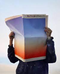
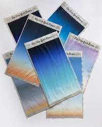
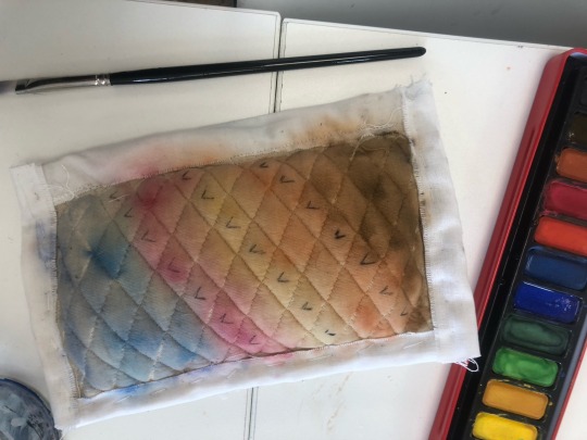
EXPERIMENTATION
I tried creating the same sunset effect using my own colours on my “practice blanket”
This experimentation didn’t go great because I used watercolour on fabric which came out vibrant at first but began to water down in colour as it dried. However, this made me realise how I really like the idea of a gradient on my blanket and I want to keep this idea in mind when potentially are printing on my blanket, I know now to also avoid usual paints (watercolour, acrylic) and to use something suitable for fabric.

0 notes
Text
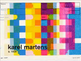

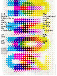
KAREL MARTENS
Karel Martens is a highly regarded graphic designer and artist known for his innovative and experimental approach. With a focus on typography, print, and book design, Martens has made significant contributions to the field.
Martens' style is characterized by a balance of simplicity and complexity. He embraces minimalism, utilizing clean lines and bold forms in his designs. However, he also incorporates subtle details and unexpected visual elements, adding layers of depth and intrigue.
Typography plays a central role in Martens' work. He experiments with different typefaces, layouts, and arrangements, pushing the boundaries of traditional design conventions. Martens' typographic compositions are often dynamic and visually engaging, capturing the essence of the message or concept he is conveying.
Color is used strategically in Martens' designs. He employs a restrained color palette, carefully selecting hues that enhance the overall aesthetic and visual impact. Martens' thoughtful use of color creates a sense of harmony and coherence within his compositions.
Martens' work extends beyond graphic design into the realm of art. He often blurs the boundaries between design and fine art, creating pieces that challenge traditional categorizations. Martens' experimental and multidisciplinary approach has garnered him recognition as a pioneer in the field.
In summary, Karel Martens is an influential graphic designer and artist known for his innovative and experimental approach. With a focus on typography, print, and book design, his work embraces minimalism while incorporating unexpected details. Martens' use of color and his ability to blur the boundaries between design and art make him a celebrated figure in the creative world.
EXPERIMENTATION


0 notes


Text
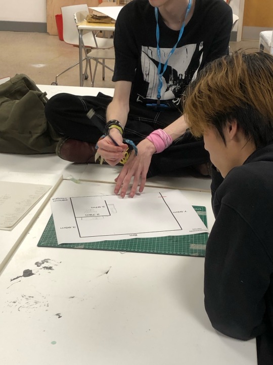
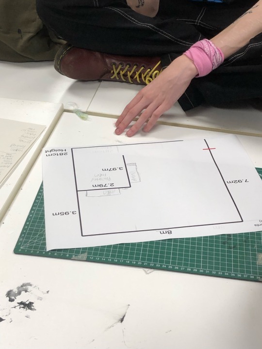
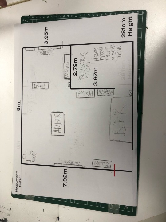
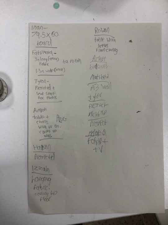
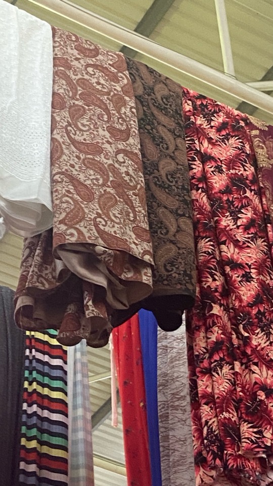
EXHIBITION SPACE PLANNING
After visiting our exhibition space we decided as a group to create a rough sketch/plan on where everyone would like to be placed.
We had to keep in mind wall and floor space including use of electronics, reachable plugs, windows and the actual sizes of each persons final pieces. It’s very important that everyone is comfortable in the space but also be able to showcase their work as best as possible without getting in the way of each other.
Our space is slightly limiting to some of our original ideas of presenting our exhibition so that’s when some of us had to make compromises like hanging certain pieces on the ceiling or walls or for the projection room, having projection work be projected for a certain amount of time before moving on to the next persons work. This is a problem because this may take out the immersive experience some of us had aimed for in our work but we tried to lay out everyone so that individual pieces don’t clash together.
We’ve also utilised one of our peers 3D modelling skills to help envision the layout better


0 notes
Text

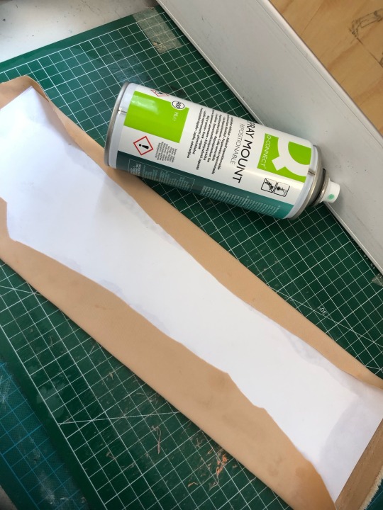

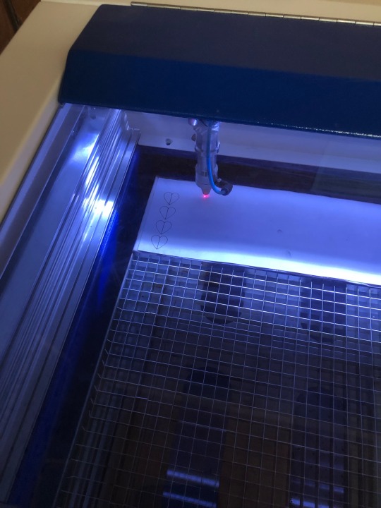
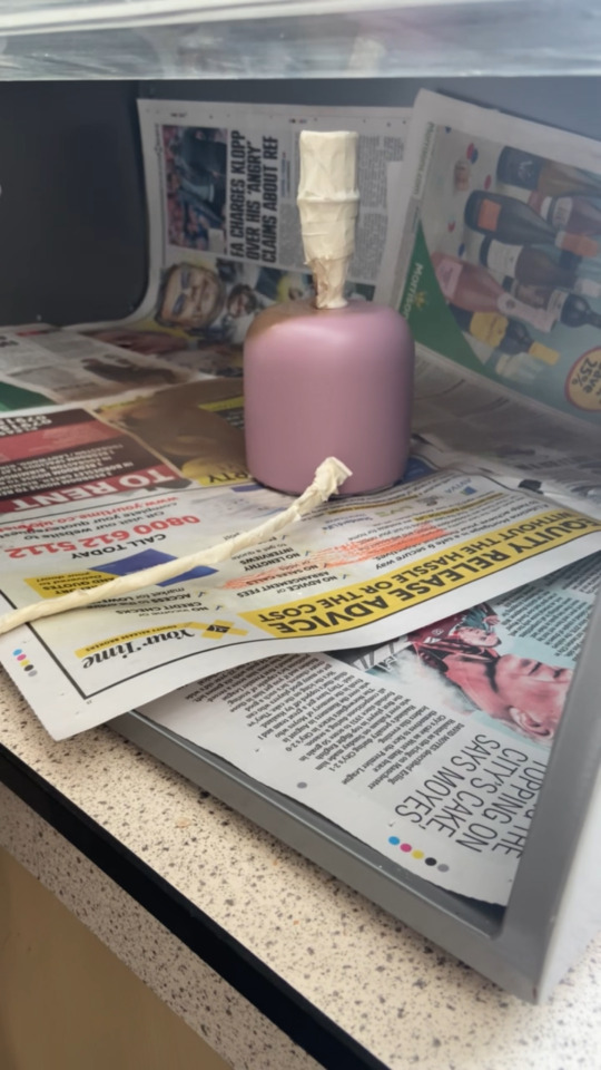
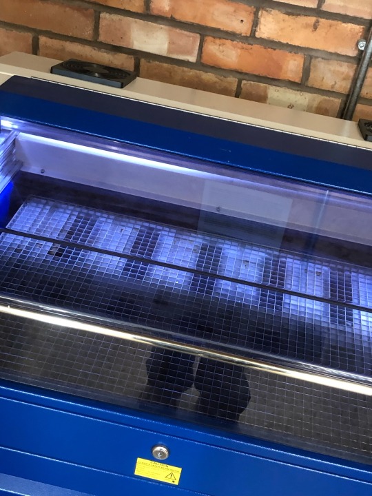
SECOND ATTEMPT AT LASER CUTTING LAMP
I made the lamp shade and used a new fabric measured the same as the old and only used one layer of fabric and a second layer of card to make it easier for the laser to cut through. taking the same safety precautions as before, i made the laser go over each line twice just to avoid the fabric catching fire, it cut through some of the fabric but left some of the card, if i was to do this again i would put the power up a bit higher. any remaining card not cut i will cut myself using a box cutter and safety matt.
0 notes
Text

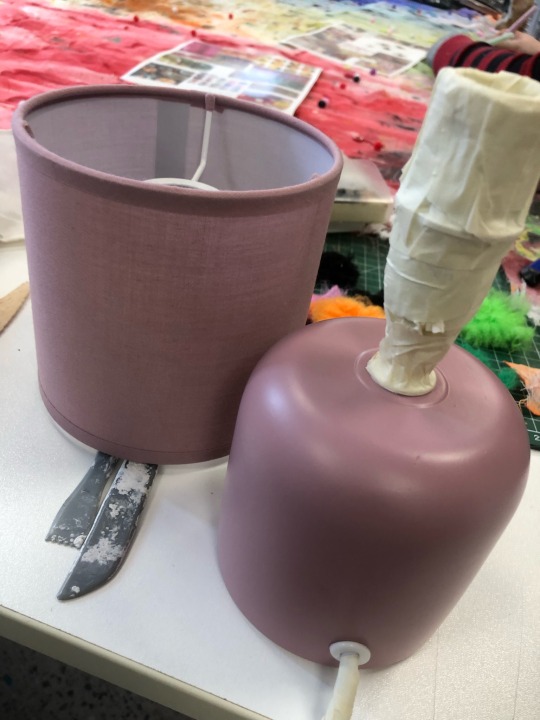


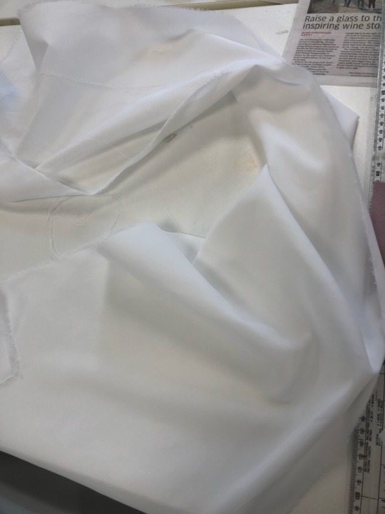
FIRST ATTEMPT AT MAKING MY LAMP
because i had spray painted and layered cardboard onto the lamp shade the laser cutter eneded up burning the fabric so when doing my second attempt i will avoid spray painting and using too many layers
safety precautions i took was keeping a safe distance from the machine when on and having a tutor nearby to make sure everything was running smoothly, once things started burning we turned off the machine and decided to start again to avoid any more damage.
0 notes