
Last Seen Blogs
of-blood
Blood Hunter

radiocontrolledsubmarine
Radio Controlled Submarine

cukuwibaladi
Untitled
bolognaarmy
The Asexual Agenda

matparking64
Untitled

Text
Press Release
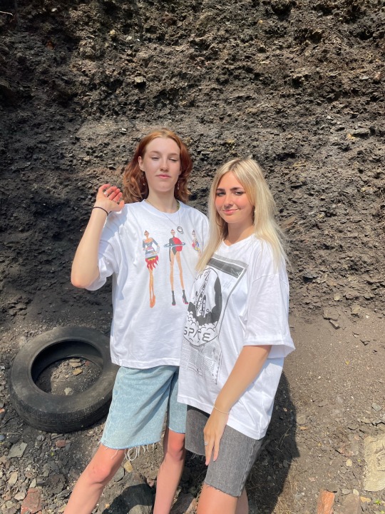
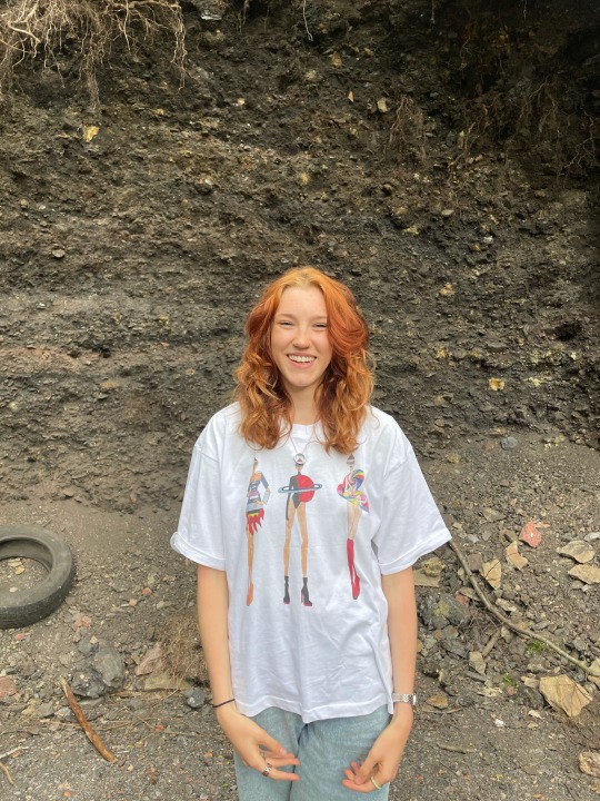
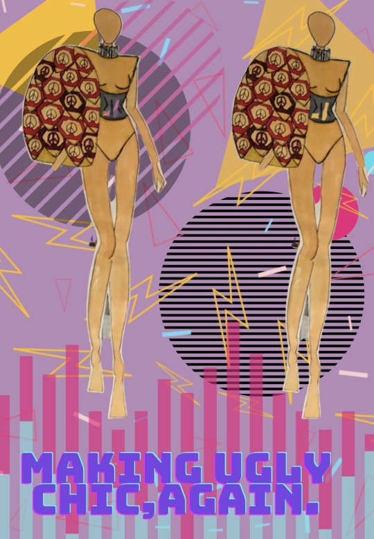
Making Ugly Chic
Making Ugly Chic is the latest collection from Lily Horton, inspired by Prada’s Ready-to-Wear Spring/Summer 1996 collection. A collection designed exclusively for the Catwalking: Fashion through the lens of Chris Moore exhibition showcasing at Cannon Hall Museum, Cawthorne in the Spring/Summer of 2023.
Horton main inspiration was taken from Prada’s collection concept, making unsuccessful trends, trends. She brought back patterns, colours, prints and accessories that were not seen as attractive since the 1970s. Horton’s initially research for her collection began looking into all the eras; 70s, 80s, 90s and 00s analysing the most popular trends and picking out which did not manage to be carried out into mainstream fashion. Horton then moved on to prints and patterns and researched iconic key movements from each era, eventually settling on the Environmental Movement of the 70s, the Video Games of the 80s, The Y2K bug of the 90s and the discovery of the Crystal Caves of the 00s. Taking influences from these elements, Horton created a six-piece collection that interpreted her research through abstract silhouettes, texture and print, creating a truly unique collection.
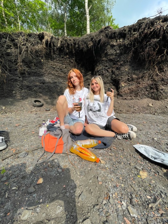
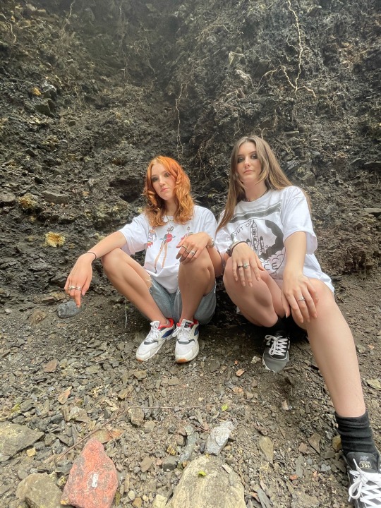
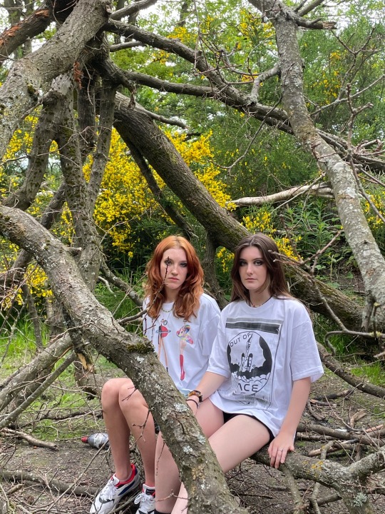
Exclusive behind the scenes and journey through the design process can be viewed at Horton’s social media platforms.
BLOG address;
https://makinguglychic.tumblr.com
###
Cannon Hall Museum, Park and Gardens
Bark House Ln, Cawthorne, Barnsley S75 4AT
0 notes
Text
GIFS
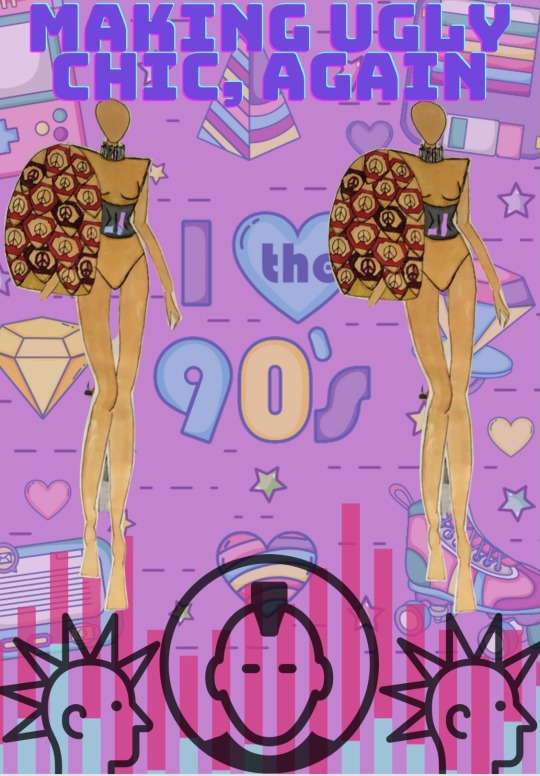
I decided to theme my GIFs around the era i looked at the most, the 80s. I looked more into the MTV style of big, bright and blocky i think this works well with the designs because it gives a fun and exciting look to represent the range. I added samples from the 70s and 90s in to portray it wasn't just 80s themes clothing being represented, 70s samples were the punk symbols at the bottoms creating like a bottom header and the 90s was obviously the ‘I love the 90s’ background. I do think that is this project wasn't based off using beige fabric only then the range would suit more the GIFS better and express the eras more, but from the colours we are allowed to work with I do think it has been illustrated well.
0 notes
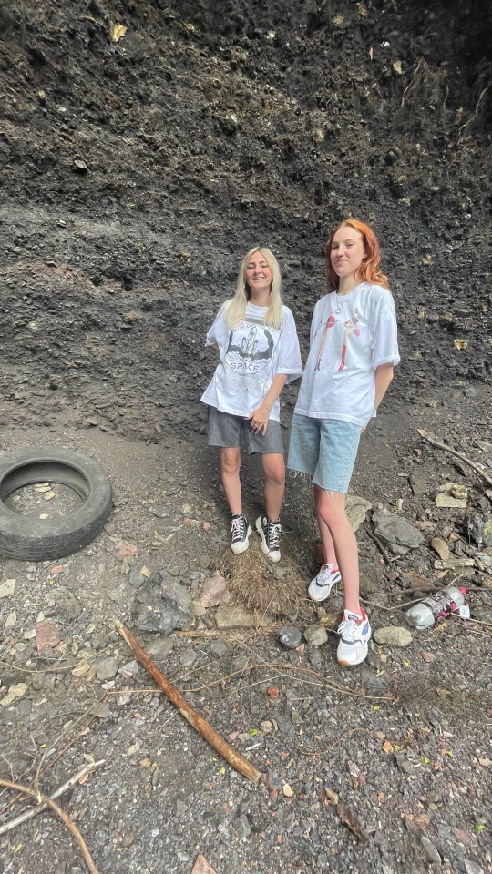
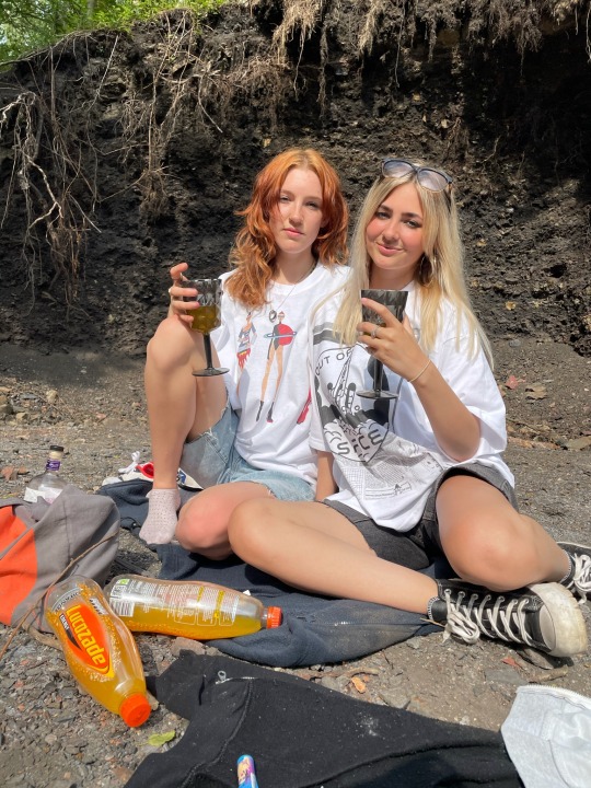
Photo

This is the style board which I would’ve used if the photoshoot was to take place, I based the photoshoot more around the 80s and 90s.
The location of the shoot would be somewhere built up like the 80s/90s rave scene with a graphic background. I found this would work well with my garment because the garment would be worn by someone who was confident and was a big character to the rave, therefore I think the rave scene would be perfect for this because many had a lot of people with a lot of different characters who stands out against the crowd, this garment would be one of them.
The mood would be the atmosphere you’d expect to feel in an 90s rave, the feeling of coming of age and being very upbeat and happy,not caring about the problems in the world. A movie esc mood being portrayed through the shoot.
The hair and makeup would be the typical 80s look, a lot of backcombing and hair spray. The 80s consisted of very bold and bright both makeup and hair therefore, the hair would be really big and volumised, keeping it in one specific upright style for the whole time. Then the makeup would be excessive and colourful. The eyeshadow, blush and lips would all have bright/ neon colour to really exaggerate the 80s look I’m going for.
The probs would consist of neon lights and boomboxes, if it was to be possible I would’ve like to have used a old retro car. Focusing on the lights and boomboxes, I think these would work perfectly in the rave scene as its known to have florescent lights and obviously music. This would work with the poses I’ve picked out, as you can see one of the poses is holding a boombox and I can clearly picture my garment in the chosen location, in this pose, the boombox with the hair and makeup. As for the rest of the poses, I think these would work with the rave scene location because of how they show strong character and almost look like they’re been pictured as the models dancing.
0 notes
Video
I decided I wanted to develop the face so I thought creating a visual idea board would help me see what I had to work with, I first started with the gas mask look to relate to the Environmental Movement. I really like these looks and it was a hard decision not to have used this as I think wouldn't complimented the types of garments I was designing. Also, the colour scheme would be very similar and it would merge well together. Secondly, I took inspiration from video games of the 80s and created a Donkey Kong head and a Ninja Turtle head. I quickly decided that this wouldn't work at all with my designs as they didn't compliment each other and just looked odd. Finally, the third designs I did was a face with long fringe and big lips. I knew I wasn't confident in drawing faces so I tried to do a unique style, but I wanted to push myself and take on this idea and make it more realistic this is shown in my media designs where i’m drawing a specific face multiple times adding and adjusting things to create a satisfactory end product.
0 notes
Text
MEDIA EXPERIMENTATION

I then looked into using different media applications for my designs, I firstly looked into chalk and charcoal. I found this worked really well with the idea of the gas mask head but overall I found it really difficult to create detail on the piece because the charcoal is very loose and doesn't set properly unless hairspray is used, but then its hard to layer it on top of the first layer.
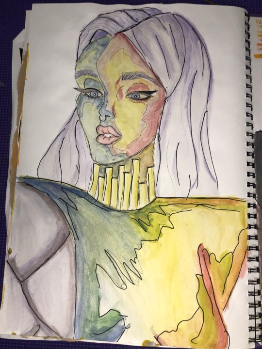
Next, I worked on experimenting with water colour. I found that the project was based on beige fabric, so I thought on I could really exaggerate the light and shading to make it more unique. This being, the shading I used cool colours like blues, purples and greens and for the light I used warm colours like yellows, oranges and reds. Overall, I really like how it has turned out because it makes it more effective than using minimal colour tones.
Moving on to pro markers, I find it hard to use these and make them work effectively as they go quite streaky when used on large surfaces. I took the same approach to this as I did the watercolour except I kept the colour scheme more neutral tones. I think this idea could potentially work better on a smaller scale or the idea of the way the colour are set out would work on a digital drawing.

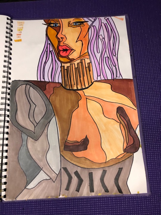
I then thought that it would be good to experiment using acrylic paint and see if I could take a similar outlook from the watercolour design. I again used warm tones like yellow and orange to express the light and used hints of greens and blue to portray where creases and shadows would lay on the garment. Overall, I really like how this has turned out and I think using a larger surface with a dark background really helped make the texture and detail stand out on it. If I was to do my final design on a large scale I would definitely use acrylic paint, although I wold try add more tones into the shading like blacks and brown to really give more realistic detail.
Here I experimented seeing if the acrylic paint look would work well on a smaller scale, personally I don't think it looks as well as it does on a larger scale because its a lot harder to add shading and depth which would make the image look more realistic and easier to visually see as garment. Overall, I think the designs on a smaller scale would've looked a lot better in a different media application like shading pencils where it would be easier to create shadows an creases. The end product of this was messy and not to a satisfactory rate, I even tried to make a sketched outline look with pen but still was not impressed.

Here I did a simple sample of pro markers used with crayons and then a fine lined sketch to visually see the sihlouette of my garment, to see more of a clear perspective. This was probably my least favourite because of how simple it is, although it does help me clearly see the silhouette. I personally don't like the crayon work with this because I couldn't find the right texture and it was mostly grainy, I somewhat like how it works against the pro marker but wouldn't like to see it on itself. If I were to use this media application again I would make sure I practised more making the two work well together maybe on a larger scale giving more room to create shadows and depth in the work.
0 notes
Text
FINAL 5 DESIGNS
After being in a design meeting and analysing all 15 designs, I shortened them down to a potential 5. I realised some of the designs wouldn't work well and effectively as my final garment.
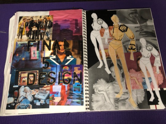
The first design I think was too simple and plain and I wouldn't have been happy to take this on to my final design as it wouldn't have been tome full potential. I really think this is. a nice item of clothing but for the brief I don't think it reaches the over the top and exhibition theme we were looking for.
The second design, I personally don't like this one much as I think there is too much going on. I don't think I was able to clearly portray the idea I had. I think it does definitely show elements of the punk look, what I was going for, like the paper clips folding the big sleeve together, the studs, shoulder pads and lots of layering. But I also think it portrays the floral trend what I also looked into from the 90s. I like the big sleeve and how it represents the flower but I think with all the layers, the patterns and the studs, it does over doit and it loses its effectiveness.
Again, I think the first design here was potentially over done. Here there is elements from the 80s aerobics trend, 70s punk trend and 80s video game screen print inspiration. I think it the piece was a lot more simple it would have more potential. I like the silhouette of the body which it gives but I think the arm and the zip was unnecessary and probably would've worked a lot better as a simple sleeve or no sleeve at all. Although, my favourite part of this garment is how I split up the screen print, I did half of the body printed and the other half not and then the other sleeve printed with the other sleeve not. I think this does give it a simple but effective look and I do think this garment could've had a lot more potential.
The second look on here I really do like, I think the oversized shirt/jacket does portray the fundaments of my out look on this project. Shoulder pads being a main trend that I have looked into. This I clearly portrayed in this look, although usually shoulder pads are used to make the waist look slimmer, I decided to apply the ‘Miami Vice’ trend from the 80s too, creating a unique look with the shoulder pads and the well known oversized and relaxed blazer.

Eventually, I decided on which I wanted to proceed with and made some adjustments what had been advised, this being making the shoulders bigger to really emphasise the Trent of the shoulder pads of the 1980s which I had researched into. Personally my end piece of work, works satisfactorily as it shows clear development from my initial research and the garment itself would work effectively as the simple body contrasts against the large and detailed bell sleeve.
0 notes
Text
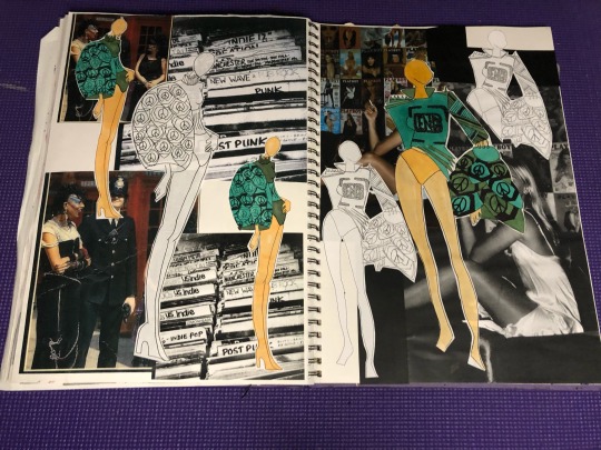
DESING DEVELOPMENT
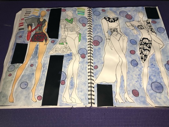
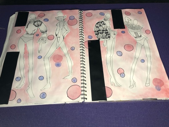

I then started my designs, first of all I experimented with 6 designs so I could get some inspiration and practice with media for my remaining 11. A running theme throughout designs is the large shoulders, taken inspiration from the 80s shoulder pad trend, I personally love the silhouette it gives on the model. It really exaggerates the shoulders and slims the waist, one of the reasons it was such a big trend in the 80s. Another element which I used and really liked from the 80s was the aerobic style, as you can see, they all nearly have a leotard like bottom really portraying a athletic element. I did look at the punks from the 70s and used elements of this in my work too, the safety pins, studs, layers, and a lot of unfinished and rough edges. I really like how majority of the designs turned out; I think they show a sense of rebellion. I think the way the designs contrast in shapes really work well achieving, ‘making ugly chic again’ by having big arms and small body or half a skirt with big shoulders.
0 notes
Video
I’ve created a quick inspiration board so I can see more visually the trends and styles ill be working with from my sketchbook, instead of reading my mind maps. I gathered some of the of the trends which initially wanted use in my designs. Seeing this visually helped me decide which trends would work and which wouldn't. For example, seeing crochet and sheer I decided these I would not be taking on because they wouldn't work with the looks i’m imagining and they would be really time consuming, especially the crochet. On the other hand, I was able to clearly picture that the aerobic trend, the shoulder pad trend and the punk trend would inspire my designs the most, creating them some of the top inspirations.
0 notes
Text
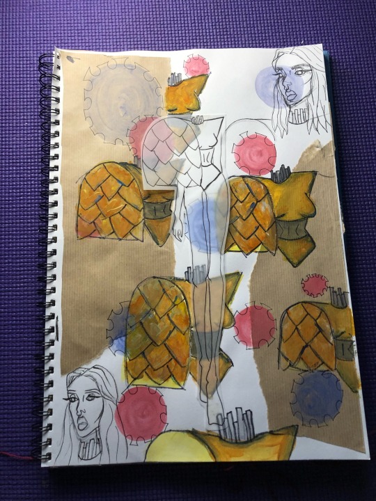
SIZING SCREEN PRINTS
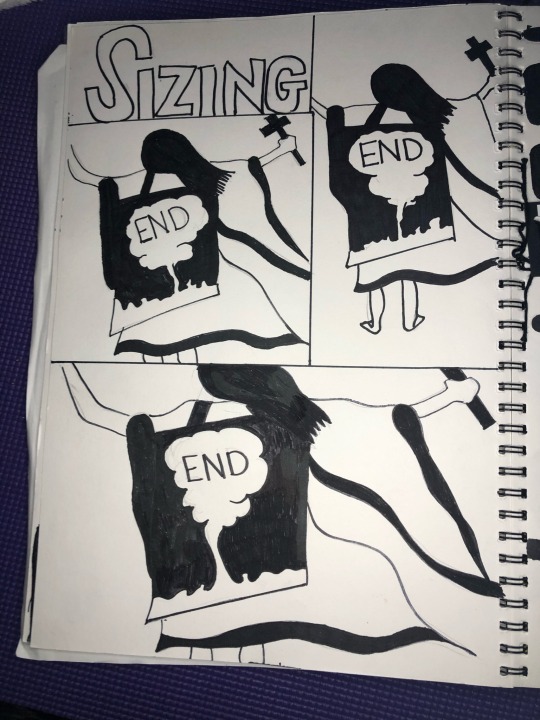
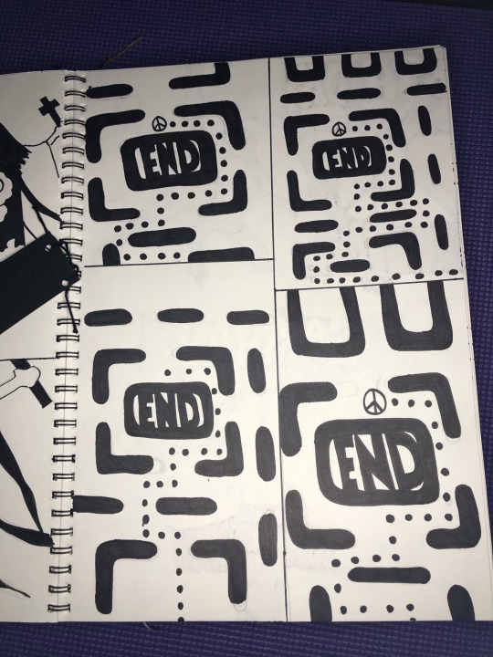
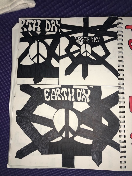
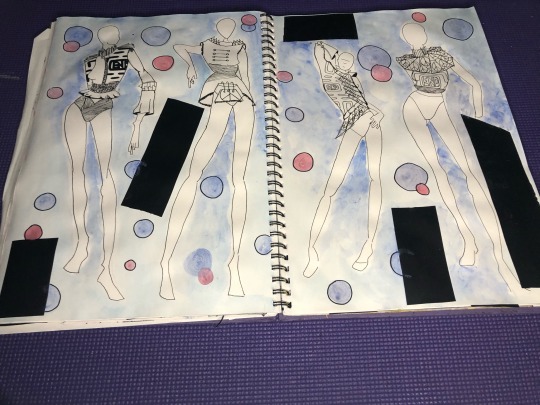
I then breifly looked into various sizing of the screen prints to use on my garment. Personally, I found that experimenting sizing on paper really helped me envision it could eventually look on my garment. This was the point where I finally decided that the ‘Earth Day’ screen print wasn't going to work effectively with the crystal cave silhouette, I also finally decided that I wasn't going to proceed with the Y2K screen print. So I then developed Earth Day into a clear silhouette of the peace sign head holding the banner.
0 notes
Text
SCREEN PRINTS
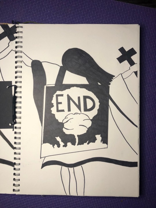
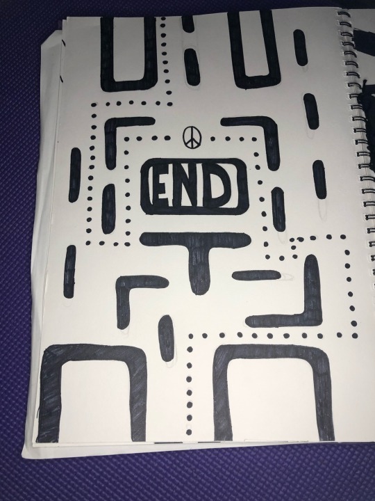

I decided to create 4 different screen prints, all taken inspiration from the Environmental Movement, Y2K, Crystal Caves and 80s Video Games. I thought that I could experiment and merge together Environmental Movement and the Crystal Caves together, creating the last image. I decided not to take on the first image straight away because I could visually see that it would look blocky when printed onto fabric. Although, I did really like the image on paper but couldn't see it progressing well in my overall work. Another design which I developed more of was the 80s style video game, initially it was just a quick sketch of an idea, but I soon realised I needed to make the lines and edged more precise for this print to work effectively. I then made it my priority to see how much I could get this print to work, it wasn't until choosing and creating my final design where I decided not to take this print any further. The print I did intent to use in my final design was the one in the final picture, I developed it and took out the silhouette of the crystal caves and sharped up the lines and circles. I then looked into different sizing of the screen print, deciding what would be better to use on my designs. I overall decided that using smaller prints would be better as it would make the garment look more effective when being layered on top of each other.
0 notes
Text
PRINTS AND PATTERNS INSPIRATION
I have decided to look into iconic moments from each year to inspire me to create prints and patterns for my work. I will be looking and the shapes and writing from my selected photos and how I could portray them into my designs, all are which inspired from the trends I previously talked about.
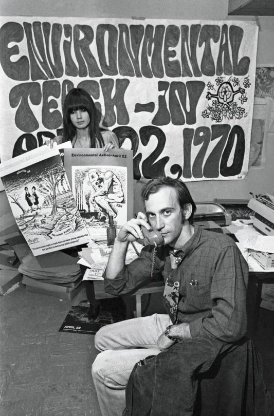
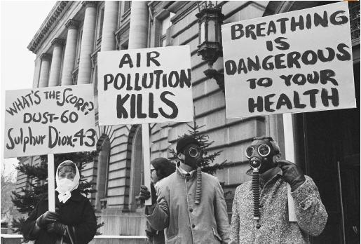
For the 1970s I have decided to look into the Environmental Movement. This was where people started making people realise the damage what pollution was causing to the air and the water. 1960s liberalism continued to flourish. For example, the crusade to protect the environment from all sorts of assaults–toxic industrial waste in places like Love Canal, New York; dangerous meltdowns at nuclear power plants such as the one at Three Mile Island in Pennsylvania; highways through city neighborhoods–really took off during the 1970s. Americans celebrated the first Earth Day in 1970, and Congress passed the National Environmental Policy Act that same year. The Clean Air Act and the Clean Water Act followed two years later. The oil crisis of the late 1970s drew further attention to the issue of conservation. By then, environmentalism was so mainstream that the U.S. Forest Service’s Woodsy Owl interrupted Saturday morning cartoons to remind kids to “Give a Hoot; Don’t Pollute.”I have inspiration from the signs they used, and the different font of writings. I think this could be used in my work where I base one garment on the 70s and use a screen print to put some of the quotes they use on the signs onto my designs and garments.
https://www.youtube.com/watch?v=8p8i276Xm8A
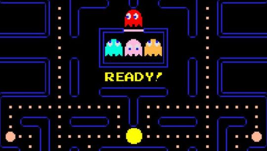
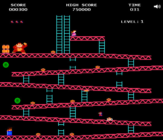
From the 80s I looked into video games, I think because geometric patterns were such a big trend and style in the 80s that because the video games are bright abstract shapes that it would look good to make my own geometric pattern from taking elements from the games. I could then also use this to merge into the trends I picked outline the aerobic gear such as leotards and leggings. Pac-Man is an arcade game developed by Namco and licensed for distribution in the U.S. by Midway, first released in Japan on May 22, 1980. Immensely popular in the United States from its original release to the present day, Pac-Man is universally considered as one of the classics of the medium, virtually synonymous with video games, and an icon of 1980s popular culture. Upon its release, the game became a social phenomenon that sold a bevy of merchandise and also inspired, among other things, an animated television series, and music. Donkey Kong is an arcade game released by Nintendo in Japan on July 9, 1981, July 31, 1981 in North America, and in Europe during the same year. An early example of the platform game genre, the gameplay focuses on maneuvering the main character across a series of platforms to ascend a construction site, all while avoiding or jumping over obstacles. The originally unnamed character, who was later called Jumpman, then Mario, must rescue a damsel in distress, Pauline, from the titular giant ape, Donkey Kong. The hero and ape would later become two of Nintendo's most popular and recognizable characters. Donkey Kong is one of the most important games from the golden age of arcade video games as well as one of the most popular arcade games of all time.
https://www.youtube.com/watch?v=W8xhFcxtxaM
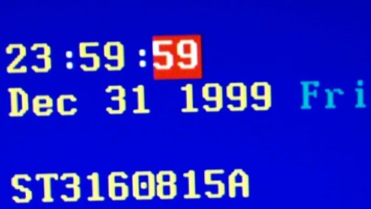
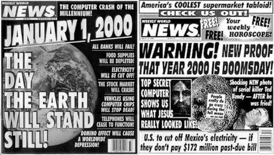
For the 1990s I thought that the Y2K bug/problem would be really interesting to look into. The Y2K bug was a problem in the coding of computerized systems that was projected to create havoc in computers and computer networks around the world at the beginning of the year 2000. Until the 1990s many computer programs (especially those written in the early days of computers) were designed to abbreviate four-digit years as two digits in order to save memory space. These computers could recognize “98” as “1998” but would be unable to recognize “00” as “2000,” perhaps interpreting it to mean 1900. Many feared that when the clocks struck midnight on January 1, 2000, many affected computers would be using an incorrect date and thus fail to operate properly unless the computers’ software was repaired or replaced before that date. Other computer programs that projected budgets or debts into the future could begin malfunctioning in 1999 when they made projections into 2000. In addition, some computer software did not take into account that the year 2000 was a leap year. And even before the dawn of 2000, it was feared that some computers might fail on September 9, 1999 (9/9/99), because early programmers often used a series of 9s to indicate the end of a program. People then became to exaggerate it saying that once all the malfunction happened that it would would cause computers to spontaneously combust and self-destruct, and the world would end. I think from this I could take the exaggeration people used into my work and also like how the news papers portrayed it. I think I would be able to make patterns and prints from the shapes and wording they used.
https://www.youtube.com/watch?v=PvXVWCckDMY
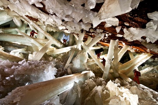
For the 2000s I have decided to look into the discovery of the Crystal Caves. Giant Crystal Cave was discovered in April 2000 by miners excavating a new tunnel for the Industrias Peñoles mining company located in Naica, Mexico, while drilling through the Naica fault, which they were concerned would flood the mine.The mining complex in Naica contains substantial deposits of silver, zinc and lead. The Cave of Crystals is a horseshoe-shaped cavity in limestone. Its floor is covered with perfectly faceted crystalline blocks. Huge crystal beams jut out from both the blocks and the floor. The crystals deteriorate in air, so the Naica Project attempted to visually document the crystals before they deteriorated further. Two other smaller caverns were also discovered in 2000, Queen’s Eye Cave and Candles Cave, and another chamber was found in a drilling project in 2009. The new cave, named Ice Palace, is 150 metres (490 ft) deep and is not flooded, but its crystal formations are much smaller, with small "cauliflower" formations and fine, threadlike crystals. I think this would be an excellent idea to make a pattern and a screen print by taking inspiration from the shapes of the crystals and the way they weave through each other.
https://www.youtube.com/watch?v=ZsIebVCr0zk
0 notes
Text
00s
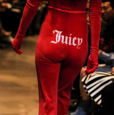
My favourite trends of the 2000s was the studded clothing and accessories, I love the extra effect it gives to the clothing. Wether it. was chunky studs or rhinestones on belts, jackets, shorts, or any of the world known juicy coture products, it was fashionable and everybody wore it. ‘Juicy’ rhinestoned onto velvet on the bum or chest of products were a fashionable casual look in the 2000s, especially for young celebrities. The chunky studded outfits relate back to the punk subculture in the 1970s, worn to give more of a grungy edge to it, the trend is carried today but now more focused on shoes, sandals and belts. Whereas, Juicy Couture brought slight popularity back by recently been placed in shops like Urban Outfitters. I think I could use these looks in my designs by creating patterns and shapes with the smaller rhinestones and the chunky studs toad depth and texture to the prints and patterns.

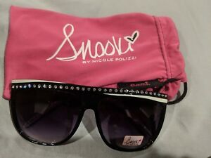
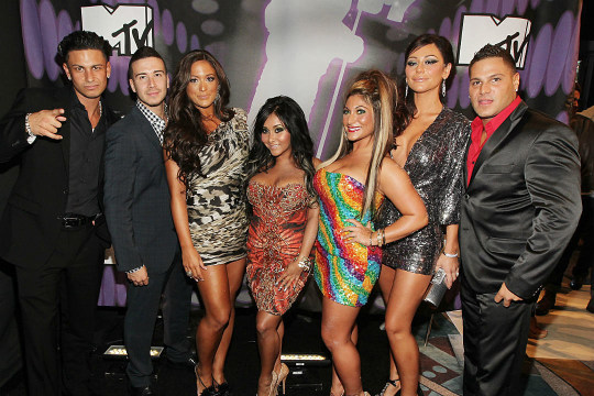
The Jersey Shore look originated from the American TV shows; Jersey Shore. The look consists of trucker hats, sparkly sunglasses, chains, small tops and dresses and a spray tan. I think only certain parts of this look I would take into my designs, such as the short skirts and tops and potentially the shape of the trucker hats. Personally, this look isn't one of my favourites and I don't see it working in the way I would like with all the other trends I have picked out from the eras.
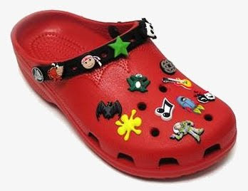
Crocs was one of the smaller inspirations I had from the 2000s, I thought the shape of the shoes and the accessory badges what go with them could make good patterns and prints for my garment. Crocs are an outdated fashion trends and in their later days they were known as children shoes and if adults wore them it would mainly be as slippers.
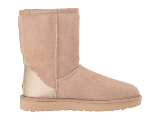
UGG boots were also a smaller inspiration which I had from the 2000s as well as the crocs. Now, I personally least like this look out of everything I've researched. I would only probably take the idea of the stitching being on the outside and the material into my designs and garment.
0 notes
Text
90s
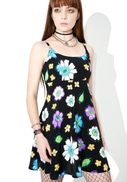
Floral clothing was a huge trend in the 90s; shirts, trousers, dresses which were printed everywhere, everyone wore it and it was one of the biggest trends of the 90s. I think I would be able to take this into my designs and associate it with the geometric patterns. it would be interesting to see how the flowers could work with sheer, using appliqué.
Crochet clothing, especially dresses, was a big fashion trend in the 90s. Usually worn with a bikini or even sometimes nude, the crochet clothing could be made in a variety of colours and patterns. I don't think I would use this on my designs and garments because I think it would be really time consuming and I don't think it would particularly go with any of my ideas from other eras. Although my theme is ‘making ugly chic’ I don't think it would be well suited in my looks which I'm going through.
More 90s trends to take inspiration from;
CRIMPED HAIR

MOOD RINGS

PLATFORM SHOES
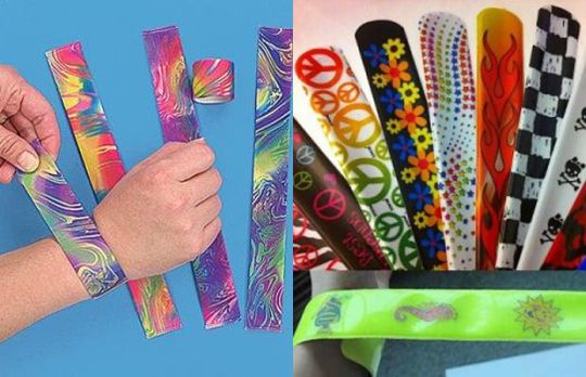
SLAP BRACLETS
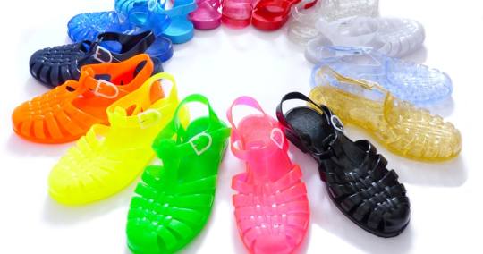
JELLY SANDALS
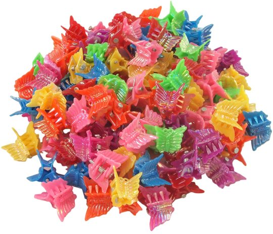
BUTTERFLY CLIPS
0 notes
Text
80s

Shoulder pads were a huge fashion trend of the 80s but didn't seem to carry its fame on in time. I think this style could work really well with the 70s Punk Culture. People would wear blazers with shoulder pads as everyday fashion, blazers are now in fashion but the shoulder pads never followed with them. The shoulders would define the torso.
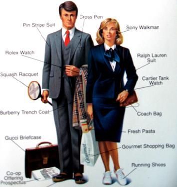
The ‘yuppie’ look consists of suits, ties, sweaters around the neck and patterned leather shoes. Young urban professionals, personally don't know if I would take this on into my designs fully. I probably would take small aspects like a sweater around the neck, and use a piece of cothing or an accessory around the neck and tied.
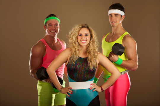
One big trend in the 80s is the aerobic and athletic gear; wearing, leg warmers, tight leotards, leggings, stirrup pants and usually all in neon colours. Although these outfits were usually worn in upbeat exercise classes, it was completely normal to wear them as an everyday outfit. I think that it could be interesting to see how this style could work with the geometric patterns and the punk looks from the 70s.
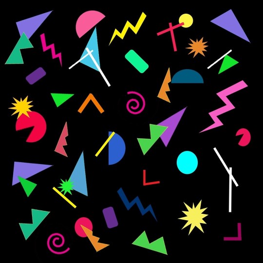
The geometric patterns from the 80s never proceeded into todays fashion but I like the way the neon colours contrast against each other and be backed with a black background/ fabric, making them stand out more. I also think that these designs could be good used different shades a colour. For example, a dark pink background/fabric with different shades of pink on the shapes.

The ‘Miami vice’ look consist of pastel colours, flowing white sports coats, blazers with t-shirts, suits. The majority of the outfits are loosely fitted clothing and quite flowy. I think I could take this colour scheme and the loose fit blazers into my designs. I think it could work well seeing how the pastel colours could work as sheer and with the leather and studded clothing. I also think the loosely fitted blazers would work well with the aerobic clothing and the shoulder pads.
0 notes
Text
70s
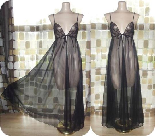
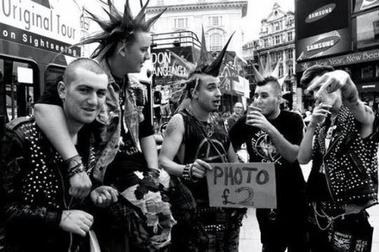
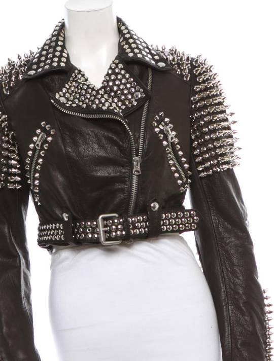
Sheer was worn in the 70s, usually with nothing on underneath it. Today we do get sheer clothing what people do wear but it isn't as popular as it was in the 70s. I think that the material could work really well as an underlaying layer. I think it would work especially with my other inspiration from the 70s which is; Punk Culture. Leather, rips, studs and safety pins was the main essential clothing and accessories in the punk era. I think that its a really outdated trend which only a minority still carry on. Personally, through my eyes majority of todays society look down on Punk Culture and I think it would be a great idea to put it into my work and make it fashionable again. The studded clothing also comes in common with the 00s trend but they have different styles of using it, I think it would be interesting to see how the different interpretations could work together.
0 notes