
Last Seen Blogs

freshflix
Fresh Flix FLIKEO


djstranger-ru
DJ Stranger
the-chosen-half-of-one
No Thoughts, Only *TV Static Noises*

barbudeville
Barbu de Ville
Text
Design for Inclusivity - Digital Technologies to Empower Everyday Living Event Reflection
The second design event I attended was “Designing for Inclusivity – Digital Technologies to Empower Everyday Living”.
The first segment was “Inclusive Design for Education and Work Readiness” shared by Mr Francis Tan, Chief Executive Officer of Trampolene. The second segment was “Inclusive Design using Conversational AI” shared by Mr Ianton Tan, Chief Executive Officer of MoWin Digital.
Trampolene
Mr Francis Tan began by sharing how websites and application are usually built for neurotypicals. However, there are many products that are not catered to the needs of the physically disabled, youths with special needs and elderly. Therefore, he emphasises the need to understand your clients and users well. He goes on to list some examples such as:
- How many wheelchair accessible swimming pools are there in Singapore?
- How does a child with muscular dystrophy use a toothbrush?
- How does a person with visual impairment travel to work everyday?
This reminded me of the usefulness of rigorous interviews and testing to ensure a product is useful. As designers, we might not be aware of certain issues even if we put a lot of effort into the design considerations. Therefore, user feedback is very important. In designing an application to aid wheelchair users, do we then have to consider if the user is speaking from the view of a manual wheelchair user or a battery-operated wheelchair user or others? Is there then a significant difference and should additional options be given for the users to toggle? This is where rigorous interviews, testing and follow-ups is necessary as it allows us to ask why and understand the reasoning behind their actions – in turn building a more effective product.
In the sharing by Mr Francis Tan, he gave a case study on the application called iGAIN. iGAIN is a software which uses gamification to help children and young adults with learning difficulties and special needs to learn different skills such as language and numeracy. He mentioned that many special education schools are typically half-day. This means the application can continue to engage them when they return home. In developing this application, he mentioned that it is important to understand the target audience and figure “who are you trying to serve” and also what are their challenges. In the development, Trampolene invited caregivers, allied professionals and teachers to design the content.
Linking back to a past experience interning at a Special Education school, I find this application extremely useful. During the internship, I had to hand cut and laminate certain cue cards and attach Velcro to the cards. For students who needed more assistance, most of their activities included matching different pieces with the Velcro stuck on them. This also meant that as educators, we were unable to switch up the difficulty level or content of the learning resources easily. With this application, the content can be modified easily and customised according to a student’s learning style and ability. This will also save a lot of time and resources. Furthermore, it is important to engage with the educators because they know the triggers of their students well. This could be helpful in designing with certain modes such as volume or vibrancy restrictions as certain students are very sensitive to sound and colours.
I think something we (or I) might tend to overlook is other potential users (of e.g. an application) aside from the main target users. For instance, linking it back to the individual project – I think it is important to not only consider the target users of the application but also the brands that will be interested in the application. As my individual project work towards building a tool for users to shop and dress easier, one main stakeholder will also be the apparel brands that will want to feature their products on the application. Therefore, it is valuable to seek feedback from participating brands to offer target users an even seamless shopping experience. For instance, as I incorporated a “Scan to Add” feature on the application, it can only be useful if the majority of online and physical retailers incorporate a QR Code on their product tags. As a hybrid application, it is not only a shopping tool but also an application with social networking features. For brands which wish to create a public account, how can they host a live try-on easier on the application? Are there some features that these retailers might need to facilitate live purchases?
In another case study shared by Mr Tan, smartBFA is an application that provides real-time barrier-free access navigation for wheelchair users. Mr Tan mentioned that wheelchair users have to consider more things while planning for a trip outdoors. For instance, they have to leave with their battery full because if a route is obstructed, they might have to take a much longer, wheelchair accessible route to their destination. Since wheelchair accessible toilets are not ready available, wheelchair users also tend to drink less water and minimise consumption of food before they begin their journey. These are many things that we might fail to consider as a designer. In general application design, it might be more useful to consider the concerns of the designer, client and the user. However, in inclusive design, it seem that a heavier focus should be on the actual user themselves.
MoWin Digital
In the sharing by Mr Ianton, he spoke on ALEF which is one of their martech products which involves the use of conversational AI. More importantly, ALEF also involve one additional element – vernacular. This refers to the consideration of the dialect spoken by people in the country or region. Using conversational AI, Ianton also shared some examples of application such as unmanned customer service kiosk for hotels and contactless intelligent elevator control. That said, I feel that designers have to be careful with it. Aside from undergoing rigorous testing to make the product better, I believe it is also a necessity to provide alternative options for the user. For instance, a customer might want to get a drink from the concierge which could count as a simple task and could have been done faster when spoken to the staff. However, unmanned customer service might bring some complications and miscommunication if the kiosk is unable to identify the request of the user. Building on to the previous blog post on the importance of customer touchpoints, a miscommunication with such solutions might end up destroying a smooth user experience. Therefore, a set of criteria has to be fulfilled by the design. For instance, ease of use and whether the design is intuitive enough for a first-time user to navigate through. After all, many hotel guests are usually not regulars. Personally, I am easily excited when I get to use new technologies and if I can complete a task I set out to do rather easily in a contactless manner. However, I can imagine someone in a rush to be very frustrated if they are unable to convey their message to an unmanned customer service kiosk and if there is no one around to help. Also, I think it is useful to be mindful of whether the target audience are largely tech savvy or not.
Mr Francis Tan also raised the possibility of using conversational AI to help individuals with speech deficit. Real life scenarios can be simulated for the individual to practice their speaking skills in a public setting. This was a rather innovative idea. Together with the above hotel example, I find context one of the most crucial considerations. The speech deficit example made me realise that the opportunity to improve on a skill you are lacking privately might be more useful and less intimidating. Likewise, in the hotel kiosk example, it might be more useful if users can complete their task or request for a service privately. If there really is a miscommunication, the user need not be frustrated due to more people queuing behind him. In designing a product, it is therefore important to not only test but also follow through how a user will use the product potentially, and consider as many types of scenarios and setting as possible – peak hours, non-peak hours, seasonal, weekday or the weekends etc.
Towards the end, Mr Francis Tan also shared that Trampolene conducts a lot of ethnographic research as they have to observe their users in real life scenarios. As mentioned above, one key takeaway was the differing points of emphasis for different types of design. For inclusive design, I feel that it is almost always necessary to conduct ethnographic research as you are building a product that caters to a specific group of users. This is why more than just an interview, it might be much more useful to follow and observe a user closely using actual, real-life scenarios.
0 notes
Text
Design Thinking for Business Transformation (F&B) Event Reflection
The first design event I signed up for was the “Design Thinking For Business Transformation (F&B)” event organised by DesignSingapore Council. I was interested in this event because I wanted to learn the practical application of design thinking in businesses. Furthermore, the event was introduced to share on how F&B owners used design thinking to stay competitive. The guest speakers were Mr Adrien Desbaillets, the Co-Founder/Managing Director of SaladStop! as well as Mr Steen Puggaard, the Inventor and Former CEO of 4Fingers Crispy Chicken. Mr Desbaillets spoke on the use of experience design in a post-covid world while Mr Puggard spoke on the designing of a brand experience.
SaladStop! (The Use of Experience Design in a Post-COVID World)
In the sharing by Mr Desbaillets, he mentioned that a big part of design for SaladStop (SS) was in understanding what resonates with the customers. Personalisation is key in the products offered in SS. As SS expanded, they made sure to keep the original design of the store while making some tweaks based on the country and the local designers they had hired.
The following is a summary of changes to their store design:
Design 1.0 – Bought some graphics online and did the design on a budget
Design 2.0 – Worked with Ong & Ong for version 2 and this was also when customers begun to ask a lot more questions, such as where the products were coming from which called for a need to convey their products better to customers
Design 2.5 – Worked with local designers to tweak the positioning and design, yet not deviating from the elements in 2.0
Design 3.0 - Creating a lifestyle brand
SS also began experimenting with some new initiatives. Some examples he mentioned included the SS market where they collaborated with influencers and chefs. As they understood that customers are pressed for time and are seeking healthier options, they have provided customers with precooked items and compatible ingredients to help people have an easier time preparing healthier meals.
Aside, SS also launched “Saladstop! Connect” and “Good food hood”. Saladstop! Connect was a result of them thinking outside the box and attempting to connect people virtually. The idea for Saladstop! Connect came from office workers who said they could not meet for lunch and connect. So, SS provided an option for them to fill up the email addresses of each of their colleagues and check out individual meals and have the items delivered before their meeting time or zoom call. They offered a service to help customers connect remotely.


(Screenshots from Saladstop! Connect webpage: https://connect.saladstop.com.sg/)
Additionally, they also launched the good food hood initiative which followed a cloud kitchen concept. In locating all their outlets in the east, it not only made deliveries more efficient but also allow users the flexibility to order a variety of items from the different stores under SS (wooshi, smoosha, heybo, salad stop).
4Fingers Crispy Chicken (Designing a brand experience)
In the sharing, Mr Puggard brought up the failure of “Lazy Gourmet”, one of his experiences as an entrepreneur. He mentioned that he had placed strong emphasis on the packaging and website – on the visual aspects of the product but failed to manage the business model such that it was not profitable. When he took over 4Fingers, he looked from the point of not only a consumer but also an investor and ensured that both customers and investors are satisfied. He also emphasised on the importance of growing the brand experience as this meant adding value for customers. He also shared on how to manage customer touch points such that a positive brand experience is intentionally created.
Key Takeaways:
Empathy
The sharing by both professionals showed how design thinking can differentiate a brand. In the journey to be more competitive, the brands definitely engaged their customers with empathy. One clear example was when SS demonstrated contextual awareness from understanding customer preferences. The design of SS did not deviate far from the central theme but also had a certain degree of customisation to appeal locally. The store design and menu were customised according to the country’s preferences. In the sharing, he also gave the example of how Hong Kong’s SS store created a customer facing salad bar and a back of house salad bar to cater to the bulk of online orders in Hong Kong. For their HEYBO outlets, they also moved transactions to kiosks as users can make purchases faster using cashless payment systems. I found out that many of the bowls offered by SS included local flavours such as Crazy Lemak and Kampong Table.
From Mr Puggard’s sharing, it is also important to consider the needs of the business. He said “the creative design process must go hand in hand with financial discipline” to ensure that it is both profitable and scalable. In addition to customer’s needs and wants, it is important to understand the priorities of the client as well. The solution should be generated in consideration of the priorities of main stakeholders. This ensures that the product is viable and meet the minimum needs of key stakeholders.
Mobility
Aside, SS connect also made the customer experience mobile. Even though the circuit breaker situation has affected business, they tapped on opportunities to overcome these challenges. As most customers started working from home, they found a need to deliver the products to people working from home and actively reach out to customers wherever they are. By understanding the problems customers faced (not being able to meet for lunch), they proposed a solution to help customers overcome that. Another problem that SS solved was the separate locations of their different product offerings. By launching the good food hood initiative, customers can purchase meal bundles which includes different types of product from different stores under SS (such as grain bowls and wraps from WOOSHI and SaladStop! etc). This provided convenience for their regular customers. It also invites existing ones to try out other products from their brand.
Throughout, Mr Desbaillets mentioned that SS reinforced design thinking to create unique experiences for customers both in-store and home deliveries. They managed to tap on the opportunities for restaurants to deliver sets or kits for customers to replicate the restaurant’s experience at home. This extends the brand experience from the physical store to homes, making the entire experience a mobile one. The sharing was valuable in showing the importance of listening to customers and building better features or solutions for them to have a positive experience. For instance, by providing customers with the option to purchase different products from different stores under SS, it allowed for a seamless experience for customers.
Finally, the customer touchpoints also reminded me a lot of the touchpoints a user has to go through while using an application. In the view of a first-time user, a smooth experience is important for customer retention. In the view of a current user, a negative experience might decrease their perceived brand value. This means a user might switch easily once a better alternative comes along. Even if there’s only a single touchpoint which brought a negative experience, a user is bound to recall that experience as one of the main disadvantages of a product or an application. When compared to a competitor application, it might lose its initial appeal. This also showed the importance of iterating both prototypes, and current products. As user preferences are constantly evolving, there is definitely a need to improve a product to sustain its competitiveness.
In all, I feel that the sharing by both professionals have definitely shown the importance of creating a unique customer journey such that it is not easily replicated. As a business strives to create unique experiences, it will definitely add to the brand value and strengthen brand differentiation. In fact, the takeaways of empathy and mobility are much beyond just mobile application but also very much essential in sustaining a business.
0 notes
Text
Week 6 Reflections
Reflections on Project: Shopee App Revamp
As the group project comes to an end, there are many takeaways that I have. In the last two deliverables (final presentation and pitch document), something I found particularly challenging was communicating the wireframes and rationale with clarity. Aside, I will also share some insights I have gained through this assignment.
Presentation Matters
Initially, I faced difficulty in presenting our wireframes and rationale in a succinct manner. Coupled with the limit on the number of slides and time, I was hesitant if the audience could understand what I was trying to bring across. I wanted to present our wireframes as effectively as possible as it was after all, a product of our group’s effort. On hindsight, an effective presentation of wireframes/prototypes definitely serves much more than just communicating with the audience. I think it is important for a designer to articulate the design effectively not only to convey the rationale behind making these choices but also to obtain useful feedback. It is only when your users/clients understand your wireframes and how they work can they truly provide you with the relevant feedback. Also, I feel that prototyping/wireframing is akin to a translation tool of some sorts – to ensure that stakeholders have a consistent understanding or visualisation of the final product the team is working towards. This also helps designers obtain feedback to improve on the wireframes or prototypes directly. In my group’s case, I considered how we could best convey our designs and decided to just mention more crucial parts of the design. For the pitch document, I decided to list down a short elaboration of the different screens and also numbered the screens for ease of understanding. For the presentation, I decided to go with a side-by-side comparison of the previous and new screens and tried to make use of more arrows just to point out significant design changes we proposed. Fortunately, we also managed to receive some feedback through the presentation and make final edits in the pitch document. Even though this project did not require us to conduct usability tests, this feedback would have been very timely as we have yet to conduct user testing. This brings me to my next point - on how initial presentations can be a really good way to gather feedback and eliminate the need for significant correction of errors later on – such as replacing an icon on subsequent screens just because it was not well thought out in the beginning… the horror… The reduction of reworks would definitely mean time and cost savings as well. On this note, I also find the tone of presentation really important. Personally, I think my group had relatively healthy dynamics such that each of us was very open to feedback and we were also very respectful of individual’s opinions. Each of us had designed different screens on Miro but we still consistently seek feedback internally, discussed and improved the screens together. This also made me realise that the tone of your presentation should be respectful and not come across as defensive. Applying this to user tests, I think the tone is extremely important. I believe it is only when users are feeling comfortable and valued then are they willing to share genuine feedback with you.
Importance of User Touchpoints
Another big takeaway from the group project is really understanding the importance of user touchpoints. While doing some research, I happened to come across an article by the Nielsen Norman Group that discussed how usability is defined by five components which included learnability, efficiency, memorability, errors as well as satisfaction. Linking it to the group project and survey results, I find a deeper appreciation for the five components. When we asked respondents what came to their mind first when thinking about Shopee, there were some who answered “a lot of things going on”, “messy”, “confusing and complicated” even though they were Shopee users. When asked why they would choose competitors over Shopee, some gave responses such as “I seem to find things I want on Lazada better and it is cleaner and easier to browse. The interface is also more intuitive.” and “Aliexpress is more user friendly. It’s easier to search for the items I want. Shopee’s main page is so confusing and congested”. From the point of view of a student, these findings were very meaningful. However, from the point of Shopee, I think I might find these views very worrying. For current users, the cluttered homepage seem to generate many negative feedback. Clearly, user satisfaction is not that great. The results reveal that many of them are just staying on because they claim its “cheaper” or has “cheap and fast delivery”. This means a significant number of current users continue to use Shopee only because of the low price point their sellers offer. This issue of cluttered homepage might also deter conversion of first time users to regular users. Linking to learnability, new users might not find it easy to accomplish basic tasks the first time they encounter the design.
Linking to memorability – will users then want to return to the design? I find this rather problematic because this means users will switch apps easily once they find a better alternative (platform with better UIUX and offering competitive prices). Evidently, there are many e-commerce apps out in the market which means competition is increasingly stiff. As apps vie for larger market share, I feel that focusing on elements which enhances mobility, in-app navigation and contextual awareness should be something all organizations work towards. Cheap pricing is something that can be easily replicated but I feel that building a good experience for the customer and outperforming user touchpoints can differentiate and make the e-commerce business more sustainable.
Conclusion
Overall, I feel that this group project has exposed me to the different stages of design thinking and to think critically about what user-centred design entails. Building onto last week’s reflection, I feel that priorities still play a key role – in understanding user priorities. However, the survey results have also shown that user feedback can be very varied for certain questions. Therefore, it was challenging to also come up with a one size fits all kind of solution – which I don’t think is ever possible...? In our case, I believe our design managed to solve some user needs. In reality, I think it requires much more. Other than considering user needs, I think it will be beneficial to consider user’s potential needs – needs that they did not know they needed. In such a competitive e-commerce climate, I think it is necessary to take in feedback and improve rigorously in order to stay relevant.
OKAY it’s been a long reflection. Thank you for reading. :)
0 notes
Text
Week 5 Reflections
As the submission of the pitch document was drawing near, we had to begin working on the navigation flow as well as wireframes. However, there were some challenging parts:
Not knowing where to stop….
One challenge was not being able to gauge the extent of low-fidelity in wireframes. As I become interested in improving my design, I felt myself working towards mid-fidelity. This was something that was hard to grasp because it was very hard to set a limit – when to stop designing?! Even so, I believe there are practical reasons to staring off with low-fidelity wireframes – for instance, I believe it can be risky if designers work towards incorporating high-fidelity designs immediately. This might make them feel overly defensive of their designs which beats the purpose of user-centred design. If I had put in an unhealthy amount of effort and get to designing high-fidelity screens immediately, I might not be as receptive to user feedback during user testing. Furthermore, a satisfactory or workable design is a result of iterative testing. Therefore, it was quite a struggle for me initially – to decide where to stop designing or improving further.
Instead, I decided to focus more on getting the basics right. Since the Shopee app at core is an online marketplace to facilitate exchanges between sellers and buyers, I decided to focus on the one thing every user is here for – purchasing a product. Therefore, I focused on working through one complete flow of purchasing a product from homepage to check out. I also decided to focus more on basic features the user will come in contact with instead of worrying too much about the aesthetic details. For instance, I focused more on the workability of my screens and whether or not the page flows were smooth or did they involve any unnecessary steps.
However, I feel that wireframes might be very abstract (prior to using these tools I didn’t know about placeholder images etc) which might not be able to resonate as well with clients during initial stage. Therefore, I also tried to add in labels like product name, product information instead of just an entirely empty text box. I also reused elements so my wireframes looked more consistent. I feel that wireframing was quite challenging in that the level of detail was something that cannot be quantified easily. Even so I think the priority should be ensuring the wireframes can communicate with clients (in this case, my groupmates) clearly and we all knew the flows of our wireframes.

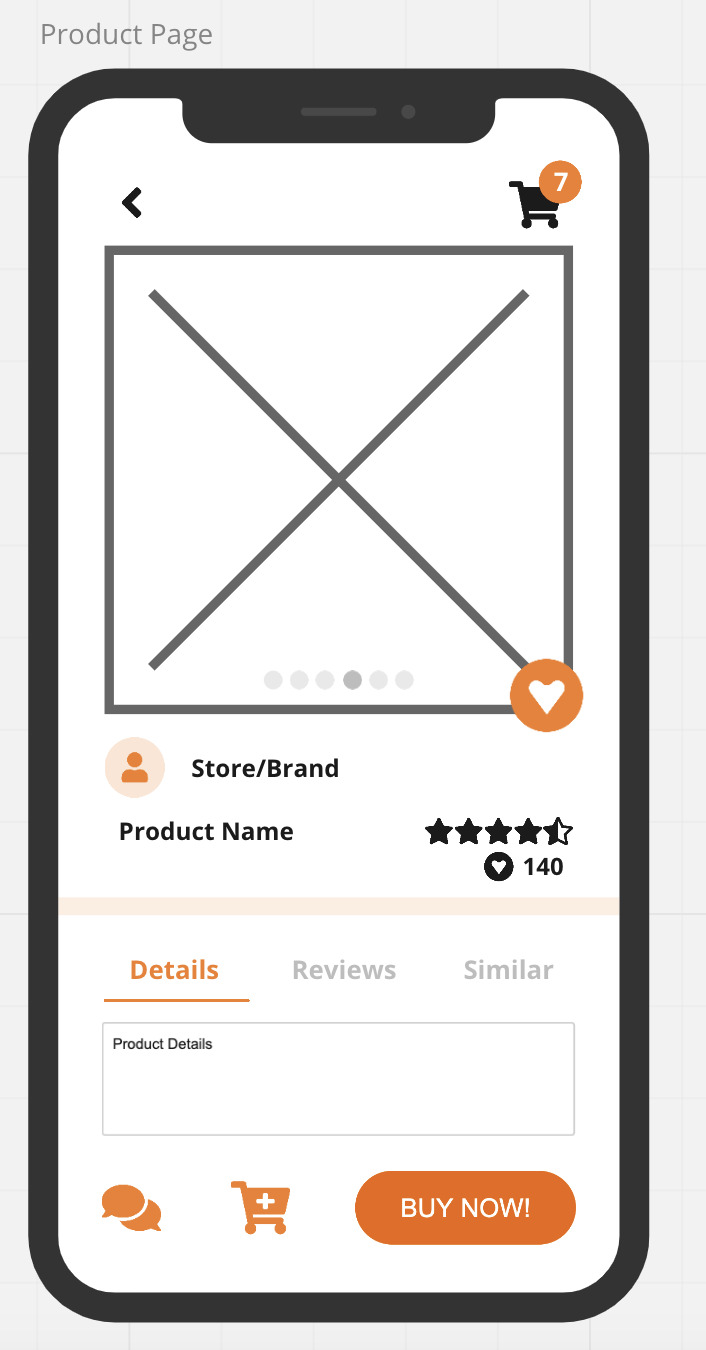
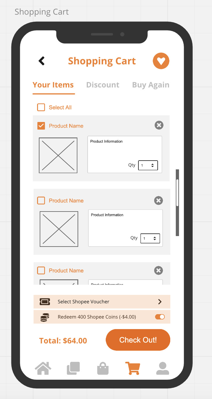
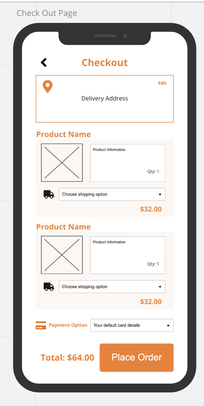
(screenshots from MIRO)
Not knowing what to include and if it was workable....
Another challenge was not knowing if the proposed solutions were workable as some of them were not mentioned explicitly by users we surveyed. For instance, the scan item feature on Shopee might not be mentioned because it was not prominent enough – that doesn’t mean users would not find it useful. All these thoughts brought about uncertainty. Thankfully, I could tap on my own experience as a user and discuss with my group if we were satisfied with the revamped version. Personally, I found it useful to have the survey results as a guide in designing the proposed wireframes and gauging if changes might be useful for users.
In particular, our group established that the search function was something that we wanted to improve on as a large bulk of users found it the most important feature of Shopee. However, in designing the flow to purchase a product, it was good to refer to other features users had found useful. For instance, it was also found that reviews and flash deals were useful. This is why I decided to bump up the “review” section so that a user can swipe to view the reviews immediately instead of scrolling through unnecessary sections which slows down the purchasing process.
Also, while our group was designing how the customisable homepage will look like on Miro, I suddenly thought of how “flash deals” was the third most important feature of Shopee to the users. While a homepage could be entirely customisable – I wondered if it was practical. Even though users wanted a customisable homepage, it might be useful to retain the “flash deals” section. This also led me to think more practically from Shopee’s point of view. Since posting ads and promoting Shopee events on the homepage can potentially boost Shopee’s revenue, we should still retain the ad banner as well. For a workable design, I feel that it has to strike a healthy balance in satisfying the main stakeholders – Shopee itself, the sellers and the users. This is why we decided to settle on having a semi-customisable homepage.
Overall, it has been pretty challenging trying to constantly think of all the problems our proposed solutions can go wrong, and then correcting them together. To sum up, I feel that it is always good to consider different points of views and strive for a good balance between parties (unfortunately we weren’t able to conduct user tests). Of course, this is easier said than done but I found it particularly helpful to ask myself what the priorities are (e.g what are the priorities of the app, what are the priorities of a user…) which will lead me to focus on the right things.
0 notes
Text
Week 4 Reflections
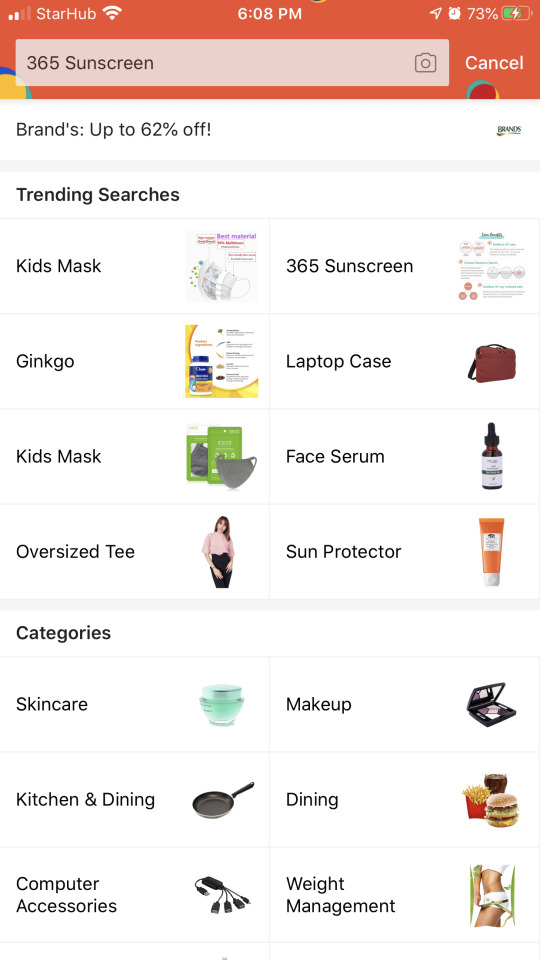
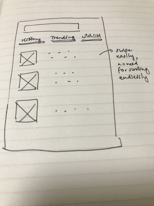
In the previous week, many pain points stemmed from my personal experience as a user. This week, I managed to gather more pain points from other users and it was interesting to uncover different aspects I have never thought of. When I asked my peers on what were some issues they faced, all of them mentioned things like cluttered homepage, cluttered design, the unnecessary icons placed everywhere, how clicking on Shopee Live brings them to a cluttered feed as well. Evidently, the lack of customisation of individual feed and homepage is a huge flaw. However, the statements and feedback provided were getting rather repetitive and vague, making it quite challenging to identify more impactful/meaningful pain points. Here, I realised the need to really dig deeper and be more persistent in asking questions - which involved a lot more of "why did you do this and not that", "what features do you think can improve your experience..." etc. Suggestions learnt from users and app reviews are valuable and will aid us in building better solutions. Personally, I find the "what if..." and "how might we.." method quite useful in brainstorming for potential solutions to tackle these problems too. For instance, some users raised the point of wanting to search for relevant products quickly. Some of them told me that the unnecessary icons and stickers are quite distracting for them and even delayed them from reaching product pages they were looking for. From there, I wondered if there was a shortcut to get to the product page they were satisfied with fast. I realised a great deal of users actually use the search button directly, that made me wonder if we can add more features to enhance the search button (e.g after clicking on the search button, they can immediately see a drop down of products they last browsed and swipe to see products they liked/ list of trending products/ products they might like etc instead of scrolling endlessly which can result in fatigue).
What Shopee’s search button show:
Possible dropdown + swipe:
Aside, I also tried to look at other apps which offer the "live" experience. I went on Instagram live and realised that the additional icons fade out after a short while and thus it's not as distracting as Shopee live. Also, they had thumbnails (below) which allow a viewer to scroll to the parts they want to see.

In designing our solution, I think it is also necessary to consider where the location of the button is - e.g is it closer to the thumb or should we use infinite scrolling or swiping? While it can be challenging to decide on our solutions, I think it is very meaningful to build on users' desires and understand why certain things/features appeal to them and not.
0 notes
Text
Week 3 Reflections
As a group, we decided to evaluate Shopee because all of us were somewhat familiar with it. Even though it was established that mobility here was not limited to mobile phones, it still took me a while to understand this and adapt to this since it was different from my expectations. My thoughts in the beginning and my contributions to the group discussion were limited to the obvious flaws of the application which were all surface level such as cluttered homepage, redundant icons as well as unorganised page flows. Therefore, I decided to spend some time recording features that I wanted but were lacking from the app.
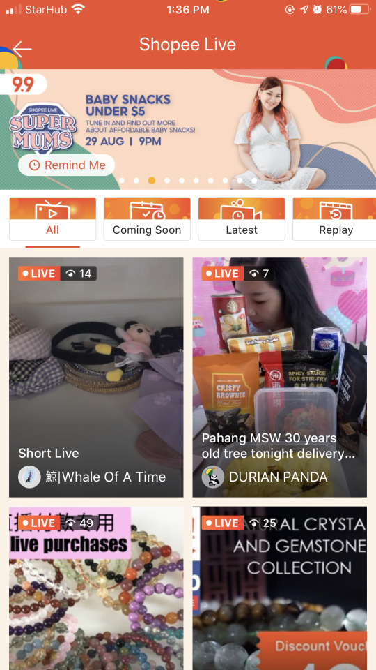
As a consumer, I find the restriction of makeup testers and implementation of additional measures in fitting rooms discouraging me from purchasing in-stores. Prior to this project, I have never been interested in Shopee Live but I realised it could be something that I can look further into since it seem like it could make online purchasing easier.
From the homepage, I find many redundant icons which makes Shopee Live icon seem less prominent. After clicking into it, I realised the first few videos were not to my liking (see below). This was very discouraging as I would want to see only events relevant to me. Usually, I would leave the page.
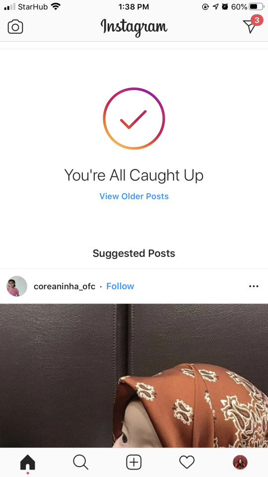
One better alternative that came to my mind was how Instagram suggests posts that I might like directly on my feed (see below). I linked this to the interactive element, to accept user preferences and provide suggestions. Aside from giving recommendations, it might be better if Shopee Live events can be categorised into fitness/workouts, beauty, hobbies, gaming, crafts etc so a user can click into the category he/she is interested in.
Upon exploring, I realise there was another sub-page which featured Shopee Live events which had ended but were available for replay (see below). I believe many users who watch Shopee Live are not part of the live audience like me. To my surprise, I was unable to fast forward the recorded Shopee Live.

Also, there is an absence of time stamps (see below) which could direct me to the exact point the host begins to introduce a certain product. I found this function extremely useful on YouTube as I could skip to listen to the parts I wish to. When I attended one of the live events, I realise the chat function was extremely distracting.

When I compared it with Lazada live (LazLive), I was pleasantly surprised by LazLive’s “quiet mode”. A user can enter into “quiet mode” by swiping right. In the quiet mode, the chat section and additional icons disappear, leaving the entire screen solely for the video. I thought these functions (time stamp/ quiet mode) could be linked to being contextually aware as the user is provided with options to engage with the Shopee Live event according to how he/she wants.
(original mode)

(quiet mode)

During the group meeting, we exchanged our experiences and I shared my personal experience using Shopee Live with my group. Then, we tried to link our experiences with the properties of mobility such as interactive and contextually aware. The properties of mobility were very helpful in guiding me to analyse the app deeper. Moving on, our group will seek more pain points from different users to validate the identified flaws or contribute to additional ones we have missed out.
0 notes