
Last Seen Blogs

trolleiros-blog
Trolleiros

teambetterends
incomprehensible on main

queen-gavin
The queen to Michael's King

vikingblogtitle
Be Ruthless

ahmedalajbr
Untitled
Text

Final Course Reflection
Wow! My first typography class has come to a close and I am now one class away from having my graphic design minor completed. I am proud of my growth in this class. This blog alone is a testament to my growth. There were many times in this course when I felt brief feelings of defeat and frustration that I could not excel to the standards of the course. After numerous hours of preparation and perfection in executing my ideas and designs, I am content. My growth in my personal aesthetic and understanding of typography I have grown in knowledge and confidence. This final project pushed me to combine all of my skills learned throughout the semester and transferred them into one project. I am confident in my abilities and have learned to take criticism positively and learn. This class was one of growth. Combining all of my skills where I was once iffy and frustrated into a successful project aligned everything in my head as uniform and I am excited for the future in my graphic design endeavors.
0 notes
Text
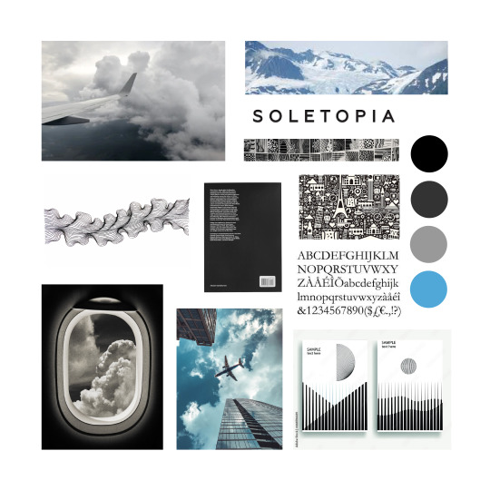
R+D and Mood Board
For this project I have been assigned to rebrand and improve a retired airline, popularly known as, US Airways. US Airways was established in Pittsburgh, Pennsylvania for mail delivery purposes in 1937 as the name “All American Aviation.” In 1997, the airline name was changed to “US Airways.” The airline had a very patriotic and inviting tone. For example, they used slogans like “Fly the USA on USAir,” “Together We Fly,” and “Fly the Flag With USAir.” After many logo changes, attempts to rebrand, and overcome bankruptcy the airline flew its last flight at “US Airways” in 2015 just before they merged with American Airlines and created the largest airline in the world to date with over 950 planes.
As mentioned prior, US Airways used a very patriotic tone in their branding. I plan to incorporate this sense of mission statement and values in my rebrand as well. Instead of appealing to the everyday American through patriotism directly, I plan to use the tone of inclusiveness to every American and for everyone they journey with. I intend on having a very appealing, sleek, and uniform aesthetic. Slightly modern and easy to use, making it eye catching to the business travelers, the seasonal family vacationers, the savvy international journeyers, and simply every American who would like to travel to their destination pleasantly with ease and safety. All Americans are united with the same desire to arrive at their destination with ease, comfort, and safety. I do not intend on changing any basis of beliefs or the name of the airline, but simply giving them a revamp!
0 notes
Text
Blog Eight
As week nine in typography class comes to an end I am reflecting on my improvement and confidence in my work. Below is one third of my final project for our last project. As compared to the previous posts I feel as though it came a long way and I can say that I am proud of the work I produced. Moving onto our next project I couldn’t help but parallel our class lectures perfectly to my marketing class lectures. The topics of personas, target audience, brand tone, etc. all align seamlessly. What is different is the depth of the type psychology, pattern meanings, and color. I have never thought of this depth of creation being just as meaningful as the strategic brief. Moving forward on this project with my expanded knowledge excites me greatly. This week’s reading regarding the appendix is quite interesting to me. “The space bar is not a design tool” is a quote found in these readings and had me reflecting on my use of spacing to create white space. “It is seen as an ugly gap” has brought many points of reflection to mind in ensuring I create type with intent and seamless interpretation. I have developed numerous skills and have many educational sources regarding typography and I feel as though after completing eight blogs I have grown and am well faceted to approach my future creative endeavors.

0 notes
Text
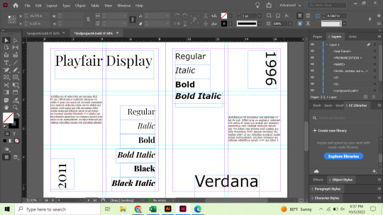
Blog Seven
As week seven in typography class comes to an end I am reflecting on the development of my skills with and comfort in using Adobe InDesign. This week's readings discuss hierarchy, hierarchy in web, and web accessibility. This reading was perfectly timed and aligns seamlessly with what edits and modifications I am looking to make to my final product of project four. Reading about hierarchy while reading a very well thought out page of text using hierarchy makes me truly see the importance of it. While reading textbooks or even reading powerpoints in class anything that is educational does follow some form of hierarchy. The bolded titles or bolded words within a body of text naturally draws a reader’s eye to what is most important. This is a key factor I am working to incorporate into my 3 spreads. Above is a work in progress screenshot of my work to date. There is much room for improvement in my work to add a sense of direction in hierarchy for the reader’s eye to follow. I am excited to utilize these resources in the finalization steps of my project.
0 notes
Text
Blog Six
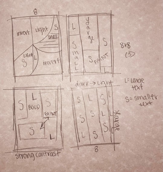
As my sixth week in typography class concludes, my confidence in my abilities has increased immensely. I have thoroughly enjoyed working in Adobe Illustrator and Adobe In Design to work on these projects. I have also enjoyed the class lectures and readings learning about the structure of typefaces, families, fonts, etc. I have recently found myself asking people if they know the difference between serif and san serif as a fun fact for my friends and family. I’ve become aware of the importance of type and noticed in logos, signs, and menus in what I appreciate and what I would have done differently. I find the reading this week most interesting due to its layouts and interesting use of hierarchy in an educational sense. I am honestly inspired by the streamline layout in the pages and how they’ve shown the breakdown of the letters’ anatomy. I have always been more drawn to serif fonts and after reading I realize that aligns well with my taste in the sense that the fonts tend to vary more in weight and size. Above is a spread that I am currently working on for this project - now, a work in progress but soon to be perfected! I intend on using all of the resources I have been provided with and the book itself for inspiration in creating a seamless, easy for the eye to follow, and aesthetically pleasing work of art.
0 notes
Text
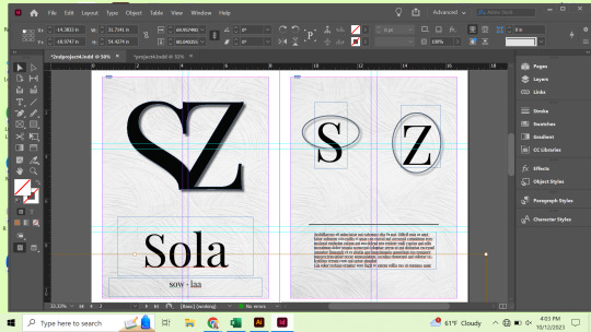
Blog Five
After completing my fifth week in typography class I am still continuing to learn a great amount of terminology and definitions in relation to type. This week's readings were about kerning, alignment, tracking, and spacing. I find the visual examples throughout pages very interesting. The tiniest characteristics of text can affect a line of type so vastly. A quote I found both enlightening and satirical, in a way, is on page 85. Next to centered lines of type reading “Rest in Peace” it reads: “Death is not a crime, and neither is centered type. Embrace the staid formality of this setting with caution however.” I am using this and many other points from the reading moving forward in this project as it advances. Now I am working to finalize my 27th letter of the alphabet and with this letter I will be expanding the project across numerous pages in In InDesign. Above is my current draft for my san serif and serif letters. Moving forward, I feel well equipped to branch out from centered type and basic gridlines. The future of this project once again excites me!
0 notes
Text
Blog Four
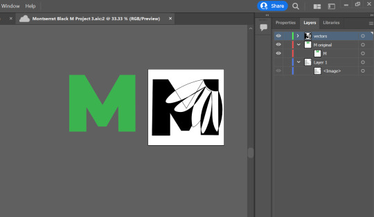
During class, our professor showed us a video about typography and the way it surrounds us. She mentioned at the end of the video that she was curious to see if our perspective on everyday sights in day to day life would change at all. For me, I have most definitely thought deeper into how things are constructed from easy to read menus or aesthetically pleasing menus. I have also paid very close attention to layouts in books and other writing publications I have come across. It amazes me that even a street sign that we are so used to seeing has such intentionality of design behind every aspect. That is the goal with my work,to appear as done effortlessly and intentionally. In the readings this week, they very much brought to light the importance of text. On page 75 there is a quote that reads “ If people weren’t good at finding things in long lists, the Wall Street Journal would have gone out of business years ago.” This brings to mind how powerful the human eye is and how the importance of chosen text must walk hand and hand with the naked human eye. In the reading there is another quote on page 73 that reads, “ How texts are used becomes more important than what they mean.” This is undoubtedly true and my goal with this current project is to use this fact to my advantage. Above is a photo of my midway through progress of project 3. I am deep in thought about how to use the interpretation of the human eye to my advantage and best incorporate the flower and letter in harmony to appear purely natural and intentional.
0 notes
Text
Blog Three
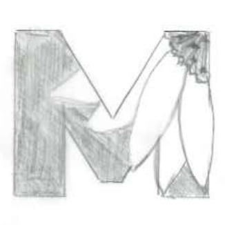
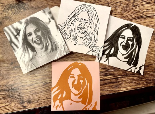
This week I have completed my third week in typography class. As mentioned weeks prior, I have been challenged to produce meaningful, well-thought out, and neatly crafted work. I have put my best foot forward to do so. Trial and error has been both my enemy and best friend throughout the process. While I reflect the numerous hours of effort and work I have put into the past two projects, I see immense improvement from my period of drafting my work. My final projects have been a product of immense effort that not all may recognize first hand do to differing skill advancement but I am content and will continue to push myself. This week our readings continued to expand upon the topic of grids. I found myself most drawn to pages 152 and 153, where there is photography incorporated into the grid styles. The caption hints towards who the author, designer, and photographer are. I find it quite beautiful that all of these components and people worked hand and hand to produce such work. This week I started a project where drawing and digital design will work hand and hand. Below is one of my 16 preliminary sketches going into the Adobe Illustrator portion of this project. I feel much more comfortable transitioning to digital design and look forward to working to exceed my own expectations and push myself beyond what I thought I was capable of prior.
0 notes
Text
Blog Two
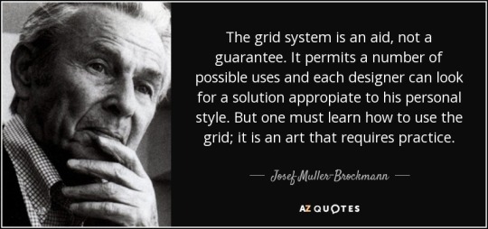
Entering this next unit of learning and new project I have already learned immensely about aspects of everyday materials I had never given a second thought to. In every textbook, menu, magazine, instruction manual, etc. there is a grid system. These are ordinary things that I view every day that now have a deeper rooted intention and design. Just as I had never seen fonts as being extraordinarily meaningful art, I had always appreciated a well thought out format, but I had never viewed a grid as so crucial to a piece of work or art. I found the quote above encapsulated my enlightened view of grids. This upcoming project excites me, I know myself along with my classmates will work, practice and plan out our grids tedious and have entirely varying final products. On page 121 of the textbook there is another quote that stood out to me amidst this period of reflection being “Typography is mostly an act of dividing a limited surface.” Grids are the basis of all design from the moment a blank canvas or idea is brought to surface at the beginning of the creative process. I am currently in the beginning stages of planning out my next project about grids but I am once again excited to prove my abilities and work toward a final product I am content with.
0 notes
Text
Blog One
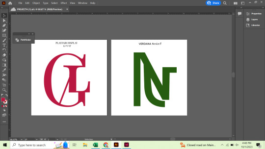
As I wrap up my first week in typography class, I reflect as my initial intimidation has become a somewhat stubborn yet positive sense of determination. This project has challenged me greatly although in just a few days I saw immense improvement. I am used to photography and digital creation and when starting from absolute scratch on a piece of paper I felt uneasy, but with much practice and overcoming frustration I surprised myself! After reading a few pages in the textbook about Letters, what stuck to me most was how the evolution of typography and fonts nearly parallel my experience thus far. Although the critic is in one's head and oneself learning new ways of doing things - adapting. Almost as if being a critic-"insider." As fonts evolved and became pleasing to all, so will this project. It was interesting to see what each time period found pleasing to the eye and appropriate for their standards at the time, much like each project and meaning behind my classmates’ work is going to differ vastly from my own. Though fonts brought trouble in the past and controversy, I do still find the beauty of art being different quite amazing. With four out of nine images for this project complete, I am eager to see what the finishline looks like with an increased appreciation for the challenge at hand.
1 note
·
View note