Link
0 notes
Text
**BLOG LINK**
https://louiesdesignlabiiblog.tumblr.com
0 notes
Text
Summary of the Paper
This has to be the hardest paper I have done so far at Massey, I have learnt what my clear weaknesses are within design and I need to spend time to improve on them. I have struggled throughout the paper to grasp the idea of just ideation and thinking differently. I am not happy with the overall result of the posters, I dont feel they are up to the standard that I should be aiming for.
Even though I dont like the poster I do think they are strong in certain ways, I really left my comfort zone and got hands-on with this paper which is a new thing for me to do. In hindsight, I definitely would've done things differently and got more creative but at the end of the day, I have delivered two posters using the same concept in two different design styles.
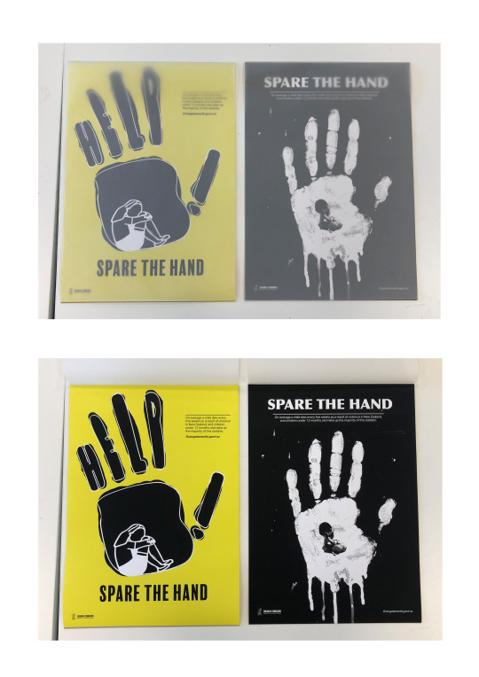
Design Styles.
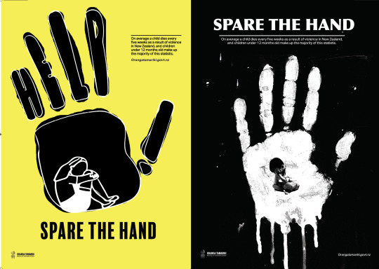
Poster One - My design style for poster one was a vector style, I drew the hand and person then ith adobe capture I turned it into a vector image. Then I painted it on photoshop and tried not to make it perfect because I wanted to give the illusion of it being done almost by a child.
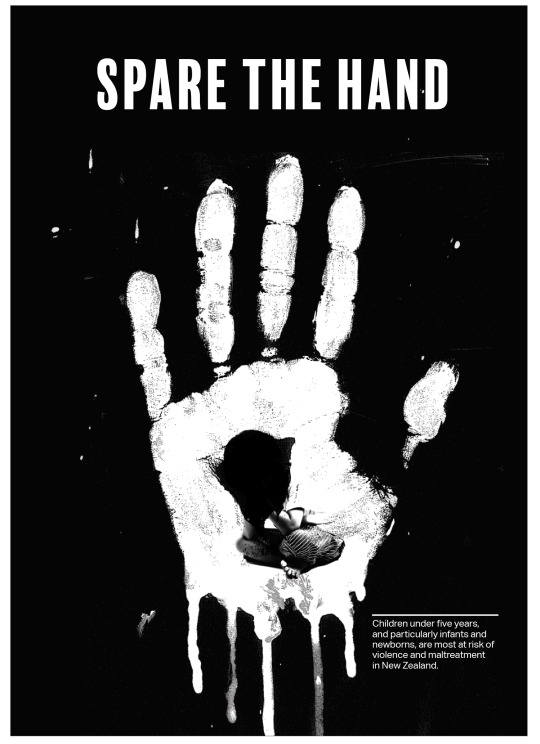
Poster Two - My design style for poster two was a more hands-on approach I tried to physically paint it rather than using the computer. I complimented the painting with a photograph which balanced the two media nicely.
0 notes
Text
Rationale Final.
Throughout the approach of Ihi Wehi I investigated how child abuse is a major inequality here in Aotearoa, the concept of the two posters are showing entrapment of children and the physical abuse they suffer. This was shown symbolically with the hand and the small child trapped inside. The fundamental design principles I used were hierarchy and scale. I used these because I wanted the hand to be dominant and powerful, using scale makes the child feel small and weak in comparison. I looked into the best media to use to convey these points the strongest. I chose vector and a hands-on approach of paint and photography, this is to allude to child's art and from their point of view. I used mixed media in my Ihi approach to creating two different posters with the same concept.
Louie Alexander
17352288
0 notes
Text
Rationale draft 2, Week 6.1
Throughout the approach of Ihi Wehi I investigated how child abuse is a major inequality here in Aotearoa, the concept of the two posters are showing the entrapment of children and the physical abuse they suffer. This was shown in a symbolic way with the hand and the small child trapped inside. The fundamental design principles I used were hierarchy and scale, I used these because I wanted the hand to be dominant and powerful, using scale makes the child feel small and weak. I looked into the best media to use to convey the point the strongest I chose vector and a hands-on approach of paint and photography, this is to allude to child's art and from their point of view.
0 notes
Text
Rationale Draft one, Week 5.2
Throughout the approach of Ihi Wehi, I Investigated how child abuse is a major inequality here in Aotearoa. My idea for bringing awareness to this problem was using a hand as the main central point, this was because a hand is associated with child abuse but also associated with being a child with finger painting and handprints. The concept of the two posters is being trapped by the hand of an adult figure. Through the process before reaching the final outcome I looked into child abuse and the severity of it in New Zealand, I looked into the best media to use to convey the point the strongest I chose vector and a hands-on approach of paint and photography, this is to allude to the child's art and from their point of view. Both posters are multi-layered and make you look twice this worked in hand with my FDP of hierarchy, having the hand much larger than the children show dominance before reading the text. As a designer I've made a poster with some emotional background to it, I’ve made each poster different from the colour and techniques but both convey the exact same concept.
0 notes
Text
Progress, Week 5.2
https://www.talcmag.gr/psixologia/timoria/
0 notes
Text
Need new ideas, Week 5.2
after a brief meeting with Matt I now need to come up with. more ideas and I just don’t have any.
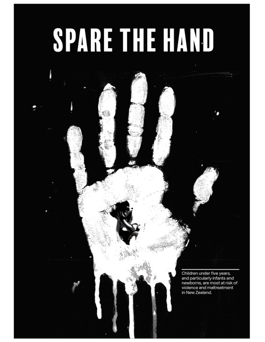
here was one idea about bringing the kid into the middle of the hand to show him being trapped. I personally just think its looks shitty
0 notes
Text
Refine Poster 2, Week 5.2

I have kept the hand through each poster as the underlining theme and the hand is so powerful, I am just refining these posters to hopefully come up with finals very soon, I am hoping my meeting with Matt will clear up anything difficulties I am having with this assessment.
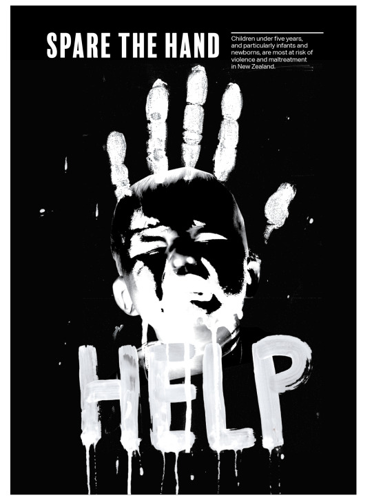
chucky
0 notes
Text
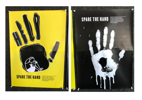
Self Critique, Week 5.1
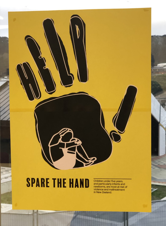
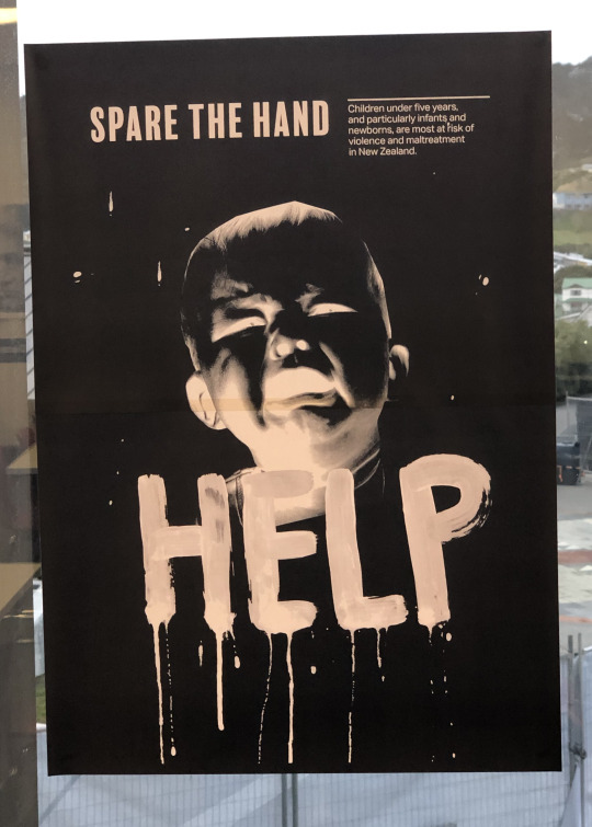
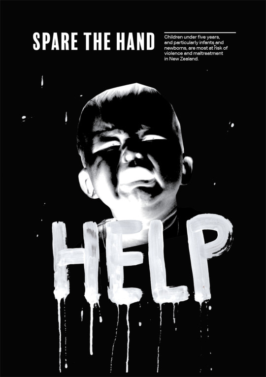
I printed both of my best poster 1 and 2 to be able to look at full size. My poster 2 is just not enough about child abuse it looks to a horror film, yes its a crying kid but I think even if I exchange the work help to something in more relation to child abuse.
I got into a conversation with a third year and I got completely fresh advice on my two posters, he gave me the idea of replacing the babies face with a hand so then it carries through from the first poster just in a different way which I feel like would work with the one concept.
0 notes
Text
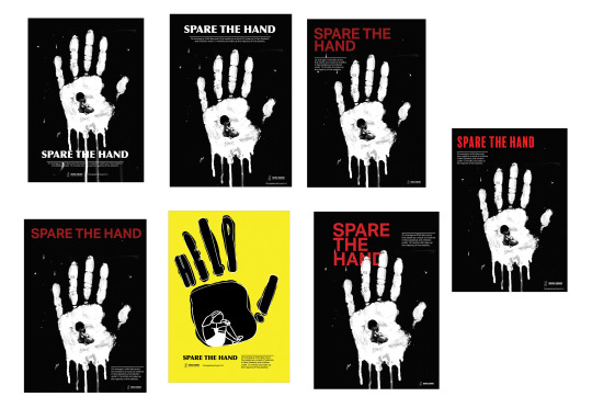
Updated Version Poster 1, Week 5.1
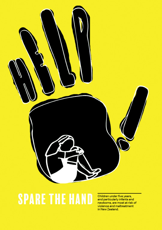
BLACK TEXT! WHITE TOO HARD TO READ
0 notes
Text
Refined poster 2, Week 5.1
Refined concept 1 for poster 2, before tomorrows class I want to have another completely new design approach for my second poster.
0 notes
Text
More Concepts Poster 2, Week 5.1
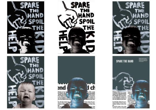
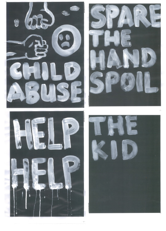
After struggling for ideas for the last few weeks I've settled on a more creative approach to my second poster and taking inspiration for the punk posters of the 70s etc. I do think there is something here that I can explore more on.
The punk era was influential for fashion and art, this will also change from my first poster with was really simple and portrayed the point I wanted it to. The second poster I want to be really abstract and a bit more thinking behind it. I've been told to get more creative and I think this will push me out of my comfort zone and allow me to do something different with my design.
The concept stays the same with both posters of being trapped with the power of the adult figure and withstanding physical abuse.

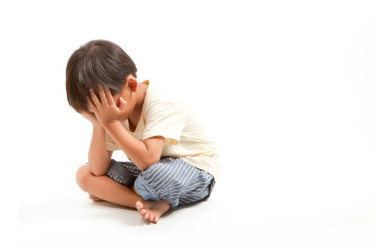
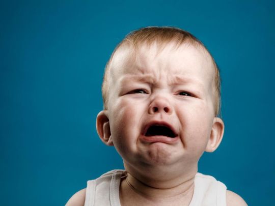
Source Image -
0 notes
