libertyfashionfmp
fashiontales
Hi I’m Libby! Here is the journey through my final year FMP as a second year fashion student specialising in illustration.
200 posts
Don't wanna be here? Send us removal request.
Last Seen Blogs
coastember
the ocean breathes salty

serifs2life
Serifs To Life

purgemarchlockdown
There Is Always More To The Amane Momose Animal Symbolism

kalewren17
The Journey of Staal 709

k3lbot
Untitled
Text
SKETCHBOOK FLIP-THROUGH
youtube
YOUTUBE. (2023) FMP ‘Fashiontales’ Sketchbook Flip-Through. [Online] Available from: https://youtu.be/FupFoh8yGuk. [Accessed 15th May 2023].
0 notes
Text
FASHIONTALES BOOK FLIP THROUGH
youtube
YOUTUBE. (2023) ‘Fashiontales’ Book Flip-Through. [Online] Available from: https://youtu.be/0FOS5krRMic. [Accessed: 14th May 2023].
0 notes
Text
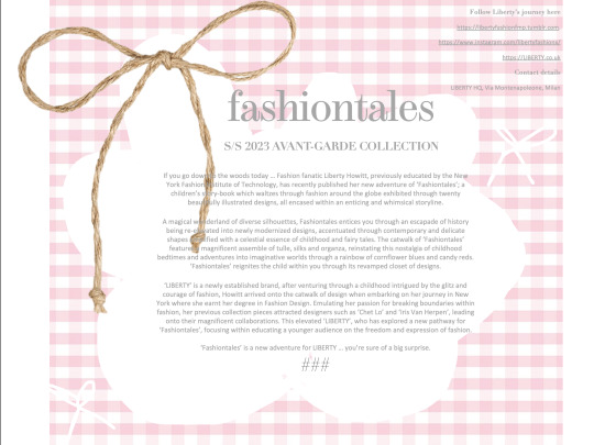
PRESS RELEASE EXPERIMENTATION
For my final press release (my last one as a Barnsley College Student :( ), I wanted to embody the same vibe as I have been integrating throughout the entirety of my FMP project. Therefore, I opted for something cutesy, childish and almost nostalgic. I really love hand drawing on powerpoint as it definitely adds to this ‘handmade’ vibe which reminds me of childhood therefore I decided to draw something I relate to as a child. I used to use this shape when drawing around something to outline it or create a brainstorm, and decided to draw it imperfectly to contribute to the overall theme. I then complimented this with a few hand drawn bows and a straw bow I selected from the internet. I wanted to keep my press release simplistic in terms of decoration, allowing you to focus on the text which entails the theme of my collection.
0 notes
Text
PREPARATION FOR EXHIBITION
A basic plan of everything I want to include within my exhibition + how to present them. I plan to present my final book on a book stand which can be flipped through, alongside the original copy spread out along the table. I want the design boards to be taped or pinned up to the board, I am also thinking about printing some additional prints off - perhaps the intro page in my storybook on a larger scale? I then want to demonstrate my journey as to how I achieved my final outcome and therefore plan to leave my sketchbook out open on a key page.

COULD PRINT A3?
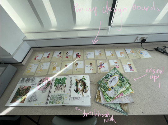
LAYOUT PLAN
0 notes


Text
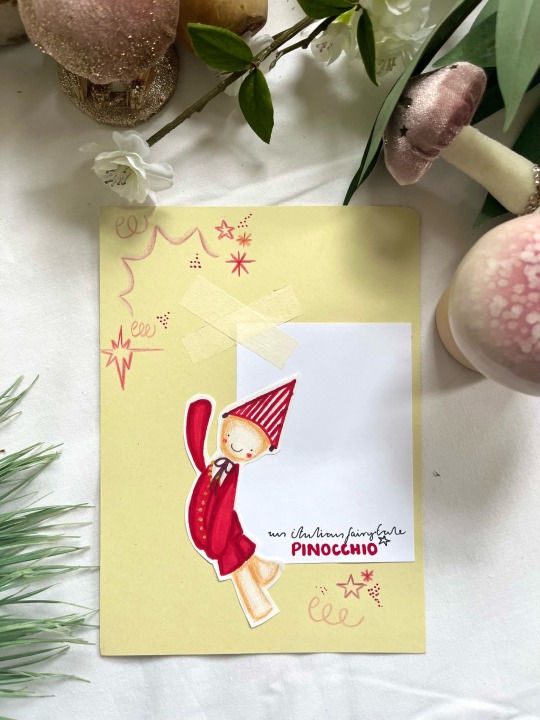
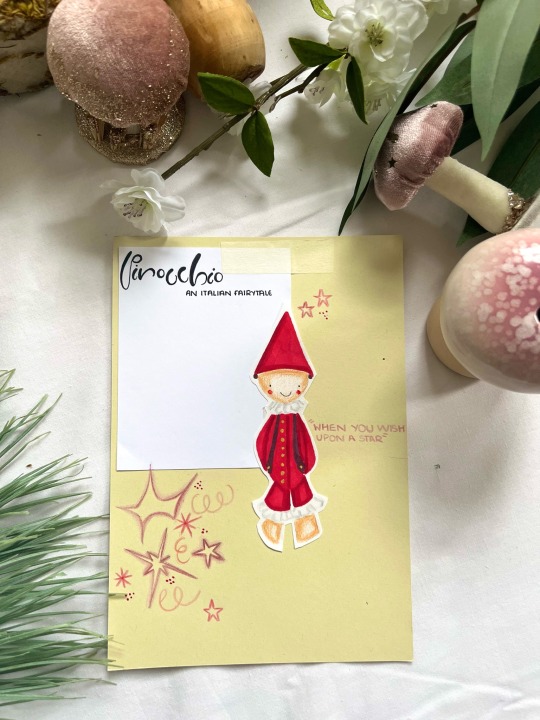
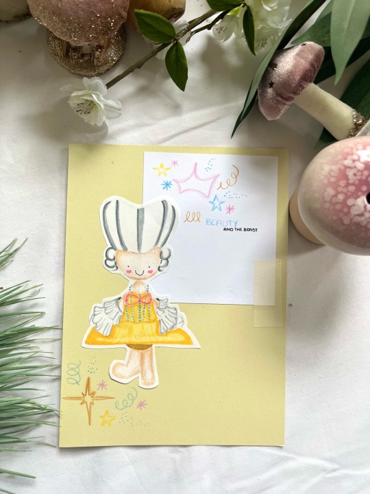
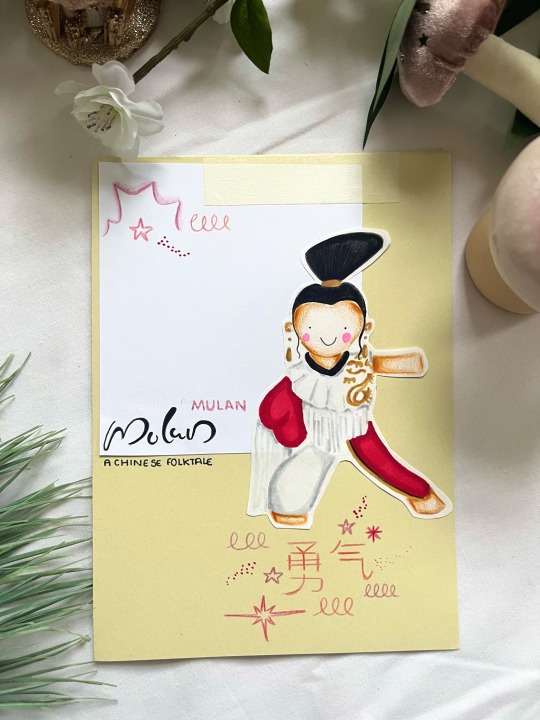
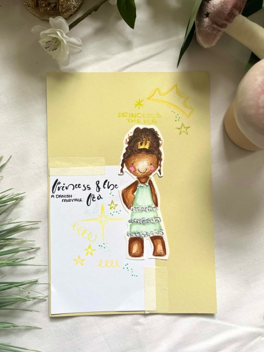
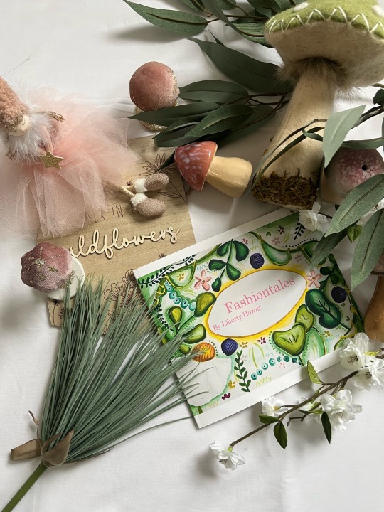
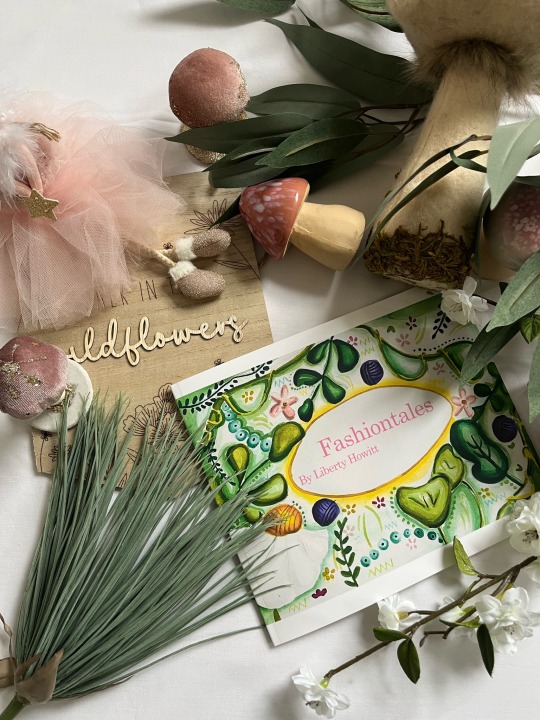
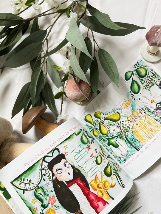
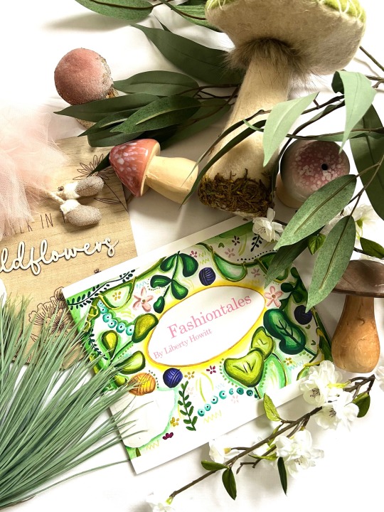
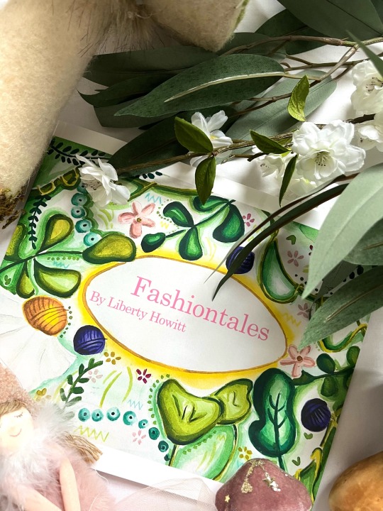
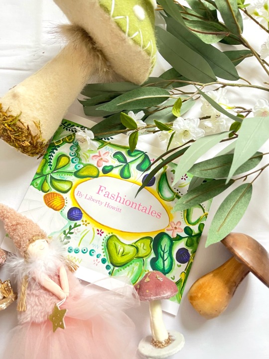
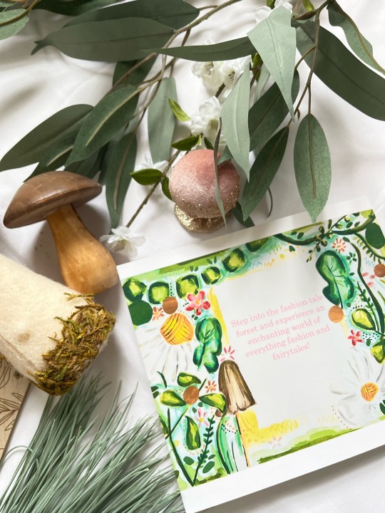
PHOTOSHOOT SET UP TIMELAPSE
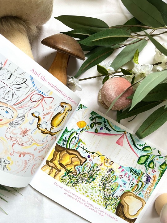
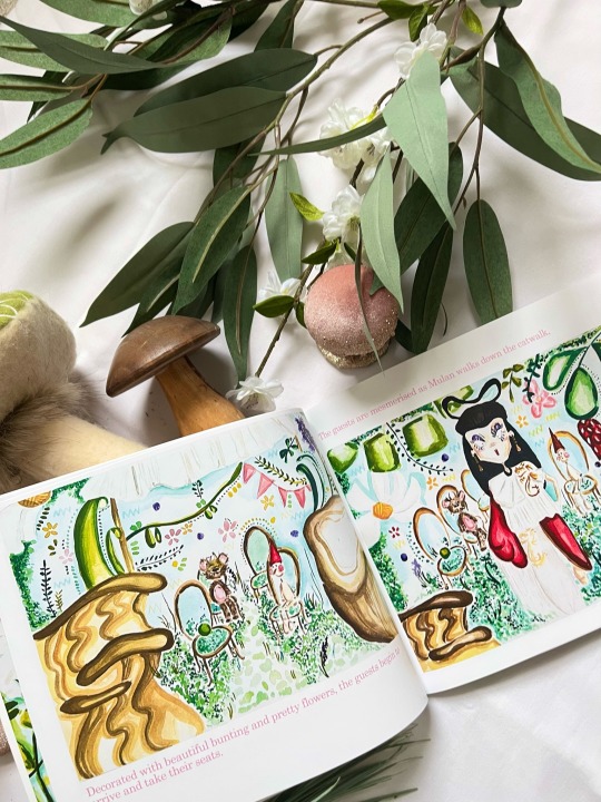
Setting up for the photoshoot, I wanted a simplistic white background to allow the vibrancy from the book to stand out, therefore using a white bedsheet. I then took my nieces bedroom decorations of toadstools and fairies and displayed these around the book followed by some foliage to fabricate a magical and enchanted scene. Assisting me in the styling process is my mum. Overall I love the layout of my book, perhaps it would be better if the sun was shining to achieve a glare and a more magical element but nevertheless, I still think the layout projects an effective look.
0 notes


Text
0 notes
Text
0 notes
Text
0 notes
Text
0 notes
Text
0 notes
Text
0 notes