
Last Seen Blogs

faded-in
hey there dreamer.
fav-emeto
My favorite vomiting clips and audios

schnukiputz
Unbetitelt

enki2
Praw Emit
thingsaboutcowboys-blog
Things About Cowboys
Photo
Mindmap/ brainstorming - original design
research
http://livehopething.blogspot.com/2015/02/tin-of-shit-valued-at-8000000.html
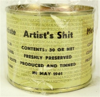
The Tate values excrement more highly than goldBy Catherine Milner, Arts Correspondent30 Jun 2002Critics of modern art will at least applaud the irony. The Tate Gallery has paid £22,300 of public money for a work that is, quite literally, a load of excrement.The canned faeces of Piero Manzoni, one of Italy’s most controversial artists, have been bought by the gallery from a sale at Sotheby’s.Can 004 is one of an “edition” of 90 tins of merda d'artista created by Manzoni in 1961 as an ironic statement on the art market. Each can contained 30 grams of his faeces and Manzoni sold it for the same price as if it were gold.The price paid by the Tate for its merda - £745 per gram - exceeds, however, the £550 that the contents of the tin would cost if they were made of 24-carat gold.The gallery yesterday defended its decision to spend taxpayers’ money on the work. The money for the purchase came from the Tate’s acquisitions budget, which it receives from the Government.
“The Manzoni was a very important purchase for an extremely small amount of money: nobody can deny that,” said a spokesman for the gallery.“He was an incredibly important international artist. What he was doing with this work was looking at a lot of issues that are pertinent to 20th-century art, like authorship and the production of art. It was a seminal work."The purchase is not the only excreta the Tate has in its collection; it has also bought three paintings by Chris Ofili featuring elephant dung.Although the tin was bought in the Italian art sale at Sotheby’s some time ago, the gallery has kept secret the amount it paid. It put the can on display last year without making any public announcement.Last week the gallery denied that it had tried to play down the purchase. "We buy 500 works a year so we can’t talk about every one,” said the spokesman.Manzoni died, aged just 29, within two years of creating his tinned art. He was a hard drinker and his alcohol consumption led to him to suffer from a liver condition. In a letter to a friend, he explained that his motivation for tinning his faeces was to expose the gullible nature of the art-buying public.“I should like all artists to sell their fingerprints, or else stage competitions to see who can draw the longest line or sell their shit in tins,” he wrote. “If collectors really want something intimate, really personal to the artist, there’s the artist’s own shit. That is really his."The cans were sealed according to industrial standards and then circulated to museums around the world.In addition to the Tate, both the Pompidou Museum in Paris and the Museum of Modern Art in New York have bought cans since. At least 45 of the original 90 cans have exploded, however. This is exactly what Manzoni intended.Soon after he created the cans he told a friend "I hope these cans explode in the vitrines of the collectors.” The Tate Gallery says that it has had no such problems.
Shit! Manzoni’s work doesn’t do what it says on the tinSo Piero Manzoni filled his cans not, as labelled, with Merda d'Artista, but with plaster. Does that matter? Does the concept still stand? Or should the Tate get rid of their investment fast?
In 2000 the Tate bought a tin purporting to be the excrement of Italian artist Piero Manzoni for £22,350 from Sotheby’s. The news provoked outrage. How could Nicholas Serota lavish such money on this four decades old send-up on the absurdity of the art market, whose artistic intervention, after all, was not intended to be a thing of beauty or permanence? Indeed, Manzoni once said that he was exposing “the gullibility of the art-buying public” with his tins of Manzoni’s Merda d'Artista. Hadn’t the Tate been had from beyond the grave by the cheeky Italian?Maybe not. Maybe the Tate’s purchase was astute. Last month a tin of Merda d'Artista as sold by the same auction house in Milan for £81,000.Perhaps now the Tate should offload their can on the market pronto and pocket the profits. I say pronto, because there are reports that Manzoni’s excrement did not fill those tins. Agostino Bonalumi, who worked with Manzoni, recently wrote in Corriere della Sera, that the 90 30-gramme tins that Manzoni filled in 1961 before his untimely death aged 29, contained not faeces but plaster. This might be one of the greatest outrages perpetrated in the history of art. Or not.Quite possibly the contents don’t do exactly what they say on the tin. “I can assure everyone the contents were only plaster,” writes Bonalumi. “If anyone wants to verify this, let them do so.” Good point: surely now is the time for Serota to get out the can opener and find out. Is there a conceptual art curator at Tate Modern who specialises in determining the authenticity of 46-year-old Italian artist’s faeces? It would be a singular job description.But no. The Tate tin will keep its mystery. A Tate spokesperson says: “Keeping the viewer in suspense is part of the work’s subversive humour.” But did Manzoni leave instructions to that effect, or are the Tate making it up as they go along? If the latter, the thought is that they are protecting their investment: the value of the work might well plummet if the boring truth that Bonalumi posits was discovered.AdvertisementDoes it matter? Does it matter if Manzoni’s tins do not contain merda d'artista? It’s actually a more serious question than you might think because it concerns what kind of authenticity is necessary in art and what is contingent. For example, would it matter if the 8,601 diamonds that stud Damien Hirst’s new work, For the Love of God, were really paste? Would it be an hilarious Manzonian artworld gag if all the cordons, bag checks and bouncers that prefigure the spectator’s five minutes’ face time with Hirst’s head were completely unnecessary and that the diamonds were not worth £15 million? Or would the revelation be really, really annoying and make us poor shnooks queuing at the White Cube feel cheated? And, even more crucially, how much would the revelation that the diamonds were dross affect For the Love of God’s £50 million price tag?Similarly, would it matter if the condoms on Tracey Emin’s bed had not seen active service in the artist’s love life? It’s an intriguing question since, surely, much of the interest in and value of Emin’s self-revelatory work relies on the presumed authenticity of the sex life she discloses in her work. Her condoms must be real or we would be entitled to be quite cross. Or would we?Either way, if there is an afterlife, Piero Manzoni surely must be enjoying the fact that the art world remains just as ludicrous as when he sought to expose it nearly five decades ago.Is modern art sh!t? In 1961, Piero Manzoni produced 90 cans labeled Artist’s Shit, Contents 30 grams net, Freshly Preserved.
The Italian artist went on to sell his ‘art’ for the price of its weight in gold. This made many people very angry, mostly because no one could work out whether it was a disgusting and demeaning insult to the public, or whether it was an absurdly clever piece of modern art. Almost 50 years on, one of these cans sits on a plinth in one of the most popular art galleries in the world, London’s Tate Modern, where it still provokes outrage and admiration in equal measure.Manzoni intended the cans to play a subversive role in the art world, following on from Duchamp’s Fountain, which was a urinal he placed in an art museum in 1917. Like many surreal moments, they cease to be so when ignored or accepted by the establishment. In 2006, fearing the latter had happened, 77-year-old artist Pierre Pinoncelli attacked a replica of the urinal with a hammer in the Centre Pompidou, Paris. He was arrested and prosecuted for damaging the artwork, but succeeded in avoiding paying for the damages by arguing that Duchamp would have approved.Excrement is arguably the original man-made material – producing it is an act of creation in which we are all involved. However disgusting we may find it, there is a certain pride associated with doing it well, or at least regularly. Prior to Manzoni, it was the feces of kings and queens that were most valued because of their importance in medical diagnosis. For instance, the stools of the British king, George III, were port-colored during his bout of madness, one of the clues that enabled historians and scientists in recent times to diagnose that his insanity had a physical origin, namely the condition porphyria.In contrast, the normal brown color of stools is produced by a combination of bile and bilirubin, the former producing the yellow overtones, while the red pigment bilirubin comes from red blood cells, and also fluoresces. Excrement also contains anerobic bacteria from the gut that break down the fecal matter, and it is this bacteria that poses the main problem for anyone wanting to preserve excrement. These bacteria do not require oxygen and will continue to thrive in a sealed can, building up gases and ultimately causing explosion.To kill such bacteria, two alternative strategies can be employed prior to canning. The first is pasturization, an extremely unpleasant process of heating to kill the bacteria. The alternative is the drying of excrement, which occurs naturally on a sunny day in every pasture in the land. Sun-dried excrement is not only easier to preserve, but is also a useful fuel when it originates from certain animals, the best examples of which are the bison and the cow. Unfortunately, dog excrement is not as useful in this respect, which is a pity given its prevalence in cities and the awkward problem of its disposal.
https://www.theguardian.com/artanddesign/artblog/2007/jun/12/shitmanzonisworkdoesntdow
Shit! Manzoni's work doesn't do what it says on the tin
So Piero Manzoni filled his cans not, as labelled, with Merda d'Artista, but with plaster. Does that matter? Does the concept still stand? Or should the Tate get rid of their investment fast?
In 2000 the Tate bought a tin purporting to be the excrement of Italian artist Piero Manzoni for £22,350 from Sotheby's. The news provoked outrage. How could Nicholas Serota lavish such money on this four decades old send-up on the absurdity of the art market, whose artistic intervention, after all, was not intended to be a thing of beauty or permanence? Indeed, Manzoni once said that he was exposing "the gullibility of the art-buying public" with his tins of Manzoni's Merda d'Artista. Hadn't the Tate been had from beyond the grave by the cheeky Italian?
Maybe not. Maybe the Tate's purchase was astute. Last month a tin of Merda d'Artista as sold by the same auction house in Milan for £81,000.
Perhaps now the Tate should offload their can on the market pronto and pocket the profits. I say pronto, because there are reports that Manzoni's excrement did not fill those tins. Agostino Bonalumi, who worked with Manzoni, recently wrote in Corriere della Sera, that the 90 30-gramme tins that Manzoni filled in 1961 before his untimely death aged 29, contained not faeces but plaster. This might be one of the greatest outrages perpetrated in the history of art. Or not.
Quite possibly the contents don't do exactly what they say on the tin. "I can assure everyone the contents were only plaster," writes Bonalumi. "If anyone wants to verify this, let them do so." Good point: surely now is the time for Serota to get out the can opener and find out. Is there a conceptual art curator at Tate Modern who specialises in determining the authenticity of 46-year-old Italian artist's faeces? It would be a singular job description.
But no. The Tate tin will keep its mystery. A Tate spokesperson says: "Keeping the viewer in suspense is part of the work's subversive humour." But did Manzoni leave instructions to that effect, or are the Tate making it up as they go along? If the latter, the thought is that they are protecting their investment: the value of the work might well plummet if the boring truth that Bonalumi posits was discovered.
Does it matter? Does it matter if Manzoni's tins do not contain merda d'artista? It's actually a more serious question than you might think because it concerns what kind of authenticity is necessary in art and what is contingent. For example, would it matter if the 8,601 diamonds that stud Damien Hirst's new work, For the Love of God, were really paste? Would it be an hilarious Manzonian artworld gag if all the cordons, bag checks and bouncers that prefigure the spectator's five minutes' face time with Hirst's head were completely unnecessary and that the diamonds were not worth £15 million? Or would the revelation be really, really annoying and make us poor shnooks queuing at the White Cube feel cheated? And, even more crucially, how much would the revelation that the diamonds were dross affect For the Love of God's £50 million price tag?
Similarly, would it matter if the condoms on Tracey Emin's bed had not seen active service in the artist's love life? It's an intriguing question since, surely, much of the interest in and value of Emin's self-revelatory work relies on the presumed authenticity of the sex life she discloses in her work. Her condoms must be real or we would be entitled to be quite cross. Or would we?
Either way, if there is an afterlife, Piero Manzoni surely must be enjoying the fact that the art world remains just as ludicrous as when he sought to expose it nearly five decades ago.
youtube
0 notes
Text
REFERENCES:
American abstract artists, editorial statement 1938, in AAA yearbooks, New York, 1969(IVA12)
Andy Warhol, B. H. D. Buchloh, Andy Warhol (Volume 2 of October files), MIT Press, 2001
Thomas E. Crow, Modern Art in the Common Culture, Yale University Press, 1998, p.49-56
Apollonio, U., Futurist Manifestos, London and New York, 1973, P.222-228
Arnheim, R., Art and visual perception, London and New York,1956
Arnold, M., ‘Culture and Anarchy’(1869), in Matthew Arnold. Selected Poetry and Prose, New York, 1953
Art&Language introduction (T.Atkinson), Editorial Introduction to Art-Language (1969), in de Vries,1974, and Art&Language, 1980 (VIB5)
Atlan, J.-M., ‘Abstraction and Adventure in Contemporary Art’ (1950), in Paris-Paris, Paris (Centre Pompidou), 1981(VB9)
Bahr, H., Expressionism (1916), London, 1920(IB18)
Barr, A. Jr., ‘Is Modern Art Communistic?’ (1952), In Barr, 1986(VC17)
Bell, C., Art(1914), OXford, 1987(IB16)
Bell, D., ‘Beyond Modernism, Beyond self’(1977), in Bell, Sociological Journeys 1960-1980, London and New York, 1980
Burgin, V., ‘situational Aesthetics’ (1969), in de Vries, 1974(VIIB8)
Bryan Holme, Art of Advertising, Littlehampton Book Services Ltd, 1985, United Kingdom, P.6/P.310-319
Christensen, Uffe (13 January 2010). “Museum sur over lorteudtalelse” [Museum angry about shit opinion]. Jyllands-Posten (in Danish). Archived from the original on 21 October 2013. Retrieved 2 May 2014.
Clowes, Erika Katz (2008). The Anal Aesthetic: Regressive Narrative Strategies in Modernism (Ph.D. thesis). University of California, Berkeley. ISBN 9780549839651.
Donald L. Brady, Essentials of International Marketing, Routledge, 2014, p.279-297
Donna Stein, Products and promotion: art, advertising and the American dream : [exhibition] SF Camerawork, San Francisco, California, September 4-October 4, 1986, University Gallery of Fine Art, Ohio State University, Columbus, Ohio, April 30-May 31, 1987, Franklin Furnace, New York, New York, Winter 1987, SF Camerawork, 1986, p.7-14
Endell, A., ‘The beauty of Form and Decorative Art’ (1897-98), IN Benton and Sharp, 1975
Eric Christian Matthews, Commercial Art: Advertising Layout, Illustrated editions Company, Incorporated, 1938, P.13
Foster, H.(ed.), Post Modern Culture (as The Anti-Aesthetic, Seattle, 1983), London 1985 (a)
Germano Celant, Piero Manzoni, New York 1972
Freddy Battino and Luca Palazzoli, Piero Manzoni: Catalogue raisonné, Milan 1991, pp.123-8, 472-5, catalogue no. 1053/4, reproduced p.472
Piero Manzoni, exhibition catalogue, Serpentine Gallery, London 1998, reproduced pp.201-6 in colour)
Glancey, Jonathan (12 June 2007). “Merde d'artiste: not exactly what it says on the tin”. The Guardian. Retrieved 2 May 2014.
Goodman, N., Language of Art, Bloomington, IN, 1976
Harries, The meaning of modern Art,1979,Evanston, United States,Northwestern University Press
Herbert,Impressionism: Art, Leisure, and Parisian Society,1991,New Haven, United States,Yale University
James Lightbody, Lux Stereometriae: Or, The Art of Measuring Surfaces and Solids: Theoretically and Practically Demonstrated, F. Hvbbart and H. Newman, 1701, p.115-127
Kabakov, L., ‘In The Installations’ in Felix, 2000(VIIIC14)
Kierkegaard, S., The Concept of Irony (1841), New York, 1965(see Art in Theory 1815-1900, IID4, 10 and 14) (Volume 1, P.101-120)
Leroy Bond, The Influence of Modern Abstract Painting on Advertising Art, 1930-1950, Oklahoma Baptist University, 1954
Merleau-Ponty, M., ‘Eye and Mind’ (1961), in Merleau-Ponty, 1964(a), and Osborne, 1972(VIB3)
Michele H. Bogart, Artists, Advertising, and the Borders of Art-
Chicago Guides to Academic Life Series, University of Chicago Press, 1995
Miller, John (1 May 2007). “Excremental Value”. Tate Etc (10). Retrieved 2 May 2014.
Morris, W., The Art of the People (1897), London, 1942
Nigel Whiteley, Design for Society, Reaktion Books, 1997, P19-20, P32-39, P55, P107, P159
Popper, K., Conjectures and Refutations (1963), rev. edn, London, 1969
Rodchenko, A., ‘Slogans’ and ‘Organizational Programme’ (1920-1), in S.-O. Khan Magomedov, Rodchenko: The Complete Work, London, 1986(IIID5)
Stephen David Ross, A Theory of Art: Inexhaustibility by Contrast-SUNY Series in Philosophy Series-SUNY series in systematic philosophy, SUNY Press, 1982, P.46-47)
(Magazine of International Design, Volume 53, Issues 1-4)/ (Asian Hotel & Catering Times, Volume 33)/ (Ted Sandling, London in Fragments: A Mudlark’s Treasures, Frances Lincoln, 2016)
Some of the reference books are non-Chicago system, which are posted here as a recommendation.
0 notes
Photo
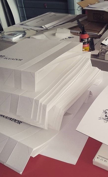

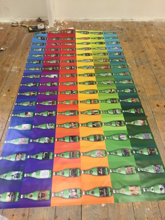
Poster material selection workflow
It involves a giant-sized poster in my work that I have collected different materials to test the performance of the paper. I personally checked and touched the texture of different types of paper during the practical research, including the following paper materials: Bag papers. Bark papers. Bible papers. Bill papers. Blotting papers. Blueprint papers. Bond papers. Book paper. Box enamels. Carbon paper. Cardboard. Cellophanes.. Chart paper. Cheque paper. China papers.
The final selection of material is Waterproof PVC painting of outdoor advertisement.(The staff of the advertising company advised me to select it) This is a common advertising inkjet material, suitable for outdoor advertising, the material contains plastic components which is not easily damaged.
Individual Practices were completed separately in different workshops and print stores. Due to the module is an individual assignment, the practical learning-outcome is primarily recorded by the Material photos and explanations. The materials I have mentioned it has been shown to the temporary lecturer in the previous individual tutorials.
Practice Location:
1. The Colour Campany/ 39 Waterloo St, Birmingham B2 5PP, UK - 29/07/2017-02/08/2017 2. Parkside workshop / 03/07/2017 Parkside print shop 22/06/2017

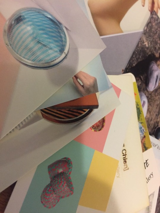
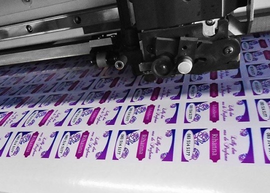
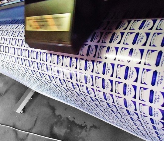
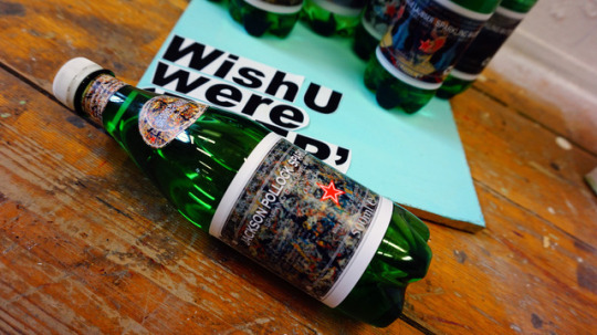
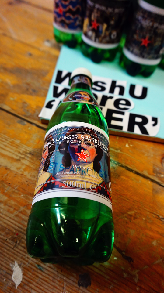
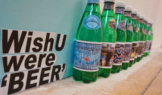
Refer to the original sparkling water label dimensions, a ratio of one-to-one for redesigning the artistic labels. In the re-design of the label, I utilized the artist's photos as background elements to achieve my work’s label. (Pls Right-click to view the larger image- open image in new tab)
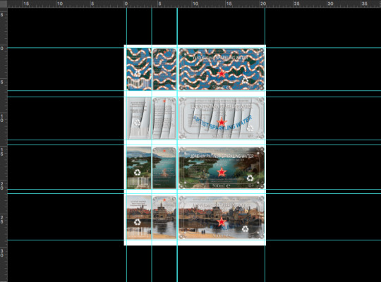

Material: Product label paper (non-self-adhesive labels. ) pls refer to Handmade aromatherapy candle label.
The lABEL finished product Please browsing the previous photos I released earlier.
0 notes
Video
Creative motivation/ inspiration
The sounds of gunfire/ Libya / 09.02.2017/ by former friend (Original video above)
This video was recorded by my Libyan friend who died in the Civil War ( RIP -12.02.2017), he had passed the video on me via WhatsApp in the last conversation between us, none of us expected what had been going to occur, accidents are always unpredictable, our talk was commonplace. The final chat topic between us is he asked me what I was doing recently, and what courses I was studying in UK. I just casually replied “Art&Design” at that time, and he was surprised to say, “Wow, art.” then I asked why he was so surprised when I had been mentioning art. He solemnly replied me, “do you think art exists in refugee countries? For example, do you think art exists in my country now? ” He’s gone, this was the last two questions he had left for me, and the two questions made me quiet for a long time because I didn’t answer him at that moment. I’ve been wondering why I came here, why did I choose to study something about art.
Creative motivation- I don’t think that I am able to completely comprehend art as I think no one could confidently perfectly comprehend art as well, I hope more people can catch sight of artwork and I don’t think art belongs to the rich, a class or a group of people. What I would like to say is that sometimes I cannot comprehend the value and significance of some artworks. For plebs, some art pieces created by some artists, which turns out a kind of rubbish in their environments. (eg.Some social practice artists put their work in public spaces and leading to urban traffic/travel inconvenience. Or racist disguises as artist to pursue financial interests.) You might say that because plebs are superficial and they don’t theoretically academically understand art, but ironically, no one had asserted that art is not superficial. ( Please refer to James Lightbody, Lux Stereometriae: Or, The Art of Measuring Surfaces and Solids: Theoretically and Practically Demonstrated, F. Hvbbart and H. Newman, 1701, p.115-127)
A hamburger and a painting of Van Gogh. Which one would you like to choose? The same question, if asking an impoverished African child, no doubt Hamburg is an effectively answer. Why? Maybe they didn’t know how much Van Gogh was worth, I don’t think even Van Gogh himself knows, this irony proves that poor people know little about art. It makes sense why my work is regarding the consumption of commercialisation art piece. A coin has two sides, there are both advantages and disadvantages in everything, I don’t think that commercialization of art is a bad thing, it makes artists more likely to reflect on how to rationally treat art. I’m not an artist, and I don’t want to be an artist as well, My only identity is human. I don’t know art, so I decided to study art, but it seems that art has told me that studying art is a foolish behavior because no one can tell me what art is, what kind of people can be called an artist. (it’s laughable….)
The initial motivation of my work was based on the video that my departed Libyan friend sent me, which inspired me to reflect on the consumption of globalisation of art and the commercialisation of art, It was a motif to urge me to pay more attention to the most basic necessities of human life, so water became the main target and object in my artwork.
The following text is my self-assessment of final project CRITICAL EVALUATION FORM, I have never regretted what I was writing in my final project. Many people unscrupulous remark others nowadays and then left some irresponsible comments. PLS do Never judge others easily, you don’t know what others have been through. I would like to ask my final project examiner, have you ever been to Refugee countries? Have you ever known what is the actual situation in these countries? Did you try to in-depth ponder over what I am talking about? I don’t even talk to you, I have never seen you before! Or whether taking it for granted that Chinese cannot use English well when you see that I am Chinese. In general, people judge and infer something via their own perception/cognition and they take it for granted (reference: Social cognition, inference, and attribution, Robert S Wyer, Psychology Press, New York,2010,p.184) Language is merely a tool of art, ( please refer to:Oskar Hasdinor Hassan,International Colloquium of Art and Design Education Research (i-CADER 2014), Springer, 2015, P.225) I don’t think that art must require high language ability, I do not think any great artist has a very amazing language ability, if humans only rely on language to communicate, there will no artistic value of existence. /YES, I am a Chinese, I used to study ( Art&Design) in U.S. for my diploma foundational course, Andy Warhol is the first artist I recognized academically, and also he could be regarded as my artistic enlightenment teacher who inspired my curiosity in the art field. I used to study in Malaysia and Singapore as well, I have heard that the education system in UK was worth promoting and learning before I came here, this was probably why I have selected MA course in UK. But unfortunately, I wasn’t aware of any educational Ideology or teaching approach which was worthy of praise during the final term, I do hope that every educator is able to be responsible for their own words and deeds, and respecting the learning outcome of each student. Is an excellent artist equal to a good educator?Wether a talented artist could be a good educator? I do not think so.
STUDENT CRITICAL EVALUATION FORM
Evaluation
water is the same bottle is the same, but Art is constantly changing. If I were in desert,
If I were in Refugee countries.
A piece of art or a bottle of water
Which one would I like to choose?
To put the artwork on the labels is my way.
I am an extremely superficial person. I do not understand ART.
I like Piero Manzoni
I like Andy Warhol
Artistic Reference:
Artist’s Shit 1961 by Piero Manzoni.
Quotes : I am a deeply superficial person. by Andy Warhol
0 notes
Photo

Initial sketch& bottle selection
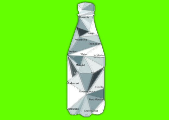
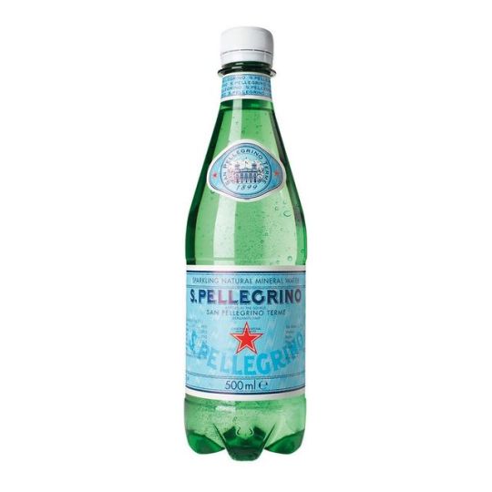
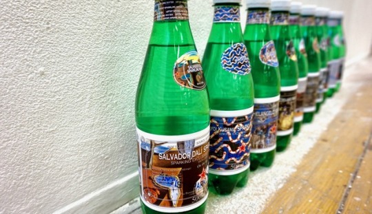
Why would I choose San Pellegrino sparkling water as the product object of my work? As an advertising-based artwork, the selection of products is one of the most important aspects. I had tried some different selection of product when I came up with the concept. Among a large number of water products on the market, San Pellegrino is one of the expensive brands in sparkling water compared with other products of the same type. First of all, my concern was that I had been looking for a representative water product, especially as an advertising or artwork to be recognizable which is directly determined whether the art piece is going to be impressive for the first impression. San Pellegrino sparkling water is an ideal selection for a product in my work, it has a recognizable bottle design ( including bottle color), and the brand is well-known.
References:
its iconic green bottle emblazoned with a red five-pointed star, Sanpellegrino does most of its business in the fine-dining sector: ... bottles sold in the U.S. in 2004 were imbibed in restaurants, making Sanpellegrino the number-two imported brand of sparkling water overall. ... Over the past few years, Sanpellegrino has worked with Alessi to design items such as bottle openers, mainly for merchandising.(Magazine of International Design, Volume 53, Issues 1-4)
These including popular mineral water brands like Aqua Panna and San Pellegrino from Italy and Perrier, Vittel and Contrex ... However it has an active recycling policy and aims to recycle all water bottles. ... Novotel Nathan Road is Accor's first signature Novotel to be created under the brand's new “natural living design”. (Asian Hotel & Catering Times, Volume 33)
San Pellegrino has been producing naturally carbonated water for six centuries. ... Bottles were tightly sealed with a wired cork, like champagne today, but there was still a risk that all the gas would leak ... These bottles were also known as 'torpedo', 'eggshaped' and 'Hamilton', the latter because a William F. Hamilton patented the design in 1809 (Ted Sandling, London in Fragments: A Mudlark's Treasures, Frances Lincoln, 2016)
TO ART AND DESIGN course ---personal Analysis
Design is the creation of a plan or convention for the construction of an object, system or measurable human interaction (as in architectural blueprints, engineering drawings, business processes, circuit diagrams, and sewing patterns).[1] Design has different connotations in different fields. In some cases, the direct construction of an object (as in pottery, engineering, management, coding, and graphic design) is also considered to use design thinking.
Designing often necessitates considering the aesthetic, functional, economic, and sociopolitical dimensions of both the design object and design process. It may involve considerable research, thought, modeling, interactive adjustment, and re-design. Meanwhile, diverse kinds of objects may be designed, including clothing, graphical user interfaces, skyscrapers, corporate identities, business processes, and even methods or processes of designing.[2]
Thus "design" may be a substantive referring to a categorical abstraction of a created thing or things (the design of something), or a verb for the process of creation as is made clear by grammatical context. It is an act of creativity and innovation.
Dictionary meanings in the Cambridge Dictionary of American English, at Dictionary.com (esp. meanings 1–5 and 7–8)
Brinkkemper, S. (1996). "Method engineering: engineering of information systems development methods and tools". Information and Software Technology. 38 (4): 275–280.
The existence of design is inseparably related to the commercial society (pls refer to Nigel Whiteley, Design for Society, Reaktion Books, 1997, P19-20, P32-39, P55, P107, P159). In terms of art and design, I personally think that art is brought into the design into design. In other words, art and design course is the integration of art and commercialization. No taboo to say that many artists despise design from the established patterns of thinking, in the eyesight of some self-righteous artists, they stubbornly insist that fine art can be called genuine art, while art and design are not entitled to be called art. Ironically, I don't think that some artists considered themselves as artists of their era even in classical art. I don't think Michelangelo, Leonardo Da Vinci, Paul Cézanne,Caravaggio, Francisco Goya and so on they would realize that they were artists of that period. I habitually call them painters rather than artists, as I call designer, engineer, teacher, lecturer etc.
TO ART: People could comprehend the portrayal of a period, a race, and even a country through Art. If art is exclusive, then the value of the existence of the genre artists such as Andy Warhol or Piero Manzoni is extraordinary. Personally opinion, Andy Warhol’s existence to satirize those who pretend that the genuine art is noble, exclusive. I don’t think art commercialized is shameful, the most shameful thing is that some poseurs who pretentiously self-righteous thought that art is exclusive to upper class. If art is priceless, it is more significant to bring art to the public, to every place in life, and to accept the art of every nation, every human race, rather than narrowing art. Air, water, sky, these things are gainable in everywhere, but no one wants to buy it at a high-price, because these are the necessities of mankind, and are priceless.
0 notes
Photo


Methodology / Explanation: idea, concept, metaphor, meaning, intention/ workflow/ Theoretical aid
Methodology/Explanation: People drink water every day, and human beings need water every day. Does human being need art every day as drinking water? I have recorded the design process/workflow of 100 days in the way of drinking water every day. Designing a poster every day could be regarded as drinking a bottle of water every day, reading a piece of art every day can be treated as consuming water every day. Drinking 100 bottles of water on 100 days and commercializing 100 pieces of art on 100 days. Water is the same, bottle is the same, BUT art is constantly changing. I have been thinking over and over again what kind of people need art?It is hard to figure out the accurate answer, but I realized that somewhere art has been reduced to a tool of racial, regional, and identity discrimination, OR a means of commercial profit, as well as a symbol of wealth. (Relevant resource: Demythologizing Consumption Practices: How Consumers Protect Their Field-Dependent Identity Investments from Devaluing Marketplace Myths/ Zeynep Arsel Craig J. Thompson/ Journal of Consumer Research, Volume 37, Issue 5, 1 February 2011, Pages 791–806��- Published: 26 August 2010). The intention of my work is clearly aiming at the consumption of commercial artwork. In terms of art and design courses, I personally think that Andy Warhol is a representative and pioneer personage in art and design both fields, his work is controversial in contemporary art as well as widely used in commercial design. And Piero Manzoni’s “Artist’s shit” more convincingly reflects the combination of design and art, Manzoni’s critical and metaphorical reification of the artist’s body, its processes and products, pointed the way towards an understanding of the persona of the artist and the product of the artist’s body as a consumable object. The Merdad'artista, the artist’s shit, dried naturally and canned ‘with no added preservatives’, was the perfect metaphor for the bodied and disembodied nature of artistic labour: the work of art as fully incorporated raw material, and its violent expulsion as commodity. Manzoni understood the creative act as part of the cycle of consumption: as a constant reprocessing, packaging, marketing, consuming, reprocessing, packaging, ad infinitum. (Piero Manzoni, 1998, p.45). Artist’s Shit was made at a time when Manzoni was producing a variety of works involving the fetishisation and commodification of his own body substances. These included marking eggs with his thumbprints before eating them, and selling balloons filled with his own breath. Of these works, the cans of Artist’s Shit have become the most notorious, in part because of a lingering uncertainty about whether they do indeed contain Manzoni’s faeces. At times when Manzoni’s reputation has seen the market value of these works increase, such uncertainties have imbued them with an additional level of irony. (Reference: Germano Celant, Piero Manzoni, New York 1972
Freddy Battino and Luca Palazzoli, Piero Manzoni: Catalogue raisonné, Milan 1991, pp.123-8, 472-5, catalogue no. 1053/4, reproduced p.472
Piero Manzoni, exhibition catalogue, Serpentine Gallery, London 1998, reproduced pp.201-6 in colour)
Implication / Metaphorical extension
Sparkling water is a potable drinking liquid between normal water and beer, but sparkling water has more bubbles than normal water while lacking the alcohol component of beer. If normal water can be regarded as mediocrity, then the meaning of beer could be the excellent artworks of genuine art. If Art is inseparable from life, then water is an indispensable basic survival resource in life. But is sparkling water a basic survival source of life? I don’t think so, I liken sparkling water to some unleavened/unfermentable art pieces, which commercially active in the marketplace. If excellent artworks were beer, then those works would be fermented like beer and to be able to drive people crazy, addicted, and even forget themselves via the influence of alcohol. On the contrary, some artworks are like sparkling water which has only bubbles are like beer, but cannot resonate with viewers and merely left a tasteless interoception. But ironically, what are the criteria for judging fermented and unfermented a piece of art? I think only the viewer knows, in other words, It’s laughable to put a mark on a piece of art as if it were priced for a piece of art, 100 viewers might have 100 or more subjective opinions on a piece of art. (Pls refer to: Stephen David Ross, A Theory of Art: Inexhaustibility by Contrast-SUNY Series in Philosophy Series-SUNY series in systematic philosophy, SUNY Press, 1982, P.46-47)
Poster – explanation/Additional message/information: Rainbow flag. The rainbow flag, commonly known as the gay pride flag or LGBT pride flag, is a symbol of lesbian, gay, bisexual and transgender (LGBT) pride and LGBT social movements. … The flag is typically flown horizontally, with the red stripe on top, as it would be in a natural rainbow. Dr.Andrew mentioned whether there is a concept of rainbow flag involved in my poster design during the latest individual tutorial? I didn’t explicitly point out and mention the concept exactly existed in my work, to my point of view that if a piece of art or design is going to be completely endowed with unchangeable meaning which is regrettable. Perfect is imperfect, why doesn’t Venus sculpture have arms?In my perspective, perhaps a piece of art leaves some space to viewer for imaging or questioning reflection that can be called authentic artwork. ———– In the concept of the rainbow flag, I just would like to convey that art could be the color of the rainbow flag, regardless of national boundaries, gender, age, race, etc… Art is supposed to be an inclusive word (Every country has their own art), regrettably, because of human existence, art becomes an exclusive tool.
Slogan “ Wish you were beer” was inspired by Pink Floy “wish you were here” 1975. This is one of my favorite songs especially the lyrics. Pink Floy was the first British band I knew, I have noticed that the metaphorical culture/ technique of the lyrics via Pink Floy albums. When I heard the song and spontaneously emerging the idea. Exactly, it was Pink Floy’s song that made me interested in Britain. Now, I can gradually understand why they wrote these songs.
Installation Introduction: Basically, my work is respectively presented by three parts: Image, Plinth, and Bottles (Please refer to the pictures above). Due to the course is named as Art and Design, firstly I assumed my work is a case of advertising design, thus the poster& promotion gimmick & products are essential parts in each advertising (Chris Hackley, Advertising and Promotion: Communicating Brands, SAGE, 2005, p.8-24). According to my hypothesis, the picture of 100 bottles in my work could be recognised as an advertising poster; the Water sculpture on the plinth can be regarded as a promotional gimmick in an advertising; of course the sparkling water bottles undoubtedly can be products of advertisement; well! “wish you were Beer” is obviously the slogan of my ads work. The three parts are enough to constitute a complete advertising case.( Donald L. Brady, Essentials of International Marketing, Routledge, 2014, p.279-297) After all, I placed my AD work in a gallery which denoted it would be exhibited as a piece of art.
Display Description: the Critical aspect of installation is the placement of each part of my work, a piece of art located in different places with different meanings. Wall, plinth, and floor are generally basic facilities of art gallery, so the three essential elements of advertising design (poster& promotion gimmick & product-3P) correspond to the infrastructure(Wall, plinth, floor) of art gallery.
This was why I respectively placed them in the corresponding position.
Theoretical aid :
Andy Warhol (1930-1987) Interview with Gene Swenson: Bron in Pittsburgh, Warhol had moved to New York in 1949. For most of the 1950s he was a successful graphic designer, particularly in the field of shoe illustration. In the later 1950s he began to exhibit his own drawings, and in 1960 produced his first canvases depicting comic strip characters. The canonical repeated Soup Cans, Disasters, Elvises and Marilyns followed in 1962. Throughout this period of his transition from graphic designer to full-blown avant-garde artist Warhol was able to purchase works by contemporaries (That’s why I think Andy Warhol is a representative figure in art and design, his work can be utilized as a successful instance of Art&Design courses)such as Jasper Johns and Frank Stella, as well as by Marcel Duchamp. ‘POP ART’ became established as the latest vanguard movement in New York in 1962. The present interview was initially published as ‘What is pop art?’ Interviews with Eight Painters (part1) , Art news, New York, November 1963. Reprinted in John Russell and Suzi Gablik(eds), POP ART Redefined, London, 1969, pp. 116-19, from which the present text is taken.
AW: Someone said that Brecht wanted everybody to think alike. I want everybody to think alike. But Brecht wanted to do it through Communism, in a way. Russia is doing it under government. It’s happening here all by itself without being under a strict government; so if it’s working without trying, why can’t it work without being Communist? Everybody looks alike and acts alike, and we’re getting more and more that way. I think everybody should be a machine. I think everybody should like everybody.
Is that what Pop Art is all about?
AW: Yes. It’s liking things.
And liking things is like being a machine?
AW: Yes, because you do the same thing every time. You do it over and over again.
And you approve of that?
AW: Yes, because it’s all fantasy. It’s hard to be creative and it’s also hard not to think what you do is creative or hard not to be called creative because everybody is always talking about that and individuality. Everybody’s always being creative. And it’s so funny when you say things aren’t, like the shoe I would draw for an advertisement was called a ‘creation’ but the drawing of it was not. But I guess I believe in both ways. All these people who aren’t very good should be really good. Everybody is too good now, really. Like, how many actors are there? There are millions of actors. They’re all pretty good. And how many painters are there? Millions of painters and all pretty good. How can you say one style is better than another? You ought to be able to be an Abstract-Expressionist next week, or a Pop artist, or a realist, without feeling you’ve given up something. I think the artists who aren’t very good should become like everybody else so that people would like things that aren’t very good. It’s already happening. All you have to do is read the magazines and the catalogues. It’s this style or that style, this or that image of man – but that really doesn’t make any difference.
Some artists get left out that way, and why should they? Is Pop Art a fad?
AW: Yes, it’s a fad, but I don’t see what difference it makes. I just heard a rumor that G. quit working, that she’s given up art altogether. And everyone is saying how awful it is that A. gave up his style and is doing it in a different way. I don’t think so at all. If an artist can’t do any more, then he should just quit; and an artist ought to be able to change his style without feeling – bad. I heard that Lichtenstein said he might not be painting comic strips a year or two from now – I think that would be so great, to be able to change styles. And I think that’s what’s going to happen, that’s going to be the whole new scene. That’s probably one reason I’m using silk screens now. I think somebody should be able to do all my paintings for me. I haven’t been able to make every image clear and simple and the same as the first one. I think it would be so great if more people took up silk screens so that no one would know whether my picture was mine or somebody else’s.
It would turn art history upside down?
AW: Yes.
Is that your aim?
AW: No. The reason I’m painting this way is that I want to be a machine, and I feel that whatever I do and do machine-like is what I want to do.
Was commercial art more machine-like?
AW: No, it wasn’t. I was getting paid for it, and did anything they told me to do. If they told me to draw a shoe, Pd do it, and if they told me to correct it, I would – Fd do anything they told me to do, correct it and do it right. I’d have to invent and now I don’t; after all that ‘correction’, those commercial drawings would have feelings, they would have a style. The attitude of those who hired me had feeling or something to it; they knew what they wanted, they insisted; sometimes they got very emotional. The process of doing work in commercial art was machine-like, but the attitude had feeling to it.
Why did you start painting soup cans?
AW: Because I used to drink it. I used to have the same lunch every day, for twenty years, I guess, the same thing over and over again. Someone said my life has dominated me; I liked that idea. I used to want to live at the Waldorf Towers and have soup and a sandwich, like that scene in the restaurant in Naked Lunch… .
We went to see Dr No at Forty-second Street. It’s a fantastic movie, so cool. We walked outside and somebody threw a cherry bomb right in front of us, in this big crowd. And there was blood. I saw blood on people and all over. I felt like I was bleeding all over. I saw in the paper last week that there are more people throwing them – it’s just part of the scene – and hurting people. My show in Paris is going to be called ‘Death in America’. I’ll show the electric-chair pictures and the dogs in Birmingham and car wrecks and some suicide pictures.
Why did you start these ‘Death’ pictures?
AW: I believe in it. Did you see the Enquirer this week? It had ‘The Wreck that
Made Cops Cry’ – a head cut in half, the arms and hands just lying there. It’s
sick, but I’m sure it happens all the time. I’ve met a lot of cops recently. They
take pictures of everything, only it’s almost impossible to get pictures from them.
When did you start with the ‘Death’ series?
AW: I guess it was the big plane crash picture, the front page of a newspaper: 129 DIE. I was also painting the Marilyns. I realized that everything I was doing must have been Death. It was Christmas or Labor Day – a holiday -and every time you turned on the radio they said something like, ‘4 million are going to die’. That started it. But when you see a gruesome picture over and over again, it doesn’t really have any effect. But you’re still doing ‘Elizabeth Taylor’ pictures.
AW: I started those a long time ago, when she was so sick and everybody said she was going to die. Now I’m doing them all over, putting bright colors on her lips and eyes. My next series will be pornographic pictures. They will look blank; when you turn on the black lights, then you see them – big breasts and. … If a cop came in, you could just flick out the lights or turn to the regular lights
– how could you say that was pornography? But I’m still just practising with these yet. Segal did a sculpture of two people making love, but he cut it all up, I guess because he thought it was too pornographic to be art. Actually it was very beautiful, perhaps a little too good, or he may feel a little protective about art. When you read Genet you get all hot, and that makes some people say this is not art. The thing I like about it is that it makes you forget about style and that sort of thing; style isn’t really important.
Is ‘Pop’ a bad name?
AW: The name sounds so awful. DADA must have something to do with Pop
– it’s so funny, the names are really synonyms. Does anyone know what they’re supposed to mean or have to do with, those names? Johns and Rauschenberg – Neo-DADA for all these years, and everyone calling them derivative and unable to transform the things they use – are now called progenitors of Pop. It’s funny the way things change. I think John Cage has been very influential, and Merce Cunningham, too, maybe. Did you see that article in the Hudson Review [‘The End of the Renaissance?’, Summer, 1963]? It was about Cage and that whole crowd, but with a lot of big words like radical empiricism and teleology. Who knows? Maybe Jap and Bob were Neo-DADA and aren’t any more. History books are being rewritten all the time. It doesn’t matter what you do. Everybody just goes on thinking the same thing, and every year it gets more and more alike. Those who talk about individuality the most are the ones who most object to deviation, and in a few years it may be the other way around. Some day everybody will think just what they want to think, and then everybody will probably be thinking alike; that seems to be what is happening.
The present interview was initially published as ‘What Is Pop Art? Interviews with Eight Painters (Part 1)’, Art News, New York, November 1963.
The ironic video is one of the sources of my inspiration below. ———————- The great contemporary art bubble 2009
youtube
Corrupt and rotten through and through dealers, auction houses and artist like Hurst, let them all go bankrupt and the art market start anew. Its a real deal for those artist who specializes realism, they have pure jealous in there heart. they extent to the point questioning the Client’s taste! a genius artist as a human he thinks how he sell his paintings. imagine billions of people around the world, and everytime they want to buy painting they have no choices all of them doing realism. and then out of nowhere picasso broke that chain. if people love a cartoon looks then what if i put in a canvass and name it a cubism. and boom… it clicks!!!! if you study the behavior of a collector. they just collect what they want with out questioning the looks or image. they collect insects,shoes,bags, newspapers,coin,old appliances, old cellphone, pictures, etc…anything they want to collect regard less of looks and price if they want it they buy it. now if they like abstract paintings don’t question their taste, don’t force them to buy realism. put your self on them, what if you have billions in your pocket???? what will satisfy you? well simple you can not bring that in the after life so buy what you want, anything you want, you can not spend that money in your whole life after all.
Fake or Fortune S04 E02 Renoir video below
youtube
Nicky Philipps, a portrait artist renowned for her pictures of the royal family, has asked the Fake or Fortune team to investigate a painting which hangs on the walls of Picton Castle, once the Philipps family seat. The work was bought in the 1930s by Nicky’s great-grandfather, Sir Laurence Philipps, who believed it to be by celebrated impressionist Pierre Auguste Renoir. But the painting has been dogged by doubt for half a century, and two art world authorities can’t agree whether it’s genuine or fake.
Very interesting detective stories. It is too bad that the art world has so many incompetent “experts”, who cost people vast sums of money every year. This episode demonstrates that fact beyond any doubt. IMO, the entire art business is a criminal racket. Then by extension the governments that spend vast amounts of money on “art” and that money is seized from citizens or “subjects” are also criminal. I dont know what is more nauseating these so called “art experts” or that upper class arrogant twit with no manners. Living in a massive house she cant afford, oh well perhaps she can get a grant from the Tory government like Tory MP Jacob Rees-Mogg did, his aristocratic wife was given millions of taxpayers money to do up their mansion. I dont earn a lot a money and therefore live happily according to my means, perhaps she should do the same.This program shows how corrupt the art world is, I do enjoy the detective work they do though and also learning about the masters.
youtube
Candace Worth’s talk at the TEDxChelsea conference, held June 1, 2012 at the School of Visual Arts. The conference theme was “The true value of art is seldom what someone is willing to pay for it.” For more information or to apply for 2013, please go to TEDxChelsea.org. Candace Worth founded Worth Art Advisory in 2001 to bridge the gap between contemporary art collectors and the increasingly exclusive art world establishment. Candace began her career in the Contemporary Art Department at Christie’s auction house in the early 1990s. Since then, she has worked for a blue-chip gallery in New York City as well as an internet-based art consultancy. She now buys artwork for a highly diverse group of clients at all price levels, sourcing most of the work from across the United States and Europe. Candace currently serves on the board of the Drawing Center in New York City and has lectured on issues related to the contemporary art market at several art institutions, including the Rhode Island School of Design. Candace received her BA in Art History from the University of Pennsylvania and continued her studies in Art History at the Graduate School of Arts at Columbia University. worthartadvisory.com In the spirit of ideas worth spreading, TEDx is a program of local, self-organized events that bring people together to share a TED-like experience. At a TEDx event, TEDTalks video and live speakers combine to spark deep discussion and connection in a small group. These local, self-organized events are branded TEDx, where x = independently organized TED event. The TED Conference provides general guidance for the TEDx program, but individual TEDx events are self-organized.
If art is only as valuable as what someone is willing to pay for it, than it is worth less than money. Also, Van Gogh’s art was, by her standards, worthless in his lifetime. Just imagine her in his lifetime arguing that his paintings were worthless because nobody would buy them. Art’s value is intrinsic. It’s what you get directly from it, irrespective of what the 1% are willing to spend on it. From her standpoint, the rich define what art is. Someone open the trap door!
when you can make something complicated look simple , the psychological aspect of art becomes common sense . some use the term enlightenment , but few ever explain what this means . why , well they don`t actually know what they pretend to project . the individual has no need for his story of art and critics are just obstacles to personal understanding . of course this has no value in a world of academic establishment as they would have to admit that everything they consider intellectual is a nurtured thought process . if you really think for yourself the conscious awareness opens and this frightens the so called genius`s because they daren`t admit they are not as clever as everyone has told them . until people daze solve the ignorance of man made exploitation this will continue.
youtube
If someone gave me one hundred million dollars for one of my paintings, would that make it one hundred million times better than if I gave the same art to a charity sale for free? We’re living in a vulgar world where everyone, including artists are judged by the size of their bank accounts. Billionaires live in huge apartments with Picasso’s on the walls, while poor people freeze to death in the street bellow… ‘Life’s a piece of shit, when you think of it.’ Quote from, 'The Life Of Brian.'
What pisses me off the most about this documentary? All of the paintings are done by white males. And the collectors? White males. This is the proof that this world still has one HELL of a long way to go to achieve equality and that white males are still perceived as the most valued humans? ( This is the racial issue in art I mentioned before) What a diluted crock of shit. (I didn’t mean to offend white men, just a matter of fact ) And not only that, but the most objectified subject IN the paints…women. And women sit back on their laurels and continue to passively endure this nonsense.
Archer demotes Andy Warhol to a “lesser artist” – he is not the first one to make that declaration. Warhol’s stature in the art world was the product of his position in the New York avant-garde, largely as a collector of personalities that were appropriated for his portraits. There was “Interview” and there were his trend-setting movies. But let’s not forget his hobnobbing with celebrities at Studio 54. (see his “Diaries” to get some idea of his intellectual depth) Would he have assumed great status if he had been the most famous artist in Pittsburgh? Probably not.
0 notes
Photo
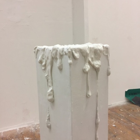
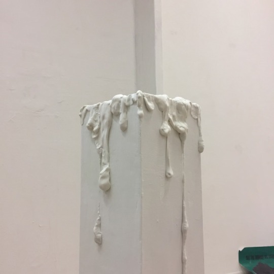
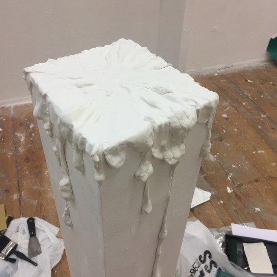
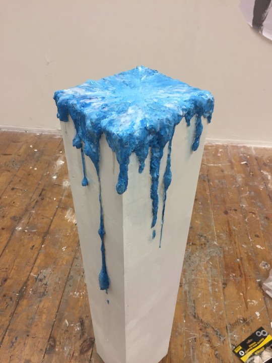
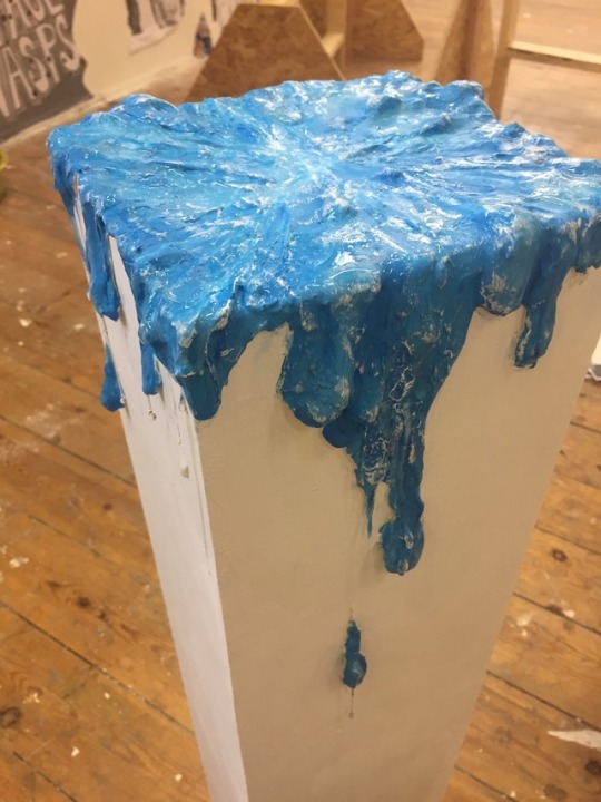
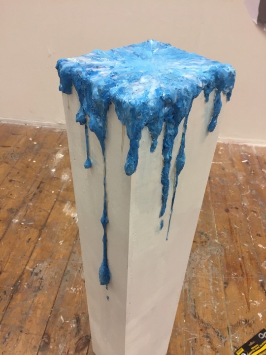
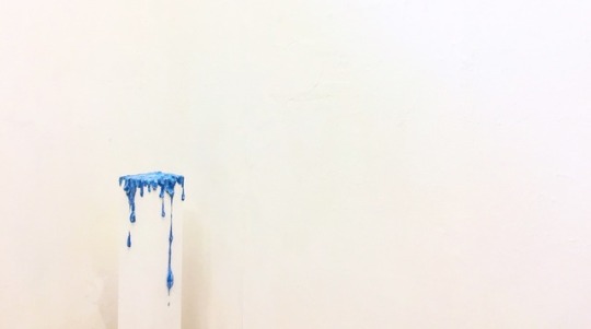
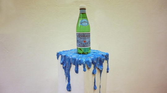
Plinth installation / Conceptual idea / Material interpretation and analysis
The conceptual originality of the plinth based on sparkling water advertising. I mainly aim at two points,
If my work contains advertising, then whether an AD needs a special gimmick as a commercial promotion?
If my work is considered a work of art at the same time, is it possible to design it more recognisable for a visually first impression?
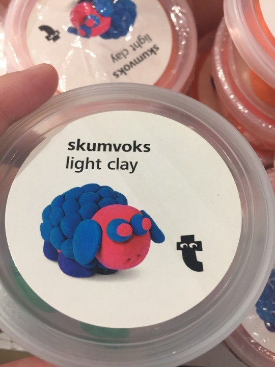
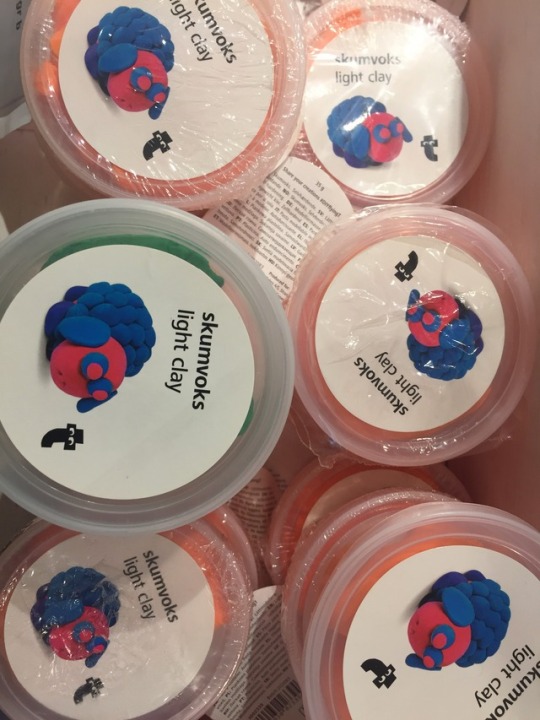
However, after a series of queries, I have got an inspiration via Piero Manzoni’s work. (Please refer to the following information: Artistic Reference/ theoretical support) The curious aspect regarding Artist's Shit is the excrement in the tin, but it's actually a poop sculpture made from plaster. So the decisive role is the material should be the major factor in the case of constructing a kind of water sculpture onto the plinth in my work. I've been thinking about what kind of material is able to design a workmanlike water sculpture as Piero made poop work. Finally, I have sought a sort of light clay that being able to quickly mold a shape of water droplets. The advantage of the light clay is quite soft and easily molding without affecting or damaging the plinth itself. (Please refer to the pictures above, which is the water sculpture workflow.) After the molding stage, I painted the effect of water drops onto the surface, and finally covered transparent glue on the outermost layer that achieved a visual effect of sparkling.
Artistic Reference/ theoretical support
Artist's Shit by Piero Manzoni. Contents of the cans One of Manzoni's friends, the artist Agostino Bonalumi, claimed that the tins are full not of faeces but plaster.[1] The cans are steel, and thus cannot be x-rayed or scanned to determine the contents, and opening a can would cause it to lose its value; thus, the true contents of Artist's Shit are unknown.[2]Bernard Bazile exhibited an opened can of Artist's Shit in 1989, titling it Opened can of Piero Manzoni. The can contained a smaller can, which Bazile did not open.[3]The piece received media coverage due to a lawsuit in the mid-1990s, when an art museum in Randers, Denmark was accused by art collector John Hunov of causing leakage of a can which had been on display at the museum in 1994. Allegedly, the museum had stored the can at irresponsibly warm temperatures. The lawsuit ended with the museum paying a DKK 250,000 kr. settlement to the collector.[4]
[1] Glancey, Jonathan (12 June 2007). "Merde d'artiste: not exactly what it says on the tin". The Guardian. Retrieved 2 May 2014.
[2] Clowes, Erika Katz (2008). The Anal Aesthetic: Regressive Narrative Strategies in Modernism (Ph.D. thesis). University of California, Berkeley. ISBN 9780549839651.
[3] Miller, John (1 May 2007). "Excremental Value". Tate Etc (10). Retrieved 2 May 2014.
[4] Christensen, Uffe (13 January 2010). "Museum sur over lorteudtalelse" [Museum angry about shit opinion]. Jyllands-Posten (in Danish). Archived from the original on 21 October 2013. Retrieved 2 May 2014.
workflow time-consumption : 2 weeks
0 notes
Photo
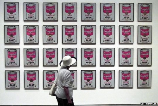
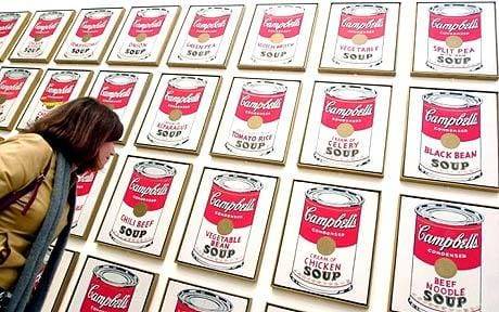
Performance reference/ Demonstration example / Installation example
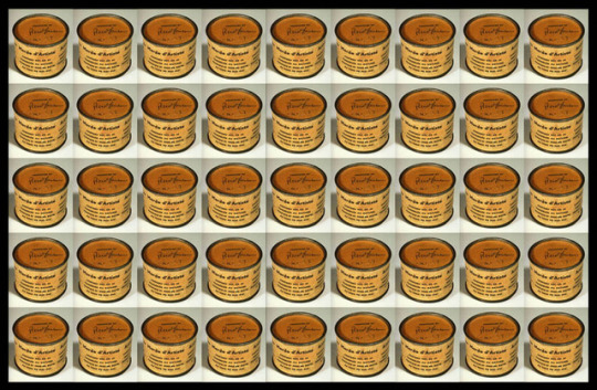
eg. Artist’s Shit
Artist: Piero Manzoni/ Period: Conceptual art/ Created: 1961/ Genre: Site-specific art
eg.100 Cans
Artist: Andy Warhol /Period: Pop art / Created: 1962/ Genre: Still life
Self-reflection: I’ve been thinking about how to present my work in a way which is appropriate.Visually and conceptually speaking, there are two art pieces in my work as reference objects which are Artist’s Shit by Piero Manzoni and 100 Cans by Andy Warhol. What I have to say there is a certain degree of similarity between the two works above. Yes, the emphasis is the similarity, according to the images I have collected above, such a neat layout gives me a sense of supermarket shelves. Fortunately, the visual hierarchy is exactly what I am looking for, and it nicely fits with my work (Sparkling water ads).
In general, sparkling water is sold as the commodity on supermarket shelves, I’d been considering to put 100 different labels on the bottle and arranging on the supermarket shelves, What kind of visual sensation it is? Fortunately, I found this visual sense in Andy Warhol’s 100 Cans installation.
There is a link below which presents why Andy Warhol’s Campbell’s Soup Cans could be regarded as an art piece and also an advertising. Therefore, I got some comments and opinions in the discussion of this video. Everyone is different and appreciating art piece within subjective perspective for making sense, I personally second some viewpoints in the video (eg. A piece of art depends on where the artwork placed.)
Why would I decide a sense of the supermarket shelves to visually present my work?
I had been thinking about how is a piece of art able to properly integrate art and design into an educational MA course. Is there a certain connection between a supermarket and an art gallery? I don’t think so, but what if supermarket shelves are installed in an art gallery? I lined up 100 bottles on a ads poster, visually causing a sense of supermarket shelves because I think advertising is a persuasive medium(Ken Burtenshaw, The Fundamentals of Creative Advertising, A&C Black, 2011,p.21). Advertising can be visible in supermarkets everywhere, but an excellent advertisement can also be regarded as a work of art if it’s located in the gallery. As previously mentioned in the video below, the value of a contemporary artwork depends on where the artwork placed.
youtube
Why is this art? Andy Warhol, Campbell’s Soup Cans | Art History | Khan Academy
0 notes
Text
Artist work Reference/ Creation Resource/Creative background
In May 1961, while he was living in Milan, Piero Manzoni produced ninety cans of Artist's Shit. Each was numbered on the lid 001 to 090. Tate's work is number 004. A label on each can, printed in Italian, English, French and German, identified the contents as '"Artist's Shit", contents 30gr net freshly preserved, produced and tinned in May 1961.' In December 1961 Manzoni wrote in a letter to the artist Ben Vautier: 'I should like all artists to sell their fingerprints, or else stage competitions to see who can draw the longest line or sell their shit in tins. The fingerprint is the only sign of the personality that can be accepted: if collectors want something intimate, really personal to the artist, there's the artist's own shit, that is really his.' (Letter reprinted in Battino and Palazzoli p.144.)
It is not known exactly how many cans of Artist's Shit were sold within Manzoni's lifetime, but a receipt dated 23 August 1962 certifies that Manzoni sold one to Alberto Lùcia for 30 grams of 18-carat gold (reproduced in Battino and Palazzoli p.154). Manzoni's decision to value his excrement on a par with the price of gold made clear reference to the tradition of the artist as alchemist already forged by Marcel Duchamp and Yves Klein among others. As the artist and critic Jon Thompson has written:
Manzoni's critical and metaphorical reification of the artist's body, its processes and products, pointed the way towards an understanding of the persona of the artist and the product of the artist's body as a consumable object. The Merda d'artista, the artist's shit, dried naturally and canned 'with no added preservatives', was the perfect metaphor for the bodied and disembodied nature of artistic labour: the work of art as fully incorporated raw material, and its violent expulsion as commodity. Manzoni understood the creative act as part of the cycle of consumption: as a constant reprocessing, packaging, marketing, consuming, reprocessing, packaging, ad infinitum. (Piero Manzoni, 1998, p.45)
Artist's Shit was made at a time when Manzoni was producing a variety of works involving the fetishisation and commodification of his own body substances. These included marking eggs with his thumbprints before eating them, and selling balloons filled with his own breath (see Tate T07589). Of these works, the cans of Artist's Shit have become the most notorious, in part because of a lingering uncertainty about whether they do indeed contain Manzoni's faeces. At times when Manzoni's reputation has seen the market value of these works increase, such uncertainties have imbued them with an additional level of irony.
Further Reading:
Germano Celant, Piero Manzoni, New York 1972
Freddy Battino and Luca Palazzoli, Piero Manzoni: Catalogue raisonné, Milan 1991, pp.123-8, 472-5, catalogue no. 1053/4, reproduced p.472
Piero Manzoni, exhibition catalogue, Serpentine Gallery, London 1998, reproduced pp.201-6 in colour
http://wunc.org/post/what-relationship-between-art-and-advertising#stream/0
(Relevant online information above)The relationship between art and advertising is usually portrayed as antagonistic, even exploitative. But then, fine art of the 20th Century has been closing the gap between art and advertising. ... And, of course, Andy Warhol's Campbell Soup paintings irrevocably changed the art and ad world.
0 notes
Link
the relevant information collection
youtube
National Museum Cardiff, Gallery 21
Bedwyr Williams uses multimedia, performance and text to explore the friction between ‘the deadly serious’ and ‘the banal’ aspects of modern life. Williams is known for satirizing the relationship between the artist and curator by creating absurd scenarios for them to appear in. More recently he has explored, through video, themes of dystopia and mankind’s significance in the universe. Williams is shortlisted for the Film London Jarman Award 2015 and represented Wales at the 55th Venice Biennale.
Video, in recent years, has become of particular interest after a decade working with spoken word performance. This new film work mixes media and involves collaboration using humour and bathos to explore issues and subjects including, our insignificance in the universe (The Starry Messenger, 2013) a hoarding dystopian future (ECHT, 2014) and buildings with odd angles (Hotel 70º, 2015).
His most recent work ,Century Egg, 2015, made during a residency with the Museums of Cambridge University, ponders the idea of preserving objects and the moment when ‘things’ become archived ‘things’. It will be presented at the British Art Show in 2015.
Recent and forthcoming solo shows include Whitworth, Manchester, UK; Visual Centre for Contemporary Art, Carlow, IR; g39, Cardiff, UK; Vestjyllands Kunstpavillion, DK (all 2015); Tramway, Glasgow, UK for Glasgow International; Oriel Mostyn, Llandudno,UK (2014); 55th Venice Biennale for Welsh Pavillion,Venice, IT, (2013); IKON, Birmingham, UK (2012); and Kunstverein Salzburger, Salzburg, AT (2011).
https://www.artangel.org.uk/project/break-down/
Artists have been known to destroy their own work and even to kill themselves, but usually it is in a fit of despair or rage. Landy's art is quintessentially modern because it is so ruthlessly efficient, so mechanised. This work took him two years to organise. At first glance the scene inside C&A looks like a factory hard at work making things. Only up close do you see that a process of destruction is taking place which is as complex as the process of creation. – Richard Dorment, The Daily Telegraph, 14 February 2001.
Break Down, Landy's strongest work to date, embodied more than a social commentary on shopping. His gesture of publicly stripping himself of his worldly goods had a spiritual dimension. He behaved as a shaman might, enacting a purge for communal ends. – Judith E. Stein, Art in America, June 2001.
Break Down was a real event, the first Brit Art gesture I have seen that transcended the new-establishment, new-elite, bad-boy banalities of Landy's contemporaries. He's a thinker, and a tough-minded one at that. Is it art? I don't know, but for once, thanks to the carefully reasoned rigour and impersonality of the project, I think so. – Bryan Appleyard, The Sunday Times, 11 March 2001.
youtube
History Of The Poster: A short history of the advertising poster, which reached it's peak in Paris at the Turn of the Century. This unique hand drawn animation was created by Yaneff Design. A simple understanding.
youtube
History Of Poster Design
youtube
Art in Advertising
Research/
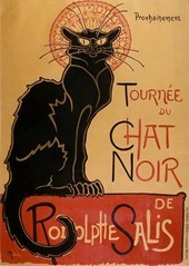
One of several posters of Le Chat Noir Cabaret in Paris by Theophile Steinlen (1896). History of Poster Art (c.1860-1980)
Contents
• Jules Cheret
• France's Belle Epoque
• Art Nouveau
• Paris in the 1900s
• Poster Art in Europe (c.1880-1910)
• The Inter-War Years: Art Deco
• After World War II
• "Art Posters" - Reproductions of Famous Paintings
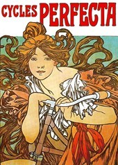
Colour Poster for Perfecta Bicycles
(1902) By Alphonse Mucha.
Jules Cheret
The evolution and development of poster art has always been closely linked to technical advances in printmaking, notably lithography. Thus although the lithographic process was invented by Alois Senefelder (1771-1834) as far back as 1798, it had little impact on posters until the advent of chromolithography later in the 19th century. Even then, it wasn't until Jules Cheret (1836-1932) invented his convenient "three stone lithographic process" in the 1860s - allowing lithographers to produce a wide spectrum of colours from just three stones - that low-cost colour posters at last became a reality.
Known as the "father of the fine art poster", Cheret not only developed a cheaper colour lithographic process, with richer more expressive colours, he also enhanced the aesthetic nature of the poster, endowed it with graceful designs (some influenced by Ukiyo-e woodblock prints from Japan, by artists like Hokusai and the younger Hiroshige) and transformed it into an independent work of art. Furthermore, he encouraged other painters to explore the genre: he later published his special book Maîtres de l'Affiche (Masters of the Poster), to promote the best designers. He also introduced the feminine form into his designs, for extra viewer-appeal. His female subjects became so popular that Parisians dubbed them Cherettes. In total, Cheret produced more than 1,000 posters, beginning with his 1867 advertisement for Sarah Bernardt's performance as Princess Desiree in the comedy La Biche au Bois. Honoured in 1928 with the opening of the Cheret Museum in Nice, Jules Cheret's posters, are some of the most highly sought-after items from the late 19th century.
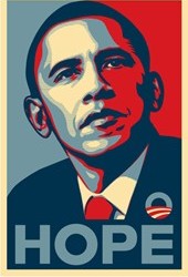
The Barack Obama "Hope Poster"
Designed c.2007 by Shepard Fairey.
France's Belle Epoque
By 1880, Cheret's new poster art form was attracting a number of other top designers such as Theophile Steinlen (1859-1923) responsible for the immortal poster "Cabaret Du Chat Noir", the great Toulouse-Lautrec(1864-1901) creator of numerous theatrical masterpieces, Pierre Bonnard(1867-1947), Edouard Vuillard (1868-1940). Their chosen subject matter featured Parisian night life, notably the theatres, music halls and cabarets of the city. The growing popularity of poster art led to the hosting of a major exhibition in 1884. The poster craze peaked during the decade of the 1890s. Poster artists were transforming Parisian streets into colourful art galleries, attaining cult status in the process, and causing theatre stars to insist on choosing their own favorite artist to do the poster for their show. More poster exhibitions were held, while publishers produced extra copies of the best posters to satisfy collectors. See also: Post-Impressionist Painting (c.1880-1905).
Famous Posters by Toulouse-Lautrec
- Moulin Rouge - La Goulue (1891)
- Ambassadeurs - Aristide Bruant (1892)
- La Reine de Joie (1892)
- Avril (Jane Avril) (1893)
- May Belfort (1895)
- Jane Avril (1899)
Art Nouveau
Interest in the poster was further enhanced in the 1890s by the emergence of Art Nouveau, a decorative style of art marked by flowing, curvilinear shapes, and drawing inspiration from Byzantine icons, Pre-Raphaelite romanticism and the Celtic Art Revival movement. Largely reliant upon form, line and colour, Art Nouveau proved the ideal poster design, and dominated the Parisian poster scene up until the late 1900s. Along the way it attracted a host of artists, including: Alphonse Mucha (1860-1939), Georges de Feure, Eugene Grasset (1845-1917) and Albert Guillaume (1873-1942). One of the first Art Nouveau masterpieces was the 1894 Sarah Bernhardt poster by Alphonse Mucha, the acknowledged master of the style. In 1896, the largest and most significant poster show to date, was held in Reims, with a display of 1,700 posters from all over Europe.
Famous Posters by Alphonse Mucha
- Hippodrome, Leona Dare, 1883
- Arlette Dorgere, 1890
- Moulin Rouge, Paris, Cancan, 1890
- Yvette Guilbert, 1891
- L'Etendard Francais, Bicycles, 1891
- Casino de Paris, Camille Stefani, 1891
- Folies Bergeres, Fleur de Lotus, 1893
- Sarah Bernhardt as Gismonda, 1894
- Vin Mariani, 1894
- Aperitif Mugnier, Dijon, 1894
- Quinquina Dubonnet, 1895
- Bieres de la Meuse, 1897
- Job Cigarette papers, 1898
- Benedictine, 1898
- Moet & Chandon, 1899
Note: the Art Nouveau style had an important influence on the various secession movements in Germany and Austria, including the Munich Secession (1892), the Berlin Secession (1898) and the Vienna Secession(1897).
Paris in the 1900s
Several events led to a decline in the Parisian poster scene during the 1900s. In 1900, Cheret abandoned poster art to concentrate on painting. In 1901, Toulouse Lautrec died. In 1904, Alphonse Mucha left Paris for America and then Czechoslovakia. And from 1905 onwards, Art Nouveau gradually lost its creative edge. Then, into this vacuum stepped a young Italian artist called Leonetto Cappiello (1875-1942), who focused on simplicity and impact. He appreciated the overriding need to create instant visual impact, as exemplified by his 1906 poster designs for Maurin Quina absinthe, and in so doing established a reputation as the father of modern advertising. Meantime, French poster art was further enriched by the arrival in Paris of Sergei Diaghilev(1872-1929) and the Ballets Russes, as well as the colourism and imagery of the revolutionary painting movements known as Fauvism (1905-6), and Cubism (1908-12).
Poster Art in Europe (c.1880-1910)
The poster craze spread rapidly to most of the main cities of Europe. Exhibitions of poster designs were staged in Britain (1894) and Italy (1894), Germany (1896), Switzerland (1896) and Russia (1897), and national styles soon established themselves: Dutch and Swiss posters tended to be neat, precise but restrained; German works were direct but lapsed into medieval gothic romanticism; Italian works were typically bold and melodramatic; while Russian posters were altogether more avant-garde.
Move Away From Art Nouveau
From 1905, there was a European-wide modernist trend to move away from the fussy decoration of Art Nouveau towards a simpler more function style. More and more poster artists switched from curvilinear shapes to rectilinear and geometric imagery, in order to sharpen the advertising message.
British Poster Art
During the mid 1890s most British designers, including Aubrey Beardsley, Will Owne, Dudley Hardy, and Walter Crane, tended to be heavily influenced by French Art Nouveau. Two of the first to free themselves were the "Beggarstaff Brothers" James Pryde and William Nicholson, who focused on far more simple types of design. Other UK post artists, some of whom specialized in producing works for the London Underground rail system, included Austin Cooper, Fred Taylor, Tom Purvis, Pat Keely and the American-born McKnight Kauffer.
Posters in Germany
German poster design was strongly influenced by Ludwig Hohlwein. Good at eliminating all non-essential graphics, he was noted for his use of shadow versus light, as well as his portrayals of people and animals. Other German post artists included Paul Schuerich, H.R.Erdt and the great abstractionist Lucian Bernhard.
It was Bernhard who initiated the German Plakatstil, or Poster Style. This style was characterized by extreme simplicity, represented by clean lines, minimal naturalism, flat colors and precise structure, as exemplified by his Sachplakat Poster (1906) for Preister matches. This Sachplakat (in English, "object poster") was to become a whole new genre of poster advertising.
Austrian Poster Art
One of Austria's best known poster designers was the Vienna-born Joseph Binder, noted for his geometrical, montage-type colour patterns. Others include the Viennese abstract artist Sascha Maurer, whose famous ski-posters also included elements of realism, as well as the Alfred Roller and Koloman Moser.
Swiss Poster Art
Positioned in the centre of Europe and speaking three national languages, Switzerland absorbed a great deal from its neighbours France, Germany and Italy. Leading Swiss Art Nouveau designers included Theophile Steinlen(1859-1923) and Eugene Grasset (1845-1917), both of whom were active at first in France, as well as Mangold, Emil Cardinaux, Baumberger, Stoecklin and Morach. If Italian poster art grew out of opera, Swiss posters depended on the country's status as a skiing destination.
Italian Poster Art
In Italy, posters were initially developed to promote the opera, under the German Art Nouveau artist, Adolfo Hohenstein (1854-1928). Although influenced by the French master Jules Cheret, Hohenstein became known for his luscious colour combinations and dramatic design - often executed in monumental-size works - features which would soon come to characterize the Italian national style. Examples of Hohenstein's posters include his designs for: Tosca by Puccini (1896), and the dramatic Madame Butterfly (1904).
Another leading Italian designer was Hohenstein's top pupil Leopoldo Metlicovitz (1868-1944). He was noted for his allegorical works, as exemplified by his award-winning design for the 1906 International Exposition. Metlicovitz's best pupil was Marcello Dudovich (1878-1962), who - partly under the influence of Franz Laskoff (1869-1918) - streamlined Art Nouveau (known in Italy as Stile Liberty) into a more modern style. Other noteworthy Italian poster artists included: Giovanni Mataloni, Marcello Dudovich, Aleardo Villa, Leopoldo Metlicovitz, Achille Mauzan, and Aleardo Terzi.
Lastly, one should not forget the peerless Leonetto Cappiello (1875-1942) (see above), who was active mainly in Paris and who eventually produced over 1,000 posters during a career spanning 40 years.
American Poster Art
The leading American poster designers were William Bradley and Edward Penfield. Others included, C.E. Millard, F.G. Cooper, C.B. Falls, H.M. Meyers, Harrison Fisher and Adolph Treidler. Edward Penfield, the pioneer of poster art in America, was actually more famous for his illustration and advertising placards for Harper's New Monthly Magazine. Cutting his teeth on ink and watercolour wash illustrations, Penfield went on to produce a large number of high quality fine art poster designs, notable for their abstract style and boldly simplified shapes. Unlike the already established artist Edward Penfield, William H. Bradley - known as the "American Beardsley" - made his reputation from poster design. Famous for producing The Twins (1894), the first American Art Nouveau poster, Bradley's style blended features of the Arts and Crafts Movement, Japanese block printing and Art Nouveau. Another American who contributed significantly to poster art and illustration was Norman Rockwell. Poster art with a social message was later exploited by Ben Shahn and other members of the Social Realism movement (c.1930-45) in America during the Depression era.
Poster Art During the Inter-War Years: Art Deco
After World War I, Art Nouveau was seen as old-fashioned and irrelevant when compared to the new modernist God of Science and the dynamism of the Machine. This new technological reality was better represented by modern art movements such as Cubism, Futurism, Expressionism and others. The first flowering of this new poster style was the Soviet Constructivism movement, inspired by Kasimir Malevich's avant-garde Suprematism movement, and led by Vladimir Tatlin, Alexander Rodchenko, and El Lissitsky. Ironically, it had more influence on Western design, through its impact on the Bauhaus and the De Stijl movement, than on posters in the USSR, which would soon be forced to adapt to Socialist Realism.
In Italy, Marinetti's Futurism seemed to be the dominant style until in the early 1920s, in the hands of Futurists Nicolay Diulgheroff, Lucio Venna and Fortunato Depero, it became too aggressive and was superceded by the quieter and more nostalgic Novecento style. Artists associated with this style included Campigli, Marcello Nizzoli and Mario Sironi, as well as Boccasile, Dudovich, and Riccobaldi.
More important than Constructivism, Futurism or Novecento was a new international style known as Art Deco. Showcased at the "Decorative Arts" Exposition of 1925 in Paris, and exactly in tune with the technological criteria of power and speed, Art Deco was marked by sleek geometrical forms, and strong, even garish, colours. The movement drew inspiration from many sources including Cubism, Futurism, Plakatstil, and even Constructivism. Exponents of Art Deco poster design include the Frenchman Adolphe Mouron Cassandre, noted for his sleek ocean liner posters, the German Ludwig Hohlwein, and the Swiss designers Otto Morach and Herbert Matter.
Art Deco dovetailed perfectly with the Italian love of dynamism and drama. Cappiello and Dudovich were both leading exponents, as was Federico Seneca (1891-1976) and Severo Pozzati (1895-1983). Progress was further stimulated by Fiat and Campari, the country's largest advertisers. Among Fiat's team of poster artists were Riccobaldi, Codognato, Dudovich, Metlicovitz, Sironi, and the great Giorgio De Chirico, while Campari relied on Hohenstein, Mauzan, Sacchetti, Laskoff, Nizzoli, Sinopico, Depero and Munari. Other directions were pursued by the Bauhaus-artist Xanti Schawinsky, and Marcello Nizzoli.
NOTE: During the 1930s and early 40s, the Nazis made full use of poster art in their vicious anti-semitic campaigns, a tactic exemplified by the poster artist Hans Schweitzer (1901-80) (better known as Mjolnir). An infamous example of Schweitzer's Nazi artwas the 1940 poster promoting the anti-Semitic film, "The Eternal Jew".
Swiss Designs
In the years following World War I, Switzerland developed a clear edge in graphic design, based on their mastery of technical and creative principles from Constructivism, the Dutch De Stijl movement led by Theo van Doesburg (1883-1931), and the Bauhaus Design School. An important figure inside the Swiss poster scene was Ernst Keller, who taught at the Zurich Design School where he nurtured the young group of designers who would later invent the world-famous International Typographic Style. Other leading teachers included the artists Jan Tschichold and Theo Ballmer. Other key factors which have contributed to Swiss excellence in this area, include a formidable printing industry and a willingness by the State and Cantonal authorities to invest in the necessary resources.
The Object Poster (Sachplakat)
First introduced by Lucian Bernhard (1906) the Object Poster (Sachplakat) style of minimalism was taken to a new level by Swiss designers. Examples include Otto Baumberger's 1923 textless poster for PKZ, and Peter Birkhauser's 1934 button poster also for PKZ. Meanwhile Swiss poster artists such as Herbert Matter and alter Herdeg demonstrated their advanced techniques in graphic design and photography with a series of Swiss travel posters.
Poster Art After World War II
Demise of the Object Poster
While the Sachplakat was still the No 1 style for Swiss product posters in the 1940s, thanks largely to the efforts of Basel designer-lithographers Stoecklin, Leupin, Birckhauser, and Brun, the 1950s witnessed the replacement of lithographic printing by cheaper offset printing. Other changes were also unavoidable. During the late 1940s and early 1950s, travel posters were increasingly replaced by photographs. Fortunately, Swiss graphic artists were making rapid strides in other areas. In particular, during the following decade, they launched a uniform, minimalist style known as The International Typographic Style because of its dependence on typographic elements, such as layout grids, sans serif typefaces, and black and white photography. Developed at the Basel Design School under Armin Hofmann and Emil Ruder, and at the Zurich Design School under Joseph Muller-Brockmann, all of whom had trained under Keller in Zurich school, the style was ideally suited to the postwar multi-lingual global marketplace, and by the 1970s, it had become the foremost graphic style in the world. However, for commercial reasons explained below, its application in the field of poster art was strictly limited.
Decline in Poster Advertising
After World War II, advertising-posters everywhere declined in importance as the market was effectively taken over by photography, radio and later television. In addition, labour-intensive lithography was also becoming prohibitively expensive, causing advertisers to switch to cheaper but less colourful methods like offset printing and screenprinting. As a result, by the 1960s - despite exceptional campaigns by post artists Bernard Villemot and Raymond Savignac - the poster was no more than a minor genre. Designers who might previously have been attracted to posters were now moving into illustration and other graphic designwork.
Poster Art in the 1960s and 1970s
In Italy, a series of spectacular images were produced for the national film industry, by Alfredo Capitani, Luigi Martinati, Anselmo Ballester and Ercole Brini. Another great Italian poster designer of the 1950s/1960s was Armando Testa.
In addition, there was a sudden surge in Psychedelic rock posters, originated by Wes Wilson. They appeared in the late 1960s, together with other popular music graphics like Milton Glaser's poster for Bob Dylan's 1967 'Greatest Hits' album. Widespread in San Francisco and New York, the music poster movement expanded into marketing and point-of-sale with free album-posters, as well as promotional concert posters. The craze for this sort of graphic artmirrored the demand for vintage posters in Paris during the late 19th century.
Note: an iconic poster dating from the 1968 student riots in Europe, and still popular today, was the silhouette style image of the Marxist revolutionary Che Guevara by the American artist Jim Fitzpatrick.
"Art Posters" - Reproductions of Famous Paintings
If original advertising posters have lost their appeal for commercial companies, the "art poster", replicating a famous work of art like The Mona Lisa, remains a popular item for consumers - especially during recessionary times. Today, it is possible to buy a reproduction of almost any major painting by any important painter from the Italian Renaissance to the Postmodernist era. Online poster publishers typically stock a wide selection of the most popular works.
Designer research: BREWERY LABEL ARTIST/ Sean Dominguez is a surfer and artist, for the past 13 years, he’s been a faithful devotee of The Lost Abbey.At this San Marcos brewery, the 49-year-old artist creates labels with images drawn from Bible stories and the history of Christianity.
http://allaboutbeer.com/lost-abbey-labels/
http://lostabbey.com/people/sean-dominguez/
http://www.thebeercircle.com/lost-abbey-label-artwork/
http://www.pacificsandiego.com/food-drink/beer-breweries/art-beer-label/
0 notes
Text
Explanation of Artists selection/ Artists sponsorship list
My work involves 100 artists from different countries over the world (less than 100 countries). Due to my work contains commercialisation and globalisation of consumption of art pieces, and my work is presenting sparkling water advertising, in terms of ads, sponsorship is an essential part of commercial advertising, so the 100 artists merely in the form of sponsorship existing in my work.
Why did I select these artists?
The 100 artists are from Asia, Africa, Europe, and America etc. They are the most representative and well-known top artists in their regions. A large number of artists are concentrated in Europe and America, why? If a value is judged by prices, the works of top artists must be regarded as the highest priced art piece. In the context of the commercialisation and globalisation of artwork, Europe and America artworks are the most expensive and most frequently visited compared to other countries.
The most expensive paintings in the world/Relevant information research and analysis
The earliest sale on the list (Vase with Fifteen Sunflowers by Vincent van Gogh) is from 1987, and more than tripled the previous record price, set only two years before, introducing a new era in top picture prices. The sale was also significant in that for the first time a "modern" painting (in this case from 1888) became the record holder, as opposed to the old master paintings which had always previously held it. The current record price is approximately $300 million paid for Willem de Kooning's Interchange in November 2015.
https://www.whudat.de/top-20-most-expensive-paintings-in-the-world/
https://en.wikipedia.org/wiki/List_of_most_expensive_paintings
https://theculturetrip.com/europe/france/articles/the-13-most-expensive-artworks-ever-sold/
GIOTTO DI BONDONE
LEONARDO DA VINCI
PAUL CÉZANNE
JEAN-AUGUSTE-DOMINIQUE INGRES
Maria Magdalena
Yayoi Kusama
REMBRANDT VAN RIJN
DIEGO VELÁZQUEZ
WASSILY KANDINSKY
CLAUDE MONET
CARAVAGGIO
JOSEPH MALLORD WILLIAM TURNER
JAN VAN EYCK
ALBRECHT DÜRER
JACKSON POLLOCK
Zhang Daqian /Chang Dai-chien
MICHELANGELO BUONARROTI
PAUL GAUGUIN
FRANCISCO DE GOYA
VINCENT VAN GOGH
ÉDOUARD MANET
MARK ROTHKO
HENRI MATISSE
RAPHAEL
JEAN-MICHEL BASQUIAT
EDVARD MUNCH
TITIAN
PIET MONDRIAN
PIERO DELLA FRANCESCA
PETER PAUL RUBENS
ANDY WARHOL
JOAN MIRÓ
TOMMASO MASACCIO
MARC CHAGALL
GUSTAVE COURBET
Laubser/, known as Maggie Laubser
NICOLAS POUSSIN
WILLEM DE KOONING
PAUL KLEE
FRANCIS BACON
GUSTAV KLIMT
EUGÈNE DELACROIX
PAOLO UCCELLO
WILLIAM BLAKE
KAZIMIR MALEVICH
ANDREA MANTEGNA
JAN VERMEER
EL GRECO
CASPAR DAVID FRIEDRICH
WINSLOW HOMER
MARCEL DUCHAMP
GIORGIONE
FRIDA KAHLO
HANS HOLBEIN THE YOUNGER
EDGAR DEGAS
FRA ANGELICO
GEORGES SEURAT
JEAN-ANTOINE WATTEAU
SALVADOR DALÍ
MAX ERNST
TINTORETTO
JASPER JOHNS
SANDRO BOTTICELLI
DAVID HOCKNEY
UMBERTO BOCCIONI
JOACHIM PATINIR
DUCCIO DA BUONINSEGNA
ROGER VAN DER WEYDEN
JOHN CONSTABLE
JACQUES-LOUIS DAVID
ARSHILLE GORKY
HIERONYMUS BOSCH
PIETER BRUEGEL THE ELDER
SIMONE MARTINI
Frederic Edwin Church
EDWARD HOPPER
LUCIO FONTANA
FRANZ MARC
PIERRE-AUGUSTE RENOIR
JAMES MCNEILL WHISTLER
THEODORE GÉRICAULT
WILLIAM HOGARTH
CAMILLE COROT
GEORGES BRAQUE
HANS MEMLING
GERHARD RICHTER
AMEDEO MODIGLIANI
GEORGES DE LA TOUR
GENTILESCHI, ARTEMISIA
JEAN FRANÇOIS MILLET
FRANCISCO DE ZURBARÁN
CIMABUE
JAMES ENSOR
RENÉ MAGRITTE
EL LISSITZKY
EGON SCHIELE
DANTE GABRIEL ROSSETTI
FRANS HALS
CLAUDE LORRAIN
ROY LICHTENSTEIN
GEORGIA O'KEEFE
GUSTAVE MOREAU
GIORGIO DE CHIRICO
FERNAND LÉGER
Related information/video collection
youtube
In this video above contains the following questions:
• Which is the most expensive painting in the world?
• How much is the most expensive painting in the world?
• How much is the most expensive Picasso painting?
• How much is the most expensive expressionist painting?
• What's the top 10 most expensive paintings in the world?
• What's the top 10 most expensive art in the world?
• What is the most expensive piece of art in the world?
• Is the Mona Lisa the most valuable painting?
• How much is a Picasso painting worth?
• How much is a Van Gogh painting worth?
• How much is a Jackson Pollock painting worth?
• How much is a da Vinci painting worth?
• How much is a Gauguin painting worth?
• How much is a Rembrandt painting worth?
• How much is a Rothko painting worth?
• How much is a Cézanne painting worth?
youtube
The selling price does not determine value; the selling price is a battle between expensive collectors. In 1960, David Rockefeller paid less than $10,000 dollars for the "White Center" painting. Half a century later it was worth more than 72 million! So the artist only got $10,000? Doesn't seem fair to the artist. This simply shows that nearly anything only has the value that we put on it as a civilization.Diamonds are a perfect example of this. It is a myth that diamonds are rare but people still pay absurd prices for them. Art is even more subjective where prices are concerned and the prices are absurdly inflated. I love art but no painting is worth the prices asked. And other than the wealthy people who purchase art in order to exhibit it, as a public service, what good is it to anyone hanging in a home? But even now when prices are inflated beyond belief People spend ridiculous amounts on something that could easily lose value overnight.I would love to own a Van Gogh or an original Vermeer but would not pay the prices asked even if I had the money to do so unless they could be lost to our culture if I did not. I like that part...."if you say how much money is it worth“? then it’s not about the art anymore. Some artist or more have not even lived and were nowhere to be seen unless a huge price was put on their art and all of a sudden media and publicly recognized their art. It’s a harsh reality that many artists do not end up getting acknowledged for their efforts during their life & now art is considered an investment to make money. I feel artist always painted with passion in old days and now a price tag makes them work harder at it just to sell and the passion dies out as the society wants the most expensive art to be shown.
youtube
Arts.21 | When Is Design Art,and When Is Art Design?
Artists design everyday items and galleries sell furniture and the lines between art and design become increasingly blurry. Meanwhile,some design is being handled as art,and is priced accordingly. In Dusseldorf,the exhibition U.F.O.
Art principle is "critical message". Now, it stops in one moment when we face in museum or movie. The next step must be items designed for reminding messages in daily life every time they use, I think.
youtube
10 Most Expensive Paintings Ever Sold
List:
10. Three Studies of Lucian Freud – $145 million
9. Portrait of Dr. Gachet – $152 millio
8. Portrait of Adele Bloch-Bauer I – $158.4 million
7. Le Rêve – $158.5 million
6. Woman III – $162.4 million
5. No. 5, 1948 – $165.4 million
4. Women of Algiers – $179.3 million
3. No. 6 (Violet, Green and Red) – $186 million
2. The Card Players – $274 million
1. When Will You Marry? – $300 million
youtube
The World's Most Expensive Stolen Paintings - Documentary
Art drives fanaticism, money drives crime.
0 notes
Photo
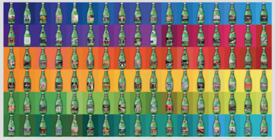
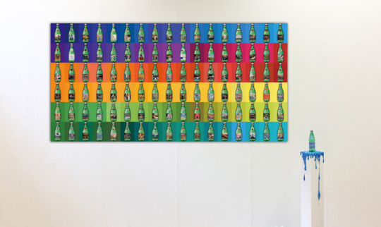
DAY 101
size: 2527mm*1262mm outdoor billboard poster
Water is the same and bottle is the same but art is constantly changing.
My work is about the Label advertising of sparkling water, presenting the commercialisation and globalisation of art piece. The concept is regarding one of well-known company San Pellegrino sparkling water as a representative label product combines with the works of representative 100 artists who were respectively selected by 100 different countries worldwide, resulting in 100 label ads. In the commercialised circumstance nowadays, these 100 art pieces merely in the form of advertising sponsorship exist in my commercial label ads work, thus lead to thinking about whether the consumption of art piece and commercial goods have different approaches but equally satisfactory results and wonderful.
Artist reference: Artist's Shit / Piero Manzoni
Artist's Shit (Italian: Merda d'artista) is a 1961 artwork by the Italian artist Piero Manzoni. The work consists of 90 tin cans, each filled with 30 grams (1.1 oz) of faeces, and measuring 4.8 by 6.5 centimetres (1.9 in × 2.6 in), with a label in Italian, English, French, and German stating:
Artist's Shit Contents 30 gr net Freshly preserved Produced and tinned in May 1961
0 notes
Photo

Day 100
PABLO PICASSO (1881-1973) – Picasso is to Art History a giant earthquake with eternal aftermaths. With the possible exception of Michelangelo (who focused his greatest efforts in sculpture and architecture), no other artist had such ambitions at the time of placing his oeuvre in the history of art. Picasso created the avant-garde. Picasso destroyed the avant-garde. He looked back at the masters and surpassed them all. He faced the whole history of art and single-handedly redefined the tortuous relationship between work and spectator.
Pablo Picasso, 1901, Old Woman (Woman with Gloves), oil on cardboard, 67 × 52.1 cm, Philadelphia Museum of Art
0 notes
Photo
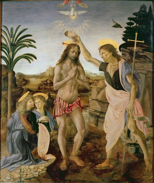
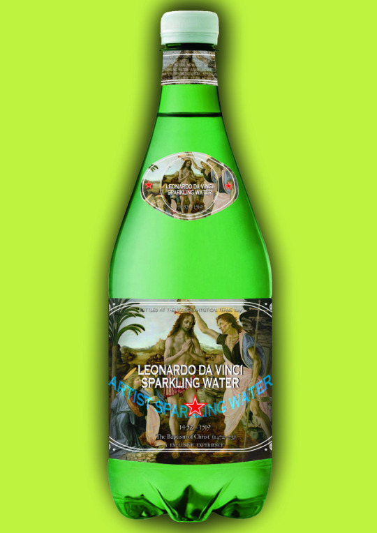
Day 99
LEONARDO DA VINCI (1452-1519) – For better or for worse, Leonardo will be forever known as the author of the most famous painting of all time, the "Gioconda" or "Mona Lisa". But he is more, much more. His humanist, almost scientific gaze, entered the art of the quattrocento and revoluted it with his sfumetto that nobody was ever able to imitate.
The Baptism of Christ (1472–75), Uffizi, by Verrocchio and Leonardo
0 notes
Photo
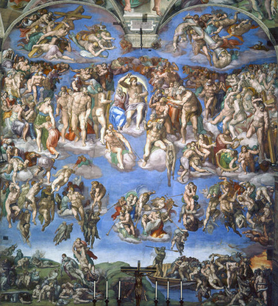
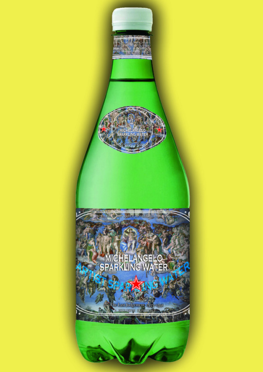
Day 98
MICHELANGELO BUONARROTI (1475-1564) – Some readers will be quite surprised to see the man who is, along with Picasso, the greatest artistic genius of all time, out of the "top ten" of this list, but the fact is that even Michelangelo defined himself as "sculptor", and even his painted masterpiece (the frescoes in the Sistine Chapel) are often defined as 'painted sculptures'. Nevertheless, that unforgettable masterpiece is enough to guarantee him a place of honor in the history of painting.
The Last Judgement (1534–41)
0 notes
Photo
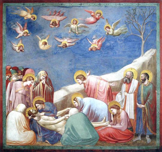
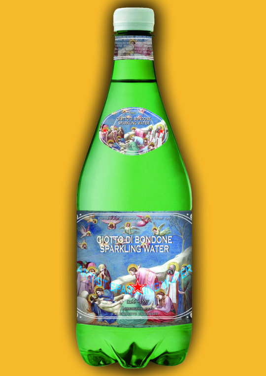
Day 97
GIOTTO DI BONDONE (c.1267-1337) – It has been said that Giotto was the first real painter, like Adam was the first man. We agree with the first part. Giotto continued the Byzantine style of Cimabue and other predecessors, but he earned the right to be included in gold letters in the history of painting when he added a quality unknown to date: emotion.
Lamentation (The Mourning of Christ), Cappella degli Scrovegni
0 notes
Photo

Day 96
PAUL CÉZANNE (1839-1906) – "Cezanne is the father of us all." This famous quote has been attributed to both Picasso and Matisse, and certainly it does not matter who actually said it, because in either case would be appropriate. While he exhibited with the Impressionist painters, Cézanne left behind the whole group and developed a style of painting never seen so far, which opened the door for the arrival of Cubism and the rest of the vanguards of the twentieth century.
Les joueurs de cartes (The Card Players), 1892–95, oil on canvas, 60 x 73 cm, Courtauld Institute of Art, London
0 notes