Last Seen Blogs

plantinghyacinths
planting hyacinths

randomfusilier2
is-not is not is-not-is

saikrishna1998
saikrishna

amystiago
buzz buzz, bitch

symphenix
Symphenix-Cantabile
Text
Dada
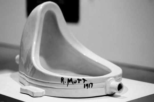
the fountain (1917)
Dada was formed 1916 during ww1 in a nightclub in Zurich in reaction to war and its atrocities. Art, spoken poetry and performances by the dada artists could often be satirical and seen as nonsensical in nature but some artists took a more direct approach in confronting societal issues. It seemed to pose the question mostly though of: Can anything be art?
It started with anti war and turned into anti establishment, anti Bougeoius, anti materialism. It was a state of mind.
Jean arp put it this way:
Dada is for the senseless which does not mean nonsense.
Dada is senseless like nature.
Dada is for nature and against art.
So it seems to be a sort of philosophical state of questioning boundaries in the world and in particular, the world of art.
Even the world itself dada is open to interpretation and can pretty much mean whatever you think to make it mean. It can mean everything or nothing. The cabaret voltaire where the movement was formed was a hotspot for all forms of dada art including performance. Many dada poems were filled with random made up words.
After the war dada spread internationally and the Berlin group that included Hannah hoc an Rahul Haussmann were the most openly political of the groups.
It was by dada artists that it is recognised emerged some of the first photomontage pieces of art.
These were often political and with artists like Hannah hoc she made a kind of feminist art with a focus on what society thought the new woman should look like in times were technologies were advancing in the 1920s and onwards.
The New York dada group had one artist that is well remembered for his work in the movement: Marcel Duchamp.
He was the creator of the widely known historical piece “The Fountain” which consisted of a urinal. The point was to push the boundaries on what could be considered art’ Could an arist declare anything art and that would make it so? It seems so considering to this day this is one of the most recognised art pieces of the 1900s.
The focus was shifted to the artistic idea having more importance than the object itself that was simply changed from its original context and displayed. This became pivotal in the modern and post modern art movements that came afterwards.
He done this with many other objects and these became known as his “readymades”.
Dada dissolved in the 20s with artists branching out into new movements such as surrealism, which dadaism layer the groundwork for.
0 notes
Text
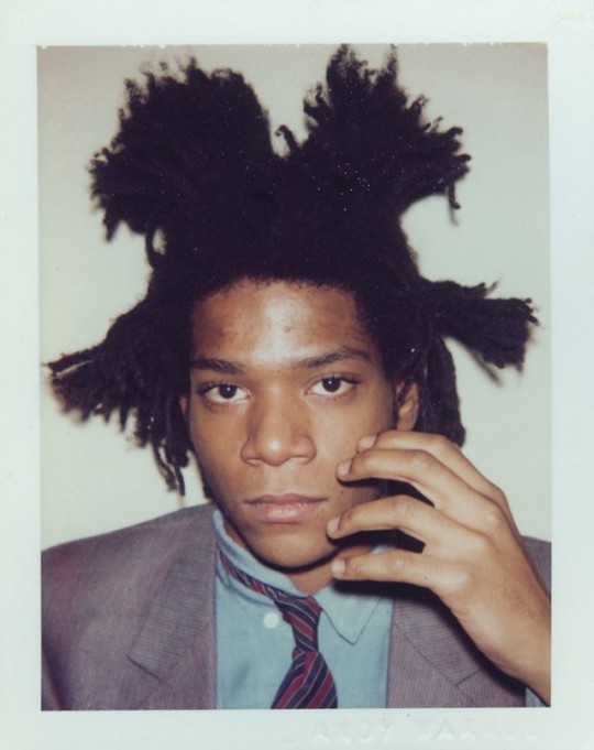
Works of Jean-Michel Basquiat
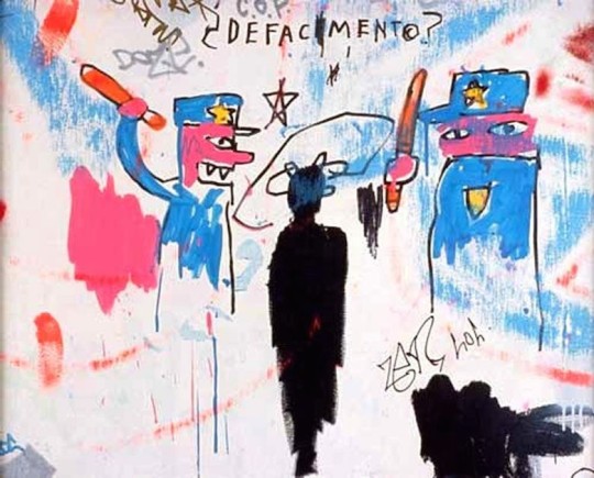
Defacement (1983)
This painting was a reaction to the death of Basquiat’s Artist friend Michael Stewart. Stewart was a Brooklyn based artist attending Pratt. He was arrested for grafting in a NY subway station in September 1983. But this was not a typical arrest, it was and incident of police brutality and Stewart was beaten and choked by half a dozen officers and ended up hospitalised with his injuries. He died after being in a coma for 13 days after the incident occured. The artist was dating Basquiat’s ex girlfriend at the time and because he was personally connected with this fellow artist, his violent and brutal death affected Basquiat. The painting had been made on the wall of Keith harring’s studio and seemed to take inspiration from a protest poster by David Wojnarowicz that was made in light of the incident calling for a protest against the transit police over what happened to Stewart.
In Basquiat’s painting, Michael Stewart is depicted at the centre as a black human figure with black paint, with no detail in the face. The only detail that is given are bums on the head with a spiral and star circling the head and in cartoon animations these were things that they would draw to show head injury.
The marks that make up his figure appear to be made quickly and gesturally with another black mark next to his body that may represent his blood or injuries. The lack of detail is symbollic because it dehumanises Stewart. He is just a black figure, and this may be a comment on the fact that through the eyes of the racist murdering police all they see is this black figure, with no attempt to humanise him in anyway.
He used bright pink to depict the white skin of the police. The left police officer has been painted with pointed teeth making him appear monstrous. The police officer on the left has his mouth open in a grin like state which may be a comment on the lack of remorse in this. Act of brutality and points to the fact that the violence is bringing him pleasure because he is racist and refuses to humanise the victim due to blatant and evil racism.
The officers look in a way dumb or stupid. They are painted in a childlike way with silly looking faces that makes them look unintelligent. Basquiat probably seen them in this way because it takes unintelligence and blatant ignorance of the attackers.
They officers are depicted with short and gestural strokes but given more detail than the black figure with their uniforms and faces. The colour palette consists only of the white wall background with blue, bright red and black.
The emphasis of red white and blue could be making a comment on America itself and how its systems of policing are historically rooted in racism and police brutality towards black folks.
The blue is scrapped around outside the figures of the cops to give a sense of movement that would have been taking place in the attack. The red is used not only to depict the bloodied bats of the police but also the red paint seems to be dragged around with his finger to show the movement of blood flying in all directions s the victim was attacked. The use of his finger could also be symbollic of basquiats own identity and empathy.
Harring who at the time was friends and working along side Basquiat, pointed out that he had been arrested 4 times for the same grafting offence but never faced any of the Brutality that Michael Stewart did. When Harring moved from the studio he cut the painting out and hung it in a frame above his bed and he kept the painting until his death in 1990, over a year after the death of his friend Basquiat.
The title defacement is in the centre of the piece towards the top. It has multiple meanings because it points to not only the defacement of the subway station its graffiti but also the defacement of Michael Stewart being brutally beaten and also the removal of facial features in the painting to possibly symbolise the removal of identity of this black man that his identity is unimportant or non existent to his attackers.
The frantic and quick nature and brushwork of the painting illustrates frantic emotion and anger that the artist Basquiat felt at the time the work was created.
At the start of his career Basquiat was doing the same as Stewart, trying and succeeding to gain attention of the media and public as an artist through graffiti. He would tag his graffiti with the pseudonym Samo.
Because of the deep historical roots and present state of racism within the American police system, this very well could’ve been Basquiat in the same position of his friend at the hands of the police for his own graffiti work. So he lost a friend but also he lost a friend to racism which was an issue that he himself dealt with making his death all the more painful to Basquiat.
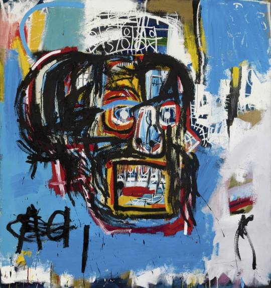
untitled (1982)
This work, created in 1991 when he was 20 and is one of his most well known pieces of work. He used paint and other media like crayons on canvas to create it.
This piece is extremely busy and full of different layers of paint and scribbling that adds an extreme amount of visual depth to one piece. It is so busy that although the main focal point is the skull itself, your eyes can help but wander from the details within the scull to the scribblings outside of it and flashes of different colours of paint beneath it.
The paint is applied to the canvas instinctively and gesturally rather than following a rigid order and the splatters of black and red paint (used to create the skull) suggest a means of quickness when applying the paint to form the skull shape.
His interest in both the human anatomy and voodoo practices are apparent in this painting with the skull being part of both of these things and the little spinal looking patterns next to the skull that could also be read as barbed Wie which was a common thing seen in urban New York in the 80s.
His use of such a wide and good colour palette in this painting also crowds the painting visually and gives a depth. He uses the colours to build and build the painting, paint over it, and more detail and paint over that until the painting is filled with an intense amount of different identifiable textures, shapes and colours.
He used the technique of pentimento in this painting by scratching out and painting over words.
This was a common technique used by Basquiat and he said of it “I cross out words, so you will see them more. The fact they are obscured, makes you want to read them”. This clever reasoning behind why he did what he did with his work shows the calculation and consideration of the techniques he was using and his reasons for using them.
The double A in the lower left hand corner may represent Hank Arron, an African American baseball star whom Basquiat idolised as a youngster.
The shift in colour from the sky blue background behind the skull to the multitude of colours above that are outlined form somewhat of what looks like a crown. The crown was a common recurrence in his work. Crowns have a deep history and usually Basquiat would crown figures in his paintings that he seen as athletes, artists, musicians and writers, many of them black as a way to pay homage and give recognition to those he felt deserved it even though they may have been overlooked by white mainstream media and public.
In this crown like shape we see a partially covered game of naughts and crosses. When he was starting out in his career he would make postcards which were cheaper to make than painting on canvas. He would sell them for a dollar on the streets of NY. While he was selling postcards he seen Andy Warhol at a restaurant. He was a fan and so he was delighted when he managed to sell Warhol a postcard in 1980 titled stupid games, bad ideas with a drawing of naughts and crosses on it that would later appear in untitled (1982).
Furthermore the expression of the face gives a sort of dead or subdued/ zoned out look which contacts with the bright colours that fit the inside of it and all over the canvas. The colourfulness may represent life and living and the sunken in skull/face may represent death. These themes could also have been personal in his conflict between enjoying life and all the art, writing, socialising etc that made life good contrasting with having serious struggles with mental health and addiction and even his first brush with death when getting hit by a car as a young boy, which can all end in death and knowing these struggles could mean he faced and contemplated death.
Since this piece is so filled with little details of basquiats own personal identity I think it is somewhat of a self portrait. I think he used the paint as a means to explore and literally build with paint his identity as a means maybe of personal reflection but also projecting to the world a very internal version of himself rather than the traditional self portrait style that uses normally just the face. But Basquiat did this an inventive way by using symbols and other details that he felt represented him as a person beyond just a portrait of the meat suit that he lived in.
2 notes
·
View notes
Text
Jean-Michel Basquiat
He was born December 1960 in Brooklyn and he grew up in a Brooklyn neighbourhood. He had two sisters and they were the children of a Puerto Riccan mother and a Haitian father. His dad moved to America when he was under twenty. His mother was Puerto Wiccan from Brooklyn. His mother brought him to the Brooklyn museum and he got he membership card so he was involved with this from a young age. When he was only about seven or eight he was hit by a car. While in hospital, his mother brought him a copy of greys anatomy and this started a fascination that he'd have his whole life with anatomy that came through in the skulls, spited and organs often seen throughout his work.
He struggled with school being more creative and school was about excelling in a more traditional sense. He also threw a cream pie in his principles face at an assembly in high school. He found it difficult to concentrate and focus and this lead to difficulties within school life and relationships with teachers.
He ran away at fifteen. He told filmmaker Tamra Davis “I was smoking pot in my room, and my father came in and stabbed me in the ass with a knife. I thought id better go before he killed me, you know?”.
Biographer Phoebe Hoban claims that he told his friend that his dad had stabbed him after having sex with his male cousin.
He ran away and was homeless, he spent time in a home for boys, lived with a jewish family, and then lived in Washington square park where he drank with alcoholics and took acid consistently for eight months.
His dad eventually found him but could not control him by this point he was taking drugs, not going to school and his sisters recalled that when he was just turning 17 that’s when he left.
His sisters say it’s a huge misconception that he never came back to the family and that he in fact invited them to exhibitions and came back to let their father know that he had made it. He showed up at the family home and rang the doorbell with a limousine waiting outside and the first words he said when they opened the door where “Papa, I’ve made it”.
He loved film, he loved reading and also music. He collected other artists work. His own heritage and African art both influenced his work.
He spent time at various clubs in New York including the mud club, area, and mr chows- and these were all places that he would mix with other artists at the time including Andy Warhol.
He was in a noise band, did modelling work for com de garçon, and even interested in ritualistic practices in Africa. Sadly, he actually had plans for a ritualistic cleansing to cure him of his drug problems in Abidjan, Ivory Coast, with his friend who was native to there (Outtara Watts) to cure his drug problems the august that he ended up dying of an overdose on august 12th 1988. Watts informed that when the news broke to the shamans about his fatal overdose that they did a ritual for the dead that took place at night and involved an animal sacrifice among other practices such as dance.
His sister spoke in an interview with vice about how he wanted to broaden the narrative about the black experience in America. He himself grew up in a more middle class background with an immigrant father who was successful in his work life and this did not fit the singular narrative that there was at the time from the media when talking about growing up black in America. She also spoke of his frustrations of having to constantly defend his identity in his field of work. She said that they wanted to pigeon-hole him in different ways including the fact he was a black artist, when he wanted to be seen as an artist and be respected as an artist. There was a lot of negative critique of Warhols show with Basquiat. His sisters said that this had a deep impact on him and after this he distanced himself from many people in the scene including Warhol and not long after this Warhol died and this really took a toll on Basquiat before his death and these two things were pivotal in making him feel isolated before his unfortunate overdose.
So he had a very unique experience as an artist in a very white washed western world and art world. Basquiat’s work still has a huge influence today and he is one of the most widely renowned Neo expressionist artists.
1 note
·
View note
Text
Neo expressionism
Nanny, Small Bears and Bogeyman (1982)
This movement emerged inn the late 1970s and early 1980s. It seemed to be a sort of reaction to minimalism that preceded it and Neo expressionism is seen as the start of a shift from late modernism to the start of post modernism. However some believe that it wasn’t a true new art movement at all because there was art on the market that shared many similarities.
Though it is widely accepted as a movement and discussed and argued over so it does hold a place in being a part of early post modernism. This constant discussion that remains over the movement actually makes it one of the most complicated and interesting ones and actually may kind of further establish that is is in fact a movement that is still relevant today.
The work was portrayed with raw emotion n an abstract manner with extremely textured and expressive brushwork.
Although they rejected the idea of sharing one kind of aesthetic, some of the Neo expressionist paintings shared similar characteristics such as: reflecting urban life in different ways, not really any emphasis on the paintings being realistic (they were much more abstract and expressive), extremely bold and playful colour palletes, and sort of primitive art style. But as it developed some artists opted for more hyper realistic approaches and some kept it abstract so it really is a movement that varies in a really wide way aestheticcally and is more difficult to pinpoint solely based on this factor.
This movements history is interesting because people can’t seem to agree on what it stood for and interpretations vary from person to person. Some believe that the movement originated in Germany and others believe it developed in Italy and the USA. But historically it can be found that the German expressionism and abstract expressionism movements both seem have given birth to what turned into Neo expressionism.
It peaked in the art market in the middle of the 1980s and was successful on an international level. Many critics pointed out that it had the typical theme of self expression so because this was something that sort of wasn’t really a new idea people started to question the economic value of the art of this movement. This critiquing and discussing of art in a manner that seems to place emphasis soley on the economic value of innovatiness is pretty reflective of the chokehold that capitalism has and had on western society and art world in the 1980s. Some even believe that the movement was pretty much all about making money and that this was motivation for much of the work so this further emphasises that capitalism seemed to be a Amin drive. However I don’t personally buy into this for EVERY artist in the movement because when you look at artists like Basquiat there were some serious social and political messages and themes in his work that confronted very real issues like racism and police brutality.
It was also controversial in its exclusion of female artists which couldn’t really be excused by this point considering this was now the 80s and women were valuable members of other movements many years before including situationist international. An example of this exclusion of female artists was clear as day in the 1981 New Spirit in Painting exhibition where 38 different artists of the movements work were on show and even though there were plenty of female artists in the movement none of there work was on show at this exhibition in London. Some of these women included Maria Lassnig, Paula Rego and Elizabeth Murray and even though these are some of the biggest names of the movement they were extremely marginalised at the time of the movement.
So ultimately its a movement that can't really be confined to one definition as it varies widely but it is an ever controversial and relevant art movement that art historians and general public can't seem to agree on making it somewhat of a mystery even now.
1 note
·
View note
Text
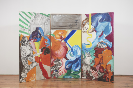
Jacqueline de Jong, Le Salo et les Salopards (1966)
This painting not only explores the 3 dimensional form in the shapes painted on the canvas but it also in on a wooden frame that stands in a 3 part curved form rather than just a purely flat painting on a wall. So, here, the relationship between painting and sculpture is being explored and the definitive idea of how a painting traditionally looks is being played with. The mirror also adds another layer of dimension to the painting and makes it more interactive to whoever is viewing it and it can almost make the viewer a part of the painting itself.
The colour in this painting is extremely vibrant and the use of colour is flat in the sense that the colours are all separate and rarely blend into one another in most of the painting. This use of clean flat colour was popular in the 60s when we think of Warhols screen prints and other vibrant artworks that used vibrant colour. The colour work is very busy and she has used many different primary and secondary colours but they hold their own in a way that rather than blending all the colours and making it more muddy and muffled the colours are used to create shapes that stand out clearly even where black outlines are not used. In the background stripped moving in different directions adds another layer of business and the flat panels and striped of colour in the background bring out and draw attention to the monstrous shapes in the foreground of the painting that are more three dimensional and use a sort of monochromatic shading to give them a more 3 dimensional look.
There are many eyes in the painting (a signature characteristic of much of de Jong's work) giving it quite an unsettling feeling but also adds to the same psychedelic feeling that the explosion of colour gives. The figures are dreamlike and although well structured the painting is almost like a stream of consciousness from the mind, much like the strange dreamlike states and figures of the surrealism movement.
The monstrous figures look large and powerful and having the teeth out also makes them seem quite greedy. This may be connected to the title which translates to Bastards and Scumbags which may refer to the greed and power of men of capitalism that she was challenging as part of the situationist International movement. The name is quite humorous which is an important characteristic of de Jong’s work. But the name is also controversial especially created by a woman at the time and it is important to remember that de Jong was a rebellious female artist of the 60s and this painting seems to be a comment on the kind of men/systems she was revolting against.Painting these figures in a way that is ugly and monstrous and silly looking seems to make a fool of them in a way.
A few of the figures are in black and white and made up of sketchy and inky lines but you can stilll clearly see human elements like the shoes and face of the little figure on the lower right. There is also a machine element at the top left which may refer to the ever growing technologies at the time used to further develop the capabilities of capitalism. The mirror in the centre of the painting plays an important role as it makes the viewer see themselves as part of the painting and poses the question what is their part in this chaotic painting. The chaos business and greed of a capitalist society, what is our role in this chaos as consumers or if not solely relating to capitalism, what is our role in this world of chaos and conflict?
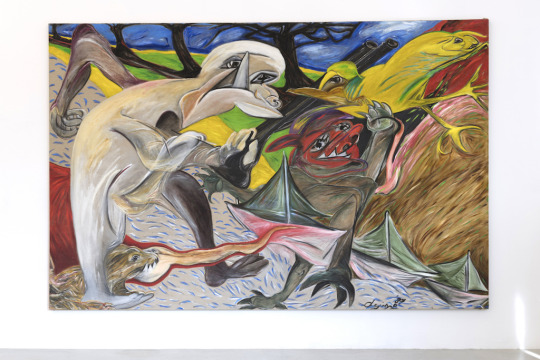
Chemin perdu de la chasse frustrée, 1987
The first thing I noticed looking at this painting are the elements of brushwork and colour that are reminiscent of Van Gogh. She based this painting on a series of Francis Bacon works who actually took inspiration from Van Gogh’s Arles paintings so this is an interesting narrative of a continued journey starting with Van Gogh's painting that Francis Bacon payed homage to and then de Jong did the same with the work of Bacon,
She used the same sort of colours and direction in her brushwork as the road painting. This painting is part of a series that de Jong made after spending time on the island of Shiermonnikoog and the first painting she made in the series was made on the island which is the smallest Dutch North Sea island. There is a theme of the sea in many of the paintings in the series because that was a part of life on the island. There is also a theme of hunting in all of that particular series of paintings. This has to do with what she observed and lived while spending time there, hunting animals. The animals were hunted easily by the people as they animals and people were in close proximity on this small island.
Although this work was made later we see a reappearance of the monstrous figures in this painting that, like the rest of the painting, are filled with movement and direction with brushwork that sways upwards and diagonally. The figures seem to be in conflict or a struggle with a gun being held making reference to the hunter and animal being hunted. The colours are vibrant and primitive and again there are also elements of colour lifted from the work of Van Gogh. Even though we can decipher the scene this work is still abstract and has the same surreal dreamlike feel of her other works and the use of shape, colour and figure are all imaginative and playful rather than being more rigid and realistic.
0 notes
Text
Jacqueline de Jong (Situationist International)
Born in 1939 Jacqueline de Jong is a dutch painter, sculptor and graphic artist. She was born into a jewish family at a time were they had to go into hiding because of the German invasion. Trying to get to Switzerland while her father stayed in Amsterdam de Jong and her mother got captured by French police and sent to Drancy internment camp but luckily they were rescued by the resistance and made it across the border. After the war they returned to the Netherlands but she couldn’t speak dutch fluently since she hadn’t lived there long.
She moved to Paris in 1957 and studied French and drama while working in a Dior store. In the spring of 58 she went to study music in London but returned to Amsterdam later that year and was later employed at the stedelijik museum.
She went back to visit London in 59 and this is where she met Asger Jorn a danish painter who was 45 and although she was only twenty they became companions. He was a founder of the cobra art movement. The movement was formed after WW2 with its name being the initials of Copenhagen Brussels and Amsterdam. It was a movement critiquing the western society and with that, its art movements such as naturalism and abstraction. The movement was formed in a cafe in Paris in 1948. The artists here shared in interest in marxism. The foundations in marxism and critiques of western society here may have influenced Jacqueline de Jong in being a part of the situationist international movement which held similar capitalist-critiquing values.
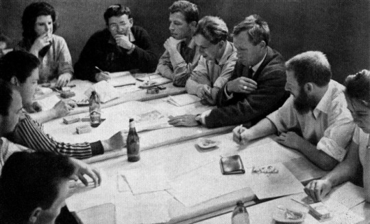
In 1960 she became affiliated with the situationist international movement and was involved in conferences within the central committee of the organisation. Her and other painters were later excluded from the SI group and she then founded the Situationist times. Between 62 and 67 she produced six issues for the Situationst Times and in May of 68 she was there to march with the students on strike, even creating posters for the movement.
Forming partnerships with people in the art world who critiqued capitalism and the western systems in which we live and herself also creating work that gave this message seemed to make sense considering her start in life as a child was part of a religious group being oppressed by a right wing fascist movement, she herself was a victim of these systems.
1 note
·
View note
Text
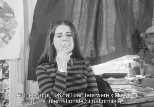
Situationist International
This movement was formed at a conference in Italy in 1957 and was active until 1972. It consisted of poets writers and artists to form a collective movement. The movement was one of anti capitalism using both marxism and surrealism as tools to create the work. They were trying to collapse the separation between the artist themselves and the consumer. Although even though it was supposed to be this open movement they followed the word of Guy Debord who was an artist that pretty much directed the movement.
Debord’s personal belief was that in a society governed by capitalism and profit - true creativity was rare because art is being created in oder to profit, and so the system of capitalism ultimately limits and restricts creativity.
They wanted art to be not just some high society luxury but to turn art and creativity into an everyday life activity.They published books, made films, graffitied walls of the city and held exhibitions and even made comics.
While the group recognised that capitalism had evolved since the writings of Marx it was still the same system and that his critique of capital remained relevant in an evolving capitalist society now with rapidly increasing technologies and consumerism.
With an artistic focus in the early age of the movement and a focus on Psychogeography was an important element which focused on the effect of geographical environment on the psychological state of people. And this term was used by Guy Debord to encourage people to interact with the city in new ways and inventive ways in order to see the architecture and makings of the city in a way that you hadn’t previously.
One of the ways to achieve of this enlightenment they were aiming for was though wandering though the city and realising that its made up of buildings, groups of people, mini climates and made up of things beautiful and things ugly and through this wandering you would achieve a greater understanding of the city as a whole and be able to form opinions on that what you loved and what you hated.
Though later on the movements focus from artistic to more increasingly political and the situationist groups had their influence in posters and writings with the May 1968 student protests in France that held world governments accountable for different injustices including the draft and the USAs involvement in the Vietnam war.
0 notes
Text
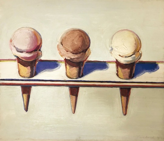
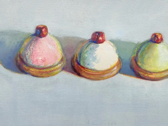
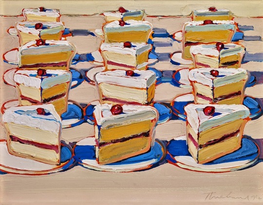
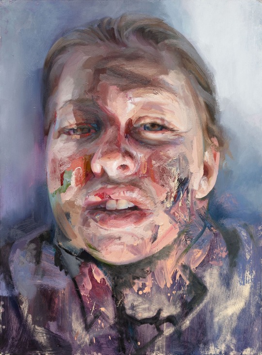
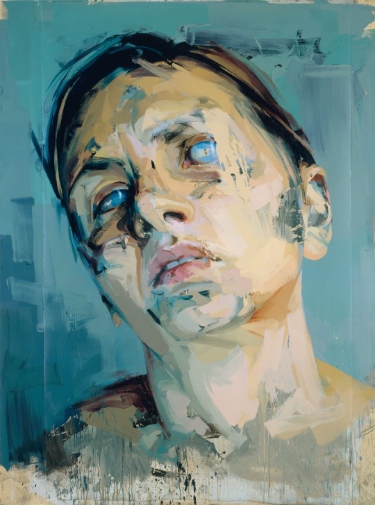
Comparing Jenny Saville and Wayne Thiebaud
Saville is a portrait and figure painter. Wayne Thiebaud is a still life painter. The subject matter and themes of their paintings are completely different yet they are tied together by their clever use of colour creating tone and their layering of paint.
Both artists are playful with their colour palette and their use of colour to create shadow is actually quite similar. Blue is used in Theibaud’s paintings to create the shadow of objects like cakes and similarly Saville uses cold blue tones to create shadow in her figures and portraits. Both artists also have a carefully thought-out precision and measurement to their work.
They also both use thick impasto paint to create texture and depth in their paintings.
The main differences in their work are the themes of their work and the style in which they paint. While Theibeud is much less gestural and much more clean and precise in his style, Saville’s work is much more gestural and although it is realistic is also very painterly in a more spontaneous way to Theibaud’s precise painterly qualities. The other main difference in their work is the subject matter. Saville is widely known for her portraits and figurative paintings whereas Theibaud is known for his paintings of American sweet treats such as cakes and ice cream. So, the subject matter and themes of their work are totally different.
Their colour palettes are interesting in comparison as Theibud uses luminous colour and very bright saturated bold colour compared to Saville’s work that incorporates much more fleshy tones. However, Saville too does use a lot of bold and saturated colour on top of these fleshy tones and in recent years has painted portraits using extremely bright saturated and playful colour palettes. Sat next to one another there are differences but also similarities in their colour palettes. Another thing to note is the use of blues and other vibrant colour on a much more muted coloured background- this much is similar in their work.
It’s safe to say these artists are completely different in both theme and subject matter and style of painting. However, certain features of their work are similar like the clever layering of paint and bold colour use.

0 notes
Text
Landscape/cityscape
Van Gogh
Very well known post impressionist painter. His work was known for its very unique thick impasto paint and short brushrokes. His brushstrokes were filled with movement and imagination giving his paintings a dreamlike feel. His earlier works used brown grey colours and after influence of impressionist painters and Japanese art his work was later filled with much more vibrant colour and luminous whites and grey tones.
Richard Diebenkorn
American abstract expressionist painter. Worked with layering thin layers of paint. His paintings were known for their colourful abstract compositions. They are landscape paintings that are abstract and the landscape is more implied than precise and it is implied with bold colour and gestural instinctive brushwork.
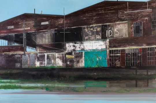
Jock Mcfadyen
British contemporary painter. He is well known for his cityscape/landcape paintings of buildings. The buildings are often scarred battered and bruised with broken windows, graffiti, rust etc. The paintings have a surreal feel to them as at first glance they can seem highly realistic but then upon closer inspection you can se
0 notes
Text
Abstraction
Willem de Kooning
A dutch American artist. One of the most well renowned abstract expressionist painters. His work embodies the gestural expressive style of the movement. His work involved spontaneous and gestural application of paint onto canvas. He was a well trained artist who looked to the greats for inspiration to be innovative and his work was radical and gestural but still well thought out.
Robert Rauschenberg
American painter and graphic artist from the pop art movement. He was knowing for collaging photographs and newsprint materials in his work. His combines consisted of bringing these materials into traditional paintings as he believed painting related to “art and life”. His painting as a result ended up extremely busy and textured.
John Hoyland
A leading British abstract painter. He met Robert Motherwell and Mark Rothko and this had a lasting impact on his work. His atmospheric paintings were known for their Vibrant saturated colour and the notion of playing with flatness and depth.
1 note
·
View note
Text
Still life and the human figure
Alison Watt
Became well known for her female nude figure paintings. She began focusing on drapery that had acted as a backdrop for her life paintings. Her paintings of fabric is now what she is most well known for and the fabric is often folded and scrunched into certain shapes that create association with different things. Her paintings are characterised by white and grey muted tonal colour palettes and her paintings have a realistic quality to them.
Avigdor Arikha
Romanian born artist who’s still life work is characterised by short soft appearing brush strokes. Muted grey tonal colour palettes often found in work but some work also with pops of saturated colourful objects with muted backgrounds making objects stand out reminiscent of cezannes earlier work
Andrew Wyeth
Native born American realist painter. He was well known for his figure paintings and his paintings were characterised by there fine detail and grey brown colour palettes. The way that light interacted with the scenes and objects in his work was also something that stood out about his work.
John Bellany
A Scottish born painter who’s painting style was characterised by its surreal dreamlike quality. His work was highly personal and he drew inspiration from the fishing village he came from for his subject matter. His exaggerated style and proportions would later be a great influence to the Glasgow boys movement and has influence on the work of Peter Howson. His works are colourful and playful. The faces in the figures he painted were sometimes reminiscent of Pablo Picassos flat looking faces.
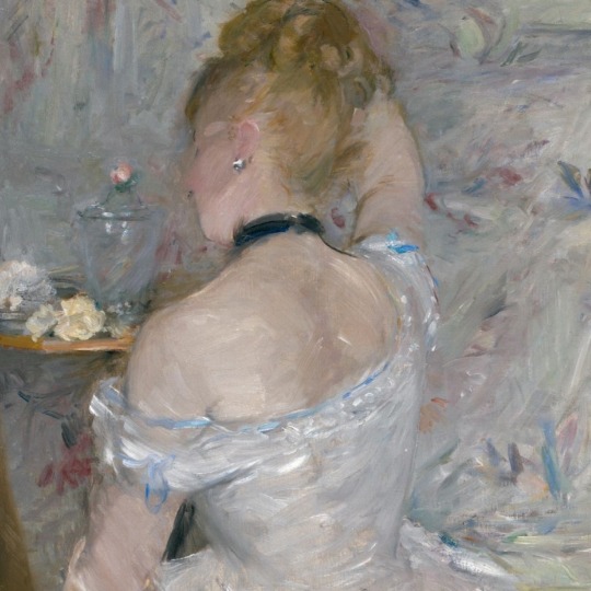
Berthe Morisot
A French impressionist painter who’s paintings were characterised by the luminous colour palettes and short brush strokes of impressionist painters. Her work had a lovely feminine quality to it that separated her from the other impressionists, oftenn paintings depicting women and children. Her work had a soft feminine delicate appearance.
Pablo Picasso
Spannish painter Pablo Picasso was one of the founders of cubism. His works focused on abstraction and colour. He used colour and exaggeration to create mood and atmosphere like his melancholic blue period. He later founded the cubist movement where he aimed to show as many viewpoints of his figures as he could at once making for extremely playful and abstract figure depictions.
Ken Currie
Scottish born painter born into industrial Glasgow. Part of The New Glasgow boys movement. His early works were heavily inspired by his industrial upbringing but later as a response to the sufferings of the social and political climate he began painting decaying damaged bodies. His paintings have a dream like surrealistic quality. Many of them unsettling and dark. He painted crowds and eventually moved towards painting spooky and twisted looking individuals that look very haunting and nightmarish.
Lucien Freud
British painter who’s specialised in figurative art. He used thick impasto layering of paint and although his works were pointing towards realism they had exaggerated tonal features. His paintings had dark brown grey sombre colour palettes and his exaggerated features paved the way for the exaggerated figures of Peter Howson.
1 note
·
View note
Text
Artist lecture notes
Euan Uglow
Precision was key .Used lines of measurement to keep the shapes and figures he painted precise. These lines could be seen in the painting by either thin pencil lines or thin coloured brush strokes. Kept colours very clean and didn’t allow them to become muddy adding to precision and meticulous style of painting that he was well known for
Gerhard Ritcher
Most well known for his blur that consisted of dragging paint across the painting to distort whatever he was painting.He worked from photographs and this allowed his painting to have a photorealistic quality but with whatever additions he felt were necessary to add (like blurring or emphasising of features)He then became a part of the abstract expressionism movement and his work focused more on texture and colour and abstract paintings that played with how paint was applied to the canvas.
Marlene Dumas
A portraiture artist whose themes are focused on race, good and evil, femininity and sexuality. Her paintings are psychological and although they are classed as portraits they focus more on an atmosphere or theme rather than the subject themselves using colour and experimental ways of applying the paint. Wet on Wet is a preferred technique of Marlene Dumas.
Peter Doig
A Scottish born artist who lived in London, Trinidad and Canada in his youth. His work focuses on the progression of modern society. He was a figurative landscape painter whose style was unique in his use of traditional painting methods in his landscape settings and combining old methods with new experimental techniques.Like edvard munch he took references for his figurative works from newspaper clippings, photographs etc.
Carol Rhodes
A Scottish artist who’s work centres around landscape paintings with a focus on landscapes that have been built upon or intervened with by humans. She paints these “man made” landscapes at a Birdseye view and they were very well measured out and sketched and were almost “perfect” and architechtural looking but her colour palette has limited tone which gives a flat look to her paintings echoing the flat perspective of Cezannes landscapes.
Paul Cezzane
Post Impressionist Artist who used small repetitive exploratory brushstrokes to create the objects he painted. Exploratory colours saturated colour palettes were used in his earlier works painting things like fruits. He believed in the importance of shape and the shapes that are found within everything in nature. This focus on shape eventually lead him into the likes of cubism and flat perception distorting landscapes.
Georgio Morandi
Muted colour palettes used in his still life paintings using a range of grey tones. Inspired by cezanne, he too focused on shape and using flat colour that covered the object and the background so that the importance of shape was emphasised in order to decipher the objects painted.
Ralph Goings
Known for his photorealistic paintings goings mastered the way that light reflected on objects and surfaces. His paintings were extremely precise and are almost as accurate as looking at a photograph. He explored themes of working class America painting common household objects found in the kitchens etc of normal working class houses.
2 notes
·
View notes
Text
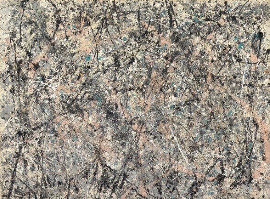
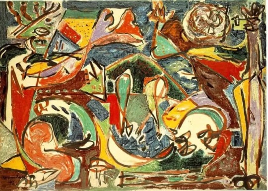
Abstract Expressionism 1940s-1950s
Question: Choose and analyse a painting from this movement
In this answer I will discuss the mood and atmosphere that this painting creates for me as an individual.
Lavender Mist (1950) painted by Jackson Pollock. From the abstract expressionism movement, this painting is highly gestural and spontaneous. It is not a painting of an object or figure but rather an abstract painting that evokes a certain mood. For me this paintings mood/ atmosphere is an extremely tormenting and it is an anxiety inducing peice of art. I think the name lavender mist sounds southing and calming and juxtaposed with a painting full of dark slashes and speckles of paint is almost ironic. It is very busy with different marks created by splattering of paint and when looking at this painting my eyes try to make sense of going on or make recognisable shapes out of these many marks, but my eyes just seem to scramble all over. It is almost in morbid curiosity that even though this painting exhausts me to look at I just can’t look away. I think this makes it a clever piece of art because it does create a disturbed atmosphere and it does make me feel like I am being drained just by looking at it. Underneath the black slashes the painting does seem soothing, with warm beige, white and other more neutral tones and I think it is the contrast of this soothing atmosphere with something that totally disrupts it that makes it so unique and creates such a split mood. It is this contrast and inability to put the painting into one box that throws me off. I do like this piece f art but I think it will be easier to enjoy when I let go of trying to comprehend what I am looking at.
0 notes
Text
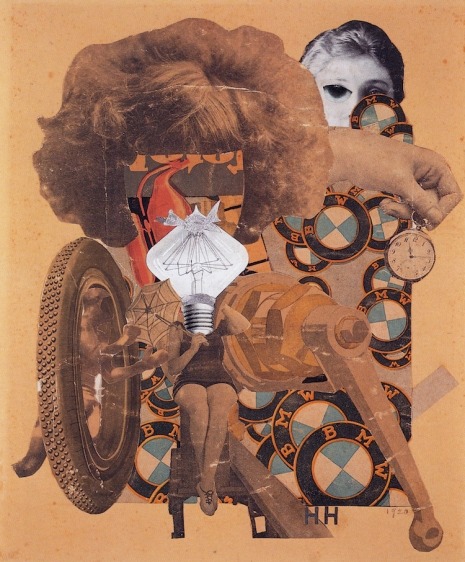
Hannah Hoch (Dadaism) 1889-1979
Most well known for her photomontages- Hannah Hoch was a German Dada artist who drew inspiration from Pablo Picasso and other collage artists. The images in her work were rearranged compositions made of mass media as a means to critique the German government. She, Like Frida Kahlo was a feminist and her work focused on criticising the government on gender issues. Some of her work was reacting to the birth of beauty standards and ideals focused at woman in the media.In her famous peice “the beautiful woman” (1919) we see a photo collage that’s main components are car parts and female body parts. This is representing the new industrialisation of the world and how the modern woman is supposed to look at this time. You can see wiith this just how objectified woman were- that their changing beauty ideals to please the modern man was just like the new parts of his car. E very powerful piece of feminist art and also in the dada photomontage world.
0 notes
Text
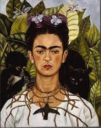
Frida Kahlo (surrealism) 1907-1954
Frida Kahlo was a pioneering mexican, female surrealist artist. She dealt with deep themes like identity and heritage, death and the human body. She herself did not identify as a surrealist painter but this is what historic movement that her work is placed under because of a similar style identified. She dealt with health problems throughout her life which disabled her in many ways so she often found herself painting self portraits in her solitude and they seemed to be a way of recording her own identity and psyche. She also dealt with a failed relationship and divorce that had a lasting impact on her and was evident throughout her art.
Self Portrait with Thorn Necklace and Hummingbird is one of her most iconic paintings.
In this painting Kahlo uses her own indigenous symbolism. The thorn necklace as a religious symbol of the sacrifices she has made in her life and the pains she’s been through. The hummingbird around her neck lifelike representing death and despair and the black cat waiting to pounce on her a sign of bad luck and misfortune. More personally the monkey represents evil as a gift to her from her husband Diego.
0 notes
Text
Vorticism
Question 1
What is the relevance or importance of voricism
Characterised by bold colour, harsh line and a theme that surrounded the new machine age- voricism was important because it paved the way for abstract art in Britain later on.
Question 2
What makes in unique or different?
Futurism fantasised machines completely taking over where as Wyndham Lewis of Vorticism believed that this was very idealised and that humans would still have limitations and machines wouldn’t just fix everything so it was the idea of this machine modernisation but in a less idealised more “realistic” way.
Question 3
What major events were taking place when this movement was active
-The industrial revolution happened not long before the movement and the rise of the machine age was beggining
-In 1912 the sinking of the titanic took place
-WW1 started during this movement in 1914
1 note
·
View note
Text
Impressionism

1. Why wasn’t Impressionism taken seriously at the beginning?
Impressionism was not taken seriously in the beginning simply because it was something new. Modern ideas are never taken to kindly at first because people don’t like change (this even applies to today!) It rejected the tradition of paintings being extremely realistic image like recordings of things. The public basically thought that the artists were rubbish because of their short brush strokes and slightly more creative colour palettes weren’t a true recording of the image they were depicting.

2. Describe the subject of Manet’s “Olympia” painting.
The highly controversial Olympia painting by Manet depicts an upper class prostitute of Paris lying on a bed being handed flowers from her servant probably from one of her customers. Taking direct inspiration from the painting Titian’s “Venus of Urbino (1538) Manet challenges the way women were depicted in traditional art. He portrays a slightly asymmetrical woman who is actually looking directly at us confronting us that she is a naked sexual real woman and this was so vulgar and controversial in a time period where women were depicted more as innocent in their nakedness- completely perfect symmetrical angelic creatures if you will. He also challenged the rules of painting by shading her hands with black and barely shading her breasts or giving her any depth in her skin tone. It looked like a real apartment in Paris with a real prostitute on a bed and not an idealised, perfected version of this. His Questioning of art standards with his colour choice and painterly technique and the viewer being directly looked at by the woman depicted made this piece highly confrontational from the artist and his subject and it was not well received in the time it was first seen.
3. Cezanne said “Everything is modelled after the sphere, cone and the cylinder” What do you think Cezanne was meaning when he said this?
I think what Cezzane meant by this is that everything in nature follows the same pattern. If you take the idealised and intricate nature out of what you are portraying and simplify it right down to just shapes- if you can master these shapes then you can pretty much draw anything in theory. With all the frills of objects people and things in nature, beneath all that are simple shapes. For example the spherical orange, the cone-like thigh of a person. The logical simple translation of building paintings with simple shape shifting focus from the frills of traditional art was a language that seemed to very much inspire the cubist painters that came after him.
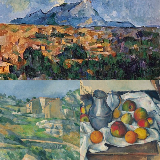
4. Describe Cezanne’s painting technique
Cezzanes painting technique was characterised by a use of parallel brush strokes and his experimental use of colour. His early works were characterised by thick brush strokes and focus on colour light and tone rather than attention to detail in what he was portraying.
The blurring of fore mid and background give a flat appeal to his paintings. He was known for simplifying perspective in his landscape paintings by blocking in colour with a limited palette. The figures in his paintings have a distinct quality, they can appear a bit distorted as he is using shape to portray objects and people shifting focus from the traditional detailed recording subjects in more of an image-like, idealised way. His painting techniques created simplified versions of things that he perceived almost like a stripped down version. He used changes in colour to show light and shadow. A painting technique in his use of colour that can be seen throughout works is his use of white mixed with in that have a glowing feel to his colour- particularly his greys.
5 notes
·
View notes