
Last Seen Blogs

emzandthevoid
Welcome to my void
howertism
jude
askthebigbrothervoice-blog
You are not allowed to talk about production.

abigailmisty
ارخص شركات نقل اثاث جدة
quinnlemley
Quinn Lemley Blog
Text
Design Rationale
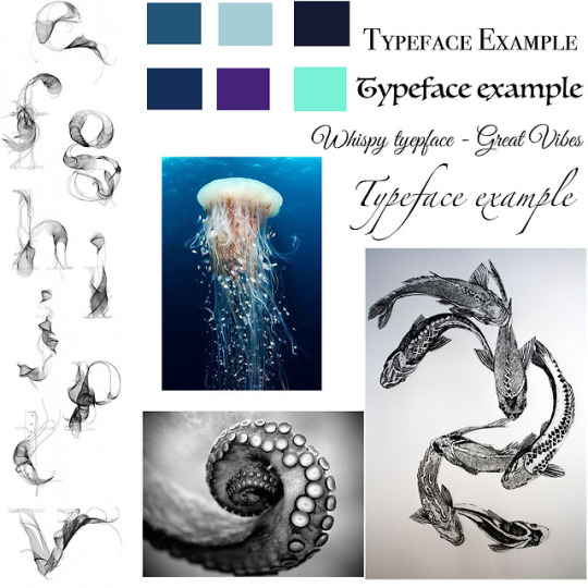
In the beginning of this project I had to ideas for what I wanted to do for my letterforms. I then quickly decided on the idea of aquatic animals. My final designs, in my opinion, do well at riding the line between seeing the letterform and seeing the creatures. I think they do well with being able to flow back in forth between seeing the octopus tentacle and seeing the letter O. When looking at typefaces I leaned more toward types that were wispy and reminded me of ocean movements, being flowing and organic. I tried to bring this into my letterforms and I think it shows. My final designs are not very different from my sketches. Originally, I attempted to draw and color them on paper and scan them in. As I began to do this, I was not happy with how they came out and tried how I would like a rasterized style from Illustrator. I liked the outcome from the Illustrator style and thought it was a juxtaposition in a way: the organic movements I was trying to create with each letterform, and the rasterize and structure of making it on the computer. The other projects we have done have helped me work on my skills in Illustrator and helped my ability with making these letterforms. I think they have helped me form my style a little more and figure out what type of look I like to create, being full of colors and usually having many things going on. While I feel these letterforms have many pieces, I think overall there are simplistic and that is what I like most about them. The previous projects have gotten me get to this project by helping widen my ideas because I felt more comfortable with the Illustrator program with each project. Overall, I am happy with how these letterforms came out and I really enjoy the deep, rich, colors that I chose for this project, compared to my previous projects.
0 notes


Text
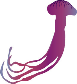
Design Brief
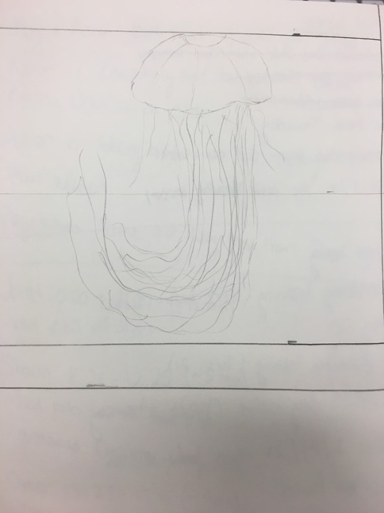
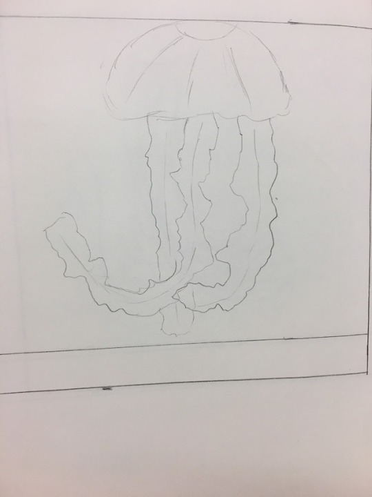
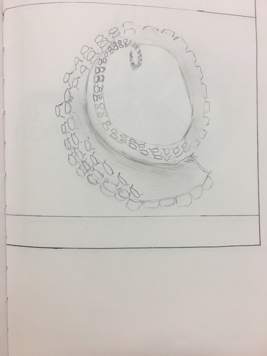
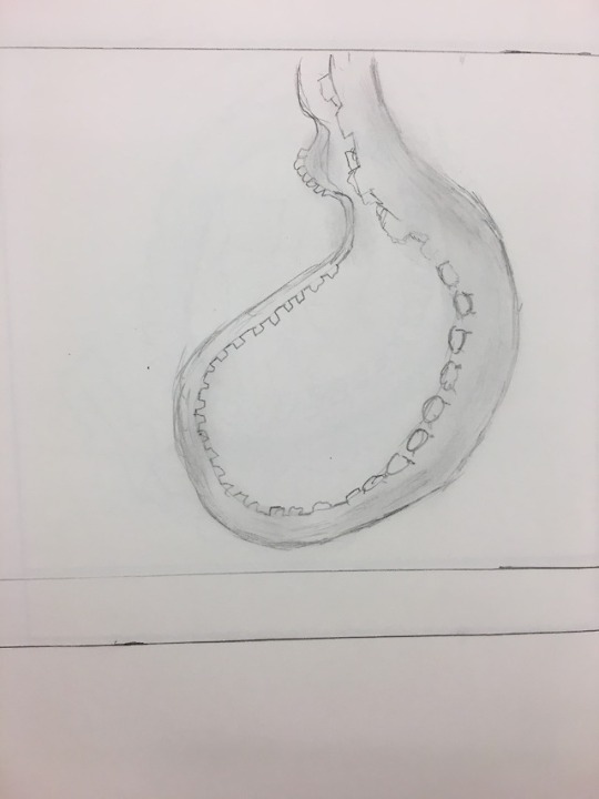
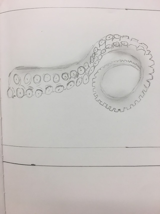
For my letterform art, I decided to go in the opposite direction of my infographic poster. I am focused on more dark and rich colors, instead of the bright and friendly colors. I will be focused on colors such as dark blues, plum, and green/blue, to emulate the colors and depths of the ocean. My theme is aquatic, having aquatic organisms that start with each letter representing it. For the letter J, I am using a jellyfish which will be a great creature because how long and organic they are. For the letter O I am using the tentacle of an Octopus wrapped in the shape of the letter. The suctions will be on the outside of the O and I plan to add slightly outlining so that it keeps the shape of the letter, as well as bringing depth. For the number 2 I was assigned I had two ideas. The first was a seahorse, their bodies being similar to the shape of the number and could work it to look like that. The other idea is using 2 koi fish swimming almost in a circle to resemble the number 2. I prefer the koi fish idea because I like the designs on the koi fishes more and feel is will keep up the organic and flowing style I want to go for. I am more likely to use Photoshop because I think it allows for more bending of the rules and is not as structural as Illustrator. I will be basing my letterforms off the gothic typefaces. I feel this is help give off a somewhat delicate feel but most important the flow and organic movements that the ocean and its creatures possess.
0 notes
Photo
Design Rationale
Copyright (c) 2011 by vernon adams ([email protected]),
with Reserved Font Names “Amatic” “Amatic Bold” and “Amatic Regular”
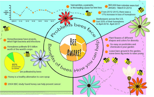
The infographic that I created was focused on the decline of honeybee populations and to bring awareness to the benefits of honeybees and what they do for humans and the earth. I believe that my infographic gets the message I wanted to across and does advocate for my topic I chose. The type Amatic used in the center with the title is friendly and draws in the eye of people who would be passing by the infographic. Keeping the detailed facts in a legible and simple texts allows for easy reading and does not get messy. If someone walked by my poster I think they would stop to look because of its bright colors and friendly look as well as the visuals of the flowers and bees. Each “bullet” is concise and someone could take something from each area quickly. Someone could go to each section and read one fact from each if they wish to get information quickly. I went through multiple design changes but the theme stayed the same throughout. Originally it was not separated into sections and then it was within the circle in the center. Finally it transformed into the current design with the sections separated the way they are. Researching my topic and organizing it by sections helped me set up for what I wanted to do. Going through the process allowed to work through my ideas and changes as well as better understand how I wanted the infographic look. Going through all the steps enabled me to go through changes and better organize the information in my poster and successfully process and work through my different ideas until I came to the one I felt worked best. During the critiques I got a lot of helpful feedback, such as adding the honeycomb style in the center. I also received the idea to make my line graph look like the trail from a honeybee. Both of these ideas have been added to my final poster and have aided in the visual of the poster. One person also suggested changing the entire thing to shades of honeycomb, to make it look like a very zoomed in honeycomb. This idea was very good, but the poster ended up looking too monochromatic and I went back to the original design. Another person suggested I style the facts into bullet like with hexagons as the bullets. I used this suggestion and it really boosted the look of the poster. It allowed it to look more organized and easier to understand, especially with the visuals around the poster. Never had using Adobe Illustrator before this course, I found it challenging in the beginning of creating this poster. I faced issues with my center circle in Illustrator and ended up creating that portion in Photoshop. As I continued to work on the poster I became more familiar with Illustrator and its tools. I went on to forums online to learn how to create the flower designs and it helped me create images for the poster, as well as get a much better understanding of what I can create in Illustrator. I am still not proficient in my opinion, but I have gotten leaps better than when I began with this project in Illustrator.
0 notes
Photo


Design Brief:
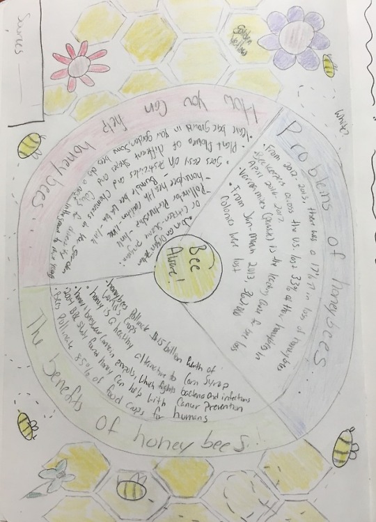
The topic of the infographic poster is going to be focused on the awareness of Honeybees as well as the benefits of them and their products. The target audience will be young adults, adolescents, and adults with children. The audience would be people who go to libraries with kids, where bright and friendly posters could catch the child’s eye. The topic of Honeybees is important because in the past years the Honeybee population in the United States has drastically decreased. The design concept would be making it into a garden, with a line graph in the soil and within the flowers and the leaves would be the facts about Honeybees. There would be bumblebees around the poster with dotted lines following them to help lead the eye through it. There was also the possibility of having not a lot of flowers in the area with the facts about why Honeybees are dying, followed by an area with more flowers that include the facts about the benefits of Honeybees and how people can help. There would be a call to action including organizations that people can be apart of in the lower right side of the poster, next to the line graph. The colors would be very bright and friendly, to draw young children's’ attention and they hopefully get their parents’ attention. The type may be serif but still legible like Georgia, so that children can read it and the facts will be in very simple, layman’s terms so that kids of many ages can understand what is being said. Other type possibilities are: Bookman, FF Ernstine, or Stag. Another design idea is a life cycle style. It would be a large circle that was separated into categories: Problems honeybees face, Benefits of honeybees, and How you can help. These sections would be different colors such as green, yellow, and blue. Within the circle would be the facts about each category in in the middle of the circle will be the title “Bee Aware” circled in the middle. Around the outside of the circle will be flowers and honeybees. There would be no graphs on this design layout. This may be more targets towards young adults because it would not be a childish, colored, and cartoonish as the other design.
0 notes
Text
Works Cited
BBC NEWS | Health | Honey ‘could help fight cancer’ (2004, December 05). Retrieved April 10, 2016, from http://news.bbc.co.uk/2/hi/health/4063377.stm
Holland, Jennifer. “9 Ways You Can Help Bees and Other Pollinators At Home.” National Geographic, National Geographic Society, 8 Apr. 2016, news.nationalgeographic.com/2015/05/150524-bees-pollinators-animals-science-gardens-plants/.
Holland, Jennifer. “The Plight of the Honeybee.” National Geographic, National Geographic Society, 10 May 2013, news.nationalgeographic.com/news/2013/13/130510-honeybee-bee-science-european-union-pesticides-colony-collapse-epa-science/.
News, Bloomberg. “Honeybee Colonies Increase after Years of Decline.” The Washington Post, WP Company, 2 Aug. 2017, www.washingtonpost.com/lifestyle/kidspost/honeybee-colonies-increase-after-years-of-decline/2017/08/02/fc79eea6-73ba-11e7-8f39-eeb7d3a2d304_story.html?utm_term=.483db129fea6.
National Agricultural Statistics Service . “Honey Bee Colonies.” 1 Aug. 2017, pp. 1–16.
University of Maryland. “US Beekeepers Lost 33 Percent of Bees in 2016-17.” Phys, Science x Science Network, 25 May 2017, phys.org/news/2017-05-survey-honeybee-losses-horrible-bad.html.
Williams, Mark. “The Benefits of Bees.” PerfectBee, PerfectBee, 26 Feb. 2018, www.perfectbee.com/learn-about-bees/the-science-of-bees/the-benefits-of-bees/.
0 notes
Text
Research for Infographic poster
Pollinators in the United States have been in crisis for more than a decade
Honey bee colonies lost for operations with five or more colonies from January through March 2017, was 362 thousand colonies, or 14 percent.
From 2012 - 2013 there was a 17% increase in national loss of honeybee colonies, totaling a loss of 46%
Parasites and disease have accounted for the majority of the decline in honeybee population. But another cause of this drop is colony collapse disorder, which has raised concerns among farmers and scientists for a decade.
A possible contributing factor to the changes in the honeybee population has been pesticides.
Honey bee colonies for operations with five or more colonies in the United States on January 1, 2017 totaled 2.62 million colonies, down slightly from January 1, 2016.
Varroa mites were the number one stressor for operations with five or more colonies during all quarters of 2016
Honey bee colonies lost with Colony Collapse Disorder symptoms on operations with five or more colonies was 84.4 thousand colonies from January through March 2017.
Beekeepers across the United States lost 33 percent of their honey bee colonies during the year spanning April 2016 to April 2017
Beekeepers who responded to the survey lost a total of 33.2 percent of their colonies over the course of the year. This marks a decrease of 7.3 percentage points over the previous study year (2015-16), when loss rates were found to be 40.5 percent.
bees are responsible for pollinating nearly 85% of all food crops for humans, as well as numerous crops that grow the food fed to cattle.
Choose to plant native plants in a variety of shapes and colors to encourage diversity
Make sure something is blooming each season (spring, summer, and fall). Some bee species are active all year, others only in April and May, still others in July and August, and all need to feed regardless of the date.
Newly emerging bumblebee queens need spring-blooming flowers, shrubs, and trees. When the insects emerge in spring, they need nectar and pollen sources—or they can't start their colonies.
Adding milkweed to your garden provides food for monarch butterfly caterpillars, but don’t forget nectar sources for the adults, such as flowers that bloom in late summer.
Leave a little bare ground. Most species of bees are solitary, and some 70 percent of them dig a nest in the ground to raise their young.
Install a bee block or bee hotel, which are available online or at some garden stores. You could also drill holes of varying sizes in a dead tree that's still standing.
By bordering your fruits and vegetables with native flowers, you'll improve pollination of your crops and also support bees when the crops stop blooming.
Go easy on chemicals and pesticides in your garden
Without bees, many plants would have no way to reproduce and die out.
There are dozens of species of solitary bees that have evolved to pollinate a single type of plant, and coexisting in unison with the lifespan of that plant. Without that specific species' devotion to that plant, the plant would cease to reproduce and become extinct.
Mass bee deaths have been past indications of the use of toxic chemicals, or severe climate changes,
honey is a healthier alternative to the high fructose corn syrup
Honey has been used as a facial revitalizer for hundreds of years. It is believed to clear the skin and soften wrinkles
Beeswax can be found as an ingredient in furniture wax, beauty products, lip balm, chewing gum, and the waxy coating on rounds of cheese.
Honey and beeswax contain a byproduct called propoils that is an antibacterial agent. This agent can help fight bacteria and infection, which is especially useful for treating wounds.
Honey has also been found to soothe sore throats brought on by the common cold.
In actuality honeybees are really not that aggressive. They will only sting if they feel their hive or queen is being threatened.
a study conducted in 2004 and reported by the BBC new indicates, “The intake of honey-bee products may be advantageous with respect to cancer and metastasis [secondary cancers] prevention” (BBC News).
Honeybees pollinate $15 billion worth of the world’s crops annually
Learn more about organizations that support pollinators and their habitats:
Pollinator Partnership
Honeybee Health Coalition
BBC NEWS | Health | Honey ‘could help fight cancer’ (2004, December 05). Retrieved April 10, 2016, from http://news.bbc.co.uk/2/hi/health/4063377.stm
Holland, Jennifer. “9 Ways You Can Help Bees and Other Pollinators At Home.” National Geographic, National Geographic Society, 8 Apr. 2016, news.nationalgeographic.com/2015/05/150524-bees-pollinators-animals-science-gardens-plants/.
Holland, Jennifer. “The Plight of the Honeybee.” National Geographic, National Geographic Society, 10 May 2013, news.nationalgeographic.com/news/2013/13/130510-honeybee-bee-science-european-union-pesticides-colony-collapse-epa-science/.
News, Bloomberg. “Honeybee Colonies Increase after Years of Decline.” The Washington Post, WP Company, 2 Aug. 2017, www.washingtonpost.com/lifestyle/kidspost/honeybee-colonies-increase-after-years-of-decline/2017/08/02/fc79eea6-73ba-11e7-8f39-eeb7d3a2d304_story.html?utm_term=.483db129fea6.
National Agricultural Statistics Service . “Honey Bee Colonies.” 1 Aug. 2017, pp. 1–16.
University of Maryland. “US Beekeepers Lost 33 Percent of Bees in 2016-17.” Phys, Science x Science Network, 25 May 2017, phys.org/news/2017-05-survey-honeybee-losses-horrible-bad.html.
Williams, Mark. “The Benefits of Bees.” PerfectBee, PerfectBee, 26 Feb. 2018, www.perfectbee.com/learn-about-bees/the-science-of-bees/the-benefits-of-bees/.
0 notes
Photo

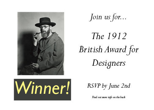

These are my final postcards for the project. I did two different ones because I wanted to see how each would come out. I like both for their own reasons. I think the background of the first one is better and I layered different pieces of art that Gill created. It has more going on with it than the second one but I wanted to keep the second one super simplistic because it was meant to be in a similar fashion as an invitation. I also added the grey behind the word winner so that it would stand out with its gold coloring. I had a difficult with designing these because Gill is more of an artist/sculptor than a typographer, according to my research. I attempted at a text wrap around his portrait in the first one but it was not looking like how I wanted so I decided to go with dividing it in equal portions. Each portion has a name of a type he created. I think my hierarchy is okay, I made the address smaller on both post cards on the back so that is not as noticeable as the bios. What I think worked well is the collage background on the first post card and I like the idea of the second one but the execution could have been done better. Not knowing any In Design definitely hindered my abilities but as I worked with it I began to get more familiar, though I would still prefer Photoshop to it. I do feel i grew as a designer in learning more programs designers use and having to think a certain way so that what I wanted to come through did and be mindful of the layout.
0 notes
Photo

For my final for the object to text I decided to follow through with two of my ideas. The first I tried was the sweet. The construction of the word was slightly difficult because I used cake and it was not as malleable as I thought. Some of the letters fell apart and I attempted to hold them together with frosting, and that seemed to somewhat work. I did this on the counter of my town home and was worried about the orange of the counter but I think it adds to it with the orange frosting. The type is kind of odd because it really doesn't have a specific type and I was more trying on getting the letter legible. I wish that I kept them all uppercase and made the t uppercase now that I reflect on it. I didn’t add any sort of serif to either projects but the cake was more because it was already difficult to mold the word.
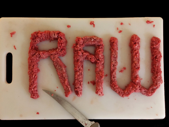
The ‘raw’ one I like a lot more than the sweet and it might because because of its shock factor, for lack of a better term. The meat is ground beef, and it was really easy to mold into the word. It was still slightly frozen which kind of helped it keep its shape. I used the thawed portions for the parts of the word that were more complex. I also added some filter in photoshop to increase the redness in the word. I also removed the orange countertop and replaced it with the black to make the word and the cutting board more stark. I like the addition of the knife and its juxtaposition in its placement. I also decided to leave the bits of meat around the board for the aesthetic purpose of the project. I also followed a type I found online when I researched aggressive typefaces. It was called Crypt typeface and I think it portrayed the apocalyptic and rough feeling I wanted with this photo and the word.
Overall I really enjoyed this project and liked being able to this sort of expression. I like both of my finals; the cake one because it is something I like to do and I have a connection to, and the meat one because it is not something you would normally see and is slightly disturbing. I think the raw one, while simple, was executed better and came out better for me. It was hard to come up with ideas in the beginning but I think they final projects came out well.
0 notes
Photo

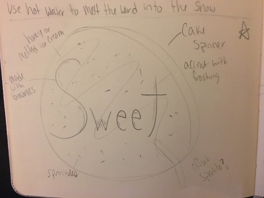
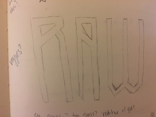
These are my first sketches for my object to text project. I initially thought of pouring hot water in snow to make the word “powder”. My concern with that would be snow falling into the melted areas or it not being clean enough to get a clear indication of the word. Also if the snow reflected too much sun. The next idea was the word “sweet” in brownies or cake. I love to bake and own a cake spinner so I was going to place it on the cake spinner with drizzles of chocolate and frosting. I like this idea and my only worry would be molding the cake or brownies into the word and to scale it correctly, to fit on to the spinner. I think brownies would form and mold better than cake but it might blend too much into the chocolate syrup. The final sketch is something slightly disturbing but is why I like it. It is the word ‘raw’ with raw meat. I thought ground meat of some sort would be best because it would be easiest to form the word with. I was not sure what I would place it on, possible a cutting board. I also was thinking of adding a red hue to this one to emphasize the meat.
0 notes
Photo
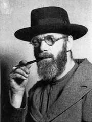
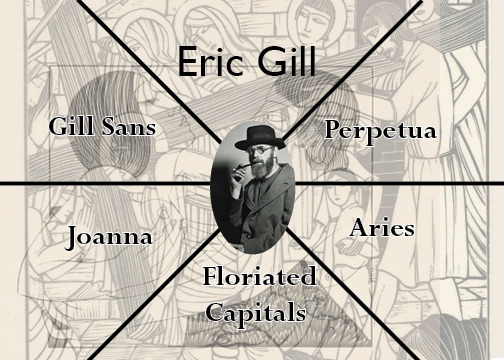
Eric Gill
Born February 22, 1882
Died November 17, 1940
Sculptor, typeface designer, and printmaker
Associated with the Arts and Crafts movement
Was religious
Sexual abused his daughters
Created erotic art
Named Royal Designer for Industry, the highest British award for designers
From England
Studied at Chichester Technical and Art School for 2 years
Created the types: Gill Sans (1927-30), Perpetua (1929-30), Joanna (1930-31), and Floriated Capitals (1932)
Also did artwork, has over 120 pieces of work
People REALLY don’t like him because of his pedophilia - very understandable
Was very sexual for being very religious
Known for his elegantly styled lettering and typefaces and the precise linear simplicity of his bas-reliefs.
1902 he turned to letter carving after studying in his spare time at the new Central School of Arts and Crafts with Edward Johnston
His piece “Mother and Child” (1912) is what brought him public notice
In 1924 he was asked to do engravings for the Golden Cockerel Press; the best remembered of his hundreds of engravings and dozens of books is the Four Gospels (1931)
One of the founding members of the Distributist worker community at Ditchling, Sussex.
His subject matter swung between highly religious and highly erotic
Many of his work depict erotic scenes
A demonstration took place outside the Cathedral to protest the Church authorities’ refusal to remove the Stations of the Cross carved by Eric Gill when his sexual abuse of his daughters was discovered
Was well involved with the Catholic Church
Due to his pedophilia and abuse, many reassessed Gill’s work and felt that it was overtly sexual and perverted
“Font Designer – Eric Gill.” Lino Type - The Source of the Originals, Monotype GmbH, www.linotype.com/391/eric-gill.html.
“Eric Gill.” Encyclopædia Britannica, Encyclopædia Britannica, Inc., 19 Feb. 2014, www.britannica.com/biography/Eric-Gill.
Odou, Patrick. Eric Gill, the Pedophile Founder of Distributism. Tradition in Action Inc, 14 May 2005, traditioninaction.org/HotTopics/j005htGill_Distributism_Odou.htm.
Williams, James. “Eric Gill's Fall From Grace.” The International Art Magazine, Apollo, 27 Apr. 2017, www.apollo-magazine.com/eric-gills-fall-from-grace/.
0 notes
Photo

For the final exercise, I would choose this one as my favorite. Originally, there was no border around the text but I felt that it may be too minimalist. I did like it without the border because I prefer little than a lot but adding the border may have gave it a extra bit of color. I matched the border with the line to keep it monochromatic and I like it the most because it is simple and legible. I am still on the fence as to whether I wanted the y in my name and the g in designer to be in the purple line or not. I chose it to because I felt there was too much space in between the line and the words when I gave it room.
0 notes