
kittybehandarlington
Kitty Behan-Darlington
University of Salford
150 posts
Don't wanna be here? Send us removal request.
Last Seen Blogs

senatorex
senatore
donnaofasgard
Head Councilwoman Donna

rosendalallen29
The Journey of Mcclure 501
whathasangramainyudonewrong
He’s Fucked Up And Here’s How
hayatonumde
kapşonlu kız
Text
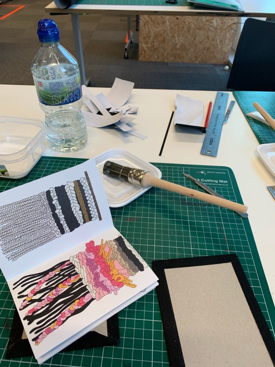
My studio wall Submission:
Due to not being able to produce as much work because of COVID-19, it prevented our work being marked in person, I decided to make sure my wall looked presentable for an online submission, As I felt a put a lot of effort in this time round as workshops weren’t Compulsory however I took my own initiative to attend them all as I was very interested, here on my wall you can see that I build a shelf for my book that I made as I didn’t want this to be on the floor, as I want to my wall to be presentable even if it couldn’t be marked person, I was proud of what I had made.
This semester I started out having an interest in the use of materiality and began to grow my theme into texture and the way materiality was used in the 1950s when women were stay at home mums creating the clothes for their family and younger children, this then turned to me buying my own weave and creating my own knitting/weaving blooms, I then had an interest in printing my weaves as I wanted to show the texture of them and as monoprint is only a one-time print, I felt this would be very individual and tell a story of its own.
This then turned to me wanting to go more digital as this is something I experimented and experienced in first year, and really enjoyed, and so I created an illustration of one of my weaves that then got screen printed, during my attendance of the workshops that I chose to go to, I came across a book book binding workshop, which lead me to wanting to create me own hard back book, which is shown on the shelf drilled to my wall.


3 notes
·
View notes
Text
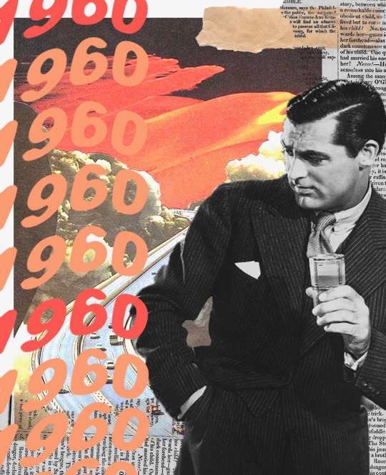
My own collages.

After seeing that artist I just posted about create that collage I decided to go onto photoshop on my laptop and make my own I came up with three collages that I really liked, I tried to give them the same vibe/aesthetic that was olden days by using men from the 1960s and colours that matched their clothing style and house interior in those days.
What I absolutely love about my first collage of simplicity of it, I found these cutouts and decided to use them in my own way, I feel that this collage is really fitting to my theme as I’m looking at feministic views and old times of when women used to be the housewife and create all the clothes for the family. this is what the women looked like in those particular times.
I added text and waved it to give it a different look each one of these collages has the same texting I tried to give them the same vibe but make them all completely different at the same time. 

1 note
·
View note
Text
Eugenia Loli.
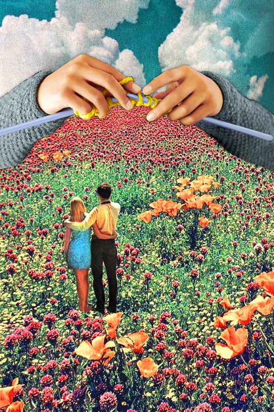
This week, I have been taking time out to create some digital collages on photo shop and procreate as I have had ideas about going multiple with my work.
I came across this photo collage containing knitting, it is a surreal collage by the artist named Eugenia Loli. I found out that she is a California-based collage artist who deals in surrealism and modern vintage, I knew right away that this was definitely within my practice I find it very inspiring. It gives me more ideas for my own work. 
Interestingly, making collages is one of my main passions, as basic as they can be I absolutely love making them, I feel you can do anything, and with the right layers it can really look great altogether. The colours within this collage really pop and I love how all the images that she has merged together have the same style/filter almost grainy and old-fashioned, what really brought me to this collage in particular was at the top of the flowered grass is someone knitting, I’ve knitted all the way through the semester and it’s something I taught myself in the first lockdown we had ever since then I have weaved it into my practice pun intended and really enjoyed it ever since. 
1 note
·
View note
Text
Betty Tompkins: deciption of sexuality art.


Carrying on looking into artists who focus on Femeinity in their work, I came across Betty Thomposon who is known for a series of giant genitalia 'fuck paintings' (inspired by her husband's porno mags), the 72-year-old painter was once blacklisted and disregarded by radical feminists for her frank depiction of sexuality. *Featured snippet from the web*.
She created a series of work titled ‘womens words’ The #MeToo movement helped inspire the artist's latest works.
As you can see, her work consists of portraits, such as the Monalisa, the paintings—text works based on around 3,500 submissions from people around the world of phrases used to describe women—were originally completed between 2002 and 2015. But with more suggestions—the most common being “bitch” and “mother”—she gamely tried to continue.
1 note
·
View note
Text
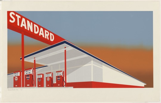
Edward Rushca.
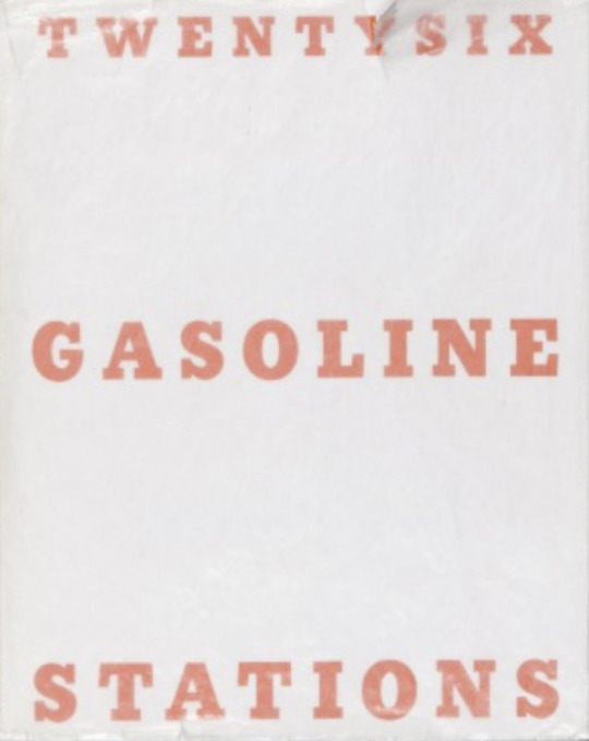
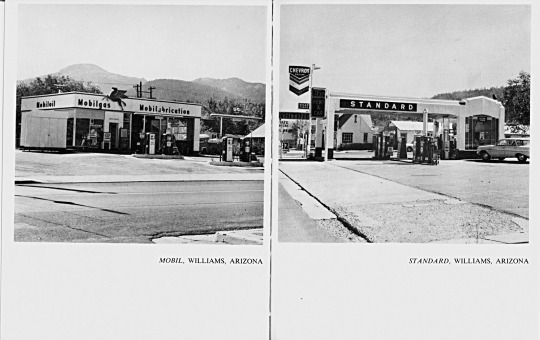
After creating my books I wanted to look into an artist that also created his own book, I came over this artist called Ed Rushca who is an American pop artist, he made this ‘twenty six gasolaine stations’ hard back book which is very self explanatory, he took photos of 26 gasoline stations.
A modest publication consisting of black and white photographs with captions, is an iconic artist book. The photographs are of petrol stations, along the highway between Ruscha’s home in Los Angeles and his parent’s house in Oklahoma City.
The captions consist of the name of the petrol station and its location (for example, ‘Texaco, Sunset Strip, Los Angeles’ and ‘Flying A, Kingman, Arizona’)
This book in particular is considered seminal in the history of artist books.Continuing my research I found that during the making of this book he had changed his idea about the layout and style about 50 times at the printers, in an interview in 2008 he stated that ‘when I got going on the books that it was really the red meat of my work. It was the choice bit. Although I was painting pictures at that time, I felt that the books were more advanced as a concept than the individual paintings I had been doing’.
I love the simplicity of this book, the front cover isn’t busy or detailed at all it is just a white cover with orange bold writing, inside it is all black and white. I feel this is very intimate as colours can distort your view on an image and distract you to focus on other things instead of the main focal point.
Edward Ruscha definitely made his mark on bookmaking in history and has contributed to this form of art massively, I love to make my books and plan to make many more.
0 notes
Text
Looking into the first book binded in history.
Perfect binding was invented in 1895. However, it wasn't used for book binding until 1931, when a publisher in Germany, Albatross Books, used perfect binding to make the first paperbacks. Penguin Books in England followed suit in 1935, and Pocket Books brought the trend to America in 1939.
The earliest surviving metal book covers originated around Syria. The first Western ones are thought to be a pair presented to the Basilica of St. John by Queen Theodelinda around 625 BCE.
The first books are bound in India. Religious sutras were copied onto palm leaves, which were split down the middle, dried, and rubbed with ink. These finished leaves were numbered and bound with twine.
0 notes
Text
1:1 with Angela.
10.12.20
Today I had my last 1-1 before submission, this was a 1-1 with Angela herself. I spoke about my practise and what I have been making, I said how I throughly enjoy the workshops and this is the backbone to my work, as I book 1-1 sessions after doing the health & safety.We spoke about what I had been doing within studio and the semester, and how I was getting on with everything.
Angela pointed me in the direction of some artists to explore, within my practise, as I have done so many different techniques I have a broad range of research that I can do to improve my knowledge. Work I’ve made stemmed from focusing on weaving, and materiality.
This then developed to my digitally illustrating some of my weaves, to the taking them down to screen print, when I heard about the 20:20 print I knew I immediately had to get involved and so used a design for this project.
Further on, I ran my physical weaves through the momo printing press to give them a new look/texture, following on with having 1:1 sessions with Sue focusing on high quality materials such as cotton and linen. After all this, I then went back to my digital illustrations and screen printing these in different colours.
After going into a graphical design style, I signed up for a workshop to make my own book, I loved it so much I went on independently to make my very own hard bound backed book, in an accordion style.
0 notes
Text
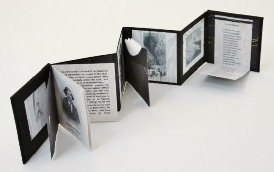
Why did I want to make a book?
The reasoning behind me wanting to create this book was as everything is online at the moment I wanted to create something that would be a physical form but of my online work.
I wanted to present my weaves in a different format instead of on a computer screen, I wanted to use digital and physical work together, as I am new to book making this was something that I learnt along the way and definitely a skill I can take further in my future pathway.
I really have a passion for the digital side of art such as graphic design, I find myself drawn to it every time I work I love creating work that is physical and also digital, this is still definitely a form of art and should be classed the same as a painting/drawing, it’s just a different use of medium that should be acknowledged more.
Books are so important within every day life, they hold memories, pictures and text, they keep all kinds of information, stories, thoughts and feelings unlike anything else in this world. Within the feminism era, feminism literature was
0 notes
Text
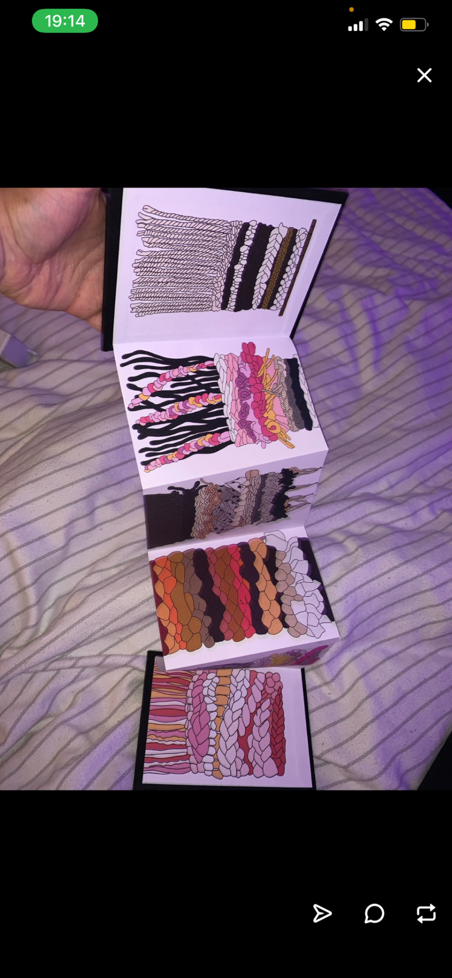
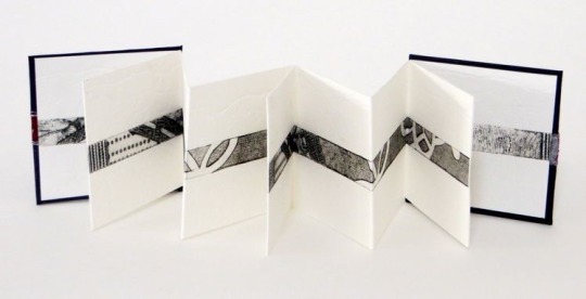
Creating my own Hard back Constantina - my digitally drawn illustrations.
07.12.20 STUDIO SESSION
Today I spent the entire morning and evening of my day with Emma in the Graphic Design studio creating my own hardback book which is a Constantina/accordion of all of my digitally drawn weaves on my iPad.
What I had to do to start the process:
To start this book making, I had to spend this week choosing and creating new digital weaves that I wanted to include in this book, I didn’t hold back on the colours, some were dark and mono tone and summer bright and also clashed. I chose the cloth of my hardbound book to be black, originally I was going to go for red however I wanted the front of it to be plain but the inside to pop with colour. I then had to print off my designs onto A3 sized paper sheets of 130 gram cartridge.
These are all single sized but had been set up on an InDesign document to be A6 per page. I started by lining up my paper onto my cutting mat to making sure it was within the great, I then 11 cm in the using my bone folder I folded the section of paper, this will be my lap joint as I have two pieces of paper for this book that need to be stuck together, a lap joint is invisible.
I then took my other piece of paper and stuck these together, this was this stage completed. I then moved onto my hardback binding which was very tricky, it’s something I had done in first year but not very well.
A one-to-one definitely helped today. I took a piece of cardboard that was going to be stuck on my black cloth that will be around my book, I then had to get my scalpel and a ruler and cut each corner off making sure I left some room as this room will be what is folded over when it’s stuck down, as all the edges need to be tucked in. Using PVA and a brush I slather glue all over the cardboard and stuck it in the middle of the square I did this twice as you obviously need a front and back cover for your book.
Grain direction:
Something important to remember is that you need to make sure your material is your paper and your cloth all have the same green direction, if they don’t have the same green direction this could cause them to bend and they will not go back to being flat as the grains don’t sit with one another evenly.
Once your cardboard and cloth were stuck together and your lap stitch was completed, it’s time for symbol this is the trickiest part as the glue can go everywhere and as I chose the colour black for my cloth it really does show up if you make a mistake.
One thing I would change is that my last illustration seemed a little bit odd out of the other five, the size and arrangement of it on the page didn’t seem to match however this doesn’t matter as it doesn’t look any different to anybody else.
However, I absolutely loved creating this book and I would love to do it on a bigger scale, I feel it’s a very sculptural piece with all my work inside of it, I knew after creating that first notebook that I illustrated the front of I needed to create a book that had my own content within it. I now have a shelf being built on my studio wall to present these ready for submission.
0 notes
Text
Femenism and Textiles: Tracey Emin.
Tracey Emin is a famous artist whose work is based off Femenism, her work is often referred to as confessional, for she uses her own personal history as the subject for her artwork.
I’ve chosen the study of Tracey Emin for my Visual Analysis Essay. I was originally going to written about the work of Joana Vasconcelos, however I changed my mind, due to the strong links of semiotics of feminism that I could talk about regarding Tracy Emin and her bed.
Whilst still looking into Textile artists I came across that Tracey Emin is also a contemporary artist who has used textiles combined with words over recent years. Some of her pieces are created from fabric letters appliqued onto a backing. Some of her textile pieces of art consist of ‘everyone I ever slept with’, and ‘My bed’.
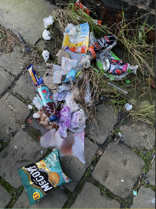
Recently, I was walking through the streets of Salford and turn down a backstreet, where I came across a mattress in the middle of an alleyway, at first I was shocked at how it had been left by previous people, however an artistic narrative came into my head and linked it straight to Tracy Emin, ‘My bed’. Even though this links to a visual analysis essay, the research to do with Tracy Emin links a lot into my studio practice., as she use personal items to her to make her installation, and this links to me as I’ve been using personal items to me such as clothing within my weaving. 
Linking with Tracey Emin ‘My bed’ there are so many objects scattered around the bed, such as the worn mattress itself, smashed glass bottles, plastic bottles, crisp packets, tissues, food, Colgate toothpaste packets, chocolate wrappers, and tampons, some which I blurred out, this is a raw imitation of Tracy Emons bed, but on a real scale and in physical form.


I do feel my work has a strong link within the scenes on Femenism. Before women had a political voice, they used “domestic arts” as a covert form of protest and activism. Hundreds of years later, they’re still doing it. In the 70s, embroidery and knitting were central to second-wave feminism's take down of traditional, male-centric art institutions. Today, we still recognize textiles as a form of communication, and a way to press against capitalist consumer ideals.
0 notes
Text
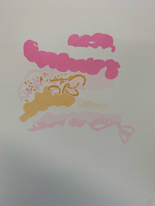
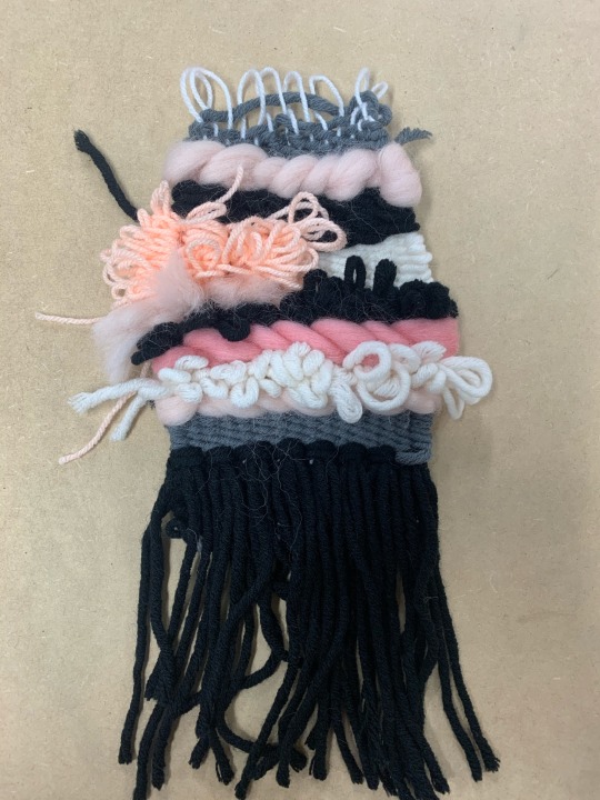
Final ScreenPrints:


26.11.20 FOLLOWING ON STUDIO PRACTISE
I’m going with my last post about my twin prints of my weave, these are my final prints I chosen as they were neat however I decided to come back after lunch and change the colour of my black outlines were bright and warm, I decided to choose orange as it was the warmest colour and I feel that it would clash with the pink and so I thought clashing would be a good idea and switch it up. I think it was a very good choice as I received a lot of praise from this particular brighter print.
When I started printing I printed the black outline first and so I wanted to be very precise with this and make sure was perfectly lined up, however when it came to the orange I buy accidentally placed myself off-line and so it caused the print to end up misshapen and out of line, out of the ones I picked I did have some perfectly black outlined ones and some personally orange that line ones, however for some reason the off that orange really caught my eye. 
For some reason the pink and the orange remind me of a 1960s/70s House and its interior colour, everything was warm tone and sometimes classed with prints in colour. I’m really happy with my overall prints and it’s definitely something towards my wall, I’ve now completed quite a few processes since starting my Yarn practise. 
If I were to do anything different I would’ve printed all three and screens differently after doing the pink orange and black, I feel adding the orange was a good idea instead of the black outline however I wish I’d completely changed it and maybe done a dingy dark print instead, to get different aesthetic’s and moods. 
I’ve asked for feedback on my prints before and after I did them and every single time I did someone replied saying this certain weave looks liked a sea urchant , hthe most popular one was a jellyfish, this is probably due to the drop in tassles/fringe on my weave, giving it an affective fluidity as it looks like it could move.
1 note
·
View note
Text
Layering my Acetate for my ScreenPrints.


26.11.20 STUDIO PRACTICE
Today, I had a day booked off in the print room downstairs, a few weeks ago I went to Craig asking if I could print my illustrated weave that I designed on my iPad Pro using procreate, as a screen print.
At first I wasn’t sure I was able to as I flattened my image meaning there was no layers to it and it can be broken up onto a screen, thankfully Craig was able to separate and get onto three different screens, this means I would have three different layers as you can see the orange layer, the pink layer, and finally the black outline which brings it all together. 
I had to be very precise when lining up my work to the screen, as I had three dividual screens and so my paper did move each time as they all weren’t the perfect size, however, I did not mind that they didn’t lineup as it adds to the effect as it didn’t need to be perfect.
When mixing my colours I wanted to make sure they were as close as I could to get to the original image, I wanted to make my yellow wasn’t very bright and so I added Brown to make it a more mustardy shade. As for my pinks, I wanted to make sure they were really bright however at the time I decided to add more white into my pink, this didn’t matter anyway as my screen had been bitmapped it changed the shades of the pink and made a few lighter, as some parts of the screen didn’t let as much paint/light through, which is what I wanted.
I’m really happy I did this, as this was my most enjoyable process wgen creating this weave, I plan to make a few more in plan for my booklet at the end of this month.
0 notes
Text
Planning my Accordian/Conertina.
24.11.20 PLANNING
Today I had a one-to-one session with Emma from the Hardback cloth and book making session, since that won’t sure it really inspired me to make my own Booklet/Zene for submission, this is something I’ve always wanted to do for my own personal use and for away to present my words are others.
She went to perfect binding with me which is what I’ve already done and also pamphlet stitch which was the simple five stitches with the thick string, there were also many other ways of producing a booklet such as a paginated book which is where you pages are designed in multiple of four and then they fit inside one another, you don’t have to manually rearrange the pages, Indesign does this for you. Then the common stapled book, hardback book making, a screw post book, which could work really well for me as it’s a book that you can edit, such as take out and add in pages and finally an Acordain.
After all these options I have decided to create an accordian, which is a folded structure, the book block is made by simply folding a sheet of paper back and forth in page-width increments. I am going to produce multiple designs on procreate on my IPad and make them all into a book, the size I have chosen to go with is A6, this is very small and not something you would usually choose to scale your work, however the size is appropriate and also works as a sculptural piece as it can be folded and moved around easily due to its size.
1 note
·
View note
Text
Mocking Up Riso Prints Digitally and Simple Binding


Today I did a workshop based on knocking up riso prints digitally and learning perfect binding. This workshop was one of my favourites by far as I’ve never done it before, this was all to do with graphic design/Adobe illustrator, I learnt a few tips and tricks on illustrator and also on photo shop I didn’t know before.
We had to bring our computer with us to access all this and follow the demonstrator, we spent the morning binding a scrap book together using a needle and stitch, just learning the simple and basic stitches. Then, in the afternoon we were able to make our own hardback book using one of our own digital designs, I chose something I previously done on procreate on my iPad, as I wanted to keep my practice in with all my workshops. I chose my illustrated weave that I’ve posted on tumblr before, this works well as a front cover however I did want to include pages in the book but this would be something that have to book a one-to-one session with. As for the back I created a five minute painterly image that fitted well as it didn’t need to be detailed, it just needs to have a back cover.
We then learnt how to fold the paper with a bone folder, and also using the special machine where you had to work out your millimetres of each crease, this could be tricky as if you messed up your book wouldn’t fit together properly. We then moved over to the machine where the spine of your book is glued to the pages, this was very difficult as it was my first time and you had to be quick with it otherwise the glue would dry without your page is being stuck together.
Mine came out successful, this is definitely something I want to do again, I’ve booked in to create my own book on the 7th of December before we break up for Christmas leave. for now my plan is to make as many digital designs as I can up until this date so I can make a full book ready for submission.
I’ve realised the importance of using different practices to show your work, such as creating my weaves physically with Yarm, printing my Weaves through the press, screenprinting my Weaves and finally displaying my digital ones within a book/Zene. 
0 notes
Text
My favourites from Mono Printing.


23.11.20 STUDIO PRACTISE
Here are some more from my mono printing session, these ones I’ve picked out, out of all of the prints I’ve done are by far my favourite, I was so shocked at how the medium of mono printing really gave a painterly/ chalky effect to my weaves.
I really wanted to create a jet black one, as all my others were so colourful and I felt that the use of different colours didn’t pick up all of the details that I wanted it to.  I almost feel that using black gives it such a ghostly affect, even though it’s dark it’s very wispy and light in the terms of how delicate it looks. 

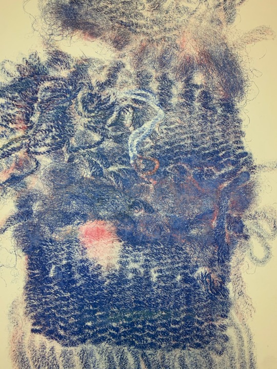
I then went in with Blue ink, I tried not to choose one that was the primary colour, I wanted a turquoise depth to it. However. for some reason I really don’t like working with the colour Blue, it is by far my least favourite colour, it doesn’t seem to bring my any joy within my work and never gives off a positive look. I tried it out anyway, as who knew what effect it would give. Once again it gave a really gentle look to my print, I tried to make sure that the placement of the wool and its tassels were similar to my black print so I could compare them.
One thing I note to myself is not to use Blue again within my own work as I struggle to see the look it gives due to me not liking the colour.

Next, are my two favourites, the colours with in these are so soft yet vibrant, they give off such a warm feeling and are delicate once again. I felt these pink/oranges were very pastelly compare to all of my others which were chalky. This was the one I received the most praise from.
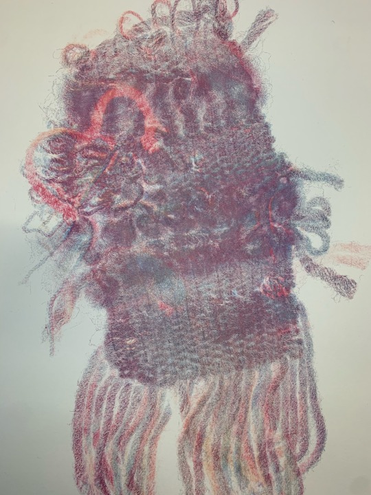

I decided to take two photos of the so you can see up close to detail at all the different colours combining, I did not plan to have more than one colour on this we’ve however through the price it picked up the colours that I previously use when putting it through them on opens press. I think the tassles, also known as the fringing is the most affective part of this weave, without this I feel that we wouldn’t have had much debt as it has now, each individual thread is a different colour and some are combining with one another. Every single colour within this compliments it’s self and are all light pastels.
0 notes
Text
Joana Vasconcelos “Finisterra” - my own take.
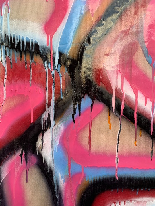

19.11.20 STUDIO CULTURE
I decided to go back to my spray paints, I’ve been looking at different ideas I can do, I realise that trying to replicate a weave using spray paint is not possible, as in to get the same look. Spray paints do their own thing as they drip uncontrollably. For my visual analysis essay I was originally looking at Joanas work and her woven sculptures, however I decided to change my mind and focus on Tracy Emin. Not forgetting Joanna Vasconcelos along the way, as she has been a big inspiration within my practice this semester, I decided to revisit one of her works that I saw at the Yorkshire sculpture park, named “Finisterra”, 2018, Handmade woollen crochet, ornaments, polyester, on canvas, gilded relief frame, plywood, iron, 340 x 550 x 80 cm.
This is a huge woven sculpture, placed in a gold frame, giving it a painterly affect. I love the colours in this piece of work and the black really adds to it, I felt that I’d be able to do this on brown backing paper as I did not have any card, I did have cardboard but it did not work well for me last time as it was quite flimsy. I went with the colours I had I wasn’t trying to replicate this completely I just wanted to give my own touch to it. As it was windy and my spray paints were quite watery everything traits and formed its own painterly form, I wouldn’t say I’m happy with this work but I’d like to include it as it is a development and a piece inspired my one of my favourite textile based artists.
If this painting did not have the black within it it would look very minimalistic, the black is so bold and really replicates what I’m trying to do. If I were to do it again I think I would use thick white card, and thicker paints as these paints were quite low in value and so low in quality.
0 notes
Text
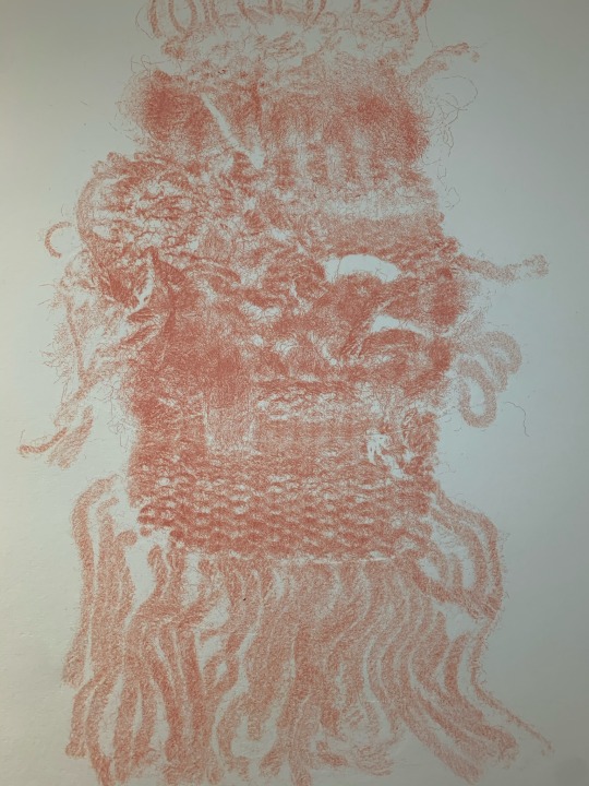
Mono Printing my favourite weave.

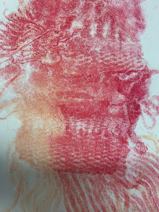

17.11.20 STUDIO PRACTISE
Today, I have been down in the print studio again, developing my practise. I have been printing over my weave, I selected a weave that I really liked, this had a disadvantage as I can not get my weave back to its original state, however it did not take me long to do.
This process was mono printing. (Mono) meaning you can only get one print from your plate, not like screenprinting where you can produce as many as you’d like all being identical if you want them to be, in a short space of time.
I decided to start with choosing my colours, this varied from black, white, yellow, orange, red, blue and a transparent gel which I haven’t used before, but learnt that it can make your colours less vibrant/transparent.
Starting with red and yellow, I made an orange that was quite coral coloured, like in the ocean, I ran this over my plate and places down my weave on top of it, I had to make sure before I did of this that I wet all my paper before hand, I then used the squeegee to take the access water off and placed it between blotting paper, rolling it with the rolling pin.
I then places this paper down on my weave and rolled it though the press, the colours came out really well, I got a positive and a negative print as the rave filled the space white and coloured the paper around it, however if you colour the weave and don’t colour the paper then you get a print that is of just the material.
I then changed my colours to a Rainbow effect that Michelle showed me, this is where you just get 3 different inks and place a blob next to one another and roll them into a gradiene of colours. You then repeat the same process.
After I did this, I switched to blue. This turned out really well as it picked up the previous colours I had on my weave and made this really Florissant and vibrant print, that I didn’t expect to happen. This was overall my favourite one, after I did this I switched yo and changed to black, I wanted a minamilistic print that I could potentially work back into with stitching.
I really wanted to do this as I wanted to try out different textures, as I feel my theme is very textural and experimental.
2 notes
·
View notes