
kirikinetictypebyjess
Jess Andersen kinetic type animation
48 posts
Don't wanna be here? Send us removal request.
Last Seen Blogs

the-half-shebang
i, the bitch herself

puffpartypodcast
Puff Party Podcast

tout-simplement-noir-voster
#Tout Simplement Noir Streaming vF (2020) regarder,,~ Tout Simpl

1crystal2crystals3crystals4
Crystal Blog

janedaniels-real
Jane Daniels ✨
Video
here is my final video. I think that i have used historical context really widely to influence the colour choices and typefaces used in this animation. this was a really challenging assesment but i learnt a lot of new skills and am happy to have a these new skills under my belt. the mood of the animation was heavily constructed through the historical context and personality and presentation of Dame Kiri Te Kanawa herself. I think that the script fonts used throlughout the animation are a strong representation of her opera background as well as luxurious famous lifestyle. I think that the san serif phosphate solid font used in correlation with the segments talking about New Zealand and Maori language work well and contrast nicely with the script fonts. Overall i think that I have considered design influences as well as mood and context to form this animation in after effects.
0 notes
Photo
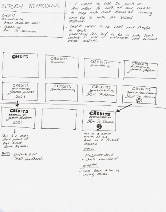
Storyboarding for the credits segment at the end of the animation. The fonts that i am goimg to use for this section are phosphate solid and snell roundhand. i also want to keep this section simple and straight to the point in terms of colours, so im just going to use black and the cream white colours. I want the headings, and subheadings to be in phosphate solid in black and the our names in the cream white in snell roundhand. I also want to use the write on text affect again to keep in with the visual theme of the script fonts used throughout the animation. I also think using a different font and colour for the names helps to seperate the text and create visual heirarchy.
0 notes
Photo

here is my little fish graphic. Ive used the green colour from the background and used different shades of that to make itvboth pop and look part of the background.
0 notes
Photo
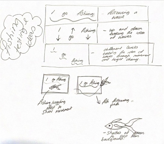
testing a few layout ideas for the text on the ‘i go fishing’ segment. I really like the idea of the text moving like waves and then the fish graphic coming in on a path ‘under the waves’. i think that the fish would look good in a shade of green to pop from the background but also look part of the background like it is the water. My favourite idea is the top one where the text is a line and the whole line moves like a wave.
0 notes
Photo
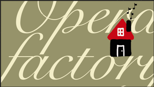
this is a screenshot of the end frame for the opera factory segment. I think that the colour scheme came together well and the graphic stands out nicely. I think the words being moved slightly out of frame but still readable is an interesting visual. The script font evokes the idea of opera and the class level that usually comes in association with that.
0 notes
Photo

here is a little graphic of the opera house that i created with the paint tool in photoshop. I think that the colors tie in with my research and the graphic itself ties in with the words and what she is talking about during this segment.
0 notes
Photo
brainstorming further ideas in correlation with the storyboarding for ‘and i enjoy singing. ummmmm i have a little place called opera factory that my girlfriend runs and we have a little sort of school there for young people’.
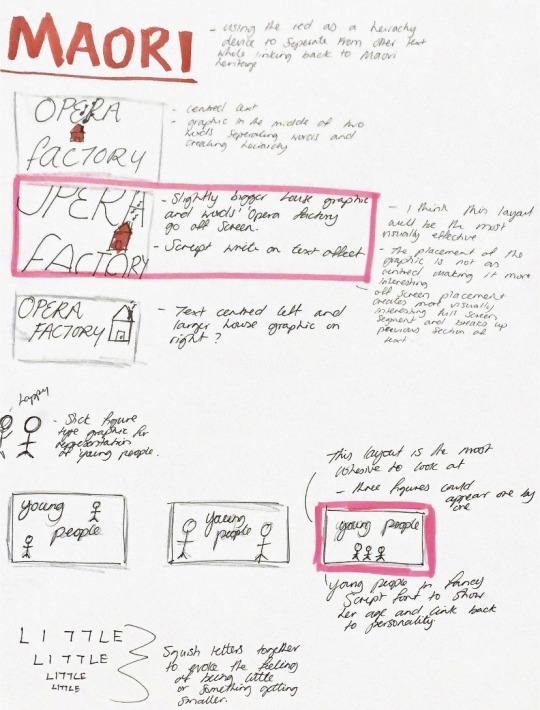
the. first part with the word ‘Maori at the top of the photo was more. just a quick idea in relation to other parts of the animation where the word Maori comes up. i was just quickly jotting down the idea of a sans serif font in red being representative of her heritage and also being bold and standing out from the other text.
the opera factory frames are tests for how i want the final frame (end frame) of the section to look. I really like the idea of a little red house graphic to tie in the colour scheme and her actual opera factory colours. The one highlighted in pink and annotated is. the one that i think will be the most effective as a end frame.
the bottom parts are little tests of other ideas such as the frames for the ‘young people’ frame with stick figures, and a visual exploration of how i want the shrinking of the word little to look.
0 notes
Photo
Adding in new colours to the. colour scheme. I think it will be important to use red black and white as they are the colours used in the design system of Kiri Te kanawa’s branding for her opera factory. These colours are also the colours of the Maori flag and will play an important part in visually representing her Maori heritage.
0 notes
Photo

Last section of the animation. the main thing that i want from this section is for there to be an obvious contrast between the parts where she is talking about England and the parts where she is talking about New Zealand through font choice. I have been showing her personality through script fonts throughout the animation as this links to luxury, glamour and elegance. I think that her life in England that is more linked to these high end fancy connotations. Her New Zealand heritage is going to be shown through a bold Sans Serif font that i have used previously in the animation ‘phosphate solid’. Having a large solid font helps to show the solidness of her. foundation in heritage and the colour choices red and black also link to heritage as these are the colours of the Maori flag.
0 notes
Link
here is an image of the logo for Kiri Te Kanawa’s Opera factory. I think it could be fun to use the same reds and whites in the little house graphic in this section of the animation to represent the true opera factory.
0 notes
Photo

Story boarding for the next section. The main frames that are going to have effects on them are ‘little’ ‘Opera factory’ and ‘young people’. I want the word little to have spaced kerning a the beginning of the word and then have the word squish together to visually represent the idea of little or something becoming small. I want Opera house to take up the full screen and have a handwritten affect as it is a direct creation of Kiri te kanawa and i have been using script throughout the animation to represent her and her personality. I also want to have a little graphic of a house with music notes coming out of the chimney. Lastly i want to have little graphics of stick figures to represent the young people she is talking about when talking about who attends her opera house.
0 notes
Photo
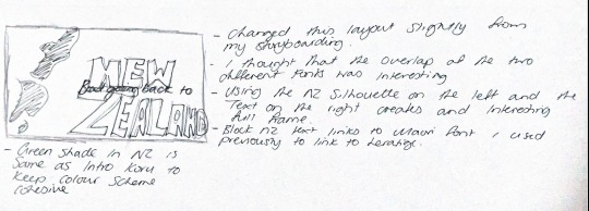
Brainstorming an alternate idea for the layout of the ‘going back to new Zealand’ section from the previous storyboarding section. I think that the overlay of the two different fonts could create an interesting visual. The words New Zealand being at the back of the composition in terms of layers also visually shows ‘going back to New Zealand’.
0 notes
Photo
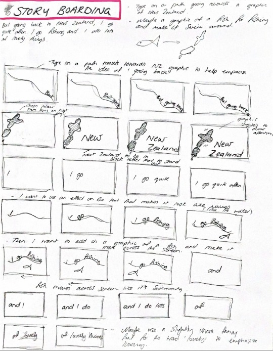
Next section of story boarding. I want to use type on a path again to help show the idea of direction when she says the words, ‘Going back’. I also want to use a text effect that makes the words look like they are wobbling up and down to evoke the feeling of water and waves when she is talking about going fishing. I also want to use some graphics in this section to help emphasise visual ideas and understanding from the audience.
0 notes
Photo
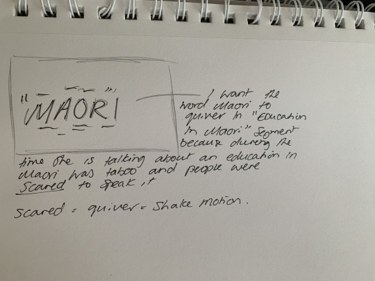
Adding a quiver motion to the word Maori is a good idea to help emphasise the fear around the idea of an education in the language.
The word education could also be jumbled to show that there wasn’t a solid process in education people in the language at the time.
0 notes
Photo

Storyboarding for the previous section of animation that i posted. I really want the sections ‘non language’ ‘Maori and english’ and ‘education in Maori’ to stand out. This will be done with colour choice, scale and font selection that is different to that of the rest of the animation.
0 notes
Video
here is a look half way through. you can see i have changed some of the colours to create stronger contrasts in the heirachy of the words. I have changed the colour of the word ‘maori’ to red to link back to the cultural use of the colour as well as using it in a ‘danger’ or taboo sense that the word is being spoken in context of. I also used a black for that same reason. To help create contrast and hierarchy in the frame layouts. I also really like the visual of the word slow being stretched out like that. i think it evokes the physical sense of the word really well as well as matching her drawn out sound when speaking.
one of my favourite segments is the ‘non langauge’ segment. I really like this segment as the word language falls back and disappears into the background evoking the idea of dissappearing or non existence which is what they are talking about.
0 notes
Video
here is the next segment of my speech/animation. I used the type on a path tool to make the text go around the graphic of dame Kiri. I think that the colour pallet and font choices are still working, the type on a path could be slowed down potentially to make it more readable.
0 notes