kaylawilliams-photography-631
KAYLA WILLIAMS
ARDN631_The Interpreted ImageI'm a street + landscape photographer working mostly in b/w > specialising in poetic street + documentative landscape photography.
40 posts
Don't wanna be here? Send us removal request.
Last Seen Blogs
sakuwaid
流れ星
sqiegel
shine on you crazy diamond
wellward
who will love a little sparrow?
denkies
come back

leafkunoichi
Naruto Sideblog
Text
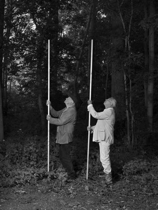
Research \ technical_Kassel Dummy Books
Bebe Blanco Agterberg
Bebe is a photographer based in Amsterdam.
Her visual language is based on what she sees in the media and she is specifically interested in that what has been manipulated. Agterberg uses artificial light in order to give a cinematic feeling to the work, which is based on emotions that tries to lure its audience into believing what is created in front of them. In her work she takes on the role of a director that investigates what truth means in modern times.
Her book, winning third in the KDB awards 2022, A mal tiempo, Buena Cara (translated In bad weather, a good face) is one I wanted to highlight for technical reasons. Her use of the flash (something I have yet to learn) creates a really interesting sense of the depth in her photographs. To me it reflects elements of photojournalism in a visual sense.
Also just a couple of the spreads/layout features of her book that I liked. The contrast of colour with black and white (which can be done digitally and in print) and a chapter of her book which Bebe describes as censored (removable) > might come back to this idea later with some of my ideas for my concept.


0 notes
Text
Research \ format_Kassel Dummy Books
Luigi Cecconi
Luigi Cecconi is an Italian photography whose "photographic research [is] focused on social issues, filtered by a conceptual intimate vision, free of a specific stylistic choice." What i liked as I looked through some of his work is visually how he presented them. Particularly this work below, Fuori era estate (2010-2016), focusing on each image and framing them in slighting unconventional ways.

His book that was entered into the dummy book awards, Incorrect Theory (2017-2022) - conceptually - followed an imaginative escape of adolescence, portraying an ideal landscape. I like the small format of the book with most of the images in the same ratio on the page. Pictures at that scale and amount almost function as a flip book which would be interesting to interact with - in regard to conceptual sequence.
youtube


0 notes
Text
Research \ conceptual_Kassel Dummy Books
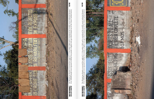
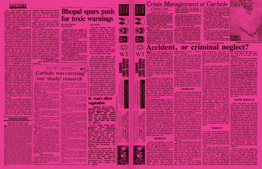
Iris Janssens
Is a photographer based in Belgium whose book, Did you know? won first prize in the 2019 KDB awards. Her work is centred around investigative documentary photography. Did you know? is a book on the ongoing effects of the Bhopal gas tragedy in India, 1984. The photos document the people and place effected by the event and how it is having lasting impact on the next generation. The range of photos include protest, portrait and landscape photography in the region.
I chose this book to analyse one of my ideas conceptually was to do something photojournalistic and as an example I really like how she put the work together.

0 notes
Text
Formative feedback
Annotate works referencing model
Assignment name on front page
Narrow down selection further - especially of self-portraits - pick the super standouts
0 notes
Text
Formative_designed pdf
I decided to design the pdf for submission like last year- it helped me visualise the way I wanted to portray both myself and the images of other people I took. In doing so I altered my selection a bit, still retaining four minimum images of each of my models and seven self-portraits.


0 notes
Text
Beyond formative...
What's working?
Experimentation - keep going with trying different things in different lighting!
What's not working?
Time - can I experiment with what I have available each day/every other to get more variety, practice and push myself to think more flexibly?
Availability - I really want to involve my family in the next part of the assignment (especially environmental portraiture e.g. their workplaces/work attire) > there availability as well as willingness to participate is the biggest road block. I know none of them will want their photos on the internet so I will need to work around with that. If this doesn't work though I would definitely work more with friends.
How can I improve?
Use reflector more
Get better at using metering (focus + exposure)
Practice natural lighting shots to get better with exposure
New ideas?
Get more wider angle shots - think about environmental portraits (self + other) *conceptually > work and workplace shots (practice vs. profession)
Explore more artificial and low-light situations
0 notes
Text
Formative editing
After doing a WIP edit in class last week I printed off all the photos (of those I had edited from each roll) so far and made selections by each model as well as my self portraits. This really helped because as much as I had my favourites on screen, once I printed them off and grouped them together I think my view changed.


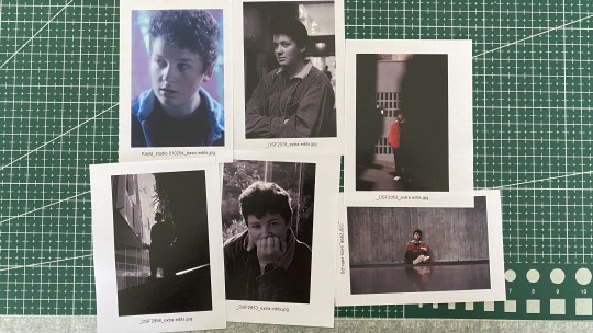

Below are my revised edits which I may or may not reduce before formative - after placing them full size in sequence in a document I may reduce my edit further.
Self-portraits
Genres:
Close up
Head shot
Traditional
Candid


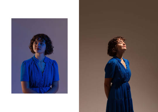
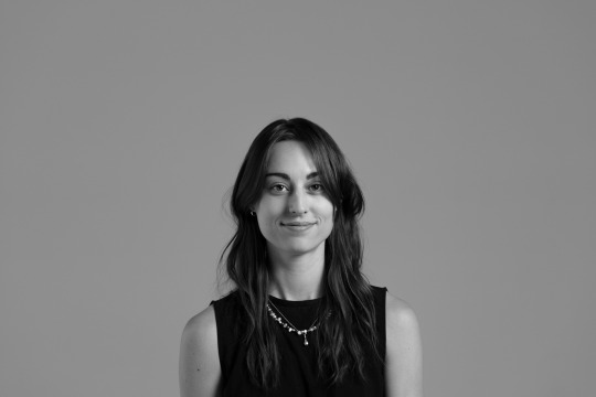
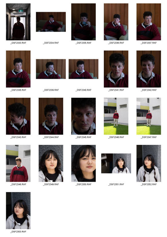
Model 01_Aurelia
Genres:
Actor head shot
Candid
Conceptual


Model 02_Daniélle
Genres:
Glamour
Candid
Creative
Action?


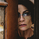
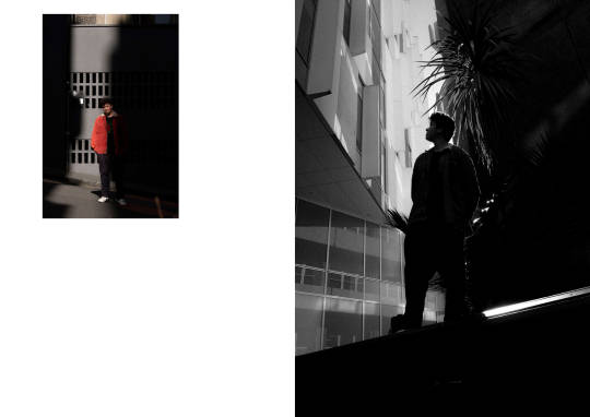
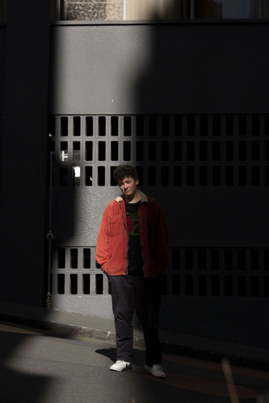
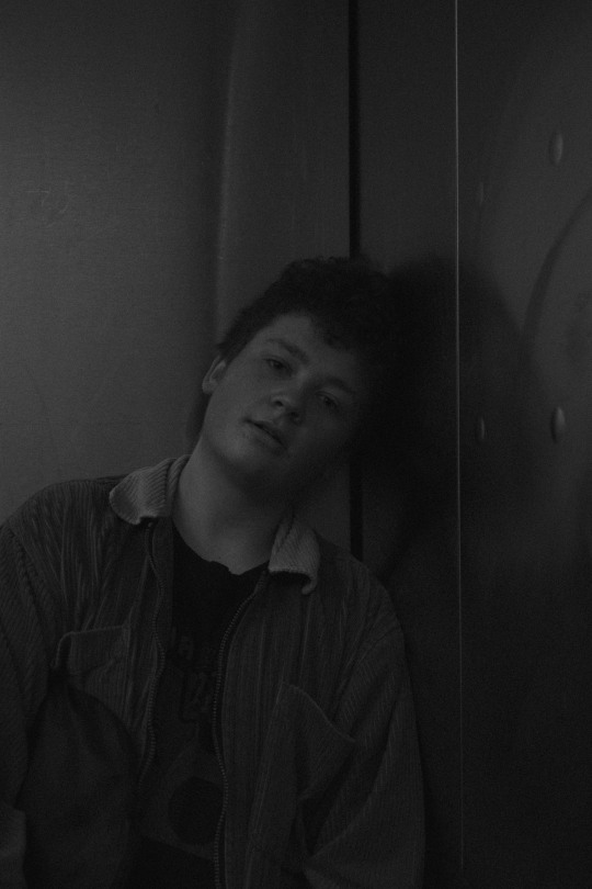
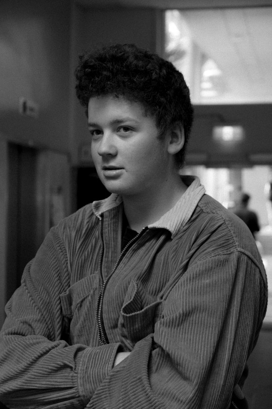
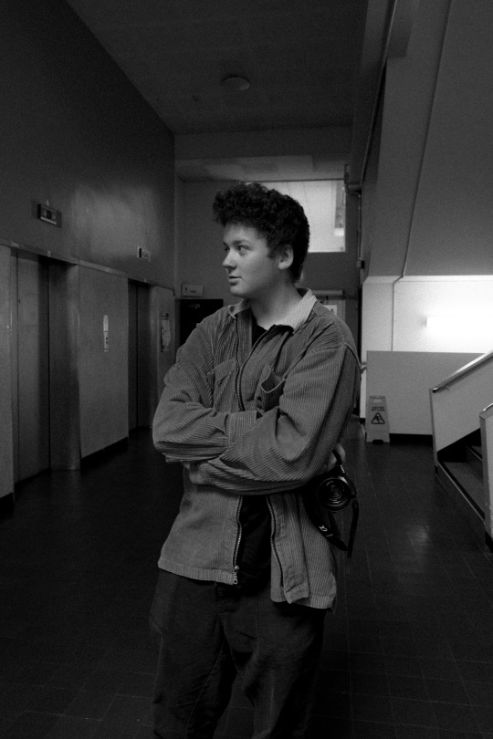
Model 03_Joel
Street portraiture
Editorial
Fine art


0 notes


Text
Week 5_ WIP > Self portraits


WIP Commentary:
What's working?
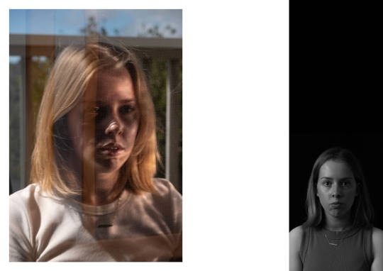
The closer-up shots - definitely - I have discovered that in most cases AF is better used that MF (with the exception of super close up shots) and I now also know how to meter properly so I can use AF correctly rather than just hoping it'll get the right spot.
The experimentation with different lighting set ups. All of these shots used natural, ambient or available light - I am yet to take any successful shots with created light which I would definitely like to do. However, I like the ambient light for how soft it is. Reflecting now on the indoor shots in the lot above - I think improvement could be achieved with using a reflector to get greater depth and contrast in the same lighting situations. As some of them are still quite flat, especially with highlights.
What did I want to portray?
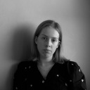
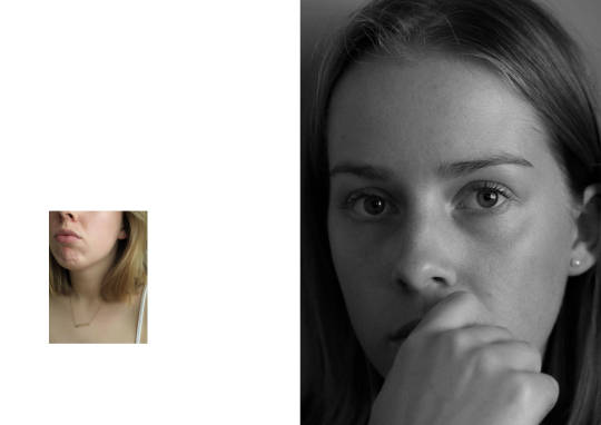
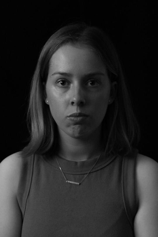
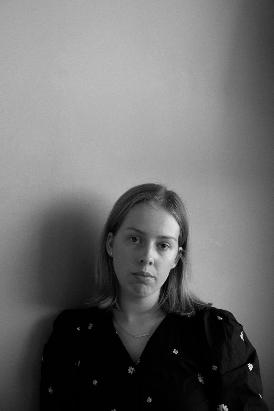
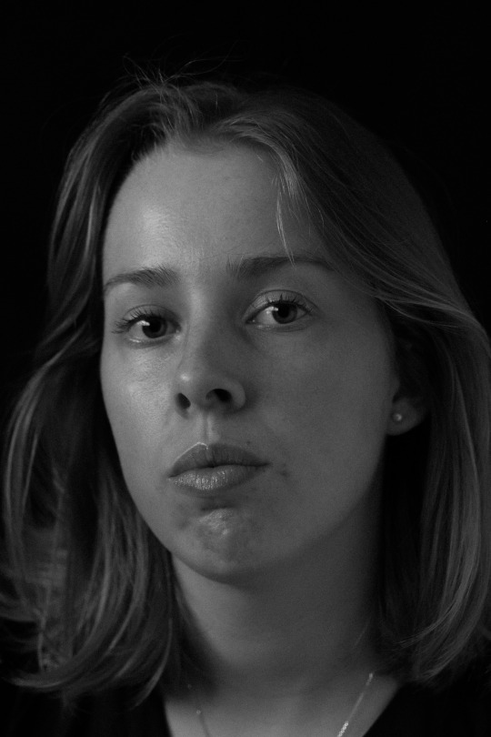
To be honest I didn't necessarily contemplate this too much before taking the images but I think I want to portray myself in a more serious fashion than I think a lot of people see me in daily life. I come across very bubbly and joyful a lot of the time but as an introvert with very limited social energy this is my expression for the most part. People tend to comment when I'm not smiling as much or am not as chirpy that I look upset or angry or think something is wrong (I've been told this for years and years) so I have grown conscious of what my face looks like when its resting. So in a way this is my own - personal - reframing what I look like with a serious expression/expressionless.
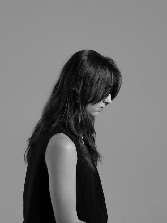
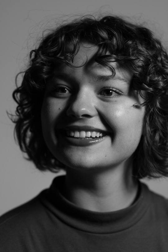
Alongside this - just simplicity - I didn't want anything to grand or complex in these images as that doesn't match my personality. I think the use of the black and white represents a subtle boldness and simplicity that doesn't distract from the subject.
Personal experience / contemplation of self:
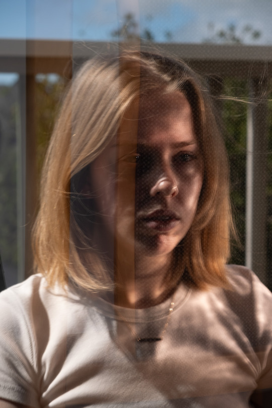
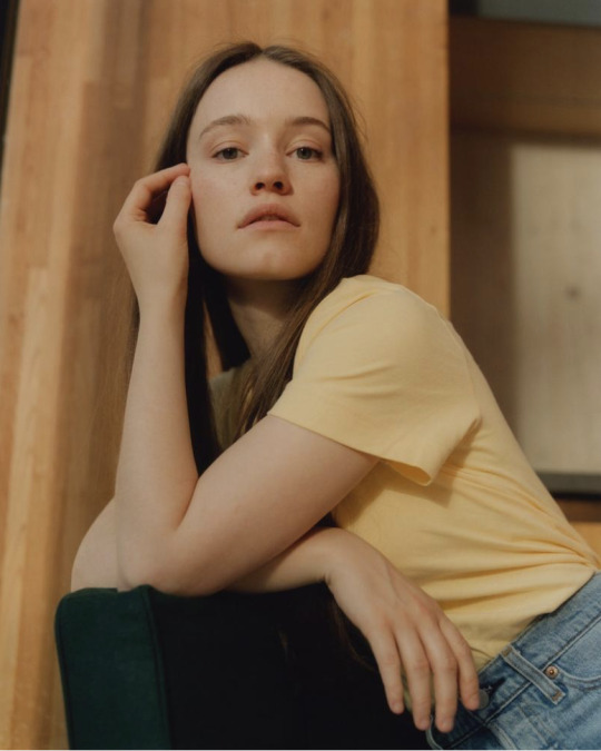
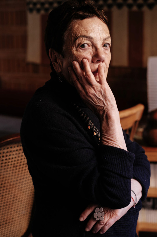
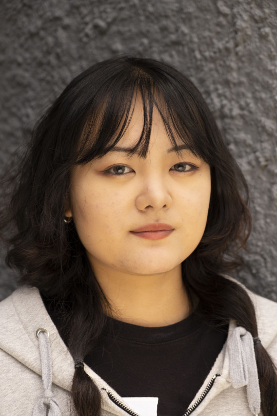
I don't have the fondest relationship with the camera - in terms of capturing myself. I'm not very confident capturing myself - I don't think I ever have been. This is one of the reasons why my selection here capture me without much expression. My key image at the moment (the first one) is probably the most vulnerable and intimate shot I've taken of myself.
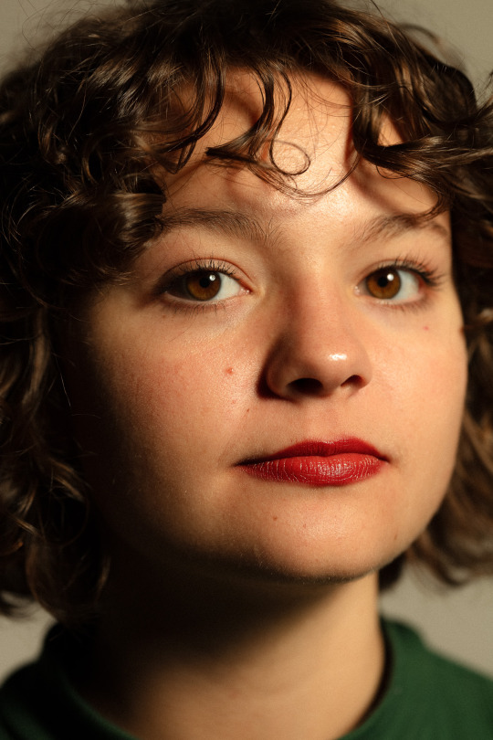
Just like most I'm not super comfortable with my face - the placement of my hand in this image was for that very reason and kind of places that insecurity in the image as I'm hiding it . One of my biggest insecurities is my mouth/chin area. It stems from so many pictures that I've been in where someone captures me with a big gummy smile or from a really unflattering angle emphasising my chin/neck. There are very few occasions where I like how I'm portrayed in images other's take of me.
Also taking these pictures at home added an extra vulnerability. I became more and more comfortable taking photos but didn't feel like I could fully capture myself - maybe how I wanted - because I had/have other family members at home some days. I think to give myself the space to express myself more - using the photo studios as a self-portrait space and to have the security of no one else being around might help. Also taking any chances of having the house to myself and giving myself space to feel more comfortable infront of the camera would help.
The use of black and white in my edits was both an aesthetic choice as well as a personal one. Apart from the two images above where I quite liked the colouring of my skin and hair, the others (also the fact that they were framed tighter) were closer and I didn't feel comfortable with certain elements of my skin being in colour for example.
0 notes
Text
Week 4_ Weekly roll / Photographic studio
CONCEPT_02
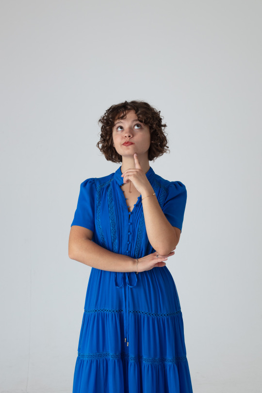
The second model I had was Daniélle. I didn't have any pre-planned concepts for her and decided to have more of a play around with lighting as by this stage I had troubleshooted a few things with lighting and exposure and felt more comfortable doing different framing, lighting, focal lengths combinations. She's a super bubbly person so I let that direct what I did a little (with the exception of some shots for the sake of lighting direction). In comparison to more serious shots I took of Aurelia, Daniélle was more bright and colourful in clothing, expression and body movement.
I shot half of the photos of Daniélle in the large white studio which I had booked for the first half of the day and then I moved to the small white studio for the latter half. Initially Cornelius explained that the middle studio isn't suited for people photography due to the amount of space you're restricted to but I did find this pushed me to try some more experimental combinations.


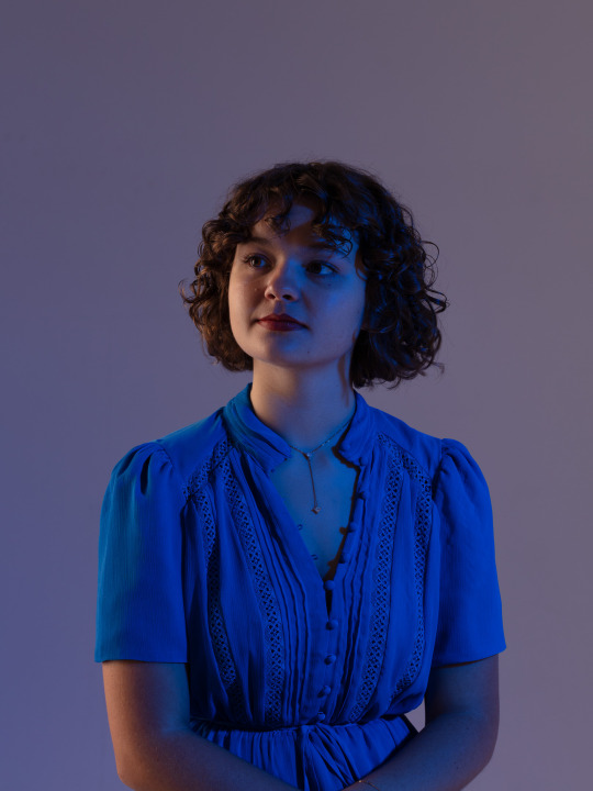
The first 6 shots were taken with the same set up as the last few shots from Aurelia. I then changed to the 50mm lens and expanded my frame of view a bit to do some full body shots. During this set up I started to have a play with some props I bought with me (some $4 plastic table cloths in gold, silver, rose gold and transparent irredescant) which I brought in more in later shots. Around the middle I also discovered the gels and starting playing with the different effects they have on lighting (learnt that they dull the light significantly - especially the darker ones).
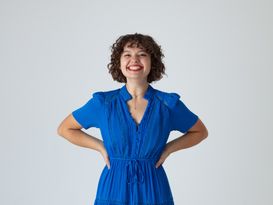


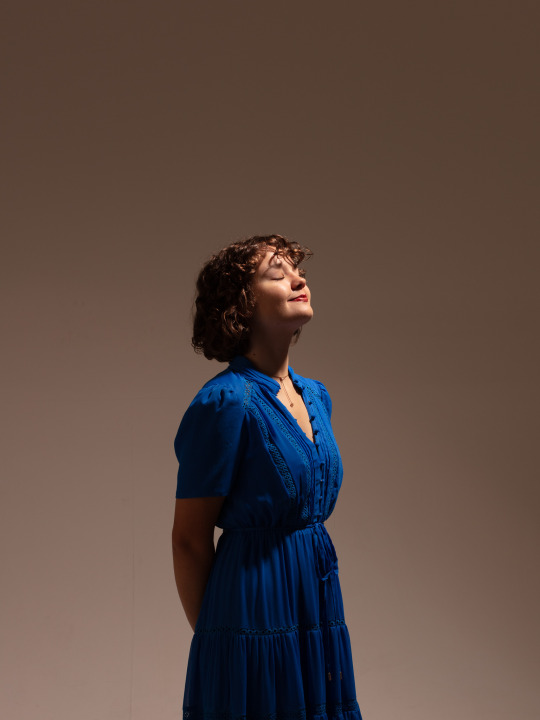


My chosen shots from concept 02.
I explored the most diverse range of lighting situations with Daniélle. Definitely had more fun the later shots using the irredescent plastic.
I will make note on a few of the shots above...
(1) this lighting situation was great but ended up feeling too stark and artificial. I definitely had the fill lighting quite bright on this and could have knocked it down. The wider angle I was working with (the 50mm for this one) was a nice change from the tighter shots I was getting with the 100mm. I think to complete my vision of this shot I would've liked a colour background - which for the scale of this assignment is a bit much but would've suited the style I was going for.
(3) Could've done with better loop lighting around the nose and under the chin.
(7) Definitely a higher contrast/high key image. I like the Rebrant lighting i got with that angle though and the catchlight brings out her dark eyes as well.
(8) I think an improvement on this shot would be turning the subjects head to get more rembrant lighting on the left side - either in the direction of shot (7) or more font on. I think by this point though I had more than enough front facing shots.
(9-10) More depth + contrast > lower aperture?
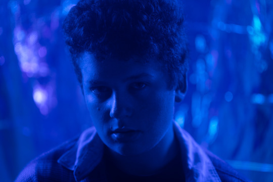
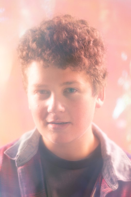
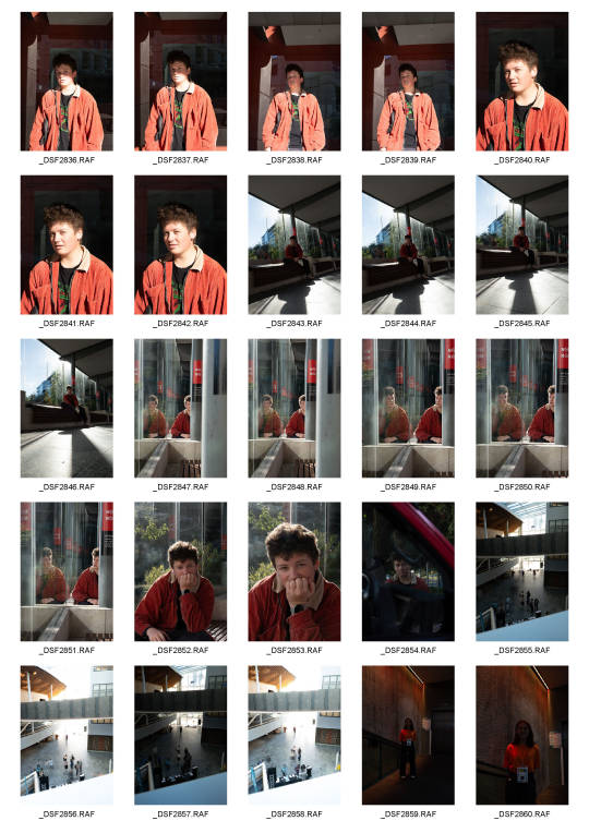
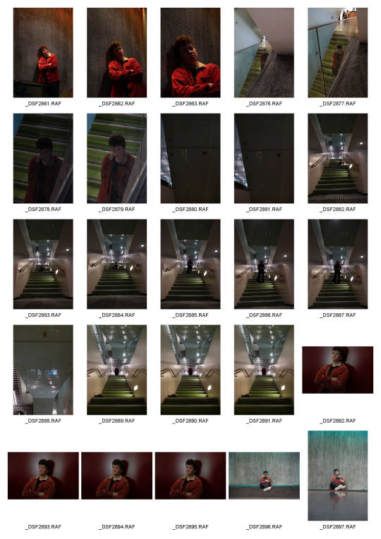
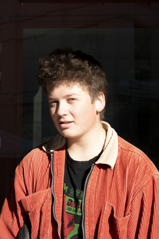
CONCEPT_03
The third model I had was Joel (more of an impromptu model). But got some more playful/experimental shots when he sat in the set up.
During this part of the shoot both Joel and I got some shots of our own however, I took mine of the studio camera (so the lights were used). Whereas Joel got his using the modelling lights and shooting around the subjects and interacting with the props. Interestingly Joel's photos got some really interesting angles and lighting situations. I noticed the same thing occured with Aurelia when the lights weren't syncing with the camera - there was an interesting dynamic with the lights. I'm interested to revisit the studio and explore shooting around just using lighting situations I can create with the modelling lights.
When I was in both studios I had the room lights turned off so it would be interesting how everything would look with them on and see what effect they have to the ambient light in the room. I would also be keen to take my reflector in with me to see what difference that could make in the space (beyond just having a black or white reflector). I think in these shots below they would have helped to create the depth I wanted.


My chosen shots from concept 03.
These were definitely impromptu shots I got at the end of the day so at this stage I was just having fun with different gel combinations.
Critically I would say the top shot with the dark blue gel was a really nice one, however I don't think there's enough contrast on the face and between the background and subject. Increasing the intensity of the key light on the right as well as the fill light on the left just for this shot would have helped that. The reflector dish light illuminating the backdrop was just right, enough to bring out some highlights. Perhaps even more intensity to create a backlight around the subjects hair would also distinguish him from the backdrop. I am yet to use one of the lights as a kicker for this effect so that would be good to try next time. I think also getting catchlight in one eye would create more depth too (like the next photo).
This shot is slighting over exposed on the left side of the subjects face and has no lighting on the opposite cheek. The lighting doesn't illuminate as much of the right side as I would've liked and perhaps more intensity of that light would have create better light on that side. I do like the DOF in this shot - with his face forward from his chest there are interesting points in focus.
This and the final shot I chose turned out pretty well - especially in combination with the colours Joel was wearing. I think the improvement here, as with similar shots I got of Daniélle would be to reduce the key and fill lighting a little and/or reduce the backlighting to create more depth.
0 notes
Text
Week 4_ Weekly roll / Photographic studio
I booked the photo studio for a whole day and decided to use the time to really get more comfortable with the set up and play with lighting. Having only explored lighting in the black studio - using both the large and small white studios throughout the day really pushed my ideas of what I though I was capable of lighting-wise.
I still acknowledge that I am a beginner at this, taking over 300 photos over the day, I spent a lot of time getting my head around the relationship between the camera's aperture, lights (their modifiers and intensities) and my subject. Understanding that the slightest change in any of the three does make a huge difference to the outcomes (controlling the light is just as hard as when you cant control it - who would've thought?!).
I was lucky enough to have three different models throughout the day who very generously volunteered their time to model for me. I had done a bit of research and moodboarding prior to the shoot around what I wanted to try (lighting + pose-wise). However, with this being the first time I was in complete control of the studio I decided to let the model lead where I went. In the sense of working with their personalities, outfits, features (hair colour being a big one I've discovered) along with trying different lighting situations.
Below is the lighting plans to the best of my memory for the two different studios and four different lighting concepts.

*Reflection > I think now that I've had a play in the studio and am starting to see what placed lighting can do I think I will try have another go at self-portraits emplying DIY versions of what I can to try and imitate it at home. I think I would also like to try self timer in the studio (if that's possible) - would need to use auto-focus and have a spot model.
**Goal for improvement - work on evening out lighting as well as working with softer light (intensity) in next shoot > perhaps try working in the black studio for this as well and challenge myself to push the boundaries of lighting in that space. I also would like to try playing with bouncing light - for playing around with intensity this could be good for that.
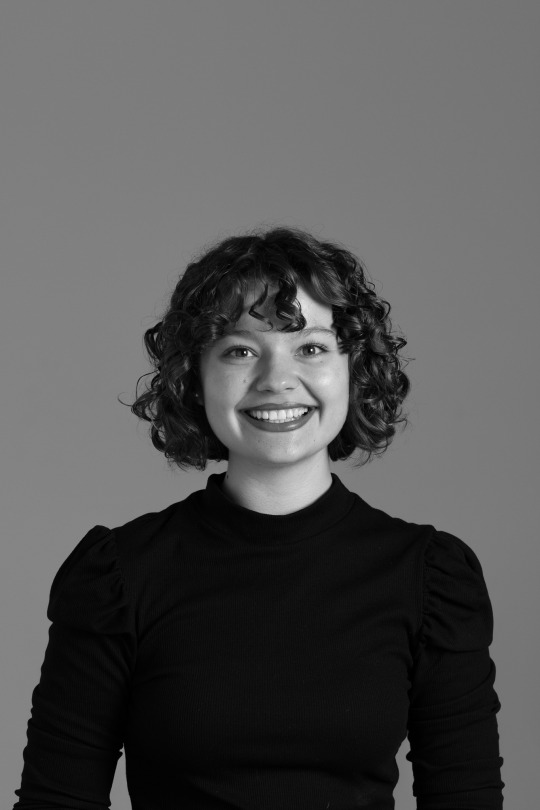
CONCEPT_01
For the first model (Aurelia) I had pre-planned to shoot some more professional head-shot style photos of her for her portfolio. I also led her to some more directed poses, working with her form and what she naturally felt led to do when posing. Below are the raw photos from her lot (pre-grey card balancing - I excluded the shots with the grey card from the contact sheet but I had 3 in different situations to reference). Being head shots that were giong to be used for profile style cropping this was one of the main reasons for the amount of negative space above her head.


Below are the edits I made - fairly minor lighting-wise with some needing lightening to shadows - with analysis of the shots and notes I made for improvement/exploration. The decision to go with b/w for some of the shots was for the fact that the head-shot style she wanted was b/w to I played with both - some for artistic/style purposes as well based on photographers I've been researching.
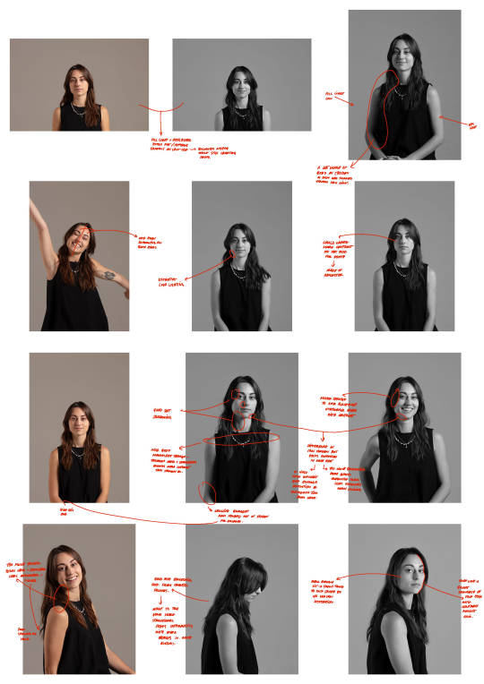


These are the finals I came out with from concept 01.
0 notes
Text
12_Francesca Allen
Francesca is a photographer and director in London. Most of her works are editorial but I explored more of her website and found a series of photographs, many self-portraits or group portraits with friends, called Diary.


The style of these photos is a little different what I would consider what I typically gravitate toward but an a concept for self-portraits I like the concept of having others photograph you - perhaps an interesing approach to try.
Technically I can see the use of natural light, golden hour lighting and in-camera flash (with lower shutter speed).

Amongst her other works I quite like this small series of photos done of Sigrid for Island Records. What I particularly appreciate about then, in contrast to a lot of other photographers I have looked at is the softness of these photos. The lighting in the last image above, for example, is super diffused natural lighting. The light looks reflected on the models back to even out shadows with very little soft shadowing around facial features. I like the embracing mid-tones in these images whilst still giving the image enough depth and contrast.
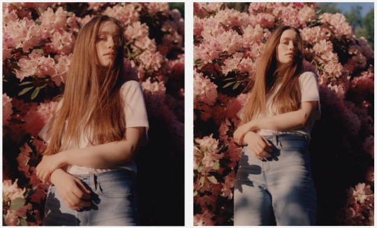
The first two pairs of the shots below are again in natural light. The left pair during either golden hour or with very strong light reflecting off a gold reflector. The right pair in morning sun(?) and has more dramatic shadowing with split lighting occuring on the right shot.
The left pair contrasts the gold-cast on the model's skin + clothing against the blue sky. The right pair are very peachy-pink with the interaction of the flowers and the model's skin tone.
0 notes
Text
11_Mia Sakai
Mia is a London based analogue photographer as well as the Creative Director and Founder of her independant publication Aether Magazine. Most of her work is very extravagent editorial but the series of photos I wanted to focus on is from amongst her personal works - called Sine Cashmere. It is a more subtle series of photos but one that I quite liked the aesthetic of for use in directing my self-portraits.
In both b/w and colour they are very nonchalant photos and I think thats what I like about them the most. The natural lighting (in images 2 + 4) that add to the dyanmic of the photo. It does appear that the second image might have a gobo to create the shadows on the subject but that in itself could be fun to try.
The lack of the model's face in images 1, 2 + 4 is something I would like to play around with too. After reflecting on my experience doing my self portraits > coming up with some different ways I can capture myself using a gobo (for shadows/interferance) or my clothing as a means of covering parts of my face.


Some other photos from another personal series, LFW SS18, I want to add in here as well for a couple of reasons. The first is the use of the flash, I really want to try and get better at using my in camera flash for aesthetic purposes. I've seen a number of photographers use it in the their work and I really like the effect it has. The other point is the amount of colour in this series of images. Art direction-wise it would be interesting, in contrast to my gravitating toward b/w photography, to play with some really bright and colourful portraits.


0 notes
Text
10_Ana Top Leanu
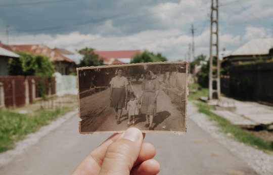
Ana is a multi-faceted photographer from Romania/Mexico having shot lifestyle, editorial, journalism, portraiture, travel + architecture. One thing she says she is passionate about is "intimate concepts such as being a women and motherhood". Its one of the works around this topic that stood out to me in her works.
In a personal series called My pillow she explored two women she calls her two mothers. One is her maternal grandmother, Mamaia, who due to communism in Romania she was sent to live with in Crivina. Her grandmother died in 2016 and this was a series of photos that she holds on to in an eagerness to keep those childhood memories. The other women is her mother who she captures alongside her.

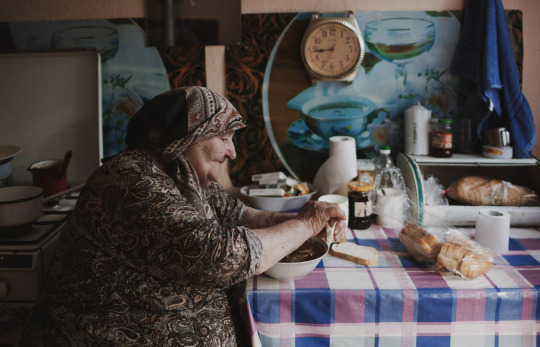

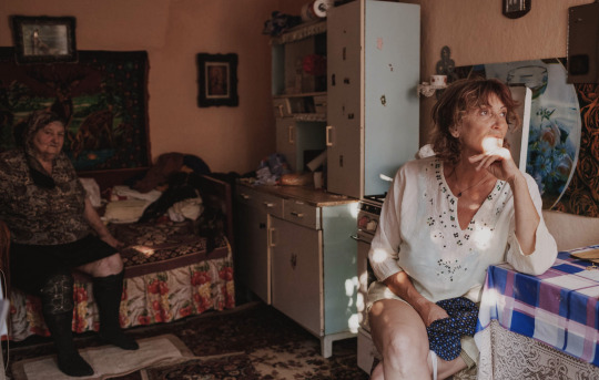
As a concept for capturing family, loved ones and memories they hold I really admire how Ana does it here. The images are very raw some posed and others not. I think most importantly, as environmental portraits, each one of these images (there are quite a few others but) has her grandmother and/or mother in it but in different ways. I like the use of the family portraits as a form of portraiture here. I would really like to explore family portraiture in this more documentative format later in the semester.
Technically, there are a few things I noticed. The second and fourth images with her grandmother utilised natural light - ambient light through a window and the sunlight coming through a gobo (tree?). The first image looks very evenly lit and looks like a white reflector is used to brighten the front of the subject. The fifth image of the picture-inside-a-picture looks naturally lit with midday(?) sunlight given the harsh shadowing of objects in the background with some form of diffusion from above to prevent overexposing the hand.
A couple of other portraits in her commissioned work for their use of natural light but utilised to create some really strong lighting situations.

Another image on from the same shoot shows that the first image is shot right next to a window with a lot of bright light coming in.
The second image uses a fragment of light and a well placed subject to illuminate that are of the image and a hallway in the distance only.
So the two images exposure would have been set for the area of light and not the background, hence the loss of detail in the shadows.
0 notes
Text
Week 4_ Camera Clinic > Technical [Exposure / Metering]


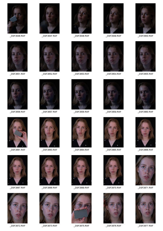
The first contact sheets were from the in-class activity. However, as it was just Joel and I we couldn't really use the reflector very well, so instead just to get ourselves more comfortable with photographing from more creative angles we did an intensive session.

This was the second contact sheet from the technical. After Natalie explained - on my camera so it actually made sense (it looks different on each camera) - metering after which point focusing and lighting reading started to make a lot more sense to me.


0 notes
Text
Week 3_ Camera Clinic > Technical [Reflectors / Exposure]


0 notes
Text
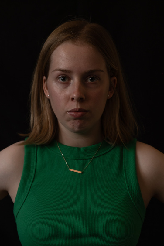
Week 3_ Weekly roll / DIY studio + other subject

I made a set up in my garage with a black tablecloth as the backdrop (just hung it on some cupboards). I used two light sources the first (darker images) were using the ambient light coming through two windows diffused by net curtains, the second (brighter images) was from available light, coming from opening the garage door like 30cm to let bright midday sun in - it made a huge difference.
I did not realise the images were so underexposed until I came to processing which was pretty disappointing.
Below are the edited versions - changes I made to lighting were largely around white balance (set by grey card reference images), some exposure adjustments as the images are coming out a lot darker (significantly) than how they appear after I have taken the shot in-camera (I need to check my settings in case I have DR set too high?) I also need to start relying on the histogram (I think it just became too much aside from modelling myself and controlling lighting, position etc.).
I also set some to b/w with minor curve adjustments to highlights and shadows and colour setting for skin tone balance. In terms of self-representation I personally like the b/w images more. I've always been quite self-concious in photos so I guess I would say b/w is my safe space. That being said I think if I play more with how I can control the temperature of light in my photos as well as direction then I might feel more comfortable with full colour images.
Stylistically, however, I tend to gravitate more to b/w in my own work generally - I think i always have. As portraiture is a new genre of photography for me - particularly self-portraits - starting out in a style that I resonate more with my style first has been a good way for me to get into this task.


0 notes