Last Seen Blogs
hotsmokersonly
HotSmokersOnly
yeslitaf
LitaF

geckkos
Shut up, Richard.
yeslitaf
LitaF

justarandomart
Mostly Fanart
Photo
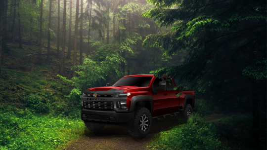

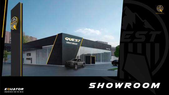
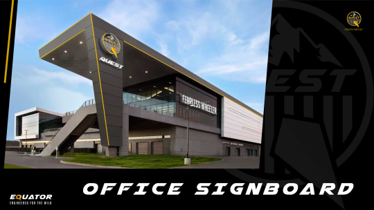
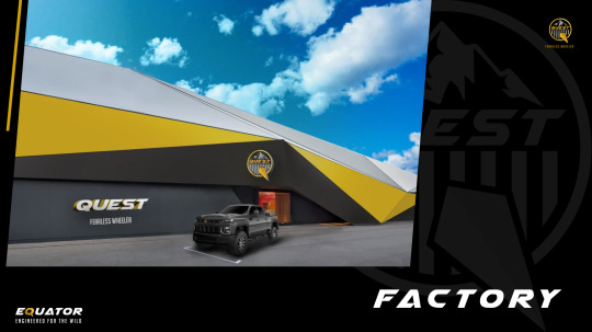
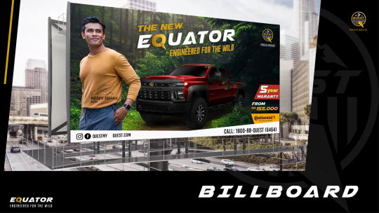


Week 14 : Final Project 2 collaterals.
For our final project 2, we were required to come out with a promotional campaign for Quest. Since Quest was a automotive company, the word Equator (means “Khatulistiwa” in Malay) was the perfect name for our 4x4 vehicles.
For our promotional campaign, we collaborated with Continental (a tire company) and we used Remy Ishak as our spokesperson.Our campaign name “Engineered for The Wild’ was to show the credibility and capabilities of both brands products that are built for extreme weather conditions.
Some of our collaterals include:
Office Signboard (Amira)
Showroom (Amira)
Factory (Amira)
Flyer (Hajar)
Billboard (Sofea Nadhirah)
Bunting (Sofea Ameera)
T-Shirt (Emirul)
Cap (Emirul
Not to forget, credits to Athirah for compiling and designing the final creative proposal.
The most important part of completing the final project was to synchronised each collaterals. I noticed that my group improved a lot after vigorous consultation with Dr Khai. I learned that consultation is very important and crucial when it comes to designing.
Last but not least, i must thank Dr Khai for teaching and guiding the design class throughout this semester. I have learned a lot of techniques and basic skills of Photoshop and Adobe Illustrator. I hope Dr Khai will teach us again in future semesters. Assalamualaikum.
Signing out, Sofea Naddy.
0 notes
Photo


Week 13 : Final Project 1 finished logo and collaterals.
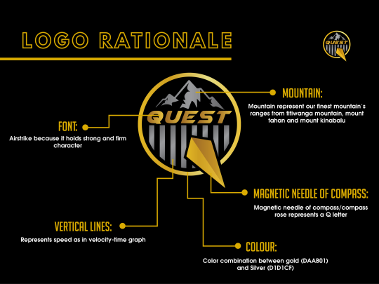
After countless time of brainstorming, we successfully came out with our company logo and collaterals. As seen above, our Q logo has a sharp magnetic needle as we wanted the logo to look like a compass. Since Quest means hunt or to seek, a compass is a brilliant element to describe or logo.
Besides that, some elements of our design include mountains and tires track to represent our vehicles capabilities. Black, gold and silver are used to show our exclusivity.
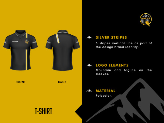
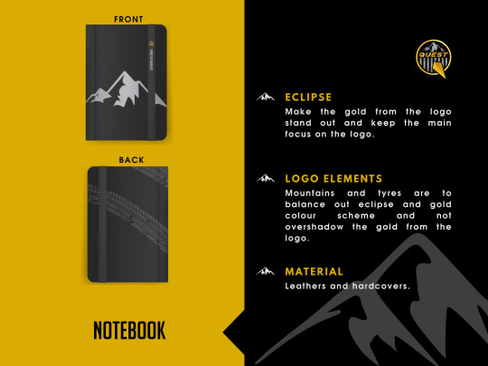
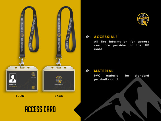
In addition, we designed a few brand collaterals for our company. These items were designed by using Photoshop and Adobe Illustrator.
1. T-shirt. (Emirul)
2. Notebook. (Sofea Nadhirah)
3. Access card. (Hajar Ashikin)
4. Name card. (Hajar Ashikin)
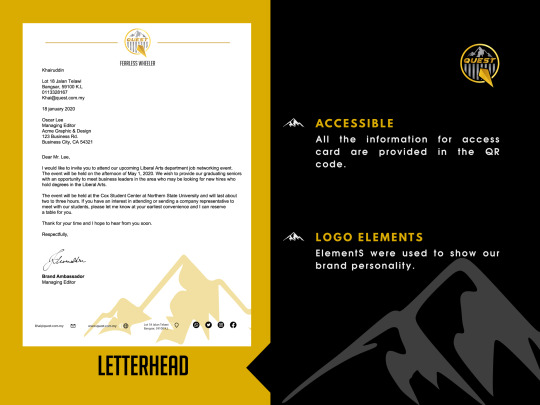
5. Letterhead. (Amira)
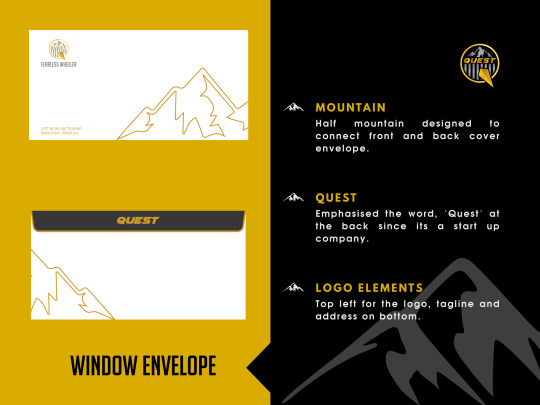
6. Window envelope. (Sofea Ameera)
Also, credits to Athirah for compiling and designing the creative proposal. Personally, i think my group has done a great job together. Since it was my first time doing a design project. I must say that I’ve learned a lot of new design techniques from my group members.
#designclass #photoshop #adobeillustrator
0 notes
Photo


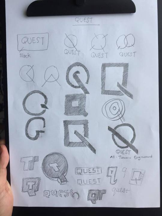

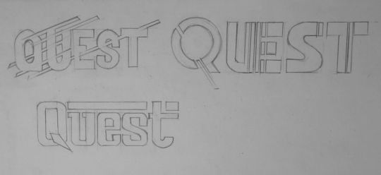
Week 12 : Final Project 1 logo sketches.
This time, our assignment was a group project. Firstly, we were instructed to came out with a logo for our new imaginary business. My group decided to choose the automotive segment.
Here are our company’s details:
Segment: Automotive
Elements on logo: Mountains and tire tracks.
Colour on logo: Black, gold, silver, and red.
Brand Name: Quest (means hunt)
Tagline: Fearless Wheeler
What i’ve learned is that branding are the actions taken to build our brand (strategy). And a brand identity is the tangible expressions of our brand (logo, typography, colors, etc).
But that said, our logo is important to our business because it communicates ownership, quality, and values.
Since, Dr Khai instructed us to focus more on designing the logo, i came to realised that a good logo is memorable, differentiates us from everyone else, and fosters brand loyalty.
A great small business logo only needs three things:
1. Great typography.
2. Simple colors.
3. Strong visual element.
#designclass
0 notes
Photo

Week 11 : Lab test poster design.
Since my lab test contributed 20% of my marks, i was pretty nervous and anxious. A day before the test, my friends and i revised together on google meet. We made sure that we are familiar enough for the shortcuts and I took some notes of all things that i’ve learned to avoid being panic the next day.
During the test, we were given 30 mins for sketches, 1 hour for cropping and another 1 hour 30 mins to design the final poster.
The poster was all about the famous James Bond movie. I felt pressure the most during the sketching segment, because i had to design a creative poster by using all the elements given. All the segments were required to be uploaded on the google classroom.
By using photoshop and adobe illustrator, here’s how my poster turned out.
#photoshopclass #adobeillustartor
0 notes
Photo
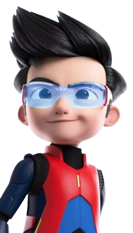
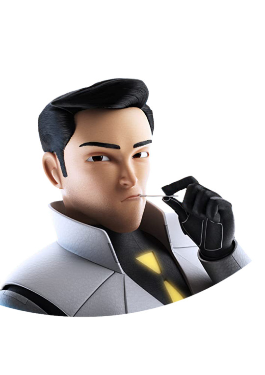
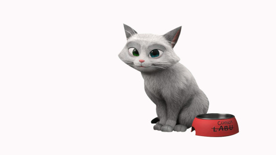
Week 10: Agent Ali Lab Test crop practice.
Whether it’s done to make images fit a specific space, or to make them tell a certain story, cropping is one of the most fundamental tasks in any Photoshop workflow. Before our lab test, Dr Khai (my lecturer) taught us tips and techniques to get the cropping jobs done quickly and easily.
We were given pictures of animation characters from Ejen Ali movie. The first one was Ejen Ali himself, Rizwan and comot ( a cat).
I’m happy that i got to learn new techniques in Photoshop. Dr Khai did mentioned that practice makes perfect.
Things i’ve learned during this class:
1. P if for pen tool, and E is for eraser.
2. Making selection is important.
3. Making layers.
4. How to change the background.
#photoshopclass
2 notes
·
View notes
Photo

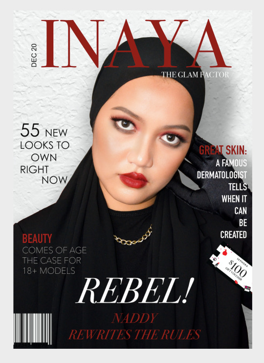
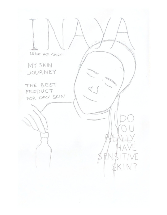
Week 9 : Magazine cover design.
INAYA - The Glam Factor.
Took me awhile to come out with this idea. I wanted my poster to look chic and sophisticated. Makeup is subjective, you can go crazy, go big as long as you like it. It’s universal. Since my magazine is about beauty - makeup and skin, i chose to do a makeup version where my image showed a bold and vogue look. White and black, red and gold are the perfect combination for me. I wanted the magazine to look rich with these colours. My lips and eyes matched the font colour for INAYA. Decided to make it look like smudged red lips and eyeshadow, hence the word “REBEL! Naddy rewrites the rules”. In the glam world, there are no rules no stereotypes. I chose white background so people can focus more on the image itself, to make it look more contrast. In my opinion, as long as people can read the text, that’s good enough. I like the first one better because of the perspective and symmetrical outcome, it is more defined than the second one! However, for the second design, i like how i can see the black glove. I think each component contributes a meaning.
7 elements required:
Masthead - INAYA.
Selling line - The Glam Factor.
Cover image - Me.
Main coverline with name - REBEL! Naddy rewrites the rules.
3 coverlines with one cropped picture - sephora coupon and 3 coverlines.
Dateline - Dec 20.
Barcode - Bottom barcode.
1 note
·
View note
Photo
Week 8 : Magazine cover sketches.
Magazine Name: Inaya.
Description: Inaya means care, protection and help. This magazine is all about beauty, including makeup and skincare. It is universal.
On my sketch, i decided to put the name centre on top, and 3 bubble around the image. Lecturer approved the brand’s name, however, i think i need to come out with more pictures to get a clearer view.
1 note
·
View note
Photo
Week 7 : Upin-Ipin Photoshop poster.
This time, i decided to try something different! I wanted my design to be something that is out of the box, hence i came out with upin ipin raya gangster edition. I wanted it to look simple but nice. The focal point here is Tok dalang. There are differences between the text-box. Here, we can see Fizi as the cheeky little boy (smiling) as he works with the gangster. Added in shadow and i managed to adjust the brightness on every character separately. I added the money and ang pao with shadow to make it look more realistic. Besides that, i also adjust the hue to make it look more warm like a ‘kampung environment’. Managed to score in top 10! It was fun designing this.
1 note
·
View note
Photo
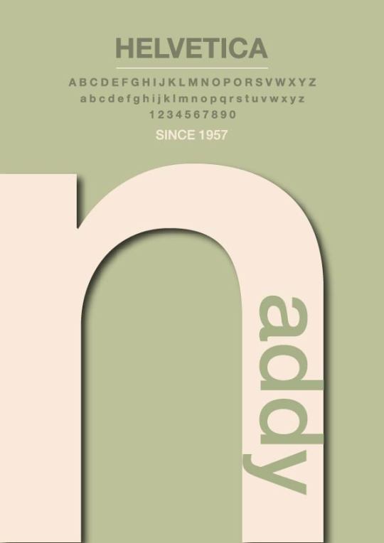
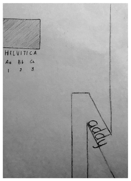
Week 6 : Font poster design.
For my final design, i decided to use 3 earthy colours. One is light pink, second is pastel green and third is a darker shades of pastel green. I used the Helvetica Font because i liked how simple it looked. The “n” alphabet is my focal point, combined with “addy” resulting my nickname as “naddy”. I liked how the “n” alphabet turned out because i can see a unique curve on my design. Added in with shadow, to make it look popped out. I think my design is pretty much direct, however i’m not quite sure about the combination of colours. I struggled to find the perfect colours that shows more about myself and my personality. Guess I need to improve more!
1 note
·
View note
Photo
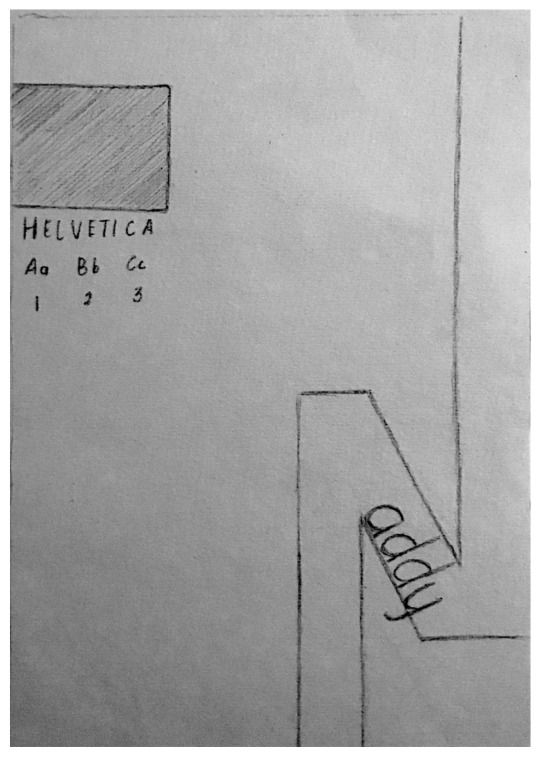
Week 5 : Font poster sketches.
For my design, I apply spaces as much as i could as it removes potential distractions and helps the reader concentrate on the main subject in front of them, it also helps them remember and get a better understanding of the content. The box on the upper left side of my design is to separate the two subjects so that the viewer can differentiate it without being confuse. Both end of the letter N is stretched to the edge of the poster is to create an illusion as if it fills the whole poster without using so much space.
0 notes
Photo

Week 4 : Bad typography.
Just like good typography is all around us, the same thing with bad typography which is also everywhere. When looking at the typographic design, there are some elements of bad typography where we can potentially go wrong. Any one of these, if not handled properly, can create confusion where there should be none.
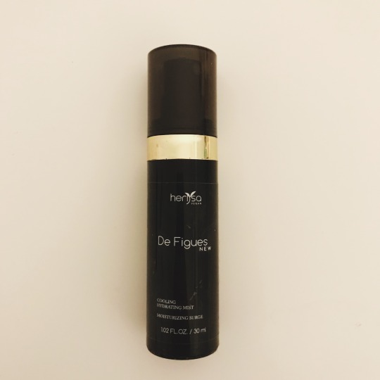
So the first example that I’d like to show is the product with the black bottle packaging. The brand’s name is Herlysa but people might misinterpret the logo as Herl Sa because the use of a leaf icon instead of a letter “Y” in the logo. Next is i noticed the colour is not much attractive as it doesn’t compliment with the black and gold packaging. In my opinion, the combination of white, black and gold colour is such a bad combination. The product is actually a face mist but the brand did not highlight it. Instead, it placed “De Figues” in the centre and this made people confuse about the product. The traditional font with such small sizing is also not suitable and makes it hard to read.
The second example is a product called Nusantara. The font used for “Nusantara” doesn’t fit with the other types of font used. It seems too bold and heavy for the logo. The font did not match with the meaning of “Nusantara” in malay. Next, the brand only use centre align para type for all the contents which made it looks too direct and straight to the eye of the buyers.
#badtypography
1 note
·
View note
Photo


Week 3 : Font poster.
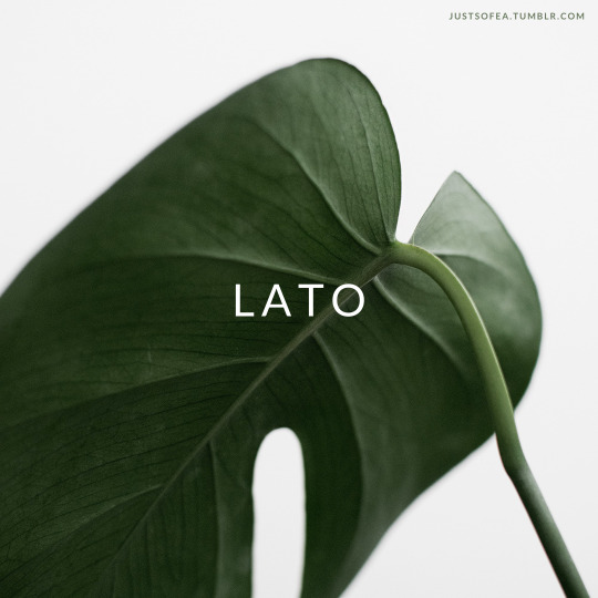
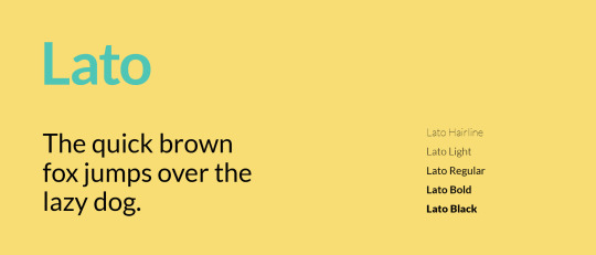
- LATO.
“Lato” means “Summer” in Polish.
I like this font because seems quite minimal when used in body text but would display some original traits when used in larger sizes. The font used classical proportions (particularly visible in the uppercase) to give the letterforms familiar harmony and elegance.
At the same time, it has the sleek sans serif look while the semi-rounded details of the letters give Lato a feeling of warmth. The strong structure provides stability and seriousness. “Male and female, serious but friendly, with the feeling of the Summer.
1 note
·
View note
Photo

Week 2 : Creative packaging.
The application of creativity in packaging is increasing in popularity around the world, particularly with regards to environmentally sustainable methods. I think a good packaging focuses on the concepts of reduce, reuse, and recycle, with the objective of maintaining sophisticated, creative, and unique packaging designs.
As seen above, the packaging that I’ve chose is a food packaging design that is ideal for serving french fries, onion rings, chicken nuggets, or popcorn. This cardboard cone will display our food in a fun fashion!
In my opinion, this design is creative and innovative. Why? Because the "little pocket " at the top can guide user to squeeze ketchup in it, rather than on paper plate, provide a sanitation, environmental protection and healthy way to eat! It features a pre-folded design for easy assembly, and can fit into a fry cone holder to enhance the overall modern concept.
It is also simple and appealing food packaging design. It’s not disturbing to the eyes. Instead, it easily captures my eyes. It can stand out from the other packaging and make a great product statement.
1 note
·
View note
Photo

Week 1 : Henry Ford’s quote.
My thoughts.
Trying to develop the right marketing strategy is becoming more important in today's competitive market. But it's also understandable that it might be hard to invest money for salaries to increase our in-house brand identity (especially for small SME businesses) given today's challenging market situation.
Depending on the business, ads can benefit a company. I used to have this mindset that advertising is expensive. However, if we are doing it right, it should be about the end result right? Advertising should help you turn RM1 into RM3 and it is a good investment because there is a huge amount of competition for limited space.
The phrase is trying to say that without advertising of any kind, businesses do fail all the time. They may resist for a few years..and then quietly disappear.
This is true. You can have have the best product or service on the face of the planet, but if no one knows about it, it’ll make no difference! You might as well have the worst product or service.
Let’s take Coca Cola (the company with the highest ���awareness level” in the world) they spend millions of dollars a year on advertising. Why? To stay relevant and top-of-mind and to make us reach for a bottle just to “taste the feeling”.
We live in a busy world. We ourselves are busy, and keep endless to-do lists. That makes it easy to forget about a product or service, unless we need it right away.
2 notes
·
View notes
Photo
- Introduction.
That’s the hardest part. Sometimes it’s the part that makes you doubt yourself, doubt your creativity and abilities. I know, the first blog post is always the hardest because nobody knows you and nobody cares what you are doing. Well, i can’t believe I’m here. So here goes nothing!
Welcome to my new and fresh blog , my name is Sofea and I am very excited to share with you my ideas and thoughts! I believe that I can achieve anything that I set my mind to, but not everything can be achieved all at once. All great things take time to grow.
4 notes
·
View notes