Photo

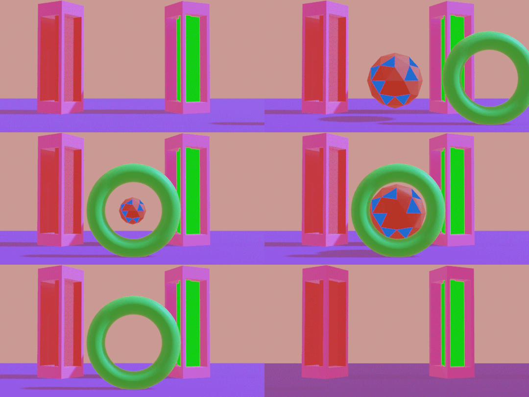

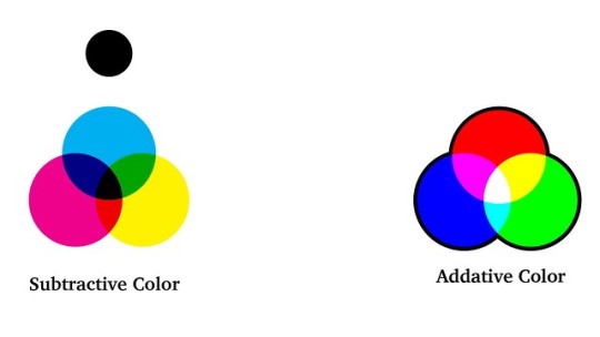
All 3 GIFS Assignment for animating colors/lights/camera/etc
1 note
·
View note
Video
0 notes
Photo





5 Websites that I like and Don’t like.
1. The LaGuardia Community College website is one of the websites that I like because it is mainly red and white. As an LaGuardia student it is very easy to navigate which is a plus. The website has many action buttons which are right to the point, also something that you find on many websites. Another reason why I like the LaGuardia CC website is that the layout brings you in and is very appealing on the eyes when you’re looking at it either on your phone or laptop. They have a good looking Home page.
https://www.laguardia.edu/home/Default.aspx
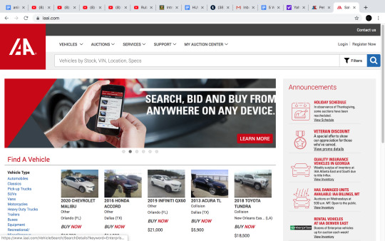
2. IAAI website is a site that you can buy different vehicles that are salvaged to perfectly good condition. That being said, the layout is very easy to navigate. You can filter out certain things threw the buttons on the top. The style of the website goes with its purpose which is the buying and selling of different types of vehicles. When looking for whichever vehicle you want, that make it easy by placing a picture under the vehicle's year, make, and model. Also they have save buttons next to the picture so that you can save whatever vehicles you like. I mainland use the website on my phone which to me, the layout look better on a phone then on a monitor.
https://www.iaai.com/
3. Apple website look beautiful which draws you in immediately. The first button on the top left corner is a draw down button that includes their products and different things like support, music, and tv. The second button on the top middle is the Apple logo which if you press, refreshes the page. The third and last button on the top right corner is the cart logo which if/when you press takes you to the cart where you can purchase your items. As you scroll down the site, the layout is perfectly placed. It’s starts with their iPhones, AirPods, Apple Watch, Apple TV, and many of there other services.
https://www.apple.com/
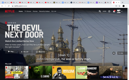
4. Netflix’s website layout is simple and easy to use, especially when you want to find movies or tv shows. They have different draw down buttons that you can press. The design of the website is very appealing and appropriate for a streaming site to be. On the top left corner there is a drop down with 3 stripes going horizontal, when you press it shows you different things Movies, TV Shows, Kids Movies, and etc. The colors are simple and eye appealing. When you first sign in, it shows you your list (My List) everything that you’ve added to your list there so it makes it easy so you don’t have a look around the website for the Movies or TV shows that you added.
https://www.netflix.com/browse
5. Hulu is another streaming website that I like. There have a unique website that is different from Netflix’s. All of Hulu’s drop down buttons are mainly on the top of the website. It’s layout makes it extremely easy to use. The navigation menu is stylish and easy to use.
https://www.hulu.com/welcome
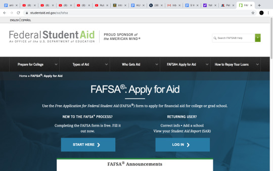
6. Fafsa is a website that students mainly use where they have to fill out information in order to receive financial aid. I personally don’t like the layout of the website. A lot of students don’t like fafsa website because of how confusing it can be while using it. The navigation menu is very annoying. There are students every year that have issues with their financial aid because they didn’t fill out or missed some information. I think the fafsa website can do much better and create drop down buttons with information in them. The Header is very simple.
https://studentaid.ed.gov/sa/fafsa
7. Yahoo’s website just looks boring to me and it doesn’t look appealing on the eyes in my opinion. The Homepage looks okay but it doesn’t shout back at you. Both the Header and Footer are simple. The looks of the Letter style is okay. Nothing on their website screams out at me. I also don’t like how there margins are set. https://www.yahoo.com
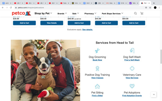
8. Petco’s drop down buttons aren’t appealing to me. Their website looks very plain. The font that they use is very boring. The Home page is cool, but there are just a lot of things to look at, at once. I like the Petco colors, but the color all over the website I don’t like. I think they should’ve stuck to the same blue as the their logo color.
https://www.petco.com/shop/en/petcostore
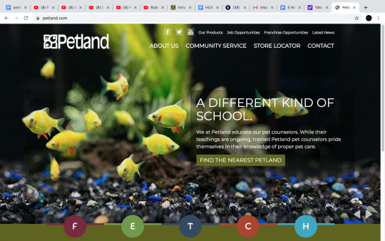
9. Petland’s Header and Footer have no style to itself. In my opinion, they made it to simple. They could’ve added something to bring it to life in a sense. Their Margins could be a little better. Their Navigation menu doesn’t draw you in. They could’ve used a better font style and font color.
https://www.petland.com/
10. Forever 21’s website Header is okay, but when you scroll over the drop down buttons or Navigation menu it looks very weird. It looks like it hasn’t been set correctly. Their website is simple, and their Margins doesn’t really help with the overall look of the website. The secondary navigation doesn’t help because of the first navigation’s overall look. The columns could be better placed.
https://www.forever21.com/us/shop
0 notes
Photo


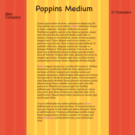


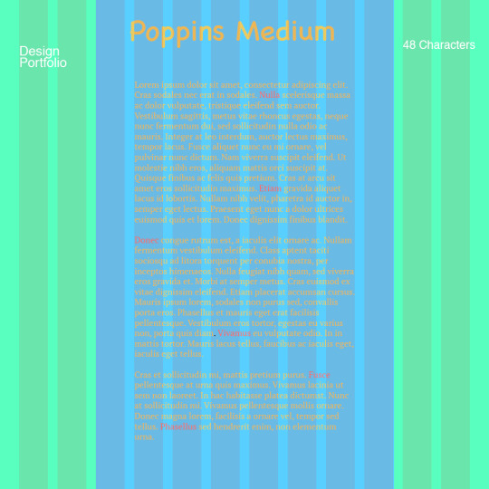
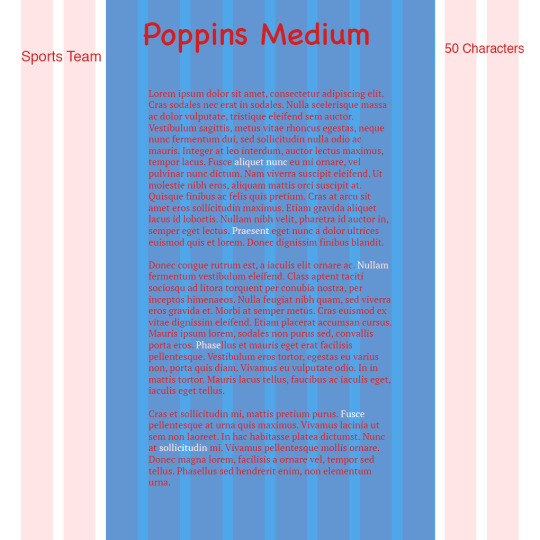
HW for Grids pt. 1
For the Tech blog, I decided to try something different.
0 notes
Photo


All 3 GIFS Assignment for animating colors/lights/camera/etc
1 note
·
View note
Photo

I chose the color blue as one of my primary colors because blue is one of those colors that I feel like can go with anything. The color is simple plus it’s easy on the eyes to look at online. Almost everybody loves a baby blue color, it’s so recognizable with the sky being baby blue. The color white is going to be the background color because almost everything looks good over white. Baby blue over white will make it pop so much. The third color that I chose is grey because if I were to ever have a website the small little finishes will be grey to make other colors pop off it. Also because the color grey is that in between color of black and white, it’s sort of a mystery. The fourth color is Black because black signifies an elegant look to a website. Also black is my second primary color because the color black can legit go with anything. It makes it easier in the color scheme. The Fifth color is a light orange because just like a baby blue color, a light orange color is easy on the eyes and easy to look at. Another reason why I chose the color orange is because the light orange color will bounce off the baby blue color perfectly. The orange will be action buttons on site around the baby blue to also make the website pop.
0 notes
Photo

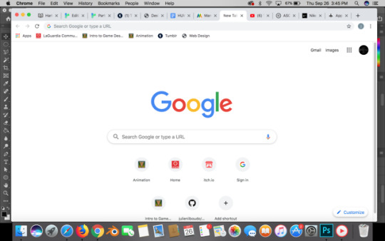


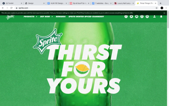


1. Youtube is a site that I always use and will always continue to use. The main color on the site is white. All of the other colors are red, black, grey, and blue. The primary colors are white and red. The main color background is white, the Youtube button is red, the sign in button is blue, and the buttons that press for your history, subscription, and etc are grey. Also the dominant color is white. I think the designer picked these colors because the color white is simple, but in a good way and very clean/cut. I like the overall scheme of colors and how the colors are placed.
2. Google is another site that I will always continue to use, because of it’s clear cut design, colors, and it’s straight to the point where you type in what you want Google to know. This is another site whose primary color is white. The main background is white, the letters that spell out Google are different colors like blue, red, yellow, and green. The design of the page is very simple yet effective. The designers picked these colors because I think they wanted to show something unique, especially with the color scheme. Google is a very simple site that everybody likes, including me.
3. Apple’s website primary colors are white, grey, and black. The site looks very unique and stylish. The colors make the sit look simple in a good way, also very straight with the action buttons being with over the gray background. The dominant color on the site is white which gives the impression of a very clean, sleek, and stylish look just like their phones and laptops. The designers picked these because I think the colors represent Apple in a way with the main color being white almost like trying to represent a clean, new, design in the way that their phones are.
4. Infiniti cars, is also another site whose primary colors are white and black. Their site is very simple with their colors. I actually don’t like their color scheme. I love Infiniti’s for their cars, but I think that they really need to work on their website. This primary white background doesn’t really work for me. I feel like it’s too simple.I think the designers picked these colors because the color white is simple, yet clean and signifies a sort of new clean design just as their cars.
5. Sprite soda is the best soda in my opinion so that’s the reason why I chose it as my 5th site. Sprite’s website primary color is green and a little bit of white for their lettering. Their website is very engaging and with the green background color it pops up at you. The green makes the website look very bright. The color scheme of the website is very simple but its effective, simple works for a soda website. I think the designers picked these colors for the website mostly because a sprite bottle is green, so they have to match the brand’s color. Green has always worked for sprite because it very unique.
6. Coca Cola soda is another soda company website that I chose to see the difference between soda company websites. Coca Cola Primary color of their website is red obviously for the reason being that their logo is red. The background color of the website is white and a dark grey looking color. Unlike Sprite’s website, Coca Cola website is very boring to me and I don’t find it very engaging. The color red doesn’t really pop for me as it did Sprite’s green. I really wish it did because red is known to have a sort of dominance with it. The designers picked the color of the website because Coca Cola logo is red with white lettering.
7. Moda Moii is my sisters nail polish company website, the primary color of the website is white. The color of the website is brown and pink. White as the primary color of the website makes it work because of its simplicity. I wish there was more of the pink color on the website and less brown. I don’t think the brown makes the website attractive and for a website about nails/nail polish, I think it needs to be attractive looking. Nothing really jumps out at me on the website. I think the designer picked these colors because they felt the color scheme worked.
0 notes
Photo


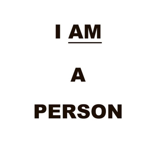



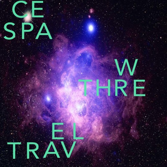
These are my text art versions of these artists work going in order including mine. (Barbara Kruger, Ed Ruscha, Glenn Ligon, Jenny Holzer, Lawrence Weiner, On Kawara, Patrick Martinez, and Tauba Auerbach, and mines is the last one that mimicked Auerbach work because I liked it so much
0 notes


