Text
CCR Q4
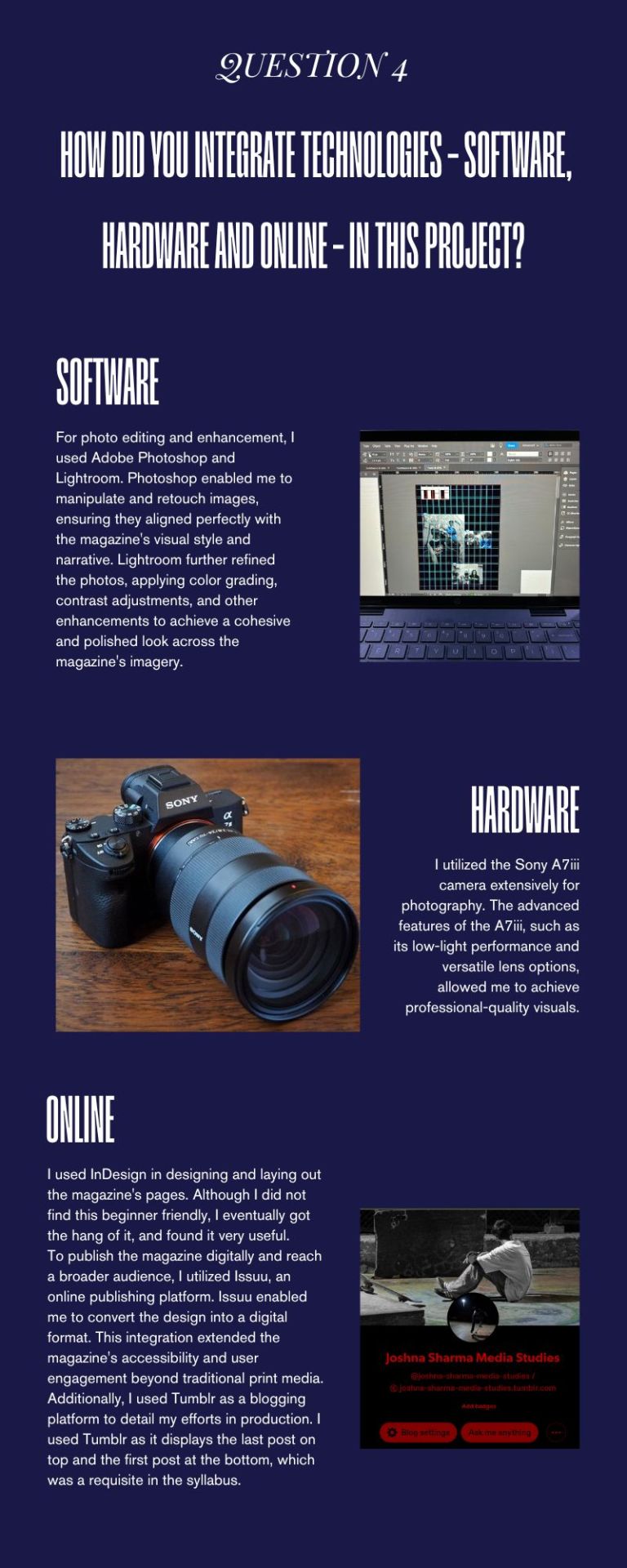
4. How did you integrate technologies – software, hardware and online – in this project?
A. I answered this in the form of an infographic.
0 notes
Text
CCR Q3
3. How do your products engage with the audience and how would they be distributed as real media products?
A. I answered this in the form of an Instagram post.
(https://issuu.com/theinkblot-cpgis/docs/ccr_q3)
0 notes
Text
CCR Q2
2. How do the elements of your production work together to create a sense of ‘branding’?
A. I answered this question in the form of a reel/short/tiktok, inspired by the short form way of communicating a mass of content engagingly on apps like Instagram and TikTok.
TRANSCRIPT
Vani as a brand represents three concepts in essence, Messy Minimalism, Rebellion and Realism.
Here is how I incorporated these three concepts, and how they work together to create a unique sense of branding.
Messy Minimalism:
As I mentioned in the previous question’s answer, I developed a well defined aesthetic that I call Messy Minimalism for this magazine. Herein, I used grunge textures, punk motifs, stark colour contrasts, graffiti work, bold and messy fonts and elements that would typically be seen as chaotic. However, I used this in a restrained manner, allowing some simplicity to the design of the magazine, as while I wanted a chaotic spirit to the design, I did not want to overcomplicate or overcrowd the pages. Hence, I used these messy elements in a minimalistic way, something that creates a very distinct and memorable style that can work as this magazine’s branding for every issue.
Rebellion:
In this magazine, I used the key concept of Rebellion to elevate the identity of the magazine. I utilised a spirit of rebellion in two senses, my depiction and my production. I depicted a defiant and deviant lifestyle through photography and text, and also rebelled myself by avoiding using anything besides the essential magazine conventions. I wanted Vani to have a strong sense of individualism and being different, as that is something that I know my target audience would connect well with.
Realism:
I wanted realism to also be a defining factor in this magazine’s branding, seeing that my concept revolves around depicting the lifestyle and culture of the young majority in metropolitan cities, I didn’t want my audience to look at my magazine and feel like its not about them or for them. I utilised candid photography (with prior consent from the people I was photographing) and a semi-formal tone in my copy to create a relatable and honest feel to the production.
By utilising these three elements, Vani created a distinct sense of branding reminiscent to magazines like Thrasher and Juice., but still apart from its house style. From the cover page itself, one can see all these unique elements clearly depicted. Hence, I utilised these elements to create Vani’s candid, rebellious and harmonious sense of branding.
0 notes
Text
CCR Q1
1. How do your products use or challenge conventions and how do they represent social groups or issues?
A. I have answered this via a presentation.
1 note
·
View note
Text
WEEK 30
FINAL SUBMISSION.
Issuu link:
(https://issuu.com/theinkblot-cpgis/docs/joshna_sharma_as_level_media_studies_issuu)

0 notes
Text
WEEK 29
CORRECTIONS and A COMPREHENSIVE LOG OF MY EFFORTS.
After showing my magazine to my Media teacher, he suggested a few changes to my work. I readjusted some of the formatting and the font sizes, and checked for any mistakes I may have made when I exported the Indesign file to a PDF. I found that the colours were not translating well in the PDF, and that the blacks were appearing grey. I solved this by editing the settings and changing the black from 100% opacity black to Pure Black. This solved my problem.
To conclude, these are a list of my complete efforts towards making this magazine.
I studied different media conventions and started consuming more print media.
I made three magazines (One not mentioned in the preliminary tasks posts)
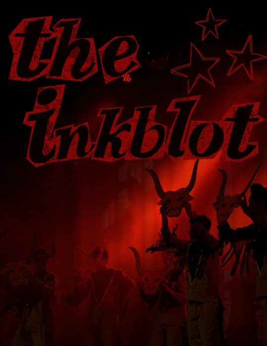

I practiced photography and photography direction, conducting three photoshoots in total (Two for my school magazine and one for my task).
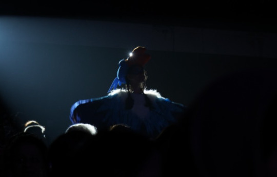
I learnt how to work on Canva and Indesign.
I learnt how to run a social media page and content write.
I learnt how to write articles.
I learnt design conventions.
I developed my creativity and eye for detail.
I learnt how to blog and to write and create posts.
Affirmation from my sir:

0 notes
Text
WEEK 28
POST PRODUCTION:
ANALYSING MY TARGET AUDIENCE AND TESTING IF MY PRODUCT APPEALS TO THEM.
My target audience for this magazine had the following characteristics:
Young adults and teenagers interested in skating, music and fashion.
Edgy youth who deviate from societal norms.
People interested in learning more about skating, alternative music, and hip-hop culture.
People interested in street-style and grunge fashions.
People interested in understanding youth subcultures.
People looking for a community of like-minded people.
GETTING FEEDBACK.
I went back to Carter Road Skatepark and showed my magazine to 10 people who fit the bill for my target audience, and got their informal feedback on how they liked the magazine.
-9/10 people said that they would buy the magazine atleast once.
-8/10 people said that they found the feature article interesting.
-8/10 people said they were drawn to the cover image.
-7/10 people said that they found most of the contents interesting.
That averages 80%, with my target being 75%- this feedback test passed my parameters.
0 notes
Text
WEEK 27
POST PRODUCTION:
ANALYSIS OF COVER PAGE

font: vVWweRraType!
I decided to use this font as it looks like a type writer, and it tied in well with the contrasting fonts on the cover page.

font: Got heroin? and Crash Alert Demo
Here I used two fonts to create a more interesting title piece, as I wanted it to draw the attention of the viewers to the top so that they follow the flow of elements correctly (top to bottom).

font: ZOMBIES NIGHT
I used a scratchy, handwritten font for the slogan of the magazine as I wanted it to feel very rebellious and almost like graffiti, or an etching on a table.

font: Punk Kid
I used the boldest font here so that the title of the feature articles would pop out.

font: zai COVID-19 VaCcine
I used a font similar to the slogan's font here, but made it slightly different so it would not look monotonous.
I made a choice to use one colour throughout the cover page so that the words pop out against the greyscale background, without looking too messy.

I generated this barcode online, and attached the price to the top as well.
0 notes
Text
WEEK 26
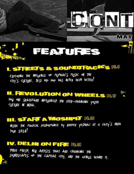
PRODUCTION: CONTENTS PAGE
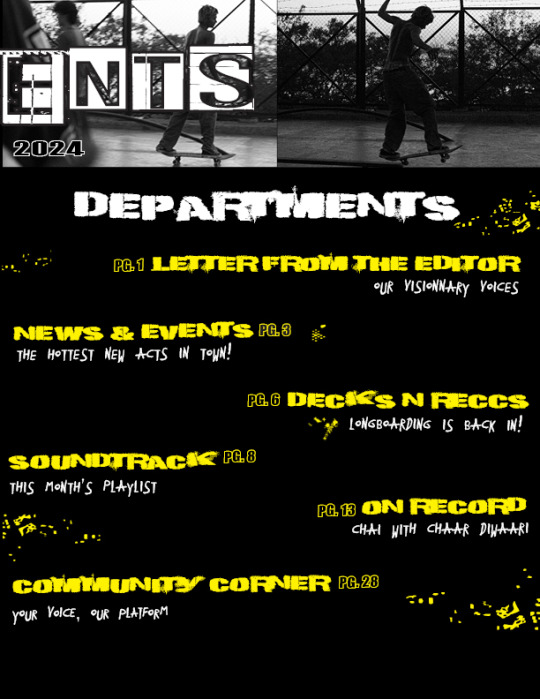
This was the easiest part of the whole process, as I now had a lot of practice under my belt. Designing the contents page took me a day of work, and I had the most fun designing this. I researched heavily on Thrasher magazine's content pages prior to this, and drew inspiration from that.
MY INSPIRATION:
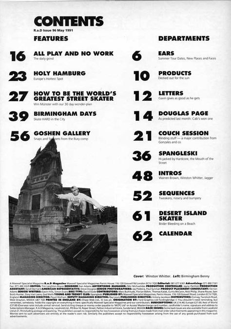
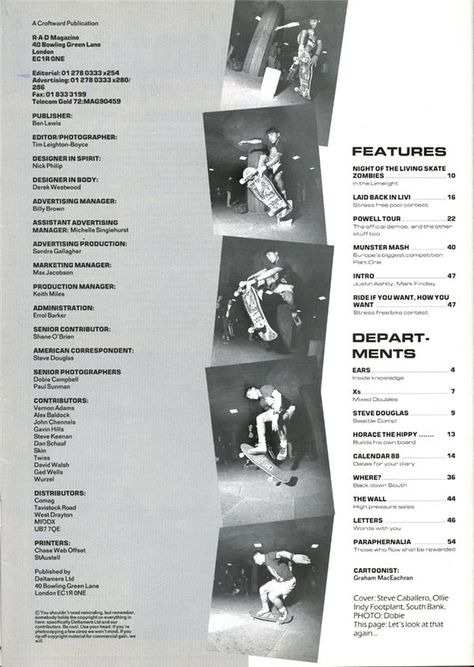
I took inspiration from Thrasher Magazine for my contents page, dividing it into a FEATURES and DEPARTMENTS style. I placed a collage on the top as a backdrop to the contents title to make it look more stylised, and placed the date below.
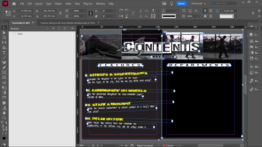
first step
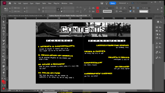
second step

third step

fourth step

final version
0 notes
Text
WEEK 25
PRODUCTION: WORKING ON THE DOUBLE SPREAD
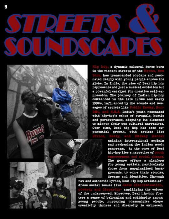
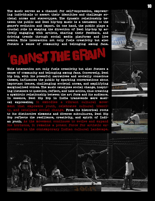
My idea of the double spread was to make it look neo-nostalgic, which is, to make it look modern in an old way. I wanted it to heavily resemble 90s styles of fonts and text.

first version
I really liked the layout of the photographs here, as well as the font of the title, however, it felt too empty.

second version
Here, I made the most major changes. I loved the title font's colour and style here and added a graffiti element to the second page to make the double spread look more interesting. I also readjusted the positioning of the photos to make it more symmetrical. I also experimented with highlighting words. I changed the background of the spread to see if a lighter colour looked better, and while I found this colour to be very complimentary to the title, I preferred the high contrast of the original version. I also changed the font to something more modern.

third version
I reverted back to the original black and highlighted some other key phrases. I also changed the colour of the graffiti. Although this was originally the final version, I was unsatisfied with the font and content of the body text. I felt like my article could be a lot better. I also wanted to make the body text's font more stylized.

final version
I changed the font and sizing of the body text, and the colours of the title and the graffiti.
I was satisfied with the outcome of the double spread, and now I only had the contents page remaining.
0 notes
Text
WEEK 24
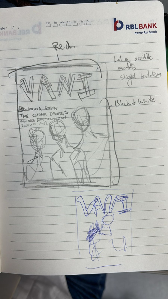
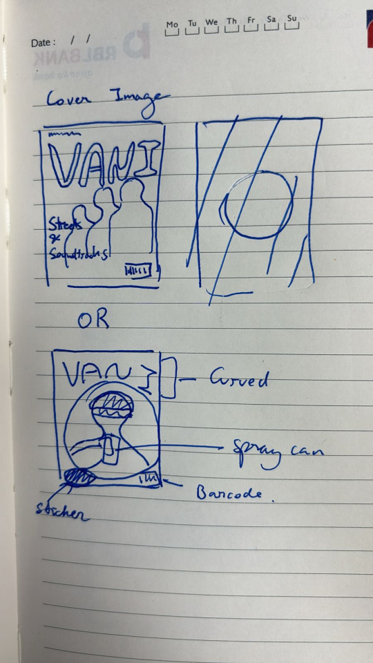
While originally editing the cover, I ended up with something like this-

However, something felt off, and I found another photo that I thought would work really well as the cover:
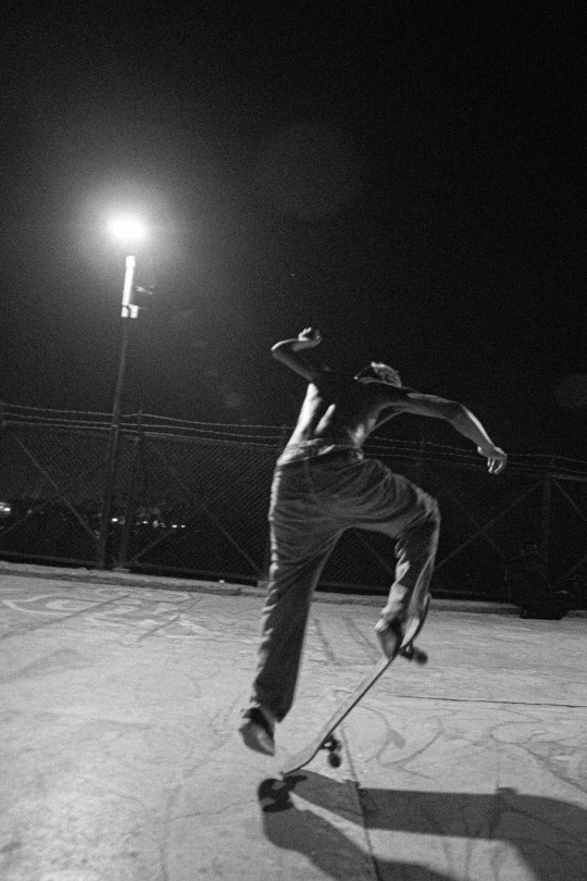
So I started trying different design ideas on this.

first version
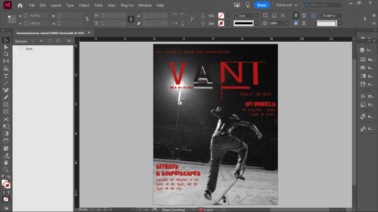
second version
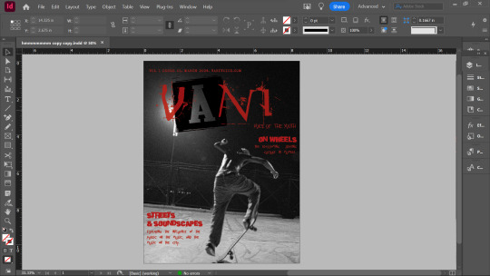
third version

final version
I was really satisfied with the last version as I thought it displayed the aesthetic atmosphere I wanted to showcase perfectly. It had a perfect blend of hip-hop and grunge elements, and I was glad I was able to combine different fonts to create the title.
The process of designing the cover was a back and forth effort, spanned across about 4 days of work.
Whilst designing the cover, I also began working on the double spread, this also took a lot of effort and underwent quite a few changes. I will detail on the double spread in the next post.

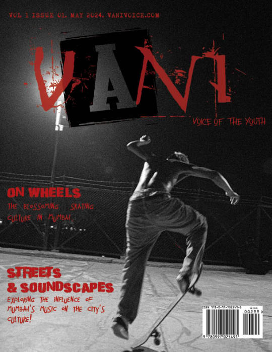
COMPARISON BETWEEN THE FIRST AND FINAL VERSION.
0 notes
Text
WEEK 22
MY RESEARCH ON MAGAZINES


How to write a feature article
In my research on how to write a feature article, I found that these were the important features.
- Figure out my aim (What do I intend to communicate?)
- Identify my audience
- Make sure my language is clear and concise
- What is my research evidence?

How to make a magazine look more professional
In my research on how to make a magazine look more professional, I found that these were the important features.
- Using good, clear photography
- Not using too many colours
- Not overcrowding the work with too many photos, too many fonts or too many styles
- To clearly communicate the most important parts of the magazine by making them the largest or the most eye catching.

MAGAZINE STUDY
In study of thrasher magazine and their contents page especially, I found major inspiration for my style and aesthetic vision.
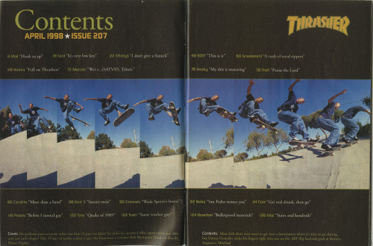

I liked how image-heavy these pages were, but I didn't find the contents appealing enough. I put myself in the shoes of the consumer, and as someone more drawn to the substance of a magazine than the style, I decided to place more emphasis on the titles of the contents as well.

0 notes
Text
WEEK 21
In this week, I conducted the actual photoshoot with 5 models. I shot on a Sony A7iii, no additional supplies were used to assist my photography. I styled my models in loose, semi-athletic clothing; I utilised oversized jerseys and jeans to create this look. I further set up the design of the photoshoot by including a boombox, cds, skateboards and spray cans.
This worked effectively to showcase the style of the era I was looking to represent. Seen below are the unedited pictures of my photoshoot.
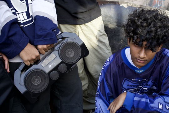
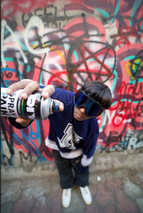


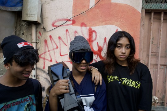
the first location ( a graffiti hotspot )
We then moved on to the second location, Carter Road Skatepark, which heavily influenced and changed the original vision of the magazine to a much more grunge feel.
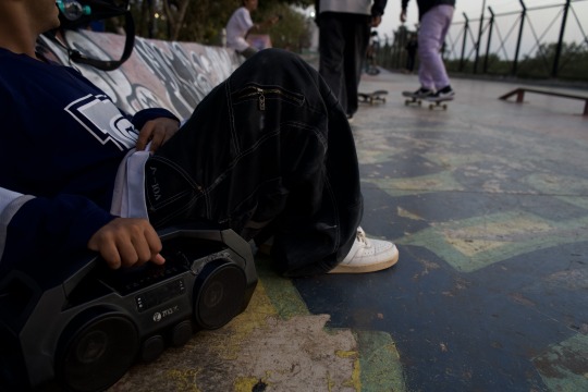
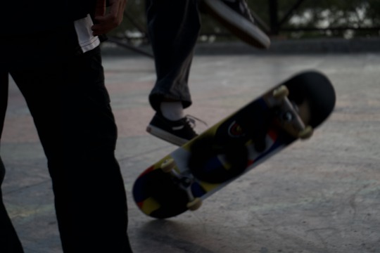
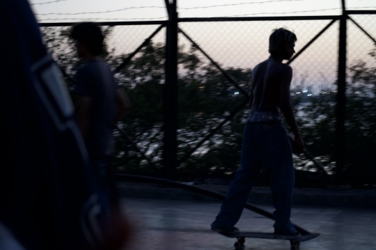

This concluded our photoshoot, and I could now move on to editing the photos. This proved to be the most difficult part. I decided to edit the photos into a black and white theme, with pop-outs of colour.
Some examples below.

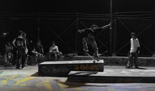
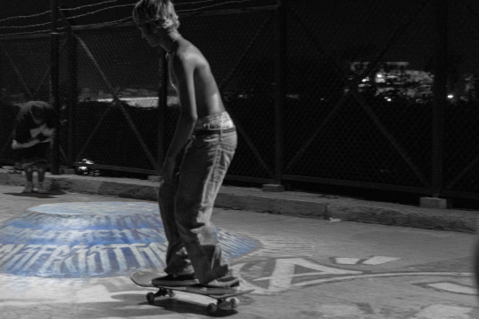
Thus concluded this week's work.
0 notes
Text
WEEK 20
PRE PRODUCTION:
PHOTOSHOOT.
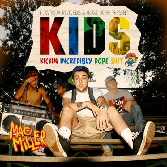
My creative vision was clear, and I began to plan for my magazine's photoshoot. I wanted to focus on a 90's inspired street style look, heavily influenced by the hip hop culture of America around the turn of the new millennium. While incorporating hip-hop inspired looks, I also wanted to tie in the grunge skater culture of the 2000's, hence creating a cohesive look that represented the aesthetic of the 'cool kids'. This 'cool kid' aesthetic was also partly inspired by Mac Miller's album 'KIDS'
I went out for a day and spotted locations around where I could find an audience representative of this aesthetic. I visited the most popular skate park in Mumbai, and graffiti hotspots nearby. At both these locations, I was pleased to find people in fashion extremely similar to my vision, which was expected due to my analysis of the evolving street culture in Mumbai. Over the past few years I've noticed an increasing trend of a wave of nostalgic hip-hop and skater inspired styles in the youth.
I spent another day to run a test-run of the photoshoot with one of my models.

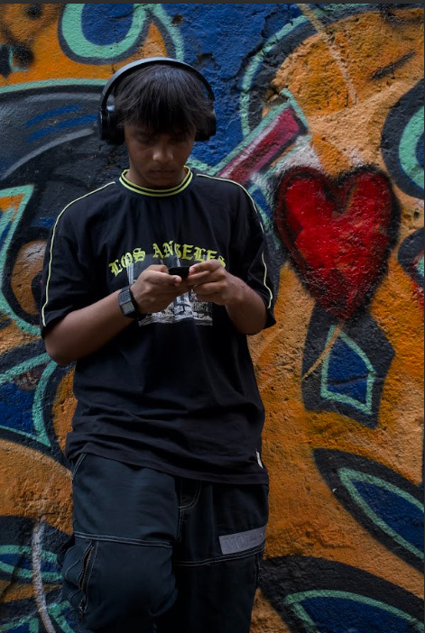
practicing poses


practicing angles


practicing compositions
I felt much more confident after the test photoshoot. I became clear in what I wanted to see and what I didn't want to see. For example, certain locations we considered initially were now scrapped, certain poses were scrapped, and a larger emphasis was placed on the grunge aspect of the magazine.


some of the scrapped locations
This concluded the test-run.
0 notes
Text
WEEK 19
PRE PRODUCTION:
As I have been designing and working on these issues myself, I have learned a lot about design and photography in the past few months. When I initially started this project, I was almost certain that I would go for a very academic or artistic vibe, but in the past month, due to my fascination with urban living, I took a complete 180 in my approach the the aesthetic.
DETAILS
TITLE:
Although I had initially wanted to name my magazine The Inkblot, taking into consideration my theme of the magazine, I wanted to pay homage to my country by using a Sanskrit word as the title. Hence, ‘VANI’- meaning voice, became the title of my magazine.
COVER:
My idea for the cover of the magazine came to me days before I was to conduct the photoshoot for this magazine. I was wandering through the narrow alleyways of a locality in Mumbai, when I saw a passage bombarded with incredibly colourful and dense graffiti. Teenagers sat near the walls, playing music on boomboxes, drinking fizzy drinks and chatting in a lively manner. I had a friend pose in front of my phone for inspiration, and within the first few poses, I found the exact style I wanted to use.
For the design of the magazine’s cover, I drew inspiration from DORK and RAVE magazine, as I was inspired by their unique approach to creating a bold and dynamic cover page, by utilizing contrasting colours and fish eye lenses.
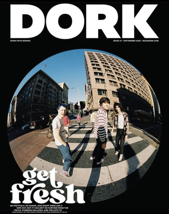
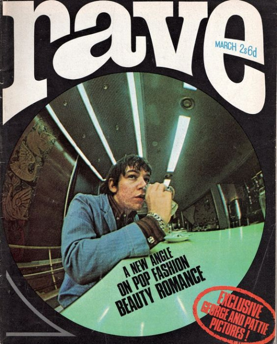
I also began to plan out other parts of my magazine, like my target audience and the components I had to include.

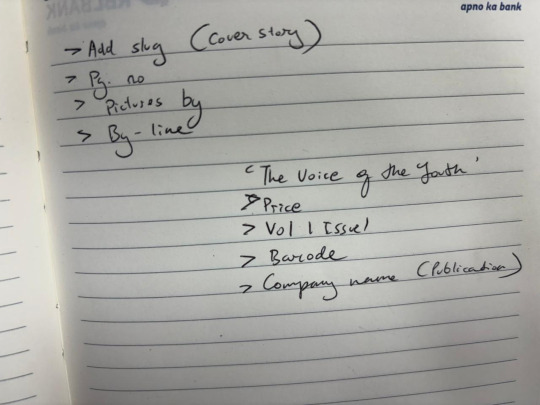

0 notes
Text
WEEK 18
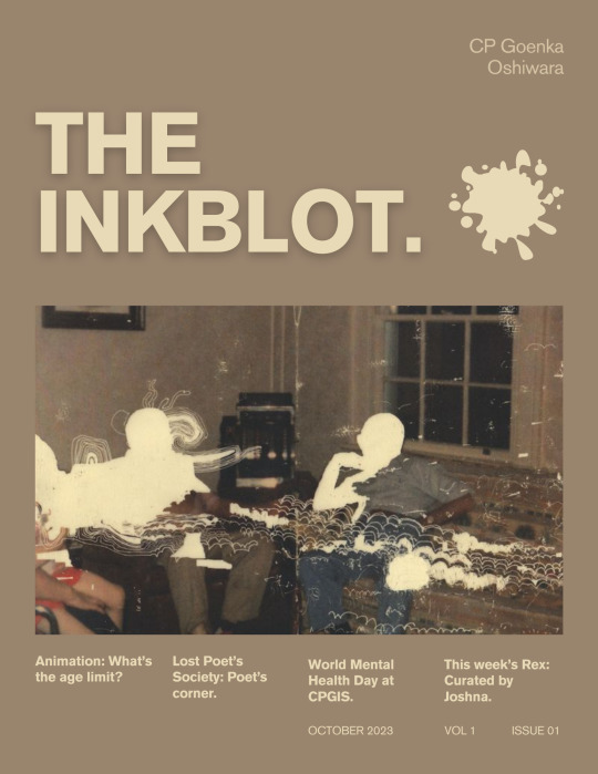
I spent the next week uploading this magazine, and promoting it online on my Instagram account for this magazine task. Hence while learning to design, I also learned how to handle a social media page and promote my work.
Shown below is the account,

These two tasks made me proficient in Canva, and ready to move on to a tougher editing software.
0 notes
