jiweisaw
Blue Is My Color
- Male - Tumblr newb - Extremely Poor - Artist - COMMISSIONS OPEN - art blog @jiweisart -
396 posts
Don't wanna be here? Send us removal request.
Last Seen Blogs
hereticaldetective
“Tales and dreams are the shadow-truths…”
stummyhort
auntie zoe’s main blog

tobenoone1
BUONO

primal-goddess
Primal's Den
fahmeenaodetta
Inside Fahmeena Odetta's Head
Photo
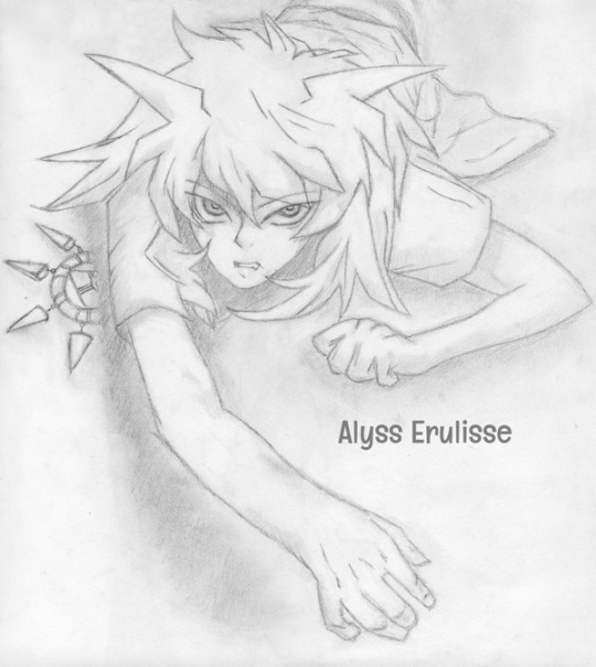
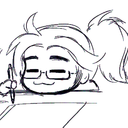
Bakura is Vexed
This is the expression I imagine Bakura wearing when Sora, my OC, tries to steal his deck during the Battle City Finals to forestall his duel with Yami Yugi.
I sketched this about a decade ago from a reference I can no longer find online. I remember my grandmother saw me working and asked, “Why are you drawing aliens?”
Happy Halloween!
See more of my work: Check out my archive.
Join me on my journey: Follow me on tumblr.
Support my creative habit: Buy me a coffee on KoFi.
48 notes
·
View notes
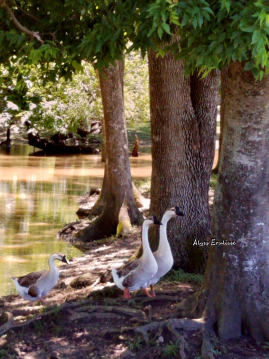
Photo

Beyond the birdbath, a doe glances over her shoulder.
10 notes
·
View notes
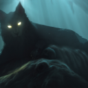
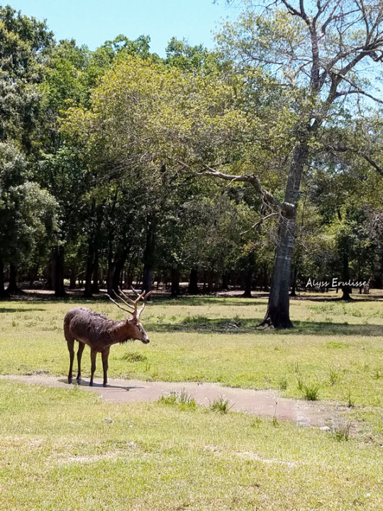
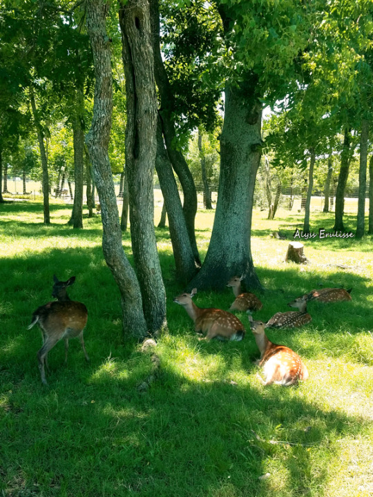
Photo
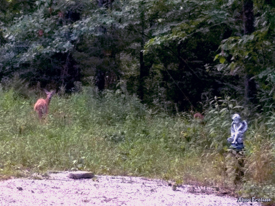
Where a stone angel guards the end of the drive, a doe glances back as her fawn wanders into the dark wood.
10 notes
·
View notes
Photo
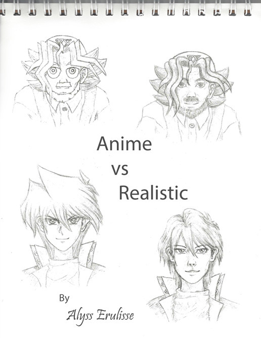
Working on developing my own semi-realistic style, I’ve started studying face shapes and sketching the faces of YuGiOh characters in anime and realistic styles.
Here are Sugoroku Mutou (Grandpa) and Jonouchi Katsuya (Joey Wheeler). Most of the characters in YuGiOh have a face the shape of an inverted triangle. This holds true for Jonouchi, but Grandpa’s face is a little more square.
By the way, I’m really proud of how Jonouchi’s hair turned out. :)
If you would like to see more of my work or join me on my journey as I grow as a self-taught artist and storyteller, check out my archive and follow me on tumblr.
15 notes
·
View notes
Photo
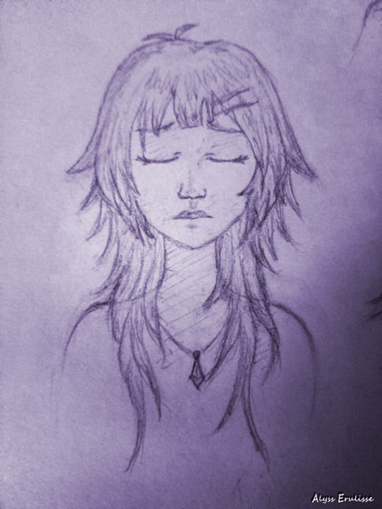
Character design for Sora Mutou, the protagonist of my YuGiOh fanficition series. I believe I have finally settled on a hairstyle. My main inspirations include Aoba Seragaki from DRAMAtical Murder and an MMD character from the video “[MMD] listen before i go (Billie Eilish)” by WCRProductionZ.
2 notes
·
View notes
Photo
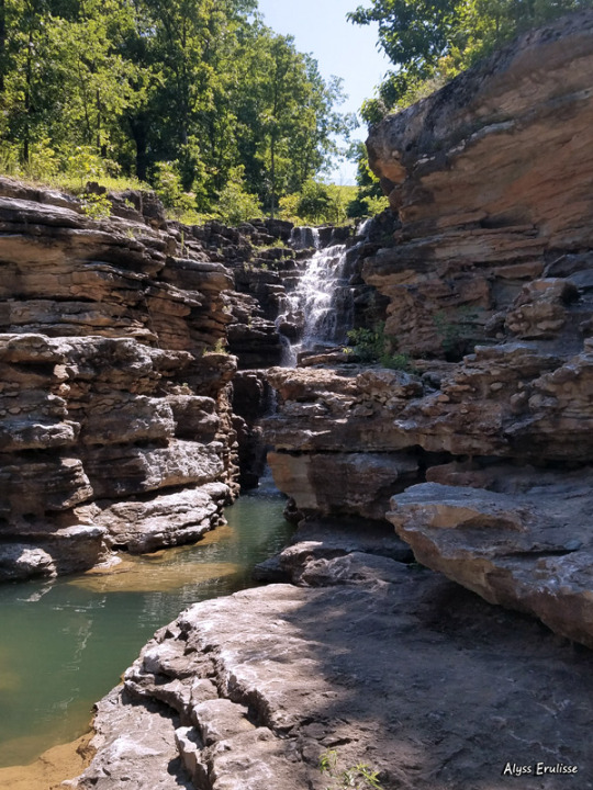
A hidden waterfall carves through rock in the Ozark Mountains.
10 notes
·
View notes
Link
I’m hosting a writing challenge for Halloween!
Celebrate Halloween by writing a short story with your favorite Yu-Gi-Oh character(s)! All genres welcome.
You don’t have to be a member of the archive to submit!
Artwork by Taiyo-Tenebris
11 notes
·
View notes
Photo
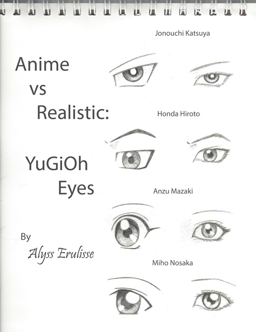
Continuing my study of YuGiOh eyes in both anime and realistic styles, I drew the eyes of Yugi’s closest friends. If you are unfamiliar with Miho Nosaka, I recommend watching YuGiOh Season Zero which only aired in Japan. She is a minor character in the group with whom Honda is infatuated.
19 notes
·
View notes
Photo
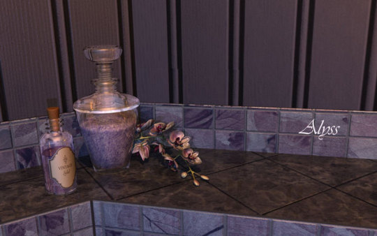
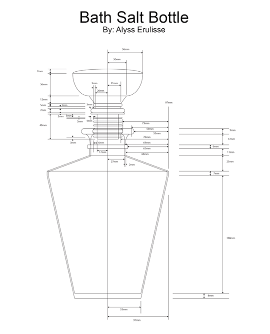
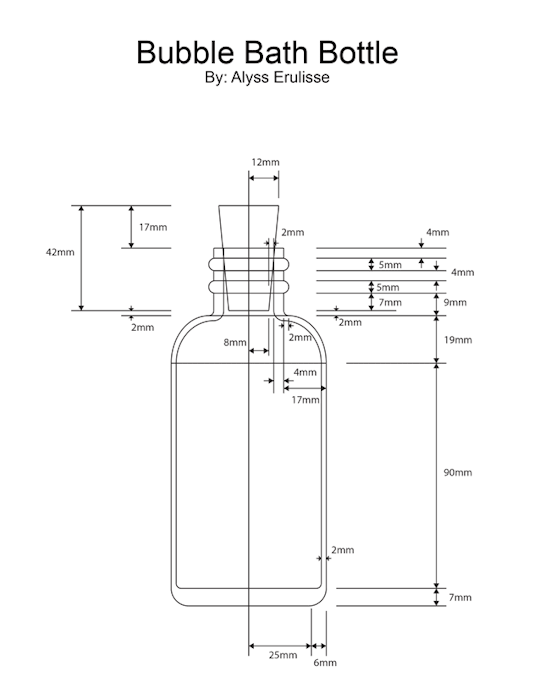
Reference is the key to realism. To create drawings with dimensions as complex as these bottles, I start with a reference photo in a background layer and sketch the front view on top of it. To take the measurements, I set up a grid and choose a scale factor.
These hollow glass bottles were modeled from the ground up, starting with primitive discs, moving up along the contour, and then down into the interior to give the glass some thickness.
The label on the bubble bath bottle was placed with a UV map and an alpha layer allowed for the irregular shape. Though the label texture only needs to be applied to the color channel, the alpha layer needs to be applied to the color, diffuse, specularity, glossiness, reflection, transparency, translucency and bump channels. Going forward, I’ve found surfacing to be an increasing complicated affair.
4 notes
·
View notes
Photo
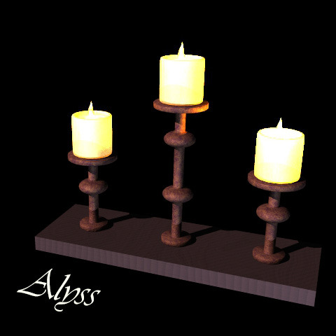
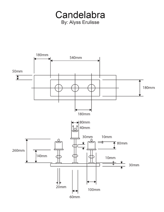

Perhaps it is the influence of my engineering background, but when building with precision for a 3D space, it helps me to draft my objects with dimensions before I construct them. I can readjust the overall size of an object with ease when placing it within a scene, but altering incorrect proportions in the object itself is more tedious.
To save time, I only created one candle in detail. Then, I duplicated and resized it to fill the rest of the scene.
2 notes
·
View notes
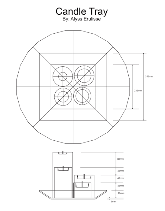
Photo
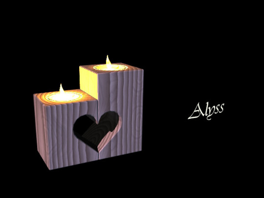
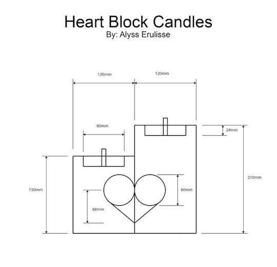

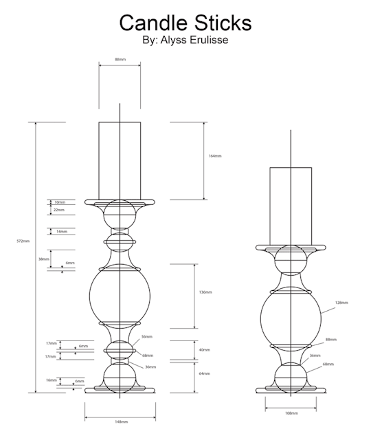
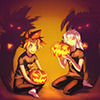
Here are some more candles. The heart was cut into the blocks with a combination of Booleans. The candle sticks were built from the ground up, starting with primitive discs, moving up along the contour, using a variety of tools to multiply the geometry.
The candle flames you see are sculpted from a deformed ball primitive and surfaced with luminosity. I positioned point lights just above each flame for further control of the lighting situation. The translucency of the candle wax in combination with the point lights simulate the effect of subsurface scattering, causing the top of the candles to glow.
I find it exciting how this study of light takes me back to physics and materials science, making use of facts like the color temperature of candlelight is 1670 Kelvin and terminology like luminosity, translucency and subsurface scattering. As they are both attempts to understand and describe the world around us, art and science can draw inspiration from each other.
8 notes
·
View notes
Photo
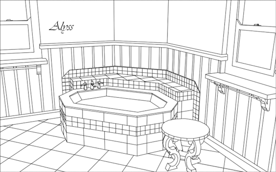

I am now at a point where I have completed my animation and am going back over my process. I had to hustle the past few weeks to meet my deadline, so I’m only now getting back to posting.
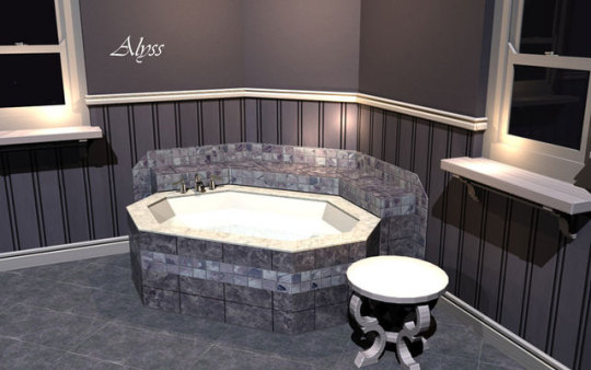
After selecting my color palette, I found and altered images to use as textures and bump maps for wood and tile around the room. Generally, textures provide the color information while bump maps provide the appearance of a rough surface on an otherwise flat plane. In the first image above, the indentations in the trim are modeled with polygons, but the beadboard paneling is a flat plane given dimension with a bump map. To create bump maps, I merely converted my texture images to grayscale and increased the contrast.
From this point, I began planning the placement of smaller objects in the scene. I traced a render to create line art, printed it out and sketched in smaller objects with a mind for both lighting and composition. If you study the last image above, you’ll see how certain things line up to guide your eye. If I were to place a character in that bathtub, can you guess how she’d be positioned?
2 notes
·
View notes
Photo
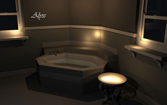
How do you pick colors that look good together? I’ve always loved color, so much so that I feel I’ve developed a stronger background in painting than I have in drawing.
When it comes to a color, there are three properties I consider: hue, saturation, and brightness.
Picking a hue is like choosing a color from the rainbow. Is it red, orange, yellow, green, blue, purple, or some color between these on the spectrum?
Saturation is how diluted or vibrant a color is. Putting several highly saturated colors together can be very jarring to the eyes, so when picking a palette, I tend to choose one color to be the standout in saturation and tone down the others incrementally.
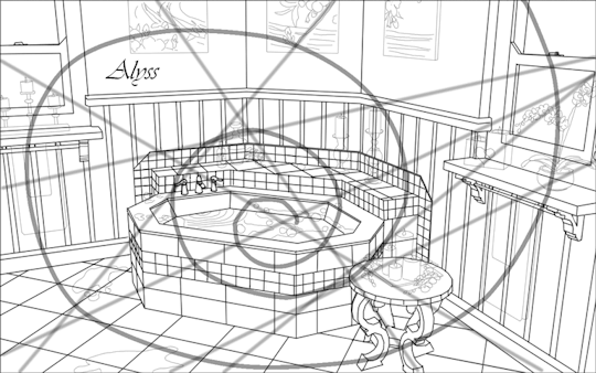
Brightness is what I focus on in the first image above, or more specifically, the difference in brightness. One technique to see the contrast between different levels of brightness in your scene is to start out working with shades of grey.
Do you remember my last post about composition? I still have that spiral and unbalanced triangle in mind when I choose where to place my lights and darks, but you might see that the eye now tends to gravitate towards the top of the scene and between the two windows. These are the areas of highest contrast.
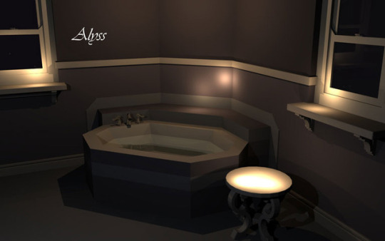
If I leave things this way, the bathtub will be largely ignored! This is where contrast between the other two properties becomes useful. A difference in hue or a pop of higher saturation can draw the eye back to the tub. In the second image, I’ve applied a color palette. The stripe on the tub has more blue than the surrounding walls, and I could increase the saturation to help it stand out more, but I still have items to add to the scene and time to make future adjustments.
7 notes
·
View notes
Photo

I built this small end table to stand next to the bath. The intricate legs required a bit of point-by-point tweaking and extrusion after Boolean operations and beveling gave me strange results. From researching references, to developing a concept, to construction, this took me about two days.
3 notes
·
View notes