jchurchillarts102-005
Joseph Churchill
arts 102 [005]
7 posts
Don't wanna be here? Send us removal request.
Last Seen Blogs


Text
Nobody expects the Spanish Imposition
Part of our final project included exporting our process book from InDesign into a 2up saddle stitch ready booklet form. Fancy!
Problem 1: InDesign does not provide an easy way to do this.
Problem 2: my home printer only supports 8.5” x 14” max
Problem 3: couldn’t just select pdf as a printer
After many failed attempts to get a suitable PostScript to PDF file over Thanksgiving, I ran across a solution that worked. It involved downloading a PPD as creating a preset folder, an inelegant solution for a very simple need in publishing.
The process for creating an imposition involves printing it to a PostScript file and then distilling it to PDF. This seems crazy since I’m forced to go from an Adobe product to a PostScript file and back to an Adobe product simply to impose a file for print. Nothing screams professional product like a convoluted process. The warning message from the Distiller just labors the point.
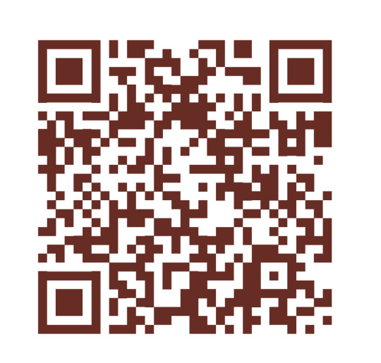
Fun things I learned with InDesign; you can build a QR code within the object menu. Sadly, you cannot customize the code aside from colors.
As I finish up arts102 this term I’d like to reflect on all the awesome CRAP I’ve learned (Contrast Repetition Alignment Proximity.)
Are you ready for Festivus?
0 notes
Text
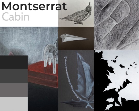
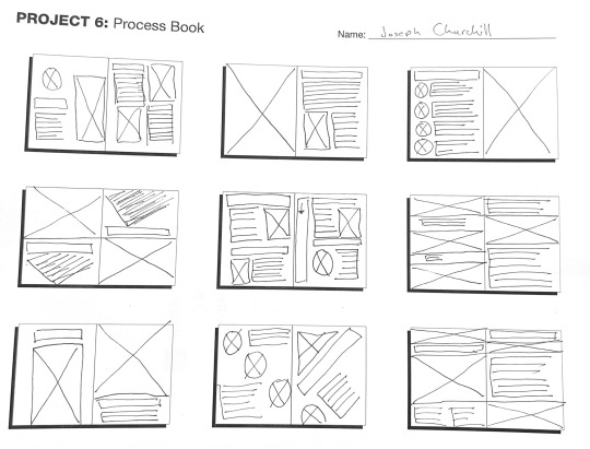
Process Book Time
In class, we’re working on the final project developing the process book that will be used to judge our entry into the BFA program for Graphic Design & Illustration (GD&I). I started by creating a mood board to set the tone of the book. Then sketching out spreads. I brought the spreads and mood board to class and worked together in small groups to determine the best direction. Next was to start building out the spreads with InDesign using the provided grid system.
The project has constraints of no bleed and only a select set of typefaces. I’m also not a fan of the grid provided because every grid box is a fractional size. So far, I’ve found it truly interesting how small the copy looks on screen versus printed. I’ve printed this booklet twice and I still haven’t found a happy ground for the size of the Merrieather typeface.
Trying to define a consistent style for the layout has been fun as well, but it still feels staid and boring. At least there are a couple of weeks left for refinement and a full semester in the spring to continue refinement. I’ll need to put the anxiety monsters away until May.
It’s been fun learning more about ways to combat rivers, hyphens, and orphans. So far I think I’m doing a great job making all the mistakes 🤔
What are some great techniques to remember when self-editing spreads and layouts?
0 notes
Text
Project 5
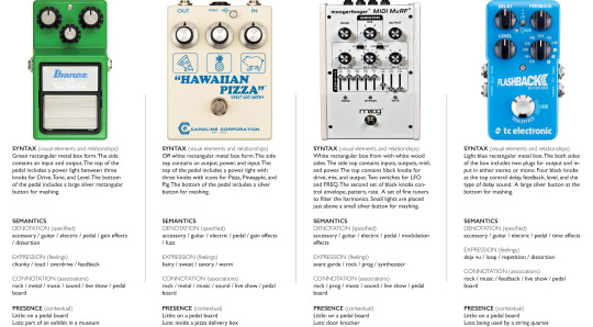
For this project, we needed to select a product anything from shoes to clothing to ink pens. I went with something I know and love guitar pedals. Next, we had to source images of high quality with no backgrounds. Following this, we needed to observe the products and comment about five specific categories.
Syntax (visual elements & relationships) is a fancy way of saying natural subject matter. Wait which term is fancier? We needed to describe the look and visual relationships of the product.
Semantics is the meaning which included denotation (specifics), connotation (associations), and Expression (feelings).
Presence (contextual) is how something stands out in the context of where it’s seen. In what instance does this project have little presence versus a lot of presence.
After sourcing and researching I set up a 17” X 11” layout in InDesign and went about setting up a grid. Part of the fun with this project was tinkering with laying out four products versus each other and trying to keep some semblance of alignment. The layout continually shifted until I was happy with the white space balance.
We’re now onto project 6 and I’m learning even more about grid systems, spreads, and InDesign. It’s giving me a bit of déjà vu regarding web design.
Do you like guitar pedals?
0 notes
Text
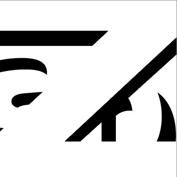
Logomarks and the search for the over stroke
We recently finished up a project that dealt with building logomarks in Adobe Illustrator and then importing the illustrations into an InDesign template, this is where the madness of a feint black line showing up drove me insane for about two hours. The only saving grace is that linking all the art and being able to just update was a time saver.
It’s funny how the paths with strokes all looked correct in Illustrator however something weird happened on the way out the door when sent to PDF, a thin black line appeared on the black and white logo where white stripes interacted with the black shape. Back to Illustrator to try and sort this out I went. Trying different stroke methods/sizes nothing seemed to work until finally I redid the entire path with zero strokes and added a few more anchor points to keep the black above the spot where the white stripe was to make the end of the shape.
Finally, success is no more thin black lines on print/pdf.
What causes this weird phenomenon from one program to the next? Is there a better way to create overlapping shapes in Illustrator without the mysterious black line popping up again in the future?
0 notes
Text
In our latest project, we were tasked with developing a poster based on AIGA’s “Get out the Vote” campaign. We got to choose three quotes to develop into word maps and mood boards. The quotes I used to work on my maps were:
“Someone struggled for your right to vote. Use it.”
— Susan B. Anthony
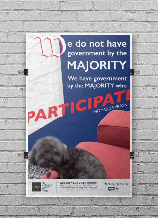
“We do not have government by the majority. We have government by the majority who participate.”
— Thomas Jefferson
“Voting is the expression of our commitment to ourselves, one another, this country, and this world.”
— Sharon Salzberg
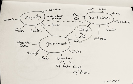
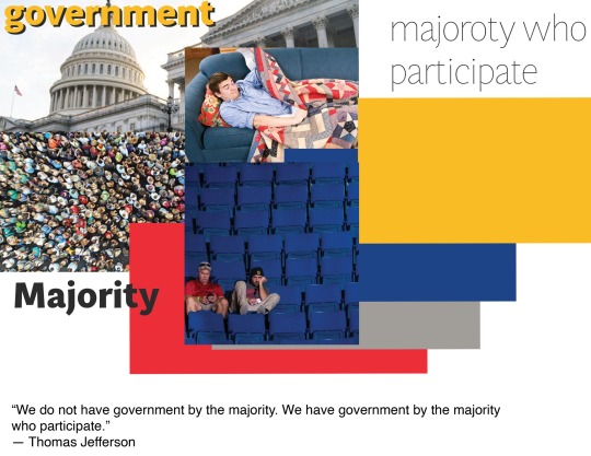
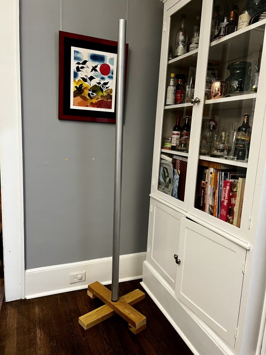
The world map and mood board that resonated the loudest in a small group was around the Jefferson quote and a lazy guy on a sofa and an idea of a butt print. With the sofa/butt print idea in hand, I began sketching out as many ideas as possible. Starting with a broken-down sofa and ending with a word spiral. Again, the butt-print idea moved forward toward the final design.
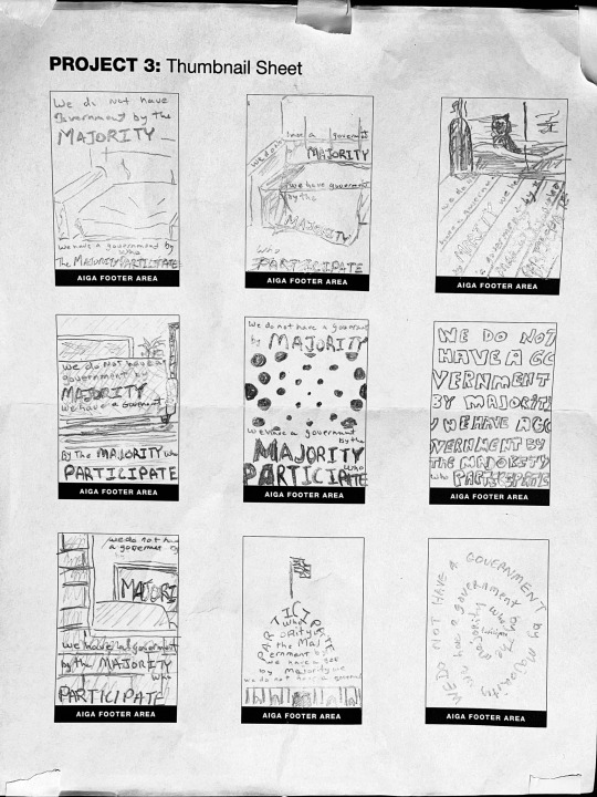
My red sofa, it’s a well-used sofa, the lip of the cushion just sort of falls off a cliff and that’s what I chose to photograph. Considering our dogs believe this sofa to be theirs getting them off to snap a photo was a major challenge until I took a very low-angle shot. Using this picture to set off the text was fun! A lot of rough drafts, over the next week, went from black and white to a desaturated color pick, and even when I thought I was done, an idea to set the W off in the same style as another famous Jefferson doc.
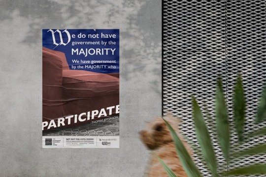
How do you think it turned out?
Also, bonus design with doggo.
0 notes
Text
Typeface Abstraction
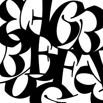
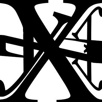
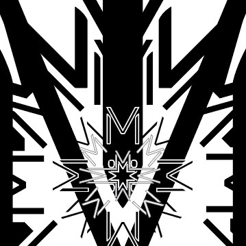
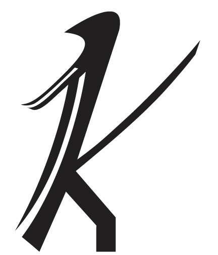
I do geek out a little bit about playing with typeface. One of our projects recently dealt with taking three consecutive letters from the alphabet and abstracting the typeface utilizing Adobe Illustrator. Sidebar, we also learned about C.R.A.P. (Contrast, Repetition, Alignment, and Proximity) this acronym makes the child inside happy. Also, I’ve used Illustrator in the past, but the idea of multiple art-boards same file life changing!
After completing the first three in class, the professor asked that I keep going, this was a blessing and a curse after completing eight and now having to cull down to three.
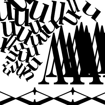
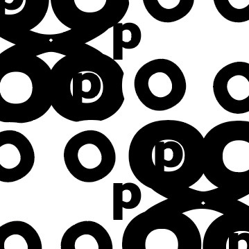
The first to go was UVW, I had fun playing with the U turning the W upside down into mountains and a V ground, it was an easy first bin. Second to shred was RST, even though I liked the symmetry of the mirror R with little t in the middle and the swirly quality of the S, it didn’t feel as strong. Third, to go was the very first OPQ, I’m still on the fence on whether I like the circular abstract, but I felt the P was just sort of there instead of bringing anything to the party.
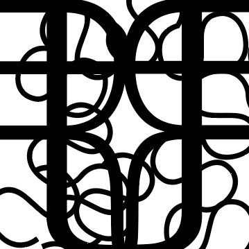
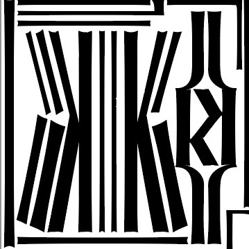
Down to five was the easiest part editing down to three was the hardest. So, I tried to determine which of the 5 I liked the most, EFG which uses an illuminated manuscript style typeface, Orbe Pro, just felt right to me. Now only 2 spots left, again I looked at the last four and tried to choose the best for me XYZ, there’s something about the angle of the y next to the X and the way the Z intersects almost like a bow across a string instrument. The final three are JKL (Lion King vibe), ZAB (White Space 3D), and MNO (Skate Deck). The Skate deck for me won but the waffling over the last three went on for days.
If you had to choose between them, which three would you choose and why?
0 notes
Text
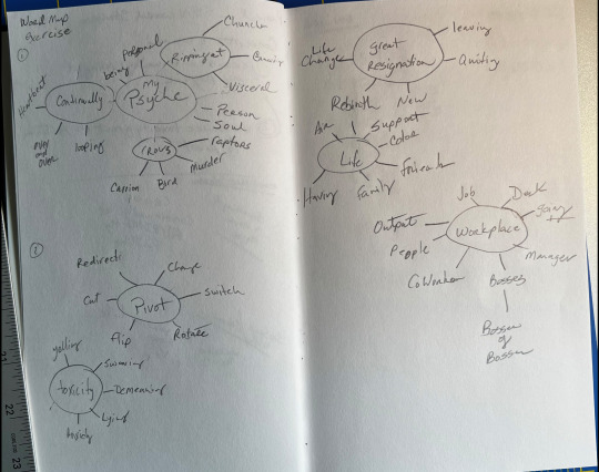
Project 1 Process Blog
Project 1 for arts 102 involved six-word stories. I developed two quick stories about what led me back to school after almost a 30-year break from the university. After collecting the stories word maps were built for each to flush out ideas and words that might help drive the visual narratives image and typeface.
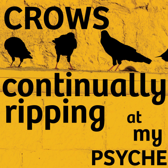
Story 1: Crows continually ripping at my psyche
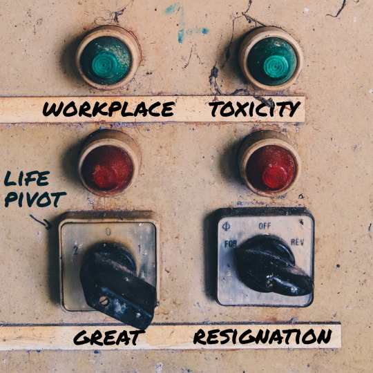
Story 2: Workplace toxicity great resignation life pivot
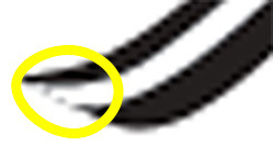
The best part of using the word maps helped with searching through stock images and typefaces to sync up the stories. For example, there are a lot of images of crows, but I happened across an image of crows with a very bold yellow backdrop it felt right. The second story’s search relied on the word map from the word pivot to switch.
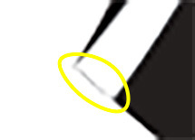
Typefaces again, thanks to the word maps I had a fairly good idea of what sort of mood I wanted to set with each story. For the first I want something to be somewhat bold with a bit of movement below the typical bottom, that’s when I found Bree Semi bold, the ‘f’ sold me on this typeface. In the second story, I was torn, the original image had etched labels under the switches, removed through clone brush, but elsewhere on the image was this wonderful sharpie text that I tried to duplicate through typeface using Permanent Marker. Which I used for all the words in the story.
Question: When working with type what are some good techniques/questions to ask yourself during layout to know when to either push the text to the bleed or beyond? For me at least it seems much easier to visualize an image and when to lead the viewer out of the frame.
0 notes