
Last Seen Blogs

lumityhouse
Lumity’s Lawyer

thebooklook
The Book Look

urbanmordo-blog
Urban_mordo

acn-newswire
ACN Newswire
amashelle
Echoes of Camelot
Text
Copyright & Plagiarism
Copyright -
Copyright is a legal right to those that create. Copyright protects the creator and the work they create. Copyright protects you automatically when you create a piece of work, these can range from illustration and photography or sound and music to artistic artwork
You can copyright your work by putting the copyright symbol (c) next to it with your name and year it was created, this does not have to be done to guarantee copyright. Copyright lasts different lengths for specific fields. For written, dramatic, musical and artistic works and sound and music recordings and movies copyright is 70 years after the authors death, this always falls on the last day of the year but ultimately the length of copyright also depends on how long ago the work was created.
Copyright covers everyone that creates work but specifically for our course in graphic design and visual communication it is a useful way to stop people copying and distributing your work that you have created. It can also stop the distribution of your work for free or for a price and altering it and publishing that work as there own. This can lead to copyright infringement. Keep or register ideas, from evolution of ideas to footprints or watermarking. If your working with others make sure you have an agreement with what happens to the work.
There are some simple steps to help you for making sure your work is safe. first make sure you work is properly marked, a correctly worded notice will deter infringement, as it states that the work is protected under law. Next you can make sure your work is registered, having registered work can help with any plagiarism cases.
Plagiarism -
Plagiarism is using another persons work without giving them the proper credit. In graphic design this could be the copying another persons logos or media without there permission.
When creating work you should check the copyright status of the work these often include embedded information about the name, source and copyright status of those images called metadata. Throughout the course we have used other peoples pictures for our blog work these have to be credited to show that the work is not our own. in some cases you may have to pay to use other people work specially if you intend on making money off of it.
How can graphic designers avoid plagiarism?
5 Tips to Avoid Plagiarism in Design from Designlab.com
Consult Multiple Sources for Inspiration.
Analyse Your Design Inspiration.
Consult Your Team.
Compare Your Final Design with the Inspiration Sources.
Always Give Credit to Your Inspiration Sources.
0 notes
Text
Visual Communication
What is meant by visual communication?
Visual communication is the practice of using visual elements to get a message across, inspire change, or evoke an emotion. Communication design refers to crafting a message that educates, motivates, and engages the viewer.
Graphic Design
Graphic Design and visual Communication are two different but related topics. Graphic design combines text, colour and images to create a piece of work that is visually appealing while being effective in the message it is trying to communicate.
When most people think of graphic design, they think of logos, advertisements, and other marketing materials. However, graphic design is more than just making things look pretty- it’s about communicating a message effectively. Good graphic designers are able to take complex concepts and make them easy to understand, using images and typography to create a cohesive design. They must also be able to balance aesthetics with usability, ensuring that the final product is both beautiful and functional.
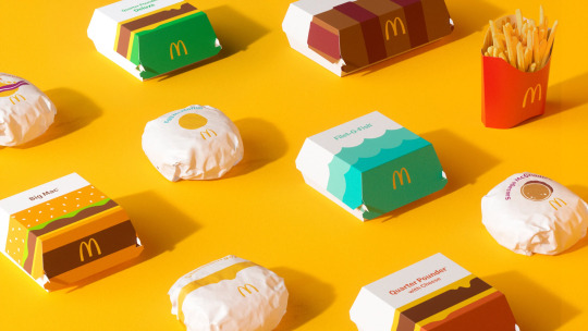
Without Graphic designers the world would look very different from magazines to advertisement the laptop im wiritng this on might not be a thing. Companies like McDonalds, Ferrari or Nike might not be as popular. The companies themselves would still exist or have existed but without Graphic designers they might not have been as successful.
Saul Bass is an American graphic designer and the man who changed graphic design. I have admired Sauls work before i ever knew he was the creator and had the idea of just how big and broad the world of graphic design actually is. Saul was borin in 1920 in New York City where he attended college, in the 40s he left for California and started in advertising. Saul broke into the industry in 1954 working on the movie Carmen Jones, desgning the poster. The movie makers were so impressed they invited saul to design the title credits and rest they say is history

Before Bass got to work on them credit were considers slow and boring. his work revoluntionised this, Introducing his signature “kinetic type,” Bass’ letters dashed and moved across the screen and frequently incorporated images other than text.
youtube
Sadly Bass passed away in 1996 but not before finishing come of his most accomplished and recognised work. films like Cape Fear, Casino and Goodfellas may not have been as big as they were without the influence of one man from New York. when the question of how influential can one person be and where would the industry be without certain people, when is comes to Saul Bass the answers is easily not the same. Frome the development of his use of graphic designs to creating some of the most loved movie posters to furthering this passion and art into change the opening of movies for generations I can understand why Saul Bass in known as the man that changed graphic design and much more.

Illustration
The main purpose of Illustration through visual communication is to give context, explanation or interpretive take on information this can make taking in the information easier or sometimes more fun. This can take many forms and can be used in the use of books, movies, posters, flyers and other sorts of visual media.
illustration was sometimes seen less important to graphic design but through use of social media and resurgence in contemporary techniques such as digital design, printmaking, painting and drawing illustration has became increasingly more popular. Online artists are giving movie posters a new vision are using illuststration to create a new take on older artwork and all over Glasgow there are artists using graffiti to convey messages of hope and change through visual communication. These are just a couple of examples of how illustration can be used.
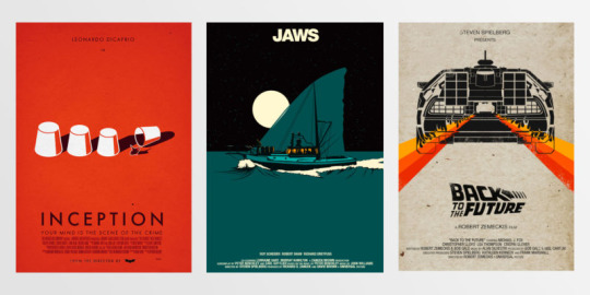
some examples of reworked movie posters through illustration.
Drew Struzan was born march 18th 1947 in Oregon. when Drew was younger he said his interests were between fine art and illustartion, his counsellor described fine art as being able to paint what Drew wanted but illustartion as being able to charge for it, Drews needed to eat so it was an easy choice from there. Struzan has said: "I was poor and hungry, and illustration was the shortest path to a slice of bread, as compared to a gallery showing. I had nothing as a child. I drew on toilet paper with pencils – that was the only paper around. Probably why I love drawing so much today is because it was just all I had at the time.
After graduating college Drew went to work at Pacific Eye & Ear a design studio where he would go on to design album covers, he went on to design album covers for Black Sabbath, The BeeGees and The Beach Boys. Despite the demand for his amazing artwork Drew was still only making £150-£250 per album.
Along with a friend, Drew started Pencil pusher when he would start to develop his love for one sheets working on some B movies like Empire of ants and Squirm.
In 1977 Drews world would unknowingly change forever we he was asked tom help assist on a unknown project called Star Wars. Drew chose a 'Circus' style for the poster and focused on the main characters, good and bad and items like the ships used in the movie.
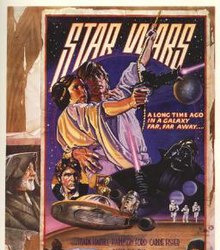
Star Wars 1978 re-release style D "circus" poster. Art by Charles White III and Drew Struzan.
Throughout the 70s and 80s Drew worked on some of the biggest movies which are still loved today, These included The Thing, Blade Runner, Back to the Future, Indiana Jones and my all time favourite movie The Goonies.
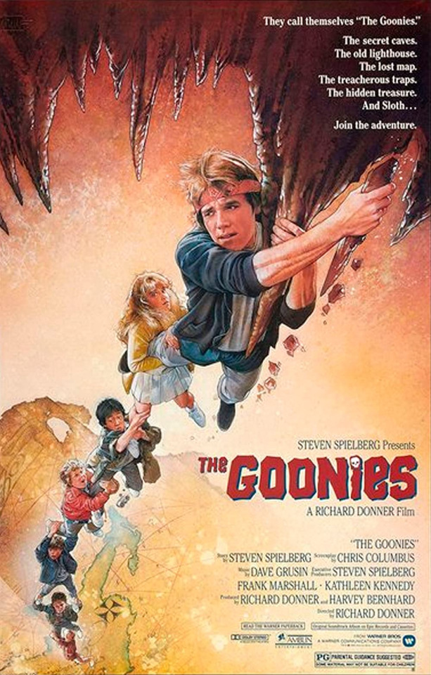
Today Drew collects some of the biggest names in Hollywood direction such and Steven Speilberg, Gerorge Lucas and Guillmero Del Toro and is still working on some of the biggest movies including Star Wars; The Force Awakens and How to train your Dragon.
Photography
Photography can be a powerful tool for Visual communication. Visual language is older then any other language in the world. Photography can sometimes be the easiest was to communicate. Through a photo we can convay emotion, it can show acts of war, peace or love and although people may not enjoy reading, a photo can get a message across just as easy if not easier and does not have to be in any language. I like to think of photography as that famous saying being turned on its head that " The pen is mightier then than the sword" i like to think that the picture can be the mightier then the pen. It caputres moments in time and gives reference to the past that now with social media and the internet can be kept for lifetimes over.
Eddie Adams
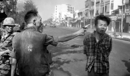
credit https://www.history.co.uk/
"Still photographs are the most powerful weapon in the world"
Pulitzer Prize-winning photojournalist Eddie Adams was on the streets of Saigon on the 1st February 1968 photographing the devastation of the war.
Alfred Eisenstaedt

credit https://www.history.co.uk/
"People tell me when i'm in heaven they will remember this picture"
Alfred Eisenstaedt’s mission through this photograph was to “to find and catch the storytelling moment.” In this post-WWII photograph in Times Square, he did just that.
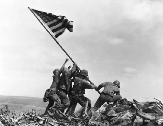
Robert F Sargent

credit https://www.history.co.uk/
This photograph titled “Taxis to Hell- and Back- Into the Jaws of Death” was taken on June 6, 1944 during Operation Overlord, United States Coast Guard chief petty officer and “photographer’s mate.” The photograph was originally captioned.
“American invaders spring from the ramp of a Coast Guard-manned landing barge to wade those last perilous yards to the beach of Normandy. Enemy fire will cut some of them down. Their ‘taxi’ will pull itself off the sands and dash back to a Coast Guard manned transport for more passengers.”
credit https://www.history.co.uk/
The above is the Pulitzer Prize winning photo has become a well known image and symbol of American victory. Taken during the by Associated Press photographer Joe Rosenthal, it is one of the most reproduced, and copied, photographs in history.
During the battle, the soldiers took the flag to the highest point of the island - Mount Suribachi. U.S. Marine photographer Louis Lowery captured the original shot but several hours later, more Marines headed to the crest with a larger flag. It was on this second attempt, that the iconic image was snapped. Three of the six soldiers seen raising the flag in the famous Rosenthal photo were killed during the Battle of Iwo Jima.
These are just some references of different photographers over different time periods using photography to convey messages of Death, Happiness, love and in two pictures from the same war, bleakness and Victory, you wouldn't necessarily need to know anything about the context to understand the message an that why photography can be so powerful for visual communication.
Working in the Movie Poster industry -
There are loads of ways to get started in the industry. Some people will could already have and understanding of the three principles of graphic design, photography and illustration. If you don't there are courses that you can take gain a better understanding of each. other ways to gain a better understanding is in social media, there are plenty of companies that use the likes of social media and platforms like YouTube now where artists while give you a step by step breakdown of how to develop a reimagined take on a movie poster.
Through the use of tools like Adobe Creative there are ways to find a step by step guide on creating something from scratch. This can be done by artists that are just doing it for fun, to individuals and companies that have built a money making company for either the design and retake on a new movie poster to growing a fan base on just the process of creating the artwork. I think its incredible that now more the ever building careers in graphic design and making a profession in creating a selling movie poster can be done by an experienced graphic designer or just in interested being that has a passion for the art but doesn't necessarily have what would be deemed as qualifications.
The titled job role for designing movie posters would usually fall under a poster designer but for companies this would fall under the job of a graphic artist, production artist or illustrator like I have included above when discussing the likes of Saul Bass and Drew Struzan, both artists and have experience elsewhere in the industry but built a following in movie posters.
If you were in these roles it would be your job to work to a brief to design the ideal movie poster, this could be from the early stages of some mood boards and drawings to start to develop the layout. from here you would use your preferred systems to work with and start creating, along the design process you would be liaising with your company if you worked for one or if your self employed arrange check ins to make sure who you are designing for is happy with what has been created, this could mean at times going back to change pictures or the layout or making sure the typography fits. The movie posters final design can be just as important as the trailer of the movies itself, this can sometimes be the first thing that's going to grip people to check out the movie. With social media being as big a platform now for creators, as i have mentioned already there is a new trend of the redesign of movie posters, this could be someone who is just a fan of the of the original who would like to give a different spin on it or maybe just want to modernise it. This is a great way to be passionate about something, put your take on it and be able to turn it into something you can make money off and you don't even need to have any qualifications just a passion and know how but even as someone starting out there is so much opportunity online now to learn and grow a platform.
As things have changed over time so have movie posters, not only how they were designed like illustrations to graphic design but also the people have designed them and culturally what they show and the progression of how the world now turns, it probably hasn't turned fast enough but it is turning. Thankfully now there are more opportunities for an everyone and anyone take on movie poster which should be celebrated and supported to make even wider available, just like the world of cinema.
Industry Roles -
Sign Painting -
Sign painting dates back centuries, merchants, pub owners and inn keepers had to advertise there business and products they had to sell, signs where the perfect use of Visual communication to achieve this. By the 1900s every store needed a quality sign painter, forome of the biggest companies now like Dr Pepper and CocaCola this was a great advertising technique and really brought the company to life while giving the people something they could recognise as a brand.

Prop-Designer
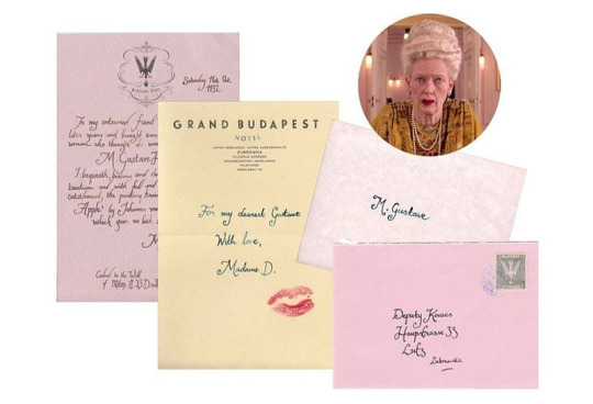
More specifically Annie Atkins is a graphic designer for the film industry. Annie Atkins has worked on oscar nominated and wining movies in which her work would probably go unrecognised but plays big parts and roles within the movie. Annie is know for BoxTrolls, Isle of Dogs and The Grand Budapest Hotel in which Annie won an Academy Award for best production design.
Packaging Design
A package designer leads the the design process from the earliest stages they work on brainstorming the ideas. makes sketches and creating prototypes. They will work with the client throughout gaining feedback to make sure design specifications are met. A packaging designer will then work with the creative design team and graphic designers to help create eye catching designs. eventually they will present to the client they finished article from sketches to the design prototype, after this the client will give there feedback to which if necessary changes can be made to make sure the clients needs are met and a final piece can be deisgned.
Logo Design
Logo Designers tend to be graphic designers that usually work on a freelance, full time or for a design firm basis. A logo designer like a package designer had the job of working from a client brief in creating a final recognisable logo for a person or company, this could be from a barber to a coffeeshop to Nike. A designer has to make sure from start to finish all design needs are met at most will create sometimes 3 logos to give the client a choice, from there all or none of these might work for the client, if it doesnt it is the designers job to take the feedback on.

0 notes
Text
History and evolution of book cover design
The cover of a books original sole purpose was for the protection of the book itself, even referred to at times as dust jackets, over time this changed and now the cover of the book can be manipulated using typography and graphics to bring the reader into the book before ever reading the back pages or even opening the book.

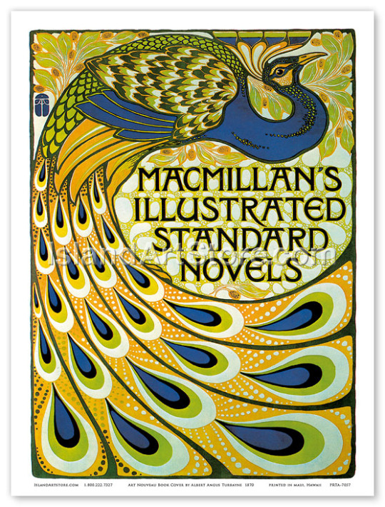
Above are some previous covers that have been used for books, these are prime examples how covers could still be ornate and make the book look good but no information regarding the content of the story of even the name of the book itself is displayed. As time progressed so would the material and techniques used.
Around the 1820s the materials and machinery used to create books started to change, less expensive items like paper and book binding machinery was now a cheaper and quicker way to get books on the market. This would then progress to machine powered presses and mechanically produced paper. This would make creating book covers cheaper and with the introduction of processes such as multi colour lithography then evolving to print would help books covers to start to create and identity.

The introduction of Art Noveau and Arts and Crafts in the 20th Century began to make its ways into book production in Europe and New York.
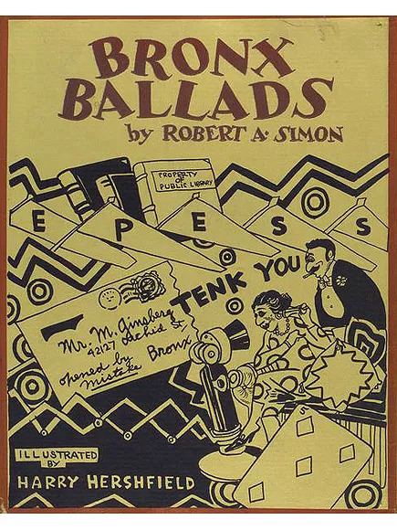
Throughout the 1920’s artists such as Aubrey Beadsley and Alexander Rodchenko were known to create strikingly different covers. Artists from the soviet union had a massive influenece creating some of the most radical book covers of its time which would go on to shape the movement going forward and by post war the book covers had became a competitive market. I feel this was a sign of the times, not only had the techniques and materials became more widely available but also the artists themselves had developed specific niche the for some people the cover of the book could be deemed more important than the actual substance of the book. This can also be seen through the use of typography and more graphics that are used.
Publishers like Penguin had a massive factor in shaping how books would develop. Allen Lane was travelling to london when he stopped at a book stall and found the the quality of the books to be poor and expensive. He came to the realisation that what was need was good stories at affordable prices. In 1935 Penguin books, a revolution in creating paperback books was founded and by 1936 they had printed over one million books. By the 1940s they created Puffin picture books helping evacuated kinds to the country adjust to life.
During World War 2 certain restrictions and and limitations were put upon publishers, the shortage of workers as well as materials with paper shortages and not to mention now more than ever there was controls put in place on the content of publications due to the censorship of the information which was released to the public. For such a difficult time in the world and conflict in every corner of the world publishers managed to survive the period.
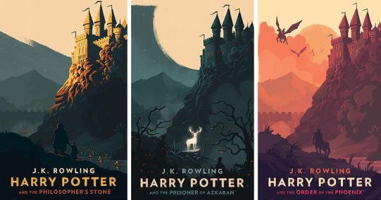
Many of the book covers that we see today can relaunch a book over 100 years old. The use of bright colours and bold lettering as well as the advancement in modern techniques as well as the revival of the older techniques that have been used for centuries can help sell a book. I feel right now the way people view reading has massively changed. The introduction of movies that have been created from using books has helped create and interest in books again, big titles like Lord Of The Rings and Harry Potter have created interest in people that would not usually read go back after seeing the movies and take an interest.
now more then ever people love picking up a book whether that has to factor in the popularity of books or that people are in need to switching off and getting lost in the story of a book again helps the development of book covers last and progress for years to come.
its not hard to see how far the evolution of book covers has came from a dyed leather 22 karat gold version of Frankenstein to a print and pressed copy to a student developing a book cover on their laptop for a college course I think sums up the development perfectly.

0 notes
Text
Written Evaluation.
I chose the Coorie Coffee Co. based out of the West End of Glasgow. I was nervous at the start of this as I have never designed a brand logo before but something at the start of my college journey I wanted to do. I enjoyed the basic stage of the design boards and the drawing ideas but found developing those ideas to be difficult. I am proud of my finished logo, it ticks the design brief boxes but skill level I think it might be a bit basic but as my experience grows my skill level should develop.

0 notes
Text
Music Response
For our music response breif we had to choose a song from a prepared list and from listening to this song design 4 different album covers. I chose Todd Terje's Inspector Norse, a song that has been a favourite of mine for years. The interesting part is that when i had listened to the song for all these years I had always thought that the song maybe me picture something completely different then what the cover of the song and video used.

For my first album cover I went straight to what the picture in my head was when i heard Inspector Norse for the first time. That was the timeless classic vintage video game Space Invaders. I used photoshop to create this cover, I started with a black background and managed to get one of the space invader aliens as the main logo in a bright in your face neon green, I then added the name of the artist and song name in a bright yellow, I added a drop shadow to the aliens and the writing to give it that 3d effect which I think makes a great addition and keeps in with the arcade game feel. for the record logo i used the same alien but added this to a neon pink background. I really enjoyed how this turned out even though I kept the look very simple.

For the Next cover I stayed with the arcade feel but this is my take on the classic Tetris. I used photoshop to create this, I wanted to try something bright and bold like the song makes me think but not copy the exact look of the Tetris look. I Kept the black background to make the bold colours stand out more and position them similar to how they would look in the arcade game. I thought from our other work of dot, line and shape it would be good to include some of this somewhere in my work. I used a picture of a ufo to add to the bottom corner of the cover, I then added the mezzotint filter to the ufo to give it a cool look and add some texture to the cover. For the record sticker I used and image for the classic arcade game to reinforce the look I was try to go for.
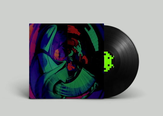
For my third album cover, I took a trip to NQ64, the arcade bar in Glasgow. We managed to get some amazing picture, that went great with the feel of the song. I then took the image to photoshop, I cut the image down to size to match the size of a typical record cover, i managed to use the adjustments to make changes to the brightness, contrast, vibrance, hue and saturation to bring up the great colour of the picture but not too much so it keeps that underground arcade bar feel. I then distored the picture to give it the look. I was very happy about how this turned out. For the record label I used the Space Invader alien in a black background with the neon green alien.

For my last cover i wanted to try something completely different then my other ideas. For this I used a mixture of different paints on white paper, I used a roller and knife to add the paint which I feel gave it a great look of different textures to the paper. I then managed to cut out words from different magazines, these words are some of the things I think of when I hear the Inspector Norse. I loved doing our piece on typography and wanted to make sure I added this in to at least one on the album covers and with the words I managed to get i think they look amazing. I managed to also find the letters of the track name and cut them out in a ransom style note. I think the letters and words sit on the paper well and stand out, with the colours it gives the cover a very 80/90s look keeping in with the song. as with the third cover I changed the picture in photoshop. for the record sticker i managed to use a part from the cover, make it neon pink to stand out and give this a counter look to cover.
Overall I am really happy about how the covers turned out. before this task I had never used Photoshop before, so it took some time and patience. i watched some Youtube videos to grow my knowledge on photoshop and spent some time playing around to find out what can be done on it, which I found is quite a lot, haha. I am happy that used a variation of pictures, painting and photoshop to create the final pieces and I am happy that I have taken the covers in a different direction then the original but how I think the song sounds and what the song makes me feel. Looking back I feel the only thing I could have done differently is maybe look for more variation in ideas, for 3 of the covers i stuck to a very similar idea even though I think I came up with 4 very different covers. This is something that hopefully as my experience grows will also grow. I managed to develop some of my thumbnails to final pieces which I am happy about but I found as I was developing one idea another idea would go into my head and i would go for that although I hadn't developed the idea from the drawing stage.
0 notes
Text
Context Design
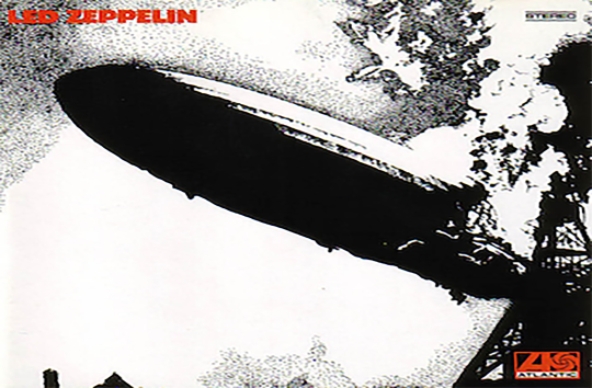
Made of of Robert Plant, Jimmy Page, John Paul Johns and John Bonham, Led Zeppelin formed in London in 1968. Originally The New Yardbirds the group had their first Scandinavian tour in September 1968 and would later that month go on to record their first album.
The New Yardbirds wouldn't last long, after completion of the first album the band would receive a cease and desist from a former band member stating the name only covered so long and by the end Scandinavian tour the The New Yardbirds were no longer. There are mixed stories about how it came to pass but the story I like the most (read online) was, In May 1966, Moon and Who bassist John Entwistle recorded the instrumental "Beck's Bolero" with Page, John Paul Jones and Jeff Beck. The track came out well, and they tossed around the idea of forming a new band. Moon allegedly said the band would go over like a lead balloon. A few tweaks were made to make the name more appealing and understandable and Lead Zeppelin was born.
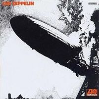
Lead Zeppelin would go on to be one of the most successful music artists of all time with record sales ranging from 200 - 300 million units worldwide. With such a a massive career and some amazing albums it was the cover of their first album self titled Lead Zeppelin 1968 that I liked.

Originally taken by Sam Sher on his big sphere camera, the Hindenburg disaster. On May 3, 1937, the Hindenburg left Frankfurt, Germany, for a journey across the Atlantic to Lakehurst’s Navy Air Base. Stretching 804 feet from stern to bow, it carried 36 passengers and crew of 61. While attempting to moor at Lakehurst, the airship suddenly burst into flames, probably after a spark ignited its hydrogen core. Rapidly falling 200 feet to the ground, the hull of the airship incinerated within seconds. Thirteen passengers, 21 crewmen, and 1 civilian member of the ground crew lost their lives, and most of the survivors suffered substantial injuries.
George Hardie was born in 1944. while attending the Royal College of Art Hardie was recommended for the Lead Zeppelin album cover by his friend, photographer Stephen Goldblatt. After rejecting some of his ideas Jimmy Page suggested re-working the picture of the Hindenburg disaster which worked with how the band forming going down like a lead balloon. Hardie set to work on the idea, using a technique called Stippling. Stippling means to use dots or marks to create an image, a build up of this in the right way could create shadows or lines and end up creating an image this could be done using different methods but traditionally and on this occasion Hardie used his radiograph pen. Mr Hardie added: 'I think the drawing made a good and memorable cover, but this was more to do with the photograph and Jimmy Page's choice of it than with my skill as a dotter.' George Hardie was payed £60 for his work which he said he was happy about and thought the album cover was "good and memorable"

(example of stippling )
Along with Led Zeppelin's album, George Hardie would go on to create some of the most recognisable album covers in music history with Pink Floyds Dark Side of the Moon and Black Sabbaths Technical Ecstasy.

I thought it was be good to add some information regarding the album typeface but looking online it I could not find a definitive answer. one website I found believes that the typeface used for the album was a modified Futura extra bold. This was down to an emphasis on the sharp points of the 'Z' but as the great thing with typeface there are other websites that disagree with this but sadly there is nothing that is 100% but the typeface was not meant to be the stand out feature of this album it was meant to be the picture tat made such an impact.
1 note
·
View note
Text
Music Response
Album Cover Imagery -
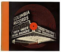
Designed in 1939 by twenty three year old Alex steinweiss while working at Columbia records. Taken from New York's West 45th Street and stood outside the city's famous Imperial Theatre. This was one of the first album covers to use a photography.
As the first album art cover and with no previous subjects to take inspiration from i think this is a great use of imagery, imagination and colour to start.
5O'S
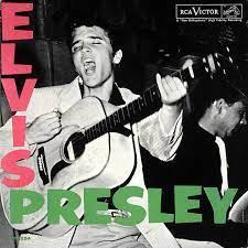
Elvis Presley 1956 was taken by William V. "Red" Robertson from the debut studio album, The picture of Elvis playing the guitar and singing during a performance at the Fort Homer Hesterly Armory, Tampa, Florida, on July 31, 1955 was used here with the singers name and album title vertically and horizontally in some bright cool colours. The set up of this album would go on to be, I used the word reference lightly in a later massive album cover. I thought this was really cool for the time of the album.
60s

A great visual and cover to reflect the time the psychedelic 60s, Jimi Hendrix’s Axis Bold As Love (1967) was created by David King and Roger Law shows art work of religious faith with the bright 60s colours. The artwork would go on to be the source of complaints and banned by the Malaysian government's Home Ministry and Jimi himself explaining how he had nothing to do with the choice of the cover. Its great reference to something to looks good but the more information you gather about it the more questions it raises.
I have also included this album cover by Led Zeplin from the 1969 self titled album, photographed by Sam Shere on 6 May 1937, during the hidenburg disaster. taken from a joke about the band starting and how it would go down like a lead balloon. The design was coordinated by George Hardie the front cover illustration, rendering the famous original black-and-white photograph in ink using a radiograph technical pen and a mezzotint technique.
70s
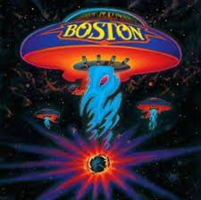
Designed by Paula Scher and illustrated by Roger Huyssen for Epic Records the cover of Boston's album is one of my favourites even if it designer Paula Scher does not understand why it got a backing when released, “The Boston cover was designed in 1976 and is now 39 years old,” she says. “It was, and still is, in my opinion, a mediocre piece of work.” The guitar shaped spaceships have become a trademark for the band and other album covers. Paula had a meeting with Tom scholz guitarist for Boston and the bands product manager, “The first space ship cover idea we showed Scholz had a Boston invasion of the planet, but Scholz said that space ships should be saving the planet, not attacking. So we came up with the Earth-blowing-up idea.
Rogger Huyssen has created close to 100 album including James Brown and has work in the Smithsonian National Portrait gallery in Washington DC, his work is amazing and very recognisable.
80s
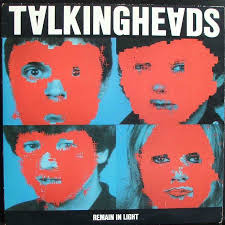
Released on October 8th 1980 Talking Heads Remain in the light album is a great alternative album cover. Using and image of the band the Massachusetts Institute of Technology blotted out the band face using red and keeping the bands eyes and mouth. Painstakingly the job took hours due to the lack of computer power in the 80s. The rest of the artwork was created by graphic designer Tibor Kilman. It was Kilman that came up with the idea of inverting the A's in the bands name, I think this is a great addition and simple idea but also has a great effect that pulls you to the writing. This and the what would be a simple job now but lengthy job in the 80s creates a great cover.
90s

The Glasgow boys make my top album on the 90s. Released in September 1991 and created by Paul Cannell the psychedelic sunburst that adorns the album’s sleeve has become the bands recognisable calling card featuring on countless t-shirts, posters and other memorabilia. According to myth the picture was created after artist Paul had taken LSD at the Creation Records office in Westgate London and Paul was inspired by a damp patch. Paul would go on to create other album covers for Primal Scream and also created work for the Manic Street Preachers. Sadly Paul passed away in 2005 but thankfully his amazing artwork lives on.
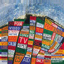
Released in June 2003 and Created by English artist Stanley Donwood. Donwood has created all the artwork for Radiohead with Thom Yorke. The cover art is a roadmap of Hollywood, with words and phrases taken from roadside advertising in Los Angeles, such as "God", "TV" and "oil". Not only did Donwood use the advertising but he also used songs from the album such as Burn the Witch and also used some political reference due to the ongoing war on terror at this time.
2010s
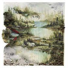
Bon Iver's second studio album Bon Iver album was released in June 2011 and the album cover was created by American contemporary artist and teacher Gregory Euclide. Gregory's artwork is most recognisable for its water colour look and its focus on nature and the outdoors. Gregory's work has had plenty of recognition from appearing on album covers and in magazines to the museum of Art and Design in New York and exhibitions on Nevada's Museum of Art. Euclide has went on to do many more Album covers and book covers.
2020s

Released in August 2020 the Killers most recent Album 'Imploding The Mirage' album artwork was created by Thomas Blackshears piece called 'Dance of the Wind and Storm'. The Killers have noted that the artwork is the main source for most of the inspiration for the entire album, the band have said there is a number of direct links between the art and song lyrics. Thomas Blackshear work has been exhibited at The Smithsonian National Museum of American History and has created work for stamps, Hallmark cards and illustrations, He has also created artwork for Disney pictures, George Lucas Studios and National Geographic magazine.
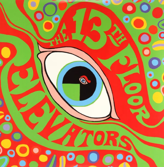
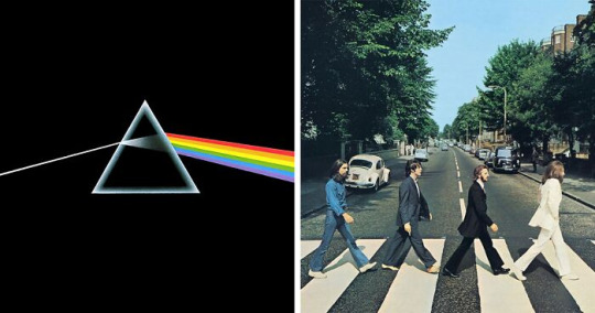
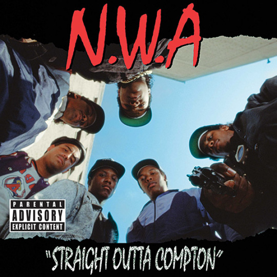
Below are some other amazing album covers.....


0 notes
Text
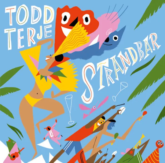
Inspector Norse
Todd Terje was born Todd Olsen in Mjondalen Norway in 1981. Training to become a pianist Terje enrolled in a local music school but dissapointed in the music available at the time he begin to look at different career path and started to study physics at the University of Oslo but the Prodigy, music stations starting to become popular at the time and tapes that his sister brought him home would change Terje's career all for the better. Playing around in his early teens on a cheap PC together with his mate Dolle Jolle, Terje made his first attempts on house and jungle music, which they played from cassette tapes on junior high school-dances.
Olsen reckoned that disco was all a bit silly – until Norwegian disco pioneer Bjørn Torske’s "Sexy Disco" caught his ears in 1999 and inflamed his love for the disco sound. In 2001 Olsen got in touch with Prins Thomas, and was also introduced to Hans-Peter Lindstrøm in Oslo. Inspired by the UK's disco heads Terje began working on editing old songs and would later start working on his own music.
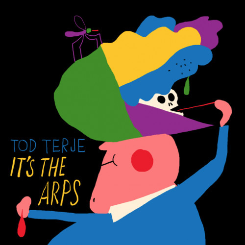
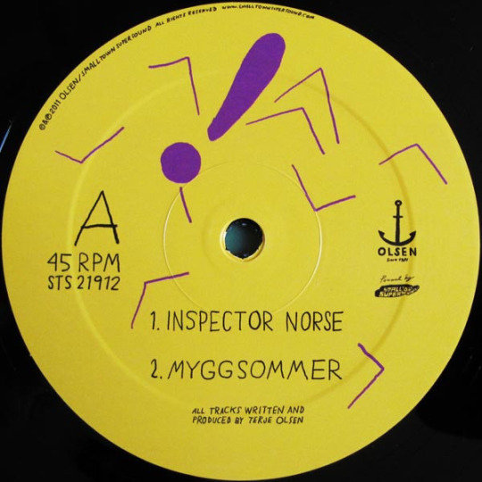
Inspector Norse was released in 2012 by Todd Terje, the radio edit at 3:47 and an album version at 6:59 was released on CD-R single charting at number 9 in the Belgium chart and number 10 in Belgium dance chart. It was the last song to be featured on the debut album, Its Album Time. The entire song was created and the ARP 2600 Behringer revered synthesiser. The artwork for 'Inspector Norse' and so many of Terje's album covers was created by The New Yorker illustrator Bendik Kaltenborn. Terje and Kaltenborn became friends in a dutch chain Free Record Shop. I love the artwork and the typography for both the single and the Album, I think they are great examples of eye catching designs.. I love the use of the black background then the bright colours with the abstract art of the skull and moskito. The covers are very experimental and I feel like the artwork for each one does not necessarily have much to do with the actual song itself which is another reason why I have chosen this song to cover I would love to Speak to Kaltenborn to understand his design process and why it was he chose each design for each cover.
The official music video for the song, lasting four minutes and twenty seconds, was uploaded on 19 June 2012 to the official pitchfork youtube channel. The video, which is an excerpt from the short film Whateverest, it follows Norwegian man named Marius Solem Johansen, known by his internet alias "Inspector Norse", and his passion for music, drugs and dancing.
Inspector Norse went on to become MixMags best track of 2012 and second on Resident Advisors list of 50 best tracks in 2012, but that wasnt it for the DJ. Terge would go on to bes listed #17 in Rolling Stones list of 25 Djs to rule the world.
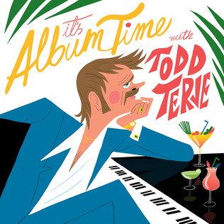
Inspector Norse would go on to appear in Terje's debut album 'Its Album Time'. The Album released on the 8th of April 2014 by Olsen Records was recorded over a span of three years, it debuted at number two in Terje's home country Norway and number four on the Billboard Dance/Electric albums chart and number twenty three in the UK album charts.
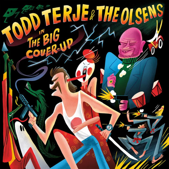
i have copied some of the album artwork from different songs that Terje and Kaltenborn collaborated on.
0 notes
Text
Modular Typeface
Blade -

Blade is a modular typeface created by Elise Eronemiller. I loved the look of Blade as soon as I seen it as I thought it was a great use of the word and it does what it says. When you say or think of blade you think of something sharp and harsh but the creator has focused on a mixture of soft curves and sharp lines but I think it looks great with the mixture of both. Elise used plants and leaves as inspiration to create the letters. Thick Stems with sharp curves in the right places give the word its perfect look. There is a great balance between the Xheight and the capline meaning that the letters looks great big and bold or smaller in form.
ATARI Font -

My next choice of font come from my love of vintage games. The Atari font of the 8 bit font was likely designed on graph paper on an 8 by 8 grid it could be seen as a bold 8x8 pixel sans font. Video game designers of the '70s, '80s, and '90s faced colour and resolution limitations that stimulated incredible creativity. With each letter having to exist in a small pixel grid, artists began to use clever techniques to create elegant character sets within a tiny canvas.
These fonts weren’t often designed by trained typographers in computer design programs and would be years before Photoshop. Instead, they were designed by hand on graph paper and coded into the game pixel by pixel. They would have to use a term called thick and stress into the 8 by 8 boxes to create the perfect number or letter as clear as possible and create an example of how video game designers used the grid to communicate to the players.
Over the years you can see how this developed with the wider range available to not only graphic designers and typography but the development of gaming systems, I enjoyed writing about this typeface as it relates closely to the dot line shape exercise that we have been working on recently.
Reprise-

Reprise was invented by Robert Holmkvist in May 2017. Reprise was inspired by 1959 poster by Karl Gerstner using the number 3 as a graphic device. Experimented with type drawn on a grid, combining squares, triangles and circles to make up letterforms used by modern design icons, Josef Albers, Jurriaan Schrofer, Ken Garland, and Wim Crouwel.
The anatomy of Reprise has mix curves and straight edges, perfectly round dots, or sharp-edged triangles. I think its interesting that a poster designed in 1959 would go on to inspire a Modular typeface created in 2017. This shows how progressive typefaces can be and how they can be adapted using the simplest changes and ideas referring back to our dot, line, shape.

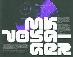
MK Voyager
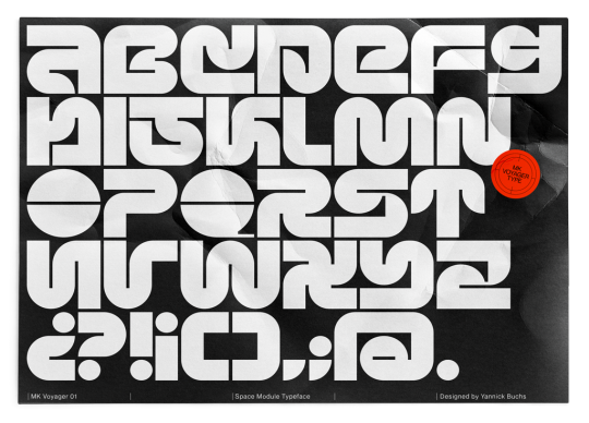
I found MK Voyager on the Behance website, It was created in 2022 by Yannick Buchs and was based on the American scientific program that had 2 robot probes launched 1977. Mk Voyager is a modular geometric typeface that has a space race and scientific feel to it which is what I liked about it. The Typeface has a great balance of straight lines an curves helping create that space feel about it. It looks as good in black and white as it does in colours. I think it would look great on Stanley Kubrick's A Space Odyssey or would go un noticed in a Star Trek computer screen.
0 notes
Text
Dot/Line/Shape - Typography

Glasgow.
When we were given the assignment to design letters using our current dot, line and shape model.
As I am new to graphic design and do not have much experience in typeface I referred to the resources provided on our assignment. I had a look online and was taken back just by how many different typefaces exist. I then went to Netflix and watched the show Abstract. One episode followed typeface designer Jonathan Hoefler. Jonathon goes into great depth describing the construction of a new typeface but also how reference is made to letters that have been around for years and how these can be used to develop the next age of typeface and the other was about Paula Scher. Paula is one of the well known names in the graphic design and typeface world who has had a hand in designing some of the most beautiful pieces that people would walk past on a daily basis and not know it was Paula that designed them.
In both of the episodes Jonathan and Paula use New York as one of his main points of reference, their passion and love for the city and how different buildings and places give them lightbulb moments made me think about my love for Scotland, from the walks in the countryside to visiting the cities for a cheeky pint. I used my graph paper and started drawing but felt like I needed some inspairation so like Jonathan and Paula I thought I would reference Glasgow.
My first Idea was to make reference to the rivers and waterways that run through the city but struggled when it was on the paper to find that identifiable shape. It was only when i was on was moving through the mad i seen that some buildings when in 3D I thought started to shape letters. it was this that helped me design my typeface.
I can honestly say that I have fallen in love with typeface so much that I am annoying my better half when we are out walking and watching things on tv but i do believe typography has the power to drive the brain mad.
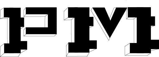
This is my finished design. I’m actually really happy how it turned out and enjoyed the full design process. It could use some refining but as my first illustrator and graphic design piece I’m over all happy. I have enjoyed typeface and look forward to doing more work on it.
0 notes
Text
Swiss & Shout
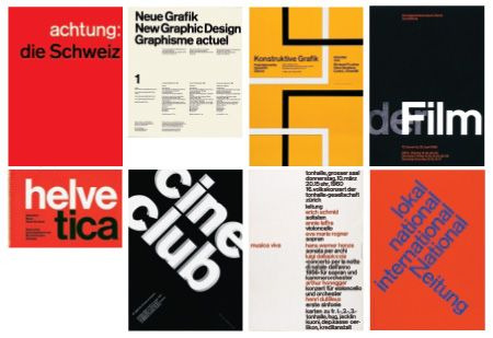
International style in the 1920s was well known throughout Russia, Germany and the Netherlands and after world war 2 and through some very talented Swiss designers, the Swiss design movement emerged in the 1950s and would be the pioneer and major force behind graphic design.
With key principles and attention mainly poised towards detail, precision, craft skills, system of education and technical training, a high standard of printing as well as a clear refined and inventive lettering and typography laid out a foundation for a new movement.
Using asymmetrical organisation on a mathematically constructed grid and using text and or images the designer would be able create designs that were clear and factual manner free from political agenda. it would spread quickly through Europe and the united states.
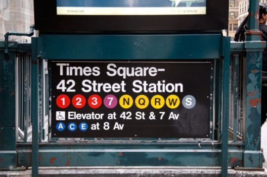
Helvetica New York Subway typeface.
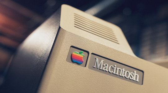
Helvetica (Latin for Swiss) was introduced amidst the popularity of swiss design. Developed in 1957 by Max Miedinger and Edward Hoffman in Switzerland gathering attention from advertising agencies Helvetica quickly appeared in corporate logos, signage , fine art, prints and in 1984 Apples Macintosh.
Josef Muller-Brockman -
Josef Muller-Brockman is one of the most influential graphic designers in its history, aka the Swiss Godfather.
Muller-Brockman was born in Switzerland in 1914. He studied graphic design and architecture at the Zurich school of art and crafts. By 1939 he opened his graphic design and illustration studio and would go on to to join the Swiss Werkbund (Swiss Association of Artists and Designers).
Different art and design movements such as Constructivism, De Stijl, Suprematism and the Bauhaus would influence Josef in the development of "Swiss international style" and result in him being the most well-known swiss designer and his name being the most recognised when talking about this time period.
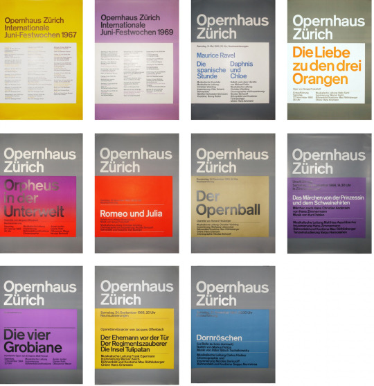
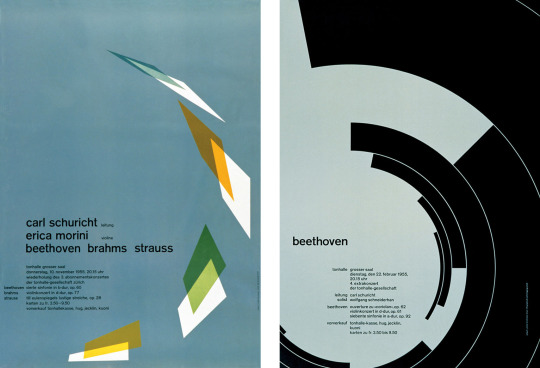
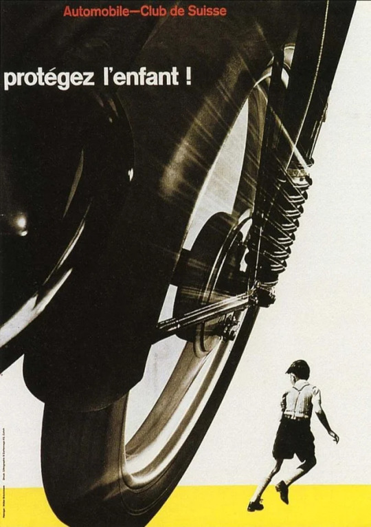
After 1945, Josef would concentrate on illustration and exhibition work leading to his first poster for the Tonhalle in Zurich, 1950. It was at this time he would develop his constructivism approach and graphic design would start to occupy all his time. Work for the swiss Automobile Club (protect the child) and numerous posters for Tonhalle in Zurich would bring him fame and recognition for his work.
From 1957 to 1967 Josef would go on to create work that would be used by most graphic today and for as long as we use graphic design. Becoming a professor at the Kunstgewerbeschule, working alongside other influential graphic designers and working as a consultant for IBM as well as his communication agency Muller-Brockman and co are just some of the things that can be discussed when talking about Josef. His work would go on to be rewarded with numerous prizes and inspire would be graphic designers like myself 83 years after starting his first adventure.
"I became a graphic designer by accident," could potentially sum up my graphic design journey so far which is why I enjoyed writing about Josef.
Hans Neuburg -
Hans Neuburg was a disciple of the swiss style movement. Hans trained at the Orell Fussli Art Institute in Zurich and went on to become a copywriter and designer in advertising agency Basel and Zurich in 1928. He went on to specialise in advertising and exhibition design in his own studio in Zurich. Hans went on to have an amazing career working on the 1939 Swiss National expo in Zurich and also the Swiss contribution to the Prague World Fair in 1945 and the Brussels Expo in 1958.

I have enjoyed looking through Hans portfolio of work and pictures from the Brussels expo remind me of vintage science fiction movie scenes which caught my attention. Hans incredible work for the Red cross poster grabs your attention and his 1957 "Radiotelefono" poster reminds me of a Alfred Hitchcock style movie poster.
Hans went on to become the director of the Kunstgewerbemuseum and while finding the time to do some teaching along the way I don't imagine understanding how big an impact he would have on graphic designers for years to come.
5 notes
·
View notes
Text
Swiss & Shout
International style in the 1920s was well known throughout Russia, Germany and the Netherlands and after world war 2 and through some very talented Swiss designers, the Swiss design movement emerged in the 1950s and would be the pioneer and major force behind graphic design.
With key principles and attention mainly poised towards detail, precision, craft skills, system of education and technical training, a high standard of printing as well as a clear refined and inventive lettering and typography laid out a foundation for a new movement.
Using asymmetrical organisation on a mathematically constructed grid and using text and or images the designer would be able create designs that were clear and factual manner free from political agenda. it would spread quickly through Europe and the united states.
Helvetica New York Subway typeface.
Helvetica (Latin for Swiss) was introduced amidst the popularity of swiss design. Developed in 1957 by Max Miedinger and Edward Hoffman in Switzerland gathering attention from advertising agencies Helvetica quickly appeared in corporate logos, signage , fine art, prints and in 1984 Apples Macintosh.
Josef Muller-Brockman -
Josef Muller-Brockman is one of the most influential graphic designers in its history, aka the Swiss Godfather.
Muller-Brockman was born in Switzerland in 1914. He studied graphic design and architecture at the Zurich school of art and crafts. By 1939 he opened his graphic design and illustration studio and would go on to to join the Swiss Werkbund (Swiss Association of Artists and Designers).
Different art and design movements such as Constructivism, De Stijl, Suprematism and the Bauhaus would influence Josef in the development of "Swiss international style" and result in him being the most well-known swiss designer and his name being the most recognised when talking about this time period.
After 1945, Josef would concentrate on illustration and exhibition work leading to his first poster for the Tonhalle in Zurich, 1950. It was at this time he would develop his constructivism approach and graphic design would start to occupy all his time. Work for the swiss Automobile Club (protect the child) and numerous posters for Tonhalle in Zurich would bring him fame and recognition for his work.
From 1957 to 1967 Josef would go on to create work that would be used by most graphic today and for as long as we use graphic design. Becoming a professor at the Kunstgewerbeschule, working alongside other influential graphic designers and working as a consultant for IBM as well as his communication agency Muller-Brockman and co are just some of the things that can be discussed when talking about Josef. His work would go on to be rewarded with numerous prizes and inspire would be graphic designers like myself 83 years after starting his first adventure.
"I became a graphic designer by accident," could potentially sum up my graphic design journey so far which is why I enjoyed writing about Josef.
Hans Neuburg -
Hans Neuburg was a disciple of the swiss style movement. Hans trained at the Orell Fussli Art Institute in Zurich and went on to become a copywriter and designer in advertising agency Basel and Zurich in 1928. He went on to specialise in advertising and exhibition design in his own studio in Zurich. Hans went on to have an amazing career working on the 1939 Swiss National expo in Zurich and also the Swiss contribution to the Prague World Fair in 1945 and the Brussels Expo in 1958.
I have enjoyed looking through Hans portfolio of work and pictures from the Brussels expo remind me of vintage science fiction movie scenes which caught my attention. Hans incredible work for the Red cross poster grabs your attention and his 1957 "Radiotelefono" poster reminds me of a Alfred Hitchcock style movie poster.
Hans went on to become the director of the Kunstgewerbemuseum and while finding the time to do some teaching along the way I don't imagine understanding how big an impact he would have on graphic designers for years to come.
5 notes
·
View notes