illustrative-musings
Illustrative Musings
A place to write Practice as Research essays
My Art Instagram
My Personal Instagram
10 posts
Don't wanna be here? Send us removal request.
Last Seen Blogs
1800free
︻╦╤─ G.Δ. GØDFREE X‼️✊🏿
julian-zepeda
juliánzepeda_fotografía
julian-zepeda
juliánzepeda_fotografía

325driver
Untitled
sillysimplysilky
Peggy/Silky/Pomni
Text
Voice and Originality
‘Thinking creatively and independently, creating art that is authentic, innovative, significant, unusual and new (was important to Modern art and is questioned by postmodernist contemporary art)’ (Wigan 2014 p.162). I agree with Wigan that originality definitely focuses on the unusual and the creative and new, but also feel that it is important to state that it does not necessarily have to be brand new, rather a twist on something old to create an original idea. Of course, a completely new idea would be great, however it is more likely to be accepted as part of a culture and actually take off if it calls upon societal queues and becomes something people can easily recognise. This is a viewpoint that is also shared by T.S Eliot who said “…we do not quite say that the new is more valuable because it fits in; but its fitting in is a test of its value.” (Eliot 1919 Tradition, and the Individual Talent). Personally, my definition of originality would be something that is recognisably your own creation. Whether or not you take inspiration from something is irrelevant because nothing we do comes without taking ideas from something, but it must be a new configuration of those ideas in order to be original.
In my own illustration practice I like to use different mediums and mix them to see what works best for me. I do not have a consistent style yet, but it is something I would like to work towards.
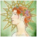
For this week’s task we were asked to come up with our own fonts. I wanted to be experimental with colour and shape in mine as well as making them as hand rendered as possible so here is what I came up with. (fig 1)
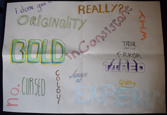
Fig 1
I think the most original one is the “Inconsistent” one made up of arms. I’ve not seen one like that before and it really feels like something I would use in a piece. I also like the “Tired” one, however that one was highly influenced by other types I have seen and therefore is not exactly the most unique. Overall, I think that this was a really helpful exercise for me as I tend to shy away from adding text to my pieces and this made me realise my writing does not have to be boring or unenjoyable.
Wigan, M. (2014) Thinking Visually for Illustrators. 2nd ed. London: AVA Publishing
Eliot, T.S. (1994) ‘Tradition and the Individual Talent’ in The Sacred Wood, London: Dover Publications
0 notes
Text
Colour Printing (Riso)
For my riso print design I created a digital drawing of a girl wearing a frog hat. I wanted to use dots (fig 1) of various intensities to create tone as I thought this would look good with the riso print process.
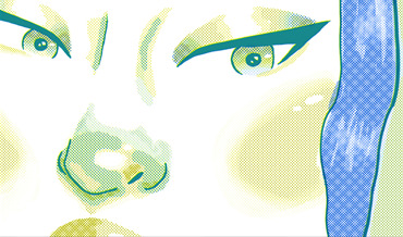
Fig 1
I created two layers on photoshop for the different colours and shaded them accordingly with a screen tone brush (fig 2).
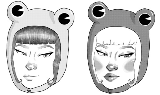
Fig 2
When drawing I pictured it in my mind as a blue and yellow combination which helped me figure out where to put which colours because I already had the idea in my head, however when I finished, I played around with clipping masks and changing the colours/ opacities and realised that I actually really like the blue and pink combination the best (fig 3), closely followed by the red and black (fig 4)as both of these had good strong contrast which I found aesthetically pleasing.
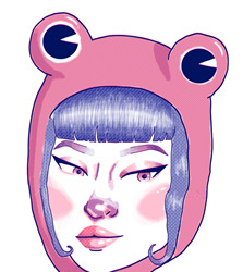
Fig 3
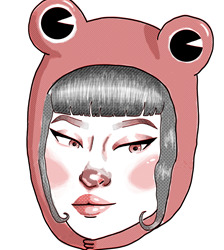
fig 4
The Blue and yellow (fig 5) did not seem strong or bold enough somehow, but I would still like to try it just to see what it would look like. I actually quite liked the green and red (fig 6), however I do not think they would look good together from the riso machine and they do not have the same impact for me as Figure 3 or 4. Unfortunately, I was unable to print this in time to show how this would look printed on an actual risograph machine, but I think that the thumbnails give a good idea of how it might turn out.
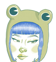
Fig 5
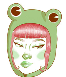
Fig 6
0 notes
Text
Week 8: Critical theory, activism, and politics
Critical theory is looking at something (art, literature etc) through a political, historical, or social perspective. Looking at the cultural factors that may have shaped it. For my essay I shall be focusing primarily on mental health however other common themes for critical theory are;
· Politics
· The environment
· Religion
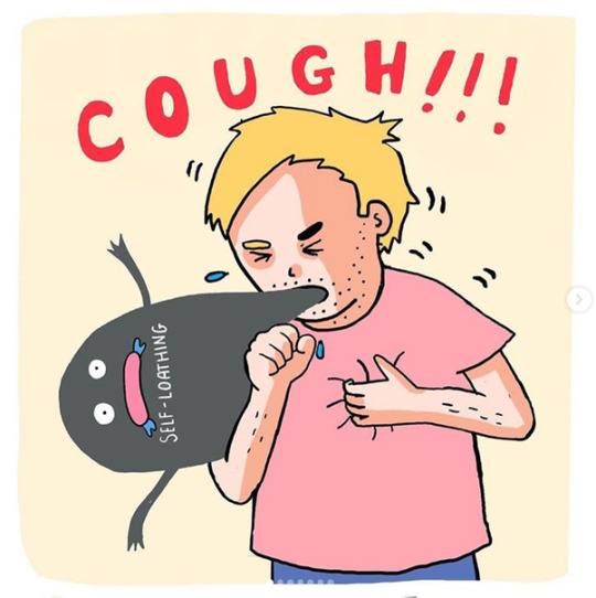
Fig 1
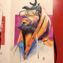
This drawing by “Alec with pen” (Fig 1) felt like the perfect illustration to discuss for this week as I think it is a perfect comment or critique of society’s views on mental illness and human emotions. He has a series where he takes mental illnesses or emotions and translates then into anthropomorphic blobs representing that specific feeling. I love the way he uses colour, texture, and form to differentiate and portray them in such a simple manner. For example here, grey is the perfect colour to represent self-loathing because it isn’t as harsh as black, just as self-loathing isn’t a harsh pain, more of a constant lingering fog, as opposed to his anxiety blob which looks slimy and brings forth the image and sensation of clammy palms or cold sweats. The cough and hand gripping his chest signify both that he is choking on his own emotions but also that he is comparing it to a physical illness and therefor turning what may be seen as an abstract concept that some people cannot understand, into a physical disease that people can see and relate to. This helps with the stigma that mental health isn’t as bad because it doesn’t always have many noticeable physical symptoms. I would also imagine that giving the self-loathing a face helps to not only personify it and make it easier to face, but also make it humorous as a coping mechanism and to make the topic not as heavy or hard to broach. He creates a lot of illustations or comics about his own personal experiences with mental health and I wanted to try to channel that in my attempt to broach this subject as well as his use of abstact forms to represent certain aspects of mental illnesses. In the end I came up with this.
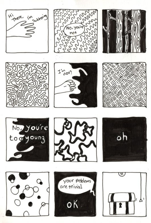
Fig 2
I feel like this piece did portray my emotions of this one particular memory well, and I really like the use of shapes and contrast to represent emotions, however I did not impliment humour in mine as I didn’t feel like there was a way to make the interaction particularly humourous, but that is something I would like to try to attempt again in the future.
Fig 1
AlecWithPen (2020) The Power of the Darkside [Instagram] 19th August Available at: https://www.instagram.com/p/CEFHqRrjFdP/ (Acsessed: 17th March 2021)
0 notes
Text
Week 7: Entrepreneurship
An area that I am particularly interested in and feel that I could incorporate my illustration practice into is Jewellery design. I am particularly interested in creating pieces from resin and laser cut acrylic. Both of these are areas that I have dabbled in before and really enjoyed. In Figures 1, 2 and 3 you will see pieces that I created in collage with the laser cutter and some colourful acrylic.
Fig 1
Fig 2
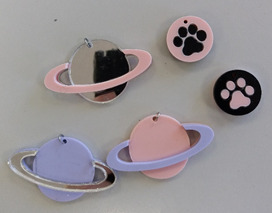
Fig 3
Some ways to get into this line of work are to
- Go on Jewellery design courses
- Apply for jobs/internships (Personally I would like to apply for one with Tatty Divine in a few years)
- Run your own online shop
I have noticed that quite a lot of people in this area run their own businesses through Etsy or other selling websites, but I think that getting the experience of a course or an internship/job first would be useful since you can try out different techniques, machinery and materials without the risk of making a huge investment in something you don’t like.
For my self-promotional item, I wanted to design a business card that captures the aesthetic of my work. I think it would be hard to create jewellery cheap enough that it would be an easy promotional item unless it was a small keychain or something similar so I thought business cards would be a good option. I wanted a laminated middle with pressed or papercut flowers suspended in it which would represent the general look of resin. The back would have all my details on, and the front would either have my name or my brand name (so far, I have been using the name “Goblin Milk”) depending on whether it was for an internship/job or an advertisement for my existing brand. Looking at figure 4, my favourite was the top right option as it was simple and clean, however I asked a few of my peers and the general consensus was that the bottom right would be more likely to stick in people heads, and if I already had a laser cutter already it would be easy enough to produce.
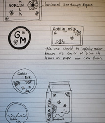
Fig 4
This practical research project helped me think about how I could go about catching the attention of potentially customers and brands I would potentially like to work with/for in a creative, illustrative way which could potentially give me the edge over other potential candidates. I now know the importance of promotional material.
0 notes
Text
Week 6: Take a line for a walk
Our task this week was to “take a line for a walk” by going on a walk with our drawing supplies and illustrating the walk as well as feelings and landmarks in an experimental way. For my drawing (figure 1) I chose fine liner as I feel that I know it well enough to be able to create very quick drawings whilst on my walk and it is easy to transport.
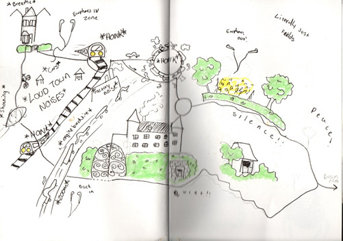
(Fig 1)
I filled in certain parts of my drawing with highlighter when I got back later to highlight certain areas and create differences in the feelings of spaces. For the town portion of my work, I used a lot of movement lines around the cars, trains, and the rugby ball to emphasis the hustle and bustle of the town (as well as annotating some of the noises I heard to make it look even busier). I also used less of the green highlighter to show the lack of green spaces and shrubbery. I drew a lot of it very quickly as I did not want to be stared at, but I think that added to the hectic nature as well. The countryside portion is a lot less crowded and greener with less annotation because I wanted to show how peaceful and relaxing that section of the walk was in comparison to the town.
I decided to reference Egon Schiele (Figure 2) for my work today because, despite the very different subjects of our work, I enjoy his expressive use of line and will practice drawing in a way that looks expressive and lose but also controlled enough to create a beautiful piece. The poses of his studies mixed with his use of line creates a very dynamic piece with movement and character.
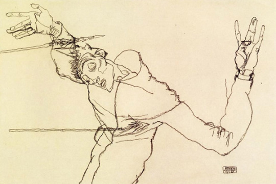
Figure 2 Schiele, E. 1914
This task has helped me realise that the work in my sketchbooks does not need to be neat and that I should put more time into practicing loose and expressive drawing too without worrying that the outcome might not be perfect
Egon Schiele (1914) Self Portrait as St. Sebastian [Pencil on paper] Private Collection Available at https://www.wikiart.org/en/egon-schiele/self-portrait-as-st-sebastian-1914 (Accessed: 13 May 2021)
0 notes
Text
Week 5: Postmodernism
Postmodernism was an art movement from the 1980’s to the late 1990’s that focused more on message and a deep sense of irony over realism or, in some cases, technical skill. It broke the fundamental rules about art and challenged them to create new styles and an idea that anything goes. It was both an extension of modernism by rejecting conservative views, having political undertones (or sometimes political overtones) and bringing art into a modern era and also a challenge of high modernism and the superiority or snootiness that went along with it.
Postmodernism did not generally include much in the way of illustration, bar crude scribbles and written words, creating both ideas for new, less realistic styles, and experimentation with other mediums such as collage and print.
For this week’s task I created a collage inspired by postmodernism. I decided to take the elements of political/current events that are tied in with post modernism as well as an aspect of mental health to create this piece (fig 1).
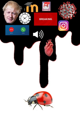
Fig 1
I chose to represent the state of my mental health during this pandemic by representing some of the things that have been stressing me out as this viscous black goo, lending to the feeling of impending doom that I am sure a lot of people have been experiencing recently. The ladybird is a representation of myself as all of these things can start to make you feel small and crushable. It is also a very non-threatening insect as opposed to a spider or a mosquito, so I felt that was appropriate.
Postmodernism has taught me that a piece of art does not necessarily need to be literal or representative in order to be interpretable and meaningful. Even the most basic object can be turned into a political statement or survey a profound message when presented correctly.
0 notes
Text
Sequential Narrative
The way panels convey the passing of time in comics is difficult to explain, as although it may be tempting to say that each panel represents a single moment or snapshot, like a photo for example, that is not always necessarily true. A string of moments can be represented in a single comic panel simply by making sure that the readers eye follows the right path. This is referred to sometimes as the “Red thread”. It ensures that the reader moves seamlessly from one panel to the next without immersion being broken. It also helps the reader to fill in the gaps between panels and movements with what we know instinctively is there. Both the passing of time and the red string idea are portrayed wonderfully in this comic (fig 1) by Scott McCloud (1994)
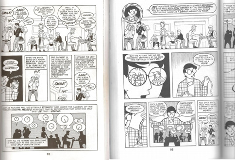
Fig 1
The gaps between panels are known as “Gutters” and are actually quite important themselves as despite being blank, they provide space for the reader to fill in the gaps (quite literally!) with what you know to be there from your own life experiences. For example, in this Page from Scott Pilgrim: Precious Little life (2004) (fig 2) you can visualise the movement of the characters through your own knowledge of what people look like when they play instruments or sing. Here, however, they are mostly filled with lyrics (O’Malley’s way of showing the reader how the song would actually sound, in addition to chord progressions, time signatures and chord maps.)
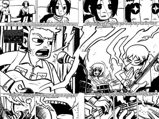
Fig 2
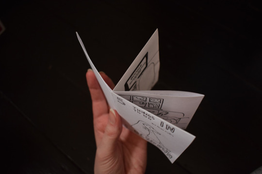
For the practical workshop we created Zines. I created a narrative about a little pangolin character during lockdown. Although it does not necessarily convey time passing in a conventional manner, I feel that this adds to the sluggish, warped perception of time that a lot of people felt during full lockdown last year (and through part of this year).
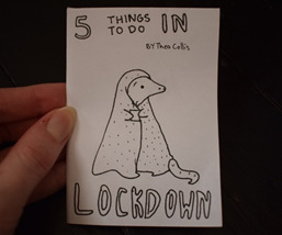
Fig 3
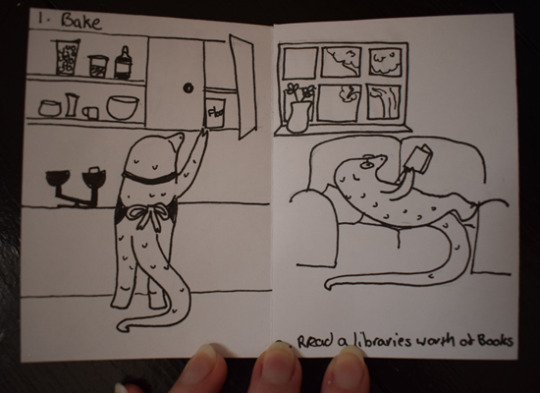
Fig 4
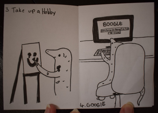
Fig 5
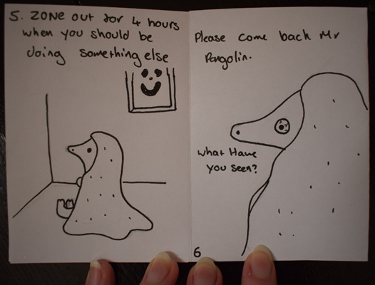
Fig 6
These are all fairly common activities, and our brains know they take time so they fill in the rest of the action for us, causing an interesting disconnect with how long we know each task takes and the relative minute or less it takes to flip through the booklet.
------------------------------------------------------------------------------
Bibliography
McCloud, S. (1994) Understanding comics: [the invisible art]. 1St HarperPerennial edn. New York: HarperPerennial.
O’Malley, B. L. (2004) Scott Pilgrim’s Precious Little Life Portland, Oregon: Oni Press
2 notes
·
View notes
Text
Practice as Research week 3: Collaboration
Being an illustrator can be a particularly solitary job at times, however one-way people can counteract this whilst still improving their craft is through collaboration. Usually this is where two or more artists decide on an idea or a prompt and either create their own piece based on that, or work together to create one piece between them i.e. one will work on the background whilst the other works on the foreground or one does line art and the other does the colouring. This can be an incredibly useful idea both from a social standpoint and a work perspective as it can help you create connections and friendships with other people in a similar field, giving more solidarity to the community. If it is via social media it will likely help all artists involved reach a larger audience and potentially find more people who will enjoy their art. Collaboration is also a good opportunity to observe how other artists and illustrators work in regard to thought process, inspiration and technique which may help you come up with new and exciting ideas in the future. Collaborating with people from different professions (e.g. Photographers, models, sculptors etc) can help you see outside the box whilst expanding your portfolio and creating strong connections for future projects. As Felix Taaka (2019) said for a Digital Arts Online interview “Every collaboration can embrace experimentation & opportunities for the development of your craft.”
There do, however, happen to be a few cons. For example you may have to compromise on your artistic vision slightly to accommodate other styles and tastes, and if you aren’t exactly on the same page it can take a lot of time to come to a suitable agreement that pleases everyone. However, I do thing the pros outweigh the cons.
For this week’s session we did a collaboration of our own. Each of us created a paper house (mine can be seen below) and we put them together as a street and created a narrative for them.
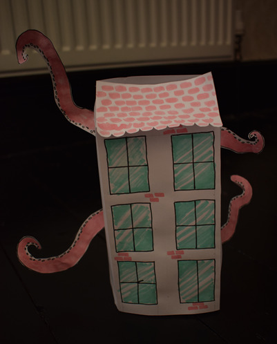
Fig 1
Since most of us created what seemed like more traditional old houses and terrace houses we decided that they would be the original old houses down the street and Raj’s, which was a more modern looking house, would be the new build that blocked the view and that the original residents were complaining about. Originally, we were going to create the residents of the houses as characters, but in the end, we thought it may be a good idea to anthropomorphise the houses themselves and give them individual personalities. Raj created the concept art for our idea, Elise wrote the story, Tom collected everything we did and presented, and I was the art director, so I made sure everything was cohesive and decided colour schemes/changes etc. I think that working with my classmates helped to generate ideas that none of us would’ve thought up alone and created a sense of companionship. Overall, I enjoyed this task and I think it was very worthwhile and will gladly collaborate with other artists in future.
------------------------------------------------------------------------------
Bibliography
Giacomo Lee (2019) Why illustrators should collaborate more Available at: https://www.digitalartsonline.co.uk/features/illustration/why-illustrators-should-collaborate-more/ (Accessed: 13/02/21)
0 notes
Text
Practice as Reaserch Week 2
Practicing Compositional Analysis
I have chosen to analyse the piece, Arrival by Abigail Larson (2019)
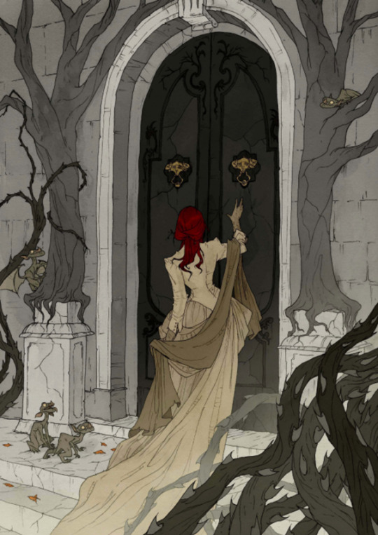
(Figure 1)
The main focus in this illustration is the character in the centre. She is framed by not only the door but also the trees, thorns, and use off fog as a white vignette at the bottom of the image, so your eye is truly guided to the figure. Her bright red hair against the desaturated, mostly grey, colours in the background and foreground elements further accentuates this. However, when you are able to tear your eyes away from the main element you can begin to see the other details such as the little gargoyles with their cheeky looking body language, which helps with prolonged visual interest. The use of layers of perspective and layering (for example, the thorns in the foreground) creates a sense of depth and you can really tell that the composition of this illustration was thoroughly and carefully considered.
Referring back to the desaturated colours, they help to form a gothic, macabre atmosphere which ties in with the rest of Larson’s work. They also help to create an antique air despite the piece being modern and partially digital. This ties in with the clothing of the character, the gargoyles and the general architecture of the door and archway. It gives the illustration a similar feeling to that of a Victorian photograph with all its stillness and clean edges.
Her linework is delicate and interrupted, which compliments the colours and composition thoroughly helping to create texture and an illustrative air without being overpowering or distracting.
Having the character in the drawing face away from the viewer gives a sense that this is a candid moment and creates a sense of mystery.
Overall, this drawing gives the viewer a sense of delicacy and foreboding, almost like the illustration itself is holding its breath.
------------------------------------------------------------------------------
Bibliography
Figure 1
Larson, Abigail 2019 Arrival [Watercolour and ink] Available at: https://abigaillarsondotcom.files.wordpress.com/2020/02/bb-entrance-web.jpg (Accessed: 02/02/2021)
0 notes
Text
Practice as Reaserch week 1
For my Children’s Illustration project, I have been inspired by the book “The Bunyip of Berkley’s Creek” by Jenny Wagner, illustrated by Ron Brooks.
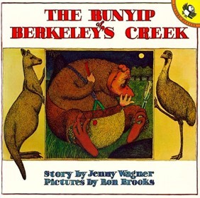
Fig 1
I chose this as it was a childhood favourite of mine and fitted well into the theme for the module, which is “We Are All Different”.
The way Ron Brooks illustrates the mythical Australian creature “The Bunyip” isn’t like anything I’ve seen in any conventional children’s books, which is perhaps why it made such an impact on me as a child and continues to through adulthood. The character is portrayed as “Ugly” and this is constantly referenced throughout the text.
I decided to start my experiments by redrawing the Bunyip in my own style, resulting in this:
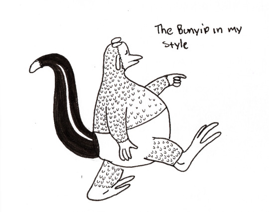
I really like how this turned out, and it helped me figure out more how Ron Brooks took elements from other animals (as well as some artistic licence) to come up with his interpretation of a Bunyip, especially since there isn’t much set lore around them or many clear descriptions. I thought it would be a good idea to move on and create my own mythical creatures by picking 2 or three elements from other animals (or plants in one case) and blending them together to create an entirely different thing. This is how it turned out:
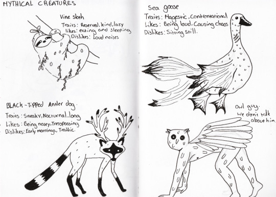
However, as much as I love these as one-off drawings, I think for a character in a picture book they are far too busy. It would be impractical as well because I would need to redraw them repeatedly in different poses which would be needlessly time consuming. Instead, I decided to stick with a weird, but pre-existing creature, the pangolin. I didn’t want my character to look too busy, especially if I was to replicate them multiple times. First, I drew out a page of simplified pangolins in different poses from reference photos to get an idea of their personality and how I could enhance it to make them stand out a little more and be specific to my drawings.
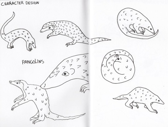
I decided on three of these designs and picked the bits I liked best from them (circular eyes, random scales) I then decided that I wanted to add a bowler hat and a bow tie to distinguish and elevate him and make him memorable.
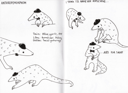
Overall, I’m really proud of him. I think that anthropomorphising him was and effective method and he shows personality. It’s certainly far from my initial research and some studies in colour would probably be a welcome edition but I think it’s better to use research as a jumping off point for ideas rather than a strict guide. I will be elaborating on this in the future.
2 notes
·
View notes