
Last Seen Blogs

pppandemia
king's abode

tracylprince
Tracy

chsgray
CH's GRAY

the-agents-daughter-blog
It's Your Fucking Nightmare
krod555
Artificial Loser
Text
Things to takeaway from formative assessment.
I definitely need to improve my final poster before the summative using all the feedback given.
I also need to start using screenshots for my blog instead of pictures.
Need to keep documenting any research and stay consistent with my exploration of themes.
Pay attention to my text spacing and experimenting with scale contrast might benefit me.
My introduction works well but I should go further into why I’m going down this career.
My rationale should be more specific and critical (discuss poem choice)
0 notes
Text

Same layout as the first poster, except with the second half of the poem, with the author’s name at the bottom. Also changed the orange stripes to match with the first poster side by side.
0 notes
Text

Same as last one, except for type layout changes on the top part. I think i like the other one better so i will do with that.
0 notes
Text
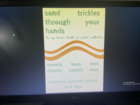
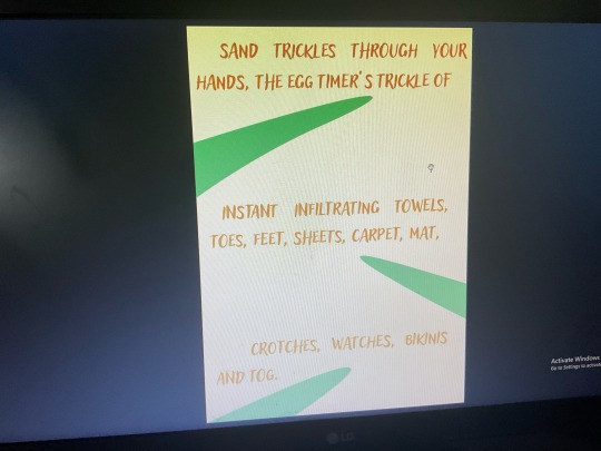
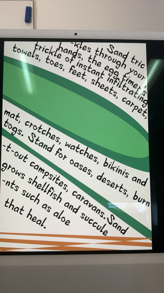
Changed the font and tried using different type of fonts in the same poster, changed to green as I hadn’t tried it yet, and placed all the text with different sizes and placement which I quite like. The orange lines are also nice and don’t take away from the type itself. I’ll probably use this design and maybe change it up a little for the second poster.
0 notes
Text
Went back to the other idea and decided to change one of the text colours to the sand texture. Still doesn’t work that well so i might try different fonts instead
0 notes
Text
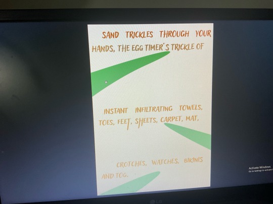
Changed the text colour back to orange for better visibility. Changed to a different sand background but it still doesn’t work so i might scrap this idea
0 notes
Text

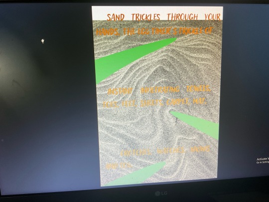
Changed text to off white, added a sand background but I really didn’t like it. Could try with a black and white halftone but i don’t think that would fit the theme and feel I’m going for. I don’t really feel like this could work.
0 notes
Text
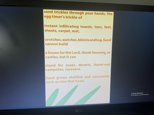
Decided to use only half the poem because it might give me more space to play around with the first half of text. I could also use the other half in the other poster. Spaced out the text across the page and added indentations to add variation. Kept the green leaves but couldn’t figure out what to do with them.
0 notes
Text
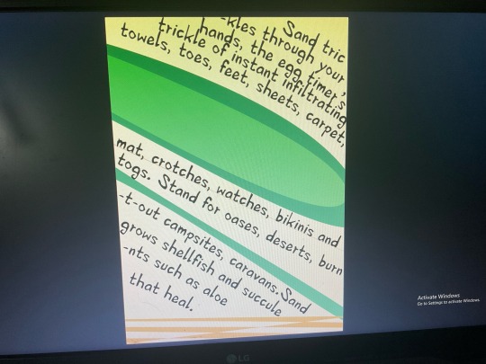
Included the whole poem, focused on type but didn’t do much with it. Kept it to three colours. I like the choice of colours but still need to do more the type. Text is very uniform and symmetrical but not varied or fun
Also changed the text to orange, keeping the overall colour scheme to three.
0 notes
Text
First design i was working off. Not enough focus on text and type. Too many colours and the poem wasn’t named and was cut out. Next designs should focus on type first
1 note
·
View note
Text
Ideas taken from 10 minute feedback
Try prioritise the poem rather than the shapes, slightly too much colours, maybe keep the off white, play around with other colour compliments, use full poem, add authors name, Maybe research the author, look into more typefaces, maybe implement sand a bit more, maybe a sandy texture background or halftones with off white colour. Just make lots of iterations, see what works. Try deconstruct poster to see if type works alone. Make type more interesting. Could split the poem to the other poster, other poster should share ideas or contrast them.
0 notes
Text
Don’t really like the choice of font or the colour. Doesn’t really say much and isn’t much to look at. I like the solid colours but the type is still boring to me.
0 notes
Text
Used the pen tool to create smooth sweeping lines and choose warm colours. I also used a New Zealand poem as the text that follows the shapes.
0 notes
Text
I like the image here and the bright colours that to me, represent my time in New Zealand. I feel like I could have made more interesting typography choices but I wanted to experiment with the line on a path tool.
0 notes
Text

I like the interesting angles here that reinforce the statement of New Zealand infrastructure. I choose this topic because it relates to my time in New Zealand where I grew up in Christchurch during the 2011 earthquakes. I like the swirl effect of the halftones as it reflects the nauseating effects of vertigo. I choose safety orange as a colour but the halftone effects make it difficult to read the small text.
0 notes
Text
Simple poster design using halftones in a monotone colour scheme. I want to see how it will look if I swap out the colours so I might experiment with this next. The background also looks a little boring to me so I want to see if I can improve it in anyway
0 notes
Text
Another image, just turned to greyscale with a halftone texture. Added text looks nice. Could be a good monochromatic poster for something.
0 notes