
Last Seen Blogs

syaosyao
Forever a Nub

growingstories
Growing Stories

angelinatheactivist
A MUSE IN HER FEELINGS

liuked
Liuked

ind247
Diapers / Caths / Stents
Text
Drone
Jeg er drone som flyr høyt -
men langt fra alle andre.
Og herfra ser jeg ikke at
båten tar inn vann,
at hun har mista en tann,
og at plenen er for lang.
Og det er ikke mulig å klandre
noen som ba om bil, men fikk en som
svever - men la det ikke være noen tvil:
Her oppe er det ensomt.
For skyer er ikke særlig til selskap.
Så du må ta til takke med din egen galskap.
Det er et spill for galleriet,
men jeg er på innbytterbenken.
Føler meg som Blücher:
alle roper “Senk’n! Senk’n!”
Men jeg hadde landa om jeg kunne -
eller aller helst forsvunnet.
Jeg skulle ønske at ikke alt jeg så
var det andre ikke ser - men også kunne få
se at, nå må alle øse, og slutte å sløse
bort luft på å fly bort fra dette sekundet.
Men jeg hadde landa om jeg kunne.
0 notes
Text
Nei, det er ikke "gutter" vi tilpasse skolen til
La oss si jeg og en dame er de siste to passasjerene ombord på et fly, og det er to seter igjen: Ett vanlig, trangt sete, og ett ved en nødutgang med god beinplass. Hvem av oss bør få den romslige plassen? Alle vet jo at menn er høyere enn kvinner, så da bør vel jeg få det? Men jeg er “bare” 1,75 meter høy - og hvis kvinnen er Kristine Breistøl, håndballspilleren på over 1,90, så bør selvfølgelig hun få den gode plassen! (Og særlig hvis jeg får en autograf.)
Kanskje er dette med for lite beinplass på fly et utstrakt problem. 1 Og dette fant vi ut ved å undersøke “Hvorfor flere menn enn kvinner klager på flyseter”. Men selv om utgangspunktet var “kjønn”, så er dette kun en indikator. Og den relevante faktoren er “beinlengde”. Så hvis noen så hadde gått i tog under parolen “Bedre flysete-tilpasning for menn!” ville jeg og Kristine stussa: For jeg, som mann, har jo grei plass, mens hun har det ikke. Parolen burde i såfall være “Bedre flysete-tilpasning for folk med lange bein!”.
Dette innlegget er ikke en kritikk av Mannsutvalget - som jeg både synes det var riktig å sette ned, og som jeg synes har kommet med flere gode forslag. 2 Men det er kritikk av utsagn som dette, fra SVs Torgeir Knag Fylkesnes, om at vi må tilpasse skolen bedre til gutter. For, når det gjelder de fleste forslagene om skole, så er ikke kjønn relevant.
To eksempler, er noen tiltak jeg er stor tilhenger av: Mer fleksibel skolestart, og en mer praktisk skolehverdag. La meg ta meg selv som eksempel:
Ikke bare er jeg mann (og forhenværende gutt) - i tillegg er jeg født seint på året, og har jeg ADHD! Dermed tyder jo alt på at skolen må ha vært en prøvelse, og at disse tiltakene ville vært midt i blinken for meg. Men en annen viktig faktor ved meg, er at jeg alltid har vært det vi på fagspråket kaller “himla nørd” - noe som er ganske nyttig i en teoretisk skolehverdag. Søstrene mine hadde lært meg å regne på den lille tavla på kjøkkenet, og jeg håpte jeg kunne lære enda mer om dinosaurer - så var sprengklar for å starte på skolen. Jeg passet inn like godt som i flyseter.
Vi bør være mer fleksible når det gjelder barn det vil gagne å få hygge seg i barnehagen ett år til, og vi bør tilpasse skolen bedre for dem som vil blomstre i en mer praktisk hverdag. Det at gutter er overrepresentert i disse gruppene må ikke få forstyrre for mye av dette arbeidet.
“Men er det så farlig, da?”
Det er særlig to grunner til at jeg mener denne distinksjonen er viktig:
Dersom du går inn på en skole, vil du se gutter som elsker livet bak en pult, og jenter som ikke ser poenget. Og vi mennesker er skrudd sammen slik, at når vi ser med våre egne øyne at dét vi blei fortalt ikke stemmer, så forkaster vi dette. Så den første grunnen er at vi ikke må la en viktig sak svekkes slik. Det tar også bort fokus fra de tinga hvor kjønn faktisk er relevant, sånn som Brede Hangelands uttalelser om mannlige forbilder. Jeg tror det er veldig sunt å ha forbilder av ulike kjønn - men det har likevel verdi med en god kjønnsbalanse blant voksenpersoner i livene til barn og unge.
Den andre er at vi unødvendig splitter befolkninga i to - og at diskusjoner rundt kjønn fort utvikler seg til “oss mot dem”. De delene ved skolen som folk sier favoriserer jenter foran gutter, er jo levninger fra en tid hvor jenter ikke fikk lov til å gå på skole en gang! Da blir det feil for meg når kvinner nærmest får skylda for at jenter tilfeldigvis (i snitt) takler dette bedre. “Skolehaterne”, som Fylkesnes snakker om, finnes absolutt. Men blant dem er det både gutter og jenter, og jeg vil heller at vi skal stå samla om å gjøre skolehverdagen bedre for dem. For alle er de “våre barn” - uansett kjønn.
Et “utstrekke-problem”, om du vil. ↩︎
Og i en del av disse er absolutt “kjønn” en relevant faktor! ↩︎
0 notes
Text
Make a Click Wheel Mode for the Apple TV Already!
In this week’s episode of the excellent Hemispheric Views podcast, the hosts discussed features they’d (more or less seriously) like to see make a return in their technology. One of the picks was the Click Wheel, which Apple, in the infamous Apple Watch reveal, mentioned in the same sentence as other great input methods, such as the mouse, multitouch screens and the 💫Digital Crown™️💫.
Still, it’s mostly forgotten since then — but actually almost got some love when they updated the Apple TV remote.
Image by The Verge.
Now, I’m actually one of the dozen of people who didn’t mind the previous Apple TV remote (the one on the left in the image above). Still, I agree that the new one is an improvement. But what’s really bothering me about the new one, is that they’re so close to making it great.
Because, whilst you, with the old one, had to use touch controls (swiping etc.), with the new one, you can choose. You get this option screen:
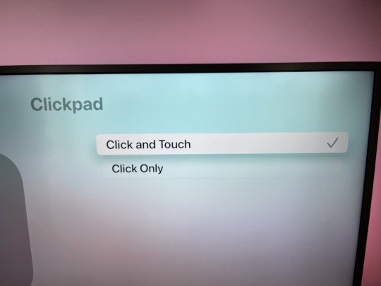
So, this is about the circle part of the remote, and how you use it to navigate and scrub. Clicking is always on, and to use it, you just press up, down, left or right on the circle. The middle is confirm.
The touch controls, is that you also can swipe, like you could on the old remote. The circle is also a trackpad of sorts. Now, they actually use this is a really clever way — because look at this screenshot:

An aside: The TV show in the image is Physical on Apple TV. I _think_ it's good - but as someone who has lived with someone suffering from an eating disorder, it was way too rough. It captures those thoughts tremendously well! So I've only seen the one episode...
It’s the click wheel!
When in this mode, you can jog around the circle to scrub in the video, and it’s wonderful. However, as this feature is tied to the circle also being a trackpad, it’s really clunky to access:
First you must pause the video.
Then you must rest your thumb on the circle for a bit.
Then the icon appears and you’re allowed to jog.
The love I’d give it:
Not that Apple needs anything for free, but here’s an idea: Please make a click wheel mode!
Remove every other touch feature so that it instantly starts to work when the user starts to jog.
However, it doesn’t have to start until you’ve went half a rotation or something, to avoid accidental activations. 1
Make it also work other places — like for scrolling lists, going through Home Screen apps and typing letters.
Please, and thank you.
Especially if the video is playing. ↩︎
0 notes
Text
What if the Floorp Icon Actually Looked Like Piano Keys?
Floorp is an interesting Firefox fork, with a questionable name and logo.
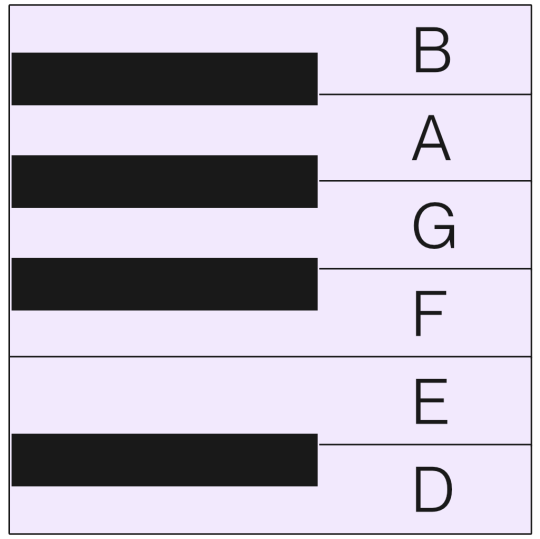
Yesterday, someone on Reddit, posted “Floorp’s logo looks like piano keys”. And here’s the thing: I’ve been thinking the same, but at the same time there was something wrong. I’m not a pianist, but I’ve played with them enough to notice the problem. Let’s rotate the Mac icon, and compare with an actual piano:


Image from takelessons.com.
The “double-sized” black key to the right was the culprit! 1 However, notice that there sometimes is two white keys next to each other. (This will be important later.)
But this made me think: What if the logo looked like a piano?
My best attempt
In addition to pianist, “designer” is also a thing I’m not. But I think icon design is very fun, so I tried my best to make a variant!
This was my design spec:
Keep the main ingredients of the logo: A white, rotated bestagon on a blue and purple gradient - with an “F” of sorts.
Have the dark, protruding rectangles actually look like piano keys.
I’m not saying these are good ideas!
Mac icons (at least) are square - so why use a rotated hexagon, which are wider than they are tall? And why on earth base a browser logo on a piano at all??
I didn’t have time for any of these questions - as I was busy figuring out:
What’s the ratio of the white and black piano keys?
And how are they placed?
It turns out, there’s no definite ratio. But I gave my black keys 60% of the width of the white ones, and that was within the norm. What was more interesting, is that the black keys don’t sit directly in the middle of the white keys. They’re shifted a bit towards where there’s two white keys in a row.
So, first I made this, as a template for the keys:
Had the app been called something starting with E, I could’ve made the letter with the white keys. But as it’s called Floorp (for some reason), I had to change flip it, compared to the original logo, and use the black keys instead.
Then I remade the parts of the logo on top of the piano template:
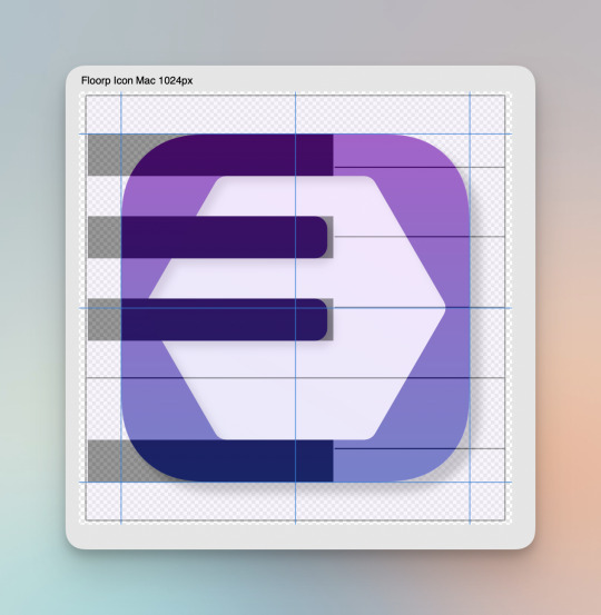
So, the top and bottom border is the same thickness as the two lines - and all of these, and the negative space, is aligned like an actual piano.
So then I ended up with this logo and icon pairing:


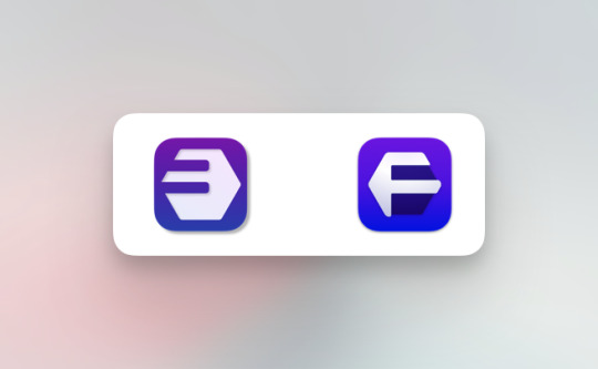
Now, I’m absolutely not sure if it’s better! I especially don’t love that the side margins, on the Mac icon, are smaller than the top and bottom ones (and squeezing the hexagon looks terrible), and the the F itself is sort of off-screen. But at least I had fun!
What do you think? Anything I should do to improve it? Or how would you solve the stupid problem I gave myself?
Now, Floorp themselves has never claimed that it looks like a piano! ↩︎
0 notes
Text
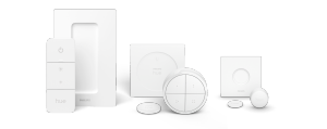
Why Smart Bulbs > Smart Switches
(I’m having some issues with galleries, which I’m trying to fix at the moment. So if you look at this post now, it might miss some images.)
I really like my smart light setup — and later I will write a guide on how I set it up. (I promise!) But in this post, I want to explain why I think smart light sources are a better option than smart switches (with regular light sources).
Some notes on costs
Smart lights ain’t cheap. And while I will argue that I don’t think going for smart switches is that much cheaper than smart light sources — my main focus is on what gives the best smart light experience. And then it’s up to each person to evaluate what feels “worth it”, or even possible, to them and their budgets.
I also think the experience is way better if you get the consistency of having (more or less) every light in your home be smart — so keep that in mind as well. I’m not arguing against those who say “Yeah, I only wanted these four lights to be smart, and then it was cheaper to go for a couple of smart switches”. What I am arguing against is those who say going for smart switches is better than smart light sources — and hopefully giving some valuable insights to those who haven’t decided yet.
Why smart lights at all, though?
Images from Philips.
To me, there are three main reasons (in no particular order):
In my apartment, I have some light switches that are in idiotically placed. I also have several lights I wish had more than one switch. So the fact that I can easily place switches wherever I want, by just sticking a little button to the wall (or whatever), is very nice. And so is the fact that it’s trivial to have one switch control several lights, or have several switches controlling one light.
I want nothing to only be controllable by my phone. But I do think it’s nice that I can use it to control my lights — even when I’m not home. I also like that I can create automations, like turning off the lights when I leave.
I really, really like to vary the colour temperature of my lights throughout the day.
The two approaches to smart lights
When you hit a regular light switch, it cuts power to the bulb (or reduces it if it’s a dimmer). And one way to get smart lights, is to replace your regular switches with smart switches, like Caseta by Lutron. These also cut power to the bulbs, but the cutting can be controlled “smartly” — so you can add automation, one switch controlling several lights, etc.

As these switches only work on things that powered through the wall, you probably need some smart plugs as well, like this from Aqara:

The plug is the circle around the lamp's adapter into the wall there.
The other option, is to make the light source itself smart — smart bulbs and the like. You never cut the power to these — but they can, based on wireless signals, turn on/off, dim, change colour, etc. So light switches for these, can just be simple buttons like the ones in the photo up top. I’ll call these smart buttons from now on, to distinguish from smart switches. 1
So to be clear: When I say “smart switches”, I’m thinking of a setup primarily with regular light sources, but made smart by switches and plugs. And when I say “smart light sources”, I’m talking about a setup where, primarily, the bulbs etc. are smart, and are controlled by smart buttons.
Listening to tech podcasts, it seems like smart switches, is the most popular solution — but I firmly believe it’s not the best solution. However, there are still some good reasons to consider it:
You can use regular, cheaper light bulbs.
The switches are wired into the grid, and the plugs plugged into the wall, so nothing can run out of batteries.
It’s even more fool-proof, as hitting the switch itself doesn’t involve any wireless technology etc.
So it’s absolutely a viable option! You also don’t have to deal with 2
… the dreaded old light switches.
A classic problem if you’re running smart light sources, and not changing the regular switches, is the following: Now you have a bunch of bulbs that you don’t want to cut the power to, while also having your walls littered with switches that do just that!
I think this is the least optimal part of my preferred setup — but it’s far from a deal-breaker in my opinion.
If you want to make it a bit nice,
… you can just replace the seesaw on the switches with covers. Here’s an example from a Norwegian forum:
"Vindu" and "Hjørne" means "Window" and "Corner", and aren't relevant. But "Alltid på!" means "Always on!", hehe.
This is very cheap, and you can just add back the seesaw if you want to dumb it down later! I assume there are similar options for the switches where you live.
You can also place a smart button on top of the cover, if you want to, like here. (The bottom part shows what some Norwegian switches look like in-between seesaw and cover.)
Or, if you’re lazy like me,
… you just add some tape or something. 🤷🏻♂️ If I was moving into a new home, I would go the nice route — but here’s an image from my current bedroom:
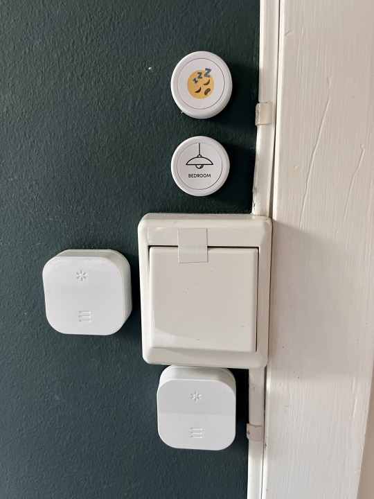
It's not as pretty, of course - but it works! The square buttons are for the smart blinds, by the way.
So, I’m not saying it’s not an issue. But I don’t think it’s a big issue, and that the positives far outweigh the negatives.
A crucial point regarding any smart home setup:
Be very mindful of those who have to use your smart stuff, that don’t know the ins and outs — be it an overbearing partner, or a visiting family member. I’m not perfect here — but I try my best to design it like this:
Every “feature” you expect from a regular, dumb setup, should be at least as intuitive to find,
and then hide the extra features.
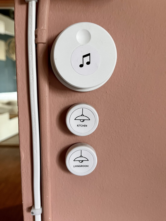
In the image above, the dial controls the Sonos system, and clicking the buttons toggles the corresponding lights on and off. 3 I refuse to accept that this is problematically less intuitive than two blank switches you had to guess the purpose of.
If you go for smart light sources, as opposed to smart switches, you have to think a bit more about how to make it intuitive. But it’s far from impossible — so this shouldn’t be a heavy argument for not going for what I, for the following reasons, think is the best solution.
Why I vastly prefer smart light sources:
I will go way more into my specific setup in a guide later — but a side note: I recommend building the system around a hub that can connect different brands. I used Homey previously, which wasn’t bad, and now I use HomeKit. I could’ve used even more brands, but I now seamlessly mix stuff from Flic, IKEA, Sonos, Aqara and Philips. 4
Firstly, smart switches completely eliminate my reason #3 for wanting smart lights in the first place — as you straight up can’t change colour temperature without smart bulbs. So even in the application where smart switches are at their best, they provide a sub-par experience compared to smart light sources. I know this might not be important to everyone, but to me, it’s a big deal. Oh, and smart bulbs can also be bought in RGB if you’re so inclined! (Which you probably shouldn’t be, to be fair.) 5
Secondly, replacing the regular switches with smart ones, is a relatively complicated job that, at least in Norway, you are required to hire an electrician to do. This eats up most (if not all) of the savings you get from being able to use regular bulbs. 6
Here's an image, from Reddit, of someone installing Lutron Caseta. It's probably not too hard - but we can't discount the cost (in stress, or money to an electrician) when evaluating these options.
Simpler setup and more use cases
The process for finding a solution for a smart light source, is pretty simple:
Pick the light source/bulb you need. (There’s way more stuff available now than previously: decorative bulbs, spots, chains, etc. I’ve never not found what I required. There are also lamps, from Philips, for instance, that are smart in and off itself.)
Pick your preferred button for the specific application, and just stick it wherever.
And then you’re done! And if you later want to change, swap or add something, it’s relatively easy. However, if you don’t want the light source itself to be smart, you have to figure out a way to toggle it remotely.
OK, the smart switches work fine for the ceiling lamp, as it gets power through the walls — but what about the reading light near the couch?
You can go for a smart plug — but the cost of a regular bulb + a smart plug isn’t cheaper than just a smart bulb. And you lose dimming, in addition to the colour temperature you’ve already lost.
And what if you want a switch that’s not the place the people who built the house wanted one? Or not on a wall at all?
No, it’s fine — you just add some smart buttons to control the smart switches! And maybe that one lamp can have a smart bulb… And suddenly, you’re running both systems! 7
Running several systems isn’t just about needing more hubs and apps and stuff — it’s also about differing logic. Like, what we want is to control the lights. And to me, at least, doing this through controlling the switch is less intuitive than controlling the light directly.
Neither system works in every situation, and could benefit from using the other to fill in the blanks. But I’d absolutely go for the system with the fewest blanks as the default.

Smart plugs can absolutely be useful in a system based on smart light sources as well! I use them for this globe, in addition to some Christmas lights. But I hope we can all agree that smart bulb + smart button is strictly better than regular bulb + smart plug + smart button. 8
More flexibility
Having smart buttons, rather than light switches tethered to the wall, feels like going from wired headphones to wireless earbuds. It’s hard to explain — but harder to go back.
Here are some of the button options from the brands I’m using:
The Philips buttons. You can use the backplate to cover the regular switches if you want, but you don't need them. As they're battery powered, they can be detached!

I mostly have these, the Flic 2.

Flic recently released the Twist, that has a light to show "the amount". You can single and double click the middle portion, and both twist and twist+click.
Somrig from IKEA is a bit larger than the others. But you can program single click, double click and hold for both the top and the bottom, and it takes regular AAA batteries (that can be bought rechargeable!). The last image is of Rodret, which instead turns on at the top, off at the bottom, and dims by holding.

Aqara has options for the simple buttons above - but they also have this cool thing! You can program it to what you want while turning it do the different sides. Oh, the possibilities!
It’s not that there aren’t options for wall-mounted switches — but you kind of have to decide once and for all. And none of them are detachable, or possible to just stick wherever you want. 9
Furthermore, both Philips, IKEA and Aqara offer smart plugs — so integrating these in a system based on these systems is trivial. 10
Some utilisations of this flexibility
In my home office, I have a button for the ceiling lights near the door. But one day I thought: “Hmm, it would’ve been nice to also have a button I can reach from my desk!” I had one lying around, and literally five minutes later I had stuck it on the wall next to me, ready to go.
Another day, I was sitting on the couch, and thought: “Hmm, it would be neat if double-clicking the button for the living room lights toggled the kitchen lights” (which are visible from the couch). And again, five minutes later, it was up and running.
This is my bedside light — and my wife has the same on the other side. It’s a smart bulb toggled by clicking the little black button. (Double-clicking the button toggles the light on the other side, and holding it turns off all lights in the bedroom.) However, the light is also part of my favourite automation:
Hitting the button with the sleeping emoji, turns off all the lights in the apartment (and lowers the blinds if they aren’t lowered already), and then lights my bedside lamp on 1% brightness. Double-clicking the button does the same, but lights the lamp on my wife’s side instead. 11
I hope it’s possible to see how several parts of this would be impossible without smart light sources — and that it has value.
To sum it up…
I’m not saying there aren’t cases where smart switches are the right choice. But personally (!) I think the true value of smart lights reveals itself when all your lights are smart — and in this situation I think smart light sources are superior.
Some negatives of smart light sources:
Might be more expensive.
You should do something about the regular light switches, and be more mindful about making the system intuitive.
**The buttons are battery powered — and these needs to be changed. **(Might be a reason to go for something rechargeable, like AAA. Having spares lying in a charger, would eliminate much of this annoyance.)
And some positives:
The flip side of the buttons being battery powered, is that they’re much more flexible — both for detaching, and general placement.
You can get bulbs that change colour (temperature), and it’s easier to make freestanding lights dimmable.
You don’t have to do (or pay someone else to do) any wiring in the walls. This also makes the whole thing more reversible.
If you’re going for (more or less) “full smart coverage”, and don’t want to litter your home with smart plugs + buttons, you probably can’t avoid some smart light sources anyway. And then it’s just nicer to have everything on the same system, using the same logic.
What have I missed? There should probably be something, as I feel like I’m in the minority! Would love to hear your feedback, or questions/ideas for my guide for setting up a system based on smart light sources.
You could run this without the buttons, and just control the lights from your phone, with your voice etc. But why would anyone do something like that to themselves and those around them? ↩︎
You do with the smart plugs, though! ↩︎
And double clicking toggles a different light - but they don’t need to know that! ↩︎
I don’t mind the “lock-in” by using HomeKit, as every piece of kit can be moves elsewhere if needed. ↩︎
One use I’ve heard, is having a little light near your desk lighting up with the colour of the current Focus Mode! You can also sync it with your Philips Ambilight TV. ↩︎
Also, bulbs lasts for a really long time these days, so you don’t have to buy the “more expensive bulbs” that often. ↩︎
Again, you might be perfectly content with just having a couple of your ceiling lamps smart, and skipping the rest - and that’s fine! ↩︎
About the same price, but more parts and less features. ↩︎
I will go more into the different types, and when to use them, in the guide! ↩︎
Aqara also offers smart switches for the wall! Might be something to look into for that one light. ↩︎
You know, for the two times a year she goes to bed after me. ↩︎
0 notes
Text
This is Test Number 2-1
Version 1
Magna magna veniam eu ut ad deserunt eiusmod. Ex ipsum dolore labore incididunt minim magna ea laborum magna excepteur dolore esse sit occaecat. Qui veniam in ea laboris elit non deserunt adipisicing aute adipisicing laboris nostrud id. Consectetur cillum officia sit laboris deserunt aute do id. Tempor dolore ea velit enim aliquip veniam eiusmod proident eiusmod officia. Laborum proident amet et aliquip labore tempor. Irure proident culpa ullamco sit. Adipisicing sit duis pariatur in quis ea laboris voluptate cillum.
Do tempor ipsum laborum deserunt duis aliqua mollit incididunt sunt consequat eu qui. In occaecat nisi exercitation esse do anim incididunt est proident ipsum consequat minim consectetur aliqua occaecat. Occaecat eiusmod culpa sint sit ex tempor proident cupidatat. Officia dolor id officia occaecat labore.
Aliqua deserunt occaecat quis ullamco. Aliquip nostrud ut nisi ad magna reprehenderit culpa eu. Consectetur ut in deserunt sit exercitation. Non veniam consectetur sint mollit mollit mollit non. Excepteur in id proident laboris eiusmod ad eu nulla consectetur fugiat.
0 notes
Text
This is post for testing
Version 1.
Magna magna veniam eu ut ad deserunt eiusmod. Ex ipsum dolore labore incididunt minim magna ea laborum magna excepteur dolore esse sit occaecat. Qui veniam in ea laboris elit non deserunt adipisicing aute adipisicing laboris nostrud id. Consectetur cillum officia sit laboris deserunt aute do id. Tempor dolore ea velit enim aliquip veniam eiusmod proident eiusmod officia. Laborum proident amet et aliquip labore tempor. Irure proident culpa ullamco sit. Adipisicing sit duis pariatur in quis ea laboris voluptate cillum.
Do tempor ipsum laborum deserunt duis aliqua mollit incididunt sunt consequat eu qui. In occaecat nisi exercitation esse do anim incididunt est proident ipsum consequat minim consectetur aliqua occaecat. Occaecat eiusmod culpa sint sit ex tempor proident cupidatat. Officia dolor id officia occaecat labore.
Aliqua deserunt occaecat quis ullamco. Aliquip nostrud ut nisi ad magna reprehenderit culpa eu. Consectetur ut in deserunt sit exercitation. Non veniam consectetur sint mollit mollit mollit non. Excepteur in id proident laboris eiusmod ad eu nulla consectetur fugiat.
0 notes
Text
Hvorfor jeg bruker Fastmail
For noen måneder sida “verva” jeg en venn til å bruke e-posttjenesten Fastmail. Og i dag, til en gruppechat, “skrøyt” jeg av at jeg hadde fått utbetalt hele 50 cent (like it’s my birthday) for dette! 1 🙌🏻
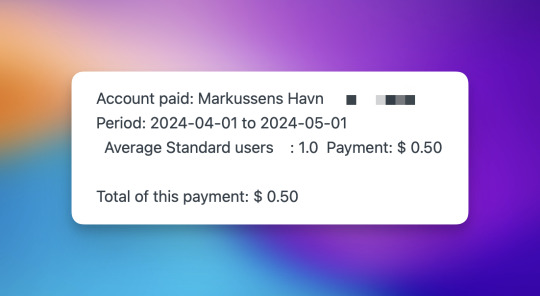
Simen i gruppa (som har en fin blogg og et fint nyhetsbrev jeg anbefaler!) var selvsagt voldsomt imponert over den frodige businessen min, men lurte også på hva som var salgs-pitchen til Fastmail. Dette innlegget er svaret til ham (i blogg-form) - og er jeg skikkelig heldig, blir kanskje neste utbetaling på en hel dollar??

Kanskje får du, som leser dette, lyst til å teste Fastmail? Hvis du følger denne lenka 🖇️, og du ender opp med å bli kunde, vil jeg altså få 50 cent i måneden. Det kan jo absolutt farge min framstilling av produktet, så ha dét i bakhodet! 2
Ja, og her har du også en “vanlig” lenke til nettsida deres.
Trykk her for å gå rett til oppsummeringa!
Hva jeg ikke bruker det til
Slik formulerte han spørsmålet: “Hva er salgs-pitchen din på Fastmail, egentlig? For, som en person som har bytta mail-app altfor mange ganger er jeg nysgjerrig på hvorfor jeg burde bytte enda en gang. 🤔”
Så det første jeg ville si, var at jeg ikke bruker appene deres særlig. Jeg bruker det nemlig primært til hosting og backend - altså der e-postene mine faktisk er lagra, og der jeg lager adresser knytta til egne domener og slikt. De har web-apper til desktop, nettbrett og mobil, og de er vesentlig bedre enn hva du får med “domene-tilbydere” som Hover og One. Men jeg foretrekker likevel apper som Apples innebygde Mail.app eller Spark.
Fastmail har også en kalender-ordning som virker ganske ålreit, men jeg bruker ikke denne heller.
Hvorfor gir jeg dem penger hver måned, da?
Jeg skjønner at det å betale for e-post er en fremmed tanke for mange! Likevel vil jeg forsøke å forklare hvorfor jeg gjør det. Dette er prisene deres, forresten:
Én person: $5/per måned
To personer: $8/per måned
Opp til seks personer: $11/per måned
1) De er ikke Google, Microsoft, Apple, etc.
Jeg kjører ikke full boycott av de største tek-selskapene - men prøver alltid å velge andre løsninger hvis jeg kan. Det er også andre grunner (som jeg berører under her) til å ikke velge disse - men dette punktet handler rett og slett om at jeg synes disse selskapene har mer enn nok makt i samfunnet allerede.
2) Fastmail har godt personvern
En annen grunn til å ikke bruke Microsoft (Outlook/Hotmail) og Google (Gmail), handler om personvern - og det er som regel grunn til å være litt skeptisk dersom en tjeneste (særlig såpass store som e-post) ikke koster penger. Her er Fastmail mye bedre - men samtidig synes jeg det er en fordel at de ikke har sikkerhet som hoved-salgsargument, slik som Proton og Tuta. 3 Vi snakker fortsatt om e-post - så jeg synes ikke det er et poeng å bruke mye energi på å forsøke å gjøre det like sikkert som Signal, liksom. Da foretrekker jeg en tjeneste som går for å ikke tjene penger på dataen min, men så heller bruker kreftene på å gi meg en bedre e-post-tjeneste.
3) Uavhengighet, og best protokoll-støtte
Det meste av e-post i dag leveres gjennom protokollen IMAP, introdusert i 1986(!). Det er derfor ikke overraskende at noen har kommet på moderne e-post-idéer som ikke støttes av denne. Gmail var én av de første - blant annet med ting som merkelapper i stedet for mapper, for å sortere e-post. De har et oversettelses-lag fra deres eget system til IMAP (så du kan logge inn på Mail.app med din Gmail-konto, for eksempel), men kjører helst på sin egne proprietære Gmail API. Det er denne API-en apper som Mimestream bruker. Microsoft har noe tilsvarende (egen API + IMAP-støtte). Så med disse, så kan du bruke andre apper, og ikke forholde seg til API-ene, men da mister du en del av de spesielle funksjonene.
Apple (iCloud) tror jeg ikke har noen spesielle API-er - men der handler det bare om at jeg gjerne unngår å ha e-posten knytta opp til en spesifikk “platform” på den måten.
Før Fastmail, brukte jeg Hey Email. Dette likte jeg godt! De har mange gode idéer, og har laga en smart e-post-app. 4 Men ikke bare er den er en del dyrere enn Fastmail - de smarte greiene er custom, og man kan ikke bruke andre apper i det hele tatt.
Fastmail er uavhengig av plattformer og slikt, og støtter også IMAP. Så man kan bruke den klienten og de enhetene man ønsker. De støtter også moderne ting som merkelapper - men i stedet for å gjemme det bak en lukka API, har de bidratt til en ny, åpen standard, kalt JMAP. Som med alle nye standarder, er problemet utbredelse - og per nå tror jeg ikke det er mange andre enn Fastmail som støtter den. Men jeg vet Mimestream-folka er veldig interessert i å støtte den (og har også vært med i utforminga) - og jeg liker så godt når selskaper gjør slike ting, at dette vil jeg støtte. I tillegg støttes jo også vanlig IMAP!
4) God administrering av brukere, alias og regler
Fastmail har en veldig robust system for å lage regler, som hjelper deg å sortere hvor innkommende e-post havner. Og siden denne ikke sitter i klienten (men i backend), dukker sorteringa opp overalt, og er ganske portabel.
I tillegg er det enkelt å administrere domener og alias. Min hoved-adresse er [email protected]. 5 Det var veldig enkelt å så sette konas adresse til [email protected], og så i tillegg lage et alias for [email protected], som automatisk sender til begge to. Som folk flest bryr ikke kona seg så mye om e-post-serveren hun bruker - men jeg liker at jeg lett kan administrere hennes bruker (uten tilgang på e-postene), og at hun ikke må forholde seg til noe vanskelig. Jeg bare hjalp henne inn i Spark, og så har hun ikke tenkt på hvor e-posten ligger (også vet hun at hun må på fastmail.com hvis hun skal logge inn på en annen enhet).
Man betaler kun for de faktiske e-post-arkivene (som i vårt tilfelle er to i tallet), mens det å legge til flere adresser som dytter e-post dit, er gratis. Disse aliasa kan også sende e-post - og man trenger ikke å ha med eget domene. Du kan fint lage @fastmail.com adresser, og til mange andre domener, som de har rettighetene til.
I tillegg har de en god støtte for maskerte e-post-adresser. Dette vil si at du kan lage adresser av typen [email protected], som så videresender til deg. Det fine med å gi ut slike, i stedet for hoved-adressa di, er at du kan skru dem av én-og-én dersom du starter å få et spam-problem, for eksempel!
Du kan lage disse i appene deres (og siste versjonen av iOS-appen fikk også støtte for Snarveier) - men i tillegg finnes det en fin app, for iPhone og iPad (med Mac-støtte), kalt Masked Email Manager, det er en egen 1Password-integrasjon, og i tillegg en Raycast-utvidelse. Her kan du se hvor raskt det går for meg å lage adressa [email protected] med sistnevnte:
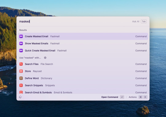
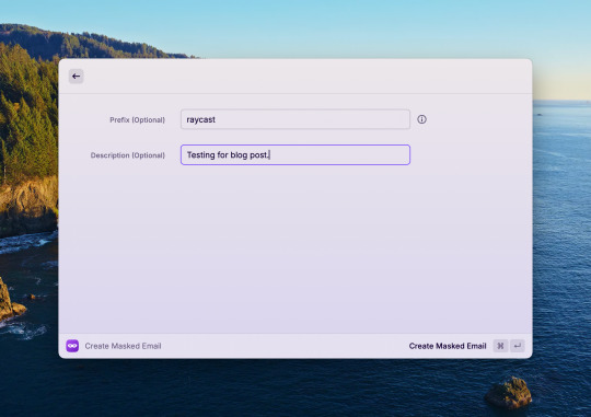
Etter å ha trykka "Enter" på siste bildet, får jeg adressa på utklippstavla. 👌🏻
Så, oppsummert er dette grunnene til at jeg bruker Fastmail:
Jeg liker at Fastmail ikke er blant tek-selskapene som allerede har mer enn nok makt. Og e-post er såpass viktig, at jeg ikke vil ha det knytta opp mot spesifikke enheter eller plattformer.
Jeg vil også heller betale for e-post med penger enn personlig data. Og jeg liker at deres eneste insentiv er å beholde tjenesten god nok til at jeg fortsetter å betale.
Jeg kan bruke hvilken klient jeg ønsker, og lett bytte mellom dem.
De fronter en moderne e-post-standard jeg har troa på og ønsker at lykkes.
Strålende håndtering av flere brukere, domener og alias.
Og dersom du også vil prøve, er dette lenka 🖇️ som gir meg litt tips om du er fornøyd!
Jeg tror faktisk jeg får det hver måned, så lenge han er kunde - så dét er jo ikke så galt egentlig! Men det blir jo litt komisk når det bare er ham, så klart. ↩︎
Jeg har skrevet mer om hvordan jeg bruker slike lenker, og andre etikk-spørsmål, her. ↩︎
Jeg tror disse tjeneste også er ålreite, og absolutt noe det er verdt å sjekke! ↩︎
Så jeg kan absolutt anbefale dette også, hvis du bruker mye e-post. De har også kommet med en kalender, som virker smart! ↩︎
Nei, ikke faktisk “etternavn.no”. ↩︎
0 notes
Text
Some quick Mastodon client reviews
One of my favourite things about Mastodon, is that, as opposed to most other social networks, the service is completely open for other developers to make their own clients. And this has lead to a remarkable ecosystem of third-party options.
Now the official ones, are pretty mediocre (especially the web app, IMO) — but I like this prioritisation. They could’ve sacrificed precious dev time to make their own clients great — but this would have to come at the expense of improving the core service. And the only thing we would gain, is “another great way to use Mastodon”.
“How good are the default apps?” is a far less important question than “How good are the best apps for Mastodon?”. Also, what’s a good app isn’t the same for everyone — so why on earth should there only be one client (like Instagram, Facebook and, now, X)?
If you’re new (or old) to Mastodon — don’t be afraid to test different clients! They can be used in complete parallel — so you could just download a bunch on your phone, and log into each of them with your username. And then you could just “main” one of them for a couple of days (turning on notifications on that one, for instance), and then move to another one.
But let’s get to the main point: Some quick reviews of some of my favourite clients!
Sadly, I don’t have any Android devices, so I can’t review any of the clients there. But here are some I’ve heard good stuff about:
Fedilab
Tusky
Trunks (also web, I think)
Moshidon
Web clients
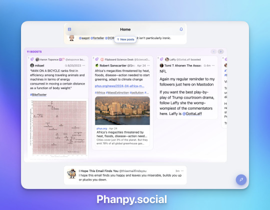
The two web clients I recommend, are Elk.zone and Phanpy.social. Both of them work excellently in a desktop browser, but also as a web app on a phone home screen!
Elk.zone looks the most like Twitter used to — so will be familiar to some. Generally, a clean interface and snappy performance. Phanpy.social is a bit more opinionated, and also more innovating — constantly trying new, useful features. I just love that there are two great options, that complement each other like this.

Native apps
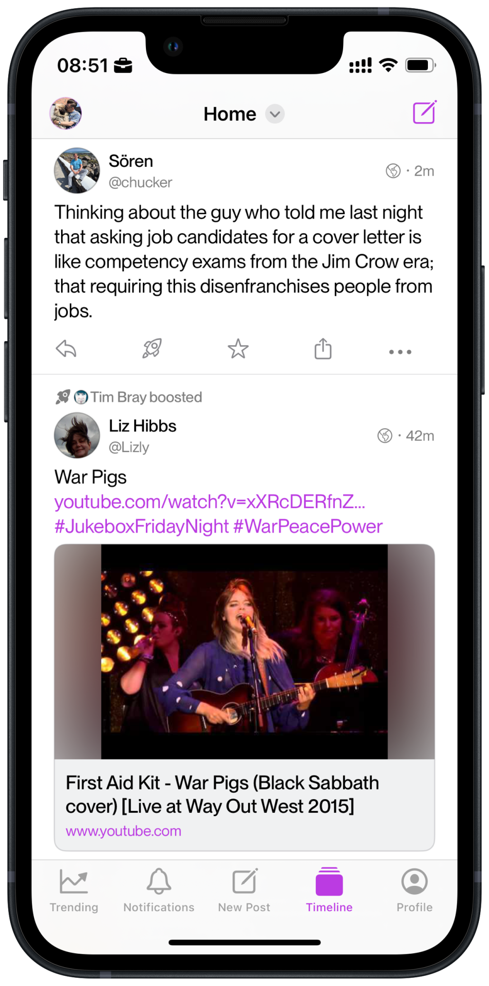
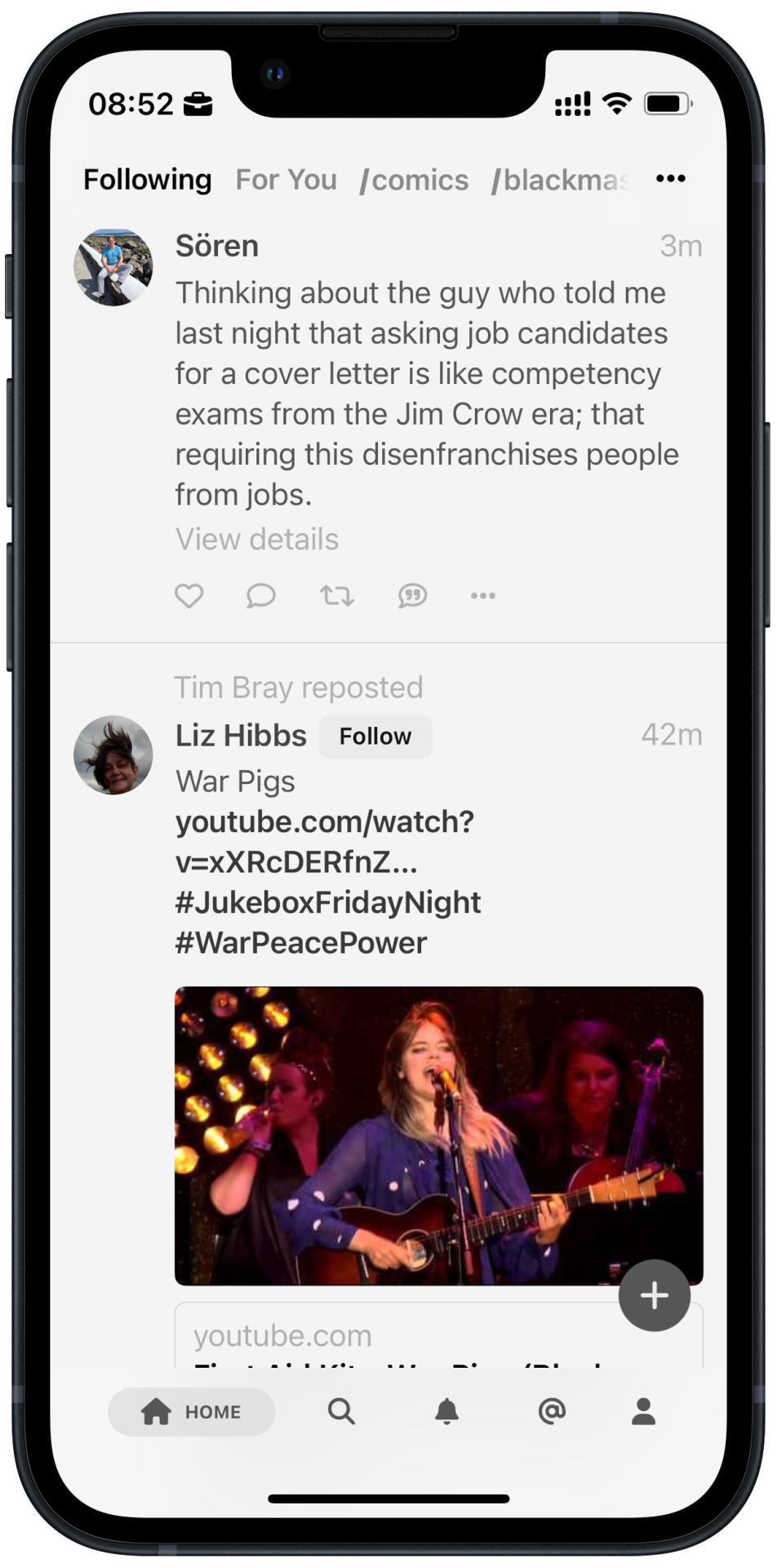
Two great free options, are Ice Cubes and Mammoth. The former is built on a framework (SwiftUI) that makes the scrolling a bit off (not the devs fault) — if you’re sensitive to that stuff. But it’s open source, beautiful, and with numerous clever features (like a thread mode for posting and AI-generated alt text drafts). Mammoth is also a nice app, but has focused on something none of the others has made their main focus: On-boarding. They give you lots of advice on people to follow, depending on your interests, and provide a bunch of custom feeds as well as a “For You” feed (without the creepy tracking). So this could be a great place to start — and here’s the beauty of open services like this: If you later move to a different client, all the people you follow are of course with you! 1
The two best apps, in my opinion, are paid — and also complement each other. Ivory is the nicest of them: The icons, haptics, and scrolling feel (yes, that’s a thing) are superb. And the Mac app is also good — with timeline sync with the other platforms!

But my favourite, is Mona
It looks and works great out-of-the-box — but in addition to this, you can customise every part of the app. Not only with (shareable) custom themes, but also the look of the timeline, which buttons to be displayed under posts and where, the toolbar at the bottom, swiping actions, whether the top and/or bottom bar disappears on scrolling and much more. But let me stress this: That doesn’t mean it’s difficult to use, or that you have to do this stuff. (I just love that it’s possible.) 2
The latest version also got a great auto-threading feature, that makes it so you can just write how long you want, and it will make it into a nice thread. And it doesn’t just cut it at the end — it will balance out the posts, and place the splits on paragraphs! Another smart feature, is that when you hit a link, Mona will still show the timeline while the page is loading, and not send you to the in-app browser before the page has finished loading.
It’s also supposed to have great automation and accessibility features, but I haven’t tested these. Lastly, two things I do appreciate, though:
It (in addition to Ice Cubes) doesn’t have the weird lopsided margins, that steal a lot of space on small phones. 3
It allows you to scroll the correct way. 4
Let me explain that last one:
On timelines, going to the newest posts and scrolling down, never made sense to me — as I would then scroll “backwards in time”. If someone is live-tweeting something, you get it in reverse order, and every so often you’d even see replies (or “thread replies”) to a post before the original post itself.
Mona fixes part of this issue, with the following option:
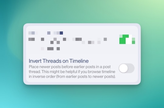
So, with this on, when scrolling "backwards in time", you'd _still_ see the beginning of the threads first. Clever!
However, I still prefer to scroll from older posts towards newer! Most apps don’t load the newest posts immediately — so if you scroll to the top at once when opening the app, it will lazy load like 100 more posts. 5My perfect scenario, is being just a bit behind the present, and scroll towards it.
However, here’s the issue with that, in most apps:
Because, you will then scroll up the timeline. This makes it so you see the bottom of posts first. And last time I checked, that’s not where most languages begin! So look at this beautiful option in Mona:
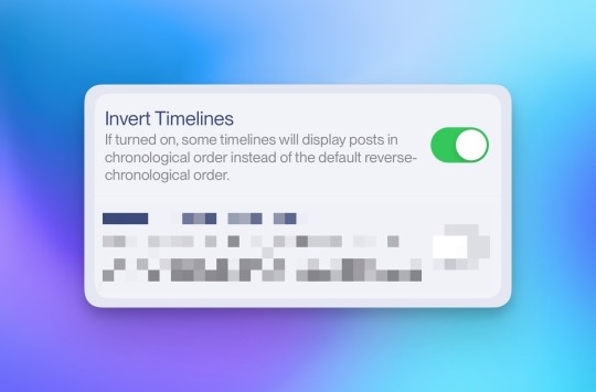
Ah, yes — so in Mona I can scroll with full width content, and get newer content as I scroll down. 👨🏻🍳👌🏻
My tips for new users:
Don’t bother with the default clients.
For the web, use the one who resonates most with you, out of Elk and Phanpy. This can be your desktop default (as well as mobile, if you prefer), or you check out the desktop apps of the native options below. 👇🏻
For iOS, I’d start with Mammoth for the on-boarding, while also giving Ice Cubes a chance. Then, if you’re a snob (like me), go for Mona or Ivory.
You can create a Mastodon account right within Mammoth - but you get the same great on-boarding if you already have an account! ↩︎
The Mac app has all the great features of the iOS counter-parts - and support timeline sync as well. But it doesn’t feel quite as nice as Ivory’s Mac app. ↩︎
Much more on that here. ↩︎
An objective truth, of course - not just my weird preference! ↩︎
To get this effect, I’ll sometimes open the app, go to the present, and then wait - like with fine wine or french press coffee. And then, when some more has been posted, I’ll start scrolling. ↩︎
0 notes
Text
I know it’s a silly little thing - but this is literally the most proud I’ve been of something I’ve designed. 🥲
0 notes
Text
Working on the blog rewrite today! So if anyone happens to visit, you can pretend I’m doing the «Naked CSS Naked Day" thing a bit late. ☺️
0 notes
Text
Anyone Else Feel Like They Should Use Firefox, but Still Struggle With It?
This post was originally (and still is) a forum post on the MPU forums. I have two concrete question blocks I’d love feedback on, which I will present during the post. I would love to hear from you, either over at MPU, as a comment to this post on Micro.blog, via Mastodon, or email. 🙂
I’d like to talk about browsers! And people are of course welcome to comment whatever they want - but some notes on what my intentions for this discussion are:
For reasons I’ll touch on later, this is mostly about desktop browsers.
In terms of privacy and security, I’m approaching this from a reality where 65 % of people use Chrome. So in this context, vastly improving the privacy from that, is more interesting than saying someone is a gullible idiot if they don’t use a Tor browser. 😛 So while I’m not saying those things shouldn’t be part of the discussion at all, I’d like to talk more about user experience and features than hardening, if you catch my drift. 1
OK, let’s go!
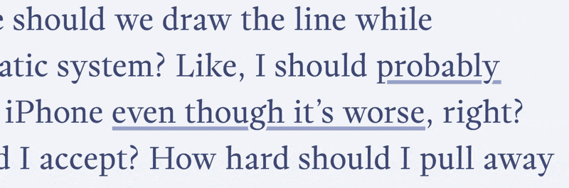
Ethics are always difficult to discuss. Because while I think everyone should be mindful of the small things we should do to improve things, people have different priorities and possibilities. And where should we draw the line while consumers in a problematic system? Like, I should probably use a Fairphone over an iPhone even though it’s worse, right? How much worse should I accept? How hard should I pull away from things like Facebook or X?
Still, I’m at least trying to try - and as the browser is perhaps the most used app, the choice of it is among the things I’m thinking about.
And here’s why I feel like I should use Firefox:
I don’t love the amount of power Google has over the web, among other things, through Chromium.
And while Safari is better, simply because WebKit is less popular, in principle I don’t love that situation either. An example is how other WebKit browsers, like SigmaOS and Orion, have to hack support for Chrome extensions to be able to offer extensions at all…
So while I could mention plenty of grievances with Mozilla Corp. as well, I still absolutely feel like using Firefox/a Gecko browser is among the most ethical alternatives. And even though we might only put it above Chrome, Safari and Edge, it would still be in the top 10 %.
Question(s) 1:
How much weight does ethics carry when you choose apps, platforms, services, etc.? If no, why not? And do you agree or disagree that there are ethical reasons to use Firefox over Chrome? What about Safari? Or something like Vivaldi?
Some notes on mobile
As, I assume, many on this forum, my mobile devices are iOS/iPadOS. And while I actually think Safari is pretty good on these devices, I think Apple’s stance on browsers here is one of the most blatant anti-competitive ones. I don’t mind the fact that others have to use WebKit, really. But combined with the fact that no one else is allowed to offer extensions, it gets problematic. Now, the EU is forcing them to open up some of this - but as many others, I don’t love the idea of Chromium getting even more dominance… So I kinda wish EU had said something like “You have to open up - but it’s only mandatory to do it to browser engines with less than 50% market share”, or something. 😛
This stranglehold also contributes to the fact that I find the mobile browser space much less interesting to discuss… 2
Two things that isn’t a problem for me, but might be for others:
The first is that I don’t have a work situation where I have to use a specific browser (engine). For instance, I know that many are dependent on work tools that only work well in Chromium browsers. But this is a good argument for why those of us who can use something else should. That more and more of the web only works in Chromium is a very serious problem.
I’ve always told myself that “Of course I need to use the same browser on desktop and mobile, as I want sync!”. However, as I only take advantage of this like once a year, I’ve finally realised that this just isn’t an issue for me. 😛 I think it’s a good idea to keep bookmarks in a separate app (I use Anybox), and shortcuts, like in the bookmark bar or what it’s called, I feel needs to be adapted to every platform anyway. And while I like that my history is accessible on mobile, I don’t see a need for it to be in my default mobile browser. As I do it so rarely, I don’t mind opening a separate app to search for it.
But my guess is that these might be larger issues for others!
I tried and failed - but now I’m trying again
I tried using Firefox as my default for about a year, around 2022, before giving up. But these are the reasons I’m now trying again:
I think Arc is the best browser. But after being unsure about using it due to Chromium, their recent change of direction pushed me over the edge - so I stopped using it. And I’m using the opportunity from “not being able” to use the best, to give Firefox another chance. 😛
Firefox on mobile is very uninspired - but, as mentioned, I don’t really care about that anymore! (And I can open Safari on my Mac to get my mobile history, and Firefox on mobile to get my desktop history.)
I’ve become much better at programming-adjacent activities since last time, so customising it to my liking is less daunting.
One thing that struck me going back to Firefox, is how it hasn’t improved at all in a year. While Arc and SigmaOS, which I’ve used the last year, get updates all the time - even though the SigmaOS team is like 6 people. But it is what it is…
If someone asks me how good I think macOS is - should I answer how good I think it is out-of-the-box (“State A”), or after I’ve customised it and added a bunch of third-party software (“State B”)? I think State B is the most relevant - but I also think it’s relevant how hard/expensive it is to get it there.
In State A, Firefox is slightly worse than Safari, and much worse than Arc. On the plus side, the other two browsers can’t be improved that much - while Firefox’ State B is a huge improvement. Then I’d say it’s better than Safari and on par with Arc. However, getting it there is way too difficult (but luckily not expensive).
Currently I’m doing a little project where I do my best to make Firefox the best it can be (at least to me). I know I’m far from the first to embark on this, but I’d still like to make it shareable. In other words, I’m trying to both improve State B of Firefox, while also making it a bit easier to get there. Here’s a teaser screenshot:

But in the meantime, as I’m very into obsessing over browser details, I’d love to hear from others:
Question(s) 2:
If you’re not using Firefox, why not? What would make you switch? (Changes in Firefox, or the browser you’re using now.) **And what are some of your favourite browser features in general?
My thought process is as follows:
I think the existence of Firefox/Gecko is very important for the future of the web.
I don’t have much power as a just-a-guy from Norway - but that doesn’t mean I shouldn’t do anything.
So if it is as good as the alternatives, I should absolutely use it.
But here’s the important part, and where I’m currently at: But what about if it’s not as good as the best? (Which it is not…) How large a gap should I accept here? And how small can I make it with the tools available?
However, even though I’m content with “good privacy”, I have zero issues with others wanting “great or better”! ↩︎
I know that Android is more open - but I think there would be way more incentive for interesting initiatives in this space, if the work could be deployed on every mobile device. Especially as iOS users spend way more in average. ↩︎
0 notes
Text
The Case for Soulver, and an App Between a Calculator and a Spreadsheet
The iOS counterpart of Soulver 3 just released — and is being discussed a bit over at the (excellent) Mac Power Users forum.
This post is (mostly) an answer to the following post there:
Soulver is a fun app to do simple math, but it is no substitute for a spreadsheet. Can it do any of this Numbers - Function list - Apple (AU)?
Can it graph data?
So I would buy it again if it was cheaper, but $35 for the Mac app plus another $34 for the iOS apps is definitely not worth it to me. I’ll keep using my free, constantly improving Numbers app.
Plus it took 5 years to finally recreate the iOS apps? Seriously? Why would I trust this developer after borking a perfectly good iOS app and taking so long to finally add it back to the App Store.
I think you’re misunderstanding
… what Soulver is trying to be,
even though you mention “a fun app to do simple math”.
When discussing solving math problems, different complexity levels make us turn to different tools. I’d say it usually looks something like this:
Very simple → In your head
Simple → A calculator (app)
Medium to complex → A spreadsheet app
Now, you could say “why would anyone use a calculator, when a spreadsheet is so much more powerful??” - but usually using tools that are overkill is less convenient. Soulver isn’t trying to replace spreadsheets in the list above - their theory is that there’s room for a tool between a calculator and a spreadsheet. (Typically for “back of a napkin” maths). So their theory is this:
Very simple → In your head
Simple → A calculator (app)
Medium → Soulver
Complex → A spreadsheet app
Now, people’s breaking points for the different categories are different. 1 How much we do the different types of maths also varies greatly from person to person. And I assume that you’re very accustomed to Numbers, so firing it up to make a quick-and-dirty spreadsheet probably doesn’t involve much friction. But I think Soulver’s idea here is solid, and a valid idea and market for an app.
As a maths teacher, I, of course, love my spreadsheets - but most people don’t! (Even though I’m doing my best…) For most people, it’s really like this:
Very simple → In your head
Simple → A calculator (app)
Medium to complex → Nah, never mind 🙅🏻♂️
And then this would be a nice upgrade:
Very simple → In your head
Simple → A calculator (app)
Medium → Soulver
Complex → Nah, never mind 🙅🏻♂️
<img src=“https://soulver.app/vid/SIA_2.mp4" alt=“Another Soulver video, with the following text: “My trip to Paris: I spent €350 on wine & cheese. €350.00 (from the last line) in USD. Then the app shows the answer.">
Re: Pricing
This touches on a different post as well, that was a reply to me saying it was actually a good thing that the new iOS app is a separate purchase. This one:
I guess there’s some flexibility to it being offered separately for each platform, but I prefer to have apps available across all platforms as a single purchase (possibly with a bit of a discount). Not a major obstacle, though, but it still ends up being rather expensive, especially when AI can nowadays answer most of the simple math questions using natural language for free.
This is the cost structure:
Mac: $35
iPad: $20
iPhone $14
I think that is pretty fair, and pretty well-adjusted for how useful it is on the different platforms. You also get all versions with a Setapp sub 🖇️.
So, in total, it’s $69 for a lifetime purchase. I can agree that it would be nice to get a discount if you bought all, say $60. 2 But I don’t think “$60 for all as the only option” is better than the current offering - which is the case when only a universal purchase is possible. This would make it a much worse deal if you knew you only want to use it for your Mac, or you simply don’t own an iPad.
Now, you might say “no, I don’t want the only option to be $60 for everything, but $35 for everything!”. But while saying it should be significantly cheaper than what it is today is perfectly valid - it’s not the same as discussing universal purchase. How we pay for something is a (slightly) different discussion than how much we pay.
And also affected by if you’re using the default calculator app or the best one 😎 (PCalc is “only” second best!). ↩︎
But I don’t even know how easy that is to do within the App Store? ↩︎
0 notes
Text
Input wanted!
In principle, I think I should use Firefox… So I’m digging deep to see if I can make it not-bad! 🙊
So, my question to those of you who use a (desktop) browser:
Why do you use the one you use now?
What are your favourite (large or small) features? Please be very specific!

0 notes
Text
A Very Good All-Round Game Controller, With One Major Flaw
A quick review of the 8BitDo Ultimate Bluetooth Controller
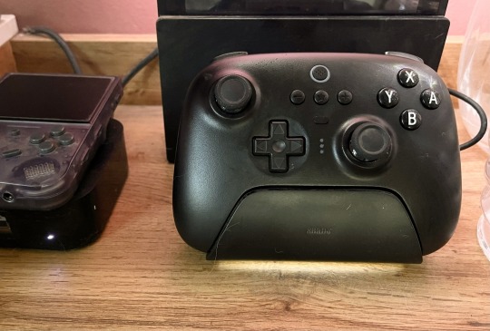
I mostly play boring strategy 🖇️ games that are just as good to play with a trackpad as anything else.
But every so often, I’ll play something that’s best played with a controller. That’s usually on my Switch, where I’ve used the joy-cons with a charging grip — but that’s never been great. Also, my joy-cons have started to drift…
So I wanted to buy a single controller that could fit all my use-cases, and my choice fell on the 8BitDo Ultimate Bluetooth Controller 🖇️. And it’s a great controller, with many smart features. But did you know that a controller can support 2.4 GHz, Bluetooth, Switch, PC, Steam Deck, Android, iOS and iPadOS, but not support macOS?? Well, I didn’t.
You can find a better alternative for almost every use-case
When I got the controller, I compared it to the official Switch Pro Controller, the Xbox One Controller, and the 8BitDo Pro 2 Controller 🖇️, and here are my findings:
When playing on the Switch, the official Pro controlled has better rumble, and ergonomics I slightly prefer. Also, it’s nicer that the official controller doesn’t have analog shoulder buttons, as the console doesn’t support that anyway.
However, you can configure the 8BitDo controller so that the Z buttons fire immediately while connected to a Switch!
I also prefer the ergonomics of the Xbox One controller (and probably the newer ones as well, but I haven’t tried those).
The D-pad on the 8BitDo Pro 2 is in a nicer spot for games that emphasise that over the left analog stick.

The Pro 2 is also a great (perhaps even better) alternative, depending on your layout preferences.
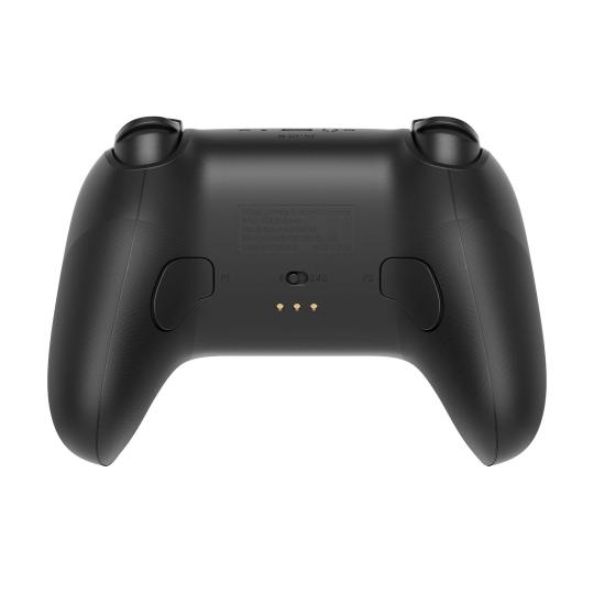
However, it does have some great features
It looks great, seems well-made, and has a pretty fair price.
The charging dock also looks great, and works well. It also hides the 2.4Ghz dongle in the base — and if you power the dock from your PC, the dongle is automatically connected!
Pretty good software, and support for profiles.
Also has two programable back paddle buttons.
Hall Effect joysticks feel good, and don’t drift.
Great D-pad (even better than Nintendo’s own!) and face buttons.
Support for many platforms. (Just not every platform! 😠)
What I like about it, is that every part of the experience is at least good, whether your playing Switch, PC, 2D or 3D titles.
However, why on earth did they go through all that trouble, and then just not support macOS? It’s especially annoying because the old and cheaper Pro 2 controlled does support every platform the Ultimate supports, and macOS! 1
The reasons I went for the Ultimate, and not the Pro 2, was the charging dock and that I had a theory that the Pro 2 is more worse for Zelda than the Ultimate is worse for Dead Cells. But if I had known about the lack of macOS support, I think I simply would’ve waited — as 8BitDo comes with updates pretty often.
But, if you don’t need Mac support, I can absolutely recommend the Ultimate controller - but I’d also take a look at the Pro 2. They’ve also just released a version of that with Hall Effect sticks!
The issue is D-input support, and not just X-input. Not that I really know the difference… Also, the Pro 2 doesn’t support 2.4 GHz, and only Bluetooth. ↩︎
0 notes
Text
A Way To Get a Fancy Link Hover Effect
Jarrod, of (the great blog) HeyDingus.net, wanted to do something about the way his links appear on his website. He asked:
Since the first design of my site, I’ve stuck with blue text for my hyperlinks because that always seemed canonical with the web. Links = blue text, blue underline. But I’ve grown less certain with its readability with all that blue text interspersed. I’m considering a change. What do y’all think?
One thing he didn’t mention there, is that he also has a nice hover effect, that changes the underline to a gradient (that matches his logo and more) on hover.
My first idea for how to solve it sacrificed the gradient - but that just wouldn’t do. But I think I found a pretty good solution in the end!
The solution, and how to implement it
Here’s the logic behind it:
We set the gradient as the background image always.
But then we use -webkit-background-clip: text; to make it so that the shape of the background is exactly like the text.
However, as we don’t want the gradient to be visible at all times, we add -webkit-text-fill-color: var(-—offWhite);. This fills normal text colour above our gradient - so now the entire background-image covered and appears invisible.
But then, on :hover, we change the text-fill to -webkit-text-fill-color: transparent;, as that will make it so the gradient shines through!
…and we do something similar with the underline - from colour to transparent.
So then we get the following CSS:
a { background-image: linear-gradient( to right, var(--green), var(--yellow), var(--orange), var(--red), var(--purple), var(--blue) ); text-decoration: underline; text-decoration-thickness: 1.5px; text-decoration-color: var(--blue); transition: all ease-in-out 0.3s; } a:hover { -webkit-text-fill-color: transparent; text-decoration-color: transparent; }
Alternative to text-decoration: underline;
An alternative way to create underlines, is by using box-shadow: inset. 1 Then you can make it shrink down to nothing on hover:
And here’s the CSS:
a { background-image: linear-gradient( to right, var(--green), var(--yellow), var(--orange), var(--red), var(--purple), var(--blue) ); text-decoration: none; box-shadow: inset 0 -1.5px 0 var(--blue); transition: all ease-in-out 0.3s; } a:hover { -webkit-text-fill-color: transparent; box-shadow: inset 0 0 0 var(--blue); }
And you could move them further down by making some pseudo-elements, but I won’t go Into that here. ↩︎
0 notes