Last Seen Blogs
ilianquisition
(un)holy

largando
Untitled

cuchitransfers-blog
Costa Rica Private Transportation & Tours
riveer-shii
I need coffee!! ☕

xbetteroftwoevilsx
☄ Fallout trash ☄
Text
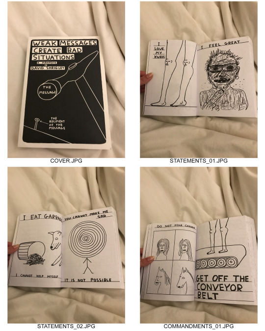
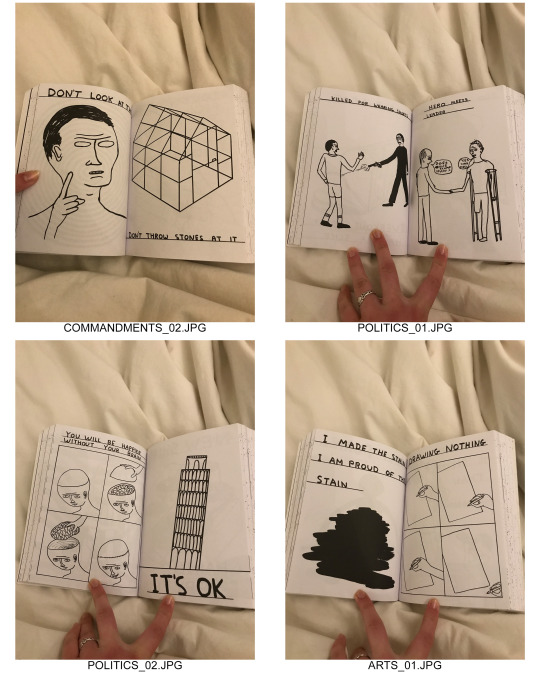
- Weak Messages Create Bad Situations: A Manifesto -
David Shrigley
This book is a visual representation of Shrigley’s opinions on a variety of subjects. To quote the back of the book, “I have a fully-composed world view. I have strong opinions about everything. And my ideas are hand-illustrated and use real handwriting that you can trust.”
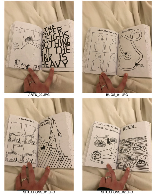
All of the images in this book are black and white ink drawings. The text is all hand written and on many of the pages have words crossed out. He also underlines a lot of the text. Inside the book it seems more like a practical choice- drawing the straight line first he can organize the page a little more. On the back it is more about emphasis. His style is very messy and doesn’t look very planned out. On the page SITUATIONS_01 you can see that he drew the stairs through the legs of the figure. Since he has this style, misspellings and ‘mistakes’ fit into the book and make sense visually.
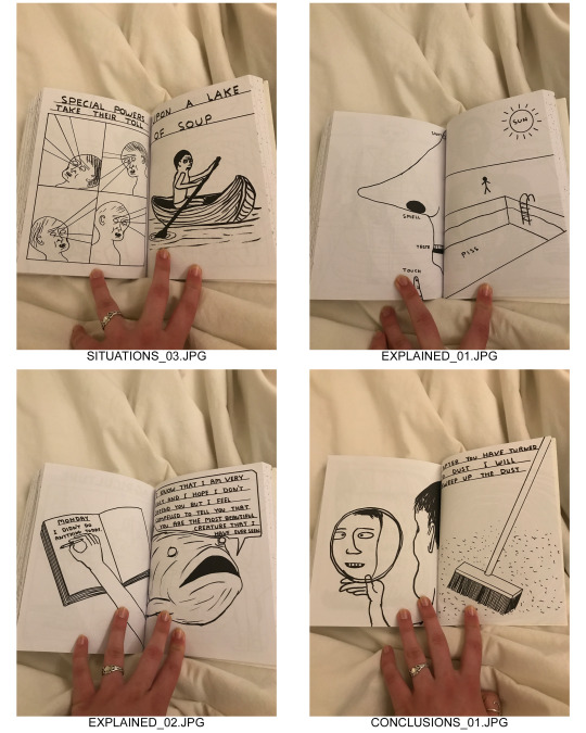
It’s divided into eight sections. They are as follows: Statements, Commandments, Politics and Opinions, The Arts, Bugs and Insects, Situations, The World Explained, and Conclusions. There are slight variations between the sections. In ‘Situations’ every page either has the word ‘I’ or ‘me’ on them. While other sections are directly addressing the reader. These divisions aren’t evenly split up. ‘Bugs and Insects’ is only about 5 pages while ‘Situations’ is close to a quarter of the entire book.
Most of the images relate to the text fairly directly. It is either illustrating what the text says or further explaining it. There are many pages where the text wouldn’t make sense without the image and vice versa. They work together to get the message across. Almost all of Shrigley’s work is combining text and images. He will occasionally have only one or the other. For example on ART_02 there is a page that has only text and on CONCLUSIONS_01 there is a page that is only an image. However, on those pages they make sense on their own- or at least make as much sense as any of the pages do. They aren’t missing any explanation by only having one or the other.
The messages that he’s getting across are usually ridiculous. Some are a lot more straightforward than others. Some take a more political stance while others are just goofy. Everything is very decisive though. He does have strong opinions on everything and presents everything in a very clear way. The way this book presents everything it doesn’t create a hierarchy. All of the messages are given the same weight. They take up the same amount of space, use the same black and white color scheme, employ the same imagery, etc.
I see a lot of his work presented on its own. He uses Instagram a lot, makes merchandise such as t-shirts, mugs or posters. His work has the ability to stand on its own- outside of the context of a book. This means that when you are seeing it compiled together it does take on a different tone. I find myself looking for more cohesion or narrative between the images. Out of the thousands or drawings he has done why are these compiled in this book? Before I got this book there were some of the images I’d seen before on their own but now knowing that they are a part of this larger work changes the relationship to them in some way. I think this book might just be a little bit too long. Seeing so many drawings that do function as stand alone works in one place creates a kind of fatigue. Shrigley does have an over the top-ness to a lot of his work though, so that fatigue could very easily be a conscious choice.
0 notes
Text
- Apartment -
Kaspar Bonnen
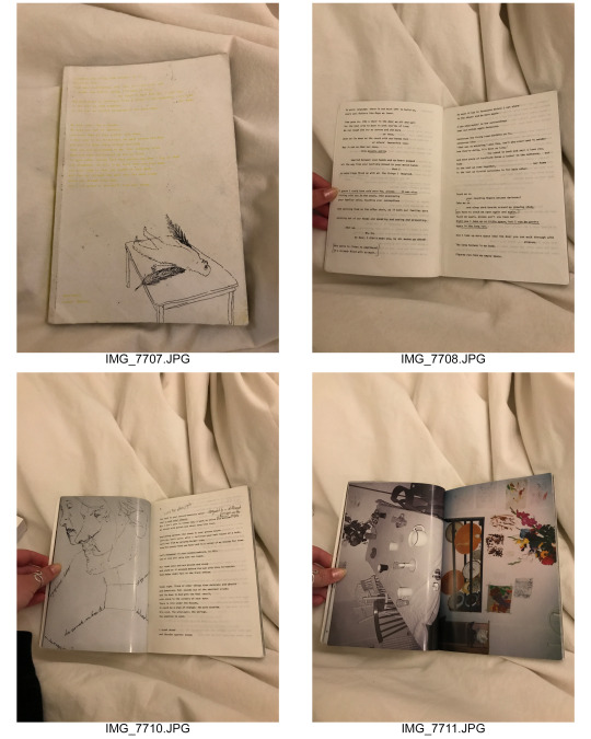
This book is a poem by Kaspar Bonnen as well as a documentation of several works by the same artist.
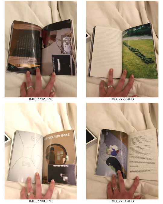
The images are a combination of color photographs, black and white photographs and ink drawings. The photos are either interiors of different apartments or photos from some of Bonnen’s sculptures, installations and performance pieces. Some text appears in those as well- as he does quite a bit of work that combines language and sculpture. Some of the ink drawings have text incorporated as well- this is typically only a few words here and there. Quite a few of his installations are recreations of apartments and have text written on the walls or beds. Almost all of the text that isn’t the poetry is in Danish though- so I don’t know exactly what it’s saying. Only one of his exhibitions featured text in English- despite the fact that the poem is written entirely in English. As far as I can tell this is the only printing of the book and there is not a version with the poem in Danish.
The pages that just have poetry written on them are a lot thinner while the pages with images are thicker, photo paper. The poem is split up into five sections. The book starts with a portion of the poem then has several pages on images, then goes back to the poem. This repeats until the poem is done and ends with images. Each section of images has a combination of installation photos and drawings. However, for most of the sections the installation photos will be from the same exhibition/project. If they include more than one project it will still be contained within that section- photos from one installation can’t be seen in multiple sections of the book.
This poem employs imagery of an apartment having memory, space representing the rise and fall of a relationship. Since many of the sculptural pieces he showed in this book are of these recreated interior spaces it’s very cohesive. A lot of the photos have a very melancholy feeling to them that is mirrored in the language of the poem. He often describes physical space and bodies in the same way- or using physical space to explain a feeling he’s having within himself. Many of the drawings use this same technique. While no images are illustrating specifically what’s in the text there is a very clear line that can be drawn between the two. He explores what ideas of home can mean and how much we are defined by the spaces we are surrounded by.
In terms of design it’s fairly simple. There is a formula that he follows throughout the book that does not change. The text is small and uniform. There are different formatting choices made for different parts of the poem- but that’s common practice for most poets. The division of the text and images creates a focus during each part. You are only reading or looking at pictures at one time. However, you go into each section informed by what you just read or saw. The only times you can see both poetry and image is at the beginning of each section of the poem. These images relate more directly to the text than one of the other ones- in my opinion at least.
This book was published in 2005 and features work that he did between 1999 and the time of publishing. While it doesn't show his work in a linear way it does still show his thought process over several years. He wrote the poem in 2005 so it could be seen as him contextualizing his own work. Looking back and finding the through-line for the past few years.
0 notes
Video
vimeo
Online Intervention - Omegle Tarot Readings
Password: Intervention
0 notes
Audio
0 notes
Text
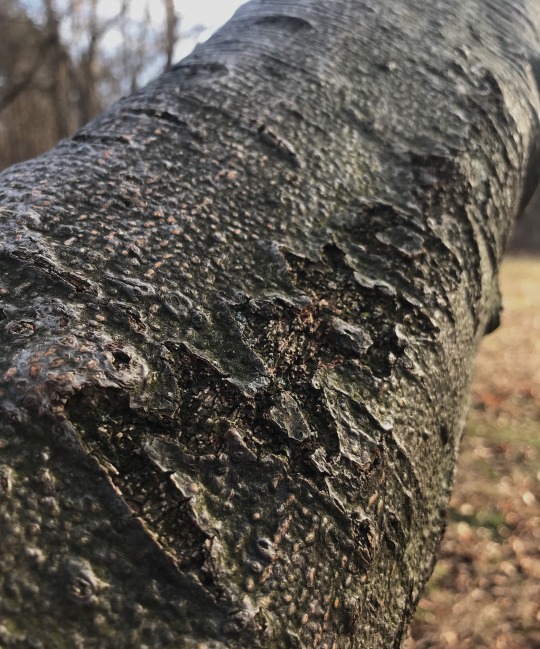
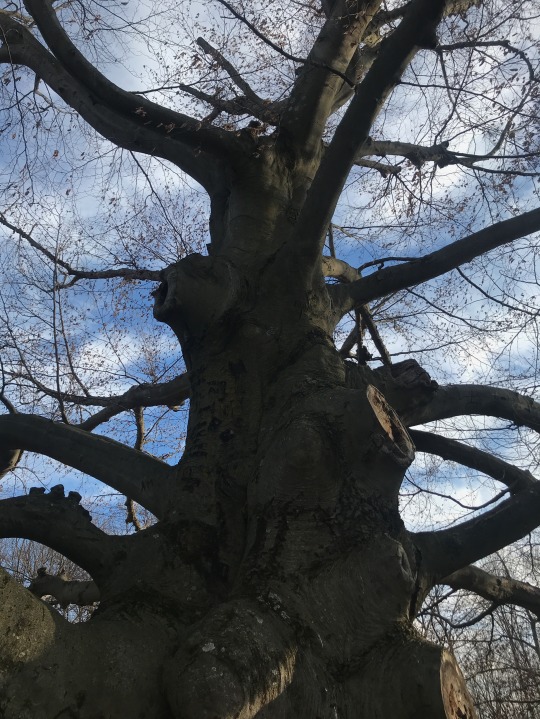
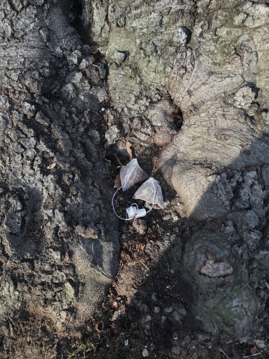
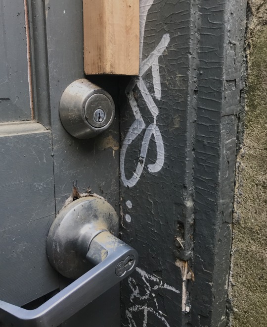
- Uncomfortable -
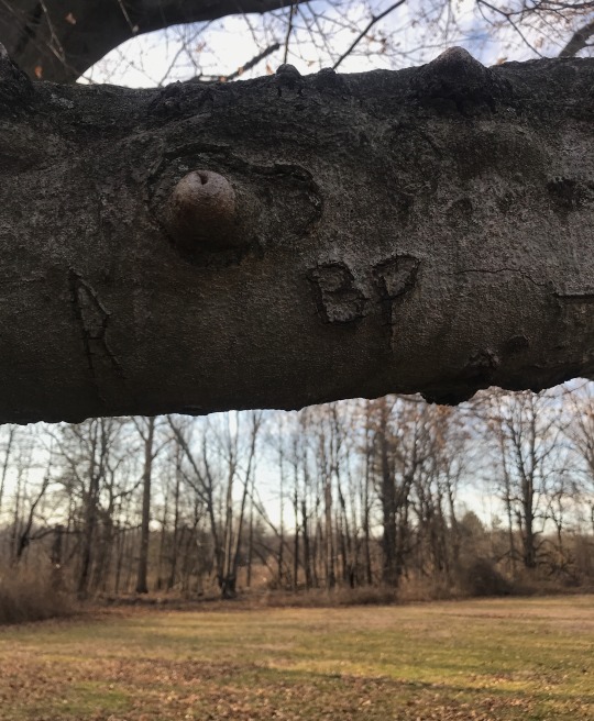
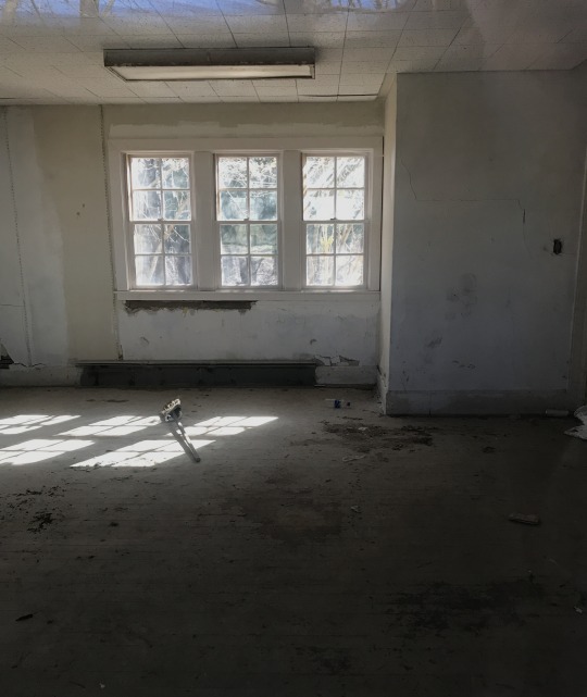
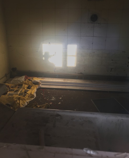
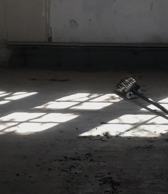
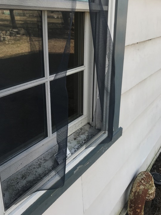
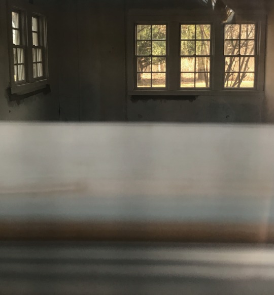
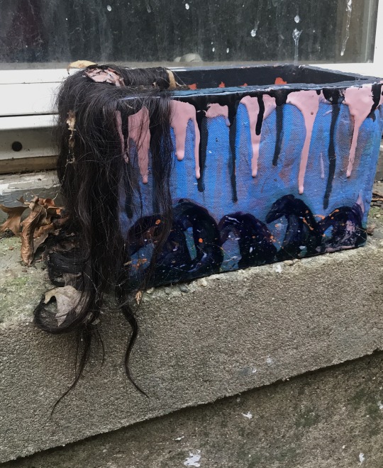
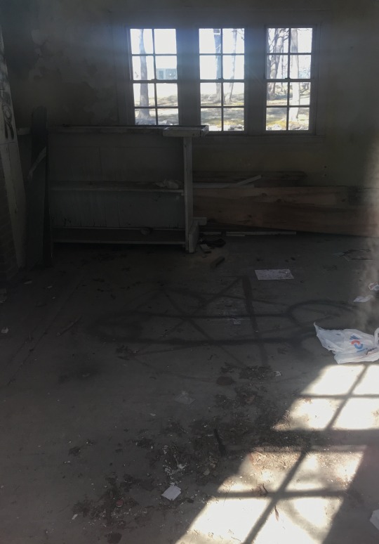
I focused the photographs on two spaces on campus. The abandoned house near the student center and the elephant tree. Both of these I’ve heard about from other students as being haunted and I found information about them online as well. People reported seeing ghosts, feeling presences, the branches of the tree swaying without wind or orbs appearing in photographs.
I completely believe in ghosts or at the very least in the idea of residual energy, especially if something bad has happened. While I do have, what I consider to be, a healthy fear of ghosts; that was not the sole source or discomfort.
The idea of “ghost hunters” entering allegedly haunted spaces is something I have always been very uneasy about. I think it’s disrespectful to whatever entity or force is there. I think it’s especially disrespectful to try and communicate with anything or anyone that is lingering- you are entering someone else’s space, someone you don’t know, and expecting them to talk to you. Entering a “haunted” space and messing around with Ouija boards or even just hanging out feels very wrong. This was why I tried to direct the photographs towards evidence of other students being there. Things like leaving trash, graffiti or carving initials into the tree.
Even asking someone where the elephant tree was, ended up being fairly uncomfortable. I felt that since I was taking the photos of the tree and the building I was part of the problem. I felt voyeuristic. I was hyper aware of other people being around me and would immediately want to stop if someone got too close.
There were multiple ways I could’ve gotten into the building, windows had clearly been opened in the past and not reinforced. I considered trying to get inside for the photographs, I definitely would’ve been more uncomfortable, but ultimately decided that I would rather only have photos from the outside than have an angry ghost following me home.
Sources:
https://hauntedcollegesny.blogspot.com/2011/02/suny-purchase-purchase-ny.html
https://www.hauntedplaces.org/item/suny-purchase/
0 notes
Text
- 99 Problems -
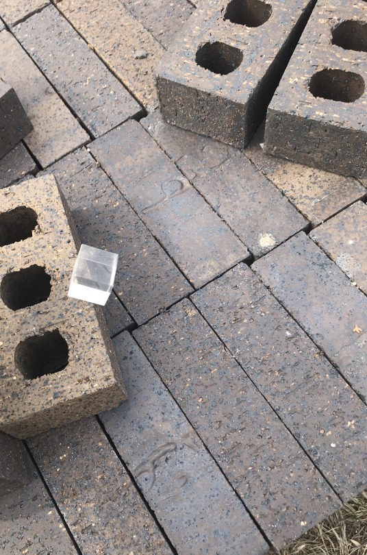
I’ve always really liked this prism-cube since it looks so different from every angle but is still a very simple form. I thought it would work well for this project since it’s so unobtrusive I could change a lot by changing the setting.
Since I chose an object that was both small and clear it was easy for it to disappear in the image. As soon as I got more than a foot away it became very hard to see, especially from straight on. I had to then try to find different ways to still have the object be the focus- or be alright with the photo being a little more obscure.
Some of the prompts were definitely more straight forward than others. I struggled a lot with vantage point. Since it’s such an essential part of every single photo I felt it was hard to have a photo that emphasized it over the other elements that were also present.
Time was also a difficult one. I ended up creating photos in series- which was something I’d tried to avoid- since they didn’t express the tenet as individual images. The single image I chose for time was one of the only ones I felt worked by itself.
The frame was probably the most fun for me. I felt like it lent itself to a lot of drama and some of those images ended up being my favorite of the whole project. Since it’s such a geometric object I liked seeing how it could interact with the geometry around it.
0 notes