
grad604frosinapopovski
Design Research_
FrosinaPopovski
53 posts
Don't wanna be here? Send us removal request.
Last Seen Blogs

tatpartime
Tatpar Time

qualityviva-blog
ViVEK SHROUTY
moonie1510
moonie_1510

blackmensuited
Black Men in Suits
Photo
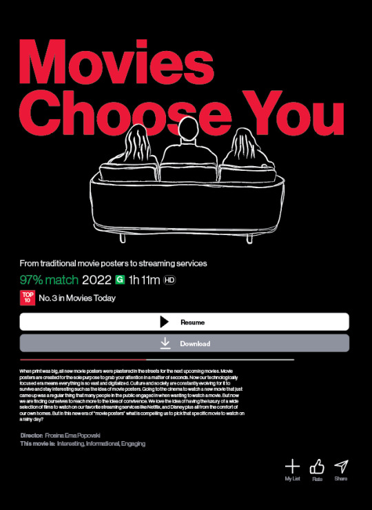
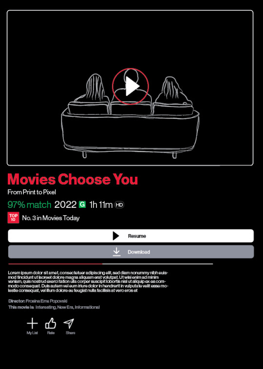
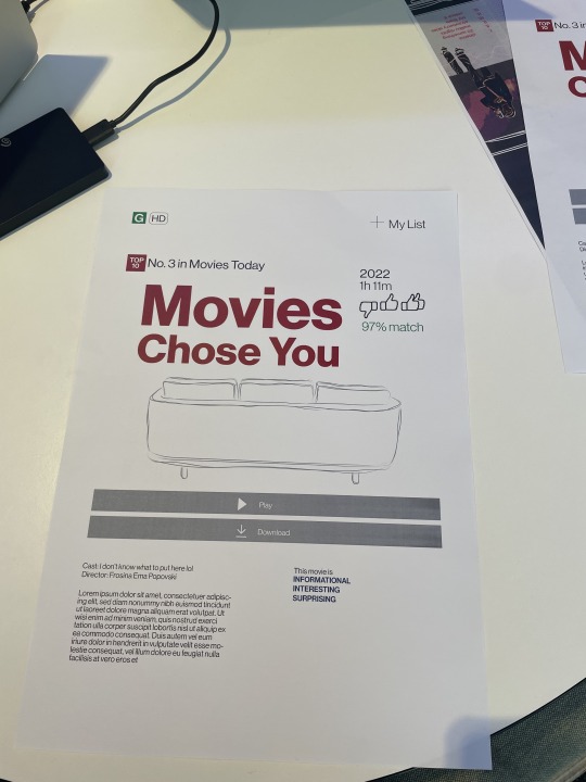
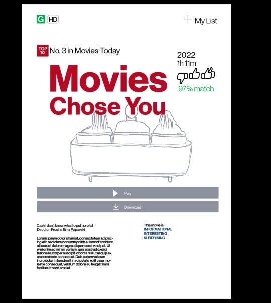
COMBINING BOTH MY IDEA AND DAVID’S IDEA / FEEDBACK
I tried with keeping the writing components, the resume and all that all the same like what David suggested but then also having the illustration and the title how I did it in my original design. But I coloured in the people's heads black. Like what David suggested because I feel like it works better and its cleaner. And you can still read the writing of the title.
WHAT TO ADD/EDIT:
Make the my list, the rate and the share smaller and align it
Add in my abstract
Figure out final subheading name
Ask peers for feedback/thoughts
Potential final !!!!
0 notes
Photo
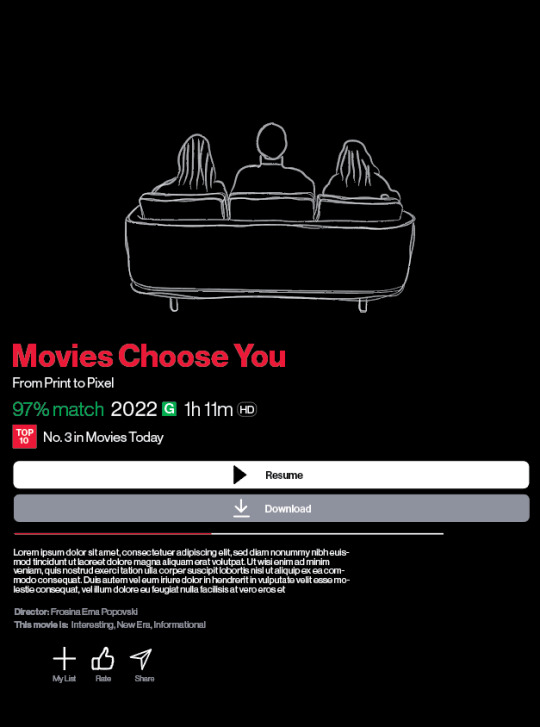
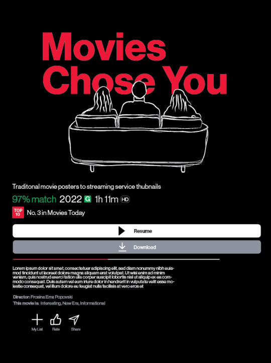
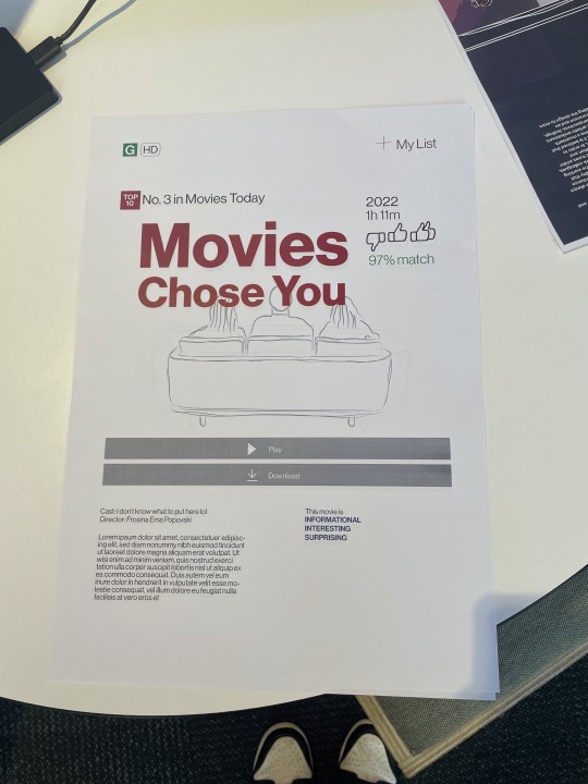
EDITING FROM FEEDBACK FROM DAVID
I took feedback and suggestions that David gave me during the 1 on 1 feedback session and tried to make it look more like the Netflix layout but I don’t really the box or the play button with the illustration just think it clashes a lot and I just don’t really like it. I also don’t really like the title name so small, I kinda preferred it more when it was bigger and the illustration kinda just sat on top of it.
I do like the layout of the other components and think they work so much better. And think that I will stick with that layout for those certain components.
0 notes
Text
FEEDBACK
Feedback from David on 19/10
Look at Netflix and look at where each component sits and kind do that for you one
Instead of the cast put the keywords
Add in the abstract
Add subtitle
Idea is could have the peoples heads and the tv as the main image but then have the title and all those elements in the tv as if they are watching it
Have the peoples heads coloured in black because then you will still be able to read the words. It’s just a but distracting with them just like that and it just doesn’t work.
0 notes
Photo
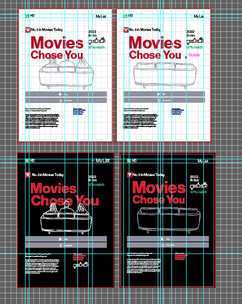
GRIDS
Working with grids and stuff to make everything aligned and clean
0 notes
Photo

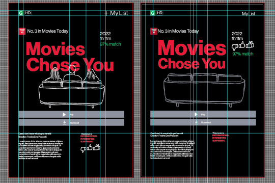
WORKING WITH FEEDBACK AND EDITING POSTER
Took some of my feedback and also Maddy’s feedback on board and made this.
Feel like the black works sooooo much better and lets everything stand out. I did have to edit to be a bit brighter though because the darker red didn’t suit.
Just really worried how black will print.
Also need to figure out the placing of the peoples heads
Want more peer feedback and feedback from David on Wednesday
0 notes
Photo
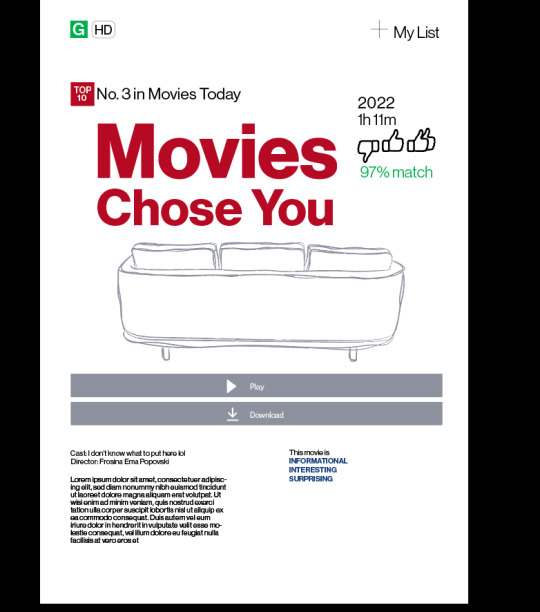
TEST PRINTING THE POSTERS
My feedback:
Looks good
Happy with the colours
Think the people need to go in front of the writing maybe?
Maybe have the right section smaller
Put in the abstract
Figure out what to put in the cast section
Test out black
Could try out a border??
Work on sizing on all of it so it all matches kinda all the place
Fix the sizing of the chose you so it matches to the movies one in the title
Feedback from Maddy:
For the top 10 create some space next to the No. 3 in movies today part
Try caps for the title
Make the chose you the same size as the movies
Make the plus for the MY LIST a thicker stroke
Make the leading wider between the 2022 and 1h 11m
Not too sure about the green on the 97% match
Could bring the people in front of the type or even could have it intertwine around the letters
Could make the illustration black?
For the play and the download could have the grey boxes wider and then it won’t look as squished and will add more room for the icons
Could have the cast and director a heavier weight
Could add a black border or frame kinda thing or even a black background so it’s Netflix appropriate
0 notes
Photo
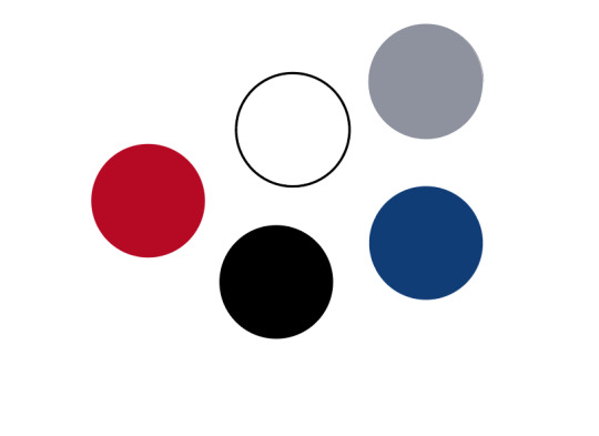
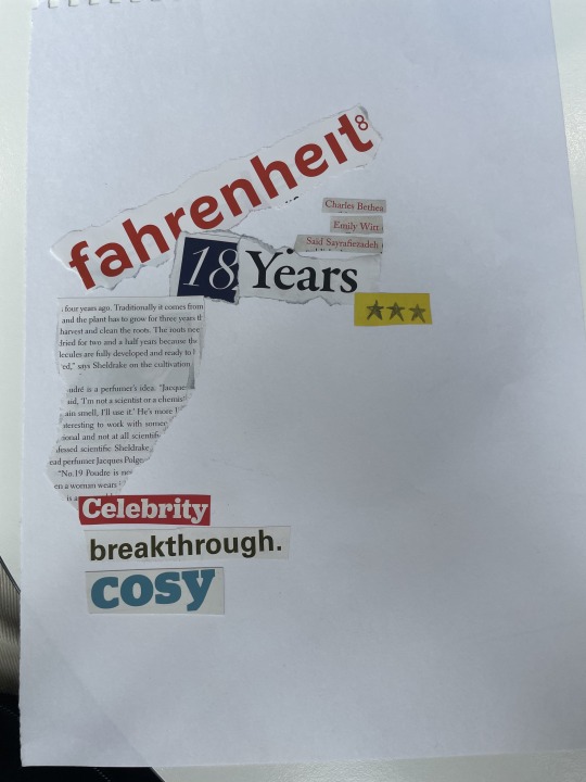
COLOURS
Wanted to keep it simple and kind of similar to what Netflix has and looking at their guidelines too and wanted to incorporate that into my poster too.
0 notes
Photo
CONCEPTS
First kind of rough idea of how it will look. Not 100% loving it. But I do love some concepts of it.
0 notes
Photo
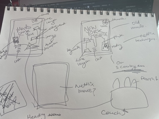
SKETCHING IDEAS
I find that my mind works so much better if I have an idea sketched out on paper instead of just looking at a blank screen on Illustrator or Indesign.
I looked at having one option being a movie called movies chose you which is my title and could probably add my subtitle in it too somewhere. And the description being my abstract??? And then have all the Netflix concepts throughout it all.
My second idea was having a movie I like and making that Netflix style.
.....
Ended up choosing to go with the first idea. Think it’s really cool and works with my whole idea and everything and it’s cool to incorporate my name and abstract into it.
0 notes
Text
POSTER REFINMEMNT
Pixel based techniques on a print based traditional movie poster
0 notes
Text
REFINING CONCEPT
The communication design of print to pixel movie posters. Looking at the design techniques used to grab users attention and how this is communicated. As well as the overall change of how movie poster moved from print to pixel and why this has changed.
FEEDBACK FROM DAVID ON REFINMENT OF IDEA:
I would say make a decision based upon what you are most curious about now, and what you think might sustain your curiosity and interest longer into third year. It might be that Print to pixel gives you a broader area of research... and communication design in the Netflix and Streaming area is just one aspect of print to pixel?
0 notes
Text
Lecture notes
Attended todays lecture to view the 2 guest speakers from MILK studios. It was really interesting to hear what they had to say about the industry as well as giving us tips on the portfolio as well.
Considerations:
- an overview
- keep it simple
- tell your story
- quality over quantity
- be honest
- know your audience
- invest in yourself
Less is more, show the work you are proud of
- strongest work first
- try put yourself in the employer’s shows
- They won’t spend hours analysing every last detail
Stick to 4-8 of your best projects or pieces
- show the thinking and the process behind some of the work - short insights can demonstrate a deeper understanding
Who the project was for
What was the brief
The project concept
Know your audience
- who are you targeting
- your goal
- show tour skills and personality
- simplicity is key
0 notes
Text
Extremely useful article
David suggested me to have a read of this article by EYE ON DESIGN named “ THE AGE OF NETFLIX”
https://eyeondesign.aiga.org/the-art-of-the-movie-poster-in-the-age-of-netflix/
Some points I found are...
Design objects we see so often we rarely stop and think who is behind them all and what is capturing our attentions as viewers.
The different genres - could talk about that, such as the romantic comedies and how the couple/lovers are faced back to back in the poster. Or in actions movies how it’s a fast moving car, with explosions and the lone hero in the front --- in old/traditional movie posters
But now movie poster are strictly based online or even on billboards
Interesting person that is Percival --- entertainment designer for movie posters like Where the wild things are, Euphoria, Wonder Woman and many more. http://percivalandassociates.com/
Percival said, ““creating work that doesn’t draw from the standard entertainment design that one typically sees.”
Percival also said , the 90′s was the era of the big idea in the entertainment design industry. “an era of the big idea and the reduction of the film’s property into its purest form.”
Also said, working with movie poster it’s not a genre film, and treating the key art as such would have been misrepresentative.
Such as the movie RAW he used elements working with a restrained typeface to juxtapose to the film extreme content
Streaming services like Netflix has revolutionised the industry and pushed different services and compaines to research new approaches. To look into how to operate and how to create designs in a new scale and a new way.
Has allowed them to experiment through the creative process for design
in the entertainment design industry means producing imagery that will remain equally intriguing at the scale of a a thumbnails on our laptops or phones or the size of a billboard
What pieces/elements of art/design compel us as users to press play on these streaming services
Percival said 10-15 years ago there was a clear path back them on how to design but now it has changed and how do we create imagery that is valuable to use in other interfaces of streaming services.
0 notes
Photo

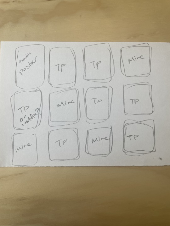
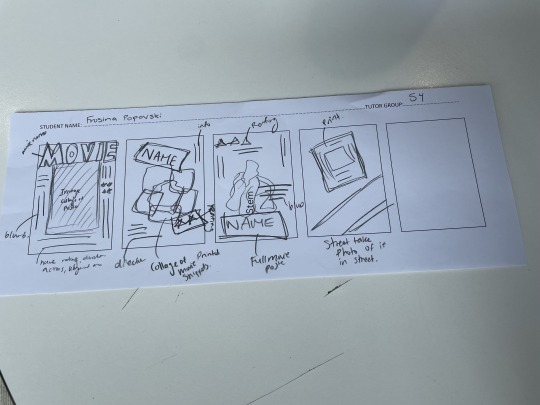
BRAINSTORMING POSTERS IDEAS
The first two poster concepts are the idea I think that I want to go with. Having the Netflix components in a traditional movie style. Probably will use an exisiting movie that is on Netflix.
The third on is kind of a photography based photo is a photography based idea but I don’t really want to take the photography approach.
The 4th and 5th one are ideas that are kinda like showing off the poster. The 4th one is what I like more it’s like having the poster from 1 next to traditional posters or Netflix based posters.
I think I will be going with the 1 and 2 concept for my poster.
0 notes
Photo
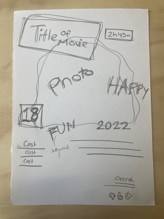
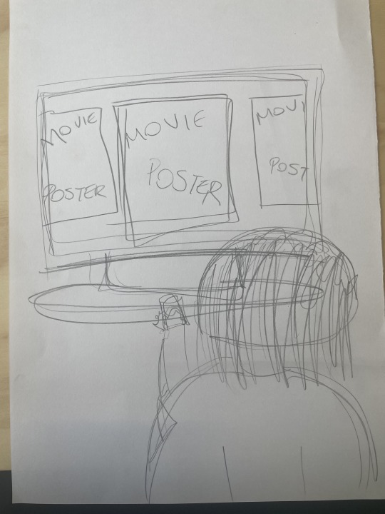
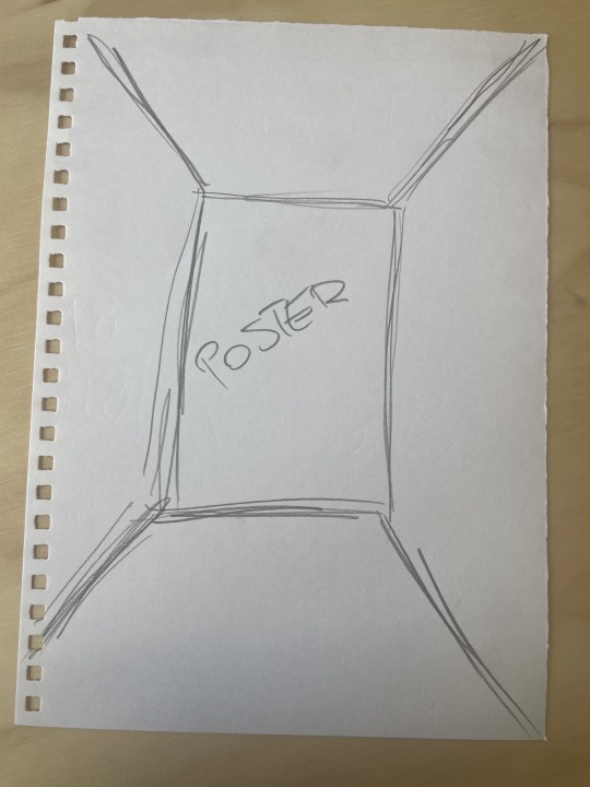
IN CLASS VISUAL ACTIVITY
First photo I just sketched out different concepts I have for creating my A2 poster. Working with the idea that I had posted in a pervious post.
Then the second one is a collage idea but I didn’t add a visual of the movie yet. But I looked at ideas like the name, year, blurb, nickname and rating.
FEEDBACK FROM DAVID:
Photograph someone holding a remote in the hand making a decision
Look at behavioural situations when choosing a movie to watch on Netflix
The environment of Netflix
Experience of how to sell
What it looks like looking at a bunch of movie posters
FEED FORWARD:
Brainstorm more ideas now and expand further than just adding Netflix based “poster” aspects to a traditional movie poster. Could look into ideas like how to create the perfect user experience. What makes me want to watch the movie. What is so eye-catching. Looking at ideas like that. Collage work? Is the approach I am looking at taking.
0 notes