grad601-pt2-catherinepascual
GRAD601/12 (pt 2) - Catherine Pascual
73 posts
Don't wanna be here? Send us removal request.
Last Seen Blogs

davida
Untitled

akitales
akitales

secretpaperprofessorpizza-blog
rememberme

ebi-art
EBI
nico-nico-yazawa
Nico Nico Nii
Text
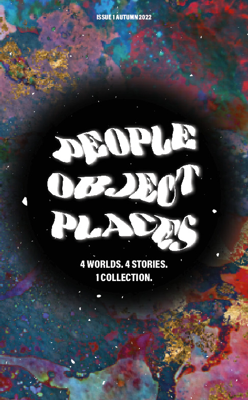
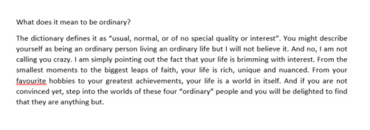
Final Post - Rationale
I’m finally done! My goodness, this semester flew by so incredibly quickly, it’s insane. And I thought I couldn’t do more work than last semester but here we are. This project has truly been such an enjoyable experience. From the smooth transitions of image-making techniques to its application into publication design, I’ve loved every step of the process. Personal projects like this, where the result feels closer to home is something I find myself to be more immersed in. I know that in the design industry, most of the projects you take on will be someone else’s brief and that also brings its advantages. But in this particular project, I really grasped the opportunity to learn more about my dad, which was a special bonding experience. I got to learn about my peers and their interviewees and it all just allowed me to realise and further appreciate the interesting nuances of everyone’s lives.
I took on a more abstract approach in my image-making and I stuck with this (after the careful consideration of many experiments and developments) because there was something about the different colours and their movement that was so eye-capturing - and the same was said by my peers. It makes you curious which was my intent. The process of making the covers was also an enjoyable one as it combined analogue and digital techniques. I loved the hands-on element of techniques I had never tried before and then the utilisation of Illustrator and Photoshop to further enhance the work. I am so much more comfortable with Photoshop - I love using its wide variety of features and oh my goodness, it’s blending modes are so damn fun to work with. All of this that I said about Photoshop, you would not have heard from me at the beginning of the semester (because I was initially intimidated by the program).
As a designer, I’ve learnt to value the ‘draft before craft’ work method and would still need to work on my perfectionist tendencies. Sometimes, you just have to let something go in order to move forward right? But I can also say that I’m very very happy with the work produced and I hope you’ve enjoyed this blog and seeing my sanity fluctuate throughout the semester. There’s still so much to lean and discover and I’m so excited for what’s yet to come. Thank you to everyone who has helped me throughout the semester and thank you to the readers of the blog for coming along on this journey with me :). Here’s to many more aye!
0 notes
Text
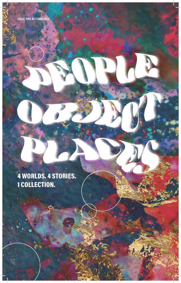
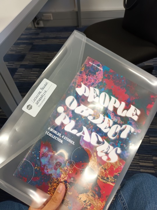
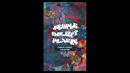
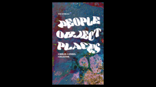
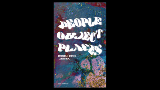
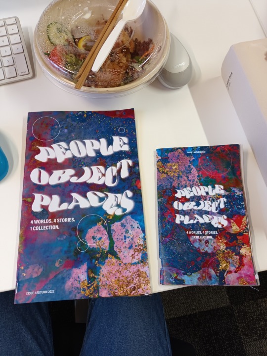
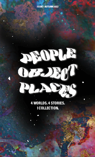
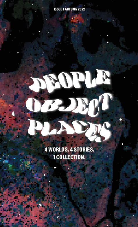
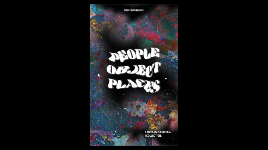
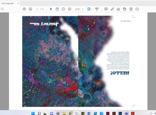
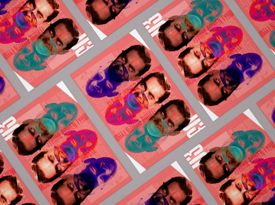
Final Publication :))
Here it is! Super happy with it :)))
0 notes
Text
Ready to hand in!!!
I used 300gsm paper for the covers and the normal AUT A3 paper for the inside content.
Now I’m just making sure I have the correct print-ready file for Canvas and we’re almost there. Then I will write my rationale!
0 notes
Text
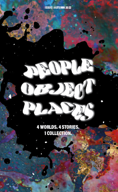
Final tweaks here and there
^doing preflight checks, making sure all images are reaching the bleed line etc. Cleaning up any unused colours or images. Basically applying what I learnt in Materials and Media to this (as if I was preparing this for a client).
^changed the weight of the circle strokes from 1 to 0.75 --> makes the worlds look more dainty and delicate.
0 notes
Text
Update
don;t know if ur still reading this blog but u might be wondering ‘yo this gurl aint done with her work what in the world is happening’. ya i was granted an extension due to some ✨ life happenings ✨ last week so now that that’s been dealt with, i have a bit more time and energy to focus on uni work and finish things off :)). that’s it for now, will work tmr!!
0 notes
Text
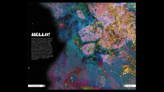
Inside Cover Developments

So when I test printed the publication, I realised the margins were too small - made reading feel risky with how close the text was to the edge. So I’m increasing the margin from 10mm to 15mm and adjusting everything accordingly. AAHHHHHHHHHHHHHH ehem anyways... back to it!
^much easier to read.
^gradient helps to make it flow better.
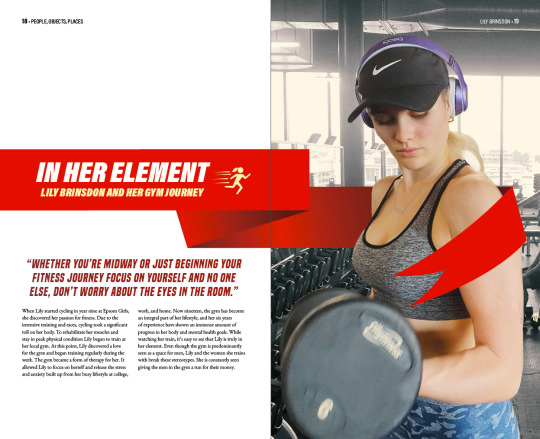
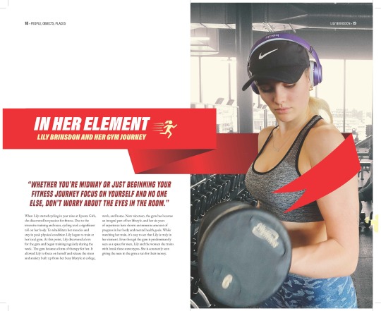
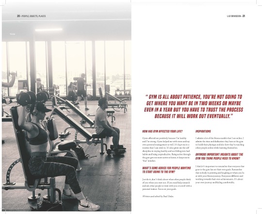
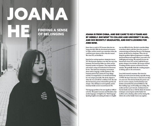
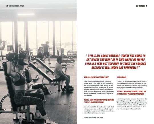
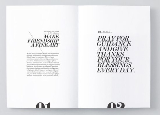
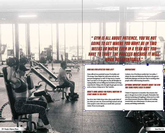
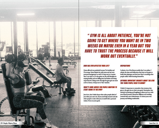
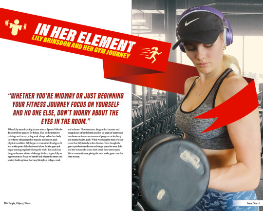
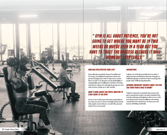
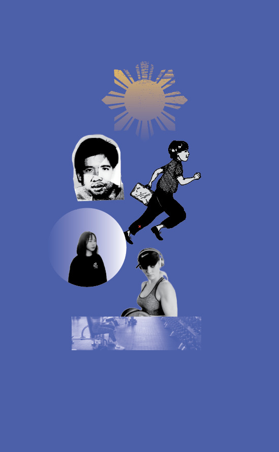
^I made quite a lot of changes to this spread - I straightened the ribbon to make it easier to read and I removed the bright yellow to better match Lily’s hair. I also removed the weightlifting icon because the girl running leads well into the image on the opposite side.
0 notes
Text
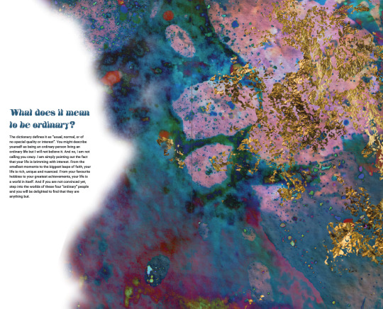
Thematic Developments
My tweaks are so minute but I’m really getting into the details...
^I used Photoshop to edit the background so that the smaller text would be easily read.
^removed the page numbers, softened the white cloud even more and proofchecked the writing with Grammarly.

^trying different page numbers.

^simple page numbering - typeface matching the ones on the cover!
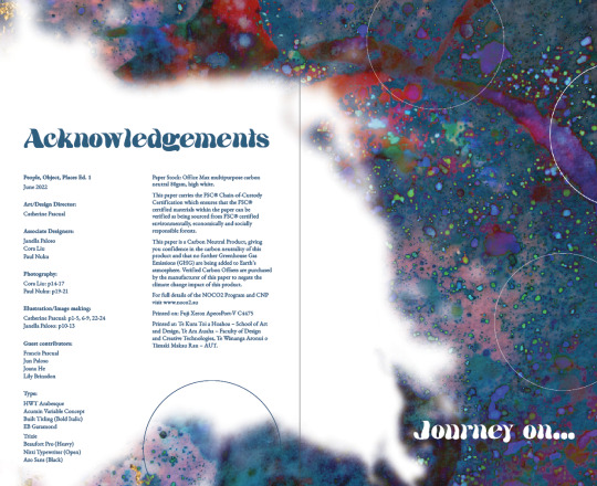
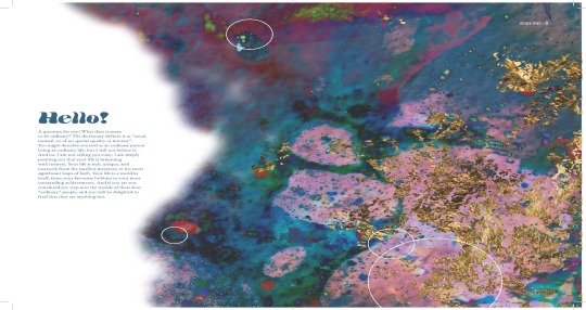
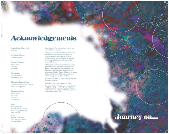
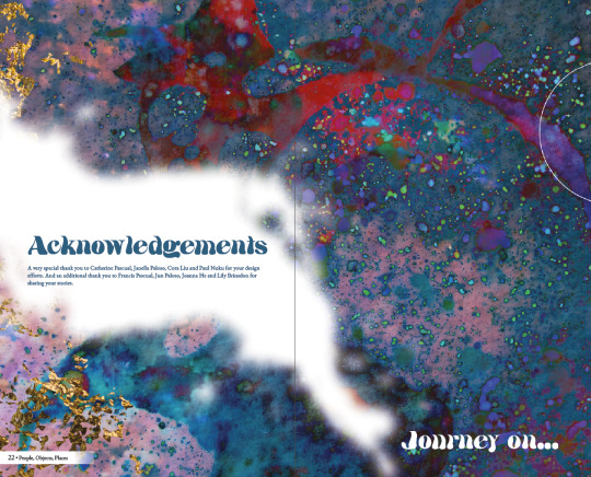
^Acknowledgements page.
0 notes
Text
What’s new...development continued
I’m on campus to do a test print and get my head around the imposed spread process. I decided to keep the white background instead because it was a lot easier to read and visually cleaner. Now I’m trying to figure out how to make the smaller pieces of information easier to read.

^I like this better because it’s easier to read but still visually interesting.
^ I would like for the smaller information to be placed altogether for clearer information hierarchy.


^slightly edited the background. Also, I looked at a couple Interview magazines to see where they placed the Issue numbers - it varied so I thought it looked best placed at the bottom.
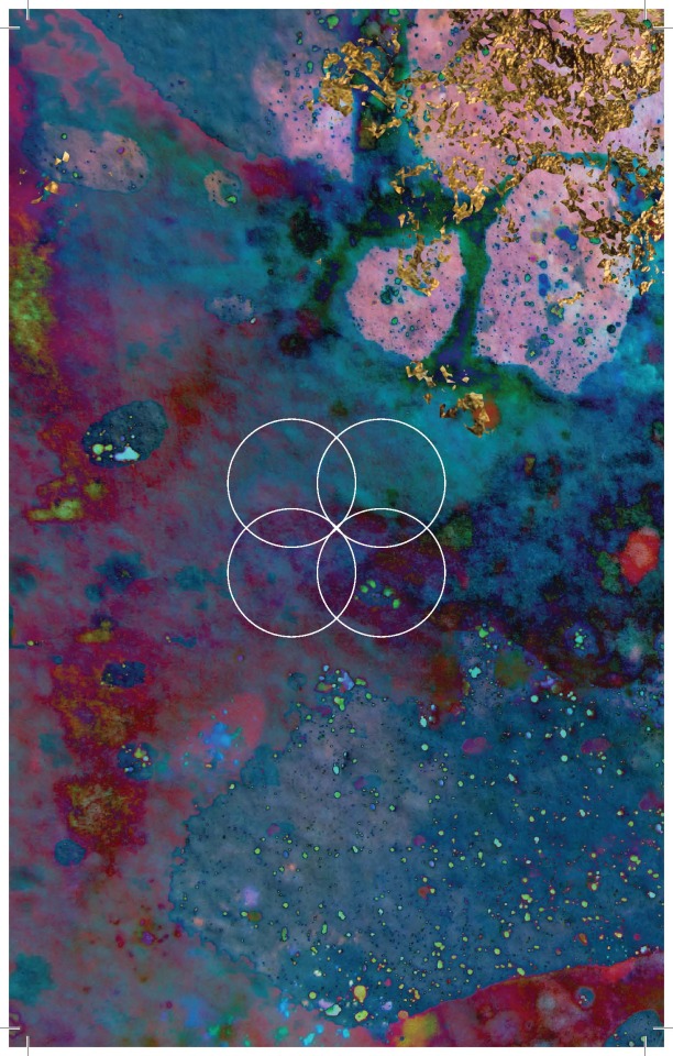
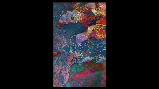
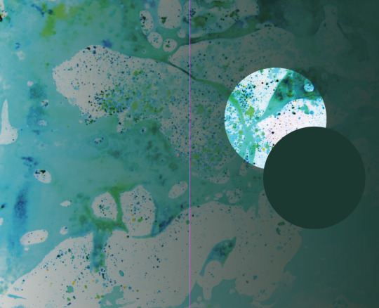
^Added the circles.
^back cover.
^did some test prints - afterwards I’ll make some notes for improvement. But right now, I gotta do my business exam ahh.
Okay so with the above test prints, I like the type composition of the first one (left) but I really like the background of the second. Imma try merge them together and see what happens.
0 notes
Text
Refinement continued!
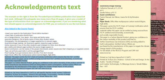
^okay got the draft version of my acknowledgement text down!
^something to note down for later (rationale).
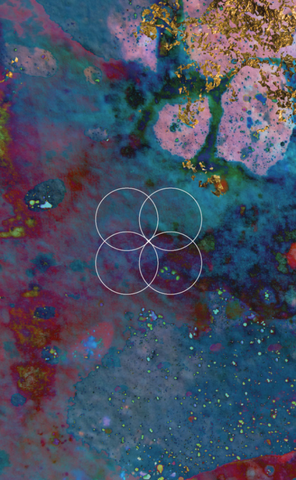
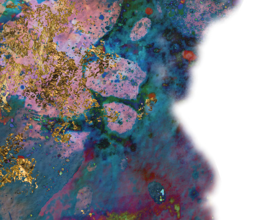
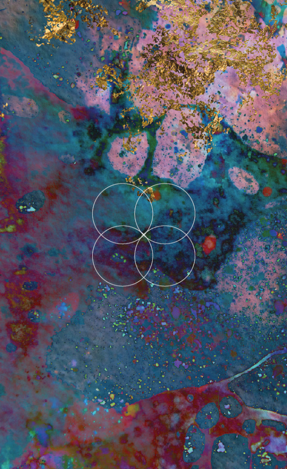
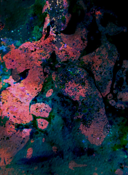
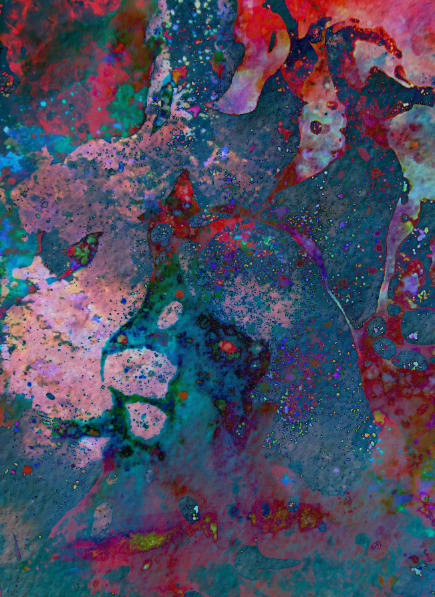
Galaxy Pictures (similiar to my images)
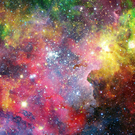
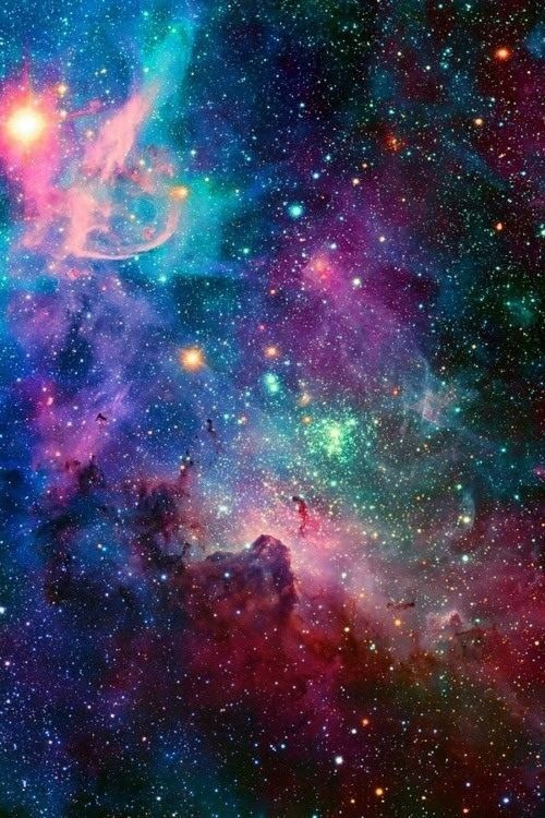
^To emulate the space aspect, I think I have to add more black.
^Maybe?
^tried with no blur but it doesn’t look right...
^the balance of colours is off - there need to be a primary dominater - whether that’s the black space or the colourful galaxy.
(sorry for the pixelated image) - I like the first colour palette better - more vibrant and interesting.
^is it too abstract?
Hmmm honestly not sure about this...
^im worried about the printing outcome with the black background.
0 notes
Text
Workshop 12.1: Development continued
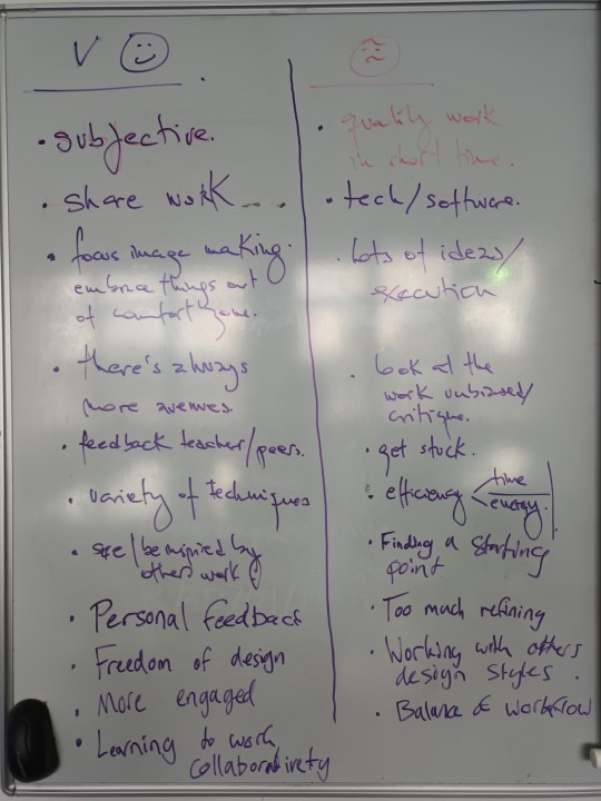
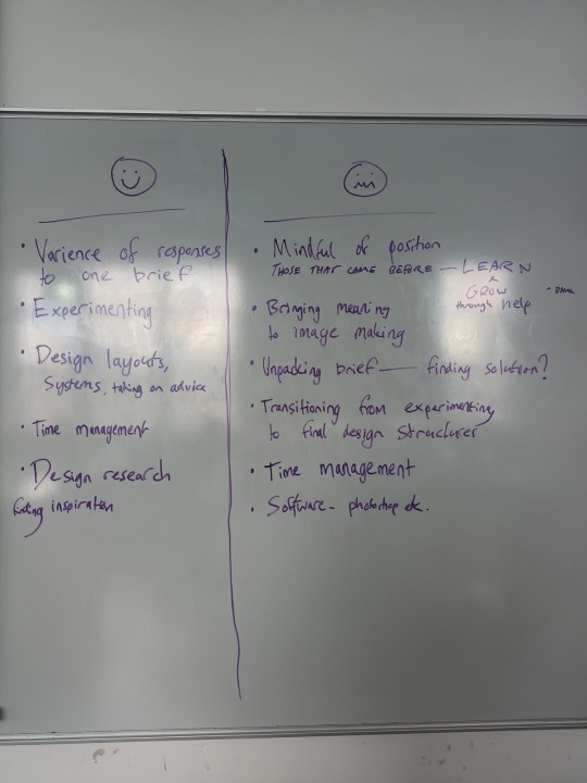
Semester Reflection
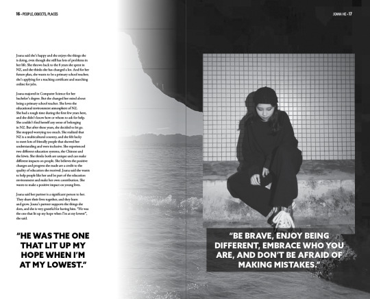
^trying to make the quote more visible.
0 notes
Text
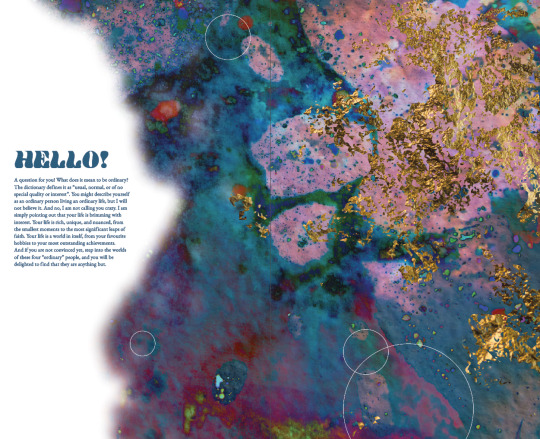
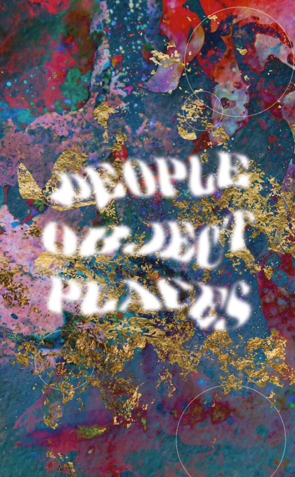
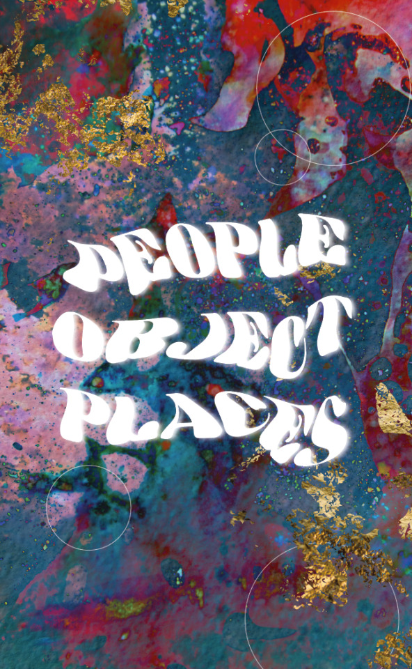
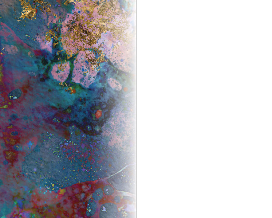
Galaxy and Gold
Editorial Theme Introduction:
Now I’m adjusting the other people’s work!
^gotta fix the lighting on the quote but we’re still in the works!
Tried creating a print file but idk if it worked...guess I’ll have to find out tomorrow!
0 notes
Text
Version 1 - Water Idea (circling back)
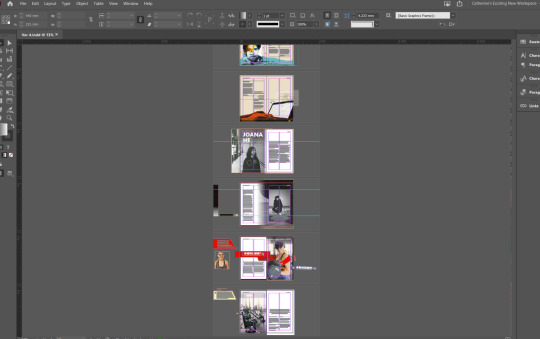
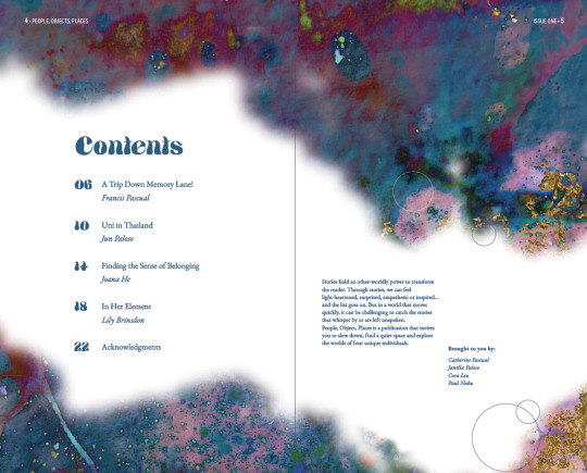
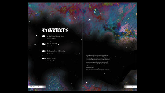
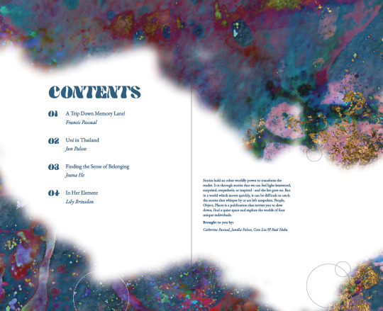
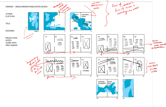
Flatplan:
^found this watery-type font!
Went on Photoshop to use blending mode and found this was super duper funky:
^so mesmerising omllll this reminds me of galaxies.

^we’re getting super duper funkyy

^maybe dial down the gold leaf.
^another experiment!
^thematic intro.
1 note
·
View note
Text
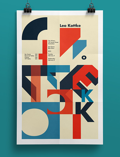
Design Direction 3: Illustration
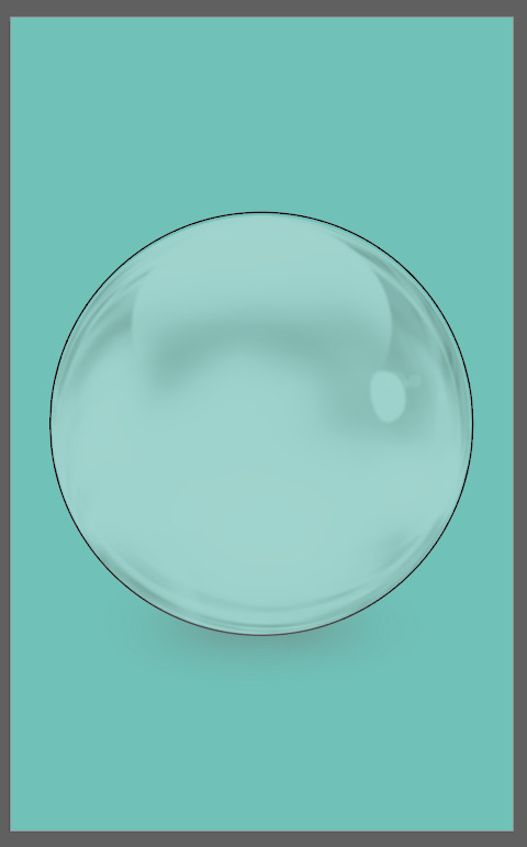
^cool bubble illustration!
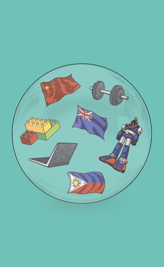
^different items that I illustrated inside the bubble!
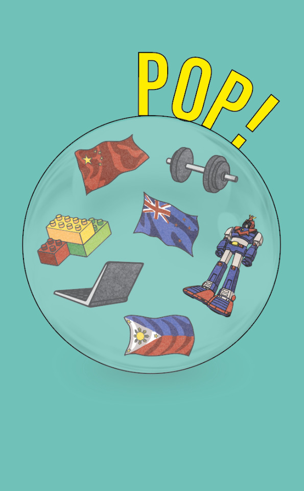
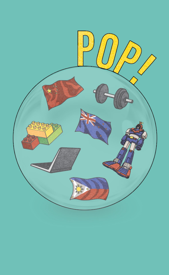
^added a slight grain texture to dull down the yellow.
0 notes
Text
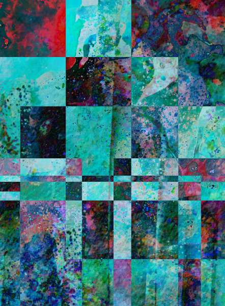
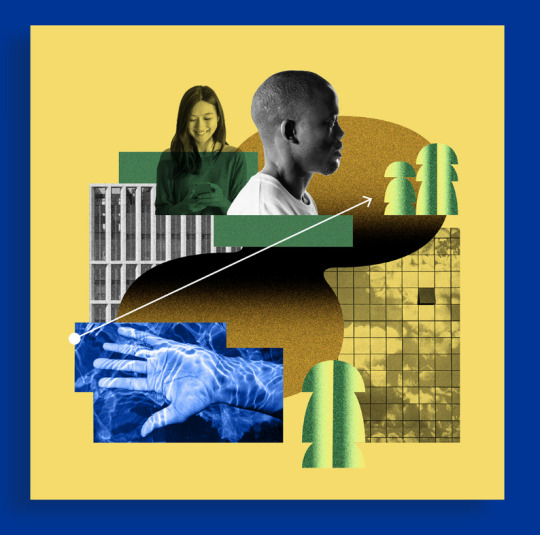
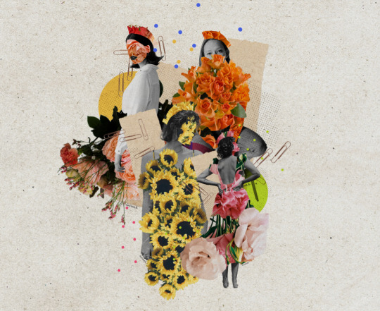
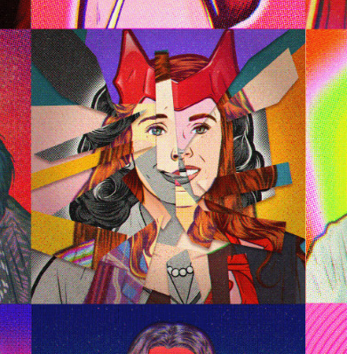
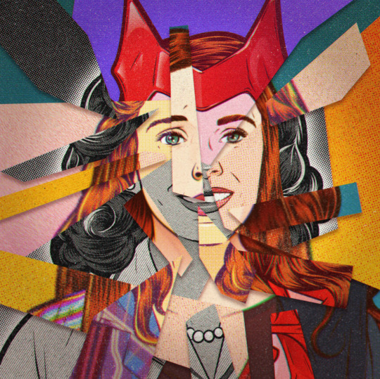
Design Direction 3: Digital collage/photomontage
I feel like this would make the most sense considering all the different styles of the interviews.

^different people, different places and different things (for a lack of a better term) - this would serve as a great source of inspiration. I’ll find 2 more then sketch out a few ideas.
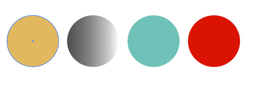
^reduced colour palette to 4 colours (one from each interview).
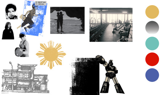
^Visual assets so far.
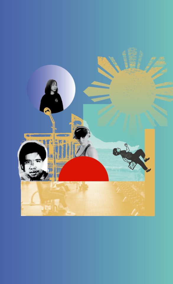
^Version 1
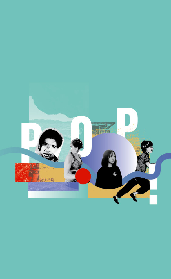
^oooooweee i kinda dig this! okay im so tired i will continue tomorrow!!!
0 notes
Text
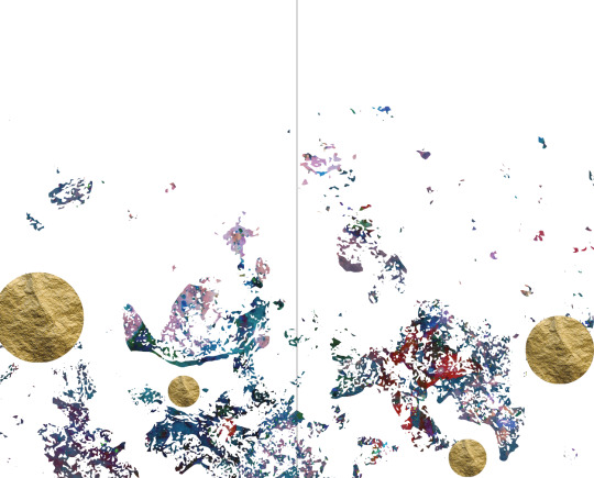
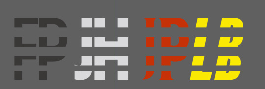
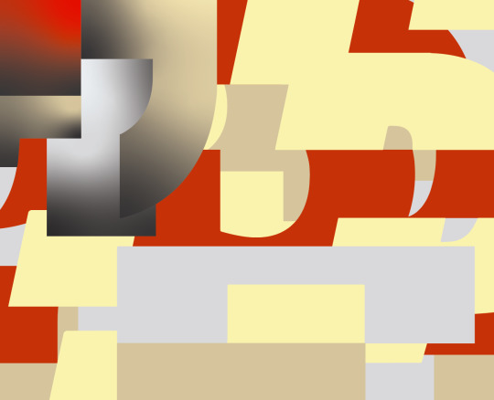
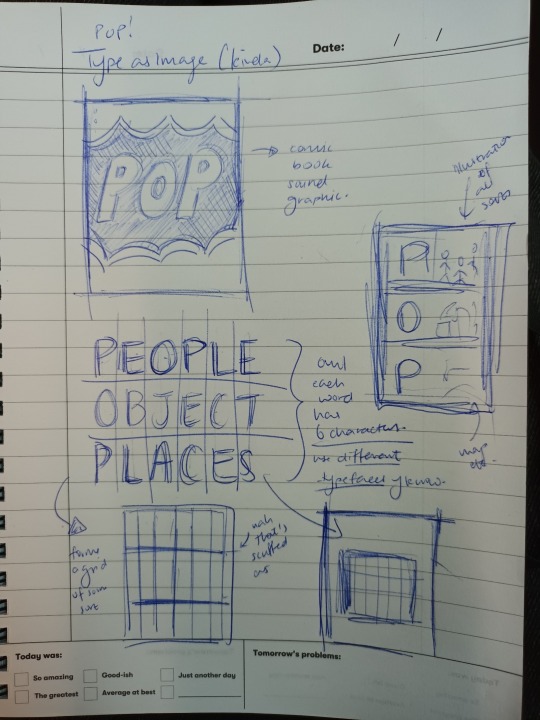
Expt 2 - Fractured Type
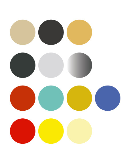
^overall colour palette from everyone’s work.
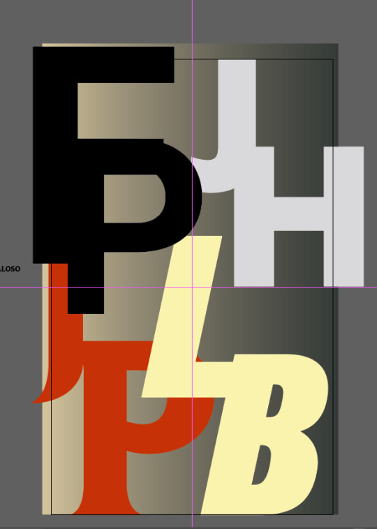
^using the initials of all the interviewees and playing around with this!
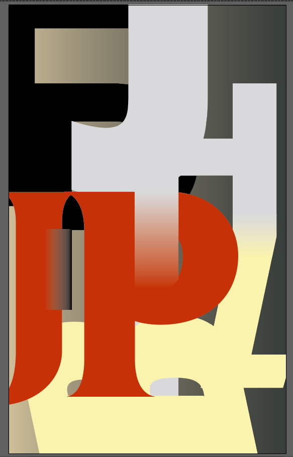
^slowly fusing it using the gradient tool and the pathfinder.
Experiment 2.2:
I took the initials of the interviewees again and I separated them into pieces to combine them again into a jigsaw-like puzzle piece.
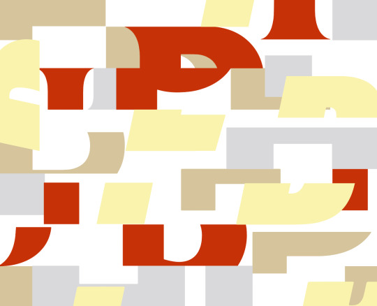
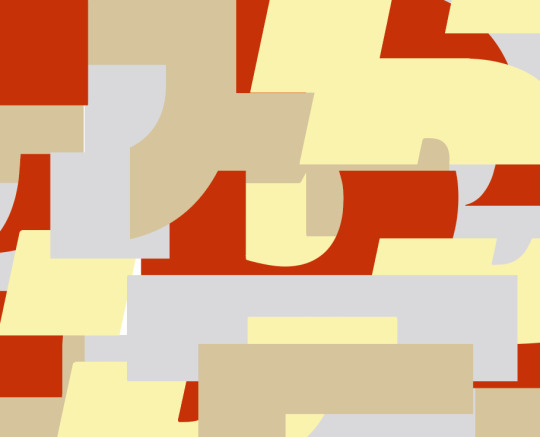
^put them all together to create a big mess - but let’s see if we can refine this a bit.

^tidied up the edges - I wanna add more depth somehow - perhaps using gradients.
^here’s how it’s playing out!
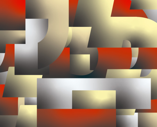
^lol now what.
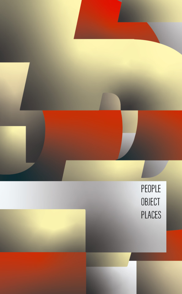
^idk how to feel about this now :(((( I feel like it’s too abstract. I’ll move onto the other different directions and then circle back to see which one has the most potential.
0 notes
Text
Type as Image continued.
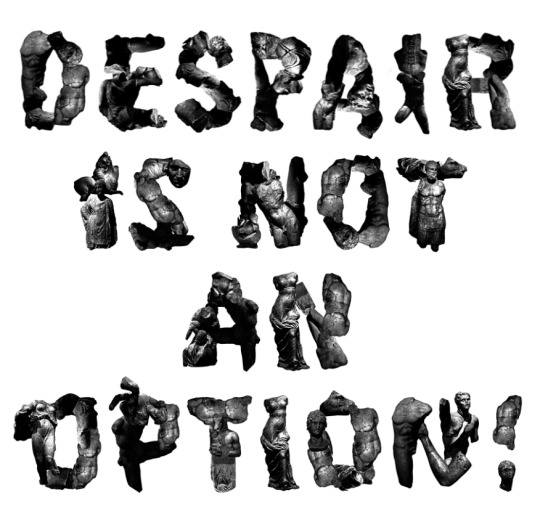
^sculptures collaged into characters.
Not type as image but perhaps an idea for the collage direction:
^squared off collage of text.
^different elements coming together.
0 notes
Text
Inspo on the train (+ eureka moment)
0 notes