
ginevrapasqualefmp
Final Major Project - 'LIFE'
144 posts
Don't wanna be here? Send us removal request.
Last Seen Blogs

ricordatidiresisteresempre
RICORDATI DI RESISTERE SEMPRE🌹

southparkgays-blog
SouthParkGays

iniguweh
:)

kaiokenx10
Honestly
Text
Week 11 reflection
This was my last week on this project. I have finally finished campaign, proposal and everything that needed to be done for next week. This week I have completed my campaign images which helped me so much for the layout on Google Sites. Then also completed my Google Sites which will be public to family and friends to see. And I have also done a research on target audience and why it’s so important for a brand to really consider it when making a product, campaign, look book... Another thing that I have completed is customer profile, I drew the lady on illustrator and then added some details that I thought could work so well with the campaign I have done. I didn’t really have any big problems with week as it was mainly just finishing things off and uploading them onto Google Sites. I didn’t do any artists research this week as I feel like I have done everything and finished it all. Overall I am so happy with how everything turned out as I was a bit stressed about my campaign but I pleased with it all.
Next week I am just going to check if everything is all done and if I am ready to send it all. I will also start to do my evaluation.
0 notes
Text
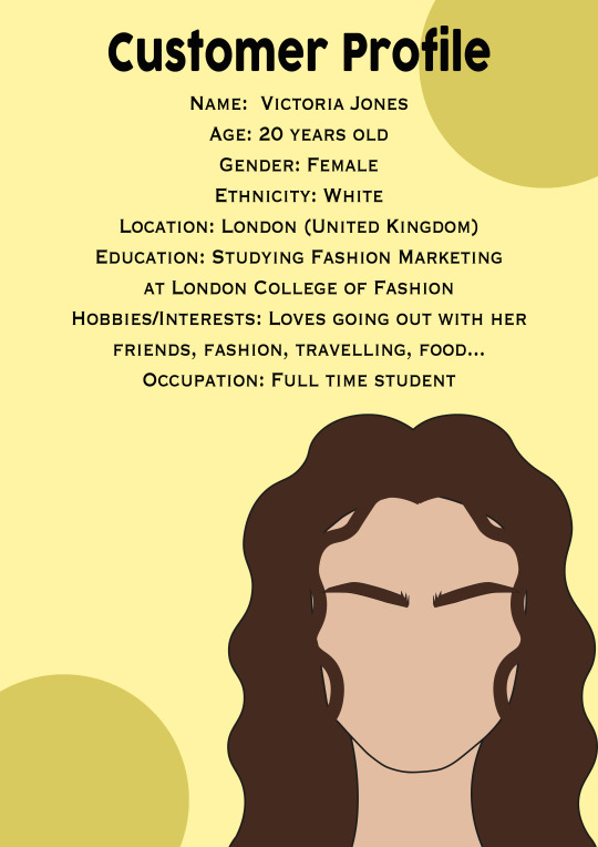
Customer Profile
What is your product / idea within your. project? For example….a magazine, brand, campaign, fashion?
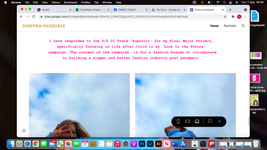
My project was inspired by looking to the future, this is because this past year we’ve all had a really tough with COVID and we are all looking for something better and being able to have our freedom back, I thought of doing this as it’s something that I knew I could have related to and also something that I could have carried on for four months. This is why I thought doing a campaign for it would have been a great idea for this kind of concept, as you see campaigns everywhere so it’s something that would have caught the attention from a bigger audience.
If you don’t have a ‘product’ - who do you think your outcomes would attract?
For my project, I didn’t create a product but a campaign, and as I said above, it would bring the attention of a broader audience, I feel like because I have done mine related to COVID being over and finally being able to have a better future is probably something that everyone wishes for which would bring the attention of more people from different ages. In my customer profile I have put that the girl is 20 years old, this is because I feel like the situation that has been happening as mainly affected our young generation, as we missed a year of education, not being able to see friends and socialise, so I feel it’s also mainly us young ones who are looking for a better future and also being able to carry on with our normal lives without having any restrictions.
Who do you think your target audience may be? This can be a broad statement (for example, young women from the ages of 16-25) Explain why and how this target audience is appropriate?
I feel like the main target audience may be men and women between the age of 16-21. I feel like that’s the most appropriate target audience for my campaign. I feel like also in my campaign it won’t be as specific as it’s more related to who can see themselves in this campaign and the way the feel when they look at it.
0 notes
Text
Target Audience
t’s the first step on the road to building a successful brand. Your choice of target audience will affect everything about your brand, from tone of voice right down to typography and colour choices. Defining the term ‘target audience’ is rather easy, it’s simply the group of people that your brand’s products or services are most likely to appeal to. Putting things into practice and applying understanding of the term to your own brand can often prove rather tricky, though. Identifying a target audience will assist you in pinpointing your brand’s most effective methods of communication. As a result, you can then engage and build relationships with your target audience in the most relevant way.Opting for a target audience of ‘everyone’ is a fairly sure-fire way for your brand to end up on the scrapheap. On the flipside, establishing as deep an understanding as possible of a specific market will help you to understand why people make the choices they do. The knock-on effect of all of this is that it can help you to identify your unique selling point (what gives you the edge over your competitors). Determining your target audience is not just a case of identifying demographic and geographic information such as age, gender and location – you also need to understand people’s interests, values and aspirations (known as psychographics). By the same token, it’s also important to identify what your potential customers don’t like – this helps you to understand which potential pitfalls to avoid.Identifying your target audience is not a case of guesswork – it’s an informed process which will help you to create brand impact and connect with customers. Your brand identity is not for you, it’s for your target audience.
0 notes
Text
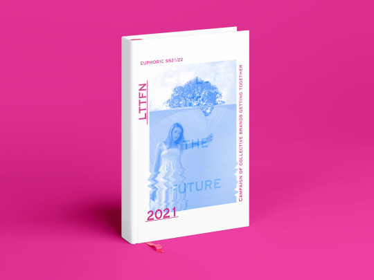
Google Sites
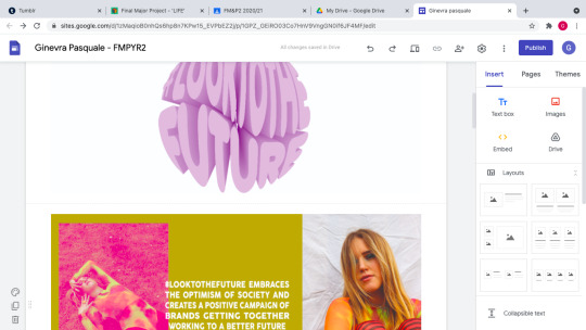
This is my full layout of my final campaign on Google Sites. I am so happy with the outcomes I have created this is because as I said in the previous posts that I was worried that nothing would have looked good all together. To create this I have used the campaign images I have done on Illustrator, those images were such a big help as I basically just had to drop them in and didn’t have to think about the layout and the order as it was all done. I thought using Google Sites was really easy and very forward as to the right there’re ideas on how you could layout your images. Now that I have finally saw the final outcome I can see how it all came out together nicely. Also I added a bit of text after my video explaining what my project is about as this is what the examine, friends and family will see, so I thought it would have been a good idea and a better understanding for who will look at this. Also added some images of Liv at the end as I really liked these two, also because most of my campaign is just edited images so I wanted to keep few normal images just as they were. I am very pleased and happy with how everything has turned out, and looking forward for family and friends to see what I have created.
0 notes
Text
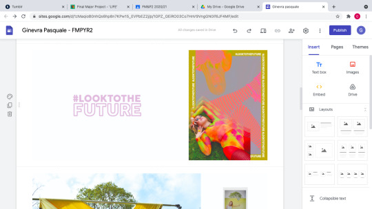
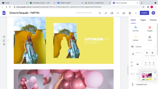
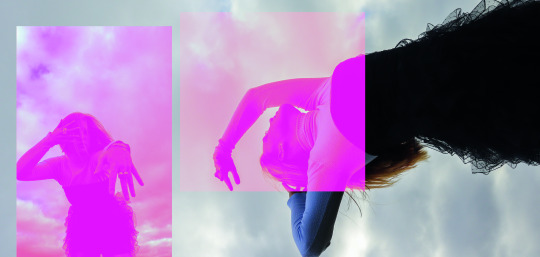
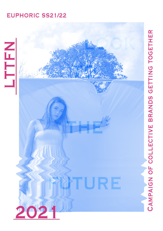
Campaign images
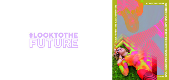

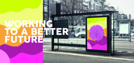
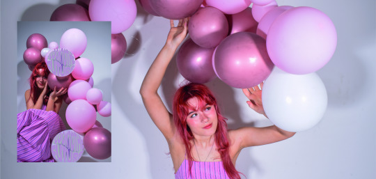
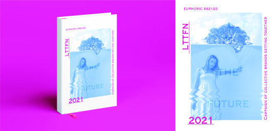
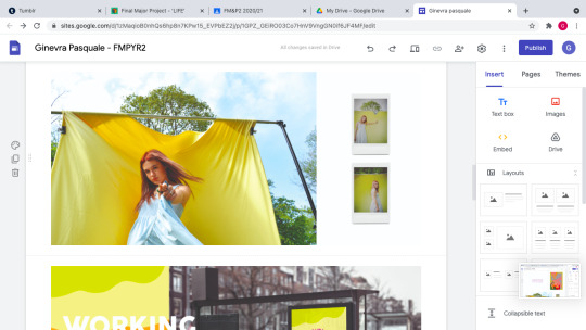
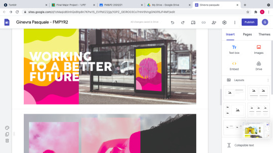
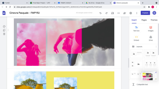
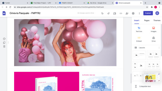
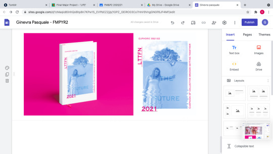
These are the final frames that I have developed with all the posters and images I have been creating in the past weeks. Before creating these frames on Illustrator I was a bit worried about all my outcome I created this is because didn’t feel like they matched really well so I was struggling to think what I could have done or added. I thought it would have been a good idea to open some landscape art-boards where I could have created the way they looked, to fully see how my campaign would have looked on Google Sites. I decided to put my logo as the first page on my campaign this is because the logo I have used is also a slogan as it’s something that the audience would remember easy and also liked and it’s what the full campaign is about. Then for the second frame I have put the poster that I have created and edited and next to it I decided to put an image of Liv which was from the same photoshoot, I really like how that frame looks as it also introduces what the campaign is about. The third one is a very simple poster that I created as to the right I have put the poster I created but because I was working with a weird canvas size, I had all the left side black so I had to put something that would have worked well with the posters before but also with the one on the same page, so I decided to keep the background white and to just simply put my slogan this is because I feel like there was a lot going on already on the actual poster so I just wanted to keep the other side quite clear. Then the fourth frame I decided to put a cute poster that I created with the images from last photoshoot this is so that I could mix it up a little bit and not use just all the images from the same photoshoot, I really like how I have put it there as it also goes very well with the next frame I have done of the ‘bus stop’ mockup, as there’s yellow tones in there as well. Then after that I have put the poster that I created with the images from Liv’s photoshoot, I really like how it goes as there’s a mockup and then after that there’re some beautiful images, I decided to put it horizontal instead of straight this is because I would have had so much blank space but I just wanted the poster to be the main focus on the page. The seventh frame was the collage I have done with the images from last photoshoot, because I had a bit of space to the right I dropped the same colour as the actual poster to use it as a background and then wrote a slogan which linked to the theme of my project. Then the next frame is just a very simple collage that I have done with two of my favourite images that I have taken from the balloons photoshoot. Then last frame is a mockup and then next to it I dropped in the actual graphic edit I have made this is because I liked how it looked so I want people to fully see it. I am actually so much happier with how it looks as now I can really see how it’s gonna look like. The only problem is that Tumblr has changed the colours of my frames and made much brighter but the real tones of them aren’t as bright.
0 notes
Text
Week 10 reflection
This is was the last proper week working onto more outcomes and last photoshoot for my campaign. I feel like this week was more productive then last week as I finally did my last photoshoot and developed few new outcomes that I will use for my campaign. I was really pleased with the outcomes of my photoshoot as I managed to create a really cool poster but I also feel like I could use some images just as they are. I didn’t really have any problems this week in getting my work done as it was mainly just focusing on the last few outcomes before finishing all posters and images I will use for it. The only thing that I was a bit worried about is that all my images and poster that I have created for my campaign wouldn’t match, but next week I am going to focus and work on the laying of the campaign so that I can have a vision of what they could look like put together. I have also continued to research campaigns to see how big and small brands promote their work from looking at their slogan and layout and content.
Next week I am going to finish my campaign by creating some frames where I can see the layout of my posters and images, then I am also going to start working on Google Sites and trying to get it done so that it would all be ready for the following week. Also going to create a customer profile to show what kind of audience will look at my campaign mainly.
0 notes
Video
youtube

Alessandro Michele is revered for his ability to completely immerse onlookers into his world of Gucci, and his latest feat is no exception. The creative director has launched the The Beloved Show, a series of campaigns inspired by late-night talk shows that pays homage to four of the Italian brand's most treasured handbag lines. The six, two-minute videos feature famous Gucci muses like Dakota Johnson, Harry Styles, and Diane Keaton, as well as Sienna Miller, Awkwafina, and tennis champion Serena Williams."We decided to show the concept of 'beloved' in an ironic way in the campaign, being inspired by the fact that bags are the protagonists in my life and in the lives of many other people," Michele said of his thoughtful approach. "We went back in time to the original TV talk shows, where the protagonist is the bag itself, the big star. Very often these creations are named after influential women who conditioned the habits and customs of many." Together, the bag and the talent create "a game of cross-references between the two great protagonists." The bags featured from Gucci's Beloved lines are the Dionysus, GG Marmont, Gucci Horsbit 1955, and the Jackie 1961 silhouette that went viral last year. All were designed during Michele's reign but with a "contemporary approach to archival elements." Part of what makes them so memorable are the distinct house signatures that have become instantly recognisable as Gucci over the years. They're able to transcend seasons and trends, along with the best of the brand's archives."Perhaps (handbags) will always be my greatest love, my favourite accessory," Michele stated. "It was therefore natural for me to call some of the ones I created 'Beloved.' The name comes from my own personal experience and my love for them."
0 notes
Text
Headless Fashion
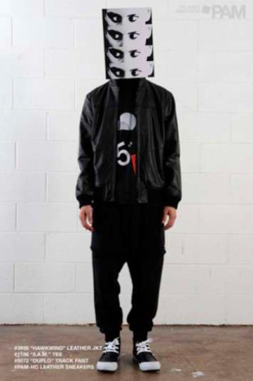
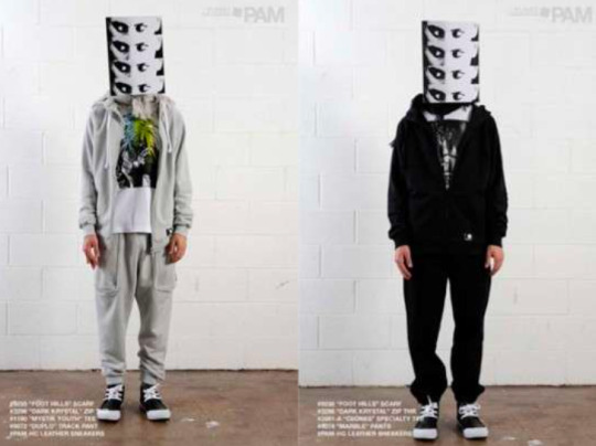
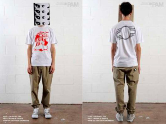
Australian brand PAM recently released their Fall/Winter 2009 look book, and within it are these photos featuring models with optical signage for heads. Personally, I like the whole pop art tilt to the shoot. These details make the books memorable and individual while still presenting the product nicely. Since look books are the first impression most people get of an upcoming line from a clothing company or designer, it is important that not only does the theme of the look book match the clothing, it is also eye-catching enough to attract consumers to the brand. Thus, attention-grabbing, unique and edgy look book designs are necessary to secure the attention of new and repeat customers.
0 notes
Text
Happy Socks’ Fall Campaign

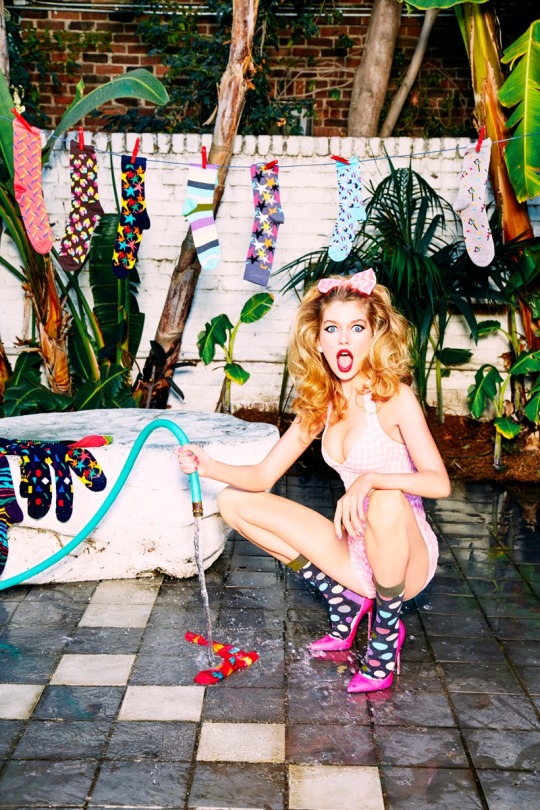
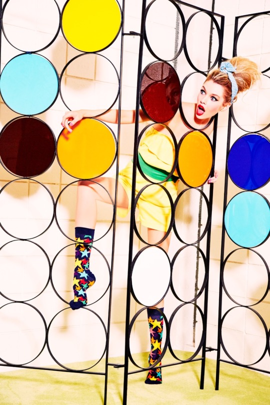
Swedish sock brand Happy Socks has linked up with Ellen von Unwerth for its fall-winter 2016 campaign. The famed photographer captures Stella Maxwell as a 1950’s housewife for the shoot. Complete with a volume-filled hairstyle and red lipstick, the blonde looks pure bombshell with her large collection of socks. The fall campaign spotlights vibrant styles including ‘Big Dot’, ‘Storm��� and ‘Hearts’ prints. In addition to the campaign shoot, Von Unwerth also created a short film for Happy Socks called, ‘The Sock Swipe’. In the clip, a pair of thieves played by Eva Doll and Cody Saintgnue snag the socks much to Stella’s dismay.
0 notes
Text
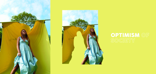
Final poster
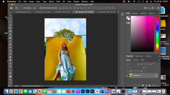
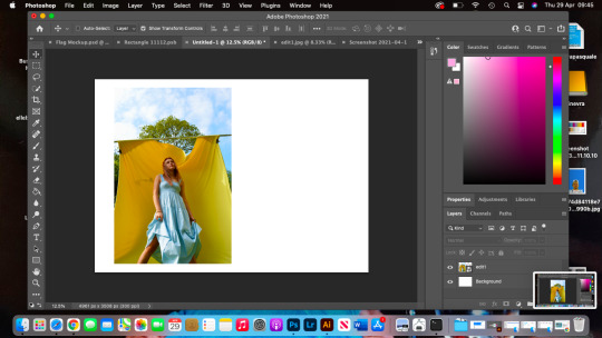
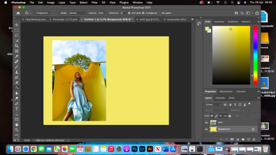
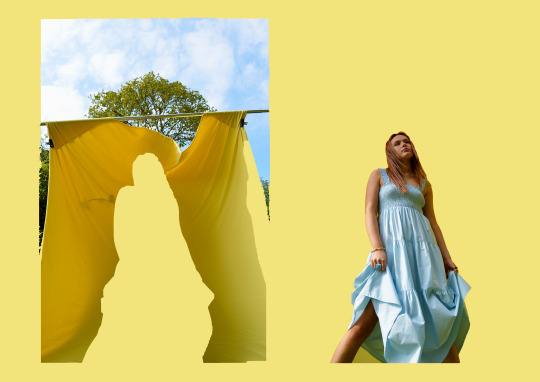
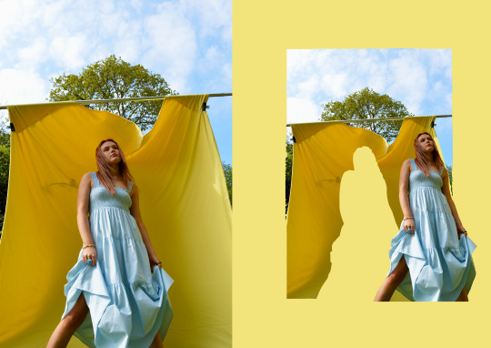
This is last outcome for my campaign. I firstly chose an image that I wanted to use for it, then opened it up on Photoshop, and edited by adjusting the levels and the brightness of the image. Once I was happy with the editing I opened up another A3 canvas on Photoshop, where I could have done my poster. After it opened I then dropped the image I was using like shown on the second screenshot above. I put the image to one corner as I wanted to recreate something similar to the poster I got inspired by. I also dropped my colour palette as I wanted to use the same tones as my entire campaign, so that all the colours I have been using throughout will match really well. I chose the yellow colour from it as I liked the way it looked with the blue dress and how it matched the bed sheet that I used as a background, because the yellow colour I chose from my palette was very bright I chose to tone it down a little bit, more to a pastel yellow, which I much preferred. To cut the image I used the ‘Lasso tool’ it was a bit hard as my model Elle was holding her dress which made it a bit difficult to cut it, once I cut it and moved it to the other side I then adjusted it by using the ‘Eraser tool’, like shown on the fifth screenshot, where I adjusted the image so that the hole would have looked more like Elle then a harsh shape. The last image is my final poster that I did, I then decided at the end to put the original image this is because I feel like the image was so pretty that cutting it out would have ruin it the image, so to the left I decided to put the actual image and to the right I put the edited one, which I much prefer the way it looks.
0 notes
Text
Poster example
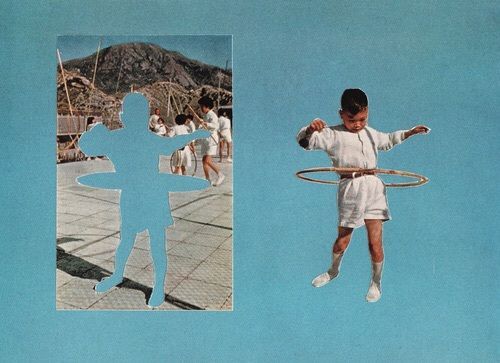
This is a poster example that I have found on Pinterest as well, because I am on my last week working on my final posters, I thought this one would have looked cute in my campaign by using my own images and my colour palette. I have never done a poster like this before in any of my projects, but to create it I am just gonna use the skills I have learnt in these two years of this course. It also looks pretty forward to create it. I feel like this one is gonna be the last poster that I will make for my campaign. Also I will create this poster on Photoshop. I will use the images I have taken this week as I have already used my best outcomes with all the other images.
0 notes
Text
Final poster
This is the final poster that I have created by being inspired from the Pinterest examples I have found. Firstly I chosen an Image I wanted to use. I chose this image above of Elle because I thought that when I was gonna use the Liquify tool it would have looked cool to do it on the dress as she was standing still when that image was taken. After I chose the image I dropped it onto an A3 canvas and then made the image just a bit smaller so that I could have the corners to write stuff on it, once I was happy with the size I then changed the colour of the image, to do so I just used the saturation and the levels of the image. After I chose the right tones for it I then used the liquify tool to create a blurry effect, I really like the way it came out this is because it’s not too harsh on the image. I also added some typography, I chose a very clear and simple font as I always prefer them much more than having too much going on, and also chose a pink from the colour palette that I have done. After I was really happy with the way it looked I went on Freemockupworld to use if I could have found a magazine front page mockup so that I could have used it for my campaign, unfortunately it didn’t let me download the magazine one so I chose this one as I liked the angle of the mockup, once I downloaded I opened it up on Photoshop and dropped my poster in it. Last thing I did do was to change the background to a lighter pink so that it would have looked good with my campaign.
0 notes
Text
Poster examples

These are some posters examples that I have found on Pinterest. I feel like this is gonna be my last week making posters for my campaign so I definitely would like to create some posters that I will definitely end up using in my campaign as these images above are some ideas of what I could do for it. I would definitely like to recreate something similar like the first and second poster above. As I could use one of the images I have taken from this weeks photoshoot and I could edit the colour of the image and then use the liquify tool to create a similar effect to the second poster. Three of these posters are into a mockup, because I haven’t done so many for my campaign I could do the same thing by putting the poster that I will create into a magazine front page mockup. I will use colour tones that also match my entire campaign as I don’t want to create a poster that won’t match any of my other colours, so while making it I will have my colour palette right next to it. I am looking forward to create this poster as once I will be done with it I can start to finalise my campaign and get it all organised.
0 notes
Text
Edited outcomes
These photos above were my favourite outcomes from this last photoshoot. To edit them I have used Photoshoot, this is because I am having some problems with Lightroom which doesn’t let me use it. When I edit my photos I always use Lightroom as I much prefer it but I tried my best to get really good edited outcomes from Photoshop. My favourite images out of all of these are the second and fourth ones, this is because I really liked the angle from where I was taking the photos. I definitely feel like these images will work really well with my campaign but I will also create some cool edits so that I will be able to see what works better for my campaign.
0 notes
Text
Behind the scene content
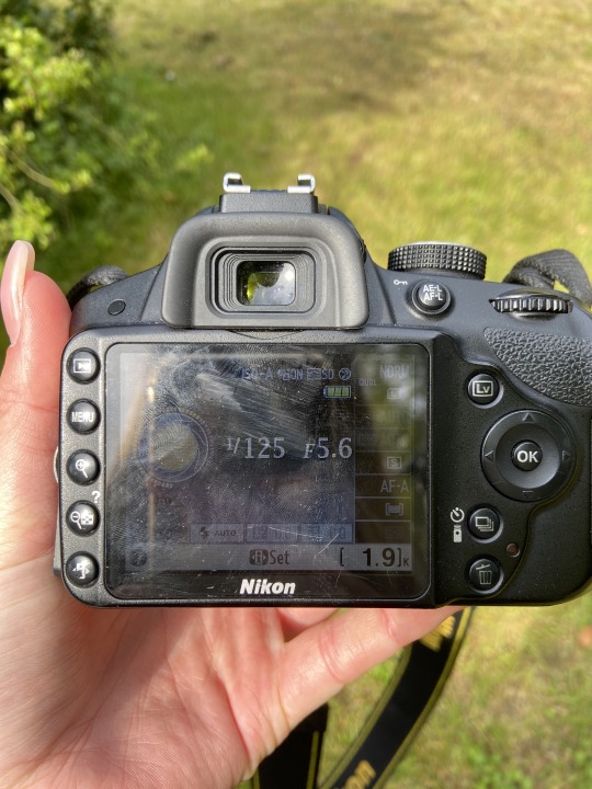
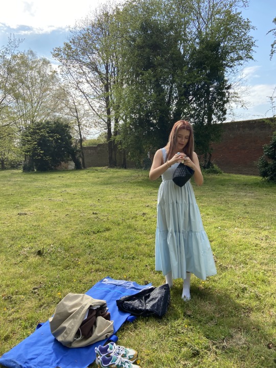
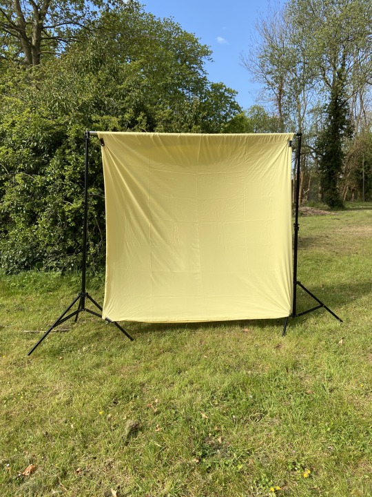
These are few photos from behind the scenes. I always take photos before doing my photoshoot, so that I can show how I set it all up. The first image is a photo that I have taken of the camera settings, I mainly used the manual mode so that I could have changed the settings each time it I wasn’t too happy with the lightening. The second image is a photo that I have just taken to show the field I was using and also the dress Elle was wearing for it. The field I was using wasn’t really big but I really liked where I set up my back drop as It looked really cool with the bush behind it. The only thing that I had to be careful of was the wall at the back as I personally didn’t really want it in my photos so I had to work well with the angles from where I was taking my photos. Another problem I had to resolve was the back drop this is because it was very windy so every minute it would full down, so I had to look for a rock or something to put on it so that it wouldn’t constantly full down.
0 notes
Text
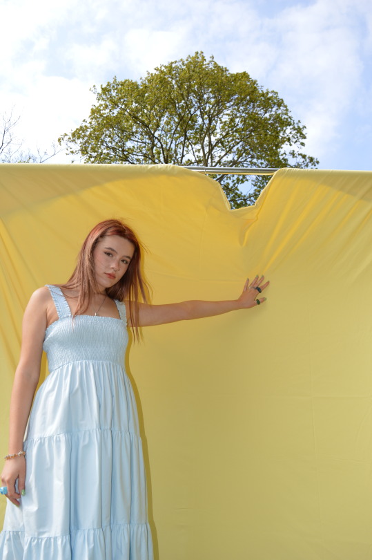
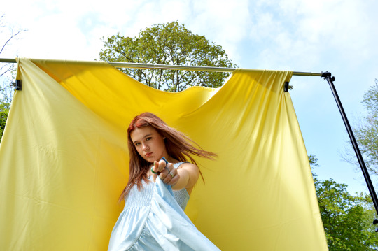
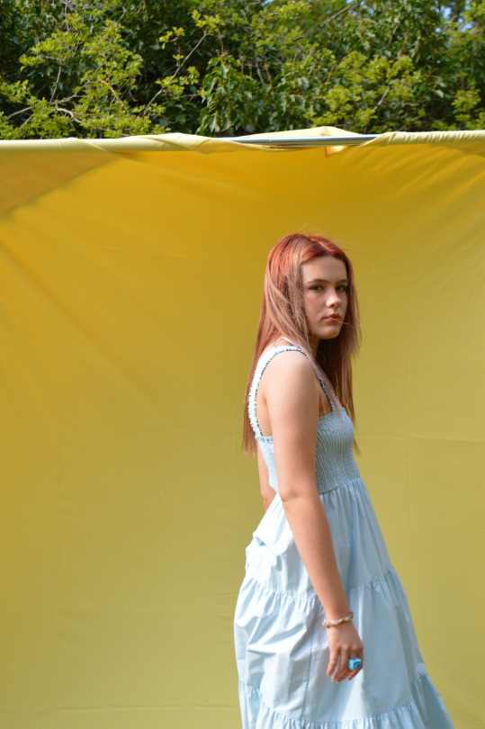
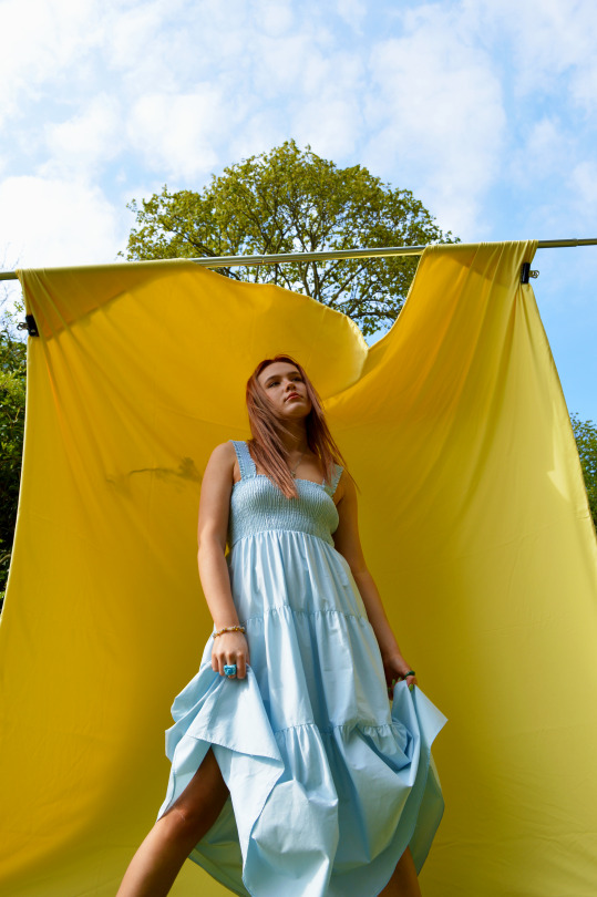
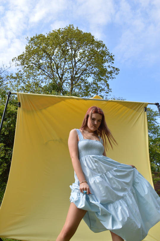
Contact sheets
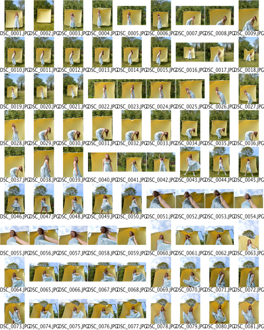
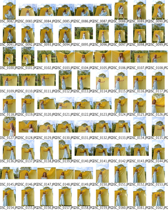
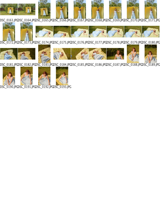
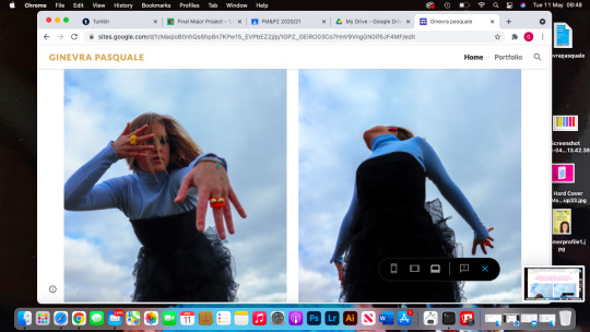
These are all the contact sheets with all the images I have taken from this photoshoot. To take my photos I went to a field near college, luckily it was a bit sunny as well which was nice as I managed to get some bright sunny images. The reason why I also preferred doing this photoshoot outdoor it’s because it could also reflect to the sense of being able to go out for a walk without any restrictions, being able to be free. It was a bit windy but I kind of liked it because the bed sheets were moving which created a sense of freedom. I styled my model with this long dress as I thought it would have looked so cute with the bed sheet as well, also because I feel like it worked better with a long one than a short one, and the images I was inspired by all the models were wearing long dresses. I asked my model Elle to move around while posing as I wanted to take photos of her constantly moving around and creating very simple poses. As I said earlier I was quite lucky to have a bit of sun as the lighting of the photos worked so much better and also really liked how I took photos from below where you can see the blue sky. I will be editing my favourite images on Illustrator like I usually do so that I can edit them and finish my campaign.
0 notes
Text
Photoshoot plan
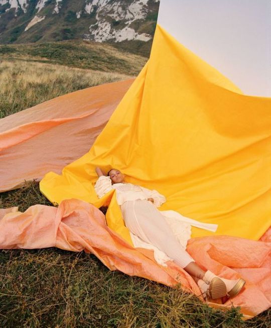
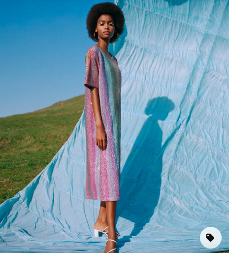
This is my last photoshoot that I will be doing for this project. I saved those images on my Pinterest board a while ago as I really liked the contrast between the bright colours and also really liked how in those photos you can actually see the background and not trying to use it as a background. I am going to take this photoshoot at college so that I will be able to use the background but the photoshoot will be location as I feel like it would look so much better in a field than a studio, it wouldn’t have the same effect. I am going to bring with me my pastel yellow bed sheets as I want the colours to contrast like those images above, and then I am gonna get my model Elle to wear a long baby blue dress, I feel like it would also work really well with the trend chosen at the start of this project Euphoric, as the colour palette is very bright and happy colours. I am actually looking forward to this last photoshoot as I feel like it’s gonna work really well with my campaign.
0 notes