Last Seen Blogs
planet-sexi
Heaven On Earth
🥛🍯

ghost-orion
teef dog

wei-of-li
Wei's art pile

callunavulgaris
Calluna Vulgaris Art

mc0-0world
mc LOVIN
Text
Visual Culture and Language
50 Indredients of You
5 favourite items of clothing
Camping Jumper
bhudda Pants
Bali tank top
Purple Asos shirt
big Grey Hoodie
5 favourite meals/food/flavours
Crisps (addict)
Long Stem Broccoli
Cheese (all)
Ice Cream
Coffee
5 favourite journeys you've been on
Train from Bangkok too kanchanaburi
Trekking Snowdonia
The drive from Sanur up too the jatiluwih rice feilds (So many Greens)
The boat Trip too Menjangan Island Snorkling Seeing sea turtles
the boat trip too Gili Air
5 favourite places spaces you've been too
Ubud Rice fields
Ubud Monkey Forest
Erawan Waterfalls (Thailand)
Snowdon Summit
Gilli air sunset
5 Favourite words you love
Brillio-Pants
Coolio
DHALINNNNNG
Lovely
Amazing
Favourite Animals
Dogs
Monkeys
Tortoise
Geckos
Chameleons
5 smells you love
Morning Coffee
Sunday Roast
Jean Paul Gautier
Clean Car
Summer
5 favourite technologies you use
Chromecast
Mobile phone
Laptop
Digital Camera
Flat screen TV
5 favourite Games/Movies
Game Of Thrones
Vikings
Rick and Morty
Planet Earth
Narcos
5 favourite songs muscians
Agnes Obel
Florence and the machine
Heartless bastards
Alabama Shakes
The Cat Empire
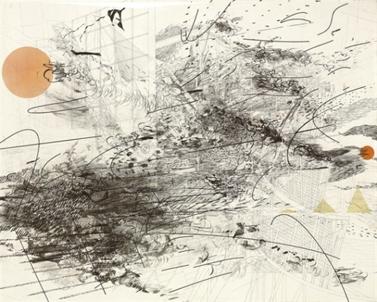
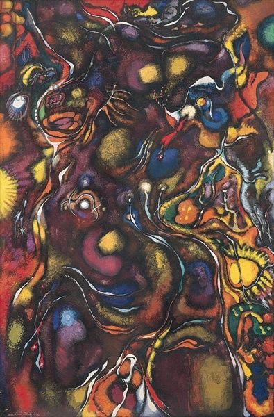
Julie Mehretu
Dimensions - 123.2x153.7 cms
Mehretu’s Art inspirations for this piece comes from geometric architectural forms she uses these as a structural grounding as a starting point too most of her works, She then uses a range of different forms of acrylic paint, pen and pencil to layer and overlap and blend the painting together.
The piece itself is a myriad of different textures, the frenetic mark making and smudging and layering of different forms and the use of broken linear curves and lines give the painting depth and a sense of urgency.
My perception of this work is an abstract representation of an urban environment that collides with busy social urgency we all experience in day to day living.
This is shown by the architectural shapes on the background which signifies Urban structures and the mark making expresses emotions of urgency, I like freedom she portrays and the blending of different formations and the layering techniques used.
Picasso - Bull (Le Taureau) 1945
Dimensions compositions -12 3/16 x 18 7/16" (31 x 46.8 cm); sheet: 13 1/16 x 19 7/16" (33.2 x 49.3 cm)
Picasso’s Bulls is a series of 11 lithograph drawings he created in 1945, these bulls are famously depict the bull in various stages of abstraction.
Picasso takes us on journey through the different forms of the animal he has created, We see the animal as realistic flesh and bone to the transformation of abstract form too the simplicity of linear drawing essentially Picasso is trying too find the essence of the bulls spirit.
Playing around with the natural contours of the bulls shape he dissects the animal into different geometrical patterns and carves the bull up similar to cuts of meat.
He reduces the shape of the head and re-arranges the whole composition of the bull playing around with texture and bold use of black and white, He can accentuate and erase different areas of the bull so he can try and find the true spirit of this animal.
Picasso’s use of different compositions in these lithographs are a wonderful journey through his developmental insights, we see the true form at the end which is the simple outline of the bull.

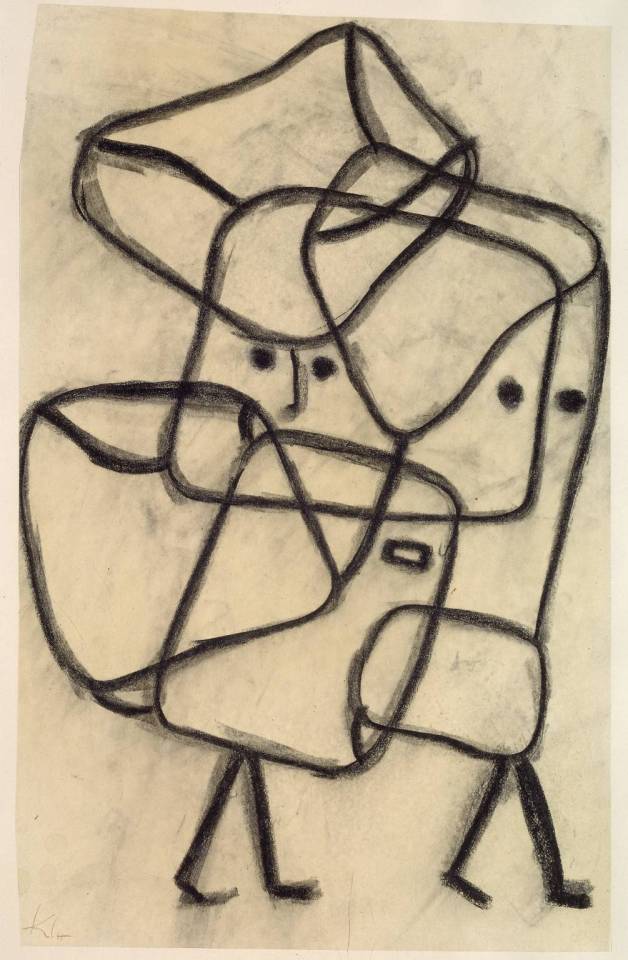
Paul Klee 1879 - 1940
Burdened Children-1930
Senecio - 1922
Paul Klee was a Swiss born artist and was from a family of creatives, He always had a keen interest for music and the visual arts but it was not until he started at The Academy of Fine Arts in Munich under Franz Von Stuck There he met other influential artists such a Wassily Kandinsky and Franz Marc and other expressionist artists.
His earlier works were always in black and white until he took a trip to Tunisia and was inspired by the landscape and light, This was inspiration into colour theory! he studied this subject and became a master of colour which led him too create the infamous works we see today.
His most popular works are heavily inspired by Surrealism, Expressionism and Cubism, His use of colour, texture and Geometric formations are visually exciting because of his abstract representations of urban scenes and people.
The knowledge of colour theory that he puts into practice is represented in emotions, He uses warm colours such as yellow,orange and red because classically they represent fun excitement and happiness!.
Cooler colours and hues such as blue purple and green represent calming emotions almost sadness loss and regret, which makes sense as Klee has experienced those with War after loosing close friends.
Klee’s use of lines in ‘Burdened Children’ are cleverly formed as we can get a sense of the emotion of heaviness and weight, Different lines depict a range of emotions, A slight curved line means a glimpse of happiness, a rectangle box means disappointment and a half oval at the bottom means anger there are a wide range of emotions being expressed in this particular piece.
Klees’s work is sometimes described as a fairytale and the compositions can look very Juvenile but i think this is an unfair evaluation his works have a lot more emotion than meets the eye.

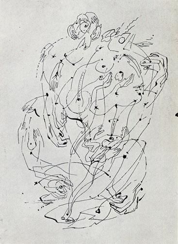
Andre Masson 1897-1987
Andre Masson is a French surrealist painter who was distinctly famous for ‘Automatic Drawing’ this was a practice where there was no preconceived subject or composition.
He let the pen travel across the paper without conscious control too reveal the images of broken human forms and a myriad of different textures and freehand pen strokes.
He also explored themes of nature and transformation! he created Colourful forms of abstract landscape scenes which the viewer was drawn into inexplicably.
He was emotionally scarred from the war and this is reflected in his works as they mainly focused on violence, pain,
The use of line in Masson’s work is a very noticable medium for him, visible jutting,slashing cuts are fast movements, his works are a jumbled melded realm of animals, humans and the taboo.
This raw unconscious creativity led too the bridge of abstract expressionism and surrealism, He encouraged a new wave of artists too adopt a new form of freedom and initiative! in there work.
His works are inspiring as they allow for anything too happen I love the use of raw creativity and a ‘no boundaries’ approach the use of melding different images and form together excites me, Its something i can relate too in future art works of mine.
0 notes
Text
Multimedia Principles
This is my ‘Elf yourself’ video its an interactive platform where you can upload photos of yourself and friends and that gets uploaded onto dancing elfs, its quite funny and hugely entertaining!
Consistency of the video is entertaining and keeps the viewer drawn in and has high learn ability good layout and bold typefaces, too explain different equivalents. the elf making experience is easy and once you have figured out how too upload one elf you can repeat process quite easily.
Perceptability is wonderfully easy i found the interface very indictive in what too do next and how too create your video this is done by the blank faces on the elfs indicating you too upload faces too the elfs. drop shadows on the buttons also indicate that you click too go onto the next stage.
Learnability the same process of uploading the face of the elf takes you back too the home screen so you instinctively know too repeat the process. also scaling with pinch and zoom uses familiar design aspects so you know how too use the interface.
Predictability The animation lets dance!
Feedback The loading bar could have an apologetic message an acknowledgement for taking to long too upload!
My 60 Second Doc
youtube
SCRIPT for 60 sec doc.
“Testicles, Balls! ,Nuts! , Nards!, Nads!, Walnuts! whatever you decide too name them, You’re about to discover the single most important fact about testicular cancer that you (probably) didn’t know.
“Testicular cancer is the most common cancer of 25 to 49-year-old men but it happens to younger and older guys too. If you’re male and aged 15+, a simple monthly ball-check will give you the best chance of beating the disease should it ever happen to you.
“Today’s Lesson will be an instructional video on how too perform a check that may safe your life gents! Here’s How:
The best time too check is after a shower, this is because the scrotal skin is relaxed and will be easier too show abnormalities.
“Place your index finger on the bottom and your thumb on top, (like this) then gently roll between your thumb and your finger (this can be done simultaneously) you should not feel any pain whilst doing this.
“on the back of each testicle there is soft tube like structure, this is called the Epididymis and its the carrier of your sperm! so don’t freak out this is perfectly normal.”
Things too look out for whilst examining are small lumps and bumps heaviness and any other irregularities, these are usually a size of a pea of a gran of rice!
if you notice one ball bigger than the other or one hangs lower this is absolutely fine also and nothing too worry about
key thing too remember
Check yourselves monthly this is too familiarise yourself so you know if there is actually any abnormalities
And please remember guys don’t be lazy and don’t be shy about this, cause cancer does not discriminate! so show this too your Father, Uncle, Brother, or freind!
For more information please go to http://itsinthebag.org.uk and thanks for watching!
Final Idea!
My final Idea for my video, is too do a 60 second informative video on how too check for Testicular Cancer, I want too make it a fun and cheeky video using baloons and water this is how i was thinking of demonstrating how too check.
The audience for the videos will be aimed at men, so it will need too have a tongue and cheek almost semi-serious feel and i will be using female actresses too get my point across effectively.
here a few examples of how i want my documentary to be
https://youtu.be/YYjmY9rX164
https://youtu.be/NgNKisQLC-U
The video needs too whimsical and comical but also getting the point accross in a factual way!
Ideas for 60 Second Documentary
Stupid Things People Say too Hairdressers.
My first idea is to make a Comical documentary on all the stupid questions i have been asked in the chair by clients. I've always thought this would be a popular video and entertaining and relate able for both the stylist and customer, The video will be starring me (of course) as the hairdresser and will be filmed with a comical tone,
featuring six questions with whimsical music the clients will be played by my good friends and work colleagues and fellow stylists Jo and Jaz,
The film will take place in the Salon Mack-Daddy's on a Sunday so logistically it will be no bother and we will have plenty of space and time too work through any technical issues with no time pressure.
The lighter Side too Marijuana.
I've always thought it would be a good video too show the lighter side of weed breaking the stigma of ‘Gateway Drug’ Stigma, I will make a short documentary showing young professionals who hold down careers and use weed as a relaxant at the end of a hard day.
Im not expecting this too be too hard too film as it will be filming in peoples houses etc, im expecting it hard too find a health professional too talk candidly about the many mental health benefits of this plant.
Exploring the reasons why society still demonises this plant that could be used for many health benefits! There will be a mixture of interviews and factual medicinal information that will ask the question why we have such a silence on this subject! #ITSTIMETOOTALKABOUTMARY-J
How too deal with Insomnia
Inspired by my poor Flatmate Qamar and his on-going struggle with insomnia, I will be following the day in the life of an insomniac, I would like to do a personal account of the internal struggle from dawn till dusk and it will have Qam talking and explaining how he feels from start too finish he will give an honest account about how he deals with coping with 4 hours of solid sleep a night.`
I dont have trouble with sleeping so it will give me a chance too be empathetic too Qams and others terrible terrible Plight, I would like too use a mixture of candid interviews and personal video diaries that Qam will film the cut them together too give a poignant view of insomnia.
0 notes
Text
GDMM106 Developing Graphic Concepts
This is my research report into book production methods, I will be exploring different binding techniques and materials used as well as investigating different print processes.
A brief history of books!
Books communicate an idea, Document a process or record historic moments throughout time, they have been used as an instrumental recording practice across all forms of each great civilisation known too man, different types of cultures such as religion, science and all manner of making practices have been recorded to quench the thirst for information!
The first materials for written documentation were beech, Bark and Bamboo it was not until the Mesopotamian culture used cuneiform tablets that were made from clay.
In Ancient Egypt they recorded written documentation on scrolls that were made from the Paryus Plant, these scrolls could be anything up too 14-52 feet in length and were clunky as you needed to hands too read them, also the longevity of these scrolls would crack and disintegrate.
The Romans created the Codex, This was the first recognisable book form as this had covers made from wood which protected the precious pages inside.
Pages made from animal skin (Vellum) was durable and lasted a long time, the codex was the first to contain an index of contents.
The first form of print was invented by the Chinese, all books since then had been hand written this was a laborious task which took time.
The Diamond Sita was a book that was printed using individual letters and shapes made out clay blocks this was revolutionary as you could save time by re arranging the letters, However the clay moulds began too crumble over time.
Koreans used bronze moulds which was a sturdier material
The Gutenberg Printing Press which was invented by Johannes Gutenberg in 1460 was a methodical printing press which gave mass communication to everyone, Before books had been an expensive luxury only for the rich but with the printing press literacy began to flourish and reference books like dictionaries became popular.
Pamphlets became popular and allowed people too share and talk about new ideas these also paved the way for newspapers and magazines!
Modern Printing opened the world up even more too affordable books as some books were still sewn together in binderies which the revolution of glued binding and with Penguin publishing selling there first Paperback in the 1930′s this was dispatched and sold in busy transport hubs for the same price as a pack of ciggarettes!
The Evolution Of Book Cover Design
Medieval manuscripts are one of the first book cover designs we see, These manuscripts are usually heavily decorated with Gold and Silver usually encrusted with jewels.
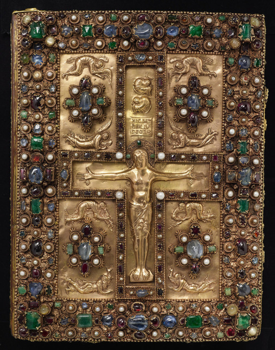
Front cover, Lindau Gospels, c. 875.
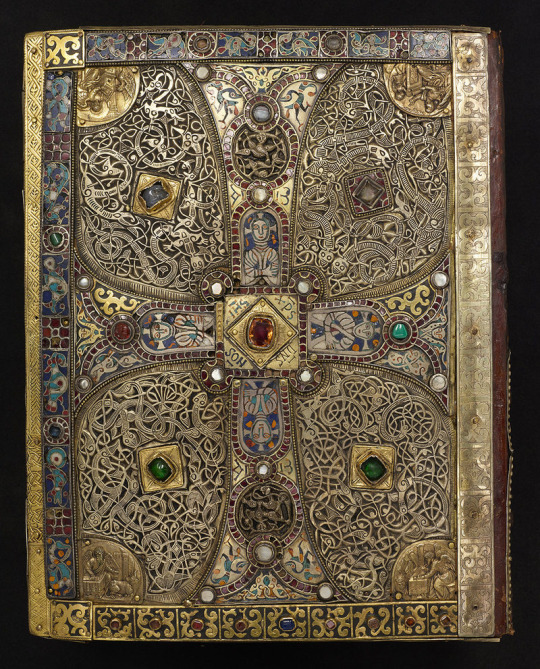
Back cover, Lindau Gospels, c. late eighth century.
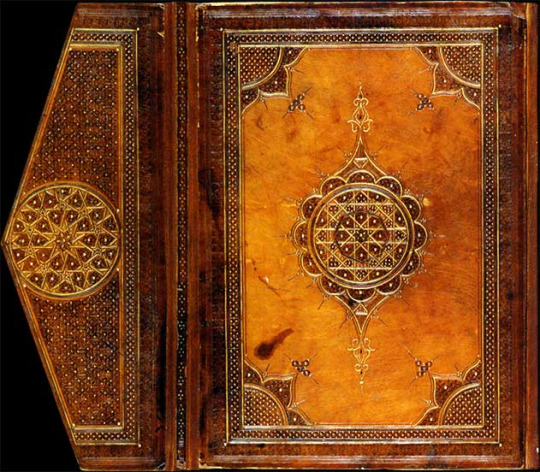
The Mamluk binding, commissioned by the Amir, Aytmish Al-Bajasi in Cairo in the eighth century, Front Cover on the Quran with intricate Geometric shapes embossed with gold
For hundreds of years these covers served as protection for the pages and are an expensive mark of respect for the cultural authority they represent.
It was not until the 1820′s that book cover design was seen as something to represent the text of the book, this was made easier by the mechanical revolution of steam powered printing which made books more affordable thus being able too experiment with applying techniques of colour Lithography and half tone illustration processes.
19th century Poster-Artists started too infiltrate book design as did the professional practice of graphic design, Book covers became something more than just protection for pages it was seen as a necessary advertisement for communicating the idea of the book.
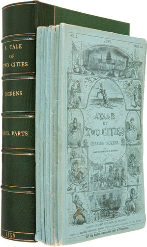
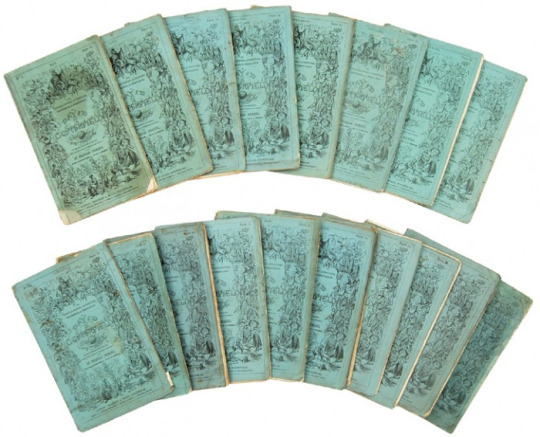
This is seen in Charles Dickens monthly editions of literature that were printed and distributed in a serialised form of twenty monthly issues, These little notable green sleeved front covers with hand drawn illustrations where made available so that the middle class could acquire these editions and spread the cost instead of purchasing the full edition.
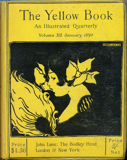
Another series of books that started too influence the necessity of book cover design was the ‘The Yellow Book’ which was published in April 1894, The striking cover illustrated by Aubrey Beardsley featured some of his recognisable and distinctive style of form and flattened perspective this coupled with his bold use of black space with yellow was a striking and noticeable.
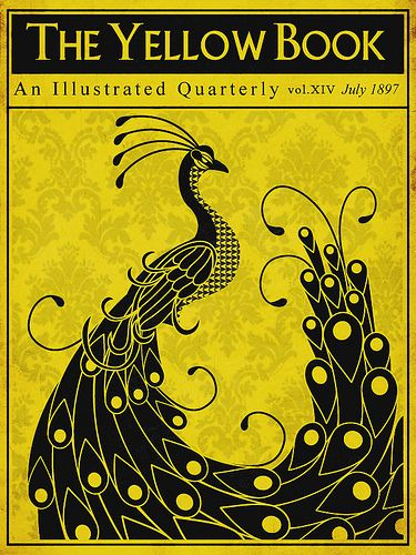
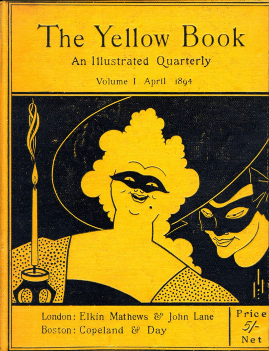

Sadly for the time these covers were not received well as The Times commented 'repulsiveness and insolence' of the first cover and went on to describe it as 'a combination of English rowdyism and French lubricity'
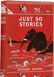
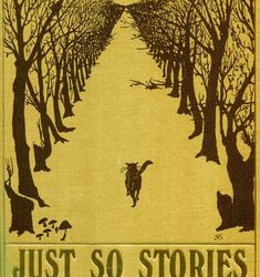
in 1902 book covers made there way into children's fiction as seen in Mr Kipling's Just So Stories
In 1911 There became a new commercial turn! Publishers became convinced that the jacket was every bit as important too advertise the book, as one publisher said "convinced that a book, like a woman, is none the worse, but rather the better, for having a good dressmaker”
This was the beginning of commercial illustrations being used too explain the contents of the book, In the 1920′s advertising and packaging design became prominent due too the economic boom in the US and with the rise of new artists this made the commercial art possible.
Publishers started taking the reigns on cover design with little or no reference too the author, In some rare cases illustrations from Authors did make there way onto the market authors like J.R.R Tolkien The Hobbit was a stylised illustration with runic type suited this other worldly book that Tolkien designed himself.
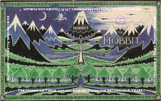
This simple illustration perfectly reflects the immense journey that is ahead with all the while drawing your attention too ‘The Lonely Mountain’ in the middle
this is also seen in other cases in ‘To the Lighthouse’ by Virginia Woolf this cover was designed by her sister Vanessa Bell
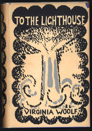
This Archetypal Column of light with the waves crashing around it is a window into the book playing on the different perspectives of the themes
The next big thing was the colour coded book designs that penguin issued in 1935, These paperback books where an instant hit as Penguin had established simple system for different genres orange for fiction blue for biography green for crime, these little books opened up literature for people of all classes and were sold at many busy transport links around the country.
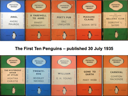
By today's standards these cover designs look very austere and quite boring simple typography with soft engravings clearly show the attitude of irrelevance too illustrative book design, This could also be due too the fact that British audiences were not used too such invasive advertising
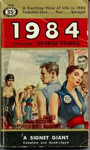
1984 by George Orwell (American edition)
Here we see a prime example of 1984 by George Orwell this was the American version that was published, We see the cover has been over sexualised and is mis leading the representation of the book.
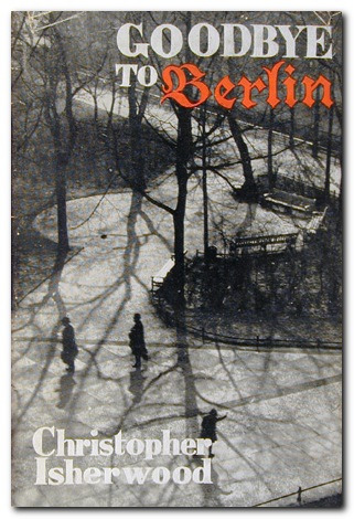
In 1939 Christopher Isherwoods - Goodbye To Berlin featured a Photograph of a Berlin park from above, This was encapsulating the narrative ‘I am a Camera’
By the 1960′s Photography was a widespread practice in cover design, Alan Aldridge cover design was always tasteful photos of womens torso’s disapearing into shadow was always sexy but restrained.
his works generally were always used for exploring the narratives for sexual passions.
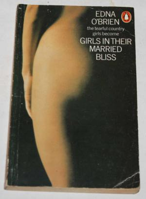
The cover for ‘Girls in their married bliss’ Published by Hogarth Press
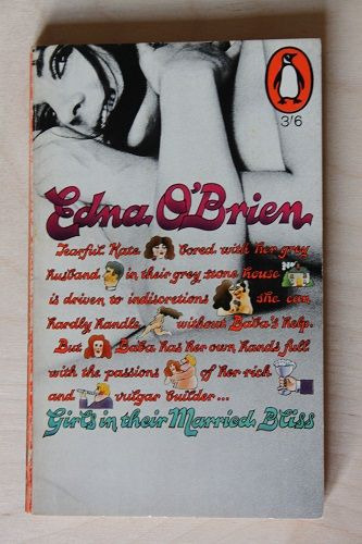
Alan Aldridge decided to poke fun at Penguins distaste for illustrative and also photographic design by placing the penguin logo too the right as if showing embarrassment of the nubile young woman.
5 notes
·
View notes
Text
Zine Research
This part of the blog will focus on a collation of research and evidence about Zines, A zine is a publication or an expression of issues that are personal too the creator, Zines can vary between info-graphical content Illustrating a story or instructions they can have a political and revolutionary context which is where these publications originally were born.
Zines tend too be non-profit and non-conformist selling very strong ideas, Because of the very nature of these ideas they do not tend too be publicised in mainstream shops and newsagents, Popular in 1970′s punk culture the zine was a great way too get information out that was being ignored by the mainstream media of that time.
Normally a zine has a very DIY approach, cutting different texts and pictures out of books and magazines too create the master copy. The master is then photo-copied and stapled together ready for distribution!
However with recent technological developments zines have been under threat from becoming an obsolete form of communication, But it seems that in recent years a resurgence for a more digitalised approach is underway and Zines are back as a modern art form.
Jennifer Lo is a Bristol based photographer who has combined her skills too create annual themed zines of dishevelled bedspreads, This for me is quite an abstract medium too create a Zine.
But looking through her online presence i realised that her work is an intimate representation of relationships and personal life, Opening that up too the online community so that other artists can get involved in Bedspreadzine is a wonderful way too show that everybody is sharing the same experiences all over the world.
However as much as i like the intimacy of relationships and the raw photos of personal spaces, Jennifers work will not reflect how my Zines will develop.
ZINE PROPOSAL
My Zine will focus on the hairdressing industry from my experiences starting from when i was an apprentice all the way to when I qualified as an industry professional, The zine is comprised of real life quotes from both clients and colleagues that express the shocking comical conversations from my own perspective but also poking fun at the ridiculous megalomania and ego of industry professionals that i have experienced over the years.
The composition and layout of the zine will be split into each salon but will be told like a story and will have colours and themes too reflect how that particular place made me feel, The illustrations will be hand drawn then rendered in photoshop as a montage but will also incorporate hand designed typography which will be apart of the illustrations as a whole.
The Zine will be called ‘Splitting Hairs’ a pun where people are making unnecessary issues between details that are so small its not important, This I feel will work well as the zine will be focused around un-important conversations and experiences in my Zine.
My intention is to create a comical light-hearted Zine that will read like a juicy gossip magazine with good visual representations that will tie in nicely with my theme, But I want to emphasise the underlying tone of how salons can be hard place too get along with colleagues due to ego and how people can be terribly two faced and will stop at nothing too get ahead.


Will Barras is another Bristol based artist i have stumbled across his style of work is layered montages that are visually intriguing and wonderfully colourful, Barras has been collating work over a 25 year period and puts Individual pieces of art into a storyboard context, The inspiration for these canvases are usually suburban environments intertwined with British landscapes.
Usually the backdrop for these is watered down acrylics that Barras lets bleed into each other or sometimes flicking paint onto canvas too create the most explosive burst of colour, After creating a library of these simple formations he then Digitally works in other layers of work together.
The combination of digital silhouettes and Hand drawn fine linear detailing is a brilliant layering technique as i feel it draws the viewer into different parts of the painting, This creates depth and emotion and takes you on a journey.
Visually his work is an exciting explosion of colour and form mixed with fine intricate details of a busy suburban environment. I Cant stop observing these paintings i feel this style is something i could see in a Zine, it has the colour too draw your gaze, It has the detail too hold your attention and the story too keep you entertained! this is something i really Love and that i can draw a lot of inspiration from.


Jamie Kirk is an illustrator, I first came across his work in Creative Review he collaborated with other artists to make a colouring zine which combines a clever use of illustrations and typography too visually describe the feelings and emotions of mental self-doubt.


The use of type and imagery is really profound combination of work, Cleverly illustrating the weight of emotions we all feel and hide day too day, These works also make us empathetic too people who are struggling with mental issues giving us insights in how too treat people who are going through these feelings.
His Typography works are big Decorative Scripts that are beautifully composed into the feelings of the word that are being expressed, the colours used are bold but are brought too life by off-beat shapes and odd forms!
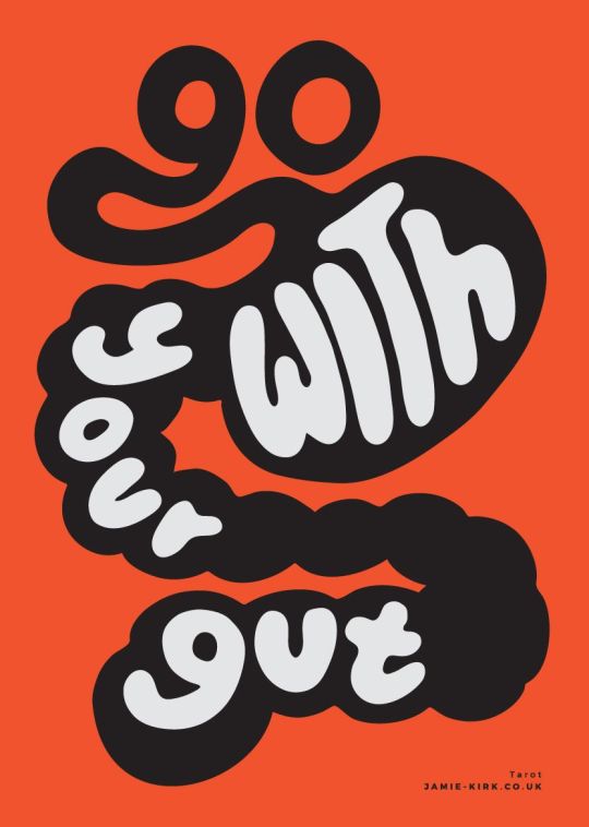

These will be an influencing factor in my typography designs I love the way they can playfully inform and illustrate at the same time!
Roy Lichtenstein
Roy Litchenstein was an american pop artist through the 1960′s along with recognisable artists of that era Andy Warhol, Jasper Johns, and James Rosenquist he was a leading figure in the new art movement!
The comic book strip style industrial paintings were blown up too huge size for better impact, this work defined the premise of pop art through parody. often in a tongue and cheek manner his most famous works are Whaam! and Drowning Girl
His iconic works of art still inspire and still look very modernised in todays world.


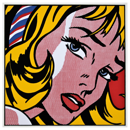
I love Litchensteins comic book style, the Pop art style is something i will start too incorporate into my Zine illustrations i think this will work well as this style with work well with my theme
Jamie Reid
Jamie Reid is another artist who defined a generation, A self proclaimed anarchist Reid's most notable decollage works have been for The Sex Pistols album covers and Never Mind The Buzzcocks and ‘Here’s The Sex Pistols’ Reids most successful work has too pin the safety pin through the queens nose that was so notable that it defined the aesthetic of the British punk movement!
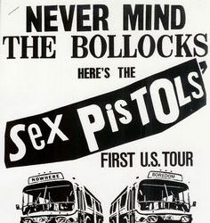


Reid's use of expressive type combining big and smaller letters and that rough newspaper cut and overlapping of illustrations are quite raw pieces of art they don’t hold back on any subject and are designed too make you think about whats going on in our surroundings.
Reid's work is inspiring me too take on a more anarchist feel too my zine too make a statement and too shock, i like the placement of text and how hes arranged images to truly get a dark undertone into his work thought provoking.
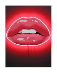
Sara Pope
Sara Pope ‘Lips’ caught my eyes as i felt they would relate too my Zine publication, as i will have a lot of female illustrations, also i like her ethos behind her work the voluptuous lips have become used as a fashion statement for haute couture labels, and her work does capture and embody the power of the lips and the mouth, but also raising questions of our ideals of beauty standards! and of course feminism!


0 notes