
gamedesignunit5
Game Design Unit 5 - Final Project
Development blog of the process of combining previous units into my own project.
13 posts
Don't wanna be here? Send us removal request.
Last Seen Blogs
sugiliteshadow
Memento Mori

easternshoreartcenter
Eastern Shore Art Center

faeillust
Fae Illust

liveslowsleepdiewhenever
Live Slow Die Whenever

Text
Unit 5 Self Evaluation
In this unit, I think that although we had some issues with our lives that drew us away from the process, giving us a very small time frame, however I think there are certain places we could have used time more effectively and I personally could have been smarter about my time and not dived in headfirst into the more difficult parts of the process and instead start off slow and effectively, this being with the character, I think I should have been smarter about the process and I have learned now that I need to start with low poly models and slowly increase, as oppose to start off with a full sculpt. With the level, I think we could have optimised the level better, it does run slow and did have a lot of problems in terms of errors in the sequencer and also building the lighting within the level which was very heavy on the computer and took a very long time to complete.
Harley, I know was very frustrated with the level as sometimes a mesh could not even be moved without the program shutting down and often time the whole cutscene would break and it was impossible to render out even small low quality videos from the game. I think we could work on that and maybe look at alternatives to particles and textures and work more with smaller assets that are easier on the system or even breaking the level into two pieces to make it easier to render and build the lighting within the level.
Me and Harley work very well as a team because we have very similar interests and wanted the same thing out of this project, he is also more technical based and I am very art based so it is easy to divide tasks and although Harley did take the design route when creating the level, we came into the level with the roles set to our strengths.
Doing this project again, I would spend more time developing the character the proper way so that I had more time to finish the parts of the level that I would have liked to improve and add more detail to.
0 notes
Text
Extra Artwork
This is some extra pieces of artwork I created for the presentation.
0 notes
Text
Future Development
So with the problems faced and the small time frame we had due to personal reasons and other responsibilities with other units, we really did not have much time to put into the work but we wanted to work hard and try our best with the level and character while improving on our ideas and expanding them further, so while I am very proud of what we accomplished, I think there are some big places we could continue to improve and change.
With the future of this project, as I mentioned with the character, I would love to go back and try and get her up and working and implemented, she works now but is obviously not what I had in mind, I would like to create the character the way I imagined her using the skills I learned in this project. I would also have liked to complete the cutscene using the story, creating the full vision of the short we aimed for at the beginning. In terms of the level, I think I could implement the things I wanted to; the flowers, ruins and I would love to continue to paint the terrain and put major detail into the smaller spaces as I am very much someone who likes to focus on the little things and put time into it.
I would also have liked to animate the character using motion capture and learn how to use the equipment in order to educate myself on the software and further the progress of our character.
I would also like to advance this project and maybe create a bigger working prototype with different sections of the story, maybe even create and implement some enemies, I spoke in a previous unit about animal transformations with the fog and I think that is something I would really like to work on and show.
0 notes
Text
Level Creation
This part of the project took place during the creation of the model, me and Harley very much decided that we would work on the things we were best at and join forces once the building blocks had been placed, In the character Harley did the technical side of the character while I created her and I would finish up the level once everything was placed and clear, however there was very little time for me to completely achieve what I wanted with the level towards the end.
Very early on, me and Harley discussed what we would like to do for this unit and how we wanted to change the level and what different aspects we should focus on, we talked about different assets and how we would use them. We agreed that we would mainly use The Advanced Village Pack by Adrian Lazar as it contains: trees, paving stones, houses, lamps and lots of other assets that we wanted to include that we did not have time for. We did talk about trying to create every asset by ourselves and I have done that before with a previous unit (click here to visit that blog) and did not want to do it again with this unit as it is very time consuming and honestly I am not the best at textures and UVs and it takes a very long time for me to create detailed assets, especially with the style we want to go for with this unit.
When we decided on a level design we wanted, we agreed on a map and decided with this map we would integrate both our individual levels with Harley’s functionality but also my environment, however, we have better equipment now, we have better computers than we did when I created my level so we could make a detailed and beautiful environment on a bigger scale and be sure that it would run completely fine.
Harley definitely took the reigns with the design in this level, I obviously had input while doing so but he was in charge of the general level placement and I would come in later and include some of my visions, the only real conflicts we had with this process were small things like assets, such as in the beginning, I wanted to use more fuller and foliage packed trees in 4K textures which Harley disagreed with, and we later agreed that using the trees from the village pack would be more appropriate with the style and of course they have wind physics and would look better when the fog began to draw in during the cutscene.
Once the main assets were placed, we agreed on more specific placements and how it would affect the layout, we also decided to introduce the second pathway from my level in the cutscene and also added new features like a flower bed and small village as opposed to a singular house.
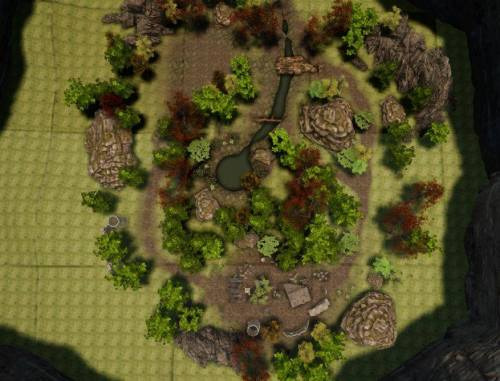
One major thing I wanted with the level was to cut off the edge of the level and make it so the player is unable to see through the level to the skybox at the end. In my level, I had cliffs to cut off my level and I hated that, I wanted the environment to be open and allow the player to feel like the forest and level was endless while maintaining a very limited space. Harley came up with the idea to use a dark mist to conceal the edges of the level, making it dark but also giving the impression that the level is endless.
In terms of lighting, I wanted a very dark atmosphere with minimal light but with very clear lighting cues, we did this by using very minimal lanterns and even used glowing mushrooms to show where the player can walk, I also wanted to include some glowing flowers too, however we didn’t have time to include those.
Another thing I wanted to do was replace the ruins at the end of the level with models that I used in my original level, however we ran out of time to do that too.
We also made the last minute decisions to add different sources of light by using lanterns that hang from trees and also replacing the rabbit concept art mesh with an actual rabbit and animations, however we did not implement a running animation.
Lantern resource
Rabbit resource
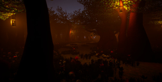
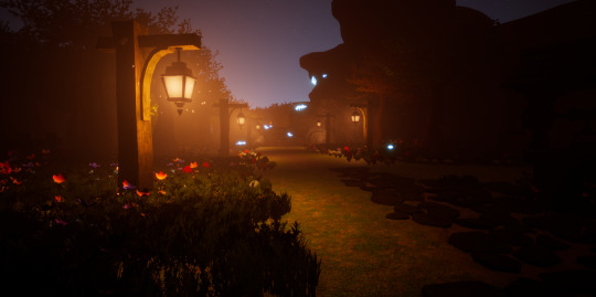
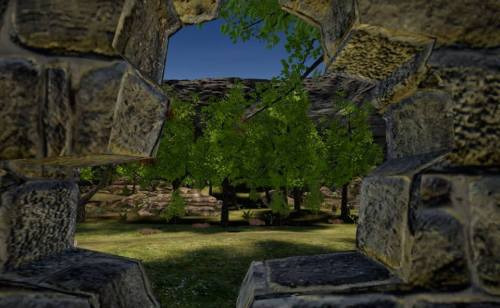
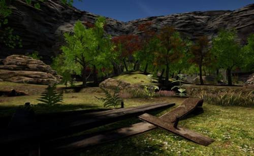
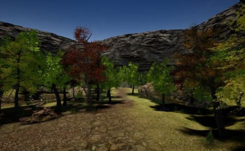
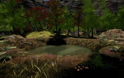
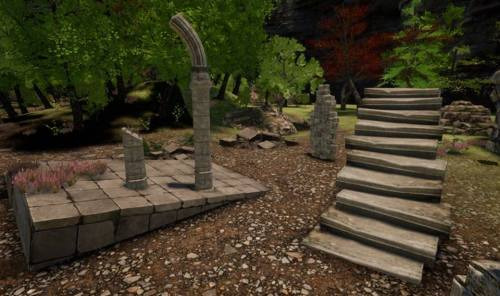
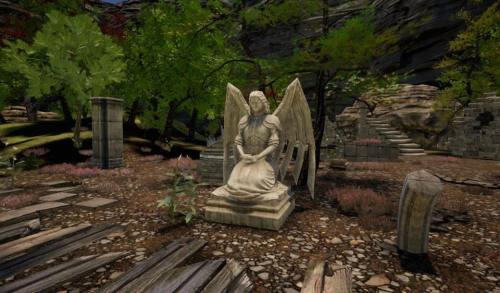
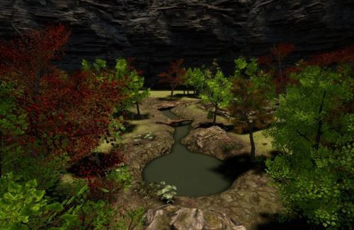
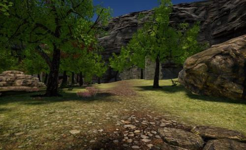
These are some screenshots of the finished level:


0 notes
Text
Character Creation
So this is the process of creating the character in Mudbox and Maya and the problems I faced when doing so.
So, for the character, I wanted to go into Mudbox and sculpt her from scratch, since the level will be mainly for the use of a cutscene and not gameplay, it would not matter if the character was too detailed and slowed down the game as the level would not really need to run properly anyway. So I wasn’t afraid of making her too high poly, however, that came to be a major problem later.
So what I did with the character was take the male base in Mudbox that it offers and make a female body out of it, (I did not think to actually download a female body at this point) once the body resembled a little girls, and reflected my style in the concept art correctly, I then worked on her boots and mask in Mudbox and later made her dress and sleeves in Maya, finally I added some details to the dress, in doing so, I encountered many problems, the first was actually importing the FBX exported file of the girl in and out of Mudbox, often times the program would freeze or the file would not show up at all. This becmae increasingly worse the more assets I added to the character until and character simply did not export correctly anymore and it was very difficult to go back to a low poly version of the character since it is impossible to undo when subdivision levels have already been added to the model in Mudbox.


These are some screenshots of the character in her high poly version, as you can see she is ridiculously high detailed and it is no wonder the programs failed to run her honestly.
To get past this and develop a character that would be fine to use for animations and just to implement as even a place holder for our finished character in the level, I opted to go the entire opposite way and create an insanely low poly version instead. In this version, I opted out of sculpting her and made her entirely from Maya, using as little polys as possible. At this time also, the level was getting created and began to run very poorly so if I had continued with the higher poly model it would not have been able to run smoothly anyway.
This is the final model.
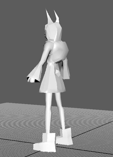
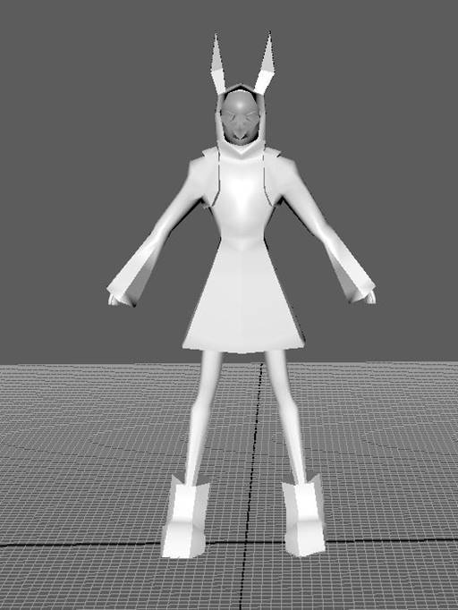
She basically is at this point a place holder until I am able to find a middle ground between the two variations of the character, I realised going through this process that I really should have started the process by creating a low poly model and should not have gone straight to the high poly model. Going forward I have learned that I should just take it easy at first and keep reasonable goals especially when I have no real experience in character creation, I should not have completely just gone for it and when going forward after this, I will definitively start it off slow and keep the model very basic and build it up slowly.
0 notes
Text
Character Plans
With the character, I am taking the reigns. Since Harley is going to be focusing on turning our vision into a working environment, it is my job to create our character and have her up and running.
For this, I wanted to draw some references for myself and also remind myself what I originally wanted for the character, while also designing a colour palette for her and finalising her.

This is a reference picture I drew in Clip Studio Paint to show the colour palette that I think would look best and also how she looks from the back and front in order to make creating her a lot easier. I decided on this colour palette for a lot of reasons, the rain coat is yellow and bright in order to stand out from the environment it will be placed in, I mentioned Little Nightmares and Coraline in a previous post and those references are really the reason that myself and Harley wanted the raincoat in the first place as it conceals any defining features of the girl while also being very childish and bright. The tights were inspired by Alice in Wonderland and Tim Burton movies in general, as they seem very childish but also a little eerie and also they are known to be used in Alice in Wonderland and that is very much a movie and book we thought about when designing this project.
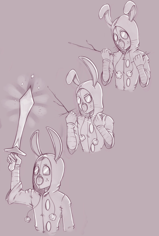
This piece is just a little sketch I created in order to show her expressions and how I wanted them to look and work when creating her, obviously I don’t intend to have a fully functional mask in the short time frame I have but it is definitely something that I want to create moving forward with the project.
0 notes
Text
Environment
These are some of the moodboards we created for this unit in order to show the kind of themes and style we wanted to recreate with this project:

In this moodboard, I really wanted to portray (in an overly stylised way) the kind of forests and area I want to make in the project. In this moodboard are games like The Legend of Zelda, Mario and concept art from multiple creators in order or show a green and beautiful woodland environment. This is the environment I want the project to take place in; a deceptively beautiful and lively environment that tricks the players at first glance that this is a more uplifted and lighthearted game before the story begins.
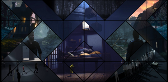
This is the flip side of the level; the grungy and scary atmosphere that we want the player to be overwhelmed by, this is the true theme of the game and shows the environment that I really envisioned when writing the story and drawing the artwork, a spooky and scary environment and is filled with unease and unsettling noises and mist. Much like in Coraline when the little door to the second world is opened, it starts off beautiful and every the little girl could ever want before it gets flipped and the world inverts into a world of nightmares and fear.
This theme is what the game is truly about and I want to try hard and bring this feeling and atmosphere into the project.
0 notes
Text
Cinematic References
These are some cinematic references that I liked the look of and wanted to use as inspiration for my own project.
The Beauty of Breath of the Wild - Part 1 - The Legend of Zelda - NO SPOILERS - Nintendo Switch
Overwatch Animated Short | "The Last Bastion"
Inside - Alternate/Secret Ending (WARNING: READ VIDEO DESCRIPTION FIRST)
Spirited Away - Bou, Yubaba's familiar and Kamajii's soots playing around
Little Nightmares Fatty chase
Death Stranding Trailer - The Game Awards 2017
Kojima Productions' Death Stranding Reveal Trailer - E3 2016
PS4 - Death Stranding Trailer 4K (Hideo Kojima) TGA 2016
0 notes
Text
Introducing New Ideas
So with this project, myself and Harley wanted to completely start over from Unit 3 and 2, instead of using what we made, we decided to wipe the board clean and start from scratch together, since we previously made different levels, with this unit we wanted to combine our ideas with an entirely new map and create something that truly reflected the game we envisioned.
Since Harley did not add anything in terms of level design the last time around, this time we wanted it to be different. Since we have decided to move away from gameplay and focus more on cut-scenes and design, we wanted to help include his vision for the game in this unit.
Together we decided that we would completely changed the way we thought about our level and show a side of the game that we haven’t before, introducing some new themes and aspects of the game that we wanted but couldn’t show last time. We agreed that we would use the same map idea from last time but wanted to truly get across all the themes and atmosphere that we intended to in the first place.
We decided pretty early on that we wanted to switch it up and have the level take place at night. In my story, I originally intended the events to take place during sun down so that the level grew darker the further the player went through it, bringing fourth a more spooky feel, since the game is supposed to reflect Coraline and Little Nightmares. With these references we wanted to bring with it the feel and environment into our own project, making it pretty and unique enough that people of all ages can play but introduce dark undertones that the player can take as much or as little from. I’m personally a massive fan of Inside and in that game, the player is told very little, with a silent main character and very little story told, the player can come up with their own theories and ideas and build a community of people with different experiences and in my opinion I think that makes games more interesting. I love going through a game a second time and maybe realising or even coming up with new theories on why the game did this or that and that is something I really wanted to portray with this project.
We decided in order to portray this, we would focus on lighting and atmosphere, and truly showcase the world we created.
0 notes
Text
Lighting and Rendering Research
This is a section from an old unit (unit 72) I did about lighting and rendering, I re-visited this research for the development of my game.
For my research, I will be looked at the games The Evil Within and Until Dawn, and how the lighting in those games affect the atmosphere of the game as well as what that kind of lighting tells the player as they enter.
I looked at horror or thriller games like The Evil Within and Until Dawn because of how impactful the light is. These games I feel are the most atmospheric horror games I have played, just because not every level is the same and just by looking at the lighting of a certain place, the player instantly knows what is to come. Not only do these games rely on lighting but also the lack thereof lighting within certain parts of their levels that creates a fear in the player and gives a sense of the unknown. This I feel is very strong in all the games I have mentioned but I will go through each of them and step through the unique aspects of their lighting.
All horror games focus on contrast to give a creepy vibe to the games, with shadows almost pitch black and the lighting sources bright and eye catching, it lures the player towards the path the game intends to follow, while keeping enough light for the player to see in and direct themselves in. Lighting is a great way of hiding areas along the way and guiding players discreetly to pathways that are just there for them to find loot or secrets. This is super handy in games, as an RPG player, it sometimes is hard to explore everywhere as the main path will usually cut the player off from exploring further and it can be annoying when it is hard to differentiate between the main pathway and a side area, discreet and not so discreet lighting is very useful in this regard.
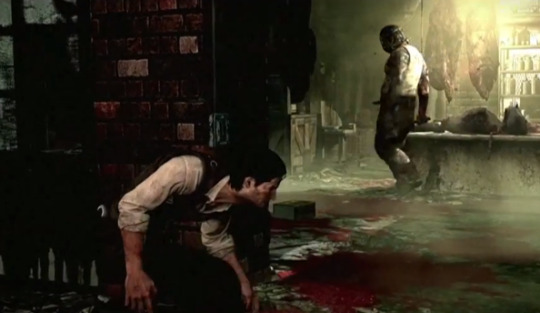
Moving on to more aesthetic lighting; The Evil Within. When the game begins it already gives a very eerie feel with a blue tinted evening light that later turns into more of a brown undertone which gives the game a very vintage, old fashioned look to it, this is very prominent in most horror games, in especially open areas which usually are very uncommon in this genre, this kind of lighting gives a very unnerving feel to an almost safe feeling place. All the titles I mentioned earlier are guilty of having this same lighting used in the same way, usually outdoors is the escape in horror games and it is a small section of game where the player can relax but with this kind of lighting, it makes even open areas feel claustrophobic and unsafe, a very clever way of keeping that heavy atmosphere over the player while introducing a new section of area to explore, this kind of lighting is the base for Until Dawn, with barely any artificial lighting, the players rely on the illumination of the moon to light their paths which gives an almost foggy look to the game, with dark surroundings and only vibrant light peeking through cracks in the background, it automatically makes the player aware of everything that is happening on the screen, the character is always what players will be looking at but with such bright lighting in the background, it is hard not to get distracted by it, and Until Dawn uses this to create very scary moments when something rushes past in the background, giving hints towards enemies later on.
The Evil Within

Until Dawn
However, it is The Evil Within’s lighting in particular that I feel stands out against other horror games is how they present their enemies with light, for example, the beginning of the game, the player is strung upside down from a meat hook and the first thing they see is a well-lit room and suddenly a huge silhouette appears, presenting the enemy, this kind of lighting is used a lot throughout the game, normally when introducing a new species of enemy. Since the game is based in a kind of hospital or mental asylum, there are a lot of bright beaming lights and darkened hallways which gives the player small reachable goals and always lets them know which way they should be heading in, with any horror game based deep within a building, the main goal is always to find your way out and into the open and organic light in small doses can give hope to the player that the safety of the end is nearby.


Because this is a lighting and rendering unit, I chose next to look at articles and portfolio pieces of other artists and further educate myself on lighting and rendering.I found this article on the basics of lighting and rendering
:http://buildnewgames.com/lighting/
This article basically explains the importance of lighting and rendering and how anyone can master it, it also offers a lot of tips and tricks for lighting and explains everything in an easy to understand way.
0 notes
Text
Unit 3 Development
This is a re-post of all the development stages from unit 3. Since unit 5 is a continuation for me, I thought I would just put a reminder of what I will be continuing to work from and how the level has advanced since then.
Plans for Unit 3 and Research:
In order to get a general idea of what we wanted, me and Harley sat down and talked about the kind of character we wanted to introduce, what their world would be like and what kind of genre we wanted to go for.
After a long discussion in class, we came up with the idea to make a horror game short, that left off at a cliffhanger. This idea came from watching shorts presented at E3 and also character introduction shorts from Overwatch. The idea is to create an incredibly detailed character and environment with realistic physics and weather effects, and high detail facial animation for the character.
The character we came up with is a little girl based on Coraline and Six from Little Nightmares. We like the idea of a little skinny girl in oversized clothes and wanted to create a world around her in which she seemed normal at first but as the cutscene progresses, there is an eery feel and it starts becoming darker and darker. Since we liked the idea of the mystery behind Six, the way her face is almost concealed and her name is vague, we wanted to replicate this mystery with our character so we came up with the idea of her wearing a gas mask which was inspired by young Psycho Mantis from Metal Gear Solid: The Phantom Pain. The gas mask idea lead into the main plot of the project, which is poison fog, this fog idea was inspired by The 100 where every night at a certain time this acid mist comes into the forest and starts dissolving organic things.
In order for the character to chase this fog, we first needed to come up with a way for her to come to it, so we came up with the idea of her chasing something into the deep of the forest where shes comes into contact with this fog and in turn runs back to her home where she finds her house crumbled to pieces and a dark shadow casts over here. This is where the short will end and leave a cliffhanger.
Since we had a general idea, we looked at some chase scenes that we liked from movies and games and also looked at some environmental references.
This a moodboard of the general theme, colour palette and mood we want:
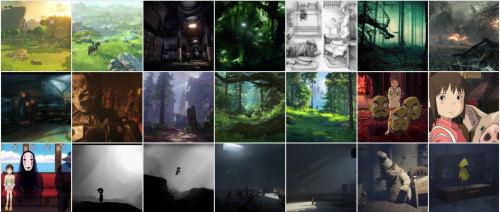
As you can see we added games like Limbo, Inside but also The Legend of Zelda and Overwatch. This is because we wanted to show what the project would look like at the beginning before it turns into a horror theme and then the games like Limbo and Little Nightmares show what the game will become once our character comes into contact with the fog.
Below are some of the videos that we enjoy that follow the same theme that we want, just click the link to open the video.
Little Nightmares Fatty Chase
Spirited Away
Inside
Bastion Short
Breath of The Wild
The next step of the process will be writing the story and creating concept art from there.
The Story:
Continuing from the last post, I and Harley came up with a story for our short so with the inspiration from hearing Pete’s story in a session, we thought the only way for us to create different ideas for our storyboard was to write it out like a story in order to visualise the scene and from that create our own storyboards.
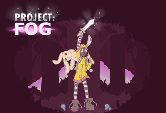
Project: Fog
The scene begins with a close worn old leather book upon an ink stained wooden desk surround by old papers and quills. The book opens slowly to two blank pages that slowly materialise into the story and a picture of a cottage, suddenly the pages are enveloped in black ink that engulfs the entire screen.
As the screen slowly clears to a view of an orange sky with a sun that is just minutes from setting, a monarch butterfly swoops across the screen, the camera follows as it flies down to a little cottage surround entirely by trees and fences, clearly deep in a forest.
A little girl emerges from the home, however her face is not shown, only the back of her head which is hooded with a raincoat. He hums as she skips down her pathway, towards the deep of the forest when something white and fluffy catches her eyes. As the bunny turns, it reveals that the rabbit is no ordinary rabbit, its eyes enlarged and frightening, the girl reveals her face to show a gas mask over it. She chases the bunny down the dirt pathway through the forest, the forest growing darker and darker as the sun goes down, she passed signs after signs of warnings, begging any traveller to keep away, alerting to danger ahead. Running after the animal, she reaches ruins where she corners the bunny.
CRACK!
A loud noise behind her causes her to suddenly look behind her. A powerful thick purple fog begins to spread through the trees towards her, with her eyes widened, the little girls starts running in the opposite direction of this fog, it tightly chasing behind her as she jumps over rocks and fallen tree branches. Behind her she hears loud growls and squeals as the woodland animals begin transforming into horrifying almost demon looking versions of themselves as the fog surrounds them. As she runs through the forest, she passes small areas of the forest where the trees have been chopped down and tents had been built, filled with gurneys and countless body bags wrapped with black tape. As she crosses a small lake, she stops running, seeming to think she is safe where she is, she bends and pants heavily through her mask, worn out from her chase. She slowly stands up and looks towards her home, only to find a pile of rubble where it once laid, as she stares at what once was her home, a twig snaps behind her, she looks back then slowly upwards as a large shadow crosses over her.
Concept art:
Before getting to the storyboard of this unit, I wanted to flesh out the characters, my plans and get everything down in stone in order to make my job of turning the story into visuals a lot easier.
I started with the environment, since this is the world the character would live in. As I stated in an earlier blog post about my plans, I and Harley want a forest theme to begin with and that is pretty self explanatory so I focused mainly on the character’s home and surroundings, the animals she would see and of course, herself.
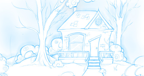
This is the sketch I came up with for her home in the woods, as you can see its very innocent and normal looking. I wanted this to be the first thing the viewers see and that would immediately give them the wrong impression of the game, since we wanted to misdirect users into thinking this was a Legend of Zelda style game when the meat of the game is more leaning towards Little Nightmares or The Evil Within.
The animals play a big part in the story as they are the driving force in order to get the character from a to be and also put herself into danger so the style was something I thought about for a while.
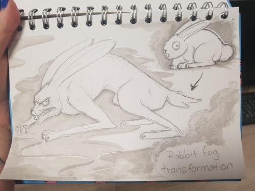
The bunny was easy enough to create, I want an almost eery looking animal that clearly shows that all is not as it seems. The transformation however is just a concept we came up with, we wanted to make the fog dangerous but also wanted life within the level so the only way the fog could affect them would be something that faded, therefor we came up with the transformation idea, where animals will grow and change as soon as their bodies are exposed to the poison.
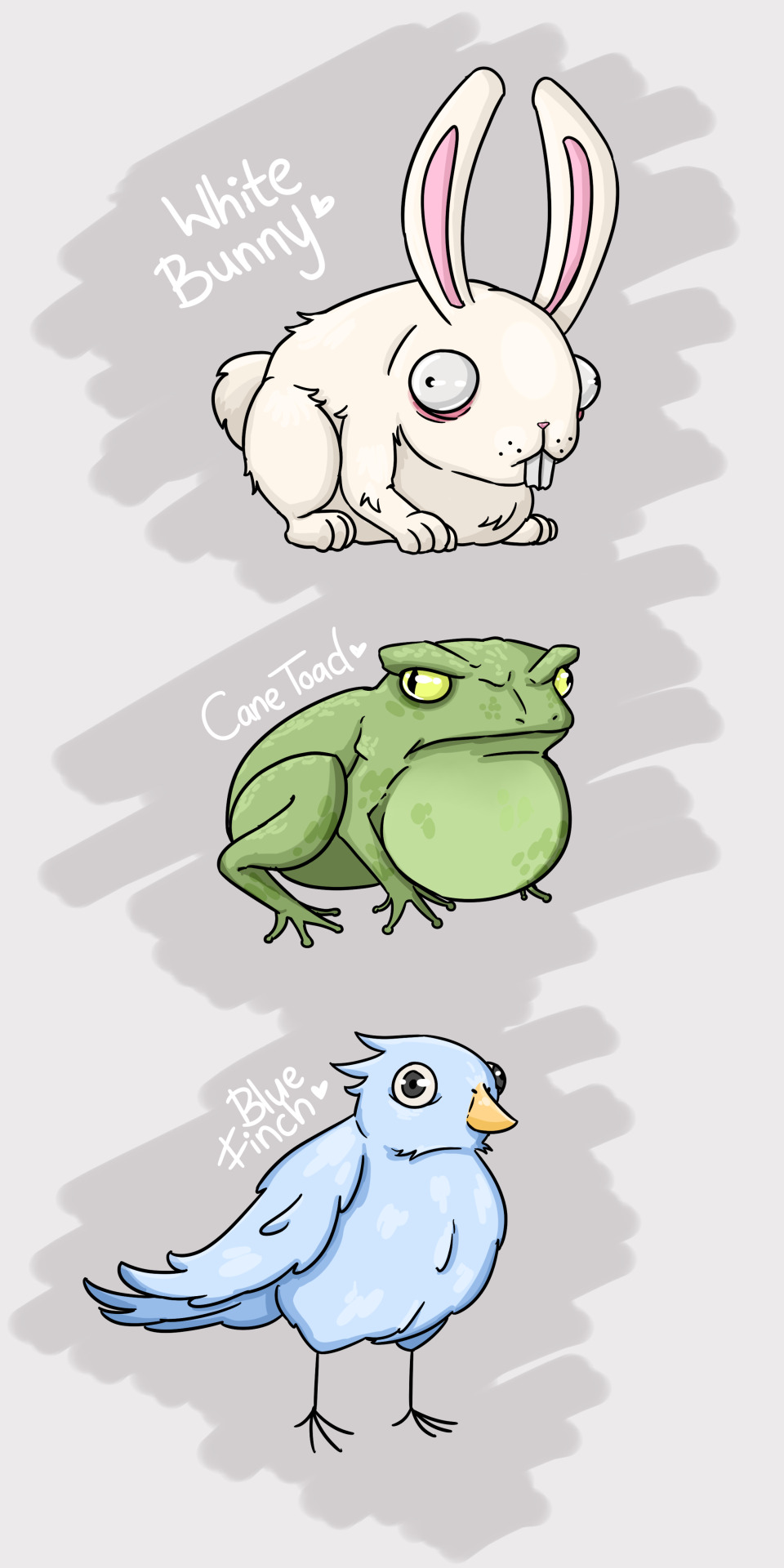
This piece is just a representation of some of the animals and what they may look like.
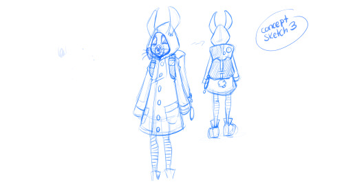
This is the final design I came up with for the main character. Me and Harley both did our concepts separately but spoke about what we wanted. Originally Harley mentioned that we should stay away from the raincoat idea as it reflected too much on our main inspiration, however I disagree and after a few designs, it was the only thing that made the little girl feel right. As you can also see, I wanted to make her appearance represent one of a little girl with the love of rabbits as they are what get her from a to b, this is reference with her ears, her bunny tail, her gasmask and the keychains on her backpack. The rest of her outfit like her shoes and long sleeves are also a reference to how small she might be and maybe that those clothes were not meant for her but acquired elsewhere.
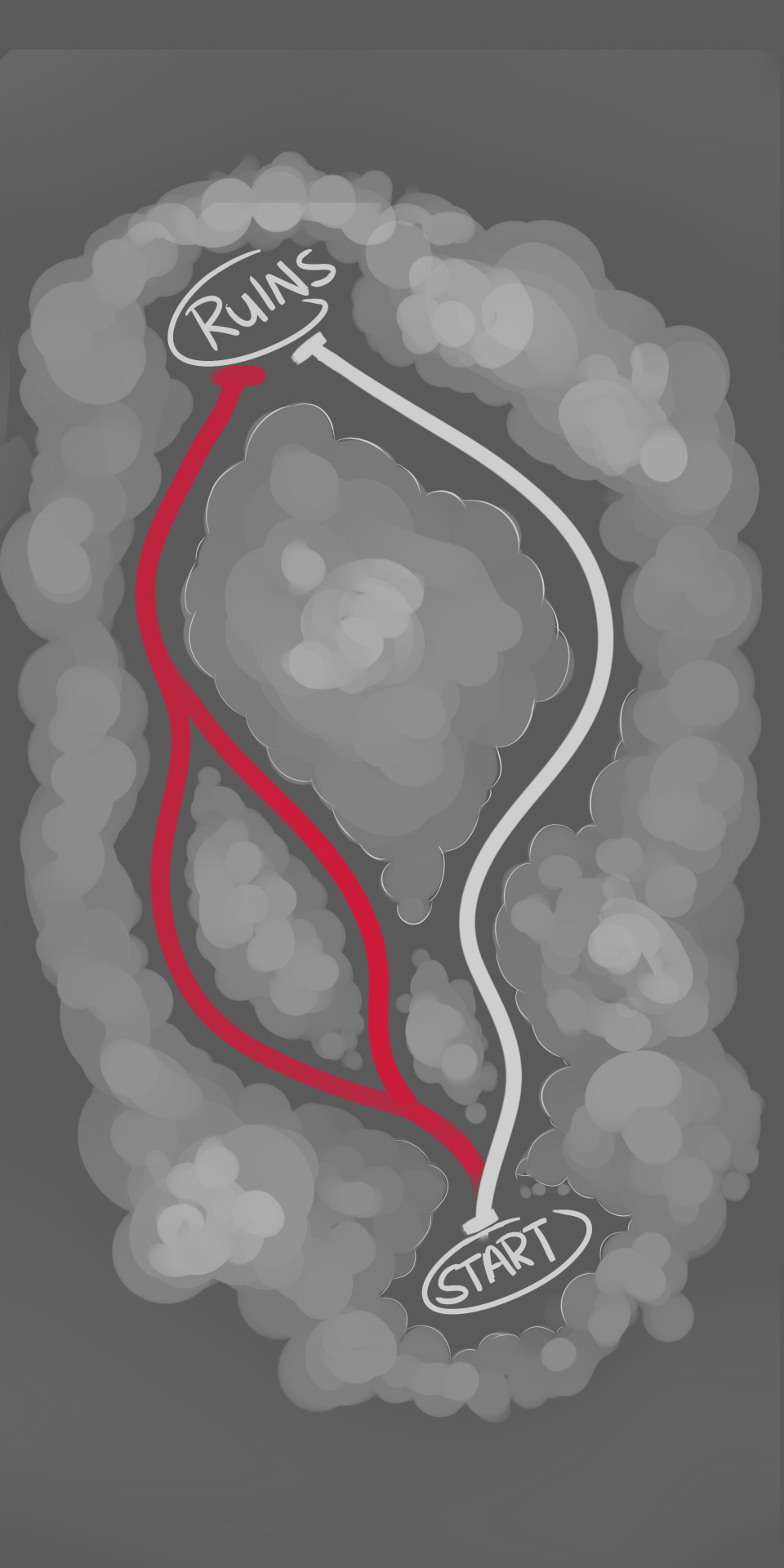
This is the floorplan that myself and Harley came up with, as you can these the white line is for the main path of the level that the first half of the story takes place and the red path represents the path taken back to the house, the fork in the road has been added for the function of the level and will appear later on in development.
Storyboarding:
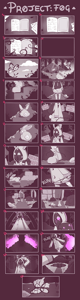
This section is about my storyboard creation, the part of this process that I was most looking forward to.
I am more into the art side of game design so to bring the story that I and Harley came up with to life with visuals and colour was the part I enjoyed the most and really wanted to focus on as it is the foundation that my blockout and level design will reflect upon.
As you can see, with my colour choice, I wanted an almost greyscale them however I tend to avoid greys and blacks when I work as I feel like it can be draining and it really doesn’t allow for complimentary colours, so I used an almost brown type colour and just used different shades to represent foreground and background, keeping the background dark and the character bright.
The butterfly as seen in the 5th and 25th shot was an important part of the narrative to me as it was the beginning and the end of this particular adventure for the little girl. It is reflective of the state of her home and life as she knows it, with life in the early section and the death in the ending.
The fog is also a major part in the storyboard as it is the only thing with colour, in games we tend to view brightly coloured liquids and gases as poison, I am not entirely sure why it is that way, whether to draw the players eye or whether the purple reflects an unnatural element or even provoking feeling. When coming up the the fog, the colour was always a major point of interest as it is supposed to reflect danger. We decided that purple would best suit this mist as it looks unnatural compared to the forest surrounding and that may lead the player to run away from the substance.
Colour Theory:
Colour theory is logical structure for visual artist when using colour combinations. There are three categories when it comes to use of colour based off the colour wheel: primary colour, secondary colour and tertiary colour.
Primary colours are a group of colours that mixing can result in all other colours. Secondary colours are the result of mixing two primary colours. Tertiary colours are obtained by mixing a primary colour with a secondary colour.
Basic formulas of colour include analogous colours, this is a combination of any three colours side by side on a 12-part colour wheel. Another being complimentary colours, this is any two colours that are directly opposite from each other on the colour wheel. This creates maximum contrast within the picture.
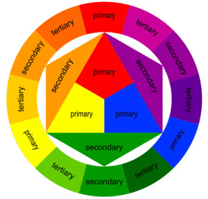
Colour theory is important because creating a good colour palette is pleasing to the eye. It can engage the viewer and help with creating any feelings that your trying to convey. A saturated warm or bright colour palette is automatically going to give the viewer a happy impression whereas the opposite, a dark cold and desaturated colour palette will give the viewer a sad or scary impression.
In media this needs to be taken advantage of, having a way to evoke a feeling automatically from the viewer is convenient.
I found examples of media that takes advantage of colour palettes I would be trying to convey in my game.
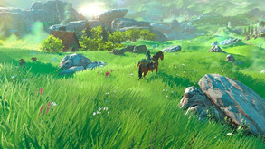
Starting off my game would be very bright, happy and peaceful. A great example of this would be from Zelda breath of the wild. The world is bright and saturated giving you a friendly, comfortable and happy vibe.
During the game events take place that will change the environment, making it dark and creepy.
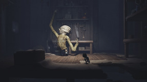
A good example for this change is Little nightmares. This game is impactful, using high contrast and very desaturated colour palettes, you immediately get a creepy and uneasy feeling from the moment you look at it.
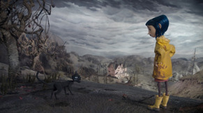
Another great example is the movie Coraline. You get a dark almost twisted vibe from the movie. Once again being highly desaturated, other than one saturated colour where they use contrast to their advantage. The example being where Coraline is wearing her yellow coat, they draw your eye automatically to and keeps you focused on her, the important object of the scene.
Block Out:
These are the screenshots from my own level blockout.
As you can seen the floorplan is the same as shown in the concept art section of the blog, as I wanted to keep it as close to the original artwork as possible.
The level creation part was a really quick process for me because I avoided making any assets myself and instead used royalty free assets either from the internet or Unreal Engine store, this made it so I could focus only on design and theme.
I wanted my level to be swarmed with assets and foliage, I wanted the trees surrounded with flowers and rocks and water, and every part of it to feel full with no empty spaces. I feel like I achieved that with this level. I positioned most of the trees by hand to make sure they were in the correct locations and the rest were painted in using a terrain and foliage tool in the engine itself. I will avoid going into how I created my settings and just say that I created the terrain materials by using ones given from the Unreal store and with the terrain painter, I layered the textures over one another to create a flawfless path through my level and really focused on making it look unison.
The lake was created with a water texture and with the terrain editor and painted around later, I added each plan around this section individually in order to really get the feel I wanted. The same goes for the ruins, each piece was selected carefully and positioned in a way that made it look almost natural. The rocks are used to fill space and separate the landscape, so it does not become too repetitive, I even avoided using the same assets more than twice at most in order to create an unpredictable environment.
The colour scheme represents the earlier part of the story where the scene is set at almost dusk, making the greens stand out more which was accomplished with a post production volume.
I am very happy with the way the level turned out, I feel like it reflects my aims perfectly and it gave me a great base to move along with in the future development of this project.
Extra Artwork:
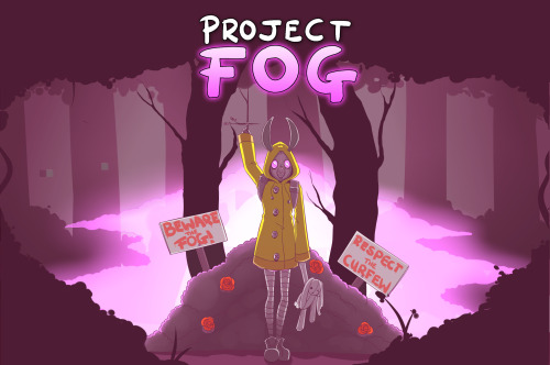
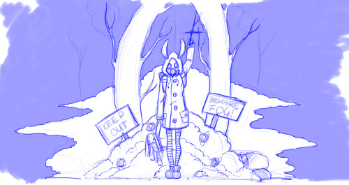
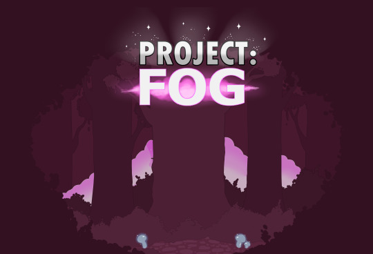
These are some extra artwork I developed for the presentation. The first and second pictures are a cover art photo or rather a splashscreen for the presentation that reflects our game and everything in it. This is also a nod to my storyboard as it holds the same colour values but with the exception of colour on the raincoat and the red behind her, the red symbolising the danger of the signs but also the roses to show life, while her coat is coloured in order to add a defining feature to her and make her stand out.
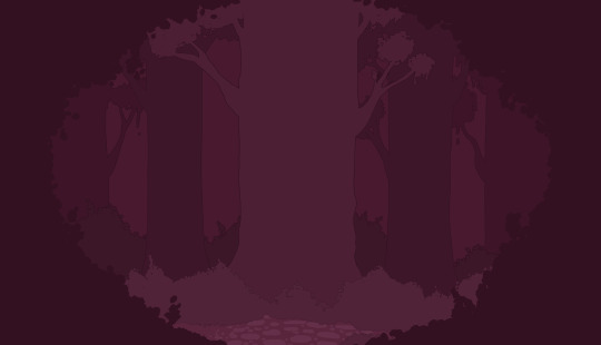
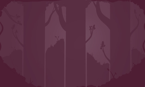
The third picture is the forest backdrop that will go behind the information on the slide in the presentation, in order to still capture our theme and reflect on the environment shown in my storyboard.
0 notes
Conversation
Welcome to Unit 5
In this blog, I will document the process of development for unit 5.
In this unit, I will be continuing from unit 3 and unit 2 where in a team, I created a story, storyboard, level and prototype of a short character introduction that included sequencer events, quick time events and short gameplay sections.
In this unit I will be expanding on the prototype and focusing more on the cut-scene and aesthetic as well as developing my character and implementing her into the game.
I am continuing to work in a team with Harley Pendleton in order to combine our skills and create a project that reflects more of what we want for the game in terms of style, theme and function.
0 notes