
fruityparfait
Fruity's Art Blog
This is a blog for my art. Come and see all the dust gathering here. Mostly stuff I do with my buddies when I actually do post stuff.
346 posts
Don't wanna be here? Send us removal request.
Last Seen Blogs

waywardagainst-themold
MANDY

z-lars
jerk

aziuuu
Aziuuu

80s-music-tourney
The 80's Music Tourney

hallecarey1
The 107th. Sergeant James Barnes
Text
site that you can type in the definition of a word and get the word
site for when you can only remember part of a word/its definition
site that gives you words that rhyme with a word
site that gives you synonyms and antonyms
1M notes
·
View notes
Text
Honestly? My main piece of advice for writing well-rounded characters is to make them a little bit lame. No real living person is 100% cool and suave 100% of the time. Everyone's a little awkward sometimes, or gets too excited about something goofy, or has a silly fear, or laughs about stupid things. Being a bit of a loser is an incurable part of the human condition. Utilize that in your writing.
44K notes
·
View notes
Text
eastern europeans love tumblr because it's literally a website for complaining. and we fucking love complaining like nothing else
26K notes
·
View notes
Text
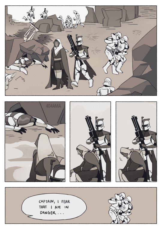
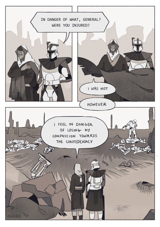
Jedi were not meant for war.
✨🌙 ART LOG -> @404ama
3K notes
·
View notes
Text
the "canon isn't real we make our own rules" to "i am begging you people to revisit the source material" pipeline
78K notes
·
View notes
Text
man. the star wars sequel trilogy could have been so good if they hadn't fucked it up
33K notes
·
View notes
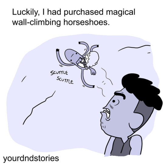
Photo


If we eat the human, we will steal his strength.
Twitter | Patreon
19K notes
·
View notes
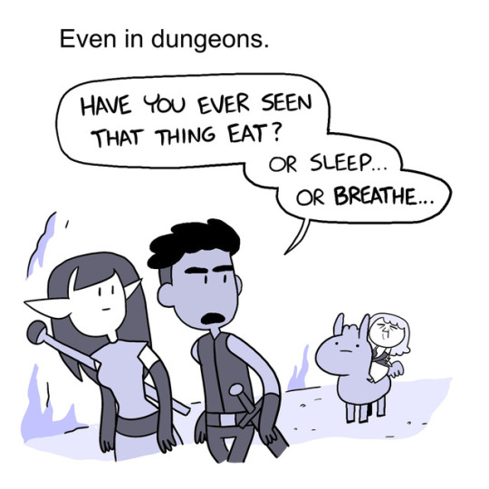
Photo

“Lo, brave adventurers! Have you the mettle to take upon ye this noble que-AAHH” “SKREAUGUGHGHH” (violent noises)
6K notes
·
View notes
Photo

She ain’t horsin’ around. From Gabby D.
Heads up, we on instagram.
48K notes
·
View notes
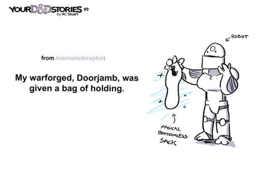
Note
Your art is extremely inspiring. Do you by chance have any tips for creating reflective highlights and their placement? It’s something I’ve been trying to figure out for so long and it’s just not computing in my brain. 🫠
First of all, thank you!
Ahh I'm not as descriptive with words, so let me give you a quick rundown.
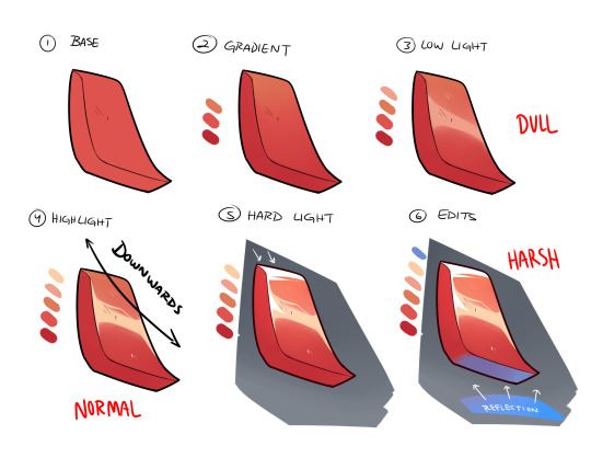
Once you have your base and all is good to go, you create the gradient in the direction of where your light source is (up -> down in the image). The direction will always depend on angle or 'curve' of the metal/material you're trying to work with.
Up top, I did a downwards reflection since my shape is more diagonal, rather than uniform and straight. There are times you'll have a round shape, in where this time you'll go ahead and create the highlight at the apex of it.
Next, you have to decide what KIND of highlight you'll be using. I usually work with multiple lighting layers, but for this example I'll only show 3.
The DULL lighting is just regular low lights that show the texture as reflective, but is most likely AWAY from a light source and/or is reflecting off something that doesn't have much shine.
The NORMAL is your regular highlights that is usually just a lighter shade than your base. Since most if the time it just follows your low light(think of it as the intensity of the reflective light source), you can just place it on top of the DULL lighting.
The HARSH lights are only portion that are directly in front of the light source OR are the most intense parts of it. Think of it as extreme sunlight etc, and it goes apart from your regular highlights.
Lastly, you can add more color to you material by taking in other reflective surfaces, specially those with different color. I added the blue as an example and just color the panel that directly faces it.
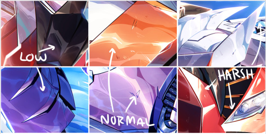
I added a few example of lighting from my works so you can kinda see what I'm talking about. They might not seem as different at first, but the placement really makes a difference once you start finishing your rendering.
I'm not great at explaining sorry, but I'll try to do another stream and walk people step by step? Would that be ok?
Hope this helps a little!
3K notes
·
View notes
Text
IDW Transformers comics mega
a few years ago there was one of these but it's since disappeared, so here's a new one. it has every idw comic so you will have to look a little to find the popular series.
769 notes
·
View notes
Text

Just wanted to visit an idea of Skye opposite her battle damaged design. Idk if I've mentioned it before but her abilities are gravity based
1K notes
·
View notes
Text
Ya know when people told me "when you're finally safe enough that you can leave survival mode and start to let go of and process your c-ptsd/trauma things are probably going to get really, really bad before they slowly start to get better" I thought that was reasonable. I did not understand that by "things are going to get bad" they meant "you're going to find yourself in the worst mental state of your entire life, but dw, that means it's working" and tbh I simply wish someone had been more clear.
78K notes
·
View notes
Text
I have realized that the perfect form of media must have a delicate balance between absolutely heart wrenching pure emotional devastation and the most ridiculous nonsense you have ever seen in your whole life
86K notes
·
View notes