Last Seen Blogs

m788stie
M778 - Nhà Cái M788 - Link Đăng Ký Mới Nhất


hugheshcky
hockey🙈
peridots-pixiwolf
Peridots!
lilacrwses
Rabbit Hole
Text
Evaluation
Name: Molly Goddard
Pathway: Fine art
Project title: Orwell’s Dystopia
Section 1: Media and Techniques
Throughout this project I’ve used a wide range of materials, techniques and processes. The first pieces of practical work I created were collage postcards inspired by Jean-Michel Basquiat. The postcards were to be tuned into cyanotypes, so they are not very strong on their own and I had to experiment with the colour shades and contrasts. I used materials of posca pens, fine liners and images from newspaper and 1984. I feel like some of the postcards are decent looking and if had the chance to develop could become strong but because they are for cyanotypes and are just the starting product, so I’m not really upset about the quality.
The second practical piece was the cyanotypes they were really fun to do, and I will definitely be buying the materials to make some more, I experimented and learned to create more of difference in contrast for future cyanotypes. But I feel like I have mastered the actual process. The only issue was that when I printed on old magazine paper I didn't realise how fragile it was so the paper ripped, next time I will mount the magazine paper onto a stronger material like card before creating my cyanotype to avoid ripping. I used the cyanotype chemicals ferric ammonium citrate and potassium ferricyanide and a special light exposure machine.
Next I learnt to create photograms, I did them twice the first time I struggled but I believe some of the images created were really strong. I struggled to find the balance between the right exposure times for each acetate but I believe that is something you learn with time so I will just kept practicing. The second time I experimented, and the photograms came out eerie and desolate I was inspired by Floris Neususs I used the opposite side of the photo-sensitive paper to create an eerie and haunting like images. Developing further I wanted to use objects instead of acetate so I used flowers and the pieces came out okay as I didn't like the lack of greyscale hue. Also, I tried moving the acetate whilst the paper was exposing and it created these really cool blurry images, that and exposing on the other side of the paper created these isolated blurry pieces that I believe go really well with my FMP theme and look really good as a set. However, the images need to look more professional but that can be done by choosing stronger acetates to expose on. I experimented with adding objects like flowers for different textures and contrast, I also used an app called “Blend” where I blended photos of my photograms together. The results were ok but unless I want to blend colours together it was a failed experiment. I also created a series of experimental photocopies of my photograms, I used a variety of colour, movement and sizing, some of them turned out really interesting and it was a very fun experiment and if I wanted a colourful project then this process would definitely of been used further in my project. Throughout the whole process and experimentation of the photogram journey I used acetate, developing liquid, stopper, light sensitive paper, darkroom equipment, flowers, the blend app and a photocopier.
View finders were my next practical work. I loved the view finder process, and it is a very good way to become confident with mark makings and although I didn’t realise it helped me at the time as an abstract artist because it gave me a way to practice the style in a quicker way and I used this method further on when creating compositional ideas and experimenting with “big Brothers” face. However, I struggled to make the pieces cleaner between each drawing, but I can fix that by using tape around the edges. I used different types of materials like posca pens, fine liners, thick markers, black chalk, carbon pencil and graphite.
Next piece was a big one for me and that was the abstract pieces. I absolutely loved this process and it encouraged me to use a range of materials from paint brushes to lolly pop sticks and sponges which allowed me to achieve different textures and layers. I used typography in my work but I wanted it to hide the lettering so if you look really close you might be able to see them. I didn't photocopy an image onto the canvas as at first the que for the printer was too long but, once I got into the painting I completely forgot about the photocopying and just did what I wanted to do however I really wanted to try this technique on my final piece but the college ran out of canvas to print on and sadly I couldn’t wait till they ordered more. I experimented with sticking printed out images from the movie and gluing them on canvas, the peeling of the photos off the canvas gave a really cool affect I painted and drew straight onto the canvas throughout every piece making deceive markings and scraping paint off with the lolly pop sticks each piece includes fingerprints to represent the identity lost in the book. I wanted a minimalistic colour pallet that lacked warmth and looks bland until the audience inquired depth within their view. This whole workshop was a experimentation and practice for my final piece so I’m very happy I got to experiment.
Next it was dry point, this practical was very short and sweet. Although etching used to be my favourite technique I have developed as an artist and so have my preferred technique. The materials used were plastic slab, etching pen, scrub, printing ink and a printing press. Etching hurts your hands and does not match my desired style so apart from this workshop I didn’t see a need for the process and technique in my FMP.
Film development was a practical follow up and development of my photograms. I wanted to further develop my skills in the darkroom and at the time I wanted to add photograms to my final piece, so it was important I learnt. I used two old rolls from last summer, the process was hard at first but by the second roll I managed to pick it up. The issue was I used a very old camera and I accidentally exposed the film to light due to me not having any knowledge of film development. I only managed to get one photo out but that’s fine I’ll remember next time to not expose the film. I used a lot of materials that was used for photograms, so I didn’t have to experiment with them I used development materials (light sensitive tank and changing room ect), developer fixer, water. light sensitive paper and a film drying machine.
Whilst waiting for the film to dry I tried Chemigrams as my next practical. The results are very cool and interesting, I love how they turned out and they remind me of trees melting. I experimented with different developer and chemical times, using the fixer or not and seeing what patterns the tongs leave on the paper. I used the same materials from the photograms except from I didn’t use any acetate.
My next practical was lino print. I hadn’t made any new lino stamps for my project up until then in my project but at this point I still was thinking about incorporating linos into my final piece. On my first project I created a coffin stamp, but it was pretty small and I wanted to incorporate it in my final piece so during half term I made a bigger A4 size. I experimented with different backgrounds and ink colours I loved the results, so I put them on my Esty shop. The materials I used was a lino cutter, lino rubber board, printing ink and a printing press.
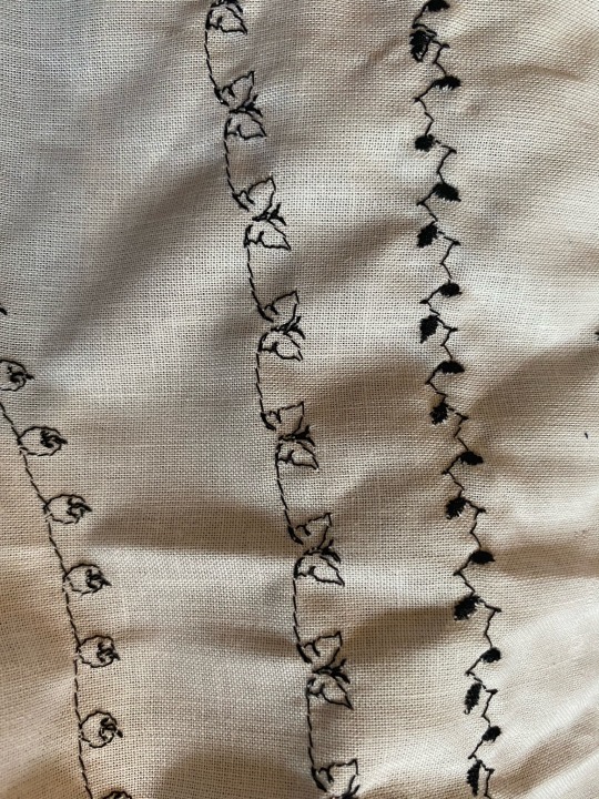
I wanted to incorporate sewing into my final piece. I've just always wanted to add this medium into one of my pieces but they never really suited it until now. I wanted to create a mix media piece and incorporate sewing but I have never really used a sewing machine before so I had to practice. I experimented with different patterns and materials whilst working on getting straight lines and not ripping the material. I used one of the simpler pieces in my final piece and stuck it on with PVA glue whilst crinkling the fabric to achieve cool patterns. The materials used were scraps of fabric, thread, bobbin and a sewing machine.
My last practical piece was my final piece. I used a lot of materials, processes and techniques. For the materials I used fabric, acrylic paint, sponges, cardboard slabs, thread and ink. I used techniques and processes inspired by my three main artist Jenny Savile, Lucian Freud and Alberto Giacometti. I analysed my practical development at the end of every week on my blog. At the end of every week id write about each college day, what I did, how it went, how I can develop it and will it work in my FMP. I did this so I could create a clear image of the processes and techniques I could carry on into my final piece. Once it got to my research and final piece planning I didn’t feel the need to create a separate post to evaluate each week as my final piece planning was an evaluation and development of each piece.
I believe my research was very strong and wide. It really helped me to inform my audience and create a strong base for my final piece, I looked at wider world research and look at news surrounding 1984 I found two articles -Orwell novels leap in popularity on Top 100 Most Borrowed Books in Hong Kong by Hong Kong Free Press- this I found really interesting although it didn’t really help with my work,-Why Orwell’s 1984 could be about now by BBC- again although it didn’t particularly help me with my research it was interesting and helped me with the political part and -The masterpiece that killed George Orwell by the guardian- which gave me a greater understanding on George Orwell and his life. I then went deeper into the book by analysing key points of the plot and the world like big brother, the superstates and newspeak. I went deeper into Orwell’s life and even watched short documentaries on the book. I incorporated snippets of the movie, wrote down a whole plot summary and also included important quotes and YouTube breakdown videos. I placed these at the end of my workshop work and just before my planning of my final piece. I did this because it is the perfect place for my audience to understand why I planned what I planed for my final piece and also there are no other distractions from past work. It creates a strong base for development and understanding.
I feel like I have kind of met the purpose of my project proposal through practical work. My Project proposal said “I am going to aim to use Lino print as my primary technique. In addition to this, I also want to delve into abstract art and experiment with this technique as well as sewing and photographic mediums as I feel it would help my artwork become stronger, however I will be focusing the most on lino prints.” I created one lino piece through out my project and certainly didn’t have it as my focusing point, I did however delve into abstract art and that became my main focusing point. I also did experiment with both sewing and two photographic mediums and even incorporated sewing into my final piece. So, I have half met the purpose of my project proposal, but I don’t see it as a bad thing because the parts I didn’t meet were the weak parts of my proposal. I have looked at a lot of artists throughout my project but I will be talking about the ones that helped inspire both my final piece and practical work. The main ones are Floris Neususs inspired me to use ghostly figures in my photograms and my final piece to create a sense of unease, Garry Fabian Miller took inspiration from his use of colour and used a very similar and heavily inspired colour palette through out the rest of my project and practical work, Ian Hodgson helped with my experimentation of Big Brothers face and the view finder practical, Robert Rauschenberg really inspired my first work with the abstract pieces, Jenny Savile her layering paint to create texture, Lucian Freud his portrait and contrast technique heavily inspired my “Big Brother” face and finally Alberto Giacometti’s unconventional use of brush strokes.
Section 2: Purpose / Theme / Context My project at the start was about “Orwell’s Dystopia” a look into the mind of George Orwell delving into the eclipsed words of his through multimedia, including his books and film adaptations. My aim is to emulate the dystopian worlds created in Orwell’s mind. It is still 90% the same however, I decided due to the sheer size and almost impossibility of reading each of his books and, both me and my audience having a solid knowledge of these complicated worlds I decided to focus on one world, 1984.
When we were first shown the 15 words the first one that really stood out to me was “revolution” as I had created a project similar and really enjoyed it. However, when creating the spider diagrams, I found connotations of “Dystopia” I really enjoyed for example, I really liked the symbolic element of 1984 and dystopias dark and twisted connotations. I was inspired by the imagery I could create with those connotations and how they were consistent with my style, but also acknowledge the challenge of creating art from literature like, creating the worlds and people just from words. After deciding on “Dystopia” particularly Orwell’s I came across the issue (like I said before) of how impossible it would be to delve into these worlds and create a good understanding for both me and my audience of each book, If I had more time it certainly wouldn’t be an issue but because I want a strong project and have my audience understand the book just from my research, I decided on 1984. I had read the book about 3 years ago and quickly I feel in love with the world, how the book made me feel and the social commentary. I knew the book well enough that I could create a strong research side of my FMP and be able to convey the feelings and aesthetic of 1984 into my finale piece.
To help me get to the theme I used spider grams. I have used them in past projects, and they really helped me to convey my thoughts and processes in a simple progressive way. I created at least 8 or more connotations of the word dystopia and from the ones I really liked went deeper into the connotations and explored the connotations of the connotations.
There was a lot of research that really helped me. Firstly, having read the book before hand really helped. There is a lot of research you can do about 1984 but there is also hardly any, what I mean from this is that 1984 is the book, it is the research. There is no stronger research you can do except from reading the book. I started off my research by reading the book again and taking down basic notes of the plot and characters ect, I then moved onto watching the film whilst doing the same thing. From that I wanted to do wider world research and look at news surrounding 1984 I found two articles -Orwell novels leap in popularity on Top 100 Most Borrowed Books in Hong Kong by Hong Kong Free Press- this I found really interesting although it doesn’t really help with my work,-Why Orwell’s 1984 could be about now by BBC- again although it doesn’t particularly help me with my research it is interesting and helps me with the politics part and -The masterpiece that killed George Orwell by the guardian- which gave me a greater understanding on George Orwell and his life. Later on in my project I went deeper into the book by analysing key points of the plot and the world like big brother, the superstates and newspeak. I went deeper into Orwell’s life and even watched short documentaries on the book.
I went through a lot of developments throughout this project way more than usual. My initial plan was to create all of Orwell’s worlds and then create Lino prints around it and have them be my main technique and my final piece. I then did a workshop of photograms and loved that so wanted to incorporate that in my final piece. From that I did an abstract workshop and completely fell in love with it and its aesthetic so much so that I immediately knew this, and the photograms would be the perfect technique and style for my project and would help me develop as an artist. I then started looking into artists that incorporate both aspects and I found the most obvious one Robert Rauschenberg, after creating a finale piece inspired by Rauschenberg, I realised how wrong I was to choose inspiration from him as he wasn’t the right style from me and the finale piece, I created was extremely weak and needed much more but I didn’t know what it was yet. I was completely stuck and lost but my lecturer really helped me by suggesting artists to me, Jenny Savile, Lucian Freud, and Alberto Giacometti. These artists really clicked with me and complete turned around my whole project and style around and if I didn’t discover them, I wouldn’t have created a final piece that I am extremely proud of.
A lot of thoughts crossed my mind whilst creating this project. First, I had no idea how I was going to translate the book into images, but I thought I had a really strong project and I could do a lot with the research. I realised how naïve I was to think I could talk about all of Orwell’s books in the time I had and still show passion for each individual book and to get enough detail that I wanted I would need to choose one book as Orwell’s worlds are so deep and filled with a lot of hidden meaning and social commentary it was stupid of me to do all of Orwell’s worlds. I also knew from the start what my main audience would be, literature fans particularly dystopian fans the one thing I didn’t know was the age range, but I knew that would depend on what my final piece would look like. The purpose of my concept was to translate the world of 1984 into a beautiful piece but now after rereading the book I want to instil the fear that 1984 emulates into my audience. And my concept is the same thing, to educate people on the book (as it is a classic and I believe everyone should read it at least once in their life) and show my audience the fear the book displays and how the citizens would feel.
My target audience after completing my finale piece has two aspects of it. The first being the most obvious, fans of dystopian literature especially George Orwell’s and the other being anyone. Anyone is a very broad term but it’s true, before starting my FMP I hated abstract I found it messy and boring but then I looked at it in a new light and now it’s become my favourite style. That is what I want to achieve, I know my work isn't a masterpiece and won’t go down as one of the greatest pieces of art but, I want to open up people to at least the idea that they could like abstract. I sold some of my favourite pieces from my original abstract pieces on Esty and my audience and buyers were female teenagers whom I know to be avid readers, so I know I’m still going to attract that audience with my finale piece. I want to present my final piece to my audience by surrounding them in darkness for a couple of minutes and facing in the direction of my piece, then one light will turn on and it will be placed above my painting center, just like the second image above. The effect I hope to achieve from this is for all the textures to be highlighted adding to the contrast of shadows and highlights. Sadly, due to covid I cannot achieve this but, In the future if given the opportunity I will install this installation.
I faced a lot of problems during my finale piece some of the main ones were, I really struggled to find artists to inspire me, but I went out of my comfort zone and found some eventually that both suited my style and had really cool techniques that helped me become a stronger artist and in the end resulted in a (in my opinion) strong piece. I changed my idea for my finale piece, in the first half I was creating pieces that I could turn into lino prints but when I decided on abstract I had a problem where I had to link old tailored work to my new vision/ idea of my finale piece but I managed to turn it around and find the inspiration for example photograms, I linked them to collage and layers. Finally, I really struggled to first start my final piece and get into the rhythm, but just like my first problem that was due to my artists and the problem was easily solved when I found the right artists. My project was a very weird journey and went through different medium ideas, to going from all of Orwell’s books to one. There was a consistent course of the right progression where both my concept got stronger and I as an artist did too. As an artist I learnt a lot on this project more than I ever could imagine. I found a whole new style and medium beforehand my style was illustration (mainly lino) usually with a mix of different line widths. Most are surrounded by dark themes and can be cartoonist like with a colour pallet of red, black and white. Then my style turned into abstract, like lino my colour pallet is basically the same except from I found the use of blue and its hues. I pull inspiration from various artists such as Lucian Freud, Alberto Giacometti, and Jenny Savile. I do not use a paint brush but instead use found materials like cardboard slabs ect. I layer thick paint (usually Acrylic) to create cool and unique textures. Without this project I never would have found this style and challenged myself in a way where I could. I also learnt very new methods. The biggest one for me was photograms and film development. I absolutely loved the photogram workshop and being in the darkroom. I enjoyed it so much that I wanted to develop my skills further by film development. I had rolls of film that I took, and I thought it was a good idea as an artist to develop my photogram work into something a bit harder. I absolutely loved it and when I have enough money I want to buy the equipment to do it at home.
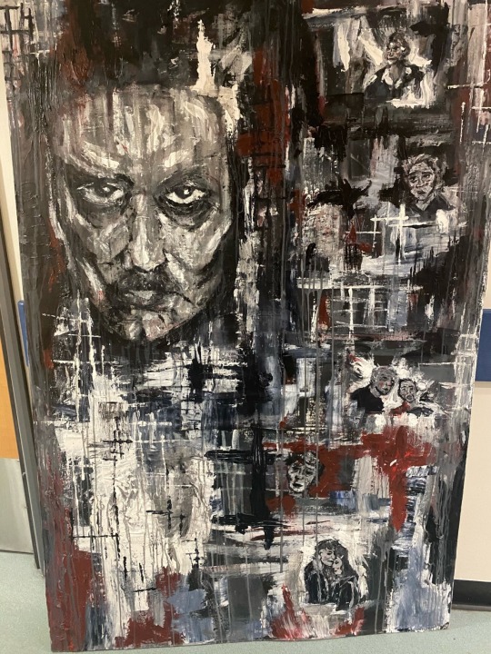
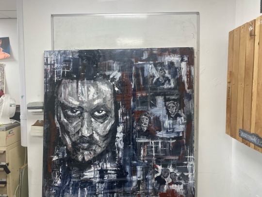
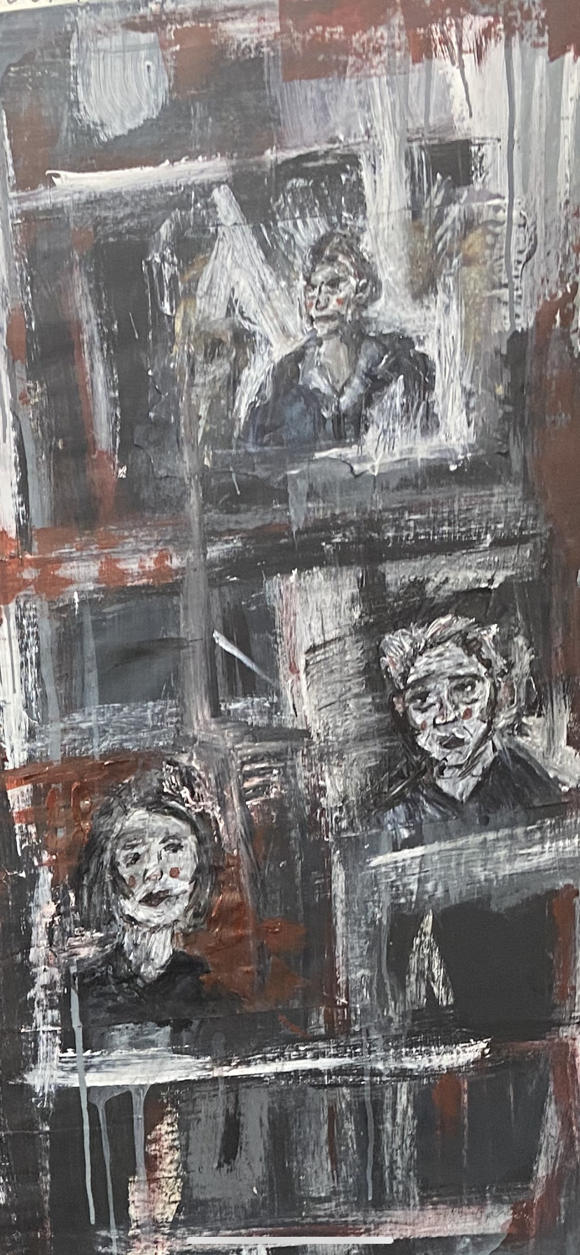
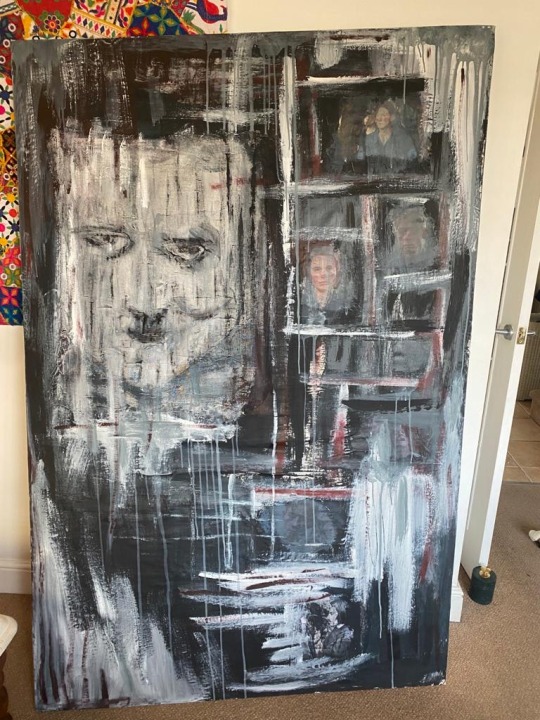
Section 3: Outcome I absolutely love this piece and am so proud of myself. My work has integrity and shows expression in each stroke, there is a sense of completeness as well as depth. I believe that there is a surness of touch and every line looks likeb it should be there this helps to create a rhythmic quality. There is a good range of tone which really helps me to create the mood of fear and hostility I seeked to create. There is a good sense of harmony within the colour pallet as they all work so well together they seem to blend.
Composition is a big part of this piece due to the size of the piece, it cant be shrugged off. When planning my final piece, I created a list of compositional techniques I feel like I’ve achieved a good amount of the. There is unity as each part feels as if it belongs there and nothing is out of place,the painting “feels right” and no side feels heavier than the other so there us also balance, there is rhythm starting at the face of big brother and then a spiral motion starting from top left, the big brothers face is the focus point and is very obvious and there is a big contrast highlighted by the white grid like patterns the only thing there isn’t is pattern, there is no big forms of repetition and I believe it wouldn’t of suited my piece anyways.
I really stuck with the colour pallet I choose which was red, white, black, grey and a navy blue. The only thing I forgot was how the white mixing with the navy blue would create a light blue colour which in the end I really loved, and I think it helps break up the deep contrast of the white and without it the piece would be off balanced.
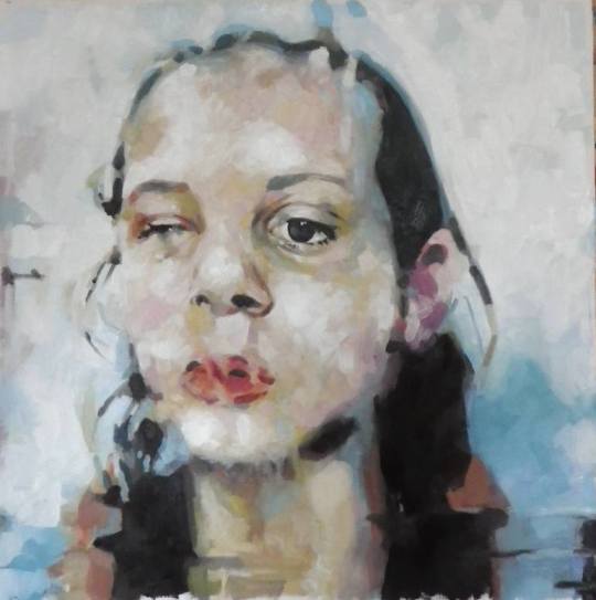
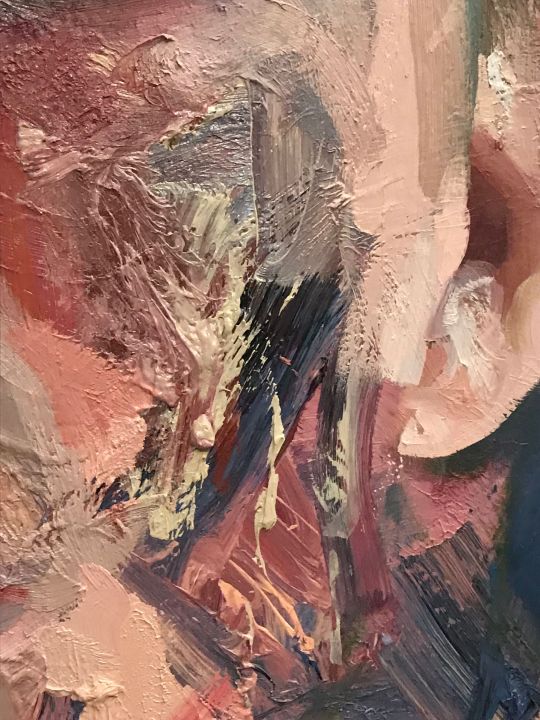
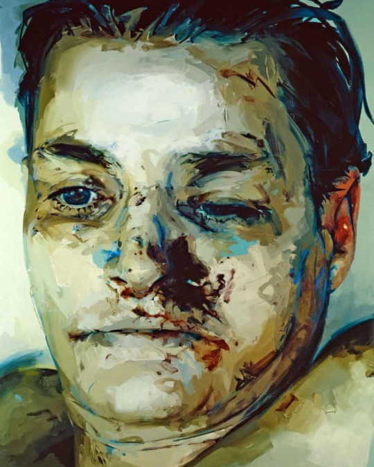
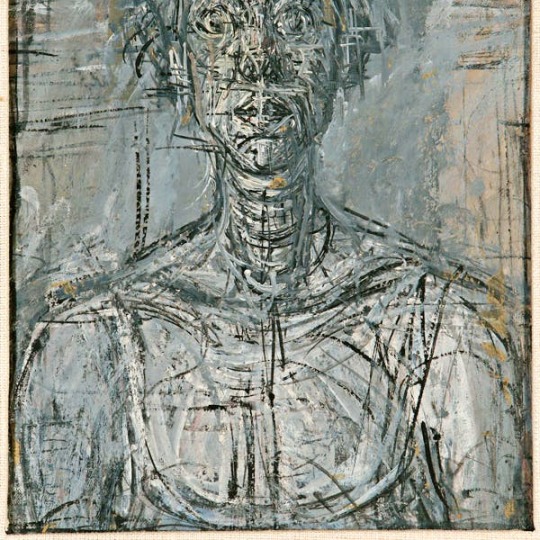
The first two images show the sewing element its hard to find them in the but I wanted them to be hard to see so when you do find them they show an interesting pattern. I stuck the fabric on with PVA and I really liked the texture that it produced when you scrunch up the material a little. The material I used to sew on was a cream colour so I scraped a light layer of paint to help show the texture still but that was extremely tough to get right and in some areas the texture is hidden. The third image shows a close up of Big Brothers face, one of the eyes are still bigger than the other which is very annoying but the face looks better from afar and with the rest of the piece. My lecture gave me a challenge of not using a paint brush which at first I hated but, now I absolutely love it and haven't used a paint brush on my piece since. Instead of a paintbrush I had to get creative and used mainly cardboard slabs and whole and broken lollypop sticks for different texture. I incorporated all three of my main artists but mostly used Freud’s method of ‘patchy’ colour placement to create shadows and light. I had the base layer already done so I started of with the eyes (in a slightly similar technique my lecturer showed me on the paper before). I used a mix of my photogram that I created of big brother and an image of him used in the movie (both shown above) and they both really helped me to grasp a concept of the shadow placement and key facial features. I used Jenny Savile’s layering technique (as you can see on the highlights of his forehead) the way some areas were thicker and then looked lighter was very interesting and I really loved it, I also used that technique to add depth and help uplift the figure around the outside, so the shadows looked darker. I kept in some of the lines that featured in my photogram as I thought they looked interesting and added a unique look to the piece. I am upset that it doesn’t look as good but also I know that its my first time with this painting style and I find faces very hard so from that I am proud it actually looks like a human. If you look closely you can see small grey lines around the whole piece these were done with very watered down drips of paint which add a variety of tone. The fourth and fifth images show the portraits and images from the movie. I used Giacometti’s line technique as it was extremely hard to do the same technique that I used on the giant face on the small face. Again, the faces aren’t that great as I know they could be but, that’s due to lack of experience and for this piece the kind of inhumanness they hold works. The sixth image is there to help show the texture and its build up, and you can also see the scrapes inspired by Giacometti. If I had enough time I would of gone in a dark room and shown the shadows the piece holds but that is something I couldn’t really control. I used Giacometti’s method of scratching to created grid like shapes. I also used big areas of one colour like Giacometti by using cardboard to layer thick acrylic paint and also printing ink so, in that sense I also accidently used Savile's method.
I believe my audience would respond well especially if I could show my piece how I wanted to present it. When writing my proposal I had my audience in mind and I believe my work emulates Orwell’s words and his described worlds of 1984.
Section 4: Evaluation methodology
I believe the strengths of my project are the research and my final piece as the research is deep and wide and is a big part of my project so it has to be very detailed otherwise my project would just be nothing. My final piece has a lot of planning and research behind it and I am never fully happy with my work but this piece I’m extremely proud of myself hence why I believe it is one of the strongest parts of my project.
The weakest parts were the artist research for the artists I didn’t like and the start of my project was also very weak as I didn’t have a clear idea at the start and I believe you can see where I struggled as its kind of messy and hard to understand. The artists research for the artists I didn’t like was extremely hard for me it was like trying to get blood out of a rock as I find I have the most to say about something I like rather than something I hate so those artists are a weak point in my project. Another weakness is my time management skills, I think I over estimated how much time I really had so I created a big project with a time period that would make my submission very close call.
There are many ways I evaluated my work the first way was by analysing side by side my final piece plan by what I achieved and writing down the parts I stuck with and the parts I didn’t and why. Another way I evaluated my work was to assess it like how I would with any other artist, analysing each section, what I liked, what I didn’t, how the piece made me feel and how I feel about the use of colour.
I self-reviewed each week and on each practical piece, I also self-reviewed each step on creating my final piece. I didn’t go into as much detail as I did for my final piece, but I reviewed the amount I believe that would help me be able to quickly read if I wanted to remember what needed improvement and what didn’t. For my exhibition if I could of done it I would of had my audience surrounded by darkness for a couple of minutes and faced in the direction of my piece, then one light will turn on and it will be placed above my painting centred, just like the second image above. the affect I hope to achieve from this is for all the textures to be highlighted adding to the contrast of shadows and highlights.
Week by week account -8th February-Researched my 11 words and narrowed them down to 5 then 1.
15th February- Researched further on 1984.
22nd February- Watched film and read the book on 1984. 1st March- Investigated artists that inspired me. 8th March- Did workshops on cyanotypes, photograms and view finders then assessed them and the artist associated with them. 15th March- Did workshops on Abstract expressionism, chemigams and further work into photograms and Dry point then assessed them and the artist associated with them. 22nd March- Did my own workshop on film development and photograms. I then caught up on any blog work that I missed. 29th March- Created and printed lino prints for my work experience and project. 5th April- Half of the week was spent on 1984 research and the other on blog catch up work. 12th April- Half of the week was spent on 1984 research and the other on blog catch up work. 19th April- Off ill most of the week and could not get work done but I manged to start a bit of my final piece plan. 26th April- Finished my final piece plan and started on my final piece. 3rd May- Working on my final piece and adding updates to my blog. 10th May- Finishing my final piece, portfolio work and finishing up on the blog.
I believe I have fulfilled and exceeded the project brief. I am extremely proud of how much work I have done for my FMP and each week I tried to go further than what we were meant to do and I believe that shows.
I did not really explore a lot of strategies to help present my final piece because I had a very clear image of how I wanted my work to be presented. The only development was that I wanted the audience to stay in a dark room before seeing my piece. There was two reason why there wasn’t that much development the first being time and me not having enough of it the second being that I really believe that my presentation idea is strong and would really be effective towards my audience.
I solved practical problems a lot one of the big ones was my final piece. On my first go I complete failed at creating what I had in mind and got into a big slump and no matter what I painted over it just wasn’t right, but I solved this problem by taking a breather and asking for help, then I was shown artists that really resonated with me and then my new final piece was born and I couldn’t be more than happy with it.
A theoretical problem that was solved was my issue of my original plan to use all of George Orwell’s books and research in depth every single one of them. Theoretically if I were to carry on with this plan I wouldn’t of been able to complete my project because I had too much work or my research would have been extremely poor.
I have learnt so many things over this project. I have learnt two very big photography techniques including film development which is something I’ve always wanted to try. I have learnt a whole new style of art, one that I never would of thought id ever be able to create, I learnt very interesting techniques that really challenged me to think outside the box for example not using a paint brush and layering thick layers on paint to help create weird and unique textures. I also learnt about three really interesting artists that have inspired me so much especially Jenny Savile who shone a new light on dark and twisted subjects. I planned my final piece by breaking it down into small parts. First my mood board, what my aesthetic is that I want to achieve and images that would work with my piece. Then I create a variety of colour pallets I could use and deeply assess each one then choose my desired one. Then I create compositional ideas and like the colour pallet asses each one, I also added plans for Big Brothers face and how I want him placed compositionally wise in my piece. I then talked about size and my audience I want to capture from that I started my final piece.
I seeked out help a lot from my lectures and friends and asked a lot of questions about improvements and strengths.
0 notes
Text


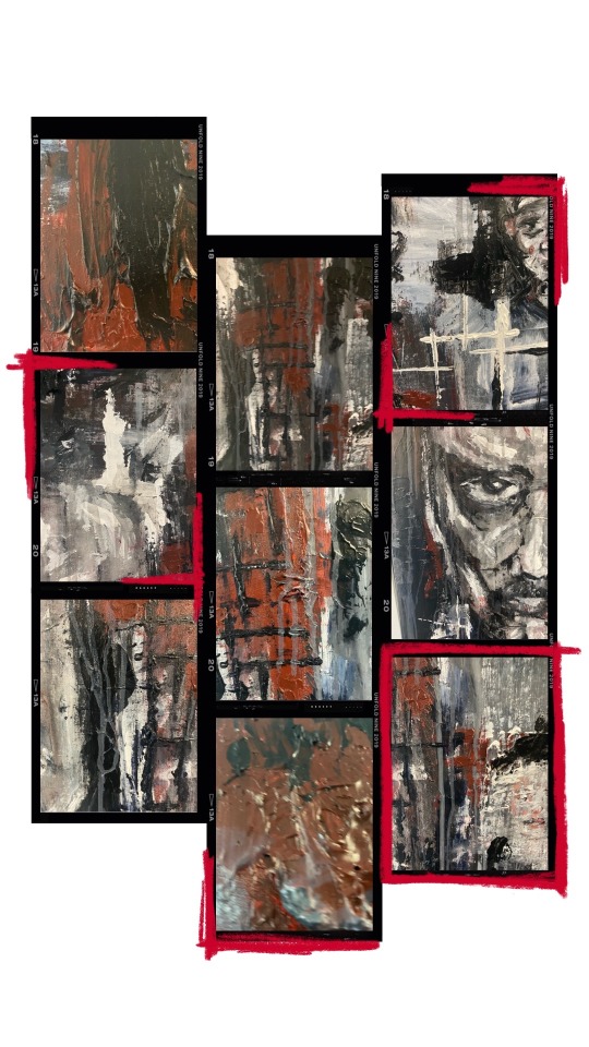
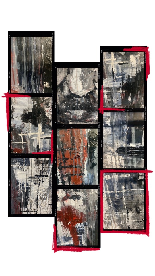


Theses aren't my outcomes but I thought it would be really cool to take close ups of my final piece and present them in a fresh type of collage way. I took around 50 photos and they all came out really interesting and it amazes me how I can get 50 + photos that look very different from one piece.
0 notes


Photo


I absolutely love this piece and am so proud of myself. My work has integrity and shows expression in each stroke, there is a sense of completeness as well as depth. I believe that there is a surness of touch and every line looks likeb it should be there this helps to create a rhythmic quality. There is a good range of tone which really helps me to create the mood of fear and hostility I seeked to create. There is a good sense of harmony within the colour pallet as they all work so well together they seem to blend.
Composition is a big part of this piece due to the size of the piece, it cant be shrugged off. When planning my final piece, I created a list of compositional techniques I feel like I’ve achieved a good amount of the. There is unity as each part feels as if it belongs there and nothing is out of place,the painting “feels right” and no side feels heavier than the other so there us also balance, there is rhythm starting at the face of big brother and then a spiral motion starting from top left, the big brothers face is the focus point and is very obvious and there is a big contrast highlighted by the white grid like patterns the only thing there isn’t is pattern, there is no big forms of repetition and I believe it wouldn’t of suited my piece anyways. I really stuck with the colour pallet I choose which was red, white, black, grey and a navy blue. The only thing I forgot was how the white mixing with the navy blue would create a light blue colour which in the end I really loved, and I think it helps break up the deep contrast of the white and without it the piece would be off balanced. The first two images show the sewing element its hard to find them in the but I wanted them to be hard to see so when you do find them they show an interesting pattern. I stuck the fabric on with PVA and I really liked the texture that it produced when you scrunch up the material a little. The material I used to sew on was a cream colour so I scraped a light layer of paint to help show the texture still but that was extremely tough to get right and in some areas the texture is hidden. The third image shows a close up of Big Brothers face, one of the eyes are still bigger than the other which is very annoying but the face looks better from afar and with the rest of the piece. My lecture gave me a challenge of not using a paint brush which at first I hated but, now I absolutely love it and haven’t used a paint brush on my piece since. Instead of a paintbrush I had to get creative and used mainly cardboard slabs and whole and broken lollypop sticks for different texture. I incorporated all three of my main artists but mostly used Freud’s method of ‘patchy’ colour placement to create shadows and light. I had the base layer already done so I started of with the eyes (in a slightly similar technique my lecturer showed me on the paper before). I used a mix of my photogram that I created of big brother and an image of him used in the movie (both shown above) and they both really helped me to grasp a concept of the shadow placement and key facial features. I used Jenny Savile’s layering technique (as you can see on the highlights of his forehead) the way some areas were thicker and then looked lighter was very interesting and I really loved it, I also used that technique to add depth and help uplift the figure around the outside, so the shadows looked darker. I kept in some of the lines that featured in my photogram as I thought they looked interesting and added a unique look to the piece. I am upset that it doesn’t look as good but also I know that its my first time with this painting style and I find faces very hard so from that I am proud it actually looks like a human. If you look closely you can see small grey lines around the whole piece these were done with very watered down drips of paint which add a variety of tone. The fourth and fifth images show the portraits and images from the movie. I used Giacometti’s line technique as it was extremely hard to do the same technique that I used on the giant face on the small face. Again, the faces aren’t that great as I know they could be but, that’s due to lack of experience and for this piece the kind of inhumanness they hold works. The sixth image is there to help show the texture and its build up, and you can also see the scrapes inspired by Giacometti. If I had enough time I would of gone in a dark room and shown the shadows the piece holds but that is something I couldn’t really control. I used Giacometti’s method of scratching to created grid like shapes. I also used big areas of one colour like Giacometti by using cardboard to layer thick acrylic paint and also printing ink so, in that sense I also accidently used Savile’s method.
0 notes
Text
Presentation
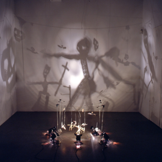
The pieces above are artwork done by Christian Boltanski, a French sculptor and is known for his installation pieces. His experimentation of light and dark is what I really love about him. The second picture really inspired me with my presentation idea.
I want my audience to be surrounded by darkness for a couple of minutes and faced in the direction of my piece, then one light will turn on and it will be placed above my painting centred, just like the second image above. the affect I hope to achieve from this is for all the textures to be highlighted adding to the contrast of shadows and highlights. I want to instil fear into my audience and give them the same affect the citizens in the book would feel. Big Brother is meant to have a very strong presence and I believe putting my piece in a big room with only a light will defiantly help my piece to capture the attention of the whole room.
Sadly due to covid I cannot achieve this but, In the future if given the opportunity I will install this installation.
1 note
·
View note
Text
Finale Piece Part 4


I started off by adding to the ‘Big Brother’ face by making the eyes more uniformed, defying and sculpturing the right side of the face more and I added more depth around the chin by creating more highlights and shadows. I still feel like the face needs more work but I haven't figured out what yet so, I will go over that another day. I forgot about three more photos (from the movie) that were on my piece but were covered in the paint so I didn't see them last time. So I worked on them in the same style as the others and used the smudging technique to make them stand out.
After working on all the faces I decided now would be a good time to incorporate my sewing skills. I used a piece that I had sewing earlier and another random piece of cloth that I quickly sewed lines on to. I didn't want to sew the clothes onto my canvas as my canvas is a bit of fabric nailed onto a cardboard frame. And I didn't want to remove the fabric as it might mess up the placement so, I stuck the fabric on with PVA and to be honest I really liked the texture that it produced when you scrunch up the material a little. I then painted on the fabric as I want only the stitching to slightly show not the material. I will show close ups of the fabric part in the future as it isn't important to me if my audience can see what parts is fabric I want my audience to look at my piece as a whole then delve deeper into each element if they wish.
I really liked the grid like sections I made in the other post so I decided I would add a lot more as compositionally wise I think it brings the audience in and adds compositions of rhythm, pattern and movement.
Next I will add the finishing touches and some more layers and techniques like drips for example.
1 note
·
View note
Text
Finale Piece Part 3

After practicing my technique on the ‘Big Brother’ face I moved onto the small faces from the film. I was inspired by Freud at first but after completing my first image it looked similar to Giacometti’s sketch work but, I continued to work in my style as although I love the influence that these artists provide me I really want to find my own painting style as, I haven't painted in quite a while. Theses figures were extremely hard to paint like I did on the ‘Big Brother’ figure as they are incredibly small and I'm defiantly not light handed. Due to this I'm not exceptionally proud of theses pieces but due to time I have to just find a way to work around them.
I then worked on the rest of the piece. I used Giacometti’s method of scratching to created grid like shapes. I also used big areas of one colour like Giacometti by using cardboard to layer thick acrylic paint and also printing ink so, in that sense I also accidently used Savile's method. Another way I incorporated Jenny Savile’s techniques is by cleaning my cardboard slab onto the top of ‘Big Brothers’ head. I really enjoyed experimenting with the different sizes and shapes of cardboard slaps as each added a different texture and look.
Next I will carry on with my work of the base and the surrounding areas by adding more layers and thicker paint. I will also find a way to make the other faces have more character and become stronger.
1 note
·
View note
Text
Finale piece part 2


This was my start on the ‘Big Brother’ face. I was persuaded not to start over but instead layer so using the outline of the original ‘Big Brother’ I started working on the face. My lecture gave me a challenge of not using a paint brush which at first I hated but, now I absolutely love it and haven't used a paint brush on my piece since. Instead of a paintbrush I had to get creative and used mainly cardboard slaps and whole and broken lollypop sticks for different texture. I incorporated all three of my main artists but mostly used Freud’s method of ‘patchy’ colour placement to create shadows and light. I had the base layer already done so I started of with the eyes (in a slightly similar technique my lecturer showed me on the paper before). I used a mix of my photogram that I created of big brother and an image of him used in the movie (both shown above) and they both really helped me to grasp a concept of the shadow placement and key facial features. I used Jenny Savile’s layering technique (as you can see on the highlights of his forehead) the way some areas were thicker and then looked lighter was very interesting and I really loved it, I also used that technique to add depth and help uplift the figure around the outside, so the shadows looked darker. I kept in some of the lines that featured in my photogram as I thought they looked interesting and added a unique look to the piece. The face still has a lot more work needed for example, the right eye is too big and needs to be uniformed and the right side of the face needs more definition and to be sharpened up. Its very had to see the flaws when painting so my technique is to take photos to help point out the flaws.
1 note
·
View note
Text
Paint brush practice
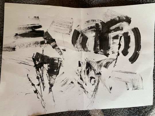
My lecture gave me a challenge of not using a paint brush, I had to get creative and used mainly cardboard slaps and whole and broken lollypop sticks for different texture. She helped my at first by showing me how simple lines and sweeps of the cardboard can create figure hence the eye she created. The rest was me messing around for a little bit to find different techniques. In the end I actually think with a bit of refinement this could actually become a piece.
I will use these techniques I learnt on my finale piece.
0 notes
Text
Sewing


After the flatness of my first attempt at a finale piece I felt like I needed to experiment with other mediums.
I haven't really been inspired by any artist to try sewing. I've just always wanted to add this medium into one of my pieces but they never really suited it until now. I want to create a mix media piece and incorporate sewing but I have never really used a sewing machine before so I had to practice.
The first two images are me getting used to the machine and messing around with lines and getting different angles. The next two are me finding out about patterns the machine can make and trying them out but i ran into a problem where the thick patterns are extremely hard to do as they kept getting stuck through the thread and knotting up. The next white thread picture is very hard to see but I wanted to experiment with sewing material together just to cover the basics of sewing in case gluing the fabric on my canvas doesn't work. The next three photos show me practicing with colour, straight lines, angles and switching to one pattern from the other. I did run into the problem where the fabric got caught again and accidentally ripped a hole in the fabric but that problem gets fixed with practice and patience. And finally I wanted to create a pattern and putt all of my new found skills into making a pillow case with the pattern but sadly I didn't have time to finish it and needed to carry on with my finale piece.
0 notes
Text
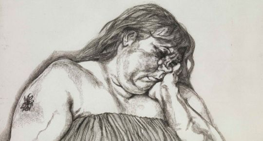
Jenny Savile


Jenny Saville is best known for her large-scale oil paintings of fleshy, mainly obese women. Saville transcends the boundaries styles both classical figures and modern abstract. She focuses on the imperfections of flesh (just like Lucian Freud), with all of its social implications and taboos. Savile spent time with a surgeon fuelling her fascination with the infinite ways that flesh can be transformed and disfigured. She explored medical anatomy, viewed corpses in the morgue and examined animals and meat. Her muses included individuals whose bodies challenge gender divisions, weight taboos and more. Her time with the surgeon helped produce these hyperreal visions of the human figure where faces are dismembered, and flesh abounds. That what I love about Savile’s work is that the juxtaposition of the use of colour and its meaning is so different it becomes beautiful. To me looking at her pieces without any context I had no clue that they descripted rotting carcases I just thought they featured that popular watercolour technique. But when added context her pieces become more fluent, and you realise the mastery that Savile manages to create.
Savile has an intuitive instinct for the handling and placement of paint. She uses a medium of oil paint that is applied in heavy layers and with that build up becomes as intuitive as flesh itself. Each mark creating a supple, of life on its own. Saville’s message of pushing, smearing, and scraping the pigment over her large-scale canvases soon starts to take away the distinctions between living bodies and their 2D representations. This plus the use of thick layers of oil paint help Saville challenge the boundaries of her genre,
Like Alberto Giacometti I was inspired by Savile’s layering of paint technique. However, Savile’s feature more of a thicker look which I believe combined with scratches from Giacometti these two techniques could transcend my finale piece. I also love Savile’s simple yet very cool technique of cleaning the remaining paint off her brush on her canvas (seen on picture 5 at the top of the figures head) its considerably basic idea but adds an interesting element onto the piece.
0 notes
Text
Alberto Giacometti


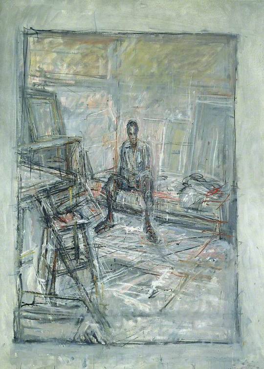
Alberto Giacometti is mainly remembered as a Surrealist artist. He used drawing as an exercise to help the development of his thinking. Alongside the basic sketches in his many notebooks, Giacometti also made separate drawings on individual sheets that he recites in pen and ink. Giacometti combined abstract signs and stylised figurative motifs. This technique, which was close to writing, helped him to translate his words into images.
Giacometti also avoids abstraction by reducing bodies to stylized pieces inspired by hieroglyphs. Giacometti liked to explore psychology and death through his stylized forms. “All the art of the past rises up before me, the art of all ages and all civilizations, everything becomes simultaneous, as if space had replaced time,”, “Memories of works of art blend with affective memories, with my work, with my whole life.” He explained that, whether drawing, or print, his artwork reflected how he emotionally responded to his subjects; he rendered people the way he believed they ought to be seen by others. Nothing best describes this quote than his use of colour pallets, they are all very warm, consisting of different shades of browns, blues, greys and sometimes even reds. They give a feeling of warmth and comfort that juxtaposes with the figure’s expressions of sadness and numbness.
Giacometti’s unconventional use of brush strokes really inspired me, and I believe that combines with Lucian Freuds painting style would fit my finale piece perfectly. He combines a mix of scratches and scrapes with thick layers of paint making each piece have its own unique look and style. My first attempt at my final piece left the “Big Brother” face looking flat and lacking depth so, finding a way pf combining Freud’s and Giacometti’s should hopefully lift the face from the painting, add more depth and give the face a haunting look like Floris Neususs.
0 notes
Text
Lucian Freud
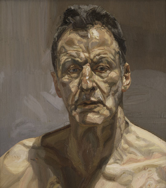
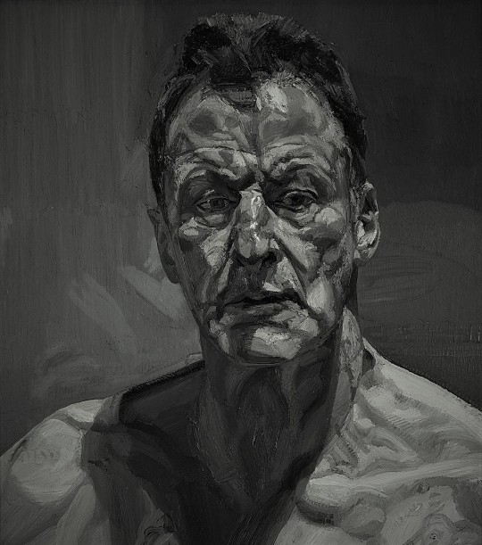


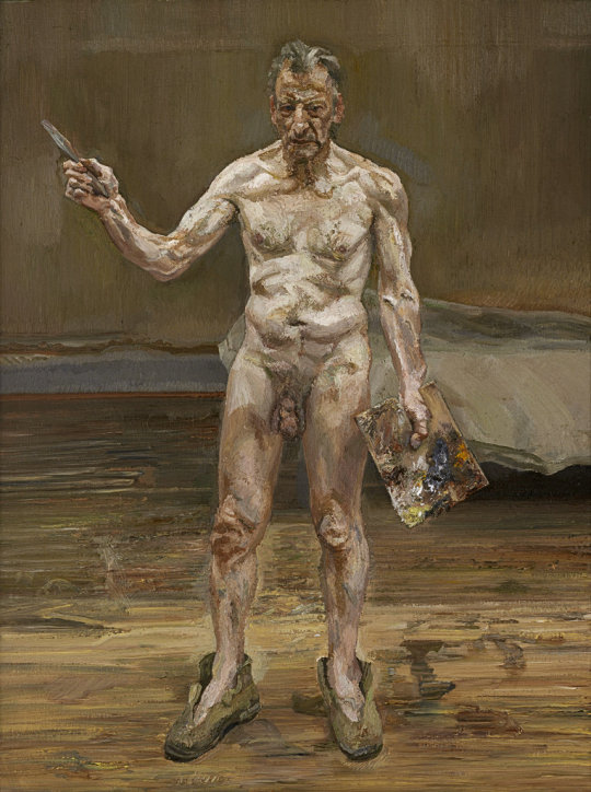
Freud was known for posing friends, neighbours, models, and family members in his studio, often as if spread casually across furniture that was falling apart and confronted their nude flesh with both a deep interest and a clinical indifference. Freud typically used a colour pallet of creamy tans and browns. Freud painted under a deep intense observation, usually over the course of many sittings, “The longer you look at an object, the more abstract it becomes and, ironically, the more real”.
His paintings show how observing everyday events can produce beautiful and significant art. His intention of making us the audience aware of our mortality, fatness, sexuality, and thinness making his work grotesque and realistic. His purpose is to expose his audience to the elements of people’s nakedness and not just what everyone dreams helping to create an uneasy atmosphere that is mostly true in Freud’s Night Portrait (1985–86) where he both highlighted and disguised the female nude’s erotica, he did not use idealizing techniques of Western art. His style portrays the realness and truth of the human body the cramped and sagging flesh and bones. Helping the audience figure out their own bodies. 'I paint people', Freud has said, 'not because of what they are like, not exactly despite what they are like, but how they happen to be' and 'The subject matter is autobiographical, it's all to do with hope and memory and sensuality and involvement really'.
For his sketches Freud uses a wide variety of mediums including charcoal, pastel, pen and ink, crayon, etching and watercolour juxtaposing Freud’s oil paintings. I was very sceptical when my lecture mentioned Lucian Freud to me as I have never even entertain the idea of creating artwork in a style similar but when I turned an image of his into black and white (third image down) I realised how much I could do with this kind of art style. I have taken inspiration from both his sketches and oil paintings. I love how Freud can make patchiness look realistic and appealing. He has found the perfect marriage between the right colour pallet and shades and placing the patches of colour in a way that from a glance don't even appear to his audience and that's what I hope to achieve when defining the face of ‘Big Brother’
1 note
·
View note
Text
Finale piece part 1

This was going to be my finale piece. I got really stuck and lost inspiration, this whole piece is a massive challenge for me considering I've only just done abstract art a couple of weeks ago so creating a piece like the abstract work I did before on a giant scale is very testing. The piece I created in my opinion has a strong concept and layout but it is missing technique and looks extremely flat so I want to add more texture. I decided to fuse together the composition idea “2″ and “3″ as “2″ didn't assert its self enough on its own and I thought It would be interesting to combine both compositional layouts together. I was heavily inspired by Robert Rauschenberg and I believe I got caught up in that which made me lose my style and threw my off the piece. The big brother face needs way more definition and the faces from the movie need something else to elevate them but I don't know what it is yet. I really like the drip effect but that's about it. It is a very poor piece and I will probably start again on a fresh canvas as it only took me a day to complete.
0 notes
Text
Audience
My audience has two aspects of it. The first being the most obvious, fans of dystopian literature especially George Orwell’s and the other being anyone. Anyone is a very broad term but its true, before starting my FMP I hated abstract I found it messy and boring but then I looked at it in a new light and now it’s become my favourite style. That is what I want to achieve, I know my work isn't going to be a masterpiece and go down as one of the greatest pieces of art but, I want to open up people to at least the idea that they could like abstract. I sold some of my favourite pieces from my original abstract pieces on Esty and my audience and buyers were female teenagers whom I know to be avid readers so hopefully I will still attract that audience with my finale piece.
0 notes
Text
Size
I really want to create a large scale piece that is as high as a wall and is portrait. I know this will be a huge demanding piece for me as I've only ever created small pieces of abstract art and even before that my pieces were no bigger than A3. So, I'm well awear of how challenging this is gonna be but, for my finale piece I really want that aspect of a challenge as you can only improve from your mistakes and this piece will defiantly bring a lot of mistakes and issues that I hopefully will solve and that will lead me to a strong finale piece that I am proud of.
0 notes
Text
Composition and size

Composition “Used to describe the arrangement of the visual elements in a painting or other artwork. Done successfully, good composition draws the viewer in and then moves the viewer's eye across the whole painting so that everything is taken in, finally settling on the main subject of the painting”. As I want my piece to be big composition is gonna play a huge role in a strong out come. I have chosen three compositional layouts.
Unity: Do all the parts of the composition feel as if they belong together, or does something feel stuck on, awkwardly out of place?
Balance: Balance is the sense that the painting "feels right" and not heavier on one side. Having a symmetrical arrangement adds a sense of calm, whereas an asymmetrical arrangement creates a more dynamic feeling. A painting that is not balanced creates a sense of unease.
Movement: There are many ways to give a sense of movement in a painting, such as the arrangement of objects, the position of figures, the flow of a river.
Rhythm: In much the same way music does, a piece of art can have a rhythm or underlying beat that leads your eye to view the artwork at a certain pace.
Focus: The viewer's eye ultimately wants to rest on the "most important" thing or focal point in the painting, otherwise the eye feels lost, wandering around in space.
Contrast: Paintings with high contrast (strong differences between light and dark, for example) have a different feel than paintings with minimal contrast in light and dark. In addition to light and dark, contrast can be differences in shape, colour, size, texture, type of line, etc.
Pattern: A regular repetition of lines, shapes, colours, or values in a composition.
Proportion: How things fit together and relate to each other in terms of size and scale; whether big or small, nearby or distant.
1. This is a very simple and widely used composition layout it creates good balance, focus and unity. It’s popular because it is satisfying to look at in an audiences perspective and easy to compose the only issue is the composition relies on accuracy and symmetry but for my finale piece I don't want it to look perfect I want chaotic and unsymmetrical hence why I will not be choosing this compositional layout for my finale piece.
2. For this compositional layout is very loosely inspired by Robert Rauschenberg “Buffalo II (1964)”. Although this composition isn't as popular as “1″ its still very effective and uses a wide range of compositional techniques that include focus, rhythm, balance and unity. It leads the audiences eye to the middle left of the frame then leads them around the rest of the piece starting from the top. This is my favourite layout and is my chosen compositional layout.
3. This compositional layout is very unique to me although I am new to abstract art I haven't seen a lot of pieces with a layout similar to this one. There isn't one focus point however there still is an achievement of balance and unity which is exceptionally hard to create with a layout like this. Although this is very close second to “2″ I wont be choosing this for my compositional layout as its an extremely hard compositional layout to get right however I defiantly will be trying it out in the future.
Composition Part 2

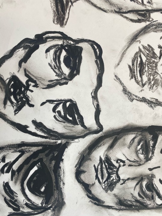
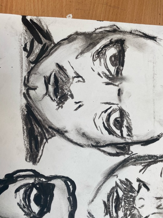

The first 3 Image’s show me experimenting with the design for Big Brother’s face. I took heavy inspiration from the description and images of him in the movie as there isn't much to go with in the book except from he was a ,middle aged man and although, I do not like the movie I can't ignore its significance in the literature to film industry. I took inspiration from Ian Hodson and used charcoal and chalk to help create a sketchy look as I believe its very affective as You can easily manipulate the chalk/charcoal to erase or add to the image. To help with the darker areas I also added ink and on some images it really helped add depth. My favourite style of image is number “3″ as it looks both innocent but scary and I believe that sums up big Brother very well. The fourth image is me incorporating both the second and third composition ideas as, they are both strong ideas and I thought it would be both a good challenge to incorporate them and make them stronger. The blank boxes are where I will be adding images from the movie.
0 notes