Last Seen Blogs

oloip55
P I O L O
falsechamp
STRENGTH & DISCIPLINE

ohnodesign
Daily Ohno Design
angelicdust
Ava

netguy0069
Untitled
Text
Evaluation:

Media and Techniques:
In this project, I have looked over colour theory, the use of colours and how they can be used to enhance a picture through complementary colours in multiple forms, saturation of the colour and their warmth, and this was used in my work. I also looked into multiple media, from Movies, games, books and even music, which has always motivated my works' visual narrative. I researched such topics as Chinese dynasties, blood connotations, Prey (2017), Charities and reuse of topics in the form of sequels and reboots. Through them, I learnt the history of the Chinese Dynasties and what led to their rise and eventual fall. I learnt how influential the topic of blood is in history, through ancient Aztec rituals and even the foundations of medicine and its religious view through such parties as the Christians. Prey led me to look at its visual nature and how it was used to enhance the setting and describe the world the characters lived in. And looking into recycling led me to discover that revisiting or trying a new outlook of a topic or idea can help enhance and surpass the original that I used a lot during this project.
These topics helped influence my project as I drew inspiration from them to create the foundations of my project proposals, eventually leading me to the creation of Blood and Gears. I wanted to use art deco, inspired by Prey’s visual landscape, to show how the world is prosperous and sanitary, regal and valuable, while using minor influences, such as H.R Giger's artwork, to show the alien nature of the place and what lies underneath. These helped meet my proposal as they enhanced my ideas and pushed me to work harder in newer mediums.
Purpose, Theme, Concept:
For this project, I wished to make it my best yet, looking into a deeper and more thoughtful idea. My theme was Self, who you are and what you are, and would follow a character who needs to find out who he is, in a more literal sense as they had no idea what they were, being an organic automaton, a juxtaposition in his beliefs and thoughts.
I originally wanted to have many written segments about the world, miniature snippets of the world separated into blurb-
like instances, however I only made one, as the project had left a large backlog to go back and complete that were far more valuable, leaving me to only to express this idea once to help further my project. I wanted to do this originally because I wanted my project to be more provoking, and a lump of text can help with that as you can pull your own ideas from it and put them together as you like. I believed it also to be interesting and unique compared to other projects and also made up for my lack of game mechanics due to my time not focusing on game production.
The main aspect of my project was the art. I knew from the beginning that I wanted to make this some of my best work yet, as I wanted to show character through visuals and style. I believe that I had achieved this during my time, however I must admit that I am disappointed in how little art was ever fully finished to final quality.
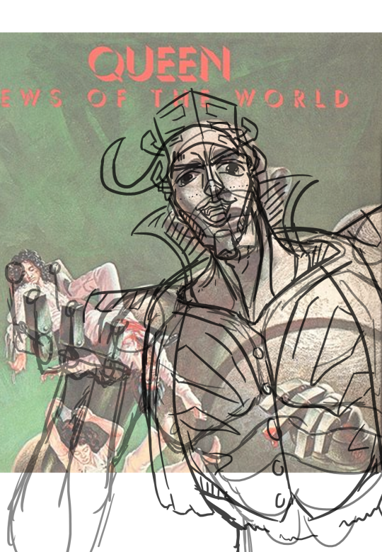
This is mainly due to my research and development that I spent leagues more time on because I wanted to improve this project compared to my past work, where research was terribly minimal, however, I over corrected, leading to me having less time to fully develop my artwork, this sadly had cut into the time of a reworked piece of the main villain, having originally been inspired by Queen’s, News of the World album art by Frank Kelly Freas, as I wanted the piece to portray power and destruction as shown in the piece, yet this piece looked off and unnatural due to proportion and foreshortening.
I then tried to colour it in, similarly the SVEN, the main character who went along much smoother, yet he looked gross and revolting, unlike the powerful and opulent monster I was striving for. So, inspired by my research into reboots, I went to remake the piece, but this was heavily crippled by my lacking time, as I went to do this at the end of the project so I could get all my other, less finished work done. I am more happy with my refurbished art, not being inspired by any other art piece that would have been used as a base, rather I made it from scratch so I could get the specific vibe I wanted, and it turned out quite well.
Sadly one piece of work was unable to be finished, depicting two side characters I had envisioned who were inspired by 1910’s french getup, being a robot wife and her mortal husband who had gone through strife when her programming hard reset, leaving her without her memories and practically killing her. In this piece I wanted to show her as this force that linger on her husband, towering over him in cold blues to symbolise his now lost, dead, wife while also using purple shadows to make her feel more ominous. This piece didn’t get far, and so I left it to complete other work that I believed was more important and interesting, which helped other pieces come into their own.
However these two would have helped my further my theming, as they would have a different opinion on who “Self” is, because of their misfortune compared to other characters like Sven, who is dealing with revelation and fear while Arron is contempt in his place and sees himself as unimportant and rather lives a life of bliss uncaring of how his “Self” is viewed.
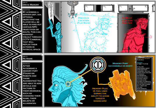
I also made a small description of two aspects that the main character can do, styled in the way of a computer, using art deco as a bases of its software styling, what is also fitting in to the nature of the game, being pristine yet gloomy, going a layer further in to show the true reality of the world and the fear of an autonomous world were self can be lost. Originally, it was going to be colourless, being a black and white Achromatic piece to feed into the computer software aesthetic, but I changed to colour to make enemies, playable characters and assessable items more visible and understandable that if it was left blank, and I still think that it feels how it should.
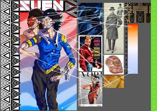
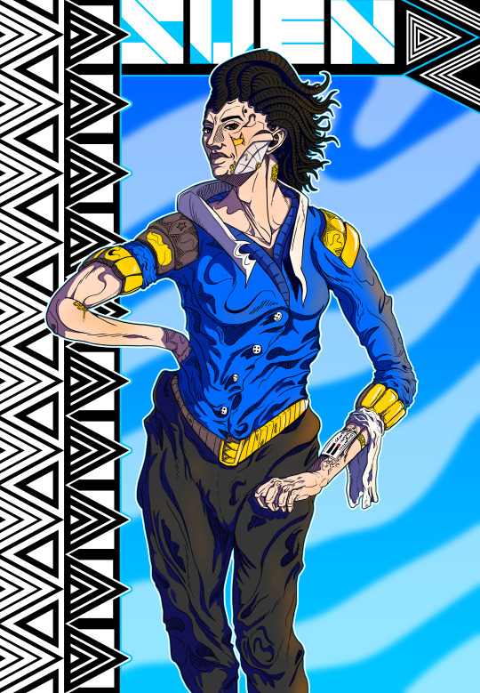
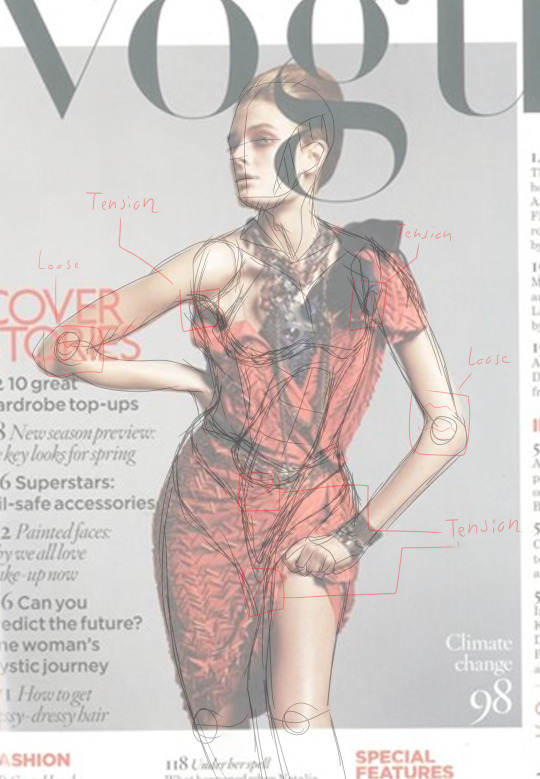
My main final piece, being Sven, was the first one fully complete and was inspired by fashion, with me using a vogue magazine and its model as reference for his pose what feels confident and strong, what is his personality before his revelation, and what he uses to assist himself being able to back himself up to help him in his pilgrimage of discovery. I took extra inspiration such as Jim Stark from rebel without a cause to help this impression while colour shifting him to make him look more calm and peaceful. I also made a second version of the image, where his face plate has been removed and his body is damaged, I wanted to do this as it showed a theme related to self, “Change,” as he is forced to accept that he is either someone new or if he is still the same as he always is, or if either is even an applicable view.
Outcome:
By the outcome, I am mixed on my feelings about this project. I have had excellent highs but also depressive bouts about the project's size, quality and overall skill. I wished to put my all into this, and make some of my best work, but being here shows that I am knowledgeable about my own projects' worth. Some aspects, such as some of my art and especially my research makes me feel proud and accomplished, but my writing skills and talents, including the wasted work, feel horrible to experience. If I was to go back to my project proposal, I think my past self would be disappointed with how it turned out, it feels lacking in areas and hasn't followed the timetable I made for it, but they never seem to match considering how projects never go to plan, always seeming to diverge into tangents and worthless work.
I believe that it has not fully met the FMP brief, but I don't see that as a negative, as it has become its own creature, allowing it to evolve further and flourish into its own identity, further and grander than that of which I tried to make it.
Conclusion:
I have received minimal feedback on my work and no peer assessment due to my lacking drive or care for others onions, as my own opinion of my work is far more valuable, as I am not one to sugar-coat what I think is bad, and I would know due to my hatred for my work, looking back at some of them I can see faults such as anatomy and proportion or just ugly decisions that I seeked out. This hatred for my art is what led me to remake my second piece and to throw other pieces into the trash. To improve my project, I could have spent longer positions and posing my characters, making them feel less stilted, this could have been exceptionally helped by using better facial expressions that would have better helped portray their emotions. I have learnt that wasting my time is worthless, even If I believe it would help enhance a piece, as I will only grow to despise it as time goes on.
Citations
Rebel without a cause (1955).
Jamiroquai (2017) “Automaton,” Music - Automaton Lyrics [Preprint]. Genius. Available at: https://genius.com/Jamiroquai-automaton-lyrics (Accessed: March 7, 2023).
National Geographic Society (2023) Imperial China's dynasties, Education. National Geographic. Available at: https://education.nationalgeographic.org/resource/imperial-chinas-dynasties/ (Accessed: March 7, 2023).
Arkane Studios (2017) Prey, Video Game.Bethesda Softworks. Available at: Prey on Steam (steampowered.com) (Accessed: March 7, 2023).
Wikipedia (ed.) (2023) Dynasties in Chinese history, Wikipedia. Wikimedia Foundation. Available at: https://en.wikipedia.org/wiki/Dynasties_in_Chinese_history (Accessed: March 7, 2023).
Guillermo del Toro's Pinocchio (2022) IMDb. IMDb.com. Available at: https://www.imdb.com/title/tt1488589/ (Accessed: March 7, 2023).
H.R. Giger (no date) Artnet.com. Artnet Worldwide Corporation. Available at: https://www.artnet.com/artists/hans-rudolf-giger/ (Accessed: March 7, 2023).
Houston, D. (2020) The Complete Guide to silver - spiritual meaning, properties and powers, CrystalsandJewelry.com. Available at: https://meanings.crystalsandjewelry.com/silver/ (Accessed: March 7, 2023).
Goryainov, D. (2020) Destiny 2 beyond light- stasis, Dima Goryainov on artstation at https://www.artstation.com/artwork/48djjn: Destiny, artwork, concept art, Pinterest. Epic Games. Available at: https://www.pinterest.co.uk/pin/406942516337017173/ (Accessed: March 7, 2023).
“Leviticus 17:11” (1986) in The holy bible: Containing the old and new testaments ; translated out of the original tongues and with the former translations diligently compared and revised. New York: American Bible Society.
Niki Clarke, N. (2019) Free online mental health chat, support & help, My Black Dog. Available at: https://www.myblackdog.co/ (Accessed: March 7, 2023).
Toy Story 2 (1999) IMDb. IMDb.com. Available at: https://www.imdb.com/title/tt0120363/?ref_=ttfc_fc_tt (Accessed: March 7, 2023).
Bungie (2017) Destiny 2, Video Game. Bungie. Available at: Destiny 2 on Steam (steampowered.com)(Accessed: March 7, 2023).
Cancer research UK (no date) Cancer Research UK. Available at: https://www.cancerresearchuk.org/ (Accessed: March 7, 2023).
LeFauve, M. (2015) Inside Out, IMDb. IMDb.com. Available at: https://www.imdb.com/title/tt2096673/ (Accessed: March 7, 2023).
Hirsch, A., McKeon, T. and Chapman, M. (2013) Gravity Falls. Disney Channel.
Zöllner Frank, Thoenes, C. and Taschen, B. (2022) Michelangelo: The Complete Works: Paintings, sculptures, architecture. Keulen: Taschen.
Frank Kelly Freas, (28, 10, 1977) News of the World, Queen.
Vogue, (2, 10, 2010) Vogue magazine, Vogue
0 notes
Text
Art Station
I have created an art station account for my project. I created an account so I could more professionally present my art, as while Tumblr is an easy way to upload my work and to show progress, it does lack the valour of professionalism that art station strives for, not only allowing for easier management of project details and allowing me to segment my other work and portfolio accordingly. It does lack the ease of just uploading my daily strides, but it perfectly encompasses finished work into its ecosystem.
It was quite easy to set up, not using my school email as I wanted to future proof it as I would be using it as Left collage and moved onto doing private work.
This will also allow for me to retrieve peer reviews from other members in the art community who see my work. I like how the website allows me to show all my work at once while also keeping it compact and divided, it is also nice how it lets me add specific details to each piece, whereas you had to make entire new blogs for Tumblr to achieve a similar yet degraded effect.
Link to project portfolio:
https://www.artstation.com/myartstation/projects?album_id=8786872
0 notes
Photo
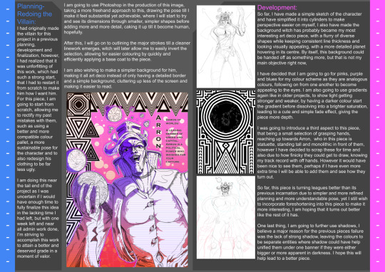
Planning-
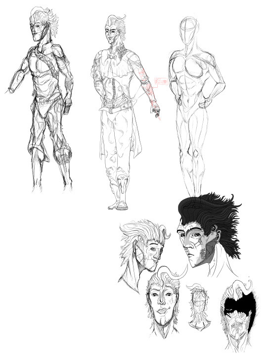
Redoing the Villain:
I had originally made the villain for this project in a previous planning, development and finalization, however, I had realized that it was unforfitting of this work, which had such a strong start, that I had to restart it from scratch to make him how I want him. For this piece, I am going to start from scratch, allowing me to rectify my past mistakes with them, such as using a better and more compatible colour pallet, a more sustainable pose for the character and to also redesign his clothing to be far less ugly.
I am doing this near the tail end of the project as I was uncertain if I would have enough time to fully finalize this idea in the lacking time I had left, but with one week left and near all admin work done, I’m striving to accomplish this work to attain a better and deserved grade in a moment of valour.
I am going to use Photoshop in the production of this image, taking a more freehand approach to this, drawing the pose till I make it feel substantial yet achievable, where I will start to try and see its dimensions through smaller, simpler shapes before adding more and more detail, caking it up till it become human, hopefully.
After this, I will go on to outlining the major strokes till a cleaner linework emerges, witch will later allow me to easily invert the selection, allowing for easier colouring by quickly and efficiently applying a base coat to the piece.
I am also wishing to make a simpler background for him, making it all art deco instead of only having a detailed border and a simple background, cluttering up less of the screen and making it easier to read.
Development:
So far, I have made a simple sketch of the character and have simplified it into cylinders to make perspective easier on myself, I also have made the background witch has probably became my most interesting art deco piece, with a flurry of diverse shapes while keeping consistent line thickness and looking visually appealing, with a more detailed planet hovering in its centre. By itself, this background could be handed off as something more, but that is not my main objective right now,
I have decided that I am going to go for pinks, purple and blues for my colour scheme as they are analogous colours, following on from one another to become appealing to the eyes. I am also going to use gradients again like in older projects, to show light getting stronger and weaker, by having a darker colour start the gradient before dissolving into a brighter saturation, leading to a cute and simple fade effect, giving the piece more depth.
I was going to introduce a third aspect to this piece, that being a small selection of grasping hands, reaching up towards Arron, who in this piece is statuette, standing tall and monolithic in front of them, however I have decided to scrap these for time and also due to how finicky they could get to draw, knowing my track record with off hands. However it would have been nice to see them, perhaps if I have even more extra time I will be able to add them and see how they turn out.
So far, this piece is turning leagues better than its previous incarnation due to simpler and more refined planning and more understandable pose, yet I still wish to incorporate foreshortening into this piece to make it more interesting, I am hoping that it turns out better like the rest of it has.
One last thing, I am going to further use shadows, I believe a major reason for the previous pieces failure was the lack of strong shadow, leaving the colours to be separate entities where shadow could have help unified them under one banner if they were either bigger or more apparent in darkness. I hope this will help lead to a better piece.
0 notes
Photo
Finalized-
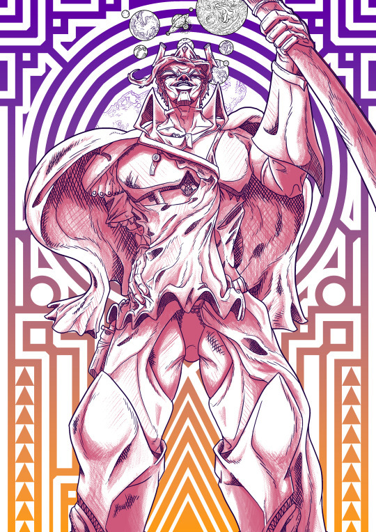
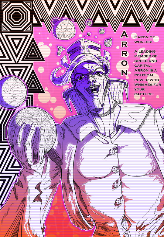
Aaron RE-DO:
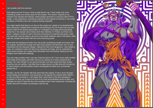
I am ecstatic with this outcome.
Only taking around 10 hours, what is quite fast for me, I have made a far more interesting, pretty and worthy piece for thai project. This rework, inspired by my research into sequels and reboots, where people returned to a previous idea of IP to create a new experience, sometimes inspired by the original to enhance it, has made the Baron of Worlds a far more creative looking character.
You might realize that there is no blue on this project as I stated in my development, that is because I realised that it would be encroaching to far into Svens look and also doesn't really fit his desired personality, so I changed it to orange,what surprisingly really fits in, the closest colour theory term that matches it is Triadic, but there is no green. I believe it works so well in the end is because it is matched with greys, what can work with near all colours, and due to the purple shadows used in this piece, witch help the orange blend better with the overconsuming purple.
I also think the background looks nice, the purple symbolising wealth and power, like the original, whereas the orange now feel more powerful and dominant, as it is now intertwined into his character design, making him feel more dangerous. I also added a cape, as I wanted to make him feel more imposing and large, and an outstretched cape works wonders as it makes their silhouette more dominating, feeding into thai designs more destructive feelings.
The only major problem that I can see is that his face is off. I have never really worked with heads at this angle, and that's obvious at a glance as it looks squashed and stubby. Yet, even though it is an obvious blunder, one that could have been simply saved by me not rushing, I had little time to object due to my little time left, forcing me to pace forward, and the problem doesn't downgrade the effort and commitment placed into it,
Overall, I am far, far happier with this piece than the original. It has a much stronger visual identity and presence, and advances on all aspects the original either failed in or had very little success in. I am happy that I came back to this and managed to complete it in time, as nit has to be one of my most accomplished works to date, and probably my best if I fixed the few minor problems that I have mentioned, including the hands, that aren't horrible, but perhaps a tad too big.
Finished Image:
Background:
Colourless rendition:
Finished Linework:
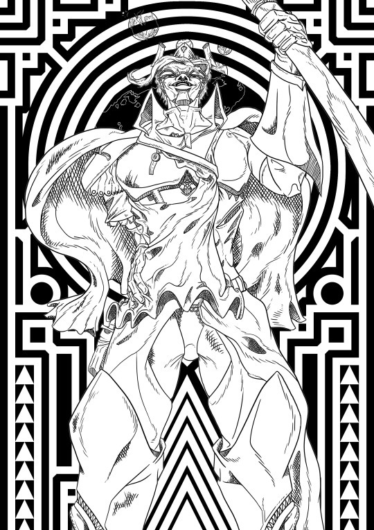
Linework

Original Sketch:

0 notes
Photo
Planning-
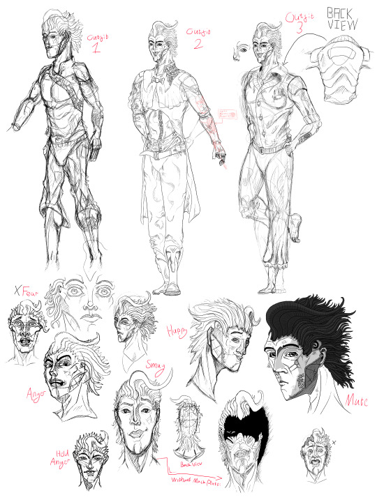
Villain:
In my project there was no necessity for a villain, or any direct opposition to the protagonist due to it being a personal journey of discovery, yet, adding conflict, especially in a foil type character, can enhance a plot. Because of this I made a character who would be introduced later into the story but be built up to through world building by making him a world leader, specifically owning the planet the game takes place on.
He will be the opposite of the protagonist, already knowing his place in the world, or at least, that's what he believes. He will impede the characters journey, trying to prevent him from digging up facts and hidden conspiracies on his way to find out who and what he is.
I want this character to feel imposing, a juggernaut so tall as to be insurmountable. I can do this by using the foreshortening that is already present in my reference image, that being the Queen Album art, News of the World, witch portrays a robotic monstrosity, originally depicted in Astounding Science Fiction in March 1954, destroying a building while holding the now deceased bodies of the band. I chose this as my reference material as I stated in my project proposal that I wished to be inspired by the music I consumed, and believed that this image would lay a perfect structural guidelines for me to follow through with.
I am going to take inspiration from 1910’s fashion, as relating to how this was the period in which art deco came into its strive in France. I will spend at least two days developing this work, including time spent on sketching, research into outfits and actual time spend doing the finished main outlines and colouring. I also want to again include the presence of an art deco inspired border to untie my pieces, but, I also wish to add a CRTV Affect to the image, using rows of low translucent to give to effect of an older model of tv. I want to do this because it feds into the identity I wish to give him, that being of a ruler of popularity and fame, and by giving him this TV appeal, he will fit deeper into that appeal.
I am making this character due to the value a good villain can introduce if they are played well. Aaron, as I am dubbing him, will be the protagonists, Svens, main foil. While Sven is still scrounging about finding out who and what he is, Aaron is lounging about, contempt and smug in his place in the universe, with an unwavering will compared to Sven’s state of confusion and change.
I wish to make this piece as similar to my last character piece as I can, so they both feel like they exist in the same world. Consistency has always been a major problem in my creative process, as one piece of mine can majorly deviate in style and aesthetic, leading to abnormal worlds, so to keep them in the same space could help, so I’m going to have my other piece open, using the same utensils as well, to keep up my consistency.
Development:
Starting the piece, I articulate a rig from my reference image, adding more human anatomy to it before furthering it by adding more human detail and clothing. I then, from my rough sketch, developed a finer linework and added orbiting planets partway through, due to it showing how powerful he is while also how the character could be seen as egotistical and self centered as his miniature dioramas of his owned planets all revolve around him.
I had come into a problem when I reached his hand, this is due to my lacking anatomical skills and terrible understanding of perspective, and when creating his hand, it became a bit unnatural and stiff, but due to mounting pressure from lack of time, I resulted to leaving it be, what is far harder to do due to the hands prevalence in this piece, grasping a planet in menichal joy.
I also came to a horrendous discovery, I wanted to try and use more diverse colours in his pallet to make him feel more vibrant while also using the colours to show his traits, like using purple to show power and wealth and gold to show opulence and greed, but it came out horribly wrong, the colours mixed like puke and came out in a terrible feat for the eyes, because of this, I wished to not use colour, rather I would leave it blank and return to it on a later date, perhaps after I had finished my admin work on the project.
Overall, so far, I am happy with my linework and his general design but am displeased with his colouration and off putting anatomy. To improve this as I further develop my work, I am going to minnamile my use of colour and put more work into the background to help further his character rather than through colour.
Finalized:
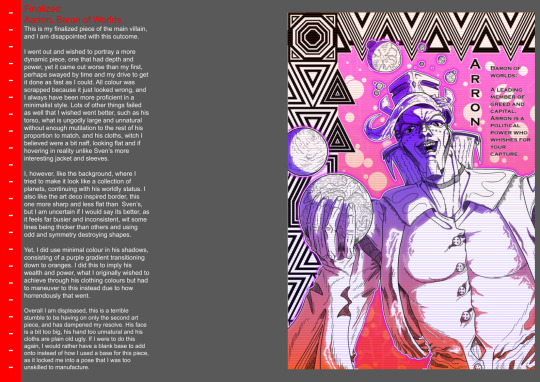
Aarron, Baron of Worlds
This is my finalized piece of the main villain, and I am disappointed with this outcome.
I went out and wished to portray a more dynamic piece, one that had depth and power, yet it came out worse than my first, perhaps swayed by time and my drive to get it done as fast as I could. All colour was scrapped because it just looked wrong, and I always have been more proficient in a minimalist style. Lots of other things failed as well that I wished went better, such as his torso, what is ungodly large and unnatural without enough mutilation to the rest of his proportion to match, and his cloths, witch I believed were a bit naff, looking flat and if hovering in reality unlike Sven’s more interesting jacket and sleeves.
I, however, like the background, where I tried to make it look like a collection of planets, continuing with his worldly status. I also like the art deco inspired border, this one more sharp and less flat than Sven’s, but I am uncertain if I would say its better, as it feels far busier and inconsistent, wit some lines being thicker than others and using odd and symmetry destroying shapes.
Yet, I did use minimal colour in his shadows, consisting of a purple gradient transitioning down to oranges. I did this to imply his wealth and power, what I originally wished to achieve through his clothing colours but had to maneuver to this instead due to how horrendously that went.
Overall I am displeased, this is a terrible stumble to be having on only the second art piece, and has dampened my resolve. His face is a bit too big, his hand too unnatural and his cloths are plain old ugly. If I were to do this again, I would rather have a blank base to add onto instead of how I used a base for this piece, as it locked me into a pose that I was too unskilled to manufacture.
Finished Image:
Coloured variant:
Finished Linework:
Original sketch:
0 notes
Photo
Planning-
Abilities and Descriptions:
For this project, I wish to show what could be done if it was ever to be picked up by better hands and put to scrutiny as a game. To do this, I am planning to make a Slide that could be seen in a game pamphlet or manual that would be found in the game case.
This will allow for the abilities to be better see and given more room to allow the player top discover them if they wish too, rather than forcing them to indulge in some controls that they might discover better on their own.
This piece will show off two descriptions, in the motif of the game, they will be shown off with art and style making them stand out from other manuals of the same ilk.
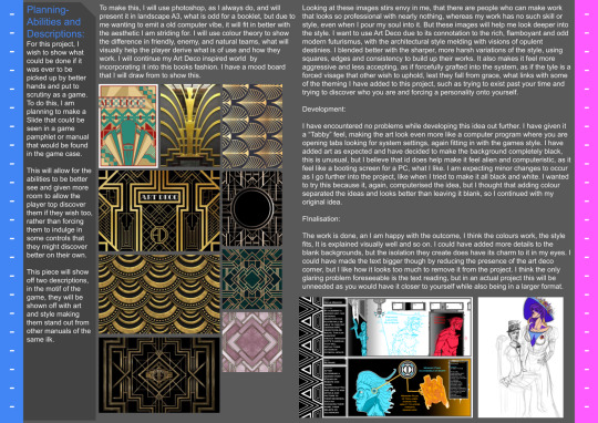
To make this, I will use photoshop, as I always do, and will present it in landscape A3, what is odd for a booklet, but due to me wanting to emit a old computer vibe, it will fit in better with the aesthetic I am striding for. I will use colour theory to show the difference in friendly, enemy, and natural teams, what will visually help the player derive what is of use and how they work. I will continue my Art Deco inspired world by incorporating it into this books fashion. I have a mood board that I will draw from to show this.
Looking at these images stirs envy in me, that there are people who can make work that looks so professional with nearly nothing, whereas my work has no such skill or style, even when I pour my soul into it. But these images will help me look deeper into the style. I want to use Art Deco due to its connotation to the rich, flamboyant and odd modern futurismus, with the architectural style melding with visions of opulent destinies. I blended better with the sharper, more harsh variations of the style, using squares, edges and consistency to build up their works. It also makes it feel more aggressive and less accepting, as if forcefully grafted into the system, as if the tyle is a forced visage that other wish to uphold, lest they fall from grace, what links with some of the theming I have added to this project, such as trying to exist past your time and trying to discover who you are and forcing a personality onto yourself.
Development:
I have encountered no problems while developing this idea out further. I have given it a “Tabby” feel, making the art look even more like a computer program where you are opening tabs looking for system settings, again fitting in with the games style. I have added art as expected and have decided to make the background completely black, this is unusual, but I believe that id does help make it feel alien and computeristic, as it feel like a booting screen for a PC, what I like. I am expecting minor changes to occur as I go further into the project, like when I tried to make it all black and white. I wanted to try this because it, again, computerised the idea, but I thought that adding colour separated the ideas and looks better than leaving it blank, so I continued with my original idea.
Finalisation:
The work is done, an I am happy with the outcome, I think the colours work, the style fits, It is explained visually well and so on. I could have added more details to the blank backgrounds, but the isolation they create does have its charm to it in my eyes. I could have made the text bigger though by reducing the presence of the art deco corner, but I like how it looks too much to remove it from the project. I think the only glaring problem foreseeable is the text reading, but in an actual project this will be unneeded as you would have it closer to yourself while also being in a larger format.
Finished Art:
Testing Art Deco style:

0 notes
Photo
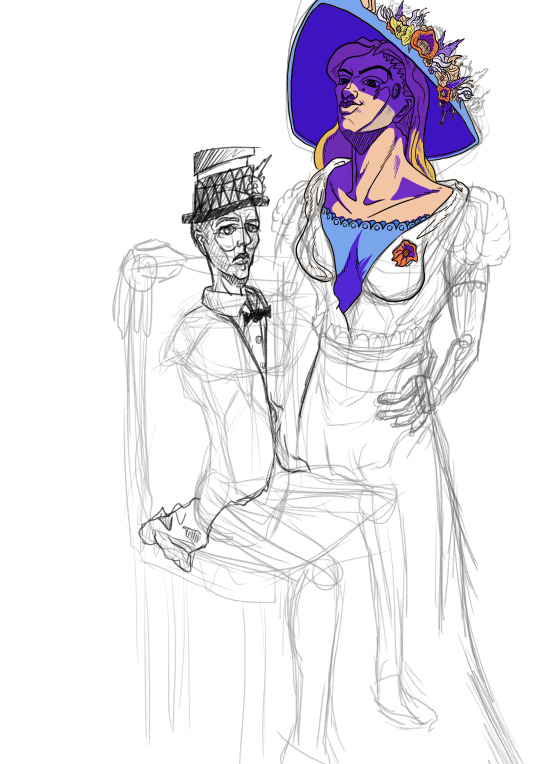
An unfinished piece of work depicting two side characters, a husband and his robotosised wife. I decided to put these two on the cutting room floor because I was already cutting it close to the deadline, and would rather spend this time making my pre existing ideas better such as the projects main villain instead of focusing on two, less integral, characters.
0 notes
Photo
Finalized-
Main Character
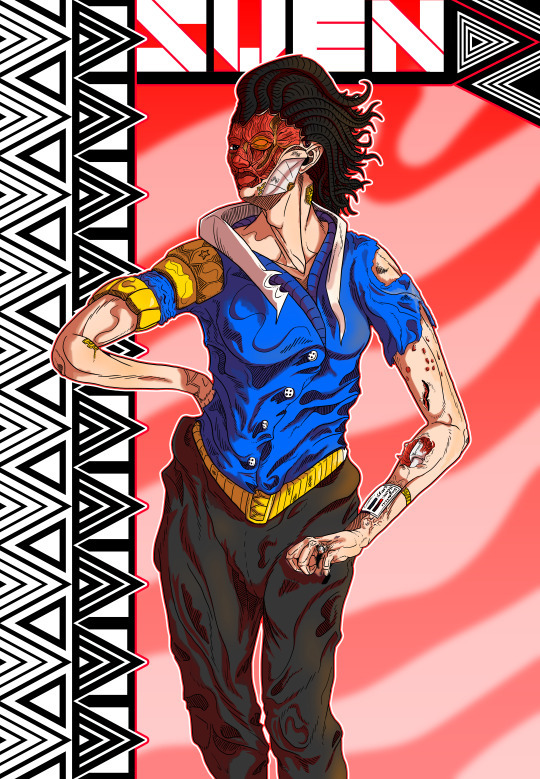
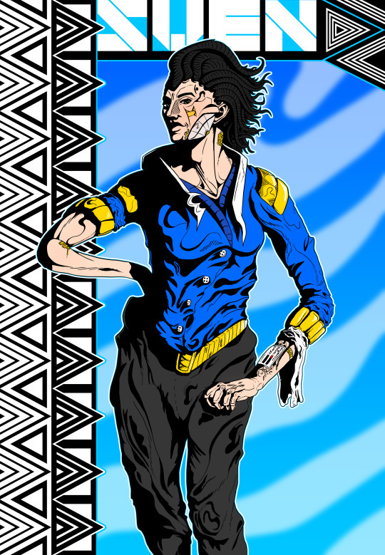
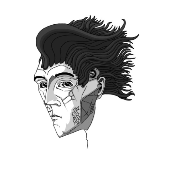
Sven:
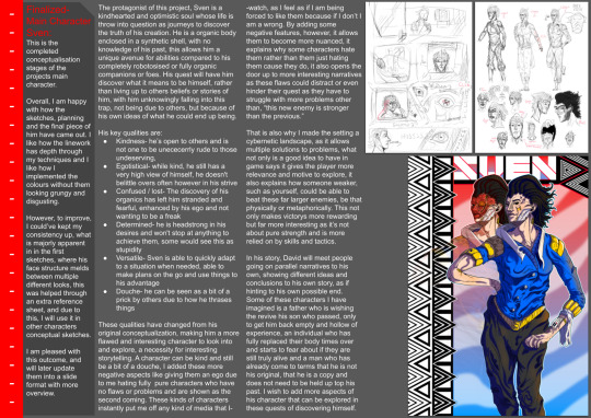
This is the completed conceptualisation stages of the projects main character.
Overall, I am happy with how the sketches, planning and the final piece of him have came out. I like how the linework has depth through my techniques and I like how I implemented the colours without them looking grungy and disgusting.
However, to improve, I could’ve kept my consistency up, what is majorly apparent in in the first sketches, where his face structure melds between multiple different looks, this was helped through an extra reference sheet, and due to this, I will use it in other characters conceptual sketches.
I am pleased with this outcome, and will later update them into a slide format with more overview.
The protagonist of this project, Sven is a kindhearted and optimistic soul whose life is throw into question as journeys to discover the truth of his creation. He is a organic body enclosed in a synthetic shell, with no knowledge of his past, this allows him a unique avenue for abilities compared to his completely robotosised or fully organic companions or foes. His quest will have him discover what it means to be himself, rather than living up to others beliefs or stories of him, with him unknowingly falling into this trap, not being due to others, but because of his own ideas of what he could end up being.
His key qualities are:
Kindness- he’s open to others and is not one to be unececerrly rude to those undeserving,
Egotistical- while kind, he still has a very high view of himself, he doesn't belittle overs often however in his strive
Confused / lost- The discovery of his organics has left him stranded and fearful, enhanced by his ego and not wanting to be a freak
Determined- he is headstrong in his desires and won't stop at anything to achieve them, some would see this as stupidity
Versatile- Sven is able to quickly adapt to a situation when needed, able to make plans on the go and use things to his advantage
Douche- he can be seen as a bit of a prick by others due to how he thrases things
These qualities have changed from his original conceptualization, making him a more flawed and interesting character to look into and explore, a necessity for interesting storytelling. A character can be kind and still be a bit of a douche, I added these more negative aspects like giving them an ego due to me hating fully pure characters who have no flaws or problems and are shown as the second coming. These kinds of characters instantly put me off any kind of media that I than, “this new enemy is stronger than the previous.”
That is also why I made the setting a cybernetic landscape, as it allows multiple solutions to problems, what not only is a good idea to have in game says it gives the player more relevance and motive to explore, it also explains how someone weaker, such as yourself, could be able to beat these far larger enemies, be that physically or metaphorically. This not only makes victorys more rewarding but far more interesting as it’s not about pure strength and is more relied on by skills and tactics.
In his story, David will meet people going on parallel narratives to his own, showing different ideas and conclusions to his own story, as if hinting to his own possible end. Some of these characters I have imagined is a father who is wishing the revive his son who passed, only to get him back empty and hollow of experience, an individual who has fully replaced their body times over and starts to fear about if they are still truly alive and a man who has already come to terms that he is not his original, that he is a copy and does not need to be held up top his past. I wish to add more aspects of his character that can be explored in these quests of discovering himself.
0 notes
Photo


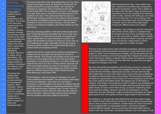
In these previous 6 projects, I have grown an affinity for art. I have learnt how to use Adobe Photoshop and a sleuth of its features such as overlaying, masks, filters and other quality of life tools. I have also learnt how to better coordinate myself and keep my mind in check while also better laying out my research and work. This is in stark contrast to the very beginning of this course, in which I thought I would have gained a better understanding in coding in Unreal Engine 4 / 5 and when my work was less organised and contained. I am happy that this course has allowed me to further my artistic merits, even if my expected path has come up to a dead end. I am happy and it means alot that I can continue doing work in a subject and area in which I am more accustomed. I wish to delve further into my artistic works due to my aspiration to achieve a great grade during this project to help further my freelance career.
For my project I wish to develop and produce conceptual art for a hypothetical game in its early stages focused around the metaphysical ideas of dreams and memories. These pieces would hold character sketches with refined images,location sketches and my interpretation of manifesting the metaphysical into reality that would intertwine initial research ideas into its theming and later primary and secondary research into its visual identity. I would need to use programs like Photoshop to create the work, such as sketches and images, and I would use Google Slides and Tumblr’s blogs to present my work, including research, overviews, developments, concept work and my problem solving skills that I presented during the project.
I will use time like independent study to develop my research further and harbour new ideas and qualities that can be added to the project due to having no resources to produce the necessary conceptual art at home, and so would rather use my time at school to produce that which I couldn't do at home. I will, at the end of every week of the project's lifespan, do an overview to see how far I have gotten and how much I have produced, inciting if I have met the qualifications that I demand of myself that week, if so, why, if not, why.
I will use a wide range of varied research to instigate this project, such as music, art and artists, games, philosophies, movies and architectural style. My hope is these will give my project a large pool to take from, allowing for more interesting and developed pieces.
I will also create and post to an art station account after my conceptual work is done, giving it a professional outlet.
I will post all my workings onto Tumblr. This will allow me not only to chronicle my work but to also allow me to show my workings and any challenges or changes that are made. When I have a large enough portfolio of my work, I will implement it into a survey that I will get others to participate in, asking for how it made them feel, if the project is of a good quality and other important questions. I will also upload my conceptual art to Art Station when it's done so it can be uploaded to a more professional outlet than Google Slides and also allowing for more opinions to be accepted through the digital medium.
…
This is my project proposal for the UAL Awarding Body. I could have made this more concise if I wished, but I believe that information would have been sacrificed for the sake of size, in my mind it is as small as I could manufacture as I don't view it as my mindless, worthless babble.
Starting from now, I will be preparing to start my projects earliest moments. I fear that I won't have enough time by the end of it to make a product I am happy with to achieve the grade I'm aiming for even with my best efforts, to remedy this I am going to plan out this FMP more than any other that I have ever produced.
[Referenced Materials used so far]
Jamiroquai (2017) “Automaton,” Music - Automaton Lyrics [Preprint]. Genius. Available at: https://genius.com/Jamiroquai-automaton-lyrics (Accessed: March 7, 2023).
National Geographic Society (2023) Imperial China's dynasties, Education. National Geographic. Available at: https://education.nationalgeographic.org/resource/imperial-chinas-dynasties/ (Accessed: March 7, 2023).
Arkane Studios (2017) Prey, Video Game.Bethesda Softworks. Available at: Prey on Steam (steampowered.com) (Accessed: March 7, 2023).
Wikipedia (ed.) (2023) Dynasties in Chinese history, Wikipedia. Wikimedia Foundation. Available at: https://en.wikipedia.org/wiki/Dynasties_in_Chinese_history (Accessed: March 7, 2023).
Guillermo del Toro's Pinocchio (2022) IMDb. IMDb.com. Available at: https://www.imdb.com/title/tt1488589/ (Accessed: March 7, 2023).
H.R. Giger (no date) Artnet.com. Artnet Worldwide Corporation. Available at: https://www.artnet.com/artists/hans-rudolf-giger/ (Accessed: March 7, 2023).
Houston, D. (2020) The Complete Guide to silver - spiritual meaning, properties and powers, CrystalsandJewelry.com. Available at: https://meanings.crystalsandjewelry.com/silver/ (Accessed: March 7, 2023).
Goryainov, D. (2020) Destiny 2 beyond light- stasis, Dima Goryainov on artstation at https://www.artstation.com/artwork/48djjn: Destiny, artwork, concept art, Pinterest. Epic Games. Available at: https://www.pinterest.co.uk/pin/406942516337017173/ (Accessed: March 7, 2023).
“Leviticus 17:11” (1986) in The holy bible: Containing the old and new testaments ; translated out of the original tongues and with the former translations diligently compared and revised. New York: American Bible Society.
Niki Clarke, N. (2019) Free online mental health chat, support & help, My Black Dog. Available at: https://www.myblackdog.co/ (Accessed: March 7, 2023).
Toy Story 2 (1999) IMDb. IMDb.com. Available at: https://www.imdb.com/title/tt0120363/?ref_=ttfc_fc_tt (Accessed: March 7, 2023).
Bungie (2017) Destiny 2, Video Game. Bungie. Available at: Destiny 2 on Steam (steampowered.com)(Accessed: March 7, 2023).
Cancer research UK (no date) Cancer Research UK. Available at: https://www.cancerresearchuk.org/ (Accessed: March 7, 2023).
LeFauve, M. (2015) Inside Out, IMDb. IMDb.com. Available at: https://www.imdb.com/title/tt2096673/ (Accessed: March 7, 2023).
Hirsch, A., McKeon, T. and Chapman, M. (2013) Gravity Falls. Disney Channel.
Zöllner Frank, Thoenes, C. and Taschen, B. (2022) Michelangelo: The Complete Works: Paintings, sculptures, architecture. Keulen: Taschen.
0 notes
Photo
Planning-
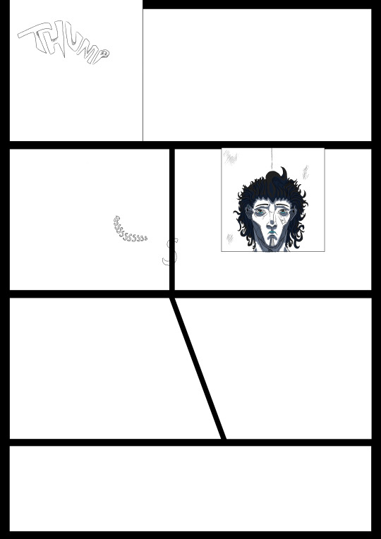
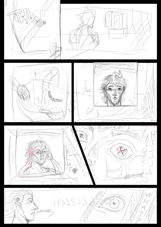
Storyboarding and Writing:
In this project, I wanted to put an increased perspective on the narrative. This is due to the more story focused route I am taking with it, wanting to develop character concepts and devising a world, all that can be made more compelling and nuanced through writing. This can be done in many ways, such as blurbs highlighting character actions or by writing full up descriptions. Yet, I wish to further this projects quality by creating a storyboard and making a short story based on it.
This scene has already been devised in the previous planning and development segment, “Main Character,” where I sketched it out and came into conflict with my consistency, leading me to research how to better compose my scene and characters looks.
This story will be short, only a few pages long, as it is is only a snippet of the bigger picture. By doing this, not only will I be adding diversity to my projects portfolio, but I will also be furthering my characters what is important in this more narrative lead FMP. Like an epilogue of a book, it will highlight a key part of the story, a cold open to the ideas that are to be explored in the story. This scene could later be used as a flashforward, intriguing readers of the project by throwing them into the thick of revelations allowing them to be shocked and interested in where the narrative could go, it will also add a mystery to consecutive chapters, where they wonder how this came to be.
The only oncoming problem I could see by delving into this is that it could take precious time away from my art, what I can only currently do in school due to my lack of computer and artistic utensils that i can use to develop it to a level I am happy with and believe could be my best work. Even now, my art is keeping me on edge, especially with the last projects leaving my artistic merits in flux as they seemingly warp to random levels of complexity and flair.
I believe this will be a simple and fun activity to participate in, adding more the my project and allowing it to be seen in another medium. This, though, will probably be the only one of its kind, as I will probably write the rest of the story based information in a summarized fashion so I am able to keep it all neat and tidy and to do it all in a timely manner, because if all of the story based writing was done to, for example, a novel level, it would be a few hundred pages long, which would be good for a different project that is more narrative focused, while fitting less in this artistic FMP.
In this Epilogue, I will use a range of vocabulary to try and make it distinctive and readable. This will include a wide range of verbs and adjectives. I also want to try and make it structured in a way that adds to the sense of confusion that the protagonist, Sven, is feeling by juxtaposing mechanical, robotic terms with that of human, biological ones. For this I have no direct reference eI wish to take from other than the research I did on Automaton, however implementing musical narrative with the narrative of the story might be a bit finicky.
While developing this Idea, I have added more than I expected to the written story compared to the drawn storyboards / comic. This is alright, as the drawn work had taken longer to produce and manufacture due to the increased time needed to make it viable, whereas with writing you can make far more in less time. Yet, I am no going to add more work to the drawn work, this is because it is unneeded, and my time will be better spent moving onto different areas of my project.
Finalisation: I am unhappy to say that I will not be able to finish off this project to a standard that I am pleased with due to time constraints and due to my own lack of skill or initiative. When I started this, I was excited for where it could go, but now I see it has become a failed dream to add to another, larger pile, of failed concepts.
This part of the project was to show character progression, advance my style and production planning while also showing how I could infuse story into my project to make it more interesting and versatile, but that has gone bust due to my lack of consistency and my fluxing style that changes from post to post. I tried to fix this by making a character sheet to show my character at multiple poses and in different clothing, but even after this, my work has once again divulged and changed once more.
My work was terrible and worthless, and it will stay as such as I move onto other parts of this project. This is a great disappointment after I had pleased myself with the characters original pose and look, and even after the less than stellar follow up of the main villain, but to come to this and so effectively be halted by lacking skills hurts to put it bluntly. This has quickly diminished all hopes for a good grade on this project, as it is now shaping up to be worse than other projects that lasted shorter with leagues less of information or research, what makes my thousands of words in research look worthless and pointless in acquisition. I could say that better planning would have lead to better results, but even I know that is wrong, no amount of planning could have saved this rubbish, because I was the one developing it, so it was duped from the start. Wherever I make a product this cycle plays out, bad to good, good to shit, shit to great and then a large trough of slop and waste.
By mothing on, I can leave this stain behind and move onto better venues, but I dread to think if they will turn out like this. A mere glance around shows that my work is subpar and worthless, so what hopes do I have to be hired? To do something with my meaningless hands? I could have chosen a hundred different subjects, and any would have flourished better than my dream, even now I am living in my failures shadows, and I am trapped in a pit
0 notes
Photo
I made this slide because I wanted to show what inspired certain parts of my art while also being inspired by Destiny’s concept art. I think that it turned out terribly though, because I am horrendous at my work. However it does it job, so I don't mind that I wasted time on it overall, I will not be continuing this however because it is unneeded in my project as I cant fucking type.
0 notes
Photo

Finished sketch of the projects main character, Sven
Sven, undamaged:
Sven, Damaged:
Sven, testing a darker shadow aesthetic:
Finished Linework:
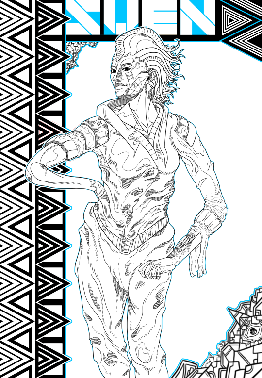
Sketch improved:

Original sketch using a Vouge Model as reference for posing:
0 notes
Photo
Finished sketches depicting the Main Character, (MC,) for my project, seen in different uniforms and emotions.
Developing MC:
Original Idea for MC:
0 notes
Photo
An original idea for the project that has been scrapped for the sake of time. It was scrapped because it would take too much time to develop, siphoning precious time that could be devoted to other parts of the project and also due to its complexity, witch would lead to multiple revisions needing to take place, leaving even less time. Scrapping it is in my best interest and will help me make better products elsewhere.
Improved sketch:
Original Sketch:
0 notes
Photo
Finalized
Short Story:
This is the complete work based on my story boards. This follows a more in depth written example of what happened that wasn't explained in the original sketches.
Overall, I am happy with this outcome, as simple as it looks, it only adds onto my other finalized work, enhancing it while also showing it in another medium, showing how I can re-conceptualize an idea and display it in other forms.
If I was to improve this, I would try and use a bigger vocabulary of various adjectives and verbs, this would allow for the piece to be far more structurally interesting and better formed.
I like how this came out, while it is simpler than it could have been, I believe that works in its favour as it works better as an accompanying piece than if it was overzealous.
...
His face was frozen. With a lagged motion, he reached for the doors outdated handle and pulled it open.
A dull light broke out from above a mirrored medicine cabinet, revealing a forgotten room, it’s tiled floor discoloured, every surface coated in an organic varnish of dust. His body found rest at a murky sink, its bowl still stained by hardened pastes, as he flicked the tap up, allowing a forceful stream of water to cascade down.
The rooms light hummed around him with its monotonous screams as he looked at himself in the mirror, its surface, much like the rest of the decrepit room, was blotted out with plains of limescale.
He looked horrid. His face’s surface had started to shatter, cracking under the pressure of the scuffle. It’s mosaic pattern that it splintered into showed his robotic nature that was usually hidden by layers of plastics and metals that mimicked natural tissue. He felt its surface, rough now with scratches and dents, he would need to replace it later.
“God…”
His eye flickered.
That wasn't good. He had never suffered from technical faults before, and so this came as a shock. As he looked around, his left eye began to freak out at random intervals, going against his will before completely blacking out in a whimpered whirl of its motors. He placed his palm on his temple, Why now?
His face clicked, small latches detached and motioned for removal as his hands reached for its edge. As his fingers pried under his false carapace, an error warning emerged in the centre of his mind, its red luminous glow flooding his senses. “ERROR, REMOVAL OF PROTECTIVE PLATING IS DISCOURAGED,” screamed throughout his systems. His fingers loosened slightly in shock, but he quickly resumed the extraction, after all, this was probably normal. He had yet to be serviced due to his spotless record, and this was undoubtedly a job for a professional mechanical engineer, but he couldn’t leave his eye in its current state.
His mind roared at him to halt, the repetitive phrase of, “ERROR, REMOVAL OF PROTECTIVE PLATING IS DISCOURAGED,” lapped in his mind in waves, “ERROR, INFECTION RATE- ERROR, VOID- ERROR-”
His mask hissed with warmth, as the mental messages receded back into the recesses of his mind. It came off satisfyingly, its seam perfectly matched to his head. As he pulled it further off, the stream of water that was still jettisoning from the tap was slightly off put by a lone drop. His eye looked down, his view slightly obscured by his now detached face, but he could see a lone red streak stretch down the sinks surface. An eyebrow would have been raised if it's motors were still connected to his head, but they both would have been raised after more dibbles of red liquid poured from his now exposed face.
He quickly yanked the metal from his face and-
“AHHHHHHHH SHIT!” his voice yelled, his sensors suddenly overloaded with pain, “what in the world was that?!” his face… tingled, it felt squirmy and unnatural compared to the rigidity of his shell, as if his systems were trying to wriggle its way out of him. But that would not be true, as he would find. The sound of the tap defined in his current shock, but as he levied his head to the mirror, it was completely blocked out.
His eye, while still, squirmed. His toes dug into themselves as his mouth hung slightly ajar at the sight that was revealed.
He didn’t scream, nor did he run, he was frozen, his mind rubberbanding back from running away to perfect stillness.
Blood. He had never seen it before, and now it fell from his exposed face. What should have been rows of motors and processors, a mess of wires and pistons, was rather filled by meat as tendons and muscles pulled themselves across the vacancy of his face, pulsing slightly as he breathed. His right eye glistened with tears while his left was dark and dormant, the pain burned.
His breathing quickened, and he slowly reached the face plating back to his head, his fingers fumbling as he did so. The locks reattached and sunk back together in a satisfying click.
…
He stared at himself in the dirty mirror, it’s grime reflecting his current status of silent disbelief. In this time, the blood had hardened on the sink in a vicious pattern, the tap still running in the background.
His face still stung.
What was that?
What is this?
What am I?
Who-
“Sven?”
A voice rang out again his head, obscured by the layers of pain layered against it, beaten and bruised. “Sven?” came a calming voice, its tone repetitive. His brain whirled to life, systems were launched but none came into view, as if none were even accessed. He lowered the handle and the water halted. He turned and left the room and returned to his job.
The street had begun to get dark, compared to when he entered the stall, it was bright only a few moments ago. An older man looked up at him, his gaze fixed unlike Sven’s, which had somehow managed to find it’s way up to the sky. He coughed impatiently, but still Sven looked on, perhaps he was looking at nothing the man could understand. “Are you alright Sven?” he inquired, “You look dazed.”
He finally looked away from whatever caught his attention and looked down at the man, before shrugging uncertainty. The man’s concerned looks were softened as they both moved on.
0 notes
Text
SWOT: Strengths, Weaknesses, Opportunities, Threats
I am creating a SWOT as it is a viable tool and one that can help me manage my qualities while also helping me to plan out how I can approach a product such as my project.
STRENGTHS:
I am dedicated, able to put my desires and time behind me and to put diligent work into its vacancy. I am always eager to produce my work and will always try and create a product that is equal in quality and style to the best of my ability. I put my nose to the grindstone and near never take it off.
WEAKNESSES:
I am lazy and unfocused, Moments of leisure can take over minutes to hours, I am easy to outburst and anger, I am unproductive with other members working on a accumulative product, preferring to work alone due to my inability and lacking want to communicate with others, I am stubborn, preferring to stay in one idea rather than creating multiple proposal that I see as worthless, I don't take others ideas well, rather wanting to work on my own ideas and research than others inferred ideas and expectations, boredom or blights of unproductivity make me feel pointless and exhausted, leading to my leaving projects quite frequently to move onto a new, more exciting product before repeating this cycle, I can be consumed by bouts of imagination and cause me to work les efficiently, I am also not organised.
OPPERTUNITIES:
Unlike the vast majority in the class, I am not working on a game specifically, because of this I am able to stand out, I am talented in my art, and due to my freedom in this project am able to further develop them and look into new and interesting venues of the expanded art world.
THREATS:
My project is bland and expected, I’m not tidy and this will make it feel unguided, I am not good ant writing what will cause the projects bulk to be full of grammatical errors, I am likely to underutilised a specific area of the project, making it feel underdeveloped or unnecessary.
0 notes
Text
MoSCoW: Must, Should, Could, Wont.
I am creating a MoSCoW because it will help me plan my project by seeing what I need, (Must,) what I most likely need, (Should,) what I want added extra, (Could,) and what I don't need or cant apply, (Wont.)
(M)ust:
My project must have 2 pieces of finalized art that I would have at a quality that I would be happy showing at an event, making them interesting and unique compared to other pieces that could have been made by others. I also need a written segment describing a miniature segment of the story to entice the viewer and show the style I wish to further the projects story. I must have a complete set of slides, describing avenues of research I have traversed to obtain my idea and my further research to show how I furthered such. I must have looked into another way to present my work other than Tumblr.
(S)hould:
My project should have references listed and probably should have overviews looking over the work already completed and seeing how I will further my project going forward. I should also have a consistent style within my presentation to make it pleasing to the eyes while also having a colour key to show when different areas are being explored in my work..
(C)ould:
My project could have 4 Final pieces if I have enough time to develop them all in time, but this will only be if I believe I have enough time. I could also refine my slides presenting my work, closer resembling my art projects
(W)ont:
My project wont have a game demo or anything, it is completely creatively driven in the artistic medium and wont have any work done in any game engine. I wont have any cooperative work as I don't want to work with others.
0 notes