
Last Seen Blogs
megatha-christie
True Crime for Snack Time

darklightcoven
witch

elena-artstyle
Elena Artstyle

tumbik
Tumbik

waynejenkinswj54
Carpet Cleaning Princeton NJ
Text
4 notes
·
View notes


Photo

ihavetoclearoutthedownloadsfolderonmyworkcomputeralsomyspacebarisntworking????
0 notes


Photo
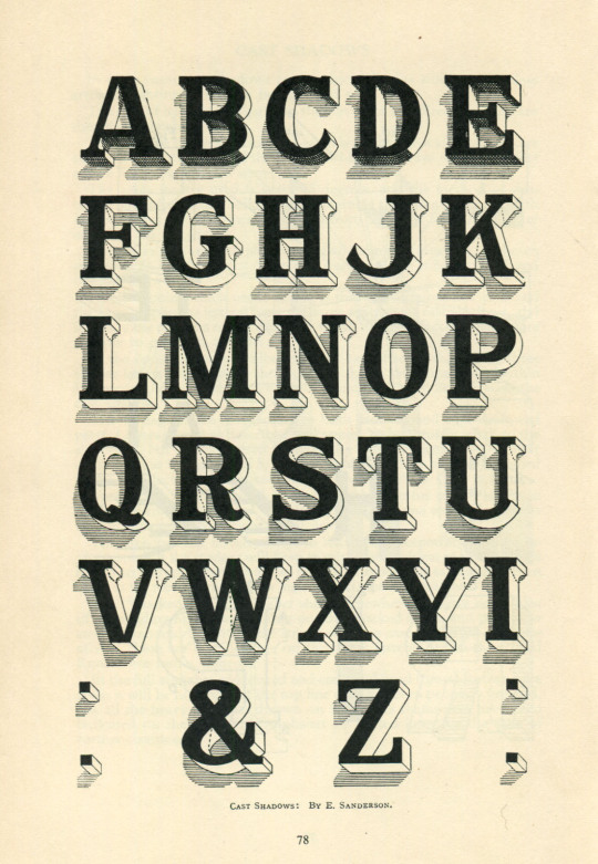
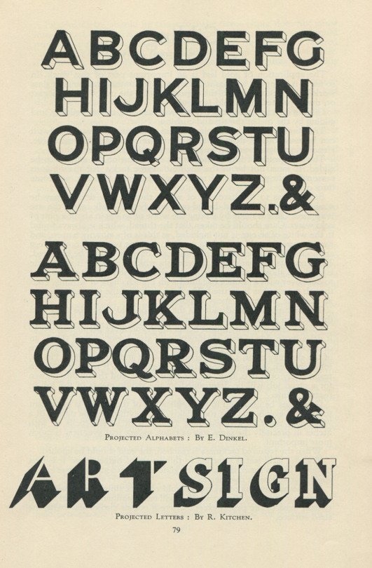
The Modern Signwriter, 1954
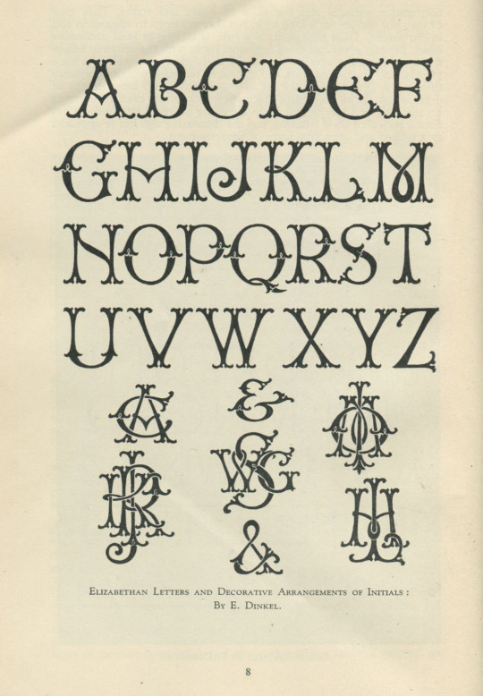
Techniques for drawing well-proportioned lettering and type are pretty constant. The Modern Signwriter is a practical study compiled from almost 30 essays, including Signwriters’ Materials, Letter Proportions, Spacing, Gilding, Glasswork and Heraldry. Pretty much all of which is relevant still.
Introduction by W. G. Sutherland, some things never change:
There is no more fascinating craft than that of the signwriter, and none that better repays intelligent study and clear and careful thought. His art is one which help in no small degree to make or mar the appearance of a building. An announcement of any kind, well spaced and clearly written, in well balanced colour, is a source of real satisfaction to the eye.
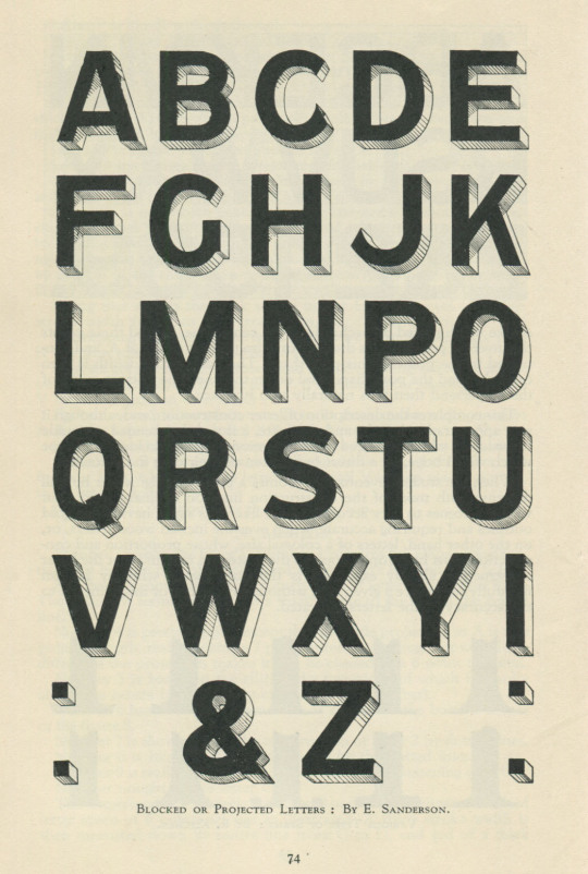
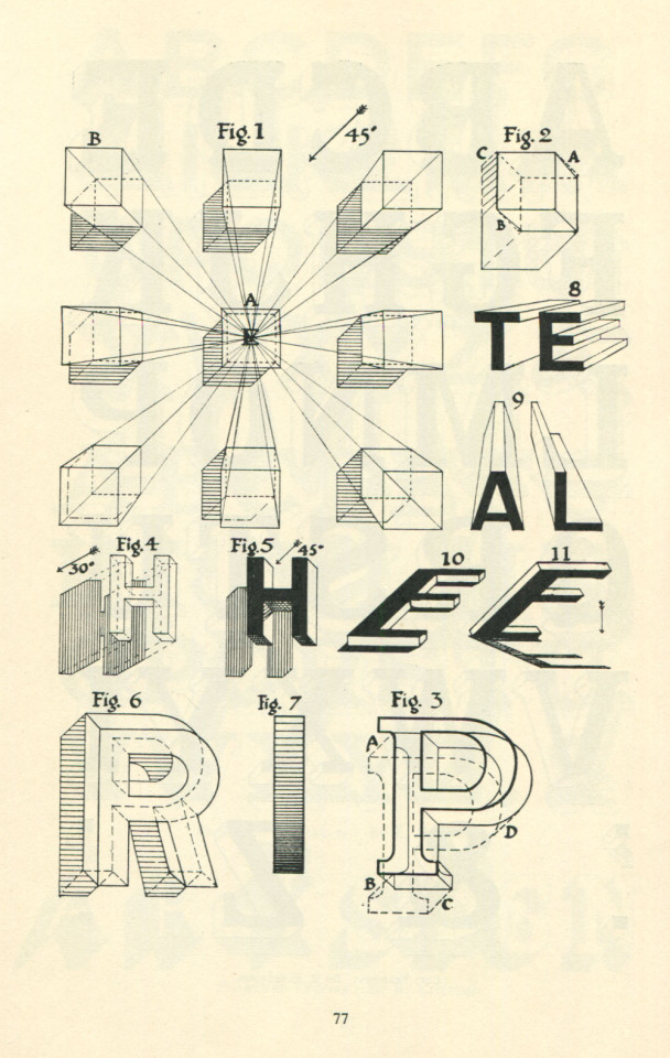
I’m naturally drawn to the areas of Projected Letters and Cast Shadows, written by E. Sanderson, which relates to my typeface work. Both Brim Narrow and my current design, made use of cast shadows and it’s great to get another perspective (pun unintentional), especially the softer, hand-drawn feel.
You can find copies of this book secondhand. Keep your eyes peeled.
773 notes
·
View notes
Link
"The horse raced past the barn fell." This frequently used, classic example of a garden path sentence is attributed to Thomas Bever. The difficulty in correctly parsing the sentence results from the fact that race can be interpreted transitively or intransitively. The reader is misled into interpreting horse as the subject and raced as the main verb in the simple past, but when the reader encounters fell they are forced to re-analyse the sentence, concluding that raced is being used as the past participle of race as a transitive verb.[1] The sentence could be replaced by The horse that was raced past the barn fell, where that was raced past the barn tells the reader which horse is under discussion.[2] Such examples of initial ambiguity resulting from a "reduced relative with [a] potentially intransitive verb" (The horse raced in the barn fell.) can be contrasted with the lack of ambiguity for a non-reduced relative (The horse that was raced in the barn fell.) or with a reduced relative with an unambiguously transitive verb (The horse frightened in the barn fell.). As with other examples, one explanation for the initial misunderstanding by the reader is that a sequence of phrases tends to be analysed in terms of the frequent pattern
3 notes
·
View notes