Last Seen Blogs
queenofcain
TWINKLE TWINKLE LITTLE FUCK

queenofcain
TWINKLE TWINKLE LITTLE FUCK

janvdyne
🏳️🌈

bitchinthewitch
menina
Text
My magazine name, 'Side Quests'- FAS3003
I chose to name the magazine 'side quests' as this is how I feel with my ADHD. When completing a task, I tend to take on different tasks throughout and complete them alongside the original goal. I like to call these 'side quests'. They're not the main event, but they're little side goals along the way.
0 notes
Text
Front Cover Ideas- FAS3003
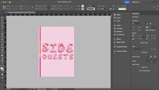

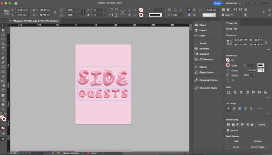
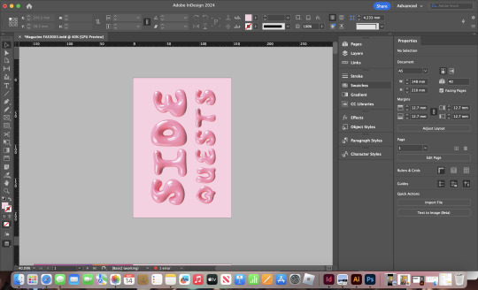
To create my front cover, I used a pink bubble font to spell out the title 'side quests'. I then tried different types of layouts. My favourite was the design in the top left. This is because it incorporated my magazine's theme and looks the neatest. The other designs looked empty and lacked simple details like the statement pattern stripe.
0 notes
Text
Creating The Circle and Logo- FAS3003

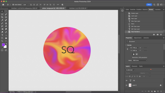
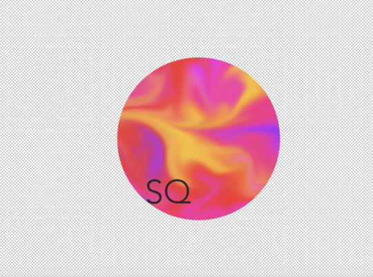
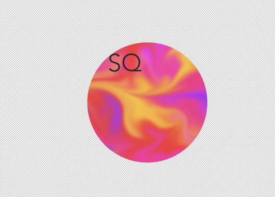
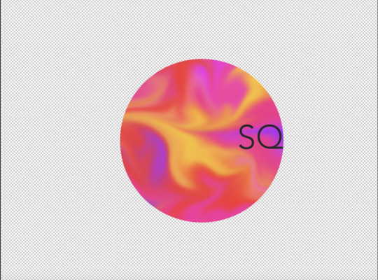

I created my logo here. This will be seen throughout the magazine, and the statement pattern will also link these together.
0 notes
Text
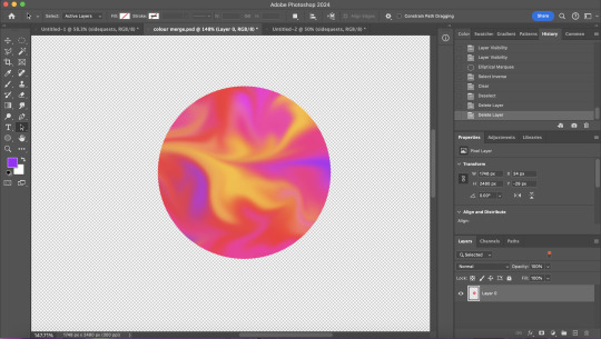
'Side Quests' Creating The 'Colour Mix'- FAS3003
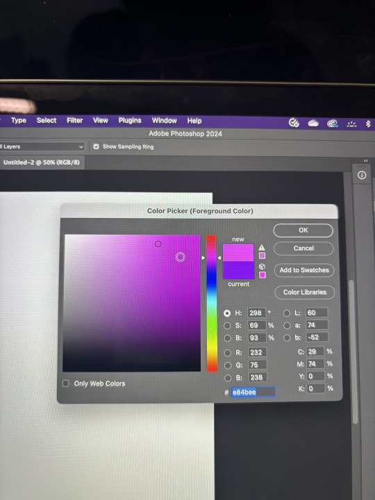


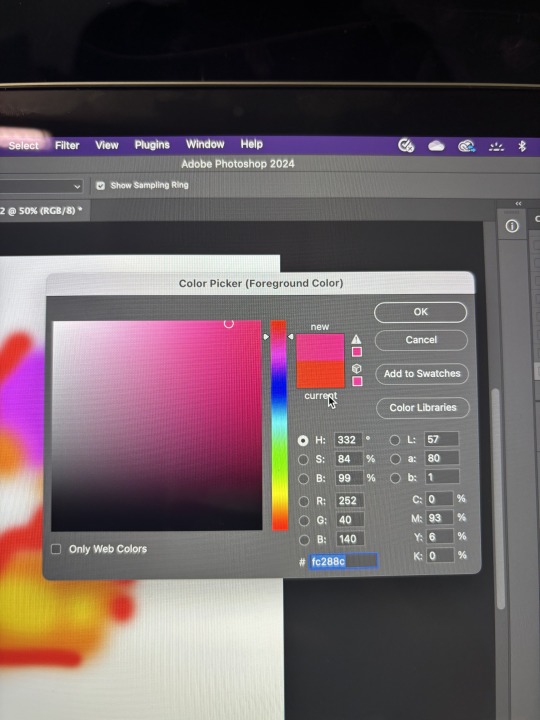
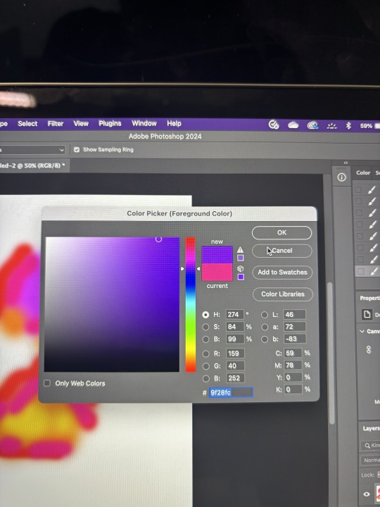
I started by selecting various colours (and noted their colour codes). I randomly scattered each colour onto Photoshop using the 'brush' tool and then used the blur and smudge tool to merge and morph the design.
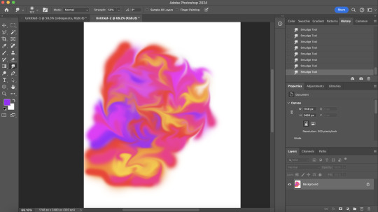
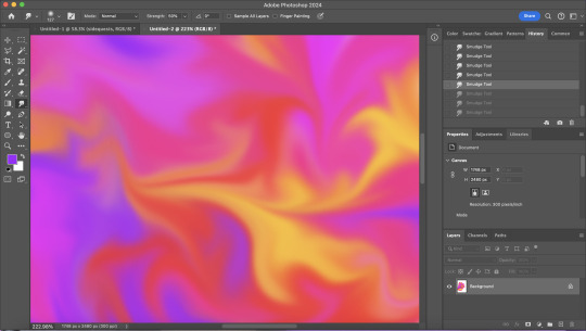
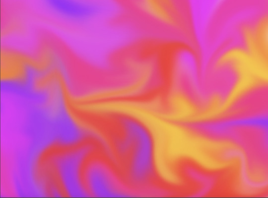
I love how this came out; it incorporated all the different colours while creating a pretty blend.
0 notes
Text
'Side Quests' Logo Designs- FAS3003

When I started designing my logo, I wanted to incorporate the S & Q (standing for 'Side' and 'Quest'). I tried to merge and link the S & Q to make a simple yet effective logo. I then considered if I wanted a background for the logo, what shape that would be and what colours. Following my colour scheme, I chose to use pink, red, yellow and orange tones. The drawings above are a basic sketch of what I wanted my final outcome logo to look like.
1 note
·
View note
Text
'Side Quests' Colour Scheme Poll and Results- FAS3003
I created a poll to help choose the colour scheme for 'Side Quests'. I took many different themes and asked my audience which they preferred out of numerous combinations.


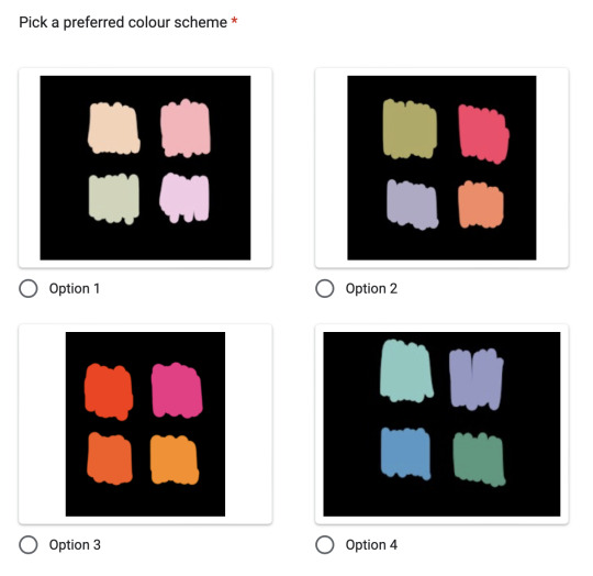
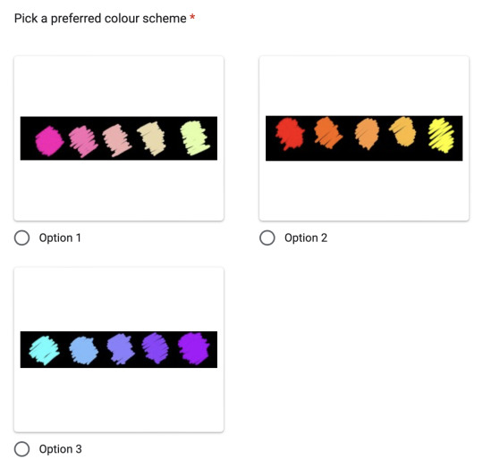
Here's an example of the questions asked (above).

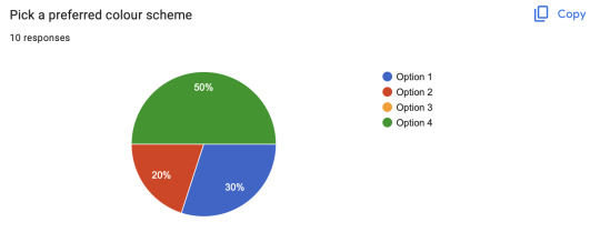
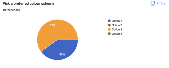
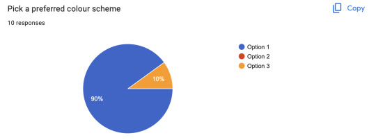
Here's a copy of the results. The brighter colour palette was preferred to the more pastel colour scheme. Question two, the most popular scheme, was the pink scheme again, making me narrow my work to a pinkier outcome. The second most popular answer was also pink dominant.
The most famous result in question three was a bit pink, orange, and yellow, which I might use for my final design. This is because it's frequently the top answer to the other questions. Finally, question four, the pink-to-green hue, was preferred, making it my final choice. I feel as though using different shades of pink, yellow and orange will make my work visually exciting as it was answered the highest throughout the whole survey.
1 note
·
View note
Text
'Side Quests' Magazine Fonts & Format Ideas- FAS3003

I chose a bubble pink font for one of my fonts. This will be used for titles/ words relevant to the pages.
For my main heading font, I chose 'Charter, Roman'. I'll use this font in size 52.404pt with a height of 62.883pt. I will also use this font in my body text in size 9pt x 10.8pt. I love how this text is visually satisfying and easy to read.
1 note
·
View note
Text
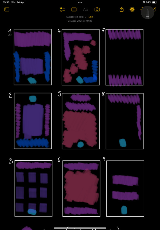
'Side Quests' Magazine Page Layout Ideas- FAS3003

Here are some layouts I have created for my magazine. Until I start making it, I'm unsure if these will fit in with my theme, but I will review them later and see if I can use each design.
1 note
·
View note
Text
'Side Quests' Magazine Cover Ideas- FAS3003

Ideas 1, 2 and 3
For my first three cover ideas, I wanted to use a photographed image but I wasn't too sure on what image just yet. I mainly wanted to play around with how I'd lay everything out around the images.
Idea 1
For my first idea, I chose to take inspiration from Vogue Magazine and laid my page out the same way they have in their editions. One alteration I made was adding my logo to the centre bottom of the page. Although this idea works for Vogue, I feel as if it doesn't hold relevance to my magazine and narrative. Vogue is a fashion magazine, whereas Side Quests is a more informative magazine, so therefore, I feel as though this wouldn't give off the correct vibe as I want it to.
Idea 2
For my second idea, I wanted to play around with the layout of the title, logo and information. I liked how the title went down the sides rather than straight along the top. However, I didn't like the overall layout. This was because I felt that the top looked really empty, compared to the rest of the page. Not only that, but I'm not a fan of having one singular image on the front to capture the tone of my magazine.
Idea 3
For my third idea, I chose to use a series of images to settle the tone of the magazine, like the 'Thrasher' magazine I looked at did. I liked how this idea allowed me to use several different images to capture the overall tone and vibe of the magazine, so I would like to consider it for one of my final outcome ideas. One thing I am worried about when completing this, however, is ensuring all images capture the narrative perfectly through the use of colour, filters and angles. If this isn't successful, I feel that this will not be a strong outcome.
Idea 1, 2 and 3 conclusion
For my final outcome, I have already decided that using an image on my front page isn't right for my narrative. When completing a poll using similar formats, my audience prefers more empty, less hectic front covers.
Ideas 4, 5 and 6
1 note
·
View note
Text
Poll Questions and Results- FAS3003
I chose to create a poll asking a general audience about what they find more visually enticing when searching for a magazine, what context entices them and what topics and research methods are most useful to them (eg: interviews or general studies).

For question one, I asked my audience which pattern they liked most. The most popular results were option 3 and option 4. Option 1 received 0 votes; I felt this was because it was too busy of a pattern and way too many colours included too, and therefore wouldn't be a great match for the magazine cover. Option 2 was the second most voted for with 27.3% of votes. Overall, I liked the aura of this hue, but I can see why it wasn't my most popular result.
The two most popular results, both with 36.4%, were option 3 and option 4. They both consisted of pink and yellow tones and the patterns within were more random than option 2, yet more controlled than option 1. Both options 3 and 4 will be considered when choosing a pattern (if I choose to do so).
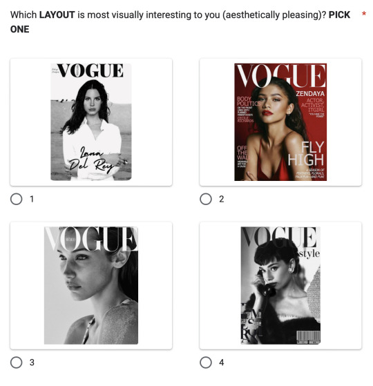
For my second question, I asked my audience which Vogue cover they liked the most. The most popular result was option 3, which was a plain cover with the title of the magazine at the top. Option 4 received 0 votes; I believe this is because it's fairly busy (due to the editorial mark on the right side of the page and bottom left). Option 2 received 18.2% of the results, making it the third most popular. I feel the reason it didn't receive high votes is because it's very gathered with all the text on the page. Option 1 received 36.4%, making it the second most popular. I believe this is because it's a clear, clean design. Due to this edition being all about an artist, her name is also on the cover, which is an attribute I liked, but it wasn't voted the highest.
Option 3 was voted the highest with 45.5% of votes. I believe this is because it's a bright, clean design and the image is HD. Not only is the image nice, but the layout is clear and isn't jumbled like options 2 and 4. I want to consider a clearer, less wordy front cover for my magazine, as it entices a wider audience (given the results from the poll).
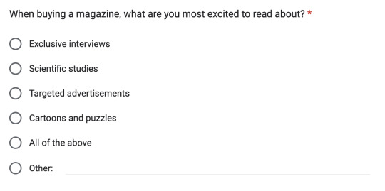
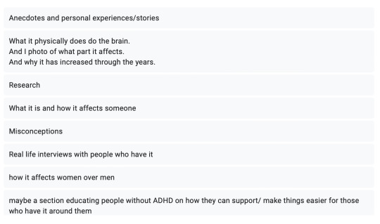
For the third question, I chose to ask, what my audience looks forwards to when buying a magazine. 18.2% of votes went to cartoons and puzzles, which I'm open to using in my magazine, making it a bit more engaging for my audience. The other 63.6% said they look for exclusive interviews, which was surprising. I want to include interviews with those who have ADHD, people who don't have ADHD and their options for ADHD and dealing with it. If these interviews are executed correctly, they could help people who are struggling with their ADHD or give someone a greater understanding of the struggle of ADHD. During the interviews, I will also include the positives of ADHD, as it's not all negative. And finally, 18.2% voted all of the above.
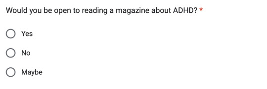
I asked if my peers would be open to reading about ADHD, and the response was overall positive. 63.6% of voters said they would be open to reading about ADHD, and 36.4% said they might be open to reading about ADHD.
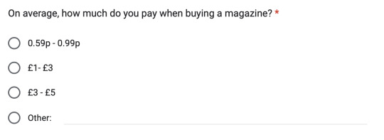
I then asked how much my audience would usually spend on a magazine. I did this so I could gauge a reasonable price for my audience. 63.6% of voters said that £3-£5 was the most reasonable pricing, 27.3% said £1-£3 was the most reasonable and 9.1% said £5+. For my magazine, I think I'll charge £4.49 as I feel it's a reasonable charge for a printed magazine.
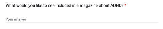
Answers/ topics I want to include within my work
1 note
·
View note
Text
Magazine Cover Layout- FAS3003

One thing I liked about the covers was that they all had their price printed onto the front of the magazine. As a consumer, I liked that it has it's price printed as then I know how much it costs before buying. Personally I prefer this as I do not like buying stuff without knowing the price before i get to checkout. Another detail i liked is the consistent format of magazines. For example, Vogue always keeps their logo the same size, font and position on the front cover. This consistency is aesthetic for the customer.
The first cover I decided to look at is the Vogue magazine cover from August 2019 (image one). The first thing I noticed about this magazine was the green colour scheme. I like the colour consistency as it gives a clean look, especially on a white background. One thing I disliked about this is the green writing on top of the green jumper. The shades weren't the same but too similar to be paired on top of each other, making it harder to read the writing. Overall, I liked the final image and look, but if I had to change one thing, it would be the shade of green used for the font.
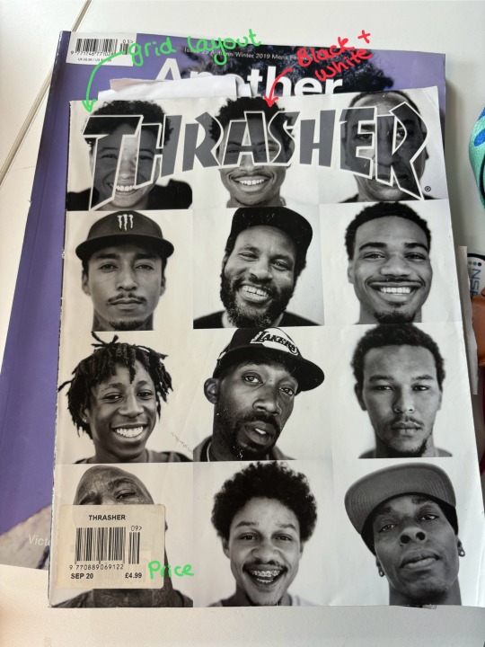
The second cover I decided to look at is the Thrasher September 2020 cover. One thing I love about this cover is the layout, the grid of 12 images. each individual image captures everyone's different personality/ emotion and I really liked how effective that was. The next thing I noticed was the black-and-white filter. For this magazine cover, they used facial emotions to entice their consumer, compared to Vogue used a green colour scheme to entice their consumers. I really like how effective this came out, but I feel the black-and-white filter wouldn't look as great on my magazine cover. For me, colour is what draws me to read a magazine, so I want to include that in my outcome, but I love the grid layout and I'm considering using it for my cover.
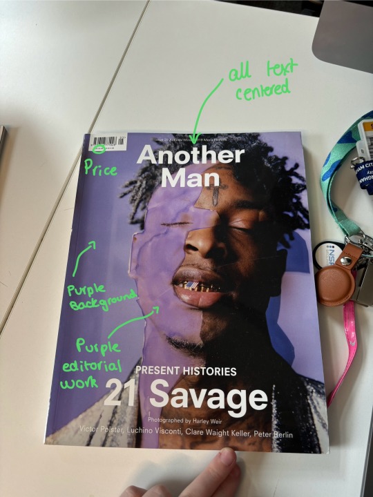
The third cover I wanted to analyse was the 'Another Man' edition featuring 21 Savage. I love the purple on this cover; the background compliments the edited purple shade perfectly. The writing on the cover is all-centred, which I quite liked as it looks more organised. The producer edited the image used on the cover to have a purple 'splash' on the right side of 21 Savage's face. I love how this looks, but I won't use it for my magazine as it doesn't match my theme. However, the idea is very excellent and effective.
After reflecting on these covers, I have gained a greater understanding of what makes a 'successful' cover, and I want to incorporate what I've learnt into my magazine's cover.
1 note
·
View note
Text
What is ADHD?- FAS3003
To begin my research, I have started with what actually is ADHD. Not only what it psychologically is, but mentally, physically and what ADHD means to me.
ADHD, attention-deficit/ hyper disorder, is a neurodevelopmental disorder which is commonly diagnosed during childhood and often lasts into adulthood. Scientists believe some brain regions look different and think specific genes play a vital role. Some scientists believe that ADHD is a lack of dopamine, but others have protested this theory isn't true. Overall, scientists are still figuring out how ADHD works, what helps those with ADHD and where the psychological differences are. There are currently no firm answers as to what ADHD is, but psychologists are studying every day to figure it out.
ADHD is a mental health disorder which affects cognitive development. There are three key 'forms' of ADHD, including hyperactive, inattentive and combined. These behaviour patterns not only make it more difficult for children with ADHD but also make learning in a school setting more difficult as they are more likely to 'misbehave'. As a result of this, over their life course, children with ADHD are also more likely to have poorer economic outcomes, which shouldn't be the case.
Hyperactive ADHD
ADHD-H (Hyperactive ADHD) is considered the more 'energetic' ADHD type. Common symptoms of ADHD-H consist of impatience, fidgeting and interrupting others. To those without an understanding of ADHD-H, it may feel like they're rude and are just butting into conversation, whereas to someone with ADHD-H, they feel like they'll forget. One way to describe this feeling is being a shaken-up fizzy drink bottle, and no one opens it. Once you open the bottle, it explodes. This is precisely how it feels when you have ADHD-H and want to say what you're thinking then and there.
Inattentive ADHD
ADHD-I (Inattentive ADHD) is considered the more 'calm' ADHD type. Common symptoms of ADHD-I consist of getting easily distracted, forgetfulness and is frequently diagnosed later in life. Those with ADHD-I also struggle with internalizing disorders such as anxiety and depression. It's harder to diagnose those with ADHD-I as it is easily masked. As someone with ADHD-I, I find it hard to focus on completing one task at once and regularly go off task, and complete 'side quests'.
Combined ADHD
ADHD-C (Combined ADHD) is considered to be a mixture of both ADHD-H and ADHD-I. Common symptoms of ADHD-C consist of sleep issues and low self-esteem. Those with ADHD-C also struggle with issues which ADHD-H and ADHD-I people suffer from.
What ADHD symptoms I frequently struggle with
Personally, I was diagnosed with ADHD-I and ADHD-C. My diagnosis primarily leant towards me having ADHD-I, but I presented a lot of symptoms which also show in those with ADHD-C. I mainly struggle with focusing on basic tasks (such as writing this). Sleeping is a massive struggle for me, and I struggle with my self-esteem.
1 note
·
View note
Text
Updated Brief 13/04/24- FAS3003

I decided to remove my idea of a trend board. This is because it no longer fits my magazine idea and doesn't add much to my overall narrative.
1 note
·
View note
Text
Yumna's Introduction 12/04/24- FAS3003

On Friday the 12th of April, Yumna introduced herself and showed us what work she had created. During this chat, she presented some of her previous work to help us gain an understanding of her skills when using the programming features on our computers. This was helpful as it enabled me to envision some ideas for my final magazine, and I'm now excited to work with Yumna on my magazine to make it successful.
1 note
·
View note
Text
First Draft Brief- FAS3003
This is my first write-up of my brief. Throughout my brief, I wrote about what topics I would like to cover and how to carry this out. I also set objectives to complete by the end of my magazine. To help ensure I have completed all of my objectives, I will be using the timetable given to help us organise our work load per week.
1 note
·
View note
Text
White Shirt Task (Part 2)- FAS3003


In addition to the images of me wearing my old school shirt, I also wanted to include pictures. The shirt holds a lot of significance to my 'story' of my ADHD, so I tried to capture a picture of it alone, lying on my floor.
1 note
·
View note
Text
White Shirt Task- FAS3003
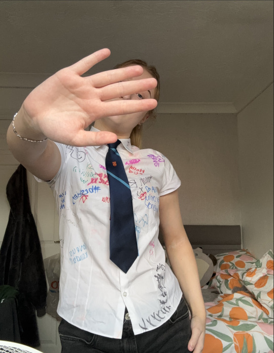


For my 'white shirt task', I chose to wear my secondary school shirt. This has 'signatures' from all my peers from year 11. I decided to wear my school shirt because it was a crucial part of the years I struggled. From issues involving friendships to education struggles, I found secondary a considerable battle.
For the task, I initially took images in my childhood bedroom. This is where I spent my time preparing for school, chilling out and decompressing after stressful days at school. My bedroom was my safe space throughout secondary school. This was a space where I could sit alone, listening to music and watching YouTube, and it was just an area where I could be myself without any judgment.
One thing I noticed when carrying out this task is that the shirt doesn't really fit anymore, reflecting on the fact that I have grown as a person, mentally and physically. For the lighting, I chose to use natural lighting for these initial images as I feel it worked best with what tools I had to take these pictures.
Throughout my years in secondary school, I was labelled as a 'naughty' student who never particularly cared about education as a whole, which was never the case. My teachers mainly viewed me as a student who didn't really want to work, so I wasn't supported as much as other students in my classes. This was made clear when I received my GCSE results. I received good grades in subjects where the teachers supported me and took the time to understand me. On the other hand, I received fails in subjects where the teachers would just remove me from classes and not understand me as a student. I didn't feel like I couldn't do it, so I mentally 'shut off'. The support from the teachers who would assist me helped me receive good grades. This is because I felt that someone finally believed in me and that I could do it.
Not only is it hard to look back on my treatment in secondary, but the fact I didn't receive a diagnosis for my ADHD or slow processing also played a significant role in my life. Going through secondary school, knowing there was a difficulty with the way I learnt and not being heard when asking for help made me relate to education as a whole with negative thoughts.
Throughout my magazine, I would like to share more stories about issues I faced during education and how I dealt with them when I never had a diagnosis to make it more sense. Not only am I using this magazine to research my own struggles with ADHD, but I also want to spread awareness for ADHD as a whole.
1 note
·
View note