
Last Seen Blogs


tacobellandanxiety
here we are

besthvacserviceprovider
Enginair Air & Refrigeration
naomitatemaghen
Poppy Red

socefesog
Untitled
Text
E - Art and My Life
Elena Larsen
12/8/19
Art110
3:30 Mon & Wed
Art and My Life
What have I learned this semester?
This semester I learned about different art styles that I had never considered art. I knew the basics of art such as different mediums like paint, charcoal and different styles such as surrealism or modern art. But I’d never thought about topics such as remix culture or architecture. I thought of architecture as something beautiful, but I hadn’t directly correlated it with art until now. I also learned that art does not have to be complicated to be beautiful. I found that in gallery walks I was most drawn to the simplistic art that told a story. It doesn’t take a revolutionary piece of art to change your life.
How has my understanding of art evolved this semester?
My understanding of art has grown a lot throughout this semester. I learned that the concept of art is constantly expanding and an infinite concept. I learned that something I view as art other people may not view as art or something that I think is beautiful and meaningful others may not enjoy. But I think that that is the beauty in art. When we did our presentation about surrealism a student asked about if it mattered how an artist self-identified their work when the world put it into a different category. I was caught off guard by this question because it was something I had never thought about before. It really expanded my mindset about art because art truly is versatile to every person. I’d thought of art as restricted in box, but this semester taught me it’s ever expanding.
Art and My Major, Life, and Career
I hope to do some line of work within psychology. I think art can be very useful when it comes to psychology because it can be an alternative way for people to express themselves. Art can provide a different perspective people’s brains and their subconscious. My sister is a child psychologist and she let the kids use art to help express themselves when words cannot. I never would of thought that art could be so helpful in a field of work like psychology but I’m open to using it in whatever field of psychology I do in the future.
Living / Practicing Art
I consider myself very lucky in that I’ve been surrounded by art my entire life. When I was younger my mom constantly encouraged me and my siblings to draw to express ourselves and I’ve continued to practice this especially when I have free time to draw as I please. This love of art has followed me throughout my life. One of my friends and I consistently go to our favorite museum in the Bay Area, the MOMA, and just wander around and talk about what we saw after. I also find myself drawn to beautiful works of graffiti around the city because my mom would point it out to me when I was younger. She taught me that you can find art and beauty anywhere if you’re looking.
Artist Conversations
The artist conversations taught me a lot about how versatile art is. Every artist we saw had their own unique perspective about the world and translated that into their art. There were a variety of different topics such as personal experiences, political issues, and everyday life. Their art continually inspired me and reminded me to look deeper into works of art to find meaning. Overall, Art 110 has taught me that art comes in many forms and there is no one right way to make art. Art can be applied to anything if you remain open and it really does have the power to make an impact on the viewers life.
0 notes
Photo

D7 - Artist Conversation
Artist : Andrea Rascol
Exhibition: Prologue
Media: Oil on Canvas
Gallery: LBSU School of Art, Gatov Gallery West
Website: N/A
Instagram: andrearascol
Andrea Rascol is a senior at Cal State Long Beach. She is working toward getting her BFA in painting as well as her Master of Fine Arts once she graduates. She uses her paintings to express herself through art. She uses simple everyday experiences to inspire her work.
Rascols art is very abstract. She uses a multitude of shades of different prime colors. Her work is made of acrylic paint, ink, soft pastels, and oil. She uses straight lines to contrast the abstract shapes. In the painting I attached there are 7 abstract shapes made up of a a different shade of 8 prime colors and they appear to be planets and galaxies. Behind the planets there is a background of space with stars, but there is also a grid of blue that fades as it gets closer to the left side of the painting. There is also a red line outline somewhat surrounding the blue grid. The bright red and dark blue are used to contrast each other.
Rascol’s art is television inspired, which explains the fading of colors and almost static appearance. She adds onto an image of what she sees on television and turns it into her own. Her use of many, many colors makes her art stand out and stick in the audience's brain. She finds inspiration from everyday experiences which explain how her work is so similar yet different from the everyday world. She uses her art to expand on reality and make it even more beautiful.
I liked Rascols work. I’ve never been good at abstract art, so I really respect when other people are. I like the surrealist aspect to her work and how she steps outside of the box to expand the world into imagination. I also like her use of color and how the different shades compliment and contrast each other. I haven't seen art like hers so that really made it stick in my mind.
0 notes
Text
D7- Remix Culture
Haikus:
1. Life and Art’s degree
Of work at take some chances
She that weekend we
2. And freedom to go
Believe appreciation
Way to a new world
Internet culture can be empowering because it’s provided people with a way to connect with others around the world. It’s also given a way to express yourself and inspire others with your work. It allows others to build off each other and become inspired. The risk is that internet culture has become a place where people feel social pressure to live up to the standards that other people set. Constantly seeing people living luxurious and expensive lives can put pressure to live up the same expectation or feel shame if they cannot. These social pressures can have a serious negative impact on individual's mental health.
I think some parts of copyright should be modified to be weakened. For example, it’s frustrating that creators on YouTube are unable to put most music in the background of their videos because it limits their creativity and relatability to their audience. They also can be forced to take a video down or risk becoming demonetized for having music in their video or do a reaction video. I think it’s successful regarding movies and books.
For my work I choose the least restrictive license of public domain. I picked this one because it’s just 2 haikus that I made up of random words from others. It’s not something I feel the need to openly claim as solely my own, so I’d rather allow others to remix it as they feel and possibly continue this cycle of creativity and inspiration.
I felt inspired by the suggestion of going on the class roster, picking a random number, picking that number from a randomly selecting persons most recent post and forming a haiku. I chose the 12th word of people's post, I’m not sure why I picked 12 I just felt inspired. The haikus I made turned out better than I thought especially seeing as it was completely random. I was surprised because some lines somewhat made sense if you looked at then separately from the whole poem, but others didn’t make sense. One challenge I came across while doing my remix was that I would pick a person on the roster and the 12th word would be too long to complete my haiku so I would have to keep looking until one fit. It did show me how inspiration could be found anywhere and that there is more than one way to remix work.
0 notes
Text
E: EC-Feedback
I enjoyed the format of the class. I liked how open-ended discussion topics were. I also liked how there was a consistent structure involving when projects were due, and when we had presentations and gallery walks.
I thought making the art gallery was easy once we figured out how to work Wix. It was easy to find information on the artists and we had plenty of time to work on it. The presentation was easy as well because we knew the topic and the people in the class were very respectful during the presentation.
I enjoyed visiting the SOA art galleries but some weeks it was harder than others to make it over there when we didn’t have time in class. But the art never failed to impress, and I liked talking to the artists. It opened my perspective regarding art and mostly grew my appreciation for smaller artists. I typically only focused on big ones in the past, so this was a nice change. It isn’t something I would do if it hadn’t been a part of the class.
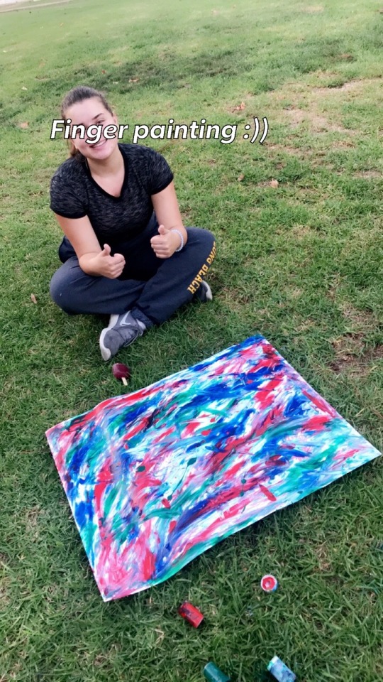
I was neutral about the weekly art activities. Sometimes it was difficult to get the materials, such as plaster, at such short notice, but other times it was easy, such as painting. The assignments made me step out of my comfort zone and expand my horizon regarding art. For example, I would never finger paint at 18 years old, but it was therapeutic. I do wish there had been an assignment related to shading or drawing figures, I think that would be a great challenge and way to broaden my horizon.
I agreed with the 7 ideas about art. They were a good constant throughout the year and apply to almost every type of art. I was confused by the idea that “Free Speech is more important than free Beer” and I still am, but I guess it just helped to teach me that everything is up to interpretation. I agreed with all the 6 ideas that I did understand!
I had to make a new Tumblr for my blog so that was a new experience for me. I haven’t used Tumblr since middle school, so it was a bit of a throwback. It felt weird to be posting college assignments on Tumblr, but it was no different than turning them in on BeachBoard. I did enjoy that I could see and be inspired by the work others in the class have done.
Wix was easy once I got the hang of it. It was a bit frustrating that you can’t save changes to the website if more than one person is on it, but we figured it out! I’d never used it before but once a group member helped to explain it, I had no problems. They also had a variety of fonts and backgrounds to choose from which was a great contributor to our group's creativity!
I thought the website was difficult to use at first, it wasn’t until about a month in that I got the hang of it. It was also hard to remember to check it along with BeachBoard. The benefit was that all the art assignments and information were in one place and easily accessible, but it added another website to consistently check.
I loved not having any “tests”. I agree that college classes tend to revolve around the concept of memorizing rather than learning, and I think that’s such a sad way to be conditioned to learn. The point of college is to learn about a topic you want to and be able to apply it throughout life, not learn it temporarily to pass a class. The lack of tests in this class meant that I understood parts of art that I choose to focus on and that intrigued me, but I didn’t fully understand every topic we talked about. I found it hard to focus on subjects that interested me less, but the ones I liked I was learning about and remembering the information. But I still think that’s a better alternative to temporarily knowing it all.
Overall, I enjoyed the class more than I thought I would. I came into it thinking it would be a typical lecture class, but it was extremely open-ended and allowed my mind to have a break from the usual structure of a class. It was nice to have a teacher who stepped out of the box and was unapologetically himself as well as an advocate for general human kindness.
0 notes
Photo

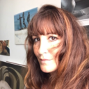
D6-Artist Conversation
Artist: Yulia Gasio
Exhibition: Donbas
Media: figurative painting/drawing
Gallery: Max L Gatov West and East
Website: n/a
Instagram: yuliagasioartist
Yulia Gasio is a 3rd year student at Cal State Long Beach. She is in MFA but chose to specialize in painting and drawing. She has her master's in art history from Cal State Long Beach. She is from Ukraine and moved to the United States when she was 21. She uses her past home of Ukraine as a main factor of inspiration in her work. This gallery focused on the violence currently occurring in Ukraine. She advocates for this war and traditional view of normalizing the violence to be left behind and move toward a more patriotic nation.
Gasio’s paintings used oil paint, which she smeared and used to create harsh lines. The piece the stood out to me was the woman on her knees surrounded by rubble. The way the paper is folded makes the painting to appear like it is a book that is telling its viewers a story. She uses contradicting bright colors such as yellow, orange, and a light blue, to emphasize the dark greys and blacks of the wreckage. The woman on her knees is on the left side of the painting and here is an outline of a young girl playing with a hula hoop on the left side in front of a dead deer.
Gasio explained that her painting that stood out to me was a depiction of her mother before and after a house is destroyed. Although there are positive memories from her childhood in the home, you can’t avoid the facts that the structure of her home is completely destroyed. The war has caused an innocent woman to lose and consequently must leave her home. The war is causing destruction and harming civilians.
I really loved her gallery! It was incredibly powerful and depicted issues in the world that I was not aware of. It was very eye opening and raised awareness about the injustices going on. It’s not a topic covered frequently in the media and that lack of awareness is contributing to why there is not a lot being done about this war. Although this is just one gallery, it has done what art should do, which is educate and raise awareness. She transforms her negative experiences into something beautiful.
0 notes
Text
D6- storytelling (photography)
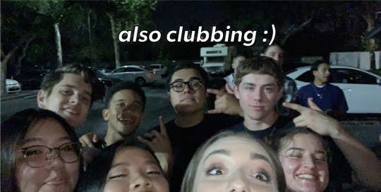
My story is based around the people that I’ve met here that have brought me joy in life. I chose this story because I recently saw a presentation about appreciating the things and people that bring you joy in life. This presentation inspired me to change my perspective and be more appreciative of the people in my life who bring me joy. This art assignment was the perfect opportunity for me to reflect on the many people and events this week that brought me happiness!
I think I did really good. I enjoyed taking the pictures and capturing people in their moments of pure happiness. None of them were staged or felt forced, so they are great to look at to remember how happy and grateful I felt. in that moment and to carry that joy with me wherever I go.
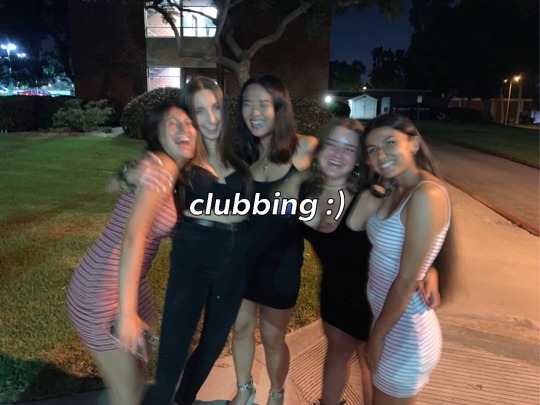
My “best” image is the selfie we took outside of the club we were going to. Everyone in it is so clearly happy and It captured such a great moment that I would usually overlook. It’s one of my favorite pictures to look at because it shows us all in a group, going to our first club together, and having a really great time.
Honestly the only reason I think these pictures are “great” is because of the people in them. These pictures wouldn’t mean anything to a stranger, and they don’t make any profound statement about the world, but they remind me to be my happiest always and never take the people in my life for granted. It’s especially important to me because I met these people after I came to Long Beach, so they are new friendships, but they all feel like I’ve known them my whole life. They are my home away. from home, and for that they are all “great” images to me.
Next time I would do this differently by also having other friends of mine taking photos of moments that bring them joy within the friend group, that way I could incorporate more than one perspective in it.
I would like to do photo stories about political or social topics such as climate change, gun control, reproductive rights, etc.
0 notes
Photo
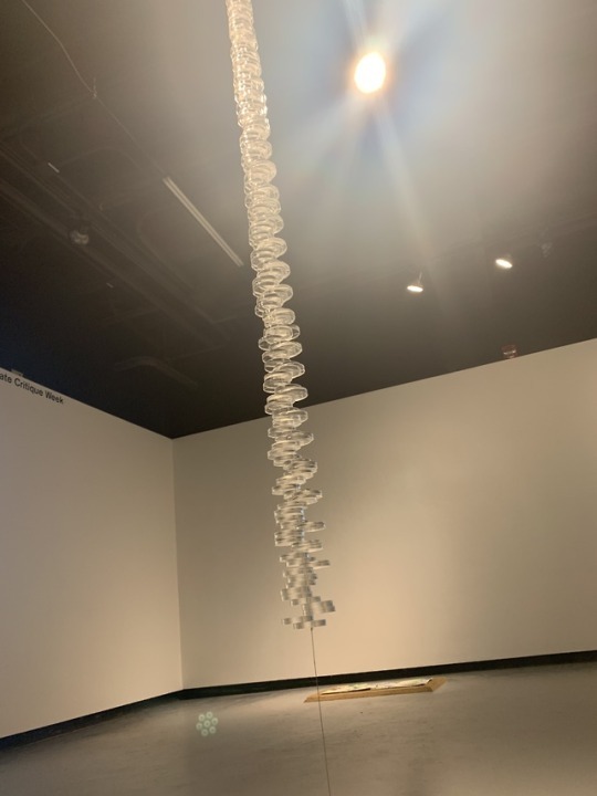
D5-Artist Conversation Alan Vidali
Artist: Alan Vidali
Media: Acrylic, installation
Gallery: LBSU School of Art, Dutzi Gallery
Website: alanvidali.com
Instagram: N/A
Alan Vidali is currently a graduate student at Cal State Long Beach. He is working toward is Masters in Fina Arts. Vidali is a student in the School of Art’s Studio Art Program. In his free time, he likes to create art pieces!
Alans acrylic line was made up of circular shapes, but they were not stacked evenly. Instead they were stacked in ways that made them stick out to either side. The room had simple colors such as white and grey, and the piece itself appeared to be white, but the closer I got the more I could tell it was more of a transparent color. It was attached and suspended by a thin and simple piece of what I believed to be a cord or wire. I almost couldn’t see the piece from afar because of its transparent qualities.
The ideas behind Alans work revolved around the beauty in simplicity. He focused on creating a version of beauty that was beautiful from all angles, it was very multidimensional. He sees anything and everything in the world as beautiful, no matter how simple. That’s what lead to his work having a simple appearance, but it stills exudes beauty. He talked about how things can be taken for granted or not given attention just because they are small and simple. He embodies this by choosing a transparent media for his work. Because even though some people may not see it at first, once they do, they are able to appreciate its true beauty. Each piece in Alans work he had to laser cut and it was initially designed in software. Each piece took a different amount of time. His work is all made of acrylics.
I really enjoyed Alans work, especially after hearing about the meaning behind the work. I love art that is simple and has a deeper meaning and his work perfectly embodied this. His work captured me and left me with questions that other galleries have not. His work had a mesmerizing touch to it! Overall, I really loved his gallery and talking to him about his inspirations.
0 notes
Photo


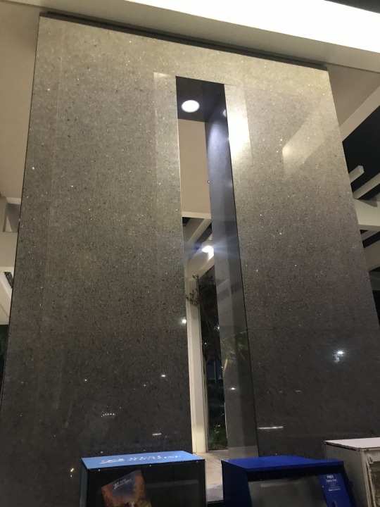
D5- Architecture and Urban Planning, The Wedge
My designs are shown above!
I would change the USU wedge by taking away the bench closest to the wedge. I would also move the marble toward the street a foot and a half and rotate the open space in the marble so that the opening would be from the ground up.
My design would make it better because by removing the bench, which I barely see people sit on, it would provide more room through the wedge. This is the biggest obstacle when going through the wedge, so it would be best to just eliminate it. I would move the marble over to provide a little more room so a bigger variety of people could fit, and your backpack would no longer get stuck or hit the marble. Finally, I would flip the opening in the marble because it now provides a new and updated wedge! People could pick which one they want to walk through, and now more people could go through at once.
Now there would be one less bench in that area, but I see removing it as overall beneficial because there is another bench just across as well as many surrounding. The bench is currently the biggest obstacle so removing it outweighs the cons of losing a bench. Moving the marble over would help by providing more room and there's plenty of room on the sidewalk for people to pass so it wouldn’t be an issue. Lastly flipping the opening would still maintain the structural integrity of the marble, ensuring the integrity of the building, but it now has an extra way to walk through. I think it would be very helpful to have more than one “wedge” on the walkway. People enjoy going through the wedge, so this prevents having to get rid of it completely!
I think students would like the new access route a year from now. You still have the option of walking normally on the sidewalk or walking through the wedge. As well it offers another option to walk through which I think people would like. The alumni would be happy the wedge still existed and now there is a new wedge for future alumni to discuss!
0 notes

Photo
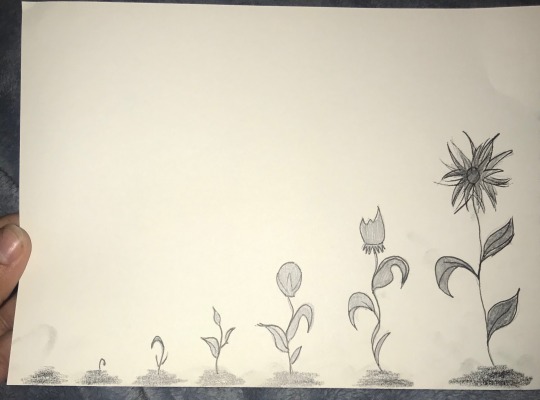
D4- Speech Actions
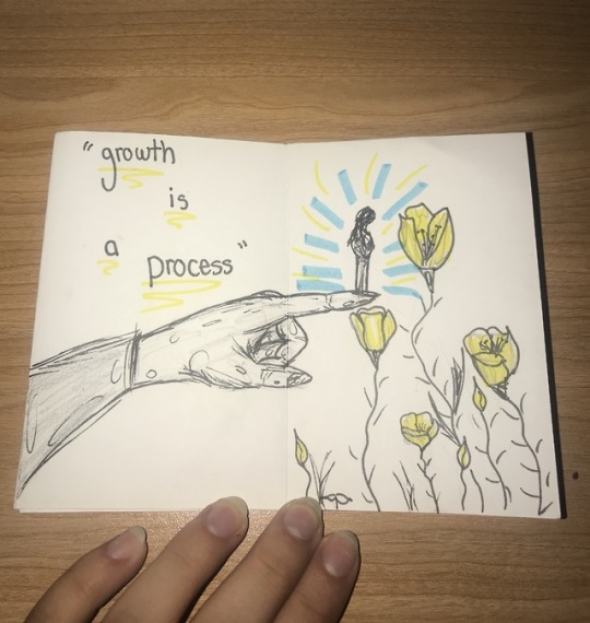
I drew the stages of a flowers growth. My idea behind this is I believe these stages are very similar to the stages people go through. We are constantly growing and changing, whether it’s physically, emotionally, or spiritually. It’s easy to be hard on ourselves because we don’t take a step back to look at our own growth and give ourselves some acknowledgment, but when you look at it overall it’s easy to see the change. It really is a beautiful and necessary thing that everyone goes through to become the best versions of themselves possible.
The media I chose was paper, pen, and pencil. I outlined the flowers In pen and colored them in with grey. The dirt below is grey as well. Life is not black and white like many people make it out to be, instead I choose to view it as grey. There are always middle points or grey areas and it’s not as simple as people like to make it out to be. That’s why I choose to make it all grey. The grey also progressively gets darker as the soil and flower develop, to symbolize how as people develop they get deeper and more knowledgeable.
I liked how simple my piece is, and it does communicate what I want it to for myself. It could be interpreted differently for everyone, but it’s clear what it means to me so I’d say it was successful!
I had fun drawing this piece. It reminded me of how I drew flowers when I was younger and it felt good to just follow where my hand took me. It was fun to just draw what first came to my mind and not have any restrictions.
This project meant growth for me. It’s something I’ve been focusing a lot on and it felt really good to be able to put it on paper as a reminder for myself. It’s about growing every part of yourself all throughout life and remembering the beauty in it all.
0 notes
Photo
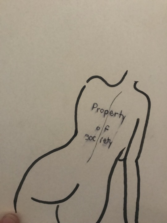
D3- Speech actions
For this activity I drew the outline of a woman’s body with the message on her back saying “property of society”. The medium I choose was pen and paper to keep it simple and self explanatory. My message is about how women are seen as properties of society or men, but not taught to be properties of themselves. Because it is on the woman’s back it is engraved into her and she may be unaware that this has been engraved on her. But the writing is smeared because the message is slowly being fought against as women are being taught to be themselves and properties of nobody. Overall if I were to do this project again I would explore other areas of speech and use watercolor.
0 notes
Photo
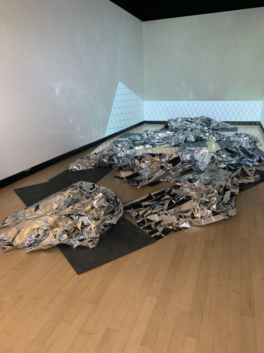
C4- Heidi Fernandez Saavedra
Artist: Heidi Fernandez Saavedra, Valeria Fragoso
Exhibition: “A-Number, You’re A number? My A-Number? Am I A- Number?”
Media: Sculpture, Installation
Gallery: school of Art CSU Long Beach, Dr. Maxine Merlino Gallery
Website: N/A
Instagram: littlemiss_heidi
This gallery is by Heidi Fernandez Saavedra and Valeria Fragosos. It is titled “A-Number, You’re A number? My A-Number? Am I A- Number?”, and that is what instantly drew me into it. Heidi is an undergraduate senior working toward her Bachelors of Fine Arts in Sculpture. In her work she explores immigration, specifically immigration detention centers, and the cruel and inhumane reality that they are.
Their gallery had foil blankets covering black mats on the floor. There was also a projection video of gates, which were some of the only light in the dark set room. The blankets were thin and shiny and contrasted the dark black of the mats. They used audio, video, and 3D work to all make the immigration detention centers come to life.
Heidi's main goal of her work was to bring awareness to the harsh conditions that children and families face being taken and separated by ICE. Although media attention has been diverted away from this issue it is currently happening and should not be neglected. Being able to touch the blankets and walk through the “gates” allows the audience to feel as if they are the ones in the detention centers. This draws out peoples empathy and really helps them understand the complexity of this issue. It makes you feel what it’s like to be treated as less than human. Her title is a key part of the gallery because it draws on the dissociation that being labeled as a number has on individuals. You are not seen as a person, but just another number.
I knew I would feel a connection to this gallery as soon as I saw the title. My aunt works to reconnect families who have been separated by ICE so this is an issue I’ve been surrounded with that is very close to my heart. The gallery really struck me in reminding me of the conditions people are forced to live in and the long term harm it will have. The audio of parents comforting children made it feel all too real. This gallery focused on a very important issue and did a fantastic job of portraying it. They really got their message across, and at the very least reminded me that this is an issue that needs addressing.
0 notes
Photo

C3
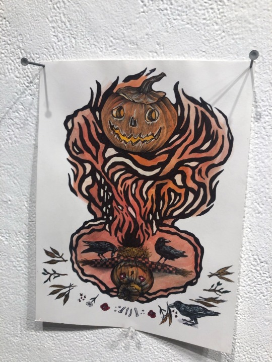
Artist Conversation- Charlie Roses
Artist: Charlie Roses
Media: Sculpture
Gallery: Max L Gatov Gallery East
Instagram: charlieroses
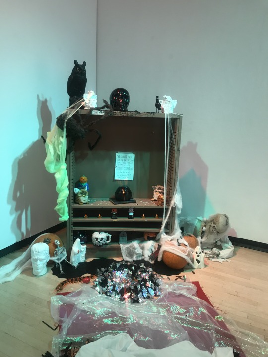
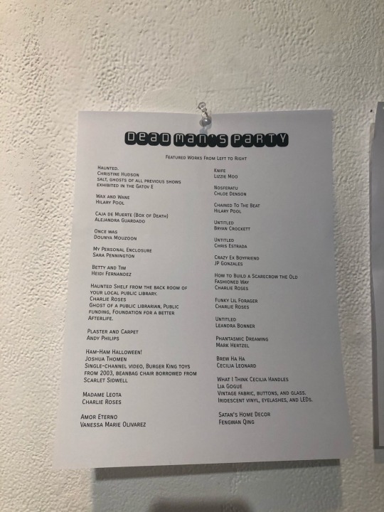
Charlie Roses is a graduate student at CSULB. She’s part of the Sculpture program and this her last semester. Most of her work is Halloween and horror themed. This is one of her favorite topics and passions.
Roses gallery had lots of pieces of art. She asked 20 artists to make scary themed pieces for her gallery. Her art has strong 1920s inspiration. She works with colors but also does black and white to align with the scary theme. She uses pen, watercolor, oil, ink and graphite. Her drawings use lots of thin lines to draw attention to the centerpiece of the art. The biggest piece of her exhibition was halloween inspired and very intricate. The piece is a shelf with lots of small Halloween related things on it. It also had many things scattered around on the floor such as a scary book, skulls, skeletons, and pumpkins. Her pieces take around 1-4 hours to create, but it varies depending on how big or intricate the piece is.
Her inspiration for the bigger piece was that she loved the idea of a sheet ghost and wanted to recreate it. She is also very inspired by Halloween and has been ever since she was little. Her inspiration comes from horror movies such as Beetlejuice. Also posters that are retro serve as inspiration for her smaller drawings. That’s why they resemble the 1920s art style.
Roses artwork made me uncomfortable in a good way. It helped to hear her explain her work and hear her passion for it. I’m not a big horror art fan but I liked that it was something completely new that I’d never seen before. The sculpture piece was my favorite because some of the decorations reminded me of my childhood, such as the scary story book. You could tell she put a lot of time into her work and was really proud of what she created.
1 note
·
View note
Photo

C2
Artist: Yaneli Delgado
Exhibition: Global Change
Media: Printmaking
Gallery: LBSU School of Art, Dennis W. Dutzi Gallery
Instagram: omequiztli
Yaneli Delgado has her bachelor's degree in Sociology and Spanish and she is currently trying to earn her teaching credential for art. Her gallery was made up from a collection of prints from a variety of artists. Her art piece focuses on her balance of the Chicano culture and the culture here. Her work also focuses on women empowerment and she advocates for more women to be included into the printmaking culture.
Because her gallery was a collection of artists, she chose to only have one of her own pieces in it. This piece was called “Ni la tierra ni las mujeres somos territorio de conquisto”. When translated to English this means “Neither land nor women are territory of conquest”. Delgado made her art by drawing on paper, painting it, and the soaking the screen to transfer it over to the cotton paper. She only uses black, white, and red in this piece. The black and white makes the red of the banner, and bandanna pop. There is a woman in the center, and she appears to be emerging from a vase. It also looks like there is a child breastfeeding and the child is the other only part of the piece that’s red. The patter used on the woman is a common pattern in Chicano art.
Delgado described the piece as a reference to Zapatistas. Black and red and significant and meaningful colors to Mexica culture, so by using them she is paying homage to her culture. The name of her artwork encourages women to reclaim their bodies as their own. Her art also compares women to land and expresses that both are their own beings and should not be victories and conquests for men to take. The lines behind her make her appear almost tree like, with the vase being the trunk and the lines around her being the branches. Because she is the center of the tree she is providing life to the branches around her and her child. She expresses that women bodies and land belong to themselves and themselves only.
I loved her gallery and especially this piece. It was incredibly relatable, and it also addressed serious social issues such as climate change. Her art successfully advocated for the basic rights of land and women. I had no trouble understanding the title and her work really translated her message perfectly. I love this style of art as well. She educated me about parts of her culture such as the intentional use of Mexica colors and I really appreciated that experience.
0 notes
Photo

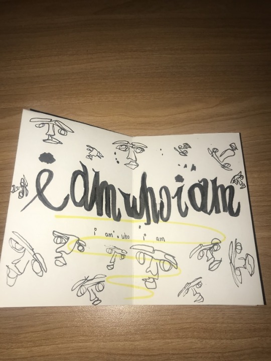
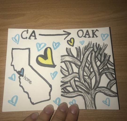

The goal of my zine was to show the multitude of places that I am from and show my journey of personal growth. I am still on my journey of growth and I think it will continue throughout my life, but I can see an improvement in myself. My first pages say “I am who I am” because I believe personality and identity are fluid. No matter where I am in my life, I will always try to stick to who I am and allow that to reflect in my identity. It’s surrounded by sketches of faces to visually show the multitude of growths you go through in your lifetime. My second page has the outline of California with a heart over Oakland. Oakland is where I grew up and it is where my family is currently so it will always be a place that represents home to me. It’s where my current identity was formed, and I believe the culture, environment, friends, and family there had a major influence on who I am today. The next page is the Oaklandish tree because it’s a symbol of Oakland that I’ve carried around with me for my entire life. This symbol is one way for me to bring a part of Oakland with me wherever I go. My final page has an outline of traditional Russian buildings with the sun rising behind it. I was born in Samara, Russia so it will always hold a special place in my heart. Being Russian is a big part of my identity and it was something that I had to work to accept. It was what always made me different, and although I used to be ashamed by it, I now see that it’s something to be proud of. That was a big part of my identity that I had to work on to accept. It’s my final page because it’s the part of my identity I would most like to explore. My goal was to have each page mean something to me and I know I accomplished that. I’m proud of my product and I think it accurately reflects parts of my identity that makes me me.
Next time I would use a different medium from my art. I have watercolor pencils at home that I think would work beautifully for this, but sadly I did not bring them here with me. I think watercolor could be a great medium to show how messy, yet beautiful one’s identity can be. They are also a medium that I haven’t worked with much so it would be great to better that skill while working on a project like this.
I would like to a future zine while I’m on a trip somewhere that I have never been to. I think it would be fun to draw the people, environment, and food I saw while I was there. I could work on it on trains, or at a café. It would help me to reflect on where I was in the moment and remember to not take it for granted. It would also be a great way to remember the trip. I’d love to be able to look back and not only remember parts of the trip I may have forgotten about but also have visuals to correlate with the memories.
0 notes
Photo
C1- Jillian Thompson
Artist: Jillian Thompson
Exhibition: No Redemption Value
Media: Metalsmithing and jewelry
Gallery: CSULB School of Art
Website: N/A
Instagram: jillian_thompson
I was instantly drawn to Thompsons work because I’d never seen anything like it before. Thompson is from Detroit, Michigan and has her master's in jewelry and metalsmithing. She told me that the foundation of her art practice begun with jewelry. I immediately complimented her on her ability to do all 3 medias, especially jewelry, because I’ve tried making jewelry and wow is it hard! She explores ideas such as African American culture, tradition, gender roles, and feminism in her work
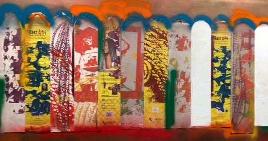
Thompsons exhibition is titles “Ode to Sisterhood”. The art piece was surrounded by lines of spray paint that ranged from blue, orange, and red. The paint followed the natural curve of the frame of the work. The shape of the work was almost fence post like. The paint overlapped and appeared messy. yet purposeful. In my picture of it, you can see 12 of these fence-like shapes all put together to form a canvas. She explained that she used a process called soak screening to achieve a smooth effect. I’d never heard of this until I met her, but she explained to me that it was burning negative images into a so they will show after the ink is applied. The colors were all bright and vivid and mostly the primary colors stuck out to me. It was massive enough that you could see the work from afar, but as you got closer you could form a deeper understanding of the meaning. You can then see that she uses a compilation of pictures of African American women smiling as the main focal point of the art. Although your eye darts around from color to color, the beautiful African American women are what stand out most.
Thompsons art has an overarching theme and depth that I had a very limited understanding before she educated me. I was moved by her sentiment in her artist's statement that she often thinks of her past experiences with her mother doing her hair when she creates work. It was moving to hear her talk about a personal experience and see how this translated into her work. Her artist statement discussed the symbolism of braids in women's hair and how they serve as a form of protection, strength, and encouragement. When I asked her to go more in-depth about this meaning, she told me about her reusing hair from either herself or people she knows. By doing this she combines the labor that goes into doing hair and tradition and turns it into something beautiful that can last forever. Her use of vivid and dull colors works cohesively to contrast each other and move the audience's eye around her work and the smiling women symbolize pride in oneself and pride in the culture. Her work empowers African American women to have pride in their culture and traditions, and through her artwork, Thomspon can reach a wide audience. Therefore, she not only educates and empowers her close friends and families but anyone who can see her work.
I thoroughly enjoyed Thompson's work, especially because I’d never seen art like it before. Sadly, work that highlights African American pride and experience tends to be less popular in museums, at least the ones I’ve gone to, so it was a pleasant surprise to learn about her experience and work. I felt inspired by her multitude of media, and hearing her story brought another level to the artwork. I resonated with her work, even though I’ve never personally experienced what she has gone through. That’s how I knew I enjoyed her work because it made me feel empathy and want to empower others.
0 notes