
elena-owens
Elena Owens
18 | Drexel University | Graphic Design Major
10 posts
Don't wanna be here? Send us removal request.
Last Seen Blogs

lordiavolo
#1 nightbringer hater

yuyas-awesome-hippos
Yuya's Awesome Hippos

-sman-
Sman
geralar
Un poquito de todo
decoratedxemergencies
The Gang’s All Here
Text
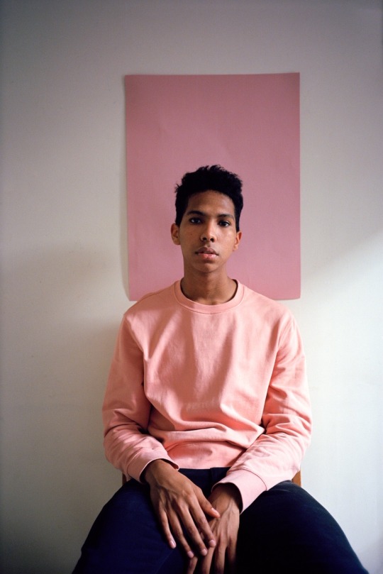
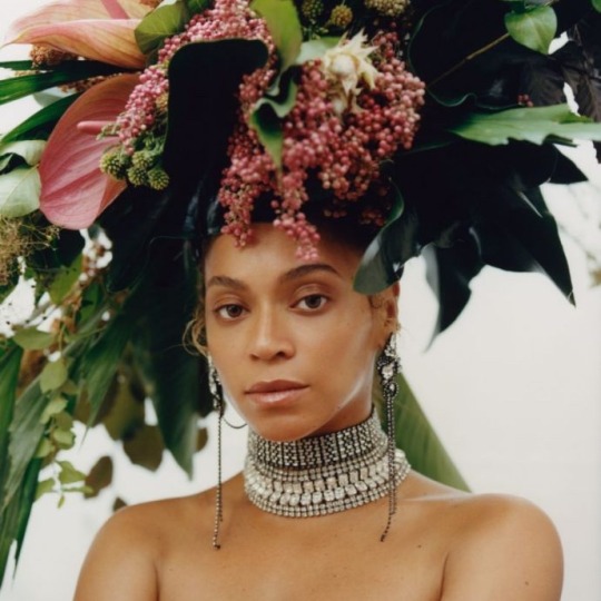
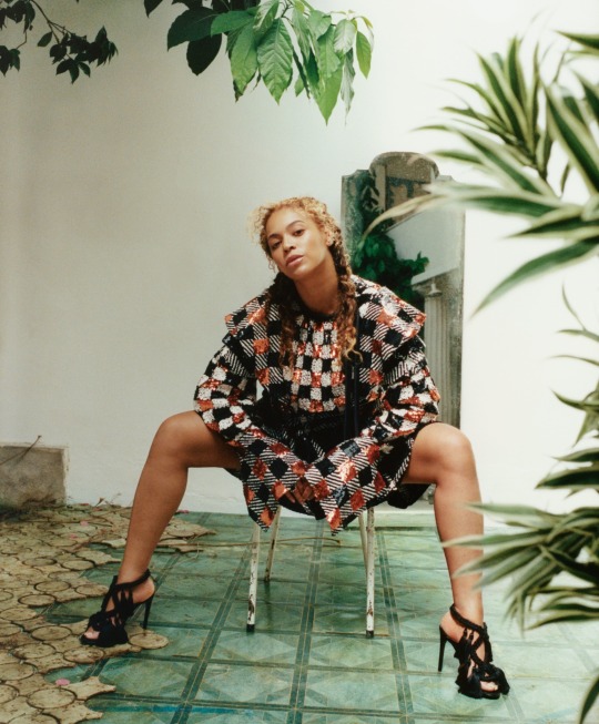
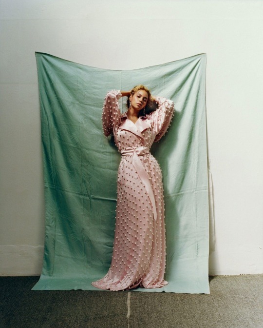
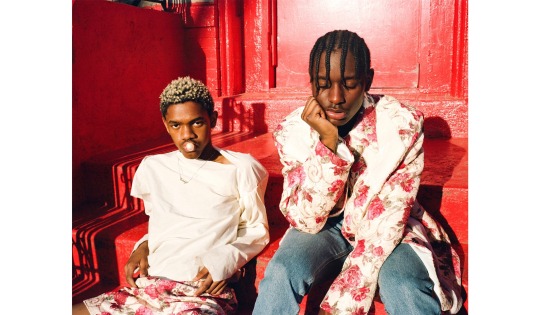
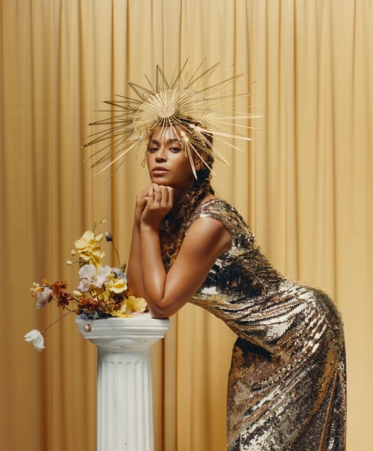
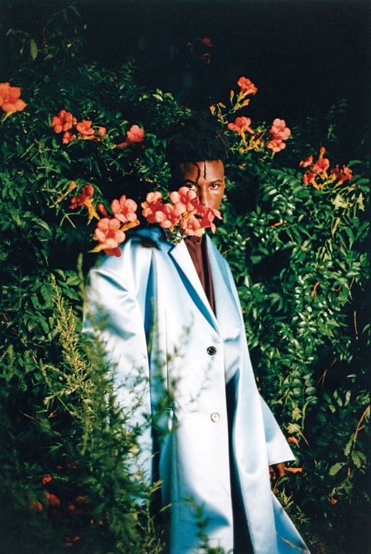
Tyler Mitchell : Photography Week 10
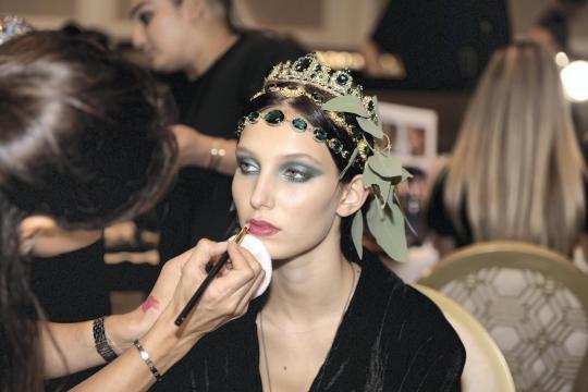
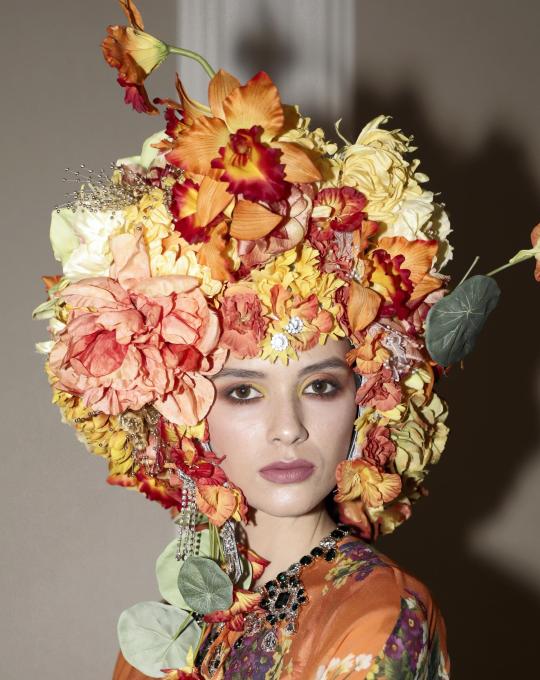
I chose Tyler’s photography for a few reasons. The first being that he is an up and coming artist. He graduated from NYU Tish School of the Arts in 2017, and only a year later was given the opportunity to shoot for Beyoncé for the Vogue september issue in 2018. He is a true rising star and not only that but like many other artists I admire, he shares a message of empowerment through his work and uses his platform for a good cause. A lot of his work was inspired by his childhood. He grew up in Atlanta and says he felt pressure to act a certain way because of his gender and ethnicity. In a lot of his work he sends a message of self-love, freedom, self-expression, and adresses issues of black masculinity and vulnerability in today’s society.
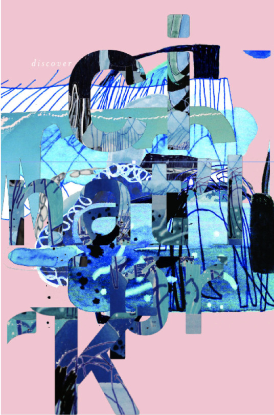
His work definitely has an amazing aesthetic to it. In the work that I liked the most of his, he used a lot of earthy, pastel tones. The props that are included in his shoots are often very chaotic on their own, but when theyre combined with the simplicity of color and clear backgrounds, they make an amazing statement. He definitely uses a lot of organic shapes which I found interesting that I was drawn to because in a lot of the work I have done, I typically stay towards a more geometric design.
0 notes
Text
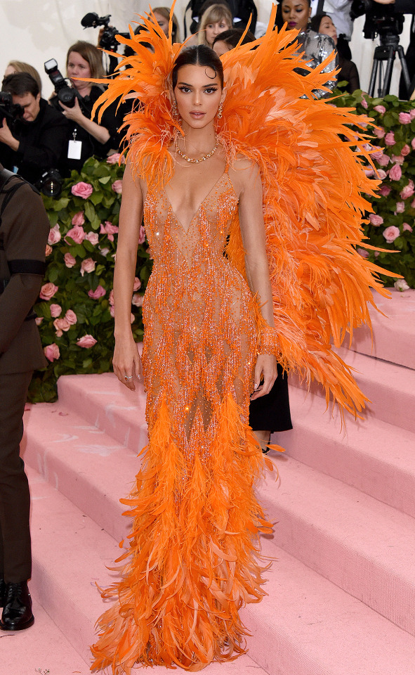
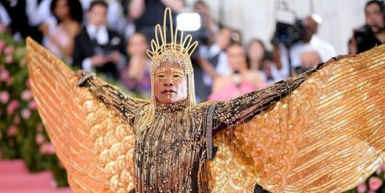
The first thing that comes to mind when I think about fashion is the Met Gala. My favorite theme so far has been 2019’s “camp”. I have watched countless interviews and red carpet walks from this event and through doing that I grew to love it. The reason I love camp so much is because when celebrities were asked what their definition of camp was, every single person had a different answer. It’s about self expression and getting as outrageously creative as possible. When I think of last year's Met Gala, Kendall Jenner’s look, a vibrant orange feathered gown, by Atelier Versace immediately comes to mind. This design somehow makes something so elegant into an eye catching burst of monochromatic, yet extremely saturated, color. Another monumental design from 2019’s met gala is Billy Porter’s Egyptian inspired, fully gold look done by Sam Ratelle of RRR Creative.
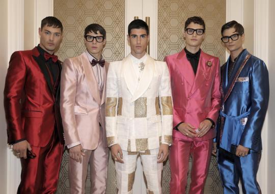
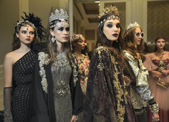
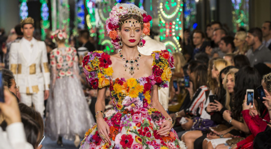
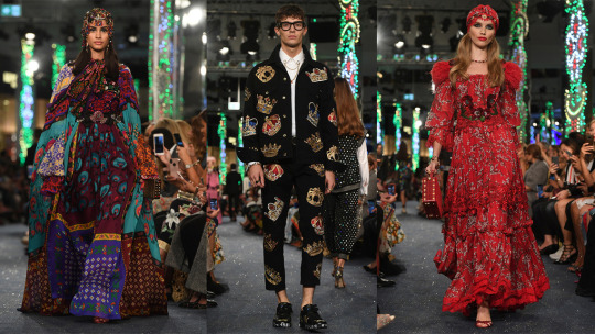
On the more specific side, one of my favorite designers is the iconic duo Domenico Dolce and Stephano Gabanna. I came across some of his work on instagram and was immediately inspired by it. It was his Dolce & Gabbana Dubai Frow. In October of 2018, Dolce and Gabbana turned The Dubai Mall into a catwalk for their first ever fashion show in the Middle East. Some of the designs featured were a combination of natural elements composed of warm energetic colors. Other designs were a contrast to that, including more neutral and darker hues which were accented with golds and very earthy, cool tones like dark greens and blue grays. I love how spontaneous this event was and personally think that Dolce and Gabbana did an amazing job including culture into their designs as well. In an interview done by Lifestyle, Gabanna says “We have done shows in Tokyo, Hong Kong, Shanghai, Mexico City and New York, because we love to explain to other people who are Dolce and Gabbana. We love to share our style. But we don’t want to colonise anybody. In every city, we try to mix our DNA with the DNA of the country. And we want to show our respect for the culture of the country.” Similarly to the designer’s I chose for the Designer Spotlight assignment, Dolce and Gabbana are using their platform to send a message which is again something I aspire to do as I enter the community of Graphic Designers.
1 note
·
View note
Text
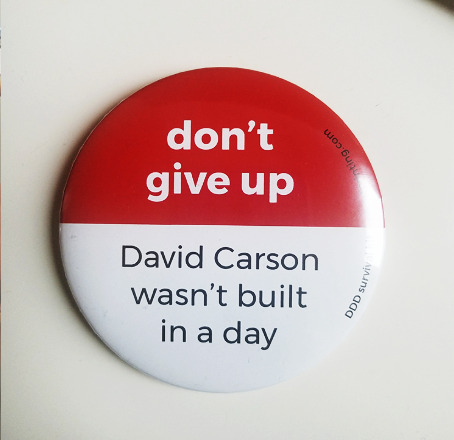
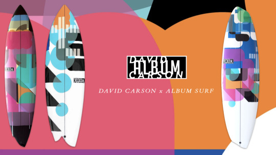
David Carson (Designer Spotlight Pt. 2 | Acclaimed designer)
The piece that immediately drew me to David’s work was a simple pin that says “Don’t give up, David Carson wasn’t built in a day”. I love the message that sends because personally as I get closer to entering the “real world”, I am becoming more and more intimidated by competition. However, reading that made me take a deep breath and realize that it’s okay to fail and take small steps towards success. David’s career started around 1985 and it took him almost 20 years to start making a name for himself. As I explored his website I started noticing his unique uses of typography. It was nothing like I have ever seen before which is why I was so drawn to it. When I came across his “David Carson x Album Surf” collection I was mesmerized by how he was able to take his experience in surfing and channel that into his work. “When lines are drawn, they're never straight. In surfing and design the principles are the same. Uniformity is boring. Creativity is celebrated.” His work as a whole, much like Wade and Leta’s, is unique in his own way and incredibly inspiring. I love how all three of the designers use their platforms to send a message about self expression because to me that’s what art is all about. I admire the hard work and determined attitude found in all of these great artists and aspire to be like them one day.
0 notes
Text
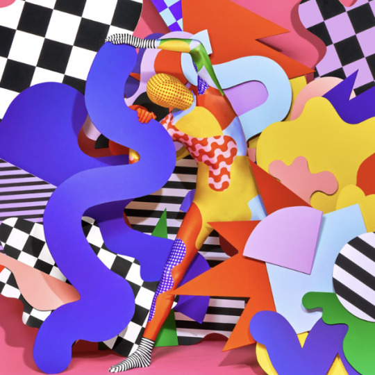
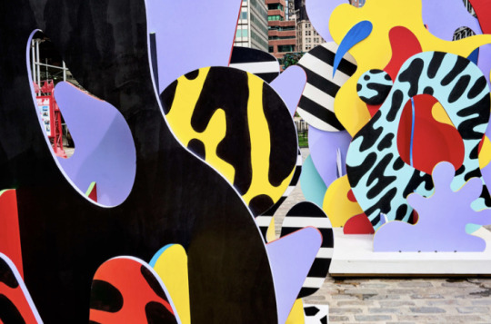
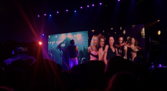
Wade jeffree and Leta Sobierajski (Designer Spotlight Pt. 1 | Younger designers)
I was browsing www.behance.net and was immediately drawn to Wade and Leta’s work. They have been married since 2015 and have been a team in their work since then. I admire how they are so bold in their color choices for projects and use a ton of vibrating edges and high contrast to create obnoxiously loud and eye catching pieces of work. The first exhibition I saw of theirs was the “music to your eyes” international exhibition in Tokyo. It seems like such a unique and exciting place to be. When I started reading more about the exhibition, I was amazed. “Our goal is to ignite a sensation for the viewer that is optimistic yet also leaves them with a sense of joy. Ultimately it is our way we describe our work: as visual music (Wade and Leta)”. They then go into more detail about how the exhibition was put together. There are photographs that cover the walls (example below) which appear to be 3-D, however they are in fact flat images. They said that each of the sculptures was hand painted and each of the bodysuits was designed specifically for this exhibition. “We embrace the fact that they are imperfect and flawed (Wade and Leta)”. Overall I love the messages they send with each new project and how their approach to every job is so independent and carefree of judgement.
0 notes
Text
University 101 — Free Library of Philadelphia Exhibition
I was really surprised when I found out how short the time period was for the creation of the expedition. Being completely honest, at first glance, I didn’t think it would take that much time. But as I looked closer and the more it was explained, the more I realized how intricate and time consuming each panel must have been. I really liked the use of color palettes and how each section has a primary and secondary text section. What really made the biggest impression on me was how similar each case was, but at the same time how different all of the secondary sources were in terms of color, patterns, medias used, etc. It sounds ridiculous but, I didn’t consider the fact that I would be working with other people once I went into the industry. Having a group of people might be challenging for me because I like to do things my own way but collaboration would open up a lot of opportunities for me. Seeing the amazing expedition that was put together in such a short amount of time and with so many different elements opened my eyes to what a career in graphic design might look like for me.
0 notes
Text
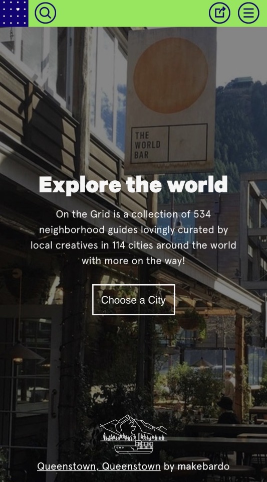
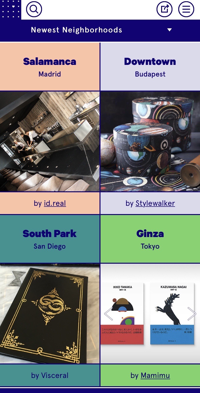
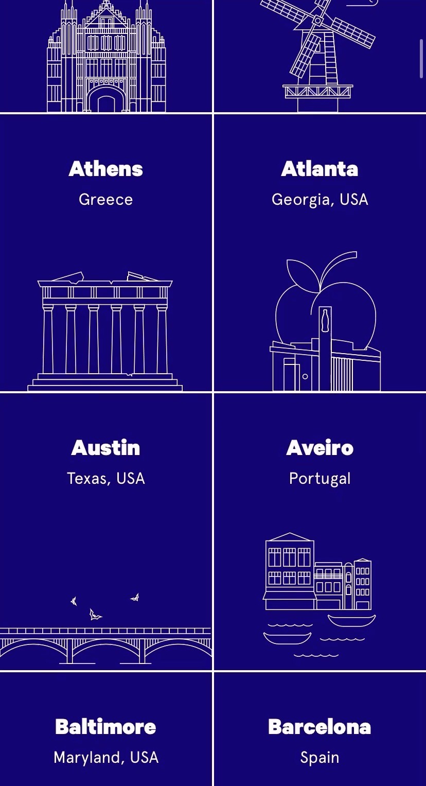
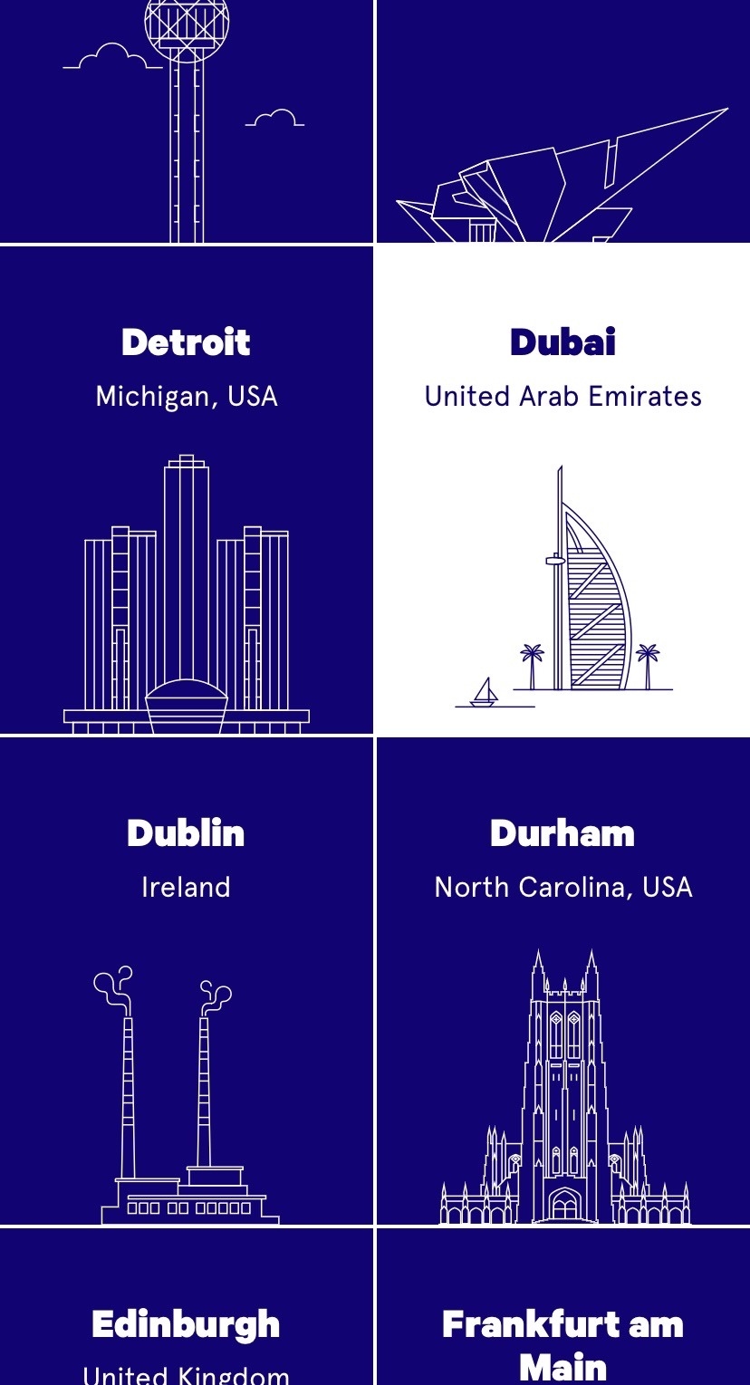
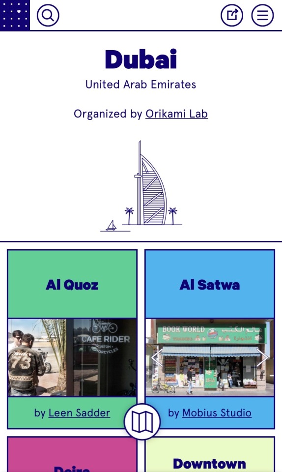
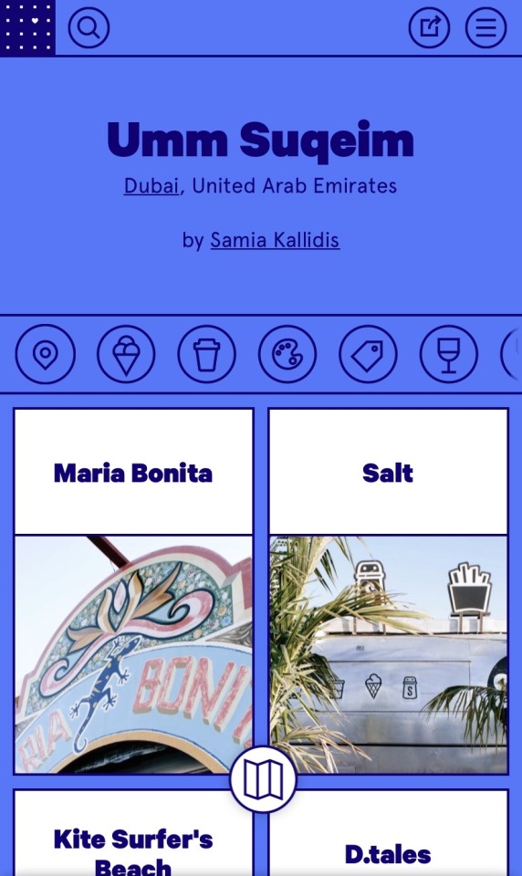
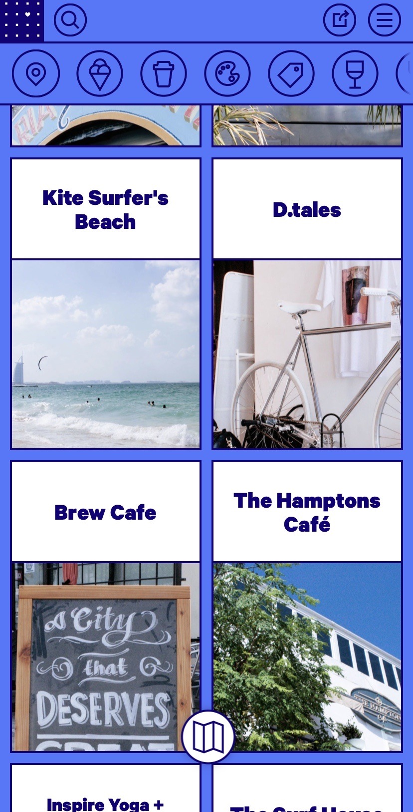
I am absolutely in love with this destination website. For starters the overall aesthetic is very pleasing to the eye. The website is really easy to use and well organized. The typography isn’t really unique but fits the clean and structured “vibe” of the website. Another thing that I love is the graphics used in each small description of the cities. As you scroll down the page the lines form and seem as if they’re drawn as you browse. They’re also very simplistic and again, fit the overall aesthetic of the whole website. As you start to disect the website and go further into what you want to see specifically, that’s when you start to see the photography. They offer so many clear and detailed photos that really grab your attention. They also have descriptions under a few of the photos that offer historical facts and fun facts about your destination. Another feature when you start to narrow down your desired destination is tabs that offer details about the place. These tabs consist of sightseeing locations, food, drinks, venues for the arts, places to explore in nature, gyms, and shops in the area. Once again, I love this website because it makes so much information that may seem overwhelming, easy to navigate and discover. The website layout is slightly different on a computer compared to my iphone, and offers street maps and drop points so you can see how far different places are from eachother. It also offers cities that are similar to the one you chose as you browse. In conclusion, the overall design and graphics shown throughout this website are very visibly pleasing and easy to navigate. 10/10!
0 notes
Text
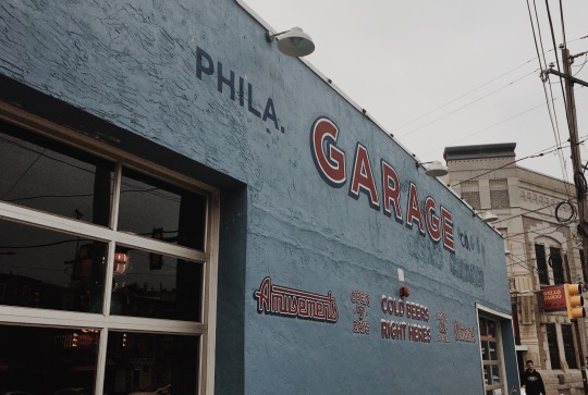
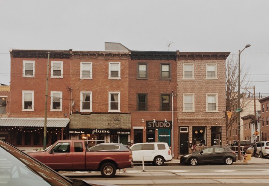
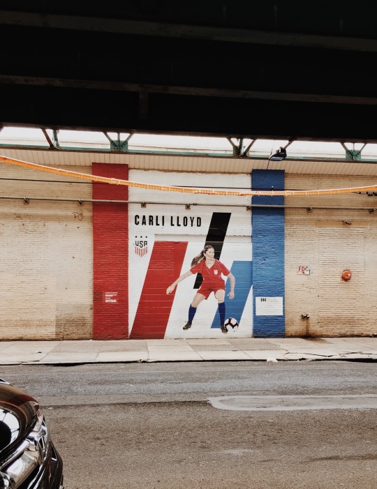
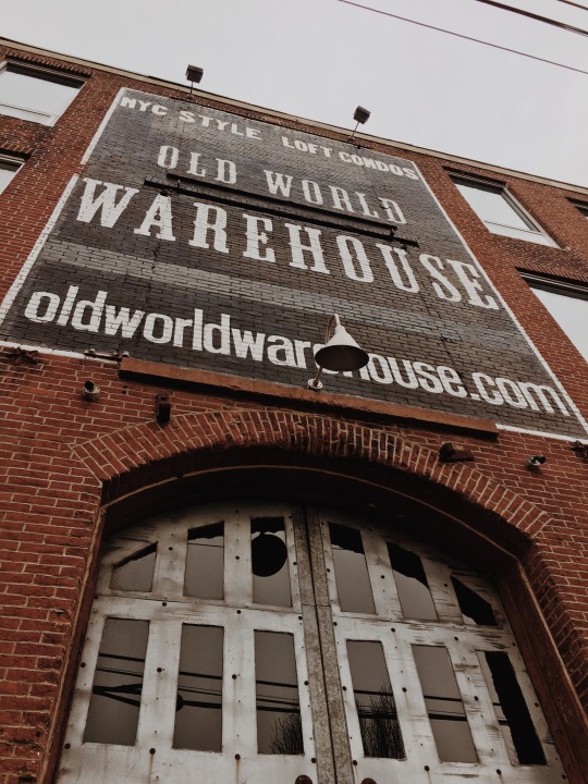

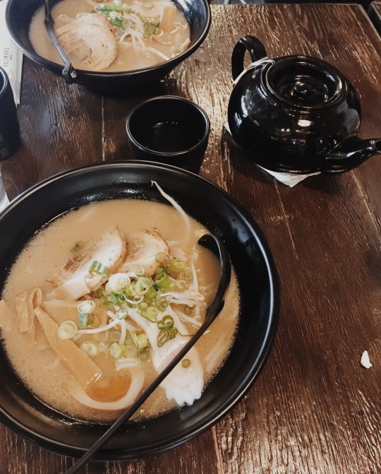
For my group’s eat and explore assignment, we went to Fishtown. It definitely was a big jump going from the high rises and newer buildings of center city/university city, to the sort of quiet and slower feel of Fishtown. For some reason, Fishtown reminds me of a town I grew up next to in the sense that in both towns I could feel the history that had been kept and reserved. There were so many great examples of different typography found around the town which interested me because I feel like I don’t typically notice that when walking around campus.
For our meal, we went to a restaurant called Hajimaru and had ramen. I have never had real ramen before and it was definitely something I’ll have to have again! 10/10
0 notes
Text
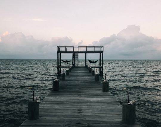

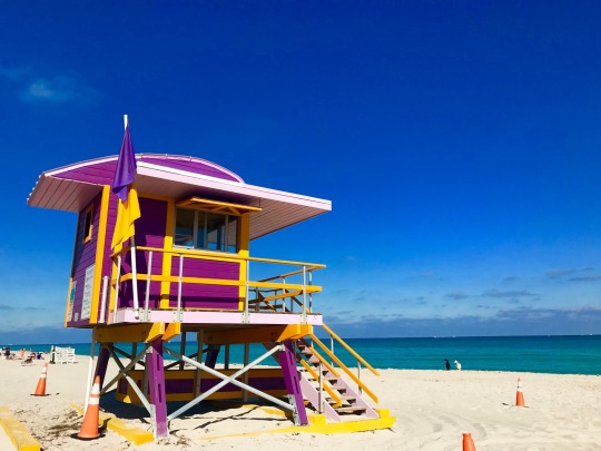
These are some of my favorite images of color I have in my camera roll. Most of them are very vibrant and great examples of pure hues, however, my favorite image would have to be the one from my trip to Belize (first image). It is considerably duller than the rest, but I love the contrast between the sky and the ocean as well as the green undertone seen all throughout the image. It brings me a sense of serenity and shows sophistication in color in my opinion.
0 notes
Text
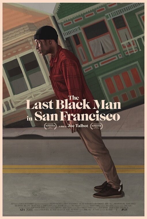
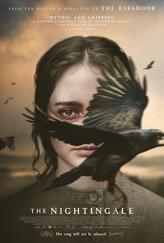
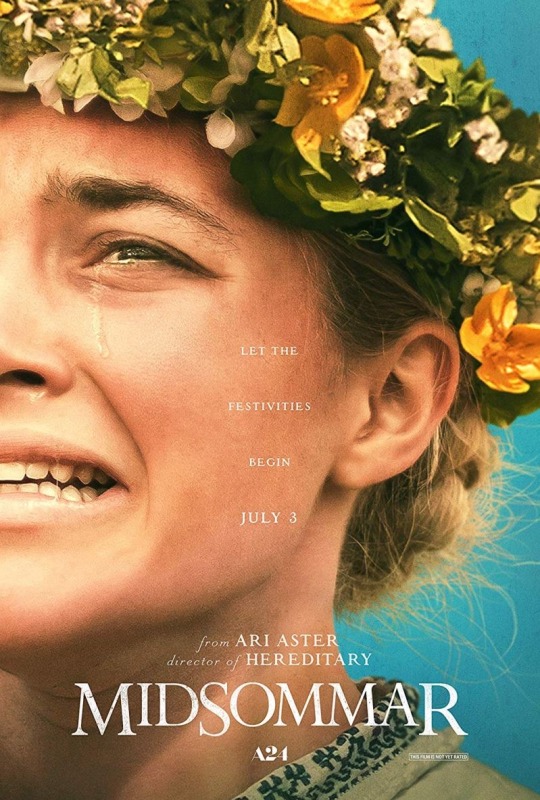
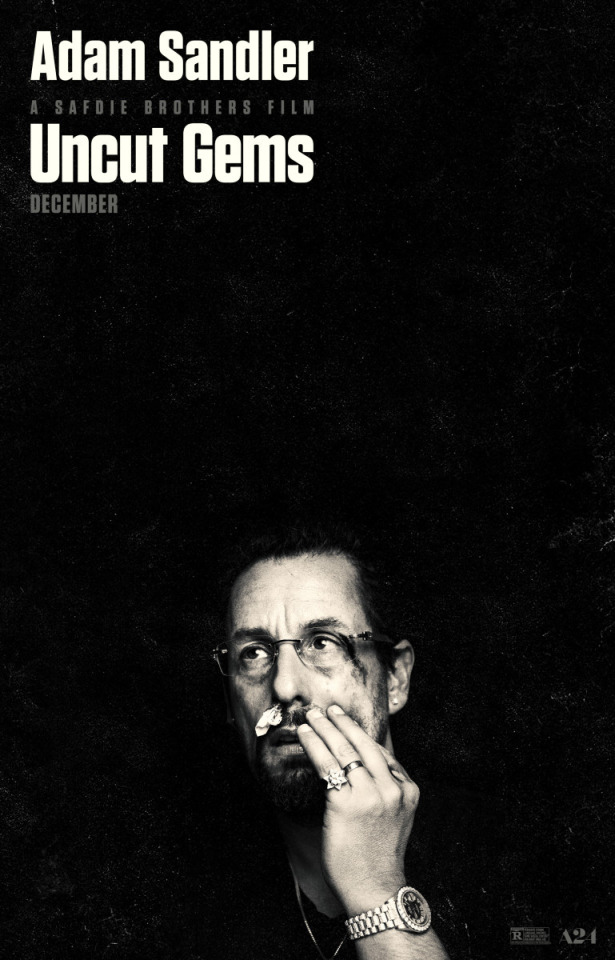
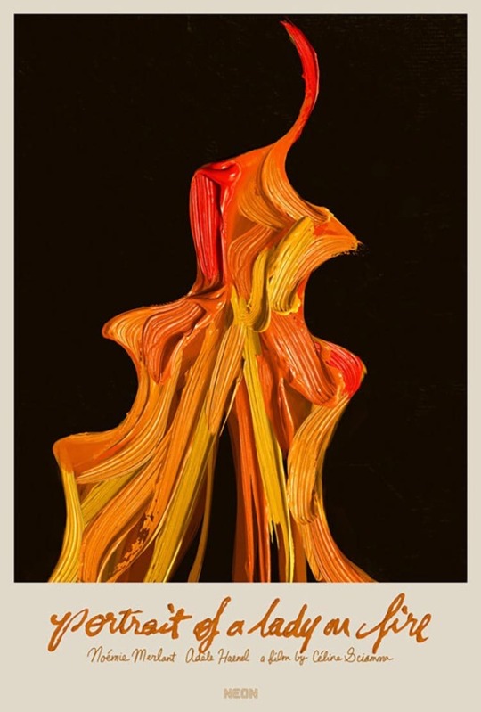
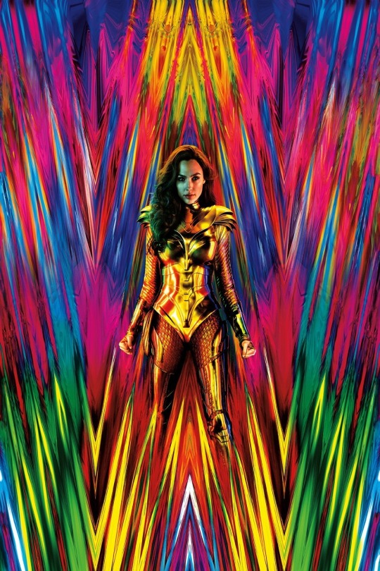
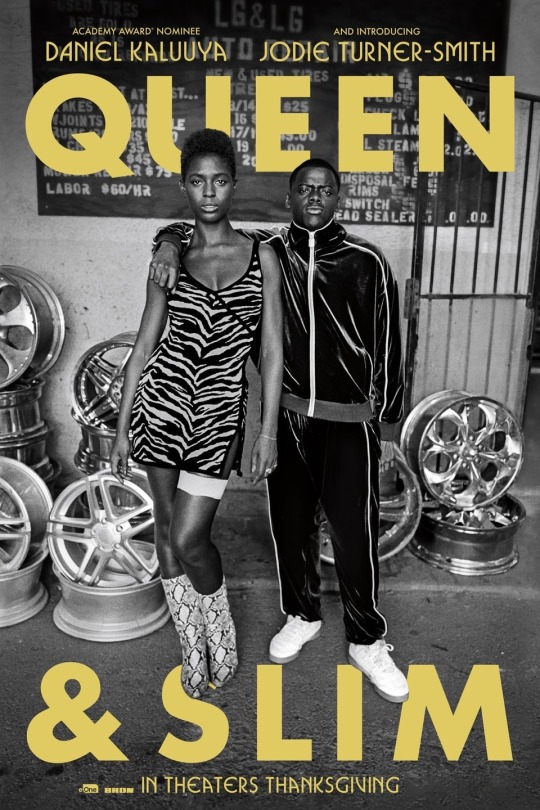


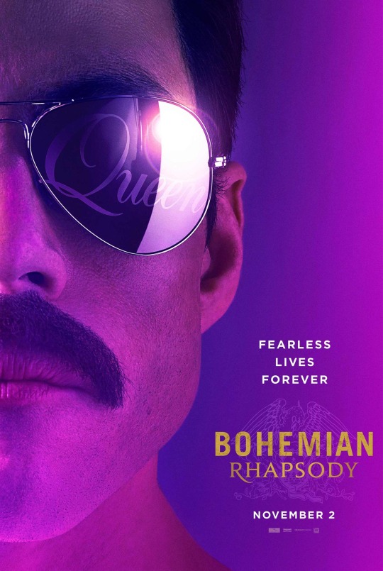
Some of my favorite components in these posters are the use of color to express a tone or emotion. A lot of the movie posters I chose, I was drawn to because they used vibrant colors to express strong feelings. In some cases though, the lack of color is what makes the image so strong. For example, the poster for “Skin” was so powerful to me because of the lack of emotion in the two childrens faces. The black and white style really drew my eyes to the prominence of the white tear of the paper down the center. I also like most of these posters because they seem so effortlessly substantial. I have always been intrigued by movie posters and album covers because they set the tone for the entire movie/album.
0 notes
Text
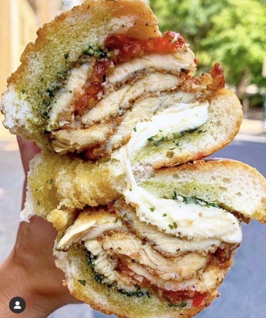
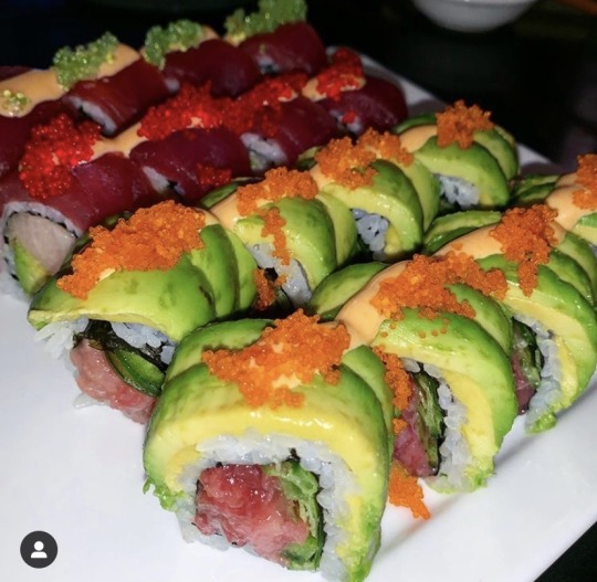
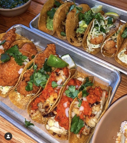
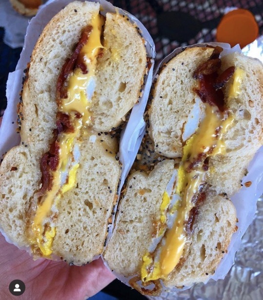
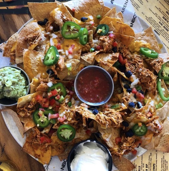
https://instagram.com/swagfoodphilly?igshid=40qbilu53o2g
This is one of my favorite Philly food bloggers. I discovered this account somewhat recently, but they have managed to make their way to the top of my list. Since I grew up 20 minutes outside of Philly, and had easy access to the city, I have always loved going with a group of friends and exploring different restaurants. This instagram shows off some of the most appetizing meals and snacks. Not to mention, their aesthetic is so pleasing, which makes the food even more appealing. They have such a wide variety of foods shown in their posts and somehow always manage to find some of the best spots to grub in Philly!
1 note
·
View note