
Last Seen Blogs

bleachluna
A Bleach Sideblog

oneoutstandingworld-blog
oneoutstandingworld
gabriel-humble-bee
Gabriel humble bee
radkip
Steph
umrohmabrursamirapurwokerto
UMROH MABRUR SAMIRA PURWOKERTO
Text
Reference List
The last magazine, Okay Kaya, Available at
https://thelast-magazine.com/okay-kaya-musician-both-profile/ [accessed at 24th March 2020]
Rafi Letzter, Coronavirus changes pollution over china, Available at
https://www.livescience.com/coronavirus-changes-pollution-over-china.html [Accessed at 01/04/20]
Jessica Harman, Conscious Clarity, Available at
https://www.wgsn.com/content/board_viewer/#/85495/page/2 [Accessed at 01/04/20]
WGSN, Swimtimates, Available at,
https://www.wgsn.com/content/board_viewer/#/85531/page/1
[Accessed on 1/04/20]
Jennie Lee, What is the true meaning of yoga, available at
https://www.yogapedia.com/what-is-the-true-meaning-of-yoga/2/9038 [Accessed at 09/04/20]
Alice G Walton, help maintain mental health during coronavirus lockdown, available at
https://www.forbes.com/sites/alicegwalton/2020/03/22/9-mental-health-practices-to-maintain-or-begin-during-coronavirus-lockdown/#413fc8854264 [ Accessed at 12/04/2020]
Katherine Ponte, Coronavirus Coping Strategies, Available at,
https://www.nami.org/Blogs/NAMI-Blog/March-2020/Coronavirus-Mental-Health-Coping-Strategies [Accessed at 15/04/20]
Tasha Eichensehe, How yoga can help your stress about coronavirus, Available at
https://www.yogajournal.com/lifestyle/ayurveda-and-yoga-for-flu-and-coronavirus [Accessed at 15/04/20]
Charlie Brinkhurst-Cuff, Fanpages Magazine, available at
https://www.dazeddigital.com/projects/article/35362/1/fanpages-magazine-publishers-biography-dazed-100-profile [Accessed at 21/04/20]
Anna Cafolla, Polyester Zine, Available at https://www.dazeddigital.com/life-culture/article/43364/1/polyester-zine-podcast-melissa-polly-nor-celebrates-marginalised-creative-voices
[Accessed at 21/04/20]
Net-a-Porter, Available at
https://www.net-a-porter.com/gb/en/
[Accessed at 23/04/20]
Asos, Available at,
https://www.asos.com/women/ [Accessed at 23/04/20]
Skims, Available At,
https://skims.com/ [Accessed at 23/04/20]
Rhiannon McGregor and Jessica Smith, Conscious Deceleration, Available at
https://www-lsnglobal-com.ezproxy.bcu.ac.uk/macro-trends/article/24271/conscious-deceleration [Accessed at 24/04/20]
Poppy Almond, Instagram, Available at
https://www.instagram.com/p/B7stXydns15/ [accessed at 4/05/20]
The brand guide, about, available at
http://thebrandguide.com/about/
[accessed at 5/05/20]
The Foreign Policy, About, Available at
http://foreignpolicy.design/about/ [Accessed at 5/05/20]
Focused Fitness classes, Lsn, Available at
https://www-lsnglobal-com.ezproxy.bcu.ac.uk/health-wellness/article/24897/focused-fitness-classes [Accessed at 21/05/20]
Yoga Journal, ways yoga keeps you fit, Available at
https://www.yogajournal.com/lifestyle/count-yoga-38-ways-yoga-keeps-fit
[accessed at 21/05/20]
Lsn, Anxiety Rebellion, Available at
https://www-lsnglobal-com.ezproxy.bcu.ac.uk/macro-trends/article/23085/anxiety-rebellion
[Accessed at 21/05/20]
Public House Of Art, Eugenia Loli, Available at
https://publichouseofart.com/artists/eugenia-loli
[Accessed on 21/05/20]
0 notes

Text
Evaluation
The main aim of this module was for me to successfully plan, develop and deliver a project that focuses on my personal creative strengths. The main objective was to show off my personal style that reflects my chosen pathway. My chosen degree pathway is Fashion Communication, in this module I wanted to push my visual communication skills creatively and really get an understanding of how to communicate a narrative. I chose to do a future trend look book which was inspired by our time in lockdown. The idea of the look book is that it is post pandemic and we have re invented our way of living, after discovering how busy we are in normal lives & understanding that we thrive from just slowing down for a little while. I wanted my look book to have a focus on looking after ourselves through fitness, as during the lockdown looking after our bodies & minds was one of the only things, we had control over.
Before I started my research, I came up with the idea of creating a post pandemic look book, as I knew that this time, we were living in was going to have a lasting impact. In addition to having a lasting impact, it was relevant, I knew I would be able to gather research and supporting evidence easily as it was currently happening, everyone was living through the pandemic. Initially I wanted my trend to have a focus on activewear but as I developed, gathering trend research from WGSN, I came to find that a new demand was going to take hold, the desire for multi-function items, this is when I decided to combine two WGSN reports. I chose to combine ‘Swimtimates’ which was a swimwear trend with a twist, garments seen in this trend could be used across swimwear, underwear & shapewear... I felt this trend was appropriate for my direction as during lockdown people had learned to live with less, streamlining their purchases, opting for garments that gave them multiple functions. The next trend I wanted to take elements from was an activewear trend ‘Bath House Healing’, the active wear was designed to be more for slower paced exercising & restorative activities, such as yoga and long walks. The trend itself is about consumers stepping away from the glorification of busy lives & embracing their time to unwind, which is the exact path I wanted to take my look book down. This research from WGSN was all vital in me gaining an understanding of how to progress my trend direction & assisted massively in the development of my look book.
Alongside WGSN trend report research I gathered research from various other sources to ensure I had evidence to back up my direction. As my direction is inspired from the current pandemic, how we are longing to escape, I decided to create a survey to put out to my peers to gain some first-hand knowledge on people were feeling, from the survey I wanted to get an insight from other people perspectives on how they were coping with the pandemic in terms of their wellbeing, the survey did help in doing this however answers were brief meaning they didn’t give me thorough insight but it did supply me with what I needed. LSN Trend Reports were a massive help in my research, as they go into a lot more depth about why we are going to see shift and what the industry is going to do to respond to a new consumer demand, which allowed me to evidence my direction further. As we are currently living through the pandemic, it was something that I could give my own personal view on as it had an impact on my life, I was able to back up my direction with how the lockdown was affecting my life & what it had taught me, I felt this was a useful insight as it was my own honest opinion which is what I felt I needed in my evidence to allow the reader to get a further understanding.
Moving on to my development... as a whole I feel as though this module has made me push my creative development and I have developed in how I create/design as an individual. On this module I really the learnt the importance of sampling, layering content and making sure that I have done extensive research on other layouts from zines etc to take inspiration from/ refer back to throughout the process. I think in the early stages of the module I was really struggling with my development and how to take my look book to the next stage along with pushing my creative skills. However, I soon worked out that my creative block was a result from me not doing enough layout research, which is when I decided to take a step back from my look book, returning to doing some research to find inspiration. This step back really paid off, I found relative layouts on Behance, which I go into depth about on my blog, and was able to take my look book to the next stage, which is the version you see in my final outcome. The Behance research reminded me of small details, such as memorabilia that you would find in a journal, which is why I created the ‘plane ticket’, I feel as though this added to that personal touch I was trying to create. Finally ‘The Brand Guide-Singapore Edition’ was what helped me the most in terms of visually communication my narrative and what elements I should add to my pages. This is when I started scanning in tissue paper, ripped paper edges, paper clips etc from around the house, all of which you see in my final outcome, as I wanted to really make it feel like a home made journal and using elements from real life told this narrative as they made it feel personal. I am really pleased with my development throughout this module and how I overcame obstacles, it has taught me the importance of taking a step back and re evaluating what direction I want to head in and what I am trying to communicate.
In regards to successes & failures in this module, I feel as if I had my fair share, with one of most failures being what I mentioned above about developing a creative block however I managed to overcome that turning into a success. Another obstacle I ran into was the use of GIF’s, initially GIF’s were something I wanted to include in my look book to push my CAD skills however when I moved onto creating my look book pages I was focusing too much on how the GIFS looked and worked together rather than focusing on other elements that would communicate my whole narrative, such as layout, content, text etc... I was relying solely on the GIF’s to communicate my direction, which was boring and wasn’t pushing myself to create to the standard I know I can reach. However, on deciding to forget about the GIF’s until I had my whole aesthetic worked out, I ended up focusing solely on what I can do to communicate to the reader and thought about all the small, finer details on doing the talking, creating multiple points of interest rather than just a moving image. I think my successes in this module come with the failures that I overcame in order to create my final outcome which I am really proud of.
If I was to do this module again, I feel as though the only thing I would do different is make sure I have research everything thoroughly before I move onto my final outcome so that I have a clear narrative in my head and can execute it to the standard I desire, doing this would avoid me having to revisit research, eating in to vital development time, which in turn reflects my time management. In conclusion, I'm really pleased with my final outcome, personally I feel as though I managed to create the aesthetic I was aiming for and managed to communicate my narrative across all elements that make up the look book. In addition to this I feel as if I have progressed as an individual and have learnt vital skills within the creative process that I will continue to use throughout my degree.
0 notes
Text
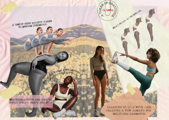
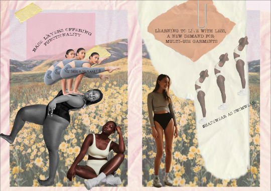
Final Look Book Pages
This is my final post showing the final outcome of my look book in order of how they appear on Indesign & PDF versions. As mentioned in my previous development posts I decided to do an 8 page look book with 6 of them being double page spreads. I chose to to a smaller amount of content but really push my communication skills to tell my narrative effectively on those pages rather than creating more pages, allowing myself to pack in more content that would of made it easier to tell my narrative had I had more space...

Front Cover
Concept Board

Colour Board
Silhouette & Materials Board

Back Cover
To conclude, I’m really pleased with my final outcome. Firstly, the aesthetic of the look book is consistent throughout, I feel as though I managed to create the idea that it was made at home as someones journal, I managed to achieve this by scanning in different textures of paper, ripped paper, envelopes etc from around the house that I could experiment with. Making it feel like a journal was important to me as I feel as though that element elevates my narrative further, the idea was that this look book was created in lockdown, dreaming of the future being free within the world, exploring, looking after ourselves, practicing our re invented way of living, which is why I felt as though a journal was an appropriate theme to use. Had I of been able to create a physical copy of the look book, I would of been able to push the journal aesthetic even further as you would of been able to feel different textures, use envelope openings to reveal content, foldaway pages etc however considering the circumstances, I am happy with what I have achieved digitally.
The whole idea of the trend is that living through a pandemic has taught us a new way of living... a restored way of living. We learnt to live with less, people lost jobs, money was restricted, businesses closed, lives were lost, holidays cancelled, limited to being in our homes only, we used the time to reinvent ourselves. Lots of people turned to DIY... you wanted a new top? Tie dye on you already have at home using a cabbage! Cut up your dads oversized shirt! People realised that they don’t always need to buy something new... not only that but people re adapted to being able to roll of the sofa in your comfiest bra and immediately start doing some light at home exercise without worrying about wearing the worlds most supportive bra, they no longer needed to pack a whole new set of underwear just to workout after work and they liked that, which is why we saw a shift towards multi function items featured throughout my look book. The trend is about taking what you’ve learnt in lockdown & applying that to your life of freedom post pandemic, being grateful for the great outdoors, being able to move your body and learning to slow down... I feel as though I managed to communicate this effectively throughout my choice of content, placement & the aesthetic I created.
0 notes
Text
Why I decided To Not Include GIF’s
As mentioned in previous posts at the beginning of the creation of my final outcome, I was enthusiastic about pushing my CAD skills and learning how to create GIF’s to feature in my look book. As you will have seen I did learn how to create GIF’s and did try out some sample pages using them however after creating these samples, I realised I was focusing too much on how the GIF’s looked rather than the whole aesthetic of the page, other than the interest of the GIF’s the pages were boring, they weren't communicating my narrative or they were but too obviously, I wanted my story to be told through other elements such as the layout, the textures, the font rather than just a simple flashing image. Which is why I decided to forget about the GIF’s, focusing solely on my layout/aesthetic, making sure I was effectively communicating my narrative first. Once I had got my layout to a point I was happy with, there was already a lot of elements that were assisting in elevating my look book, I had multiple layers of textures, added in finer details such as paper clips, sellotape and I been very selective with my imagery along with colours, I felt that I didn’t need to add another point of interest such as a GIF, as then there would of been just too much happening in one place.
To conclude, I am glad I managed to learn how to make a GIF & understand it. I managed to challenge myself, pushing my CAD skills further even though I didn’t use the skills in my final outcome they are skills which I will definitely use in the future throughout my time at university & in industry however in saying this I am pleased that I was also able to fully communicate my narrative without them, stripping it right back meant I really had to think about all the other elements that make up my look book and ensure I was allowing them to reach their full potential. By doing this I think I have developed a further understanding on the importance of your layout when creating a lookbook/zine and with this comes the finer details which all play a huge part in what Im trying to communicate. I have took away valuable knowledge that I will apply to my design processes in the future.
0 notes
Text
Why I Decided Not To Include ‘Doodles’
Similarly to GIF’s, I was going to create some illustrations that felt like doodles to add to the personal touch I was trying to convey. In a recent post I spoke about Poppy Almond, who’s style of illustrating, I felt would be suited to my final outcome. To be truthful I think I ended up not including illustrations as I didn’t manage my time effectively and I left it too late to start creating illustrations in addition to this I focused a lot on my layout to ensure that I was happy with it, admittedly forgetting about adding doodles. However this also tell’s me that as I forgot about them, I didn’t feel as though my layout needed anything adding to it when I came to the final stages, which I suppose is a positive.
In conclusion, I am disappointed that I didn’t manage my time very well meaning I did not even start creating illustration samples, which tells me this is something I need to work on as effective time management is crucial in terms of completing my degree to the standard I want to achieve but I don’t feel as though my final look book is missing anything by not having them which I can only take as a positive.
0 notes
Text
Development of Look Book- Scanning In
In order to elevate my look book I decided to scan in different textures of paper along with little details like paperclips and sellotape to assist me in making my digital look book have that hand made journal aesthetic.

I scanned in tissue paper, envelopes, lined paper, ripped bits of paper all of which I have featured in my look book. The tissue paper has been used on all inside pages of my look book as the background, this way it feels like the rest of the images are stuck onto the tissue paper assisting in making it feel less digital rather than it just being on plain white background. The lined paper samples & ripped paper samples I layered together on all the pages again, as this added to the journal aesthetic, as if someones just used scrap bits of paper from their home to create their journal.
I think scanning in these different textures is what really helped me create my aesthetic, if I hadn’t done this step, I think my final outcome would be a lot different, it would a lot more simple. I think scanning in played a part in pushing my communication skills in this module, I had never worked with this many layers on the page before often playing it safe opting for a plain background however it was really important to me to communicate my narrative in all elements that make up the look book rather than just the imagery I choose to us. Im glad that using the scanner was suggested to me in the early stages of my development and I think it will become a piece of equipment I rely on heavily throughout my future at University.
0 notes
Text
Restorative Living
This post is covering why I chose the title Restorative Living for my look book. I was really struggling to think of a title to begin with, as I wanted to get it right, I wanted it to fully encapsulate what my trend was about. As my narrative is all about our new lease of life post pandemic as we have adapted to living with less, slowing down, looking after our selves, it was important that I got this across in the title.
At the start of the project when I created my personal brief I played around with titles such as ‘A Fresh Start’ and ‘New Beginnings’, whilst these titles could represent my narrative, there is truth behind them for some people when lockdown ends it will be a fresh start, we will be starting our new life without the virus however I just felt as though these titles were a bit bland, too simple.

I thought about using words such as reinvented to tell the story of a new way of living but again, didn’t set the tone how I wanted. I used an online thesaurus to look up the word ‘Restore’, this word can be used in many different ways however I liked the way it could be used to ‘Bring back to a state of health, soundness or vigor’- this definition felt suitable to my trend and applicable to the current pandemic, for more than one reason. Firstly it can be an obvious representative of the virus, we are all hoping to restore good health across all nations when this crisis eventually begins to end, not only that everyones health is at the top of their priorities right now in order to protect their loved ones. In addition to this the use of this word could represent our new outlook on how we live our lives post pandemic, focusing on our wellbeing both physical & mental, since being on lockdown we have established a new importance for slowing down and looking after ourselves which will continue as we move forward.
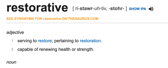
Finally, I decided on ‘Restorative Living’ as I liked the definition shown above ‘capable of renewing health or strength’. I feel as if this title can represent the strength we all had, getting through the pandemic, the strength we had to protect loved ones, the strength shown by millions worldwide working to get rid of the virus but it can also tell the story of how we reinvented our way of looking after ourselves when we had nothing but ourselves to focus on. As my research throughout my blog tells you, there is a big focus on moving our bodies & putting our wellbeing at the top of our priorities, we used the time during lockdown to shake those bad habits & learn to slow down, so that when we could return to normal life we were able to keep up with ourselves, being kind and listening to our bodies when we needed to rest. In conclusion I feel as though my title embodies my final outcome in more than one aspect and without being so obvious which will entice the reader to want to know more, it leaves some room for imagination, which is what I wanted from my title.
0 notes
Text
Look Book Font
I decided to just use one font throughout the whole look book, as I felt it communicated my narrative and I didn't feel as if I needed to add in another font plus I think if I did add another font it would have been difficult for me to find a one that has the same effect as the one I have decided to use throughout. The font I went with was called ‘Stamp Writer Kit, before I found this font and got some inspiration from the Singapore Brand Design, I was thinking of using a handwritten font, as shown below.

Initially I thought of using a handwritten font as thats what I felt you would see in a journal, someones handwriting, it also makes it feel a little more personal as you can connect with the person who has written it, it gives you more of an insight to a person when you see their handwriting and thats exactly what I wanted to do, I wanted my look book to feel personal however once I started looking at handwritten fonts they weren’t communicating the way I wanted them to, they were boring... I felt as if I had seen it before, so thats when I decided to re think my font choice. In addition to this lots of handwritten fonts can be difficult to read especially when theres other elements to the page and you have limited space to work with.

When I started to rethink my font, I tried to think about what else you might use in a journal from your at home crafts kit and I remembered stamps. Stamps still hold that home made quality in addition to this they have a nostalgic feel to them which could tell a story of its own if you were looking back at the look book remembering when you were longing for the life you now have post pandemic. The font also has a similar look to an old school typewriter with ink spots coming off the printed letters which again I think has the same effect as a stamp. I think my font communicates my narrative clearly & adds to aesthetic of my look book rather than getting lost amongst the rest of the content, which is what I wanted to achieve.
0 notes
Text
Further Look Book Development
Look book development after Interim Review. Following on from my interim review, the feedback that I was given was to start putting my boards onto double page spreads to enable me to move onto the next stage of placing them into InDesign & so I could see visually what pages would work together. I have decided to turn my concept, colour & silhouette boards into double page spreads, I decided to do this, so that the content on the boards wasn't so cramped together allowing my narrative to flow smoothly through the look book.
Concept Board.
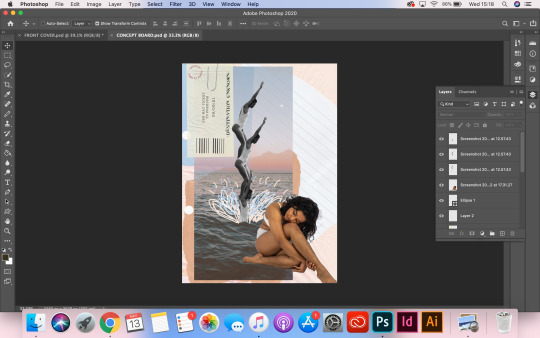
At the minute I’m pleased with how my concept board looks, as you can see it has moved on from my previous development post. When I turned the board into a double page spread, naturally a lot of space then opened up for me to play with, before I added in the hiking imagery, the page felt bare and I felt as though it didn’t really communicate my narrative clearly, it was missing another element, the idea of light exercise & looking after your body was missing, which is why I decided to add the hiking image. I feel as though that image is a strong image to use as the focus isn’t entirely on the exercise, it also supports the idea of being out at one with the world, being free amongst the hills which is the story throughout my look book. This board just needs some final tweaks done to it now before its ready to go into InDesign, I need to add in some hole punches to the pages to add to the home made aesthetic, in addition to this I want to add staples again to support the home made aesthetic, these are both design elements that i’ll add to all the pages in the look book. Finally, this page is going to have a small piece of text added to it that elevates the concept board and really brings it all together and then I think this page will be complete.

Colour Board.
The colour board is almost finished, I really like the simplicity of it, I wanted to avoid using fashion images until the silhouettes page to encourage me to think more about how to communicate my narrative without being so obvious. I am sticking with the background scenery images being slightly opaque as I feel that it shows the reader that this scenario is out of reach, we can dream to be there, we can see it but we cant get there... I feel as though the opacity tells this story as its slightly faded, it makes us question is it really there, is it accessible? In saying this, the boldness of the butterflies adds to this dreamlike theme, as there is such a contrast between the opacity and the solidness, they look like they are part of the scene but somethings off about them, it doesn’t quite make sense which is what dreams often feel like. All in all, i’m pretty happy with this page, like the concept board I think just a few additions such as staples and hole punches to complete the aesthetic and it will be ready for InDesign.
Silhouette Board.
This is the start of creating my silhouette board as a double page. Im unsure with what to do with the layout of this page, when it was a single page I really liked the layout however in my look book it is going to be a double page but I feel like this layout doesn’t quite work, it doesn’t flow together. Although I do need to incorporate a material & textiles board into my look book so I was thinking of combining silhouettes & materials to utilise the space in my look book. I need to revisit this & think about my layout, I will update my development in a later post.
0 notes
Text
Eugenia Loli
Upon showing Natalie some of my progress made on the development of my look book, she told me to really push that surrealism concept that was coming into play in my boards. She informed me of Eugenia Loli who creates surrealist collages.
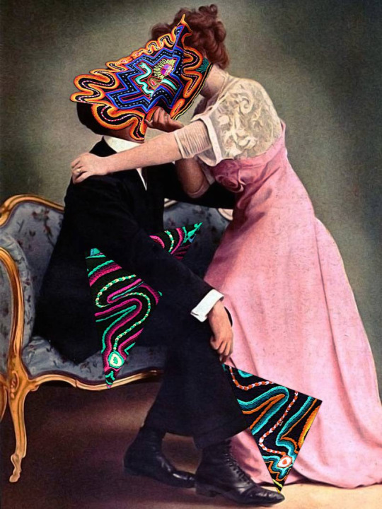
Each of her collages merge vintage with modern to shape a new vibrant world bursting with colour, often creating a lasting impression. Her collages are thought provoking, they don’t quite make sense but they do in a way, connecting out of this world galactic backgrounds with real life scenarios, we often don’t associate space & life on planet earth together, but why not, after all they exist in the same universe? She creates some sort of parallel, supernatural, surrealist world.
I can see why Natalie suggested for me to have a look at Eugenia Loli’s work, as I was trying to create a slight surrealist, dream like effect in my look book. It was really interesting to look at her work and she works everything together. However I didn’t really end up pushing the surrealism theme too much in my final outcome, I created more of a sense of longing, I didn’t want it too feel to ‘out of this world’ as i’m not sure that would have communicated my narrative. In saying this, Loli has shown me the beauty of combining multiple images that you might not see together in real life, I will 100% explore the surrealism art world in future modules.

0 notes
Text
Look book Development
Following on from my previous development post, where I talked about needing to add more layers, textures, elements to my pages to really communicate my narrative, I revisited some of my layout research to help draw out my creativity when creating my look book, as this was something I was struggling with. I was really inspired by the ‘Brand Guide: Singapore Edition’, which I went into more depth about in a previous post, I loved the use of different textures of paper, the stamps, the opacity of some pages, the personal touch, so I want to try and incorporate these elements into my own lookbook... I feel they are fitting as I want my look book to feel like a journal, which is personal, not always perfect, bits of paper thrown in here and there.
I decided to scan in even more things to assist me in creating my desired aesthetic. One of the things which I think really helped me move forward with my look book was tissue paper, as you will see in the later images of this post, I added tissue paper to the background of my pages as it creates another dimension to the page, it elevates that concept of being handmade, making do with what we have.
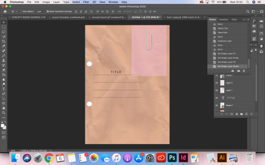
The above image is the start of creating my front cover, the brown paper is some which I scanned in, I like the crumpled effect on the paper, as it makes it feel worn in, something that a used journal would feel like, especially if it had been created out of materials from the home, it adds to that personal quality, you can tell that someone has made it themselves. In addition to this I decided to add some holes that you would get from a hole punch, which I will include throughout the look book, this is to represent where the look book would of been held together by string/binder had I of been creating a physical copy of the look book. I need to revisit the front cover and add content such as the title of my trend look book, text and image to add to the narrative.

Above image is showing my first concept board, which I have spoken about in previous post, which I decided to revisit and focus more on the layout of the images rather than the GIF’s. I have included here to compare/refer back to when I move on to talk about the next two images, showing my development.

When I started to rethink my concept board, I totally stripped it back, taking the focus away from the GIF’s, re focusing on my actual layout & elements of the page which were going to communicate my narrative. Above shows the initial stages, I stuck with the ripped out bits of scrap paper to add layers but have begun replacing the imagery. The imagery in first concept board ( 2nd image) was all very square and had no real meaning which is why I chose to change them.
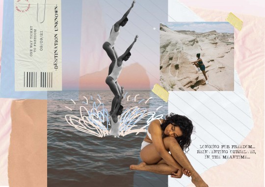
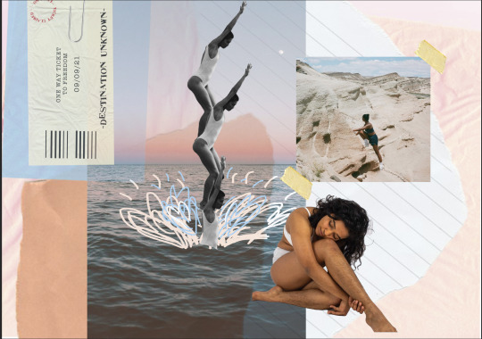
As my look book is inspired from the global pandemic, a time where we were all stuck in confined places, limited access to roam free, certainly no visits to beaches far away any time soon, I want to include that sense of wanting to escape our houses, to be somewhere far away from the chaos, which is why I included the image of the horizon on the beach, I think immediately it creates a sense of ‘oh I would love to be there’, we truly appreciate how beautiful the great outdoors just from that one photo... its important I communicate the message of wanting to be free amongst these beautiful open spaces in the world, as thats what we currently long for, we are dreaming of being able to visit these beautiful places of the world. I want to create that idea that we are dreaming of all these things, being free in the mountains doing yoga, relaxing on a beach far away, these are activities that we cant currently take part in but we are longing for the day that we can. To create this ‘surreal’ ‘dream-like’ concept, I will use collages, duplicating the same image, similar to the one above with the girl jumping in the ocean, I think along side this, adding a scenic background to the page will help create aesthetic i’m hoping for.
The above image is a further development of my concept board, as you can see I have added a scan of tissue paper to the background to assist me in creating that hand made aesthetic, when I compare it to the above image of the concept board without the tissue paper, I cant believe how much the tissue paper improves the page compared to just a white background. If I have learnt one thing from this, its that layering different elements & textures is really important and can play a huge part in communicating my narrative.
In addition to the tissue paper, I decided to take inspiration from one of the products I looked at on Behance, as mentioned in a previous post I really liked the idea of creating memorabilia for my look book, as a journal would most likely feature this sort of content. I started with the creation of a ‘Plane Ticket’ which you can see I displayed on the further developed concept board (above)
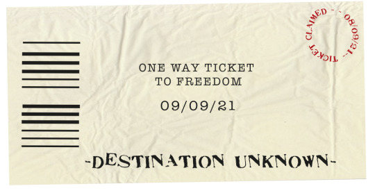
Sticking with the theme of longing and dreaming for the future, I used dates from 2021. I decided to refrain from using locations, to help me stay within that surreal concept, as I think not having a location, keeps it as a dream rather than reality...I used the phrase ‘One way ticket to freedom’ instead, as I think this sets the tone of not really caring where we go, as long as we are free, free to roam, free to be at one with the world, free to travel, I think if I had used a specific location it wouldn't of had the same effect, it would turn into a longing for that one specific place rather than a feeling of freedom. I also didn’t want to make the ticket super realistic, as it sticks the aesthetic of being hand crafted during this time of isolation not only that the fact thats its not real supports the idea that this is an idea we could only imagine, a real plane ticket is out of reach for a long time for the majority of us and I feel as though this recreation helps me tell this narrative, visually.
0 notes
Text
Poppy Almond Illustrator Research
As part of my research/inspiration Ive been looking at an illustrator/artist called Poppy Almond, she is a freelance illustrator but has done work with Skinny Dip, Harrods & Valfre. When looking her work, its playful & colourful, I would describe her work as ‘Sophisticated Doodles’. They are levels above the kind of doodles you would find on the back of your english work book but they could have taken inspiration from. She uses really simple shapes to put together a image which I love, its so simple yet really stylistic.

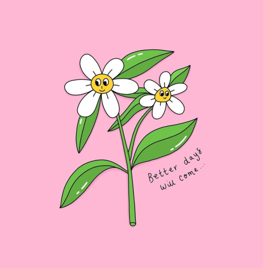
Some of her work has a positive message featuring quotes such as the above ‘better days will come’, I think her illustrations are good to combine with positive messages as the whole approach then becomes a lot softer, their easy to look at, they aren’t in your face or too overwhelming which is what I feel people want when they are looking for positive illustrations, they don’t want something to deep or personal if your looking for some fun positive artwork to hang in your guest bathroom.
I decided to have a look at Poppy Almond as I needed some inspiration for my look book. As I want my look book to feel like a journal I need to add some more layers to it rather than just using digital imagery found on the internet, I’m going to add some doodles onto my pages to create more of a personal aesthetic along with adding interest to the look book otherwise it could start to look boring by just using digital imagery.
I will create some samples of illustrations using illustrator which will be featured in a later post.
0 notes
Text
Layout Research- The Brand Guide Singapore Edition
After my Tuesday Morning meeting with Tamsyn I have decided to spend some time revisiting some research in order for me to gain some more inspiration to create my look book in regards to the layout & contents. Tamsyn informed me of ‘The Brand Guide Singapore Edition’, this is a visual book with contents from different brands from Singapore, the book is created by a company called Foreign Policy. Foreign Policy are a consulting agency which specialise in making brands ideas come to life in areas such as branding, packaging, illustrations and much more.
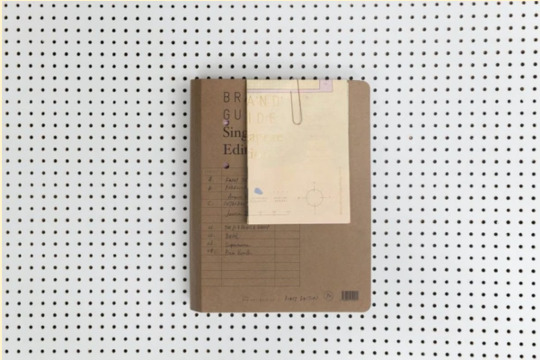
‘A documentation of the most progressive local brands & a celebration of the visionaries & designers behind them – it is filled with takeaways and anecdotes capturing the vision to fruition of each brand owner.’ The Brand Guide.
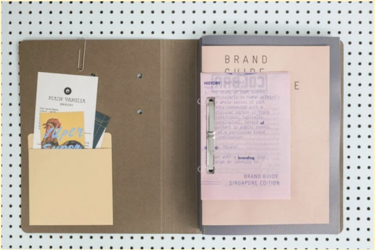
The Singapore Edition was a huge success and has completely sold out and they are currently in the process of creating reprints. The book itself is visual and filled with content, working with each other. The book acts as a guide to inspire others who admire the homegrown brands who contributed to the making of design in Singapore. The guide also displays the creative process that has gone into the 17 brands that are featured.
The brand guide documents the creative inspirations along with the design processes through brand & design reports.
‘The publication is 468 pages, comes in a clip-bound folder with 4 booklets coupled with various inserts, all printed and hand-assembled in the sunny island of Singapore.’ The Brand Guide.
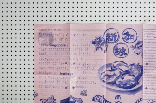
In terms of the guide layout, I love the whole aesthetic of the guide. Obviously the guide is filled with different brands so the contents varies however the way it has been displayed & communicated is something Im really drawn too. The guide feels really personal, I think this is because it has that handmade element to it, by using pockets to fill with brand content, the use of paper clips on the front cover to add mixed textures. Parts of it almost feel undone... To me just from looking at it feels like a scrapbook where they have used scrap bits of paper to put information on, like ‘The History’ which I guess could symbolise all the work that goes into a brand behind the scenes, its not always all perfectly laid out, on expensive paper. Also the use of different paper adds texture & interest to the reader which is what makes the guide so visual & unique to look at. In addition to this, I really like the idea of foldaway content, this makes the guide feel more interactive, in saying this, it almost feels invasive, like i’m reading someones notes... Which I guess, is maybe what they are trying to do with how they have displayed the contents, as after all the guide is individual brands creative processes, inspirations, notes all of which assisted in creating the brand.
In conclusion, I find this guide really inspiring. I love their approach in displaying the contents & the whole idea behind the guide. The way they have used foldaway pages, mixed textures of paper, stamps & handwritten content really makes it feel like a scrapbook but like I just mentioned it feels really personal and invasive and I think that is because these are areas of a brand that you don’t think about as an outsider to the brand, all the behind the scenes, the hours of labour, the notes taken in meetings, the creative process... I suppose these are all parts of a brand that you wouldn't ever see... we only ever see the shiny final outcome. So it makes sense that they have displayed the guide in this way and I think it works beautifully. I will definitely take parts of this guide away with me to apply to my work. In hindsight, I would have loved to create a printed copy of my look book with foldaway pages, pouches containing content... however I no longer have the time or the facilities to do, but I can 100% create a similar feel digitally by scanning in different types of paper such as blotting paper, tissue paper to create different textures, in addition to this I can add envelopes to the page which would display my look book content such as the colour story. I will do a post more in depth on my final outcome after my research.
0 notes
Text
Behance Layout Research
As mentioned in my previous blog post, I am struggling with finding layouts that I could take inspiration from for my own look book. Tamysn was a great help in sending across some Behance Projects for me to look at to assist in finding some inspiration.
2020 CGV Diary
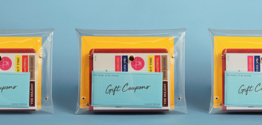
The first one that really helped get some creative ideas written down was one called 2020 CGV diary by an account called Studio Saworl. From what I can gather from the images, it’s a product/package that has been created which contains a journal for you to fill in accompanied by add ons such as stickers. The journal has the title of ‘The Script of My Journey’ it seems as though they have put a twist on the normal journal by allowing you to write about your days as if they were a movie review. Which explains the title. I really like this concept and I have never came across a journal like this before. Given we are moving into a time where self care & looking after ourselves is going to be a big part of our daily lives/ already is for a lot of people, I think offering a creative journal like this allows us to think about our days differently & could get us to use or imagination... It sort of reinvents journalling and could offer an escape for us, it gives us a chance to maybe take a small part of our day and be over dramatic with it, turn it into a wild movie plot. For example we could take a negative part of our day and reimagine it into a small blockbuster film, which is a refreshing way to interpret our thoughts rather than just writing them as they are. It’s less black & white.
From this product I really loved the add ons like ‘The Golden Ticket’ to a movie and the coupons, this really supports the idea of a journal how you would save little tickets from a day out at the arcade or a theatre performance schedule, just little bits of memorabilia from things you’ve done that you would then keep in a journal or a memories box so that you could look back on these memories for the rest of your life. This product in particular has stuck to the movie theme with movie tickets & coupons as that is what their narrative is. However it did give me the idea of creating my own little bits of memorabilia that I could incorporate into the journal that I create. For example I could include ‘one way tickets’ to support that narrative of escaping & being free from isolation... or leaflets from events that we visited pre isolation to create a sense of reminiscing on the times when we had freedom, Im unsure on exactly what I could do but this has definitely inspired me to create some samples and see how I could work them into my final outcome as it will add to that ‘journal’ feel, making it more personal rather than just imagery layered together. I will go into more depth on this idea in a later post when I start creating samples.

In addition to the ‘Tickets’ concept, the stickers are another add on which adds to the journal. The stickers allow you to add another element to your journal page where you feel necessary and gives you the choice to choose one that you feel appropriate, although you are limited to choices, you can still choose where/how you place them which makes it personal to you.
From this example, I was mostly inspired by the idea of creating tickets & coupons, I think these are a great concept to explore and include in my final outcome.
0 notes
Text
Layout Samples &Look book Development 1
This post is featuring some layout samples that I have been trying out to see which sort of style to go for with my look book. I have an idea in my mind of how I would like my final look book to look, which is making it feel like a personal journal/zine created in lockdown with a sense of longing for this time to pass, a look into the future of how I want to be living... slowing down, looking after myself, its a journal to escape. I want my look book to be digital, I really want to push my CAD skills this time round by using gifs in my look book, maybe showing different outfit builds that we could see with this trend in mind or doodles in GIF which would also add the journal aesthetic.
1. This is my first layout sample, this is a very basic play around for my layout. I know I want some pages to have journal snippets, helping me to set the tone for my narrative, so my reader can really understand what i’m trying to communicate. Now that i’m thinking about it, I could create GIF’s with my journal snippets if my journal snippets aren't too long, I think this will create another interesting layer to the pages, drawing the reader in.
Now that Im looking back at this ‘sample’ at a later date, it dosen’t make sense, if I was looking at this sample having not created it I wouldn’t understand what the message was without reading the journal snipper, even then i’m not sure it would make sense. In saying this I do think some of the imagery used could be used just in a different layout. In conclusion I learnt with this sample, that I really need to work on my layout by adding layers upon layers to really visually communicate my message, which is looking after ourselves post pandemic, being free to roam, practicing self care, loving the one world/life that we have.
Look book Development
This is my first set of samples created for my look book pages. So moving on from my very first basic example that I featured above, I began to add layers to add depth to my boards and create interest for the reader. I scanned in scrap bits of lined paper along with envelopes & brown paper which again was done with the intention creating a home made journal/scrapbook aesthetic to my look book, which I do feel as though I have achieved in the video below however I do feel as though I need to re visit my communication of the boards, by using more of a variety. The scrap paper works but the images are all square at the minute, I need to use more cut outs, different sizes & shapes to add interest to the page in addition to this am going to do some illustrator research to find inspiration for the types of ‘doodles’ I want to feature throughout my look book.
Below is an example of a layout I was playing around with but looking back now I was focusing a lot more on how the GIFS were going to work together rather than my layout/ how the page is presented, while there isn’t anything majorly wrong with the layout here its just a bit simple. All the images are square and of a similar size, the drawn lines add a simple detail to the page but again they are all the same width, all been drawn with the same amount of pressure etc so I can definitely re explore this page & make it more exciting.

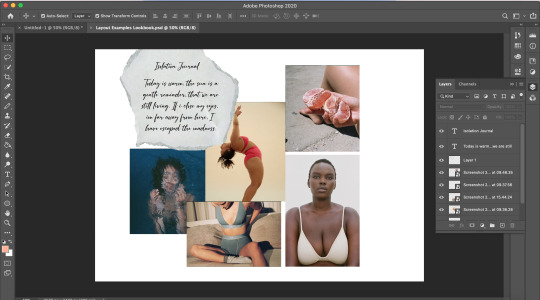
Screenshot of Photoshop Development.
Finally, when i’m creating my next samples Im going to follow Louises advice from our tutorial and get my layout spot on before I create any gifs on the page, this way I can ensure my layout is really communicating my narrative before adding extra elements which will enhance my narrative rather than being the focal point. I can definitely be more creative with my communication which is what I’m going to focus on with my next lot of samples I begin to create.
1 note
·
View note
Text
GIF SAMPLES
I began playing around with some GIFS on very basic sample layouts just so I could get an idea of how to create them when there are multiple layers on the board. I think with the GIF’s I want them to be really simple, I want them to be an add on to my communication, I don’t want the GIFS to be the main focal point as I want my layout & choice of imagery, editing of the images, placement etc to really communicate my narrative rather than relying on exciting GIFS.

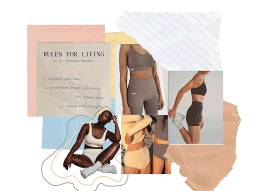
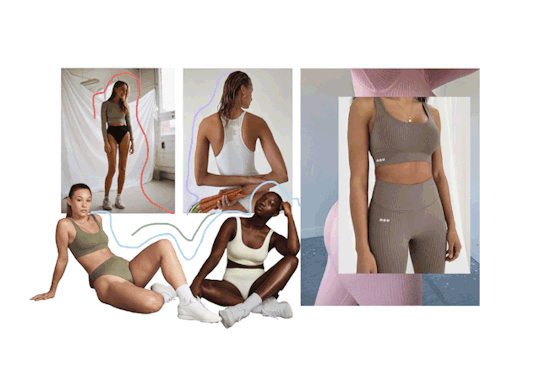
Above is a Colour Story Sample board. This is a very basic layout & was more created for me to get an idea of what colours I wanted to feature on the page and collect imagery to begin with. I am really happy with the colour palette and I feel as though the images I have chosen really communicate a sense of wellbeing, retreat & keeping yourself active without being so obvious. In terms of development I need to add more layers, add scans of paper, newspapers to make it feel more like a scrapbook along with doodles that I am going to feature throughout.
This is my first example of a silhouette page, like the colour board, it was created to get a sense of the images I wanted to use & to get an understanding of how GIFS work. Im happy with this layout, it’s not bad but again needs a lot of work on it to create the narrative I desire. I really like the lines and the effect they create, I feel as though they are mindless doodles drawn when our mind is elsewhere which is supportive of my narrative of longing for lockdown to end.
To conclude, my next step is to add more layers and elements to the board to make it a lot more visual & to re visit some research to remind myself of my narrative.
0 notes