dongles-at-uts
DONGLES
the process diary behind an animated short film
69 posts
Don't wanna be here? Send us removal request.
Last Seen Blogs
zaheeras
Bina
stephabeheaven
Stephanie Abrams

boyn20
Novas amizades ❤
ratsandfashion
Rats & Fashion

letsfitmotivation
Untitled
Text
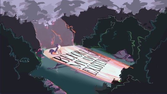
FINAL ANIMATIC!!!
Frames by Lauren, edit by Meg, blood sweat and tears by DONGLES 🫡
— DONGLES 💾
0 notes
Text


I nabbed Lily’s style frame (it’s beautiful isn’t it) and messed around with colour + vibes for a bit :D
— Lauren 🌼
0 notes
Text

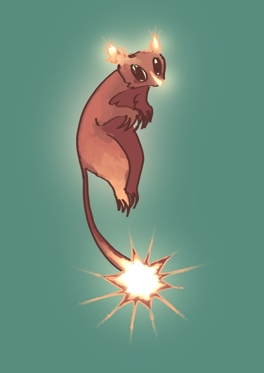
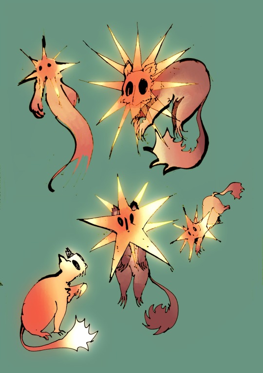
FINAL TURN AROUND FOR STAR POSSUM!
Potentially would add more glow/burn to really get the star popping, but this is quite nice for now :)
— Lauren 🌼
0 notes
Text

Building on the ideas I iterated before, we narrowed the star possum design down to these two, and a secret third in which it’s just the star tail and no glowing nose/ears.
I really do enjoy the Phantom of the Possum!! But is it too busy?
— Lauren 🌼
0 notes
Text

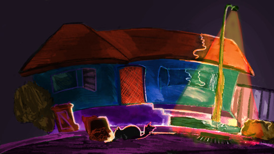
After some guidance from my group members about colouring, I whipped up the star possum style frame and the others played around with the curves on my previous style frame of the suburb. The revised version is a moody, uneasy vibe, which will contrast well with the bush colouring.
- lily 🌞
0 notes
Text

This style frame took a very long time to perfect, and i still feel it isn’t there just yet. But I had lots of fun testing out colours. The others like the vibe, but it is more suited to the bush.
- lily 🌞
0 notes
Text
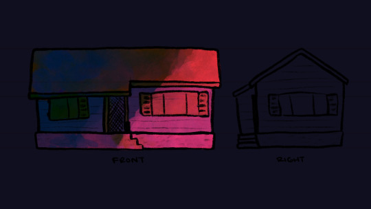
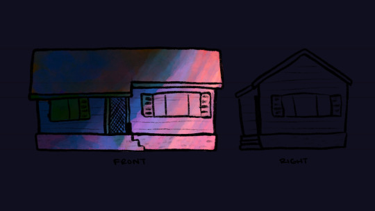
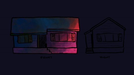
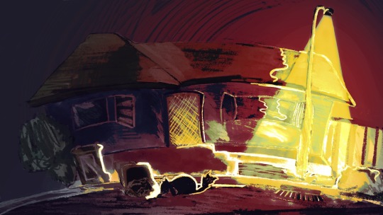
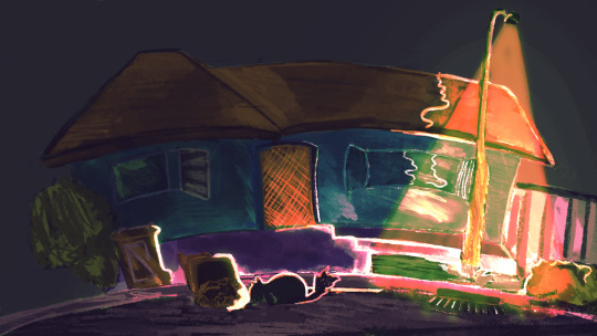
In this recent colour research, i used Maddi’s house design to try some colour thumbnails for our opening suburb shots. We all liked the last one the most, ominous vibes but still gives a mood of nighttime.
- lily 🌞
2 notes
·
View notes
Text

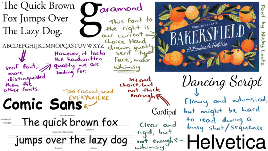
Typography research was rather time consuming, but i got there in the end. The chosen font is called “Bakersfield”.
- lily 🌞
0 notes
Text

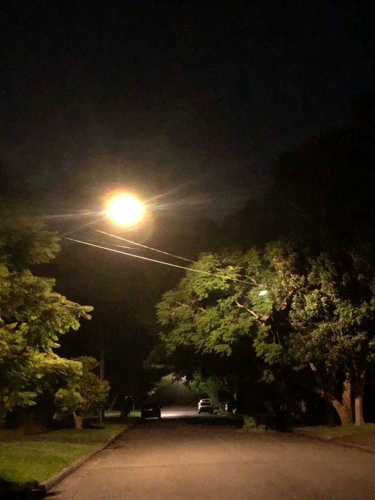
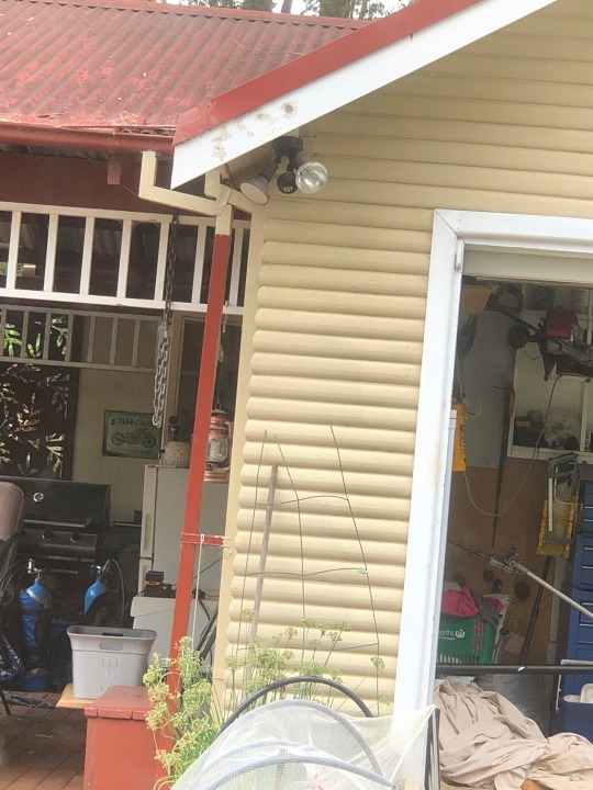
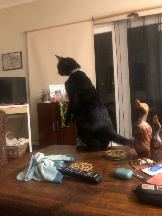
These rather amazing research photos from my home and suburb are making me believe my cat is actually a possum. But I like the vibe of the light from the street lamp.
- lily 🌞
0 notes
Text

Colour palettes for each environment - We wanted a distinct look for each area. I was hoping to make the bush seem more relaxing and inviting
- Meg ⭐️
0 notes
Text

Here are the first two style frames i made with the characters in them to test out how the environment works with them.
I need to work more on pushing colour for my suburb style frames.
- Lily 🌞
0 notes
Text

Brief Typography Brainstorm
-- Evie 🦝
0 notes
Text

Storyboard scene brainstorm
-- Evie 🦝
1 note
·
View note
Text

Expression sheet for possum character
-- Evie 🦝
0 notes
Text

Final Turn around with design style notes
-- Evie🦝
0 notes
Text


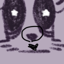
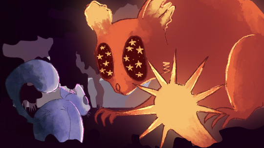
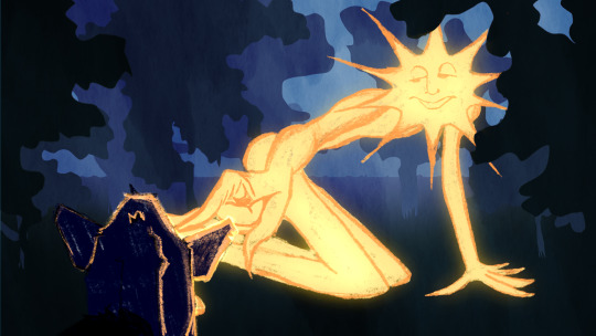
Iterations of a new character: STAR POSSUM!
A friend and reflection of our main character possum (possy), this star possum guides possy back to the bush they came from, and to the stars.
Cuter than the star people, no?
— Lauren 🌼
0 notes
Text


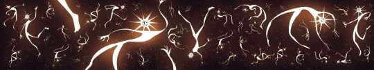
Style frame for the final environment: the star space! This was drawn for the second draft of the animatic, before getting feedback on the star people and needing to redesign.
Just imagine the star people as plain ol’ stars, and it still applies.
— Lauren 🌼
2 notes
·
View notes