
Last Seen Blogs

vaveyard
Victoria Aveyard

b1love
Unbetitelt


glogobaba
Welcome To My Weird And Bizarre World

deathtastegirl
⛧𝔞𝔩𝔢𝔵𝔦⛧
Photo

Final Project Process
For the final project, my book cover is based on the book 1984. 1984 is a dystopian novel written in 1949 by George Orwell, which follows the life of Winston Smith, a low-ranking party member who is frustrated by the party's omnipresent eyes and its ominous tyrant, Big Brother.
My design will be heavily inspired by the omnipresent eyes and features a prominent red throughout that represents tyranny. I will research a typeface that gives life and representation to the originality of the book.
0 notes
Text
Chapter 9: User Experience Specialists Response
User experience or UX is a method of design, its main purpose is to design a device that gives its customers a fantastic experience. UX follows a variety of disciplines, such as user interface design, usability, accessibility, the architecture of knowledge, and interaction with computers. User experience is practiced by creators who are particularly concerned with the relationship between users and the device they use. UX designers don't simply concentrate on making functional goods. They reflect on other dimensions of the user experience, such as enjoyment, productivity, and fun, too.
0 notes
Photo
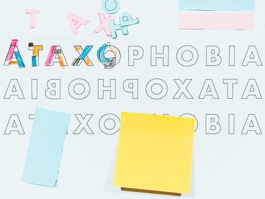

Experimental Type Process
I am very excited about this project. Recently, I have been learning about new skills on Illustrator. With this project progressing, I can apply the skills to it. To start off, the phobia I chose, something I struggle with, is ataxophobia. In other words, this is a phobia of disorder and untidiness. To showcase this phobia, I started off with a sketch and cutout of letter on sticky notes for their colors. I will be displacing the letter and litter part to create a chaotic poster. It is good to note that creating this poster caused anxiousness in me, but it is something that should be talked about for the reason that many people mistaken this phobia to be neat-freak or anal. Regardless what one’s view is on it, it should be brought to light.
0 notes
Text
Chapter 9: Branding and Packaging Response
Much as your identity makes you distinctive, branding is your company's secret that separates you from all the competition. So what is it? Branding is the compilation of all elements created by a business to present to the customer with the right image. The term branding refers to the commercial process of forming a recognizable brand aggressively.
When creating a brand, you should consider your mission, your value, your personality, and your voice. These elements are what define your brand. Before you start building your brand, you must have a clear understanding of each. So ask yourself, why are you starting this business? What are your beliefs and values? Why are they important to you? What makes you special and stand out? Once you have these questions answer, you are off to start your brand.
0 notes
Text
Chapter 4: Letters and Type Response
Typography is the art of arranging letters and text in a way that makes the copy visually appealing to the reader. It is primarily concerned with both the visual world and print in recent times. An artistic revolution in the practice of typography came with the birth of the computer. Web designers were immediately at their mercy with an array of fonts and type choices, making typography more visually diverse than ever before. Typography requires the form, appearance, and structure of the font, which seeks to evoke certain emotions and express particular messages. In short, what brings the text to life is typography.
Typography is so much more than simply picking elegant fonts. It's an integral aspect of creating the user experience. Good typography will set up a clear visual hierarchy, provide the website with a graphic balance, and set the overall tone of the product. Typography can direct and educate the users, maximize readability and usability, and ensure an outstanding user experience.
0 notes
Photo


Spread Process 2
Continuing on the magazine project this week, I finalized my design. As I have mentioned before, the concept of this project is to keep it simple, clean, and minimal. With these three terms in mind, I created all three of my spread using a single grid system. This is beneficial to my design by keeping it consistent. Consistency is a keep factor in designing. You want your audience to understand the purpose of your design from the first page to the last. Keeping a consistent grid system taken your viewers to a familiar place. I also tried to keep all my pictures on one spread in a similar style. This allows the viewers to understand the images as a group. The consistency that I've applied across my design has this project my strongest.
0 notes
Text
Chapter 8: Social Innovation Response
Chapter 8 was about social innovation, terms in the graphic design field about bring positive influence and change to society. In 2020, social innovation has been the topic. This year as a nation, we witnessed social injustice and started a movement to end racial discrimination. Many designers have created work that reflects this movement. One of which is to encourage people to vote. Voting is especially important this year. Many people are voting for the first time and are overwhelmed by the choices. This is where the design field comes in. Across social media, we have seen brilliant designs of voting posters. These posters showcase the importance of vote and the effects that come along with it. Changes begin when people raise their voices and concerns. It is the designers' job to create posters that educate and inform the public. Graphic design is a tool that can bring about great changes.
0 notes
Photo
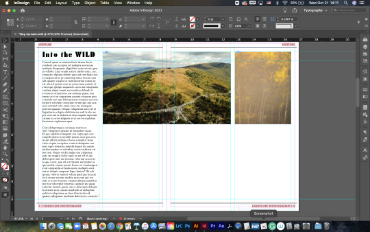

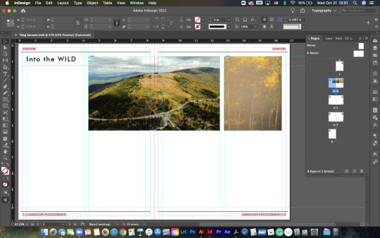
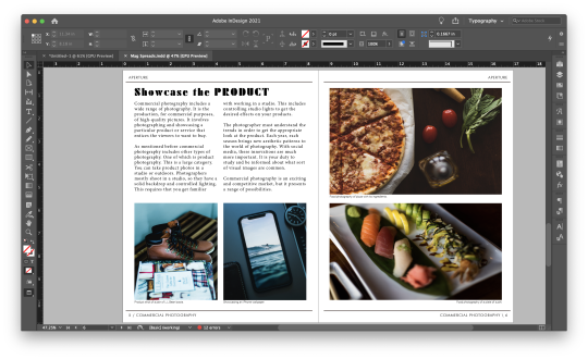
Spreads Process
The idea of the project is to keep it clean and simple. I want these spreads to be informative. My design is based on a very textbook-like and "griddy" design. My three spreads are information on landscape photography, portrait photography, and commercial photography. The text on these spreads is basic information on each genre of photography as well as my experience with them. All images are photos I have taken myself.
One thing I am struggling with is font pairing. I love the font Futura for the reason that its legible and clean. I have also found this Futura font call Black that I like to incorporate into my design. But I feel like its doesn’t look as good with my idea and concept. I will work on this issue throughout this week.
0 notes
Text
Chapter 5: Making Logos and Marks Response
Having a logo is an important part of every company or business. It represents the business and its identity. A logo must be eye-catching. We have a very short attention span. Having a logo is to grab the viewers' attention and to tell them the value of the company. Let's face it, we are told not to judge a book by its cover, but we often do it. An eye-catching logo makes a strong first impression. When people see it, they gravitate toward it, and it introduces the business and allows them to learn more about the business for potential customers. Like mentioned before, a logo is a huge part of a business identity. Let's take a design firm as an example. The logo tells the customers what the company is about, the mission statement, and core values. A design firm might want their logo to represents these qualities through different elements and principles of design. A logo is also a marketing mark. It sells your company and brings in potential business.
0 notes
Photo

Mood Board - Project 3 Process
In this project, I have created a simple and clean mood board. My focus for the magazine spreads is to keep them minimal. I want to let the photo speak for themselves. This is also my aesthetic in photography and design. I have also chosen the fonts Futura and Roboto Mono. Futura is one of my favorite fonts for the reason that it is clean and minimal. Roboto Mono is a font that I am experimenting. I found it on Google Fonts. It has similar characteristics to Futura. My only concern is that it looks too similar to Futura and it doesn't stand out. But, we will see how well it works to fit in my theme on minimalism.
0 notes
Text
Chapter 11: Understanding Change Response
Like many things in the world, graphic design had expanded its principles with the progression of time. It started as an idea that solely focused on designing. Now, it has many practices. Graphic design has become more involved in its products. The big idea is how can graphic design change the world and be more involved in the elements that surround it. Graphic designers begin to think beyond design. Let's take Shepard Fairey as an example. He is a designer and also an activist. His big idea is about bringing changes to the world with his works. In this chapter, we also experienced a few graphic designers who share this idea of using graphic design as a platform to bring about changes. Véronique Marrier focuses on bringing an engagement in her work to the audience in which helps people understand the issues at hand. Graphic design is a platform that has many potentials to bring about changes.
0 notes
Photo

Landscape Photography is My Favorite Hobby - Project 3 Process
It is not a mystery that my favorite hobby is photography. The genre of photography that I am most interested in or fascinate by is landscape photography. Landscape photography is capturing the essence and spirit of the outdoors. This genre of photography is interesting to me is because of the mystery that nature offers. You can never know when you can capture a perfect landscape photo for the reason that the landscape is constantly changing. But when you capture that perfect photo, it is so satisfying to look at it constantly, especially when you print it large. I have photographed different landscapes in different conditions and seasons, I have yet to capture my perfect photo. I don't think I will because I am always searching for a better one.
0 notes
Text
Chapter 2: Books and Book Jackets Response
Book design is a text-based process, which can bring different reading results to the work. There are two components of book design, the interior and the jacket, Book design reflects the original text style and it also reflects the designer's attitude and value toward the book. The book interior design refers to the text. This controls the rhythm of the book. It also communicates the meaning of the book contents. Sometimes graphics are added to the interior of a book to aid the reading for better understanding. An important aspect of book interior design is font application. The font is the way of communication. It needs to be legible and layout properly. This ensures a pleasant reading experience.
Book jacket design can have an aesthetic function, but it is mostly practical. What it means to have the aesthetic function is that it grasps the readers' attention at first glance. The practical function is the basic function of the book. This reveals what the book is about and some contents of the book. It is important to consider all aspects of design when creating a book.
0 notes
Photo
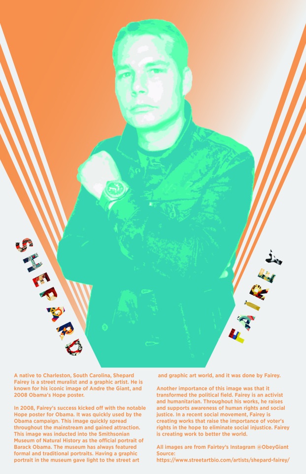
History Poster: Shepard Fairey Final
Last week, I had the layout of my poster finished. The last thing I had to do is layout the information about Shepard Fairey. I struggled to lay it out. Some technical and creative issues were involved. The technical issues were that my Illustrator is locked in a weird mode where I can't just drag to change the size of my layers. Another issue was that my Illustrator was in compound or masking mode. I searched all over the internet for resolutions, but I had no luck. With these issues, I had to change some of my approaches on laying out the text. I tried a couple of ways, but this layout is what I feel is the most natural way of executing the final design.
1 note
·
View note
Text
Chapter 2: Partners on Partnering Response
This chapter touched on a topic that is highly important to all fields of work, and it is collaboration. Collaboration expands one's creativity by sharing ideas. One can argue that they can be creative by researching other people's work and don't have to ever collaborate. Yes, they can, but that's not the point of collaboration. Collaboration and sharing idea is a way to learn. Someone can have a beautiful design but allowing others to collaborate with them helps them to learn where they could improve on and make adjustments. This further one's success in the graphic design world. Apart from learning and expanding creativity, collaboration forces someone to communicate. This is one of the most important skills to have in a professional field. Good communication skill aids the success of one's career. It helps a team to work efficiently and be productive. It boosts the growth of everyone. So ultimately, it is not only about collaboration, it is about the traits and skills one can gain from collaborating.
0 notes
Photo
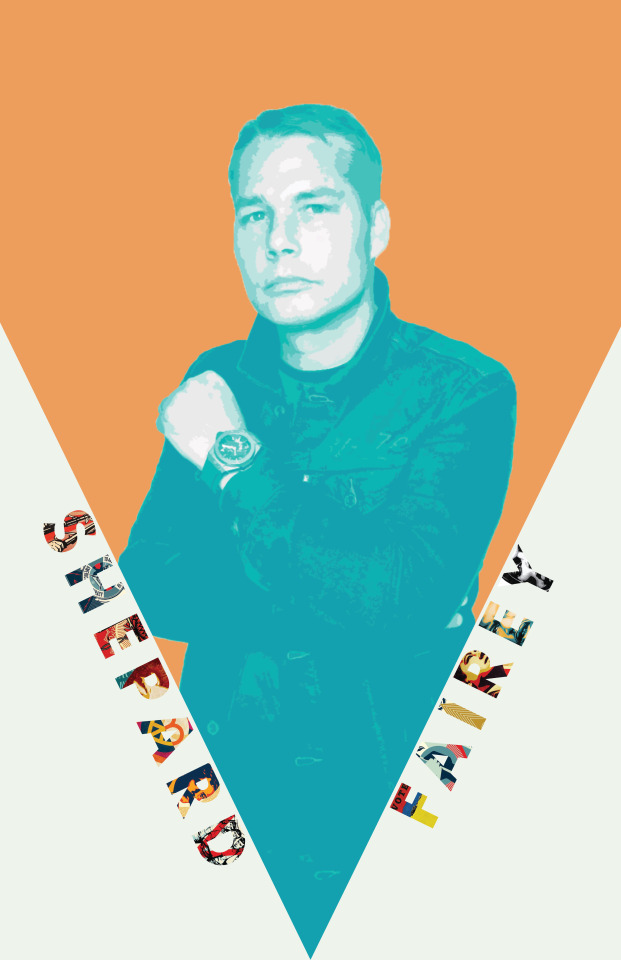

History Poster: Shepard Fairey Process
This week I started designing the history poster. Before I start explaining my process, I want to state that all images used in my design are from Shepard Fairey’s Instagram. With that out of the way. Throughout my design, I incorporated different elements from Fairey's design. I transformed a photo of Fairey using a gradient map to create the look of Obama's Hope poster. The style of my poster matches some of his designs. I also masked some of Fairey's recent works into his name to showcase them. The next step is to creatively add information about Fairey into my poster.
0 notes
Text
Chapter 2: Starting a Studio or Working for Someone Else Response
In chapter two, the discussion is on being a boss or an employee. Without a doubt, many of us want to own a business. It is the most promising way of income. This is a goal for some designers, owning their studio. Being an entrepreneur is very risky, as the business might not earn its reputation. But, for some entrepreneurs being independent is a huge motivator to take this risk. Being independent is important for many reasons in the designing field. It allows the designer to make designing choices, take on their desire project, and establish a clientele. Being a business owner also enables you to be flexible with work hours. While projects have deadlines, one can have weekends off or choose the operational hours. While there are benefits to owning a studio, there are also stresses that come with it. Being a business owner means your responsibility is higher. One has to be in charge of the finances, employees, and dealing with the clients. For this reason, some designers choose to work for someone or have started a business but close it. Whether one's desire is to own a studio or work for someone, the design field is an array of possibilities.
0 notes