
Last Seen Blogs

leweymonkey
Marney Pillow Cat

yoraak
✵

soupsnakessss
Soupsnakes

blackgarlicna
Black Garlic North America
yoraak
✵
Text
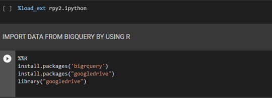
Google Colab experience - K-means clustering in Python
Google Colab experience – K-means clustering in Python
In this post, I want to share a small example developed at Google Colab for those who want o explore clustering algorithms. Colab is a Jupyter notebook-based runtime environment that allows running code on the cloud. Colab gives access to Google resources such as BigQuery or GoogleDrive data.
Despite Colab being a Google Research product to write and execute Python code, we can also use R code.…
View On WordPress
0 notes
Text
Documents clustering - Text Mining
Documents clustering – Text Mining
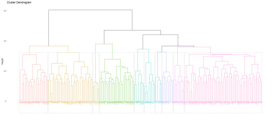
Agglomerative hierarchical clustering is an unsupervised algorithm that starts by assigning each document to its own cluster and then the algorithm interactively joins at each stage the most similar document until there is only one cluster. The goal is to assign a topic to a document that is category it is previously unknown.
Those algorithms use a high variety of similarity measuresto…
View On WordPress
0 notes
Text
COVID-19 graphs - Data Visualization
COVID-19 graphs – Data Visualization
Data visualization is a faster and effective communication source. People are visual learners, data visualization tools become popular and simple to use. Graphic representations are easy to understand. They represent a easy source of information for readers and when well used they can be powerful presentations of data. Currently, in this pandemic scenario newspapers, health websites and others…
View On WordPress
0 notes
Text
Get customers segments from RFV score and KMEANS by using Bigquery and Data Studio
The RFM (Recency, Frequency and Monetary) model was introduced by Bult and Wansbeek in 1995. Since then it has been used in many practical areas, particularly by marketers to make effective marketing strategies.
RFM model is a behaviour-based model that can be applied to calculate customer value and customer lifetime value (CLV), segment customers, estimate the response probability and observe…
View On WordPress
0 notes
Text
Scraping with Python to select the best Christmas present!
Scraping with Python to select the best Christmas present!
Every Christmas it is a challenge to decide all the presents. So I decided to do a website analysis to decide which presents to buy! The website selected is a Portuguese famous perfume and cosmetics seller notino.pt. My goal is to do a small study of perfume’s opportunities and finally buy some presents!
Many bigdata projects use data from the web. One way to get this data is to access the…
View On WordPress
0 notes
Text
Text preprocessing for NLP and Machine Learning using R
Text preprocessing for NLP and Machine Learning using R
In this post I share some resources for those who want to learn the essential tasks to process text for analysis in R.
To implement some common text mining techniques I used the tm package (Feinerer and Horik, 2018).
install.packages("tm") # if not already installed library(tm) #put the data into a corpus for text processing text_corpus
View On WordPress
0 notes
Text
“Data visualization is viewed by many disciplines as a modern equivalent of visual communication. It involves the creation and study of the visual representation of data.” [wikipedia]
The history of Data Visualization
“The concept of using pictures to understand data has been around for centuries, from maps and graphs in the 17th century to the invention of the pie chart in the early 1800s. Several decades later, one of the most cited examples of statistical graphics occurred when Charles Minard mapped Napoleon’s invasion of Russia. The map depicted the size of the army as well as the path of Napoleon’s retreat from Moscow – and tied that information to temperature and time scales for a more in-depth understanding of the event. It’s technology, however, that truly lit the fire under data visualization. Computers made it possible to process large amounts of data at lightning-fast speeds. Today, data visualization has become a rapidly evolving blend of science and art that is certain to change the corporate landscape over the next few years.” [SAS]
Nowadays, an efficient information presentation it is crucial in the big data era. In this post I want to combine some resources of information that help us to do excellent data visualizations and don’t make terrible presentations.
Why is data visualization important?
“Because of the way the human brain processes information, using charts or graphs to visualize large amounts of complex data is easier than poring over spreadsheets or reports. Data visualization is a quick, easy way to convey concepts in a universal manner – and you can experiment with different scenarios by making slight adjustments.” [SAS]
From: Visualizing Data with SAS: Selected Topics – SAS Support
From: Visualizing Data with SAS: Selected Topics – SAS Support
“Data visualization is one of the initial and most important steps of uncovering value from data. It influences the impact of data on your business strategy by identifying what insights to extract, how to work on data assets, and how to develop strategies over time.”
To achieve the best visualization it is important to know the best practices of data visualizations. James Gorski recommends seven best practices:
Agree on a methodology
Understand your audience
Determine the desired outcome
Use classification
Use Profiling
Use visual elements as intended
Fail faster
There are many software solutions to make graphs but only some of them provide useful data visualizations. As you can see here. Tableau is on of this software solutions that provides excellent resources. Here you can see the data visualization beginner’s guide where you can find some examples.
An interesting list of the Best and Worst Data Visualizations of 2018 is presented by Dan Clark.
To know more about graphs and solutions to present data information you can consult this catalogue where you can select the best data visualization by function or by list. And also this collection of data visualizations to get inspired.
To avoid disasters and learn more about Data visualization you can find here an interesting course. And finally there are some data visualization disasters!
if you want to keep updated, you can follow the Top stories in Data Visualization of Towards Data Science.
Data Visualization – Why it matters? "Data visualization is viewed by many disciplines as a modern equivalent of visual communication. It involves the creation and study of the visual representation of data." …
0 notes
Text
Find the most frequent words in your TripAdvisor reviews - Text Mining
Find the most frequent words in your TripAdvisor reviews – Text Mining
In this post I share a small example about how to find the most frequent words in Tripadvisor reviews. I followed some examples that I mentioned in the references and I build this resume for those who are starting in this topics.
#Building a corpus library(tm) library(NLP) data<- VectorSource(data) #converted our vector to a Source object data <- VCorpus(data) #to create our volatile corpus. #…
View On WordPress
0 notes
Text
In the same place, at the same time, so many interesting presentations and high level data science research. Five days of pure amazing moments and excellent opportunities to learn and share knowledge. The opportunity to meet other data scientists, data engineers, all kinds of data professionals and experts. To see what they are doing and to understand that there are so many many things to learn! Five days that are an spectacular opportunity to refresh and reorganize our work and our career priorities.
This conference allowed me to breathe fresh air and to see the data science state of the art. At KDD we see what has been done in academic environment and also in the industry. How both sides work together and how data science plays a pivot role in the digital world.
In this post I share part of my journey at KDD! The goal is to show some interesting works that I saw. To be honest in some moments I completely forgot to take pictures, I was so involved that I completely fly into the moon!
The first presentation was “Data Science in Retail‑as‑a‑Service” from JD.com. My first job was in a retail company, not as a data scientist 🙂 but in the logistic department! Since then I have a passion to “give the right product, to the right customer at the right time“! In the case of JD.com it is incredible the company dimension and the challenges faced. The main topics were Understand Customers, Connect Customers and Serve Customers (pdf: KDD-TutorialSlides-20180821-final-novideo).
This slideshow requires JavaScript.
The high quality presentations continued with “Behavior Analytics: Methods and Applications” and “Explainable Models for Healthcare AI” the 7 pillars of explainable AI in patient flow: Transparency, domain sense, consistency, generalizability, fidelity , trust and parsimony (pdf: ExplainableAIinHealthcareKDD2018)
Only the first day could be an excellent experience but at the second one…….
The day for media business! 👉 Data Science, Journalism & Digital Media“. The “Metro Maps of Information and Applications to Journalism”, from Dafna Shahaf, that are interesting for story presentation.
Abstract: When information is abundant, it becomes increasingly difficult to fit nuggets of knowledge into a single coherent picture. Complex stories spaghetti into branches, side stories, and intertwining narratives; search engines, our most popular navigational tools, are limited in their capacity to explore such complex stories. We propose a methodology for creating structured summaries of information, which we call metro maps. Just as cartographic maps have been relied upon for centuries to help us understand our surroundings, metro maps can help us understand the relationships between many pieces of information. We discuss extensions of the framework for analysis of news and media, personalization, and investigative journalism.
Then BBC, what are they doing with data science? Interesting! Classification, neural networks and sentiment analysis in news. Followed by an unsupervised clustering for clustering news articles… a complex approach. And fake news, how to detect fake news? A challenging task! The papers list:
Chris Newell, Tim Cowlishaw and David Man: Quote Extraction and Analysis for News
Gisel Bastidas Guacho, Sara Abdali, Neil Shah and Evangelos E. Papalexakis: Semi-supervised Content-based Detection of Misinformation via Tensor Embeddings
Angelika Kirilin and Michael Strube: Exploiting a Speaker’s Credibility to Detect Fake News
Jonathan Carlton, Joshua Woodcock, Andy Brown, John Keane and Caroline Jay: Identifying Latent Indicators of Technical Difficulties from Interaction Data
Stiene Praet, Walter Daelemans, Tim Kreutz, Peter Van Aelst, Stefaan Walgrave and David Martens: Communication on Issues by Political Parties on Twitter
M. Tarik Altuncu, Sophia Yaliraki and Mauricio Barahona: Content-driven, unsupervised clustering of news articles through multiscale graph partitioning
How Zeit Online uses Data Science? Cool projects for journalism and interesting ideas presented by Andreas. For example, “my country talks” that is an international platform for political dialogue; the online questionnaire that allowed to understand the readers feelings allong the day and the analysis of street names where they found interesting patterns related with German history.
Abstract: ZEIT ONLNE is one of the largest online news platforms in Germany. The data science department at ZEIT ONLINE is part of the newsroom and deals with a broad spectrum of problems, ranging from journalistic projects to the analysis of readers’ traffic patterns.
And finally a paywall model!
“an adaptive paywall mechanism to balance the benefit of showing an article against that of displaying the paywall. …we model the problem as a stochastic sequential decision process. We propose an efficient policy function for paywall decision making.” 👉 video.
The biggest social networks and online businesses were there, of course! They presented really complex works! Linkedin…
This slideshow requires JavaScript.
Airbnb….
Pinterest.…
More and more..Amazon…Microsoft…..
And the big question!!! Who is a Data Scientist? A brilliant panel, many questions, some answers and the conclusion was…. a Data Scientist is someone that knows math and statistics, machine learning algorithms, knows a programming language, has business knowledge, has some economics knowledge and has communication skills.
A special moment: women’s lunch! Great advices and recommendations from @claudia_perlich, Jeannette-m.-wing, Hema Raghavan
know the rules of the game you want to win
fin your support system, be with friends or a piano in a dark room
remember two body problems or any body problem or any problem for that matter is temporary
your network follows you
see things through specially things you are passionate about
systems are deterministic, people are not
Hands on tutorials and some papers for read….
This slideshow requires JavaScript.
KDD 2018 International Conference on Knowledge Discover and Data Mining – my journey! In the same place, at the same time, so many interesting presentations and high level data science research.
0 notes
Link
0 notes
Text
“Productive stupidity means being ignorant by choice. … The more comfortable we become with being stupid, the deeper we will wade into the unknown and the more likely we are to make big discoveries” – The importance of stupidity in scientific research
Short read:
An interesting blog post series ‘Probability & Statistics for Data Science’ with simple and important statistic’s definitions.
Artificial Intelligence: 6 Step Solution Decomposition Process There are six key steps to the Solution Decomposition Process to undertake before deploying AI solutions to derive and drive business value.
Identify and Understand Your Targeted Business Initiative
Identify Your Stakeholders and Constituents
Identify Key Decisions
Identify Predictive Analytics
Brainstorm Data That Might Be Better Predictors of Performance
Implement Technology
“oceans of data are useless without a vessel to navigate them. Data-driven companies will be the winners in the digital economy. To that end, it is critical to invest heavily in infusing the discipline of data science into your company for the benefit of your customers and employees. It all starts with a data framework like the one we use within Jabil.”
Data-driven companies will be the winners in the digital economy.
Don’t Follow the Money; Follow the Customer! Superior understanding of customers’ behaviors and preferences and product usage patterns form the basis for industry transformations.
Some information about Big Data Certifications!
22 Differences Between Junior and Senior Data Scientists
Microsoft R Open 3.5.1 now available
The AI Hierarchy of Needs
Did Python declare victory over R? “I don’t think so, because R is an excellent platform with tremendous depth and breadth, which is widely used for data analysis and visualization, and it still has about 50% share. I expect R to be used by many data scientists for a long time, but going forward, I expect more development and energy around Python ecosystem.”
The modern open source data science ecosystem: Python, Anaconda, scikit-learn, Tensorflow, Keras, and Apache Spark. R has small positive associations with Apache Spark, SQL, and Tableau.
Long Read:
Python Data Science handbook By Jake VanderPlas, all the info can be found here. The book was written and tested with Python 3.5. The book introduces the core libraries essential for working with data in Python: particularly IPython, NumPy, Pandas, Matplotlib, Scikit-Learn, and related packages. Familiarity with Python as a language is assumed; if you need a quick introduction to the language itself, see the free companion project, A Whirlwind Tour of Python: it’s a fast-paced introduction to the Python language aimed at researchers and scientists.
Mastering Machine Learning with Python in Six Steps: This book is your practical guide towards novice to master in machine learning with Python in six steps. The six steps path has been designed based on the “Six degrees of separation” theory that states that everyone and everything is a maximum of six steps away. Note that the theory deals with the quality of connections, rather than their existence. So a great effort has been taken to design eminent, yet simple six steps covering fundamentals to advanced topics gradually that will help a beginner walk his way from no or least knowledge of machine learning in Python to all the way to becoming a master practitioner. This book is also helpful for current Machine Learning practitioners to learn the advanced topics such as Hyperparameter tuning, various ensemble techniques, Natural Language Processing (NLP), deep learning, and the basics of reinforcement learning.
Natural Language Processing with Python This book provides a highly accessible introduction to the field of NLP. It can be used for individual study or as the textbook for a course on natural language processing or computational linguistics, or as a supplement to courses in artificial intelligence, text mining, or corpus linguistics. The book is intensely practical, containing hundreds of fully-worked examples and graded exercises. The book is based on the Python programming language together with an open source library called the Natural Language Toolkit (NLTK). NLTK includes extensive software, data, and documentation, all freely downloadable from http://www.nltk.org/.
If you want to read more? here you find a selection of 100 books!!
Amazon newest arrivals
From Bruce Ratner Linkedin post
Data Science Summer Reading List "Productive stupidity means being ignorant by choice. ... The more comfortable we become with being stupid, the deeper we will wade into the unknown and the more likely we are to make big discoveries…
0 notes