Last Seen Blogs
estellxli
❝𝔀𝓮𝓵𝓬𝓸𝓶𝓮 𝓭𝓪𝓻𝓵𝓲𝓷𝓰❞
kpopdancings
Thùy Nga
moonwatchuniverse
Moon Watch Universe
dreamsofadramaqueen
Little Queen
fallendoctor
mads
Text
Evaluation
My project is about the Multiverse and looking at how context is used in art. I started off by choosing 12 words and researched them – with the outcome being I would create a Zine based off of them, however, my final outcome would not be the intended result as due to remote learning I would not have the resources to create a Zine. My project started out with me researching my 12 chosen words which were, Universe, Space, Time, Reality, Botany, Archangel, Freedom, Galaxy, Dimension, Darkness, White Noise and Anthropology. I researched the meaning of the words then found images that represented them and what I thought about when I thinking of the words – I also created mind-maps for each word, linking ideas and other concepts.

For my project, I also looked at context in art and how it is presented – for this I watched a couple videos and read a few articles and compiled my thought into a blog post. Context is important in art because a piece of work can hold an entirely different meaning if the context is known or unknown. For example, by adding context to a piece of artwork, it gives it a meaning and a purpose and makes it a visual story, in a way. Designers create context in their artwork by portraying it to the viewer via image and colour and communicate their intent and meaning through the work.
Another thing I learnt about was how to create a Zine in InDesign and what the history behind them was – after researching, I found out that Zines were first used in the 1930s but became more popular in the punk era of the 1970s – with bands and other members of the music community using them to promote. While I could not produce my own Zine, due to lack of resources, I found it very interesting how Zines have developed over the years, how they were once very popular but are not, not as popular but still hold the core values that makes Zines what they are.

In my project I used a variety of materials and resources, that I could use despite the circumstances. I did a lot of my editing and digital creations on Photoshop but I also experimented with photography and other digital art apps like Snapseed and Ibis Paint X. I used Snapseed to edit my photos that I took, you can edit contrast, brightness, hue and edit separate sections. Ibis Paint X is a free drawing app for tablets and phones – I used it to start the base of my final outcomes. On Photoshop, I used the paint brush tool to add small illustrations onto some of my photographs as I was experimenting with the idea of mixing reality with un-reality. I also used previous skills with the saturation and hue effects to edit my final outcomes and make them unique.
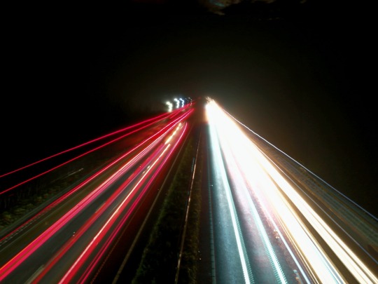
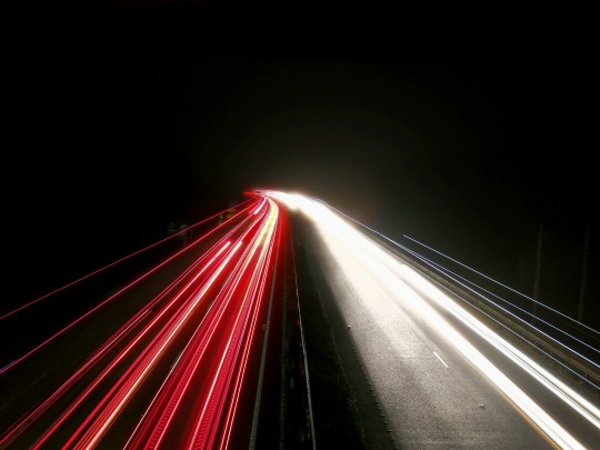
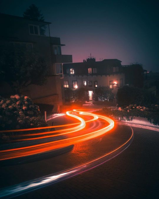
The photographs I took were themed around some of my chosen words and I took inspiration from the American photographer Daniel Kranken. I first discovered Kranken on Instagram and his unique style of photography caught my eye – his pictures are dark and he uses shadows to emphasise his main subjects and he likes to capture city spaces and life. I also experimented with different photography techniques, such as long exposure – I tried out this method during the night and I took long exposure shots of cars going down a road, the long exposure made the lights look like long tails behind the vehicles. Capturing their trail and movement in a still image, I like this idea of how you can use long exposure to capture moving objects in a still image but they can still appear to be moving.
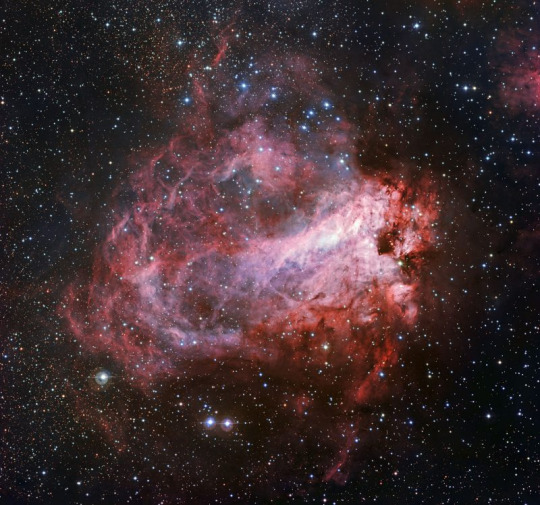
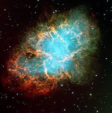
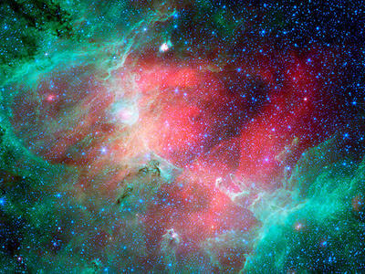
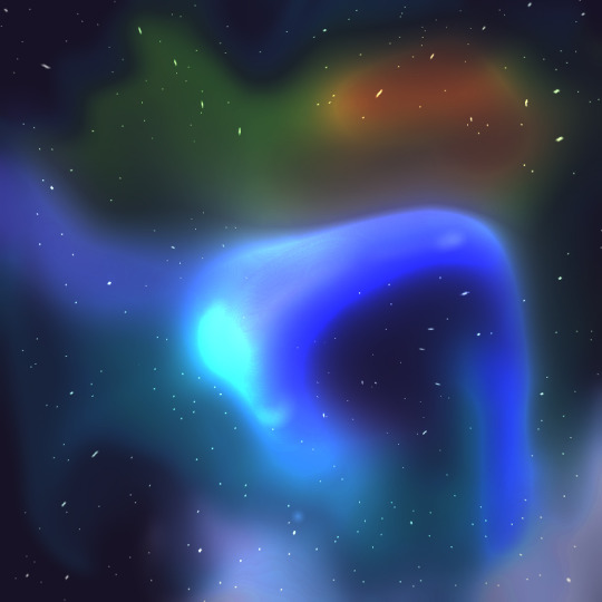
I also looked into space and the colours in space, as it was one f my words. I was fascinated by the various colours you can find – lots of red, blues, yellows and purples – created by gas, dust and tge distortion of light in the vacuum of Space. This research led me to my main idea for my final outcomes as I looked at Nebulas in Space and how they are bright and vibrant in contrast to the black and darkness of what is around them. After creating a mood-board post about Nebulas, I started designing my own on my phone by creating a canvas and had a black background and added bright colours swirled into patterns. I used the smudge tools and blur tools to create a sort of swirling and whispy effect then experimented by crystallising the colours so that they would be spread out and gradiented more. Next, I set the layer to the divide option so that it would show through on the layer below, but with inverted colours. The outcome was this purple-red mist with a denser orange and white form in the middle. I took it to Photoshop where I used the hue and contrast effects to change the colours so there were multiple variations and turned them into postcards. I really liked the outcome because it feels as though each postcard artwork holds its own emotion.

A strength of my project would probably be my photography experimentations and understanding how and why context is needed in art. However, my weaknesses would probably be how I could have made more physical artwork, if I had the chance to do this project again with more resources, I feel as though my outcomes and other artworks would be more varied as I would have access to a larger variety of materials. During this project, I did learn how to efficiently work remotely and has helped me develop my at home working skills.
0 notes
Photo


Experimentations with mixing reality with digital illustrations
0 notes


Text
Final Outcome processes
First off I created a light coloured orb with patches of greens, blues, yellows and a strip of black mixed in. I used the smudge tool to mix them together and make them swirl into a sort of twisted pattern shape. I added a very dark blue background on a layer beneath.
I then used the crystalize tool to make the edges jagged.
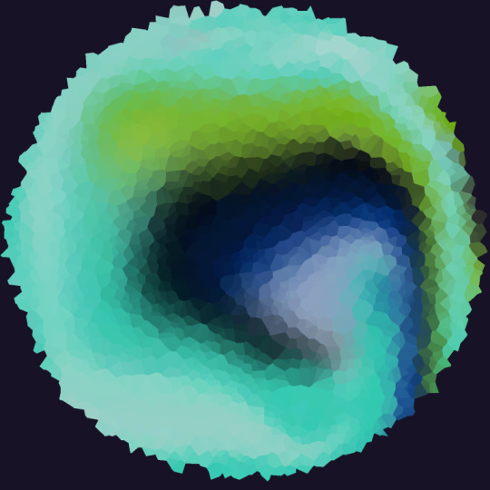
After using the crystallise tool - I used blur to mix the colours back together so it was smooth once again - I then cut it back into a circle shape.

I then set the top layer to divide so that the colours were inverted and crystallised it again - it created this sharp mist shape that began to look like something that was from the depths of space.

Next, I used the blur tool again to make it more formed so that it would resemble a nebula cloud in space. To add final touches, I added stars in the background and adjusted the brightness and contrast in Photoshop - I then repeated the process with different colours to create 6 different variations.

0 notes
Photo

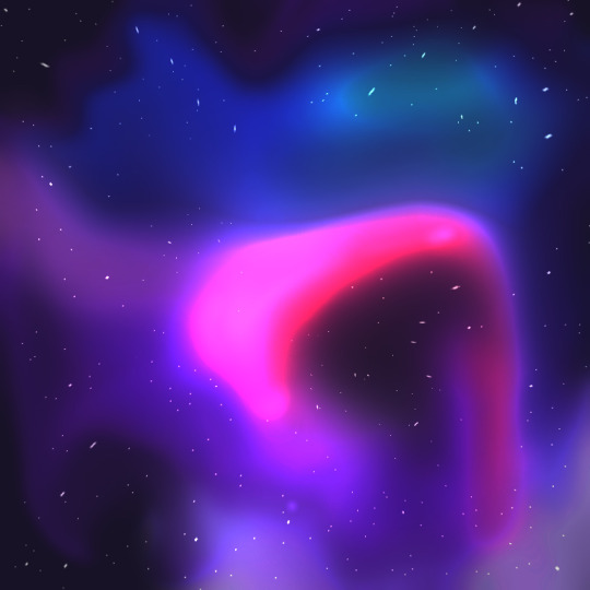


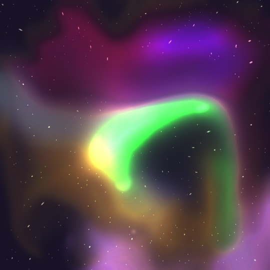
Final Outcomes - 6 Postcards based on the words Space, Universe, Reality and Dimension.
Created on Ibis Paint X and Photoshop.
0 notes
Text
Working
My working station :

Materials and Softwares I am using :
Pencil
Paper
Drawing tablet
Photoshop
Phone Camera
Snapseed photo editing app
0 notes


Text
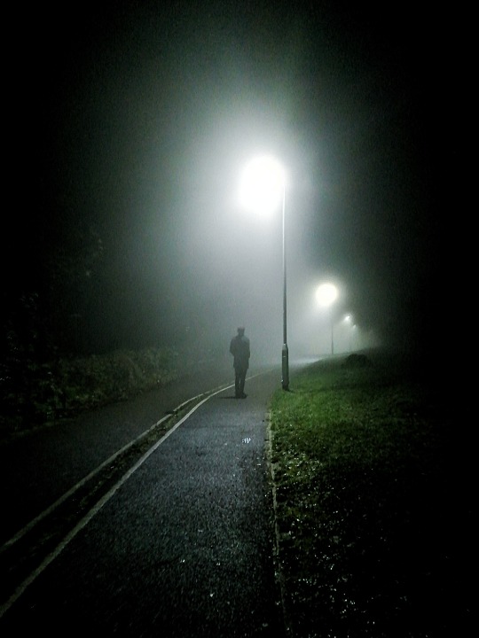
Daniel Krankan Photography
Daniel Krankan uses long exposure in some of his photographs and I’d like to try that technique, I would also like to try and edit some photographs similar to the style he does - like making them darker and contain more shadows.
I would like to try and implement these techniques into my own work I am doing now by capturing photos that link in with my theme and chosen words.


0 notes
Text
20-22/01/21 - Learning Objectives
2.1 Use knowledge of the characteristics and context to plane and develop the idea and theme, Can highlight that the concept can be linked in with a creative solutions and designs ideas.
2.2 Select appropriate materials to develop creative solutions for a chosen art and design activity Has explored ideas and materials. All materials to be annotated and ideas to be developed with ideas and concept in mind and linking in with research.
2.3 Apply practical skills, knowledge and understanding of the characteristics and operational context to produce creative solutions for chosen art and design activities.
0 notes
Text
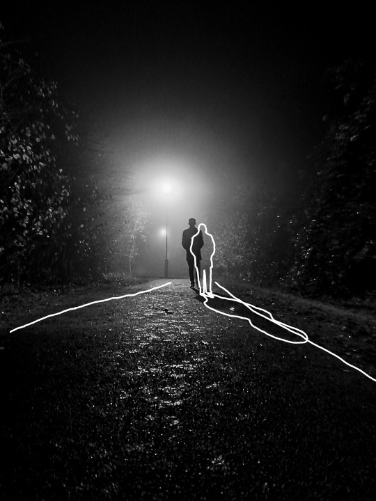
Daniel Krankan
@/danielkrakan - photographer - link it to ‘space’ as in city space
Daniel Krakan is a photographer based in the US and Canada. He typically photographs city life and spaces around the city - which is why I chose to explore and research him.

His some photographs are edited to make them look darker and greyer while still capturing the life moving around the city. His photography reminded me of one of my chosen words; ‘Space’. I explored what ‘Space’ could mean and thought about how you could interpret it as literal spaces such as rooms, corners, towns or cities.

Krakan has also used time-lapse features like long exposure to capture photos over long periods of time, which links to my word ‘Time’. I really like how long exposures of lights creates these winding, vibrant light trails that in a sense create a moving photo.
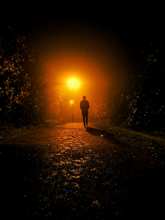
In the photo of the lone figure walking down the street - I like how it can also symbolise the word ‘Freedom’ because of how open the photo is, with the dark sky taking up a large area of space. And how there is only one person walking along the path, making it very empty and free.

Sources: Daniel Krankan
0 notes
Text
Murray Somerville
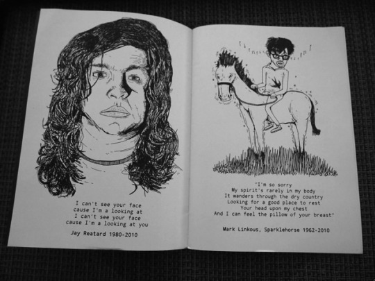
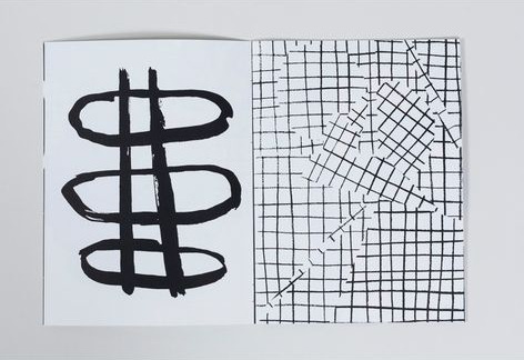
Murray Somerville is an illustrator, games designer and writer. He is the author of the 6 part Zine series from 2012 called ‘Macro Shrub’.

‘Macro Shrub‘ as a series has a variety of themes, including music and the character’s relationship with all things musical. Unlike ‘Ouroboros’ - ‘Macro Shrub’ has no bright colours and only uses black and white, it also has text in. The featured test ranges from poems, playlists or deep thoughts - depending on what the Zine’s overall theme is.
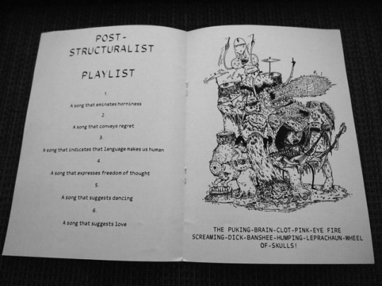
Inside the issues of ‘Macro Shrub’ alongside the text, are different kinds of illustrations - some are detailed portraits while others are less detailed collage-esque style.
Sources: Macro Shrub 1 & Macro Shrub 2
0 notes
Text
Ben Newman
Ben Newman is an illustrator that has worked on creating art which uses bold colours, shapes and various characters - he has worked with companies such as BBC Radio 4, Apple, Google and The New York Times. Newman is the creator of the Zine “Ouroboros”.
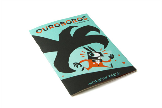
‘Ouroboros‘ is an action adventure tale that plays on the themes of life, death and rebirth - the main colours used are shades of blue and red with black and white also being included. The style is in Newman’s signature bold, shape style and it is aimed at older audiences because of the mature themes in the story.

‘Ouroboros‘ is a very eye catching Zine because of the vibrant colours used - the red and blues contrast eachother and makes the blacks stand out more. The illustrations are sectioned up into squares and rectangles and in total there are 24 pages of these comic book drawings.

‘Ouroboros’ is an example of a Zine with no type, apart from on the front cover. The story is purely communicated via the drawings. While the drawings are simple - the reader can clearly understand the plot and what is meant to be happening.
Sources: Ouroboros
0 notes
Text
Zines - What? Why? When? Huh?
Zines

Zines are small printed publications, around 12 pages in length. With professional Zines - there are often less than 500 printed. Zines first appeared around the 1930s and were mainly based on sci-fi and fantasy themes, however, the modern kind of Zine first became popular in the 1970s when punk culture became large. In the 1970s, Zines were often made with photocopiers and out of paper to keep the cost low and so they were as D.I.Y. as possible. To this day, most Zines are made from paper.
Zines can be used to present a range of things - they aren’t limited to one kind of theme. Some Zines are made to portray one’s political opinions and some have no real meaning and are made just as a piece of artwork. Zines can include literature such as articles, quotes or poems - or they can include various types of artwork such as, comics, illustrations or abstract paintings and drawings. Some Zines are made using physical materials like paint, card and ink while other prefer to make them digitally on Photoshop then print them off.
Zines are good a good way to visually communicate context because they are small and simple and aren’t bound to one kind of medium or artistic style. You can also make them as complicated or as basic as you want. There is a lot of freedom when it comes to making a Zine.
This Zine here, reminds me of one of my chosen words ‘Dimension’ because of the 2D dimensional shapes used. As you can see, the pages are different and it shows how with a Zine you have complete creative control.

Sources : What is a Zine?
0 notes
Text
My Chosen Words
From the theme ‘Multiverse’ - I decided to chose the words Universe, Space, Time, Reality, Botany, Archangel, Freedom, Galaxy, Dimension, Darkness, White Noise and Anthropology. I chose ‘Universe’ because of how it links to the theme ‘Multiverse’ and because of the vast ideas you can explore with it. ‘Space’ was the next word I chose – it stuck out to me because of how much you can branch off and explore with the term space, for example, you can link it to planets, galaxies, stars or literal space – crowded and empty. The word also allows you to experiment with different colour patterns and the use of negative space in your artwork. The next word I chose was ‘Time’, because I could think of a lot of sub ideas from it – for example, life and death and what the concept of time means people and how it affects them. ‘Reality’ was the next word – which I chose because of it’s links to ‘Multiverse’, with these two words you can explore the idea of reality and non-reality – exploring different ‘dimensions’. Botany stuck out to me because when paired with ‘Multiverse’ it made me think about how you could twist the meaning of plants, such as flowers, into something completely different and otherworldly. It also allows you to be able to lots of different colours and experiment with various colour palettes as botany is very vibrant. The next word is ‘Archangel’ – I liked this word because it allows me to explore the ideas between what is reality and what is myth – explore religion and other mythical beings. I also liked the word ‘Freedom’ because of how you can manipulate it into lots of different ideas about how people view freedom and what it means to them. To me ‘Freedom’ feels like a bright, happy feeling and gives off a vibe of spring time and calmness. The next word is ‘Galaxy’ – it’s similar to ‘Universe’ and can also be similar to ‘Space’, depending on the context, but the word made me think about all the colours that make up a galaxy in space. Lots of purples, blues, yellows – they have a nice colour palette. In other context, ‘Space’ could also mean a place or are - for example, a city, room, house, corner, etc. so that can also be expanded and be look down that route. ‘Dimension’ was my next word – which can mean 3D shapes or 2D shapes, artwork based on this can be centred around the 3D aspect making it physical or it can be centred around the 2D aspect where only 2D shapes can be used. ‘Darkness’ was my next choice of word – I liked this word because of all the stigma and fear around the word, which allows you to branch your ideas off. It gives off a cold, trapped vibe. In contrast, ‘White Noise’ gives off a quiet, open vibe and is compared to ‘The Big Bang’. It also links to static and glitches which can be made with digital effects. The last word I chose was ‘Anthropology’ which is the study of humans. This can be looked at in multiple ways – the study of human biology or human society. Going down the society routes can lead to ideas such as human emotions and creating art based off different emotions.
0 notes
Text
Context in art
Context
Without context – art wouldn’t exist. Context can be used in art to highlight specific things – for example, some artists use it to highlight issues in the world, such as social issues, racism, sexism and political issues. These problems can be documented in art by photos, videos, paintings, drawings etc. By putting these themes into artwork you are giving them visibility. By adding context – it gives the piece of artwork meaning, for example, giving context to a photograph changes it from a still image to a sort of short story or biography. Context can also change how a person views a piece of artwork – the meaning of the piece can dramatically change depending on the context as sometimes the meaning can come through entirely different if you don’t know the original intent. A good example of something changing meaning when you have context is sarcasm – without knowing whether something is sarcastic, it would seem completely normal but knowing when something is sarcastic changes how you view it. In art, designers use visual context to portray their intent and they also create context in their art based off experiences of the viewer. They visually communicate their meaning via image to reach out and ‘speak’ the viewer to show the story behind the piece of art.
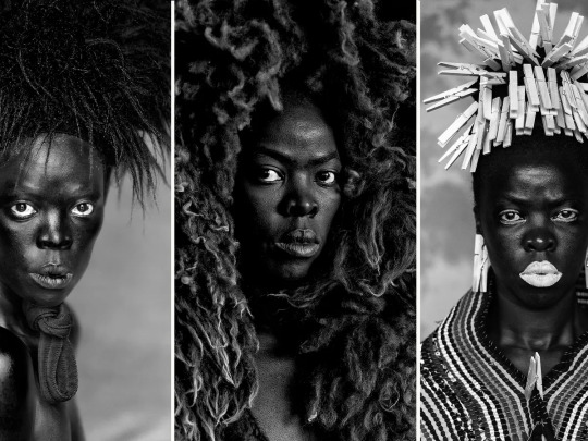
The art created by the photographer Zanele Muholi is heavily centred around context. The context of her work is creating a documentary of black LGBQTI+ people from South Africa. Her photographs are portraits of black LGBTQI+ people and she makes them to bring light and give them a platform to be represented on so that other people in the world can see them.
Sources : Zanele Muholi , The Importance of Context
0 notes