critique-my-tattoo
Tattoo Critique
This is a blog for critiquing tattoos that are submitted by the owner of said tattoo.
Be sure to read the FAQ before submitting/messaging.
Please do not submit tattoos that are not your own for critique; there are dozens of other 'laugh at the bad tattoo' blogs out there that would be happy to take your submission.
I do NOT do critiques over IM.
After you have read the FAQ, you can Submit Here
221 posts
Don't wanna be here? Send us removal request.
Last Seen Blogs
borusnapok
Borús napok~

wolfstrela
he says to be cool but i'm already coolest
solcita-ita-ita
El imaginario

littlejeff54
Untitled
Photo
This was the 1st session-I really like the design but I’ve 4-5 people tell me it is horrible and would like your opinion.
****************
They're right, tap out now and find a better artist to try and fix this.
The shading is terrible and blotchy, the linework is shaky at best, and if you let the artist who fucked this up continue it'll be an even bigger, more expensive mess to fix or remove.
Find an artist that specializes in cover ups or fixing scratcher level tattoos, and be prepared to pay a lot more than you would have if you'd gone to a decent artist to begin with.
DO NOT go back to the artist that did this, even if they swear they can fix it or it'll "look better" when it's finished, they can't and it won't.
1 note
·
View note
Photo

Been working with this artist for about 2 years on this sleeve. The birds were already there from a previous session with this artist. I just wanted clouds to fill in the background. This is what I got…what do you think?
*****
Uh.
Well, if you're happy with it...
The shading is pretty awful, even for stylized swallows those are bad (I mean c'mon the wings are coming out of the head for a start, and if it's only been two years there is no way the lines on those swallows should be that faded looking unless you're one of those 'I never wear sunscreen and am also outside in the sun most of the time' sorts...), it almost looks like two different artists did both parts pictured, and really, personally, I'd have switched artists after those awful swallows but, again, if you're happy with the style that's all that really matters.
Can't really judge the shading on the clouds too much as it's still fresh and shading often looks darker than it will heal as when it's fresh, but it's got some really harsh lines between the varying shades and not what I'd expect to see even on a fresh tattoo with properly done gradient shading. It's likely going to be choppy and weird looking instead of soft and cloud-like with lighting dynamics when it heals just based on what it looks like right now.
Those reddish birds will, without any defining darker lines on them, just look like reddish blobs in a few years.
From an overall skill-of-the-artist standpoint however, this is very, very mediocre and if their hourly is over $60, I'd be amazed and also tell you they are vastly overcharging for the level of their skill.
If you're not happy with it, start looking into artists that specialize in cover ups and be prepared to pay a hell of a lot more for a good coverup than you've paid over the two years for this.
1 note
·
View note
Text
First picture is what I asked for and second is what I got. It’s still healing but I would like to know what can be changed, fixed and the artist suggestions that could fix the issues.I personally dislike the hand and leg part it looks weird. Lips could also be improved. I wanted more of a realistic look.
*******
Healing is not going to fix this. Tattoos look best when they're fresh, and this one is a hot mess right out of the chair; you unfortunately chose an artist who has exactly zero skill and likely got what you paid for.
In the future, be sure to check an artist's portfolio, and if they don't have a physical one to look at that showcases healed work (i.e. photos they took of their own work; it's easy to steal a good artist's work from the internet and put it in your online portfolio) take it as a massive red flag and go elsewhere.
There is no fixing this tattoo, it's too poorly done in terms of the overall composition, the style you wanted, the line work, and the shading.
You'll need a coverup here.
Be sure to research your artist well for that; coverups are significantly more difficult (and expensive) than regular tattoos, and you want to go to an artist that has a lot of experience doing them.
Artists who specialize in realism in tattoos are usually more difficult to find and the price will reflect the quality of their work.
Check the FAQ for links and tips and whatnot on finding a good artist.
5 notes
·
View notes
Photo

So, I a bit of backstory on this. I got this about six to eight months ago now and I loved everything about the artist until he put this on my arm. His portfolio was solid and everything was fine, even the stencil looked good. Then he finished and the black was too close together and I basically lost his face to the machine. This is less of a critique request and more a cry for help - can this be fixed or covered? Exactly how bad is it from a technical standpoint?
*******
It could be fixed up or covered but you’d need to do a lot of research and look for an artist who primarily does cover ups and has a larger portfolio of examples of their work.
Keep in mind, depending on what the end goal is:
- You may need to go through a few rounds of laser removal to lighten it up enough to be able to get it covered or fixed up.
- Artists that specialize in cover ups tend to be significantly more expensive than regular artists, just something to keep in mind.
1 note
·
View note
Photo
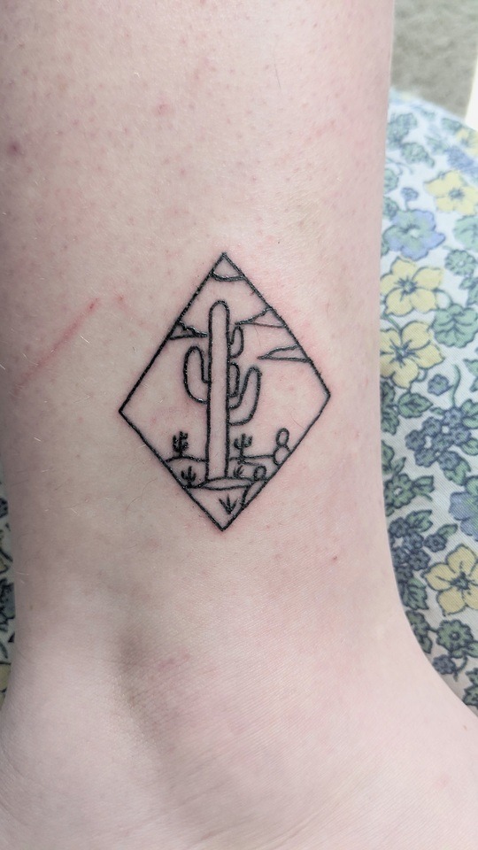
Got this done recently from a flash sheet at a place that came highly recommended, but I’m heartbroken about the terrible lines. Planning to get some shading/color at a different place after more healing time and better research. Do your worst!
-------------
Shading and color aren’t going to really help hide the lines on a piece that small; on a larger piece, sure, but that’s very small and trying to busy it up will just make it more of a mess as it continues to age.
They won’t fix the crooked ass uneven diamond frame either.
That’s piece that’s either a “live with it” piece or a piece you have covered with a larger version of something similar by an artist who knows how to do basic line work. If you go that route, be sure you choose an artist that specializes in cover ups.
Good cover ups require a different set of skills than just general tattooing, and the price will reflect that.
Forget about recommendations, a lot of people with really shitty tattoos “highly recommend” their artists, and don’t rely on IG portfolios, ask to see an artist’s printed portfolio and ask to see examples of their HEALED work.
If they can’t show you examples of healed work, which is where any minor or even more glaring mistakes will show up (even bad tattoos often look best when fresh due to swelling and ink not having had time yet to blow out or heal patchy), cross them off the list of artists you want to consider.
The other option is, of course, laser it to fade it or remove it, then have it redone somewhere else (or just leave it removed), just be aware that if it leaves scar tissue that can sometimes be harder to get to take ink, even with an artist who has experience tattooing over scars.
2 notes
·
View notes
Photo

Just got it done, still fresh. It’s a tatoo of st micheal and I would like to know your opinion on the tatoo. Did my artist did good. I’m planning to get another tatoo. Should I look for other tatoo artist?.. As you can see I’ve got a dark skin. I’m an Indian.
****
Just done often isn’t an accurate indicator of how well something was done unless there are very obvious technical errors like wobbly lines or patchy shading.
Tattoos look their best when they’re freshly done because they haven’t really got skin covering the ink as they’re an open wound. That’s also why you see a lot of just finished tattoos in portfolios: They’re the most vibrant and stand out against the skin better when they’re fresh.
A better indicator as to whether a tattoo was well done is if it looks good after it’s fully healed and your skin has had a chance to fully heal and mature over it.
Because of how skin and skin tone works, grey wash tattoos on darker skin tones may not pop out as much as they would on someone with a lighter skin tone; I say this only so you don’t end up comparing your tattoo to similar tattoos on lighter skin and thinking your artist did something wrong.
If, after it’s fully healed, you don’t feel like it has enough contrast, you can always have it gone over again to add more saturation to the black or you could consider adding color to the piece’s background to make it pop a bit more.
Any tattoo artist who tells you color “doesn’t work” on darker skin tones (and it’s amazing how often I’ve heard people say that, either artists themselves or people who were told that by an artist) simply doesn’t know how to work with colored ink on darker skin tones and if your artist tells you that color “won’t” work with your skin tone then definitely look for an artist who is comfortable with it; sometimes artists will balk at fixing or adding to another artist’s work but if you tell them your original artist refused to add color because they weren’t comfortable tattooing color on your skin tone an artist who has experience with it shouldn’t have a problem with adding to it.
If you take a look at the google image results for “color tattoos on dark skin” you’ll see a variety of vibrantly colored tattoos on a wide range of skin tones ranging from yours to very deep to give you an idea of what could be added to the piece after it heals if you end up thinking grey wash alone doesn’t stand out enough.
That all aside, it looks fine from what I can see but do keep in mind that it’s as contrasting with your skin tone as it’s going to be because it’s fresh and it’ll fade a bit from this point.
2 notes
·
View notes
Photo
I’m not able to get a great photo of it healed by myself without bends in my arm or weird shadowing. The filter took a bit of the depth out of the shading and after it healed the stippling calmed down and blended better. Im going in for a touch-up session to clean up some line work because he didn’t want to chew my skin up. Thoughts?
******
If an artist can’t nail line work the first time, I’d be really, really wary about letting them try to ‘clean up’ anything a second time.
That indicates that:
A) They don’t know how to do it right the first time to begin with.
B) They think you can straighten wobbly or inconsistent line work without having to make the ‘touch up’ line work thick enough that it basically overwrites the original, poorly done line work with solid line work, which is what they should have done the first time.
Unless you want thicker lines, it’d probably be best to just let it be.
Shading & coloring are sometimes done in stages to avoid overworking the skin or in cases where it healed patchy (patchy healing on shading can be either caused by overuse of oils/lotions while the tattoo is healing--personally, I go for the ‘leave it the hell alone’ method and, aside from gentle washing while showering, don’t do a damn thing to it while it’s healing--heavy scabbing which can be either the artist’s fault for being too heavy handed or just how someone’s body heals, or because the shading wasn’t done properly in the first place), but line work should be one and done.
That said, without seeing a healed picture without any filters applied, it’s hard to actually get a good idea of how well done (or how not well done) the line work and shading are.
If you can’t use a tripod (either an actual tripod or just propping your phone up against something) to get a clear, unfiltered, color shot or can’t get someone to take a picture for you, it’s pretty much impossible for me to accurately tell you whether or not the line work and shading are good, mediocre, or poorly done.
The heavily filtered, B&W shot lands squarely in mediocre territory.
1 note
·
View note
Photo
Obviously on the table finished. Pretty happy overall. My first big tattoo. You can see my only other one left pec.
*****
Yeah, that’s a pretty good looking piece.
1 note
·
View note
Photo
It’s not the entirety of the tattoo, and I apologize for not being able to submit the whole thing. Getting this tattoo was a learning process, and I’ve obsessed over it enough that I no longer can tell if it’s objectively good. I would also really like your thoughts on not only it, but how long you think it should have taken.
********************
It looks pretty solid to me.
It also looks like a piece that was probably multiple sessions; a similarly sized/complex one on my upper arm took, I think 4 sessions at 4 hours for the first 3 and about an hour for the final one.
I suppose, given the style, it could be something that might be doable for a really skilled artist in a 6-8 hour single session.
0 notes
Link
Seriously, watercolor tattoos only look good when they’re new.
They fade super fast into a muddled, ugly mess on most people.
0 notes
Photo


I’ve been asked many times what someone should look for when trying to find a good artist. The best way you can do this is to look at their portfolio, whether it’s in a book at their shop or online. If they don’t have good work in their portfolio, they’re probably not good artists.
The shop may be clean, the people there might be nice, and the design they draw up for you might be exactly what you want, but if your artist doesn’t stand up to the points listed above, then you’re going to get a bad tattoo.
It’s okay to walk into a shop, talk with an artist for a while, and decide you don’t want a tattoo from them. Even if the artist has a bad attitude about it or tries to convince you to just let them do it, remember this is going to be on your body for the rest of your life.
191K notes
·
View notes
Photo

Hey! this is my first tattoo! it was so painful and definitely made my artist’s job harder because i couldn’t figure out how to breath properly while he was tattooing my sternum..I know there are some hiccups but i really like it, whatcha think?
Thanks!
****
You submitted this twice with two different e-mail addresses.
Anyway.
It looks generally okay.
There are a few wobbles and some odd randomly thick areas in the line work on the vial, but I’m going to guess those came from movement on your part based on what you’ve said.
The shading is fine, and the line work on the leaves and flowers is all right.
It’s not a bad piece at all, but it’s certainly not something that jumps out as amazing; it’s pretty run of the mill decent work, which is just fine. :)
2 notes
·
View notes
Photo

Just got this done. It’s still unfinished (missing the background that’ll tie it all together). But so far I don’t know how I feel about it. It seems cluttered and lacks flow. Any opinions would help.
*********************
It's kind of mediocre as far as the artist's skill goes, even for something unfinished.
The lines on the skull are particularly kind of not that good; they're noticeably wobbly in several places, especially up near the top.
The jaw looks strange to me as well, like the artist drew it as though there were still muscle/tendons present and not as an actual just bone skull but that's not a technical thing, just an artistic choice that strikes me as a little weird. It’s not bad, it’s just weird to me.
I'm not sure if it's the angle of the picture or not, but the top rose seems really oddly shaped; like the bottom is far, far too wide in comparison to how narrow the top is. The bottom petal especially seems really wide and doesn't fit well with the rest of the rose.
The randomly different shading on the roses is also kind of jarring; the top and lower left ones are shaded very lightly, then there are two darker ones (I think there are two more in there, but since the picture doesn't show all of it due to arm curve, I can't really tell). That may just seem odd because it's unfinished, however, and once it's colored and has a background it might look fine.
I do agree that the flow is a little awkward as it is right now, mostly because the roses just seem kind of randomly placed and there are two blank spots between roses at the top of the skull, but you did mention it's unfinished and missing the background so it's very possible that, with the background, it'll look more cohesive.
Honestly, aside from the somewhat wobbly lines on the skull, it's really hard to judge an unfinished piece when it's missing components that may very well make it flow just fine; if you have concerns about it, definitely talk to the artist. Their reaction will determine whether or not you let them finish it.
If they get defensive and angry, I'd strongly encourage you to look into having it finished by a different artist--as the artist should be open to a client's concerns without taking it as a personal attack--at a different shop and just explain that you weren't able to get it finished by the original artist and let them know the concerns you have about it.
1 note
·
View note
Photo

Um okay so I’m pretty new to your blog I and I don’t know much about tattoos except there’s one I’ve wanted for almost three years. I’m sorry if this is a repeat question and you can totally delete it if it’s already been addressed in detail which it quite possibly has. My issue is that the tattoo I want is a symbol and I want it on my wrist. That’s close to the hand so it might fade quickly, right? But also this is super personal to me so I really want it facing me and I really don’t give a crap if people think it’s upside down because I can see it. But would any tattoo artist worth their salt agree to do that for me? Since it’s facing me and on the wrist (btw sorry about the picture it literally wouldn’t let me do anything without it)
********
You can see it even if it's oriented correctly. If you can't, you need to have your eyes checked.
No decent tattoo artist or shop would want their name on an upside down tattoo, so if you're dead set on getting it done improperly, you'll have to take your chances with a shitty artist and a questionable shop.
That aside, wrist tattoos don't fade like hand tattoos. You'll be stuck with your upside down garbage--and there is no such thing as a 'good' tattoo that is upside down--until you have it covered up or lasered off.
As for the submission requiring a picture, that’s because this is a tattoo critique blog, not a tattoo advice blog. :)
0 notes
Photo
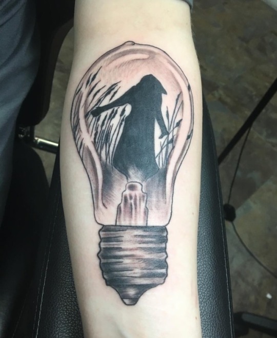
The lack of symmetry at the base of the bulb is driving me up the wall, but that’s just a personal preference (I like things to be symmetrical).
The bulb itself looks a bit distorted, but that tends to come with the territory of trying to draw something evenly roundish on an oblong surface; it’s always going to look a little distorted.
It also kind of bugs me that the ‘top’ of the bulb isn’t really at the center top, it’s just off to one side, but that doesn’t appear to be a technical error, just a style choice.
Personally, I think this piece would have looked better on a flatter/wider surface, as it just looks a bit squished on the narrow area of the forearm, but if you’re happy with the placement then it’s fine. :)
There are a few wobbly bits on lower right side and the areas where the bulb meets the base aren’t even on both sides so it does look a little odd in that regard.
I’m not honestly sure if having so many things asymmetrical was a style choice or was due to the artist not being able to draw something that looks even on both sides; if it was a style choice, it’s one that I don’t personally like but, if you like it, that doesn’t matter.
The lines, aside from the wobbly ones mentioned, and shading look generally pretty solid and I don’t see any obvious blowouts or wobbles where it’s not supposed to be wobbly.
0 notes
Photo

Also this was my first/second - elephant healed, flowers fresh. Thoughts?
**************
It's jarring, and not in a good way; the style difference between the flowers and the elephant make it look like it was meant to be two different, separate tattoos and someone decided, at the last minute, to cram them together and hope it worked.
As individiual pieces, they'd both be nicely done--though someof the denser shading on the flowers will muddle to no detail around the 10 year mark or so.
As a full piece, it's really incohesive and doesn't looklikeit belongs together; it kind of feels like either the elephant or the flowers were done as an afterthought and possibly by a different artist.
On their own, the flowers would be nice, as would the elephant but with the style differences between the elephant and the flower it just...doesn't really work.
When you're trying to mesh two tattoos together into a cohesive piece, it's generally pretty important to work with either the same artist who did the original piece or work with an artist who does the same or a very similar style to avoid the look of, "What is composition?"
Poor composition aside, the line work onboth tattoos is solid.
The darker shading on some of the flowers looks good now, but won't hold up well over time (Take a look at this post to see what often happens with 'detailed' shading in small areas), however.
#tattoo#elephant tattoo#flower tattoo#this is why it's important not to mix styles so close together#submission
0 notes
Photo
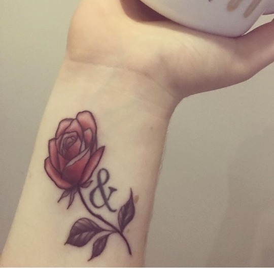
I’d like your critique of my wrist tattoo? I know it’s pretty basic, but I love it. I’m hoping it will last well over time, do you think so? Thank you!
******************
It's upside down, for a start.
Yes, tattoos can be upside down; that's an objective fact, and if it's right side up when 'facing you', it was done upside down. Shame on your artist for lowering themselves to do something they knew was objectively incorrect; artists who tattoo upside down because "it's what the client wants" are poor quality overall as no skilled, quality artist would want their work attached to something upside down.
The & just kind of looks clunky and out of place, kind of like it was an afterthought to the overall design, doubly so since it's oriented incorrectly so anyone looking at it (unless you raise your arm for them) will mostly see a bit of gibberish.
The rose petals are pretty poorly done due to all the wobbles in the line work and unevenness in the thickness of the line work. The stem has inconsistencies in thickness and appears to be blown out (which usually means the artist pressed too hard and got into the fat layer) in a couple of places.
The shading on the petals and leaves is pretty inconsistently done; it looks like the artist couldn't decide (or didn't know how to design) where the light source was coming from while shading so they just kind of went, "Eh, whatever."
I'd say it could be fixed but, as it's upside down, it really can't. The lines could be cleaned up by a skilled artist, but the jarringly out of place & and the fact that it's upside down are two flaws that you're kind of stuck with.
The fact that the leaves are so small and so heavily shaded means that, over time, you'll lose the detail on them and they'll just look like a muddled black/gray.
Overall, it looks like you probably didn't pay too much for it, which is a plus, but the downside is it looks like you didn't pay too much for it.
If you're happy with it, however, that's what matters.
still, I wouldn't go to this artist or shop again for future work.
2 notes
·
View notes