
contextualstudiescharlotte-blog
Pop Art and Neo Expressionism
8 posts
Don't wanna be here? Send us removal request.
Last Seen Blogs

youtubetopgames
Top Games

talkingwoso
maya

atplngp
AjinkyaTutor
bootiesbooksandtheblues
BOOTIES, BOOKS & the BLUES

ci11a
I draw trash so get over it
Text
Characteristics 2
The top piece, ‘High and Low’ by David Salle, is another example of Neo-Expressionism and the bottom is ‘Sweet Bowl’ by Patrick Caulfield. Salle created this piece using lithography, woodcut and screenprint. I like the photo montage look he has achieved with his screenprints, I feel that he has created elements with a sharp, clean look however he has countered this with the messy look of the background and pale blue paint strokes. I think he has done a good job of keeping a balance between chaos and the piece looking too organised. Caulfield created the piece ‘Sweet Bowl’ using screenprint. I like the way he used three tones of blue and focusing the rest of the colour on the sweets in the bowl. I believe this has been done so to immediately make the sweets the main focus point of the piece. The choice of blue specifically works well as it is a cool, softer colour I feel it would have failed to have the same impact had he chosen a yellow as a base for this piece. The colours of the sweets he uses include, yellow, red, orange and purple. These all contrast each other well and as they are light shades, they stand out against the deep blue used for the bowl.
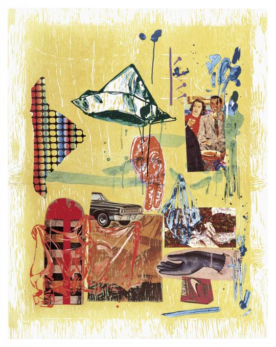
David Salle - High and Low (1994)

Patrick Caulifield - Sweet Bowl (1967)
1 note
·
View note
Text
Pop Art’s influences on illustrators
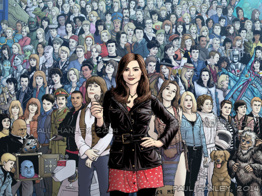
Pop Art on the other-hand is still widely recognised as an art style, due to the popularity of Pop Artists like Warhol, Lichtenstein and Haring. It was also a very long lived movement, spanning around 20 years. I think that Pop Art has impacted modern day illustrators to draw topical subjects, based around such things as popular musicians and new films. The below Illustration is a piece made by Paul Hanley, influenced by the popular Sci-Fi series Doctor Who, I find that many artist create similar work, sharing their love of popular programs, whilst displaying their talents in art. I think this helps encourage people to pursuit a career in art, when seeing fans of TV shows produce such artwork. Although not all of the characteristics of Pop Art are present in this illustration, the concept of producing work based on popular culture is.
0 notes
Text
Has Neo-Expressionism been forgotten?
I feel that Neo-expressionism has been forgotten, it has certainly impacted modern expressionists, however those influences have been manipulated and distorted to an extent that Neo-expressionism itself has been lost. Some modern artists take the idea of intense colors, dramatic forms and portray it in an emotional way, as Neo-Expressionists do. The idea of vibrant, intense colour has been a key part in many art movements beginning with post-impressionism, however Neo-Expressionism changed the way a lot of modern artists use colour, and I feel modern illustrators particularly use vivid, unnaturalistic colours as Neo-Expressionists once did.
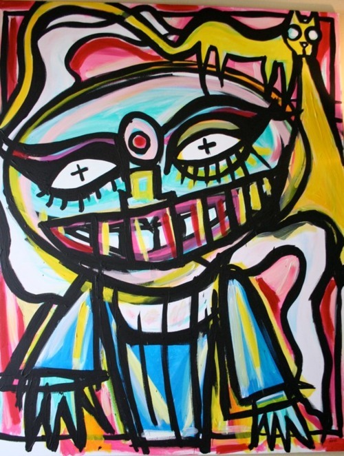
Noel Fielding - ELLO DARLING, BOLLYWOOD BEAUTY STANDING WITH PUMA, WITH LIGHT FOR BREATH
Robin Eisenberg - WEEKEND PLANS FOR GOTHS
4 notes
·
View notes
Text
Basquiat and Warhol
My discovery of Neo Expressionism came from learning of the collaboration between Pop artist Andy Warhol and Neo Expressionist Jean Michel Basquiat. It immediately caught my eye, seeing the bright colours and the messy, haphazard painting style of Basquiat contradict the clean cut, organised style of Warhol. Many critics disliked this clash of style and found it to be of bad taste, complaining it was too busy. Warhol at the time was reaching the end of his career as an artist when he met Basquiat in 1980 and died 7 years later, in these years the majority of Warhol’s work was produced alongside Basquiat. Many people said Warhol was using Basquiat to regain some of his lost fame and popularity, Warhol being renowned for his obsession with fame. “The relationship was symbiotic. Jean-Michel thought he needed Andy’s fame, and Andy thought he needed Jean-Michel’s new blood. Jean Michel gave Andy a rebellious image again.”


1 note
·
View note
Text
Characteristics 1
I have found both Neo - Expressionism and Pop Art both tend use bright, vivid colours in their work. However Pop Art seems to have a sharp, clean look sometimes with bold black lines as an outline. Neo - Expressionists on the other hand paint in a rough, heavy way with thick brush strokes, with no defined lines. Neo - Expressionism also liked to distort the subject matter very heavily which can also be common with Pop Art.
The top image is Lichtenstein’s ‘Drowning Girl’, you can see the bold, sharp lines that are present in pop art and the overall clean look to this piece. The other is Paula Rego’s ‘Nanny, Small Bears and Bogeyman’, this piece was done using acrylic which means Rego can produce thick strokes that appear unblended and whilst still using outlines, they are varying in size and they are not consistent. In Rego’s piece, there is a clear example of unnatural colour, and the colour is reflective of each character's mood.

Roy Lichtenstein - Drowning Girl (1963)
Paula Rego - Nanny, Small Bears and Bogeyman (1982)
0 notes
Text
Introduction
I have found that Pop Art and Neo-Expressionism work interestingly together despite being made up of opposing characteristics. I would like to explore in which ways they are similar and different and why people either love or loathe the clash of styles. I also wish this blog to reflect the art movements independently as they are both individually interesting, successful movements.
0 notes
Photo
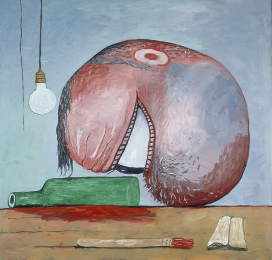

Head and a Bottle - Philip Guston (1975)
Neo - expressionism
this piece was produced by Guston in 1975 and portrays what people believe to be what Guston saw as himself. the detail of the bottle may depict a form of alcoholism that he had been struggling with, since it is one of the bigger elements of the painting.
The red paint on the brush links heavily to the red beneath the bottle which is assumed to be red wine however, I believe it had a connection to blood as his head is resting directly above it. His head resting on the bottle shows he has some form of dependency on alcohol and the use of a single eye could be showing us that his hobbies of reading and painting are not fulfilling him, I think this because all the single eye is focusing on is the empty bottle.
0 notes
Photo

Ignorance = Fear - Keith Haring (1989)
Pop Art
Haring finished this piece in 1989 after being diagnosed with AIDS in 1987, this triggered him to make more, and work faster. I feel this piece was highlighting the stigma around AIDS and trying to expel that as he calls this piece Ignorance = Fear and Silence = Death. he also has ‘fight aids act up’ written in this piece. You can see his classic stick man style, present in all his work, however this piece show that these characters are displaying feelings of anger, fear, and potentially sorrow. the lines coming from each character shows movement and potential anger where the lines are coming from the head. AIDS have claimed the lives of many of his friends which is represented by the X on each of their chests. The use of the red shows his passion and emotion for the subject as he himself was a sufferer.
He also includes a small pink triangle at the bottom of the piece, this is the symbol used in the holocaust to identify gay people. It has since been reclaimed in the LGBTQ+ world, a lot of Haring’s AIDS related pieces included this pink triangle.
1 note
·
View note