
Last Seen Blogs

iconicgirls
WOMEN


spider-gets-inspired
Spider Gets Inspired

windowsmeisbest-jbp
beans

alldaysmokebreak
all day bs
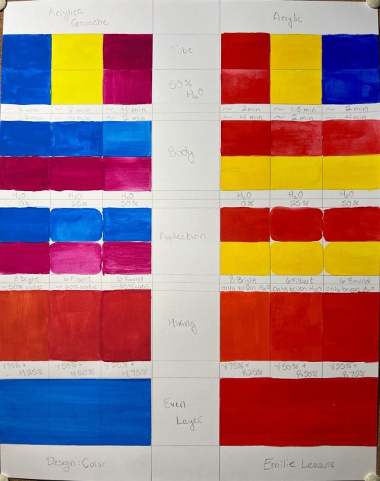
Text
Final Project
I had a hard time photographing this due to the shiny finish on the acrylic paints. I learned that I am still not particularly good at estimating how much paint I need mixed especially as the projects grow in scale. I was lucky that some of the more complicated colors I did towards the end where it was more likely for me to be able to mix the correct amount. I also found out that for freehand geometry like this I prefer a smaller, chisel tipped brush with a shorter handle so I can finesse in the corners better and have an easier time getting straight edges without stray hairs carrying paint elsewhere.


0 notes
Text
Final Thoughts
Overall I am fairly happy with the results of this course. A lot of what I'm taking away from it comes in the form of lessons learned from the materials that we were working with, since I had gone through a similar course previously with my lighting background. I enjoyed doing the exercises based off of specific artists/ color theorists though, and I think that is part of what sets this course apart from others.
In terms of reflection on myself within the course, I wish I were able to get over my struggle points with the materials (and apparently the color of the lights in the classroom) sooner. I primarily work with heavy body acrylics when I paint and have worked with both watercolors and gouache before, yet I still struggled to wrap my head around our class paints some days. I was able to adapt to the fluid acrylics adequately I think. From what I had gathered from some limited research, acrylica gouache is slightly different from traditional gouache, so that may have been part of my issue there. In hindsight, I probably should've tried it on paper with more tooth or gotten out my cotton fiber paper just to confirm that suspicion since I am also not used to using bristol board to paint.
Pretty much all of my issues with this class were of my own making, but because they were more focused on the art/product aspect of the class rather than the theory part of the class I felt more inclined to try to work them out for myself.
0 notes
Text
Broken Grid VIII
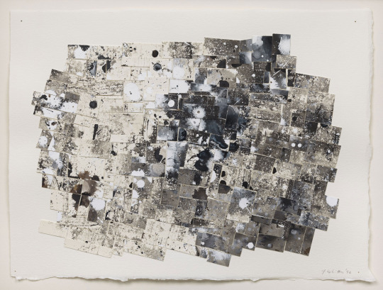
Jack Whitten was born in 1939 in Bessemer, Alabama. In his 20s, he attended a Speech from Martin Luther King Jr. regarding the Montgomery bus boycott. This speech kickstarted Whitten’s “vision for a changed America”[1] and interest in the civil rights movement. In 1960 he began studying art at Southern University and continued to participate in civil rights demonstrations. His concern for himself turning violent out of frustration in those demonstrations[2] led to him moving to New York to finish his schooling[3], which is where he remained to begin his art career. His heavy inspiration from abstract impressionism was drawn from meeting Bill de Kooning, Franz Kline, Philip Guston, Barney Newman, and Mark Rothko, as well as Jacob Lawrence and Norman Lewis.[4]
Broken Grid VIII was created in 1996. It is an 11 ¼” x 15” collage of sumi ink and acrylic on paper.[5] It and its sister work, Broken Grid VI, were created after Whitten became engrossed with the thought of compiling and visualizing all experience.[6] It is an attempt to ‘digitize’ his own mind at the moment of creating the pieces.[7]
The piece itself reads as an organized chaos. It utilizes clean cut tiles of paper overlapping in various orientations and tilts to create depth and to fracture and relocate the splatters of paint and ink that is on them. Broken Grid VIII is a very contemplative piece, where one can get lost in the journey of exploring all the texture and movement created by both the splatters and the limited color palette. With only warm and cool blacks and whites paired with the color of the paper, Whitten uses the visual weight of the contrast in those colors to create an asymmetric, monochromatic composition. I chose this piece due to having to do a double take when I scrolled past it in my search. It is so striking with the large cold white splotches cut up and layered with the rich darkness of the sumi ink. On top of that I think the collage aspect of it gave it enough of a ‘grid’ that the title suggests that you get lost in exploring the cervices and seeing how the differing tiles fit together. The use of the paper as a color is also very playful in the upper left of the piece and allows for the exploration of the different values of white creating visual interest. It also has a fascinating centralized movement that keeps your eye engaged and wanting to continue looping back to see if anything was missed at first look.
[1] Smee, Sebastian. “Jack Whitten: Once Neglected Artist Lately the Toast of the Art ...” The Washington Post, The Washington Post, 22 Jan. 2018, www.washingtonpost.com/entertainment/museums/jack-whitten-a-neglected-artist-who-embraced-african-and-expressionist-art/2018/01/22/f9df8190-ffa8-11e7-8acf-ad2991367d9d_story.html.
[2] “An Interview with Artist Jack Whitten.” Crystal Bridges Museum of American Art, 23 Jan. 2018, crystalbridges.org/blog/an-interview-with-artist-jack-whitten/.
[3] Sung, Victoria. “Stories of the Soul: A Farewell to Jack Whitten.” Walkerart.Org, Walker Art Center, 29 Jan. 2018, walkerart.org/magazine/jack-whitten-in-his-own-words.
[4] Ibid
[5] Whitten, Jack. “Broken Grid VIII, 1996 by Jack Whitten.” Ocula the Best in Contemporary Art Icon., Ocula Limited, ocula.com/art-galleries/hauser-wirth/artworks/jack-whitten/broken-grid-viii/. Accessed 4 Mar. 2024.
[6] Shiff, Richard. “I AM THE OBJECT Featuring Jack Whitten’s Work of the 1990s.” Contemporary Art Library, Hauser & Wirth, www.contemporaryartlibrary.org/. Accessed 4 Mar. 2024.
[7] Ibid
Bibliography:
“An Interview with Artist Jack Whitten.” Crystal Bridges Museum of American Art, 23 Jan. 2018, crystalbridges.org/blog/an-interview-with-artist-jack-whitten/.
Shiff, Richard. “I AM THE OBJECT Featuring Jack Whitten’s Work of the 1990s.” Contemporary Art Library, Hauser & Wirth, www.contemporaryartlibrary.org/. Accessed 4 Mar. 2024.
Smee, Sebastian. “Jack Whitten: Once Neglected Artist Lately the Toast of the Art ...” The Washington Post, The Washington Post, 22 Jan. 2018, www.washingtonpost.com/entertainment/museums/jack-whitten-a-neglected-artist-who-embraced-african-and-expressionist-art/2018/01/22/f9df8190-ffa8-11e7-8acf-ad2991367d9d_story.html.
Sung, Victoria. “Stories of the Soul: A Farewell to Jack Whitten.” Walkerart.Org, Walker Art Center, 29 Jan. 2018, walkerart.org/magazine/jack-whitten-in-his-own-words.
Whitten, Jack. “Broken Grid VIII, 1996 by Jack Whitten.” Ocula the Best in Contemporary Art Icon., Ocula Limited, ocula.com/art-galleries/hauser-wirth/artworks/jack-whitten/broken-grid-viii/. Accessed 4 Mar. 2024.
0 notes
Text
Pattern Color Swap

The horizontal diamonds both on screen and in picture are reading more purple, but in person I was reading them as navy, thus the color choices. The painted portion also looks a bit darker in picture, but upping the exposure was blowing out the printed portion unreasonably without putting the image into an editing program and fixing exposures separately.
I used the RYB wheel and the acrylic paints for the colors in this piece, however for the black I did use gouache since the matte finish made it read as a darker color in person. I was unable to get a 'cool black' with either set of paints. I think I still could've gone lighter on the horizontal diamonds for the value swap and possibly slightly more yellow and less pinkish. I am unsure if a 'dark orange' exists that isn't just brown. I also think my dark blue could've lightened up a small amount, but the light that I work in at night is vastly different from how all my finished products are reading in the daytime this semester, so it's making it a bit hard to predict readability and do the tone mixing.
0 notes


Text
Munsell Chart

The lower section of this ended up being a two hue tint and shade chart instead of a Munsell chart. This was discussed in class and I understand where I misread the instructins now.
0 notes
Text
Color Charts
I think I'm still having issues with mixing too little paint, which ends up being seen in the tertiary colors looking grainy and slightly streaky. It was interesting to see how much lustre was lost as we mixed the gouache charts from RYB. It felt very much muddying too many single pigment paints together making the colors desaturate. I have not looked into our paints and I don't know if they are single pigment or not but I would assume at least some of them are. I also think I did not add enough white to the purple range of the RYB chart so it looks a little off, but adding white in gouache seemed to act differently from adding white to acrylic.
RYB Chart:

CMY Chart:
0 notes
Text
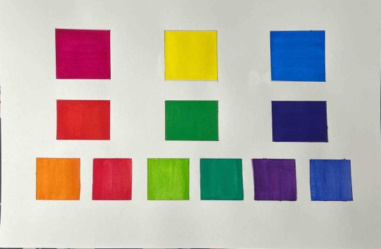
Color Wheels
Acrylic Wheel (Red, Blue, Yellow primaries)

The above was trying to mimic the wheel below.

The purples were generally difficult to mix as it seems we have a very warm red and a very cool blue to work with. One of them flipping to the other side of the spectrum in their color family would make the secondaries a little less muddy, but adding white was able to bring out some hidden color. I wish I had put some white in the teal though as that is reading more as a dark green rather than a blue. I am unsure if the white would have helped, but it would be worth a shot to try and brighten the color a bit.
Gouache Wheel (Cyan, Magenta, Yellow primaries)

The above work is trying to mimic the wheel below.

The primaries available in the gouache made it easier to establish clear and concise jumps between the stages of the color wheel. It was interesting seeing the differences that a bright and dark would make when mixing as the color wheel on the screen has a much lighter shade of magenta and cyan than we were able to achieve on paper. In particular this can be seen in the spring green and violet mixes. I'm not sure if white would help at all push those colors closer to what is shown on the screen but I feel like those are good examples of where the color differences exist between pigment and light (pixels in this case).
0 notes
Text
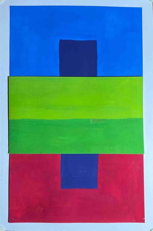
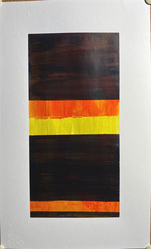
Final Barnett
I ended up choosing Adam for this project. Original work listed below from Tate.

I ended up choosing this piece because it was one of my favorites that didn't end up using mostly black. I like that there is no 'void' in this piece, the maroon/brown covers the red but it doesn't obscure it. Since the brown has a majority red base they work together in a semi analogous way. This creates a harmony in their contrast making the piece a bit more calming. I also liked the 'hidden' extra stripe off to the right that felt more like glazing the initial red back over the brown rather than adding a whole new color.
Below is my recreation of the work, albeit a bit brighter and more saturated than the original. I used a lot of red paint making this piece. When making the brown I was having issues with the coverage of the naphthol red. While I knew from the bottle that it was light coverage, I didn't realize just how streaky it was going to be when layered on top of a full page of just red with a light wash of brown underneath. I also felt like all I was doing was using my entire bottle of red paint because of just how much needed to be used to cover a whole sheet of bristol board multiple times. My side stripe is also slightly misplaced and a little too bright, but I think the concept of glazing over the brown layer worked well for it. I also wanted to tone down the saturation a bit for the piece as a whole but I didn't know how to do that without adding small amounts of black, so I elected to stick to our primary colors instead and leave the piece slightly bright for my printout comparison.

0 notes
Text
Baby Barnett's
I am enjoying working with acrylics that aren't super heavy body, but I am running into wishing that we had them in CMY. While it's nice to not have to thin the paints very much out of the bottle, RYB pigments are super restrictive especially when you want to go into the purple range of the color wheel. I haven't quite wrapped my head around gouache yet as a medium. They feel like a cross between watercolors and acrylics, but I'm having a hard time keeping them smooth. The scale of our work is also something that I am having to adjust to. I am used to working on projects with much less paint at once, so I still need to work out how much to put on my palette at once.
Semi related: My Frog Tape still ripped my paper way more than intended despite being careful. Varying the amount of time on the paper did not change the result of this ripping.
Acrylic Complimentary:
Gouache Complimentary:

Acrylic Split Complimentary:
Gouache Split Complimentary:

0 notes
Text
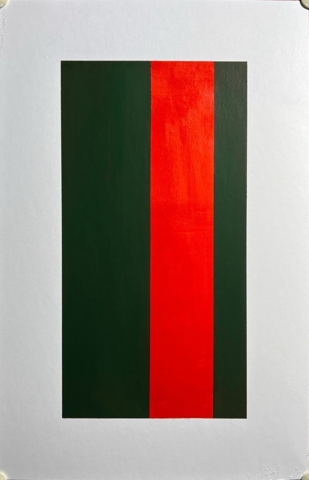
Red
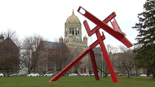
Mark di Suvero's Victor's Lament.
We don't have much information about this sculpture or its intentions outside of the artist's fascinations with abstract movement and use of material. In this case we only have the shape of the sculpture itself, the I-beams, the aircraft cable cords, the color, and the name to extrapolate meaning from the piece. I find it fascinating to look at the color as more impactful than the form like Muhlenberg students typically do, especially given just how much 'blood spilled' would be needed to cover something so large in non contemporary ways.
In the reading I thought it was interesting how multiple countries had the 'secret' to red right under their noses the whole time. While I'm sure the results and variations are different enough that monopolies would still occur, it would be interesting to see if other countries challenging the Spanish monopoly on red would have an affect on what we now consider common or normal paint colors in pigment ranges.
1 note
·
View note