charlottesdigitalenviroment-blog
Charlotte Jenner
Digital Environment Project
21 posts
Don't wanna be here? Send us removal request.
Last Seen Blogs


chemicalprodigyblogs23
Untitled

ey3ball
eyeballcreature

roztherizzler
Rozzy

kawaiib0rn
oh darling i wish you were here
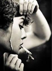
Photo

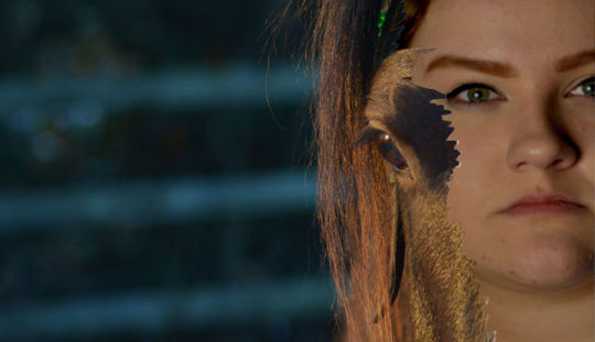
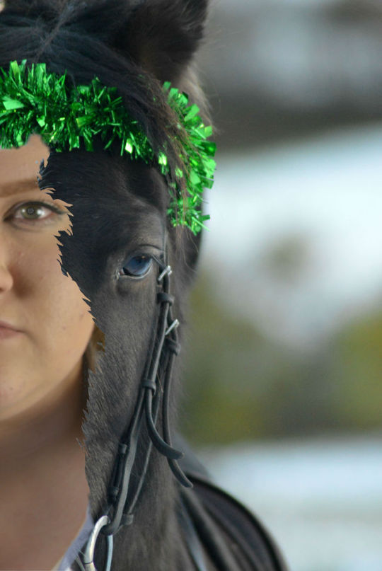
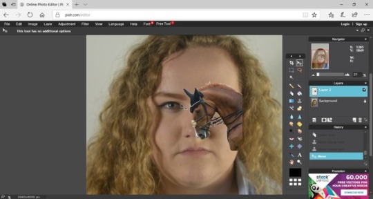
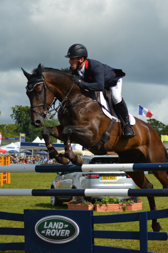
Final Edit 3:
For my third edit I wanted to show a more raged and tore image, the line of the image together being more raged and more like a erupting and caught in the moment emergence from the background image. This allowed me to be more loose with my editing and gives the impression of the face consuming the background instead of it just sitting in the centre of the horses face. The image itself is well lit by the natural sunset lighting in the background image and I chose to make the subject of the girl slightly darker in order to improve the shadowing and make it almost over power the background area that it is close to or covering. I think that due to the background and the girl being quiet dark, I think the sunlight in the image adds to the overall feel of the image. I choose to edit out the colour at the top of the image, as I believed it was distracting from the image and didn’t work with the composition of the image. The expression on the face of the girl links well with the rest of the edits as it gives off a very harsh and determined expression, we are who we are and the way we chose to express ourselves is key in the society we live in now. Hobbies are generally looked down upon if they aren’t the modern and all the range type of activities and allow for people to be judged on what they enjoy. This expression shows a running tolerance of opinions and gives a strength to the subject as she emerges from her hobby.
0 notes
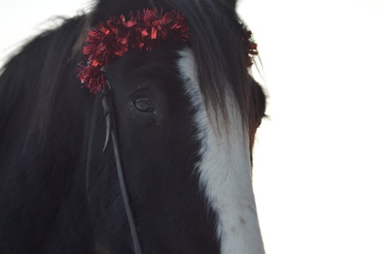
Photo

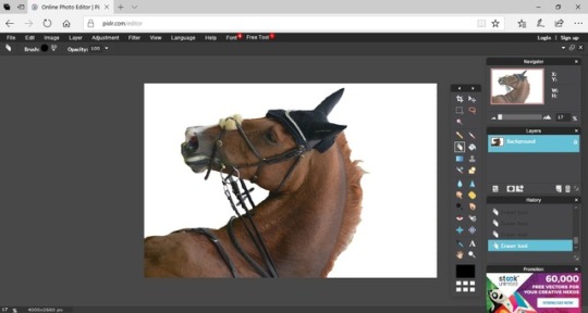
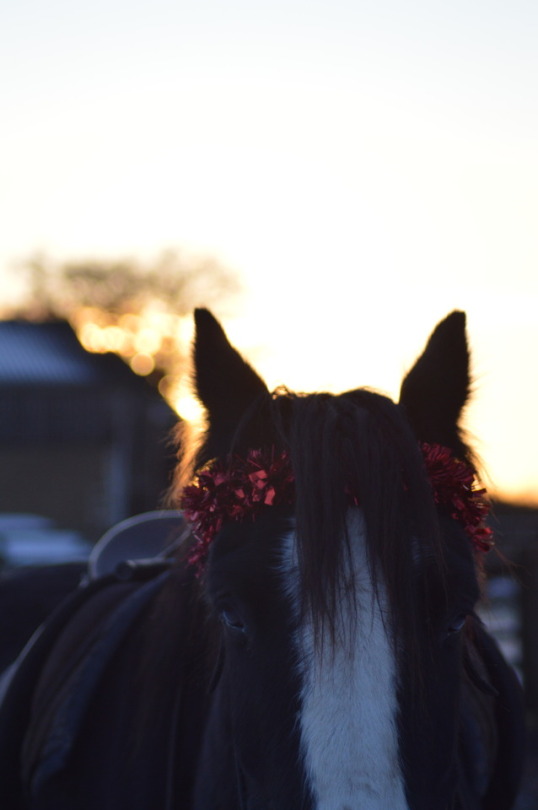
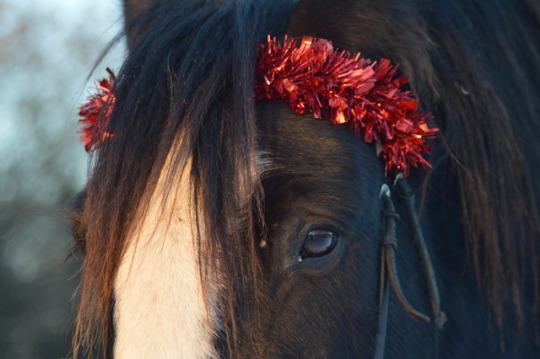
Final Edit 2:
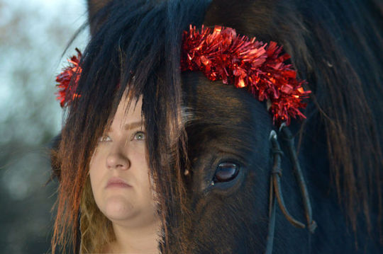
For this image I wanted to play with the angels more then I had with my two previous edits, I wanted to look at how the light effected the image and almost highlighted certain areas to the viewer. In this image I think that the lighting highlights the emergence of the face from the front of the horse, the sunset lighting being head on to the image and bringing and almost fire like colour to the horses forelock, adds to the image and shapes the face of the subject emerging. I also like how the hair of the subject merges with the forelock of the horse and allows for the image to become stronger and more well rounded within itself and within my project. The fact that the expressions on both of the subject doesn’t a line and express almost contrasting emotions is key in this picture. The horse as the back ground image has a gentle, kind and relaxed expression, going hand in hand with a horse and it’s temperament. While the subject emerging from the picture has a more determined, harsh and limited expression. The expression on the girls face is key with the idea of us emerging out of what we like to do, how our identity is shaped and the emotions we go through when explaining our hobbies or having some critics them. This along with the lighting and the red at the top of the image creates a very harsh and determined distortion. The red colouring of the image symbolises danger or strength and I feel like this is what the image generally sums up due to the contrasting expressions. I chose to leave in a section of the white markings of the horses face in order to show the emerging for the face at abetter angel, the fact that the marking above the horses eye is white and disappears behind the forelock to emerge the other side as a face, I believe is interesting and gives another layer to the image.
I believe the use of angels has moved my project forward and given it another side that was not thought of before, although I am not totally happy with the sitting of the image on top of the background, this has helped with my editing for the future and the rest of the project.
0 notes
Photo
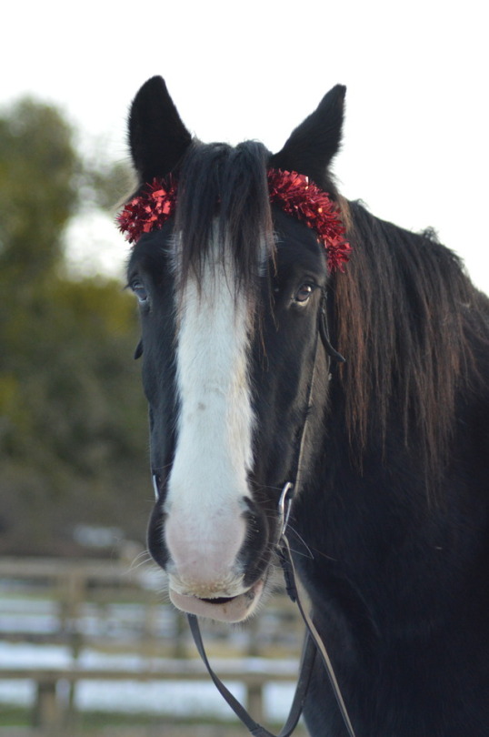
Final Edit 1:
For this image I wanted the focus to fall on both sections of the image, the clear and stand out colours and textures of the equine photo compliment the simple and slightly out of focus head shot. I like how the subject is slightly out of focus as if she is emerging out of the image, coming through the equine photo and she is still slightly covered by the strength of the equine photo. It allows for the hobby in the photo to hold the main focus while still allowing the subject to come through in a subtle way. I decided to edit my subject into the white area on the horses face in order to create a natural feel, the replacement of the white area, takes up the normal bare and vast area in the photo, and allows for the subject to come through in a broken and fracture shape instead of being out and straight in our view. This gives the image some individuality and flips the idea of Chevrier on it’s head by having the subject hiding the true person. I believe the composition of the image is good, I enjoy how the image leads off into the background and isn’t just solely focused on the subjects and allows for the viewer to take in a more well rounded image instead of just focusing on the one thing. This also brings me on to how the images line up with each other on a downwards angel, I think the way the eyes line up in the image is interesting, it’s almost like the two subjects were photographed at the same time and stood in the same place and yet they are from totally different scenes. To develop this further I want to play with angels and allow for the light in the images to play a factor in what I end up with and later achieve.
0 notes
Photo
Scanning in Film:
First you need to load the software on to the computer
Select the type of scanning that you need (commonly copy or photographic)
When using the scanner you first have to remove the white protective sheet.
The place your film in its appropriate holder on to the glass and close the lid.
you then need to select the type of film you are scanning - Negative (C41) or Positive (E6, slide film)
You then need to select your colour mode - Colour or greyscale
Selecting the films resolution is key: the image will be scanned as 100% of its size, therefore they must be scanned in a large resolution. Normal images 1200 dpi and if only one image is wanted at a good quality(large print) is useful.
Make sure the files are saved as TIFF files.
Choose a destination for your images and then allow for the canner to show you a preview of the images.
Once the preview is up, you can change the colour ( use the histogram for a better grip on the changes) and the contrast. Once you are happy with the changes you can scan the images you want from the rows and they will appear in your designated file.
0 notes
Text
Reflection So Far:
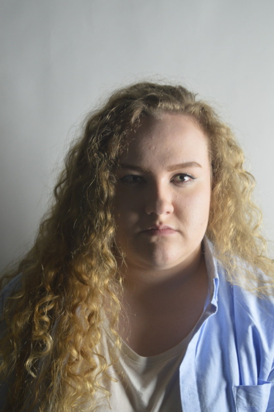
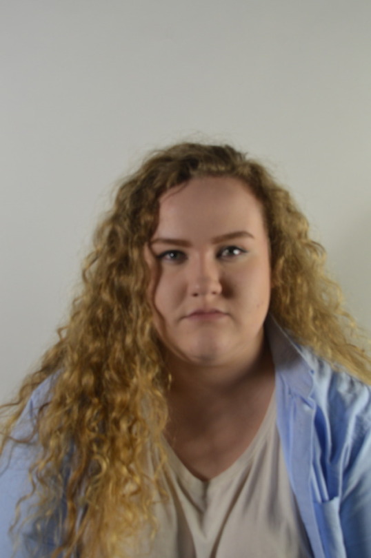
My images so far have demonstrated a way of hiding a persons emotion and showing their identity through overlapping their expression with their favourite hobby or past time. I used my subjects most treasured hobby in order to tell us about her, when looking at her you wouldn’t fist jump to the fact that she rides horses and I wanted to play on the unexpected hobby for my images.
However, moving forward I want to use the shape and detailing of the horse to distort the image further, maybe using the human subject to distort the animal subject to show her coming through and stepping out of her subject to reveal her personality.
0 notes
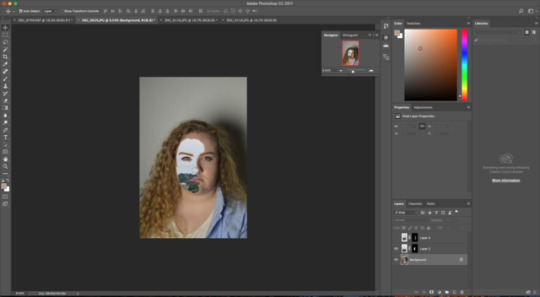
Photo
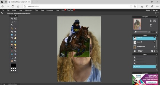
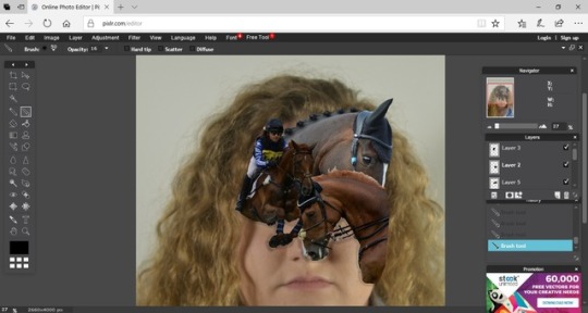
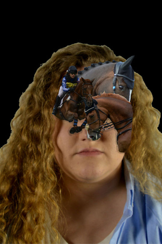
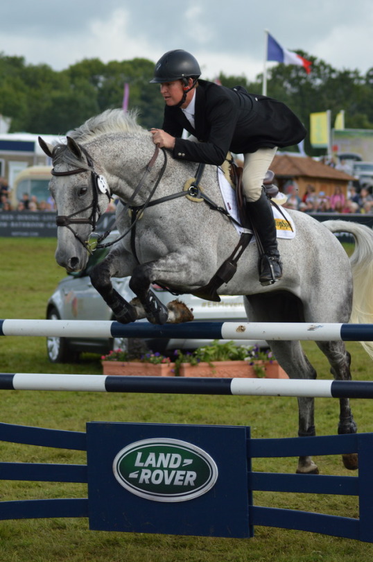
After looking at Sandra Chevrier’s work, I played with the idea of using the key personality trait or hobby of my subject to cover key areas of the face and create an also most mask like shape, similar to her work in order to demonstrate something about my subject. I wanted to remove the eyes of my subject as many people call this ‘the window to the soul’, we can tell a lot about a person from their eyes and I want to remove any key emotion from the image and allow for assumption to be made purely from the posture and the lower section of the face. However, I don’t believe this is the strongest way of portraying my ideas and feel that the idea could be developed and changed in order to create a more well rounded image.
The image itself was created by using the eraser tool to erase out the unneeded areas of the image, such as grass areas, grand stands and jumps in which did not have a place on the final image. Once the image were placed on the background image, I used the area of the face to position the new layers in a interesting and yet covering way (the new layers were made from old photos that I believed fitted my idea well).
I then brought the brightness down on the new images in order for them to give a full and effective mask appeal to the image. the background was changed into black in order to draw the attention to the subject and the distortion.
0 notes
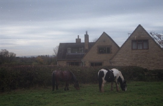
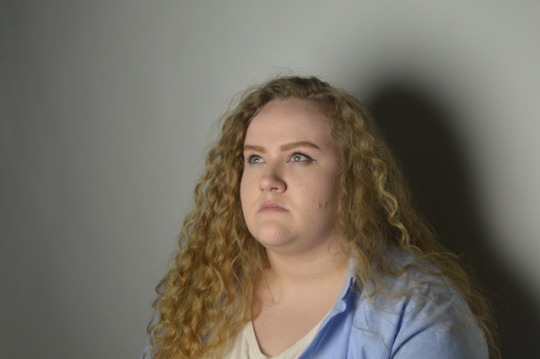
Photo
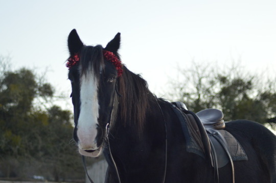
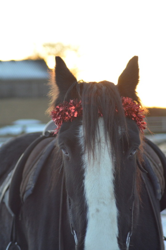
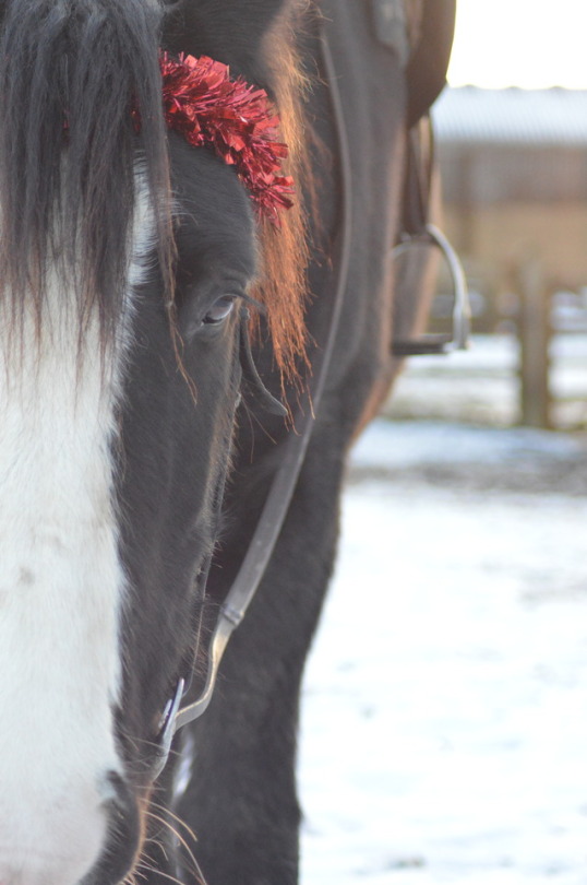
A range of photos taken from a shoot done in order to develop on my idea and use as a more current and up to date group of photographs.
0 notes
Photo
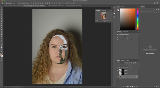
In photo shop I began looking at how to cover areas of the face, how i can use other images to edit the face and zoning in on areas in which hold the most detail and identity with the subject.
I used the quick selection tool and allowed for it to chose the area in which i wanted to cover, this allowed for large and precise areas to be covered and allowed for an even coverage with new and interesting edges that gave the idea of the mask being part of the skin and face due to the constant wearing and manipulating of the area.
0 notes
Photo
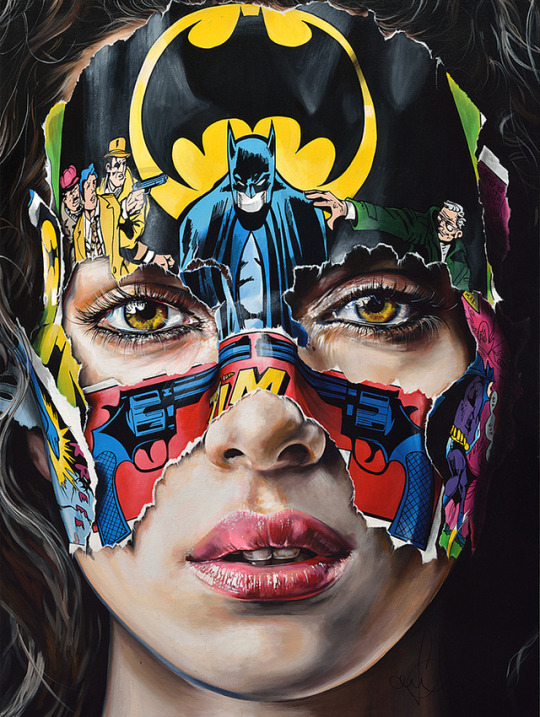

Sandra Chevrier
Chevrier creates a range of portraits (paintings) that focus on a women staring directly out at the viewer, with normal relaxed or dynamic facial expressions which compliment the story in which the image is portraying. She adds the idea of a superhero mask, compiled of a range of comic strips normally containing Superman or Batman to conceal the woman’s face. This allows her to play with scenes that focus on the hero at their weakest point and allows for her display the vulnerability that lies below the heroic acts.
1. 2017 Collection: Les Cages: L’espace entre les barreaux (Cages: The space between the bars): This image clearly demonstrates the loo and feel that Chevrier was aiming for, the positioning of the comic strip allows for vulnerability to come through and the emotions of the women beneath. The defeated and downcast expression of Batman at the top of the nose allows for the focus of the image to centre around the eyes and the central parts of the masks, this is effective as this is where the majority of the detail is in the image. By having us focus in on this section allows for the viewer to directly make eye contact with the image and also become consumed by the gaze of the woman. We in turn begin to question the identity of the women and the reason she was used to demonstrate this dynamic mask. The colours in the image stand out against the darker background and almost demonstrates the scene in the movies when the hero steps out of the shadows, before they save the day; the main focus falling on the bright colours as the emerge from the image.
2. La Cage et les traces du passé (The Cage and traces of the past): When looking at this image, i became fond of the fact that the colour and detail has been added into the most looked over and sometimes forgotten about sections of the image. The wrapping of the ears in comic strip and the blue and red highlights in the hair give anther depth to the image and engage far more then if they had been left blank. The fact that the whole of the face is covered instead of just covering the area around the eyes (where the typical superhero mask covers) by doing this it truly allows for the identity of the women to be hidden and for the comic strip to consume her expression completely by covering up her eyes. The fact that the main body of the image (Woman’s face that shows and background) is in black and white allows for the mask to act as the embodiment of what the wearer wants to be seen as and show to the audience, the attention is taken away from the actual features and allows for the mask to take centre stage.
Refrencing:
Chevrier, S. [N/D]: Online, ‘Hand Painted Cages’. https://www.sandrachevrier.com/ [Accessed 13/12/17]
Chevrier, S. [N/D]: Online, ‘2017 collection’ https://www.sandrachevrier.com/ [Accessed 13/10/17]
0 notes
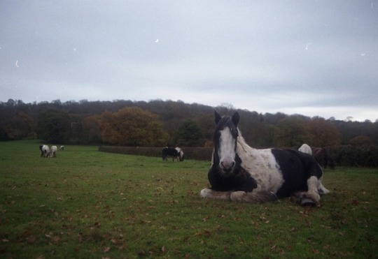
Photo

This shoot allowed for me to play with lighting and angles, by doing this I was able to look at the fact that the angles that focused with a head on shot allowed for me to gain the right light and area to be able to build the mask on while allowing for the images to still show the vulnerability I was aiming for in mirroring Sanda Chevrier’s work
0 notes
Photo
Making a Gif:
First we need to upload all our images into separate layers, you can do this by opening them all in Photoshop and the creating a new file and organising them into the order in which you want (Layer 1 = first image in sequence, layer 4 = last image in the sequence). The simply way to do this is to select Layer Stack and select the images you want in the order that you want them in.
In order to create the animation you need to go to Window - Timeline. This will open at the base of the screen and will be completely empty.
In order to create the animation, you need to click in the animation box and select create frame animation.
Once you have done this only the first layer will have been used to create a frame, in order to use the rest of your layers, you need to go to the right hand side of the timeline box and click Make Frames from Layers.
Now all of the frames are there, each will have a drop down box allowing you to select the length of time in which it is shown for, you can also play with the order and preview the gif by clicking the play button at the base of the timeline box.
In order to save your gif, you will need to head to the Save for the Web section. Now you can change the gif to run on a loop and the image size to make it easier to save and distribute later on.
0 notes
Photo
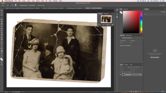
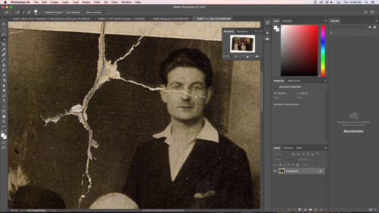
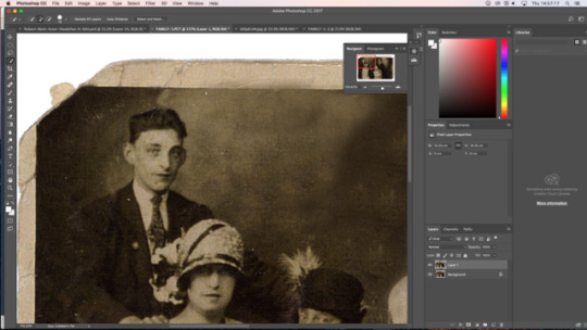
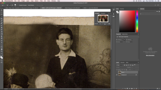
Retouching Old Images:
When editing this image the first thing I did was straighten the image out, so the image itself was easier to work with and manoeuvre. (image > rotate canvas > arbitrary)
I the saved the image in my folder again allowing for my original image to stay safe and away form any major editing that takes place during this time. (make sure it is saved under a new name)
There will be some marks on the photograph that can be removed now, we do this by using the dust and scratches filter but it is better to apply this to only small areas at a time (with a feathered edge) to allow for the definition to not be lost.
You can then build up the missing parts of the image with the clone stamp, making sure not to repeat the same area and create a pattern
Use the healing brush top repair small marks in the image.
Once happy with the repairs use the sepia effect to tone the image (image > adjust > colour balance)
Finally sharpen the image ( filter > sharpen > unsharpmask)
0 notes
Photo
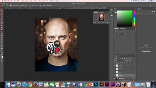
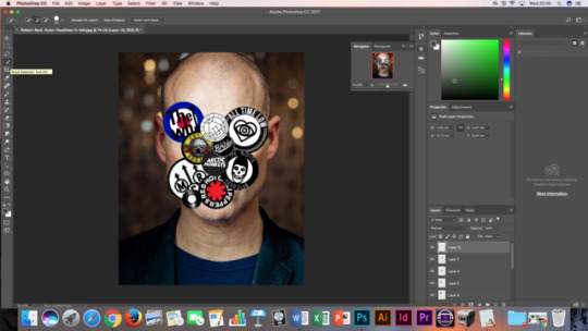
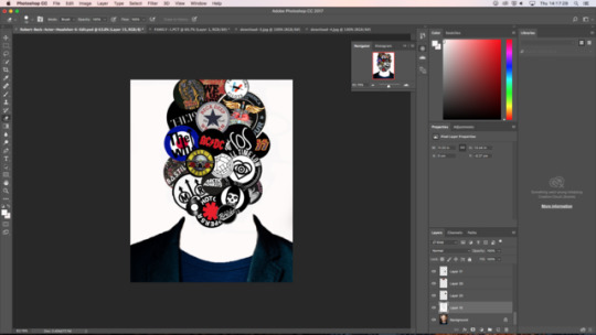
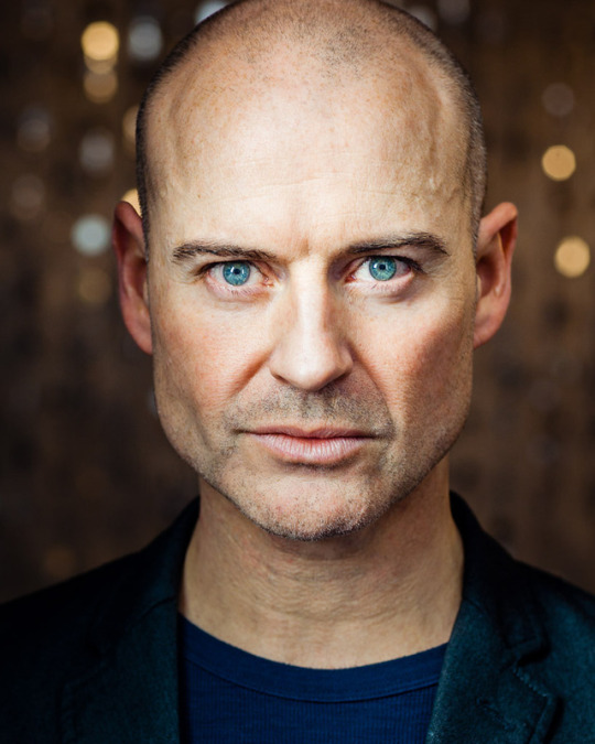
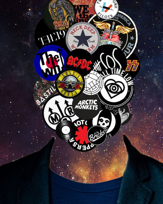
When editing this stock image, i wanted to remove the whole face in order to completely change the idea of identity within the subject. By doing this I wanted to use common and found stock images to present the identity in a different way. But after consideration, I believe it would be more effective to cover only sections of the face, allow for the eyes or mouth etc to be seen in order to still be able to compare and show the identity of the subject and how they feel.
Refrencing:
IMDb, [N/D]: Online’ ‘Robert Beck stock image’ http://www.imdb.com/name/nm0065266/ [Accessed 26/10/17]
0 notes
Photo
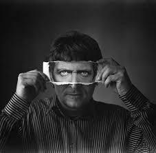
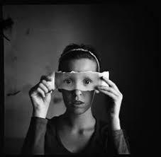
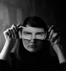
Mihaela Ivanova:
By looking at Mihaela Ivanova’s work it allowed me to study more physical manipulations of the photo. Her work is interesting as she piece’s together different face through her physical manipulation, creating an almost illusion like view to her subject’s faces and almost revealing the true self below the persona in which we display on a day to day basis.
Her use of paper and mirror, in order to create her manipulations; allows for a almost simplistic change while still having an in-depth interpretation. the idea that we are different on the inside to what we show on the outside, becomes clear in her work as she tackles the way in which different people choose to present themselves to the wider public.
Refrencing:
Ivanova, M. [N/D]: Online, ‘Mihaela Ivanova Photography’ http://mihaelaivanova.com/ [Accessed 26/10/17]
0 notes
Photo
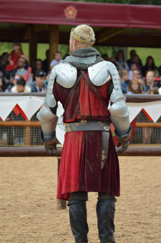
For this image, I wanted to keep the image simple wanted to play around with a more simple way of distorting the image. This would allow me to have a wider range of ideas when it comes to my own images.
Using the Liquify tool, I manipulated the background to give the main focus of the image to the actor. By doing this it allowed me to look at how the background of the image can be manipulated without the need of removing it. This tool also allowed me to look at how different manipulations can effect images, the liquefied background could be seen to represent how the actor s’s the world around him during his high energy and speed jousting performance.
If I was going to do this photo again, I would make sure not to catch any of the main subject in the tool as not to take away from the image in anyway by merging the back ground and the subject together.
0 notes
Photo
In order to create this image, I used the quick selection tool on Photoshop. This allowed me to easily and effectively cut around my subject and remove it from it’s busy and distracting background. By doing this it allowed me to experiment with distorting the image without having to distort the main image. Photographers such as Mark Beaumont, use this technique of isolating the subject in order to create sharp, dynamic images. I desaturated the image in order to distort the image away from it’s normal bright colouring and give it a different feel to normal.
However, after re-evaluating the image, it seems that the subject looks slightly out of place on the back drop. In future edits the lighting and shadows of the new image need to be address in order to create a more well rounded image, by improving the way it sits on the background.
0 notes
Photo
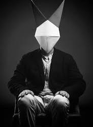
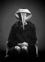
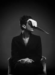
Giacomo Favilla:
When looking at Giacomo Favilla’s photography, her dynamic, precise and detailed images are a prime example of how distortion can effect the identity of the subject.
Her black and white highlight the simple sections of her subjects and her intense shadows allow for her vivid detail and ideas to come through in her images. The simple and reserved positioning of her models allows for a simple but elegant image to be produced, and yet each image has its own identity coming through the models used. Even though the faces of the models are removed from the image, the identity of each person comes through due to how they are sat, the rabbit head (Top Left) has a more relaxed, straightforward pose compared to the two other images in which a have a more professional and yet effortless posses held by the two women.
The three images below use a more physical form of manipulation after the original image has been taken. The use of different textures and similar colouring to each image allows for a sophisticated approach. The use of manipulation in covering more then just the face allows for even more to be left for the viewer to decide, the similar clothing and faceless body enables for the identity to be built from the unknown and devised simply on what we think rather then what we are shown.
I hope to take on board her use of portraits in order to create a dynamic and detailed image while manipulating the face in my own way while still keeping in mind her use of colour and light in the images.
Refrencing:
Faville, G. [N/D]: Online, ‘Giacomo Faville Photography’ http://www.giacomofavilla.com/ [Accessed 25/10/17]
0 notes