
charlottejacksonfineart
Charlotte Jackson Fine Art
322 posts
Don't wanna be here? Send us removal request.
Last Seen Blogs
amaya-sims
yes i changed her name

shoutp
you can call me aboba

arkhet
Aiden Hornung
alt-music-moods
Alternative/Indie/Grunge/Emo Music Moodboards

mycosevulvaire-blog
mycose vulvaire
Text

JOAN WATTS | ZAZEN
May 31 - June 29, 2024
Opening Reception for the Artist: Friday, May 31, 5-7 PM
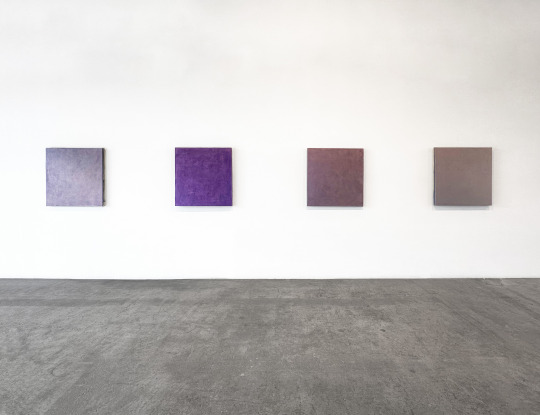
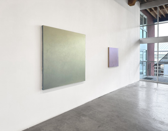
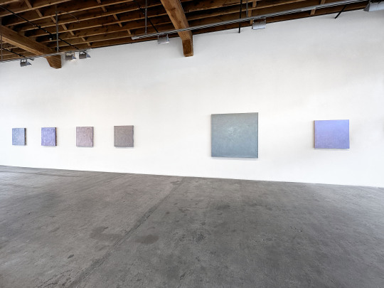
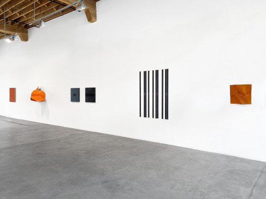
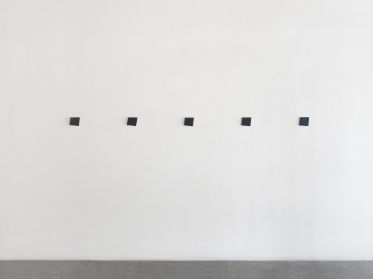
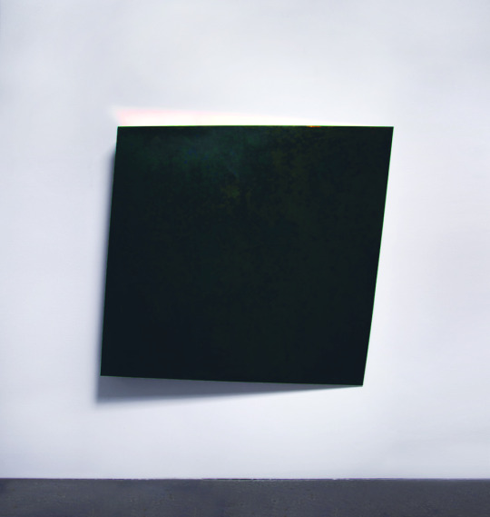
These colors reach into you. Pierce the sternum, fill the solar plexus, root in the gut. Jewel-toned maroon, shadowed forest green, cool wet slate, warm turned earth, heart-of-iris purple, deepest navy sky: these rich and saturated colors anchor and ground the bottom halves of a series of square-format paintings. Rising from these fertile beds of redolent color blooms a collection of pale contrasting tones: petal yellow, sage green, fog, and topaz, palest aquamarine.
The series of paintings by Joan Watts, Zazen, included in this eponymous exhibition was featured in an exhibition in Wiesbaden, Germany at Galerie Ulrike Buschlinger in the late 1990’s and has never before been shown in the United States.
There are so many ways to approach the series: the pared down visual vocabulary; the square format; the minimal colors. The tonality of those colors and the intricate and painstaking layers of paint used to create the complex and yet simple surfaces. The soft white horizontal line created by grouping several of the individual paintings together. Each viewpoint reveals a facet of these works. But the viewer must go further, and ultimately inward, to join these facets together and see the series holistically.
While it is tempting to see horizons – with the paintings’ darker toned bottom halves rising to light colors above, the title of the series and familiarity with the work of Joan Watts (as well as the square format) suggest another direction altogether. By the late 90’s, Watts had been studying Buddhism for about a decade and by that time the practice had thoroughly shifted and influenced her artistic process. These pieces, as the title suggests, focus particularly on the primary, essential practice of Buddhism: zazen, or sitting meditation. So rather than landscapes, these pieces move the viewer from macrocosm to microcosm, from outward to inward, from distance to closeness.
With this perspective, the squareness accentuates a sense of balance – the feeling of solidity that might come from sitting still upon the earth. The darker tones and colors: body. The lighter colors: mind. Moving through the gallery, piece to piece, that initial impression of the colors rooting down into the gut makes sense. Moving between the darker and lighter halves we begin to intuit a common paradox of Buddhist theory and practice – the simultaneous coexistence of discipline and freedom, of being and nothingness, of solidity and intangibility, of structure and fluidity. Like other Buddhist art forms, Watt’s work exemplifies this dichotomy through a balancing of the qualities of precision and structure with a flowing and intuitive expression.
Now we can stand (or sit) with Watt’s paintings and experience them on their own ground. Root our feet. Take a breath. Aha! We can feel how that mysterious white line, balancing between dark and light, negotiating between dense and diaphanous, might just be breath, the joining of inside and outside. We can walk from piece to piece and feel how each individual painting shows the slightly different experience of Zazen. One day thoughts lead one way. Another day, memories arise. Yet another come emotions of sadness or joy. Another paradox. While the practice remains the same: sit, breathe – the experience is always a slightly different color.
In this way the small works on paper add one additional element to the whole. These tiny pieces feel like fragments, glimpses, bits of thought or imagery. They show glowing lines, fragments of larger layers and geometries. Taken in the context of the whole, of this experiential exhibition of Zazen – these little pieces appear like the bits of thought that can arise during meditation: the fragments of an idea or memory, the flicker of a color or feeling.
Take time here with Zazen. Breathe with each piece. Allow them to guide you.
- Michaela Kahn, Ph.D.
Zazen - Selection of 10, 1995, oil on canvas, 26 x 26 inches each
0 notes
Text

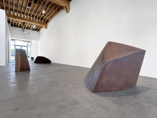
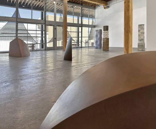
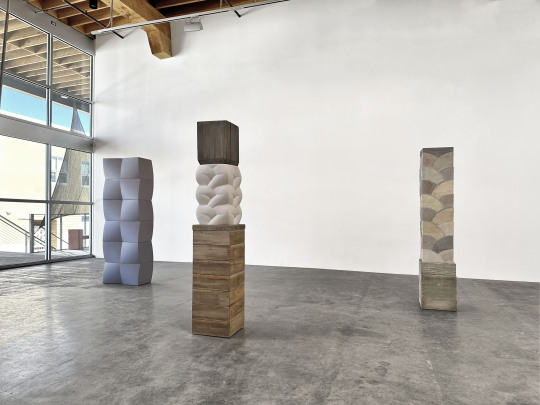
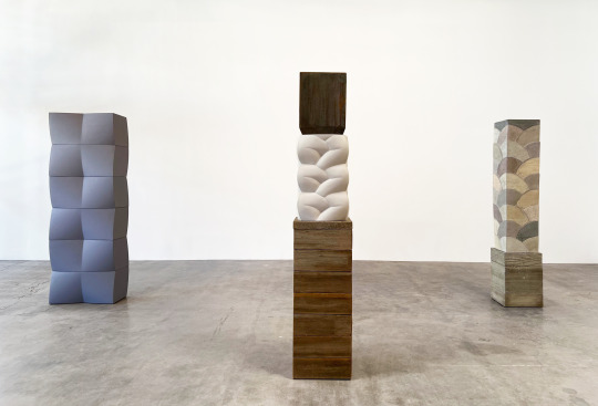

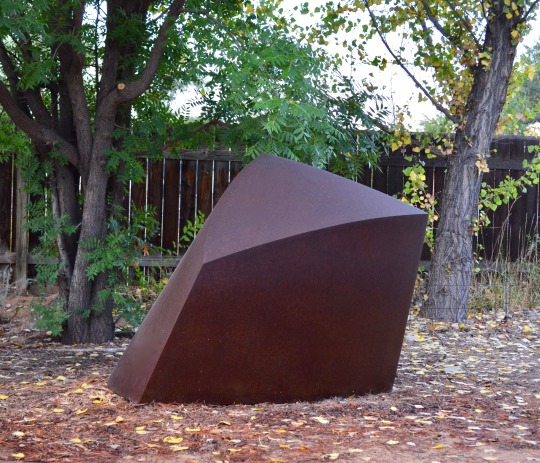
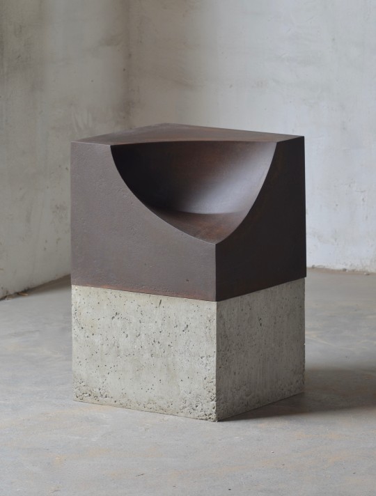
Tom Waldron: Steel and Concrete
April 26 - May 25, 2024
0 notes
Text
Tom Waldron: Steel and Concrete
April 26 - May 25, 2024
Opening Reception for the Artist: Friday, April 26, 5 - 7 PM
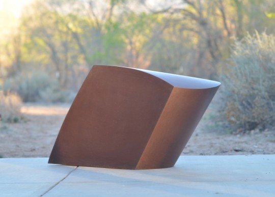
The eye follows a smooth plane, curving gently in pitch, slope on slope, sweeping to meet and create a line. A deep rust form tilts, leaning, forming a deeply shadowed side. A sharp, faceted arc sweeps to a point. Softly interwoven curves braid together in a column. A round oxidized shape seems to fold up on itself, caught in a moment just before it sprouts wings.
It is a trick of sculpture to put us squarely into the here and now. Mass. Volume. Weight. Sculptures inhabit space with us and we with them. They alter the air’s flow through a room. They radiate their own minute gravity. Fully art object, whether molded or cast, carved or welded, sculptures remind us that our world is multi-dimensional – not solely existing in the 2D hybrid mind/light no-space of our screens.
Tom Waldron’s work not only brings us to attention but challenges our perceptions with its deceptively simple forms. It is likely no surprise that Waldron’s entrance into artmaking was spurred by his love of the materiality and physicality of the process. The challenge and intense focus required of welding, it’s possibilities and generative power led Waldron to leave his studies in architecture to pursue sculpture.
Steel and Concrete brings together a disparate collection of Waldron’s work in different mediums. While he is best known for his steel pieces, this show also incorporates works in concrete, a dense gypsum plaster (Hydro-stone), and even in wood. The concrete and wood pieces have evolved slowly in relationship to the steel works. First, as simply materials for pedestals and bases. However, over time, sometimes the line between sculpture and pedestal would blur. Later, Waldron began to take some of the curved cardboard constructions that he creates as models for his steel works and use them as molds to cast concrete or hydro-stone pieces. In this format, Waldron saw the possibilities of using them like modules. Using wood allowed Waldron to explore wall-mounted work because of its lighter weight – but the medium also allowed him freedom to alter and find forms not possible in steel.
The pieces in Steel and Concrete, in each medium exemplify these different properties and effects – the steel pieces with their gently curved volumetric masses tend to encapsulate or bloom into space. Sledge, at over eight feet,and Agave, at five,seem like massive geometric creatures frozen in a moment of twisting growth. Ledge 2 tricks the eye into seeing a rectangular block from one angle – which then bulges and puckers from another. Mounted on a concrete base, Spoonful, inverts Waldron’s more familiar convex curves with a smooth concave scoop out of the sharp-edged steel square.
The concrete pieces included in the exhibition are all columnar – composed of regular interlocking shapes and modules which showcase the motion of uprising lift and rhythm. Shadow Column includes both a wood base and cap which contain a smooth, white, braided sculpture of hydro-stone within. Fan Column, on its wood plinth, is a complex composition of interlocking arced forms in alternating muted colors. His most recent piece, Six Color Column is comprised of gently curved blocks fitted together to create an undulating tower.
Finally, the wood piece, White Cloud 3, explores the same fascination with curved planes and elegantly intersecting lines as Waldron’s steel works – but makes good use of its lighter weight to create a more delicate shape that seems to sail out abstractly from the wall.
Step by step, each sculpture of Steel and Concrete leads the viewer through an experience, from objective observation through to subjective co-existence. Frozen curves intimate at the gentle slowing down of time. (We pause. We notice.) The density of the large steel works grounds our feet into the floor. (We find balance in space as they balance so elegantly in their twisted curved forms.) And the columns, rising slenderly toward human height, feel like fellow beings. (We stand with them, being.)
0 notes
Text
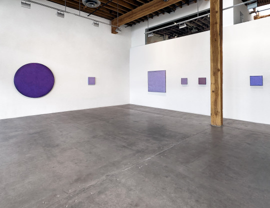
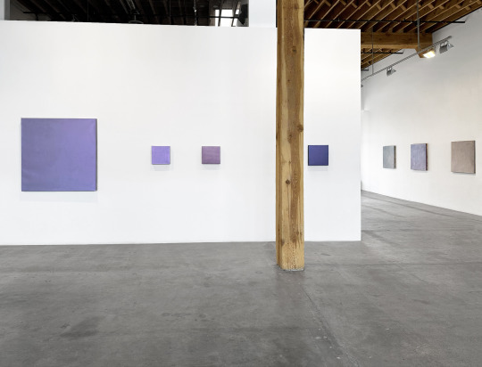
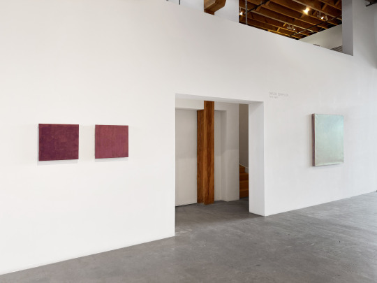
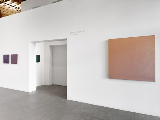
David Simpson: First Light
January 26 - February 29, 2024
0 notes
Text
David Simpson: First Light
January 26 - February 29, 2024
Opening Reception: Friday, January 26th, 5 - 7PM
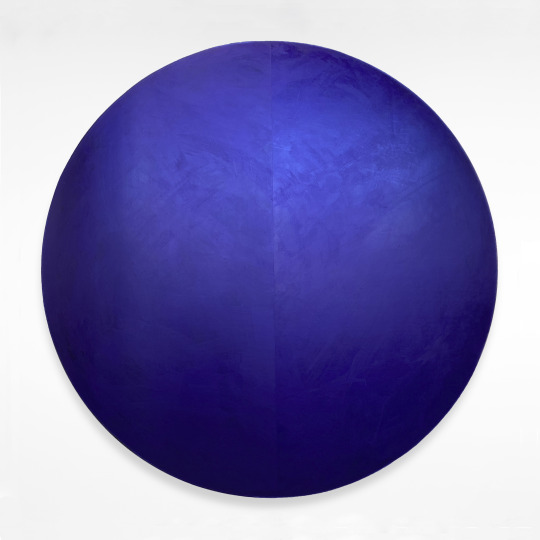
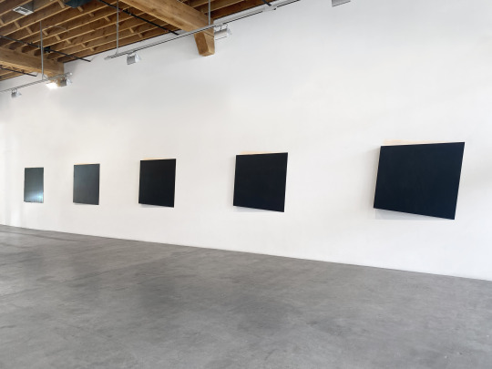
There is something inside the viewer that leaps in response to David Simpson’s paintings, a feeling that rises, draws a deep ah of breath, and becomes entranced, enmeshed in the orbit of each piece. These works have a kind of gravity – like small suns or worlds. They seamlessly pull the viewer to move, shift, to seek out the possibilities of light and color that transform across their canvases. This layered depth, this endless rippling change, gives a clue to explain why it is not only that jolt surprise of beauty that calls to us. These pieces feel alive.
The work included in First Light presents a survey of Simpson’s famous interference paintings from the past 30 years. Using a unique method of combining acrylic pigment with interference paints containing micro-particles of iridescent mica – Simpson painstakingly applies layer upon layer upon layer of translucent paint to the canvas. The painted surface becomes a three-dimensional space where light enters and has room to move – shimmering, reflecting, and refracting off these interference particles. It is this depth and chance interaction of light and particle that causes the signature color shifts that Simpson’s work is known for.
Each piece is a revelation – from the subtle to the radical. A piece like La Belle Bleu can shift from a shining, icy, saturated blue to a flat, pewter-heavy violet with a move from left to right. The intricately textured golden surface of Small Favor ignites into champagne pink and then deepens into frosted lilac. The deeply intense violet blue of Dark Violet Tondo glows as if with some kind of internal fire or bioluminescence, both arresting and calming.
Changes in viewpoint are not the only ways that these pieces can shift. The quality, color, and intensity of the light itself will cause changes in the paintings. Natural light or gallery light, a sunny day versus a cloudy one, the declination of the sun in summer or winter, these can cause a bright blue painting to become deep purple, or a red-shift in a copper one.
Which brings us back to that sense of these pieces being alive, unpredictable, and even mysterious. Like the show’s title, First Light, there is an analogy to these works in the beauty of a sunrise. Not only does it elicit that same kind of shock-of-joy-in-beauty, but no two are ever exactly the same. The light shifts. Clouds roll through. The sun ranges across the horizon. Trees grow. Mountains wear away. And the self seeing these sights is different from one day to the next.
Art is primarily a static medium: beauty (or terror) is caught up in paint or plaster, arrested in a singular moment to be experienced. What Simpson’s interference paintings do is to infuse the unknowable, transience, variation, changeability, to what at first appears fixed. Something of nature, a living element, shines through in these pieces. Never the same. Always beautiful.
- Michaela Kahn, Ph.D.
0 notes
Text
Conversations: A Group Exhibition
December 15, 2023 - January 20, 2024
0 notes
Text


Fall Crush: A Group Exhibition
November 10 - December 9, 2023
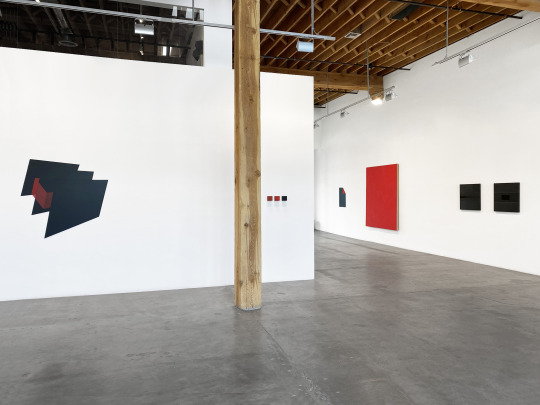
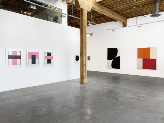
#charlotte jackson fine art#contemporary art#group exhibition#Phil Sims#Jeremy Thomas#Max Cole#Michael Rouillard#Peter Weber#Clark Walding#Michael Post#William Metcalf#Liane Nouri#Constance DeJong#Helen Pashgian#John Beech
2 notes
·
View notes
Text


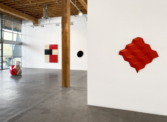
Constance DeJong: SEQUENCE
October 6 - November 4, 2023
0 notes
Text
Constance DeJong | SEQUENCE
October 6 - November 4, 2023
Opening Reception for the Artist
Friday, October 6, 5-7 PM
When you open the door and enter the gallery – pause. Close your eyes, feel your feet on the floor (concrete), sense the space around you with your other senses (ears, skin, proprioception). Take a breath so that you can feel your own three-dimensional self in the three-dimensional space.
Now… open your eyes and let Constance DeJong take you, step by step, view by view, on a journey.
Each piece in the new exhibition SEQUENCE has been curated carefully, placed, and organized to provide an experience that explores human perception. The exhibition invites the viewer in the gallery to engage with DeJong’s art in a particular sequence, an experiential voyage of small and large differences, of revelations and puzzles, of centering and flight, and to notice their own noticing along the way.
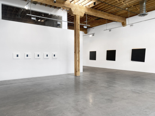
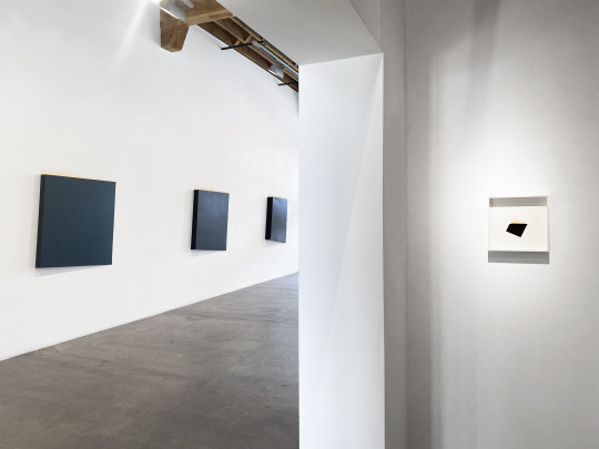
The viewer is first guided between two sets of square metal wall sculptures. Along the left are the large, 4-foot squares of copper – chemically patinaed deep, roiling black on the surface, each with a progressively (and mathematically proportionate) larger fold that allows the viewer to see the wall-glowing, fire-like shine of the copper verso. The fold levers the piece from 1 inch to 5 inches from the wall, canting the square respectively. The progression allows the viewer to notice the very subtle shifts of the folded pieces. Once noticing the shifts, the viewer can then take note of how those shifts affect their response, their experience of the piece.
On the opposing wall are tiny 4-inch versions of the metal pieces, formed to the same specifications. The counterpoint of the large and small pieces in line across from each other highlights the very different responses that the human body has to large format and small format works. The large Squares, with their painterly, tactile, and mysterious black surfaces, elicit a feeling of falling into. They tug at something in the solar plexus, pulling us into their dark and brooding depths, while distractions, tangled thoughts, concerns, die away, left behind as we settle quite fully into a state of presence with the work. A profound sort of quiet takes over here. In contrast, the small squares spark something bright and happy under the breastbone. These small pieces focus our attention in a gentle, glancing way.
As the viewer moves into the larger gallery space, the eye is drawn to two black metal wall-mounted columns. They are identical – with an irregular shape. By mounting the two pieces near each other, the viewer is given the opportunity to see both sides of the piece at the same time. Whereas normally one would need to work round each side to view the differences in the forms – here the identical companion piece shows the viewer what they can expect on the far side. It’s a bit like magic and highlights another aspect of human perception. Whereas the first set of pieces contrasted scale and illuminated the subtle shifts of angle – this installation allows the viewer to explore the ideas of three dimensional space, of back and front, of the limitations of our sight.
Finally, the viewer comes to a series of new drawings from a series titled Score. These exquisite puzzles demand the viewer lean in close to examine their intricate lines and shapes. The complex drawings are “generated” using the principles of the Golden Mean. Once DeJong has made her first set of lines – the rest of the piece unfolds from this starting point according to mathematical principles. The drawings are, in some ways, like a microcosm of the exhibition at large. While the installation of the exhibition was created to draw the viewer in through a series of shifts in perception – the drawings themselves do this same work on the small scale. They draw the viewer’s eye through a sequence of moves and shapes as the puzzle progresses and becomes both more complex and more comprehended as the viewer goes.
In the end, the exhibition as a whole does what DeJong’s work, piece by piece, is always so good at doing: it assists the viewer in landing firmly in the present moment. Distractions fall away. With their dark depths and bright flares of light, the pieces vibrate with a kind of presence that translates itself into the viewer. The viewer is lured, step by step, into a state of quiet concentration. We stay with the work, in the work. Solid. Grounded. Here. Now.
- Michaela Kahn, Ph.D.
1 note
·
View note
Text
Robert Kelly: The Pearl Diver and Other Stories
September 1 - 30, 2023
0 notes
Text

ROBERT KELLY | THE PEARL DIVER AND OTHER STORIES
New Paintings
September 1 - 30, 2023
Opening Reception for the Artist: Friday, September 1, 5-7 PM
There are stories everywhere. The story of the artist. The story of the magpie. The story of the stone on the beach. The story of the painting. The story of the goddess. The story of the buried city. The story of the sun-bleached bone. And our own story – which itself is really the weave of a thousand thousand stories, flaring out, radiating around us, brushing up against the other stories of the world.
But often enough, we don’t hear them, don’t notice. Get tangled in noise, lose the thread. This is when sometimes the world reaches out to us, offering a spark, a reminder. It might be a crow landing at your feet. It might be a particular stone on a beach.
It might be a painting: Aging paper, layered, overlaid, ghosted with images and text; cut, covered, framed and highlighted by thick, sensuous black geometric forms. Through the yellowed layers, a strangely winged figure emerges. Around him, half-revealed, half-concealed by those black forms, strange shapes and unknowable words.
This is The Pearl Diver, one of the pieces included in the eponymous exhibition, The Pearl Diver and Other Stories which brings Santa Fe native, Robert Kelly, back to New Mexico with his first exhibition here since 2012. This exhibition includes works from several different themed series (Mimesis, Tales of Lakshmi, Boneyard, Nocturne, El Senor, and Ash to Ash) though all of these are created with Kelly’s unique process.
This starts with a canvas surfaced, layer by layer, with up to 30 strata of paper, coated and affixed with a viscous polymer, gridded at right angles, and then overlaid with the special old, archival papers that Kelly finds and collects on his travels. These papers can be old movie posters, advertisements, handbills, newsletters, placards, announcements. Often, they are printed with text in a variety of languages. These papers are always faced backward so that their surface is facing toward the verso. This, as Kelly says, is “history looking back on itself, like Vermeer painting himself, painting the woman in the window.” Finally, the piece is glazed with an oil-based medium, and then it is ready for Kelly’s oil painting of forms. The geometric forms themselves are exquisitely precise. Balanced tonally with the faded paper surfaces and yet completely integrated and responsive to the complex patterns that have been gridded and aligned beneath. There is an intricate dialogue at work between the forms and the layers, between past and present.
Metaphors abound: History’s enigma. Time’s cipher. Collage. Archeology. Palimpsests. Ghosts. Phantom limbs. The strata of a cliff-face reading off geological ages. Stone masons. Stories. And each of these metaphors is not exclusive of the others, but rather, interconnected, as in the Buddhist metaphor of Indra’s net. This net is a vast, universe-spanning web with a multifaceted jewel (or pearl) at each connection point. Each jewel in the net contains the reflection of every other jewel. And each reflected jewel contains the reflections of all the others. Infinite. A representation of how all phenomena in the universe are connected and interpenetrating.
Multifaceted and nuanced as they are, there are many ways to know Kelly’s work. Kelly’s modernist sensibilities hail back to influences such as Bauhaus, De Stijl, the Constructivists, the Supremacists. Kelly finds himself fascinated by a sort of seamless meeting place between the “high-minded formalism” of Mondrian and the “soulful purity” of Morandi. However, Kelly’s roots in New Mexico could offer nearly as important a perspective on his work. The region’s layered history is palpable in its architecture and landscape. And beyond even the human history there is a significance, a something more, that seems to resonate in its natural light and colors.
This is where the experience of Kelly’s work distills toward essences. With global references and sources, with sensibility meeting precision of skill, perhaps what pulls the viewer closer is something both unique and universal. Kelly has said, “Finding a stone (on a beach walk) draws our attention through form, shape, polish and substance, and suggests a connectivity created by this momentary flash of recognition. A pause. Paintings call at us this way….”
Stories. The work of Robert Kelly offers us reminders of connectivity, pulling us back into a world of meaning, where even the most mundane objects and experiences are freighted with significance. Without being in any way narrative or figurative, these paintings act as jewels in the net – the many layers, stories, refracting, reflecting. They remind us of the mystery and complexity of the world, and of our own stories, our place within the web.
- Michaela Kahn, Ph.D.
0 notes
Text
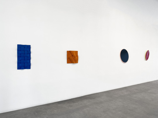
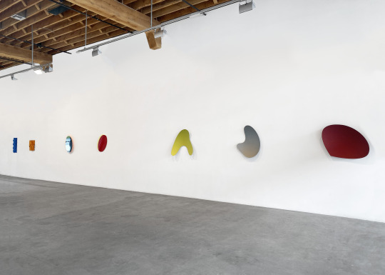
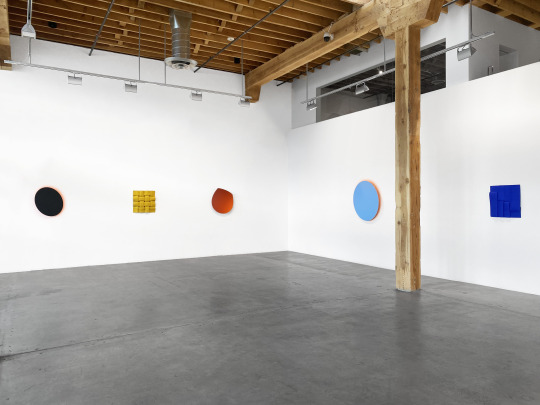

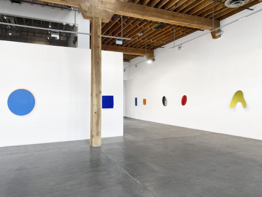
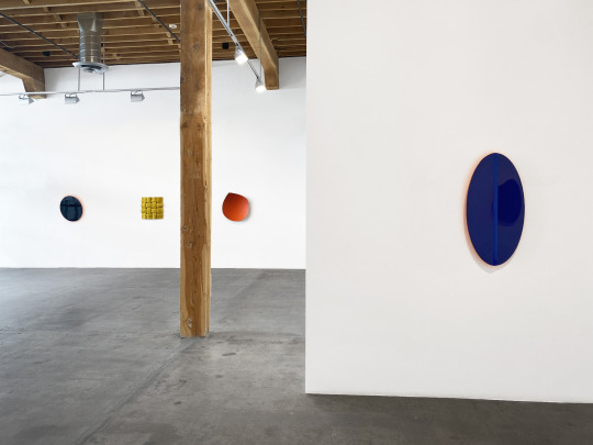
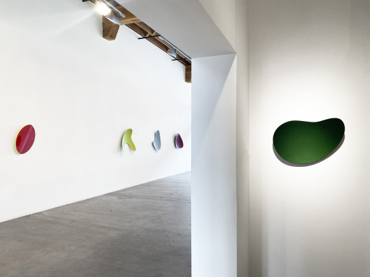
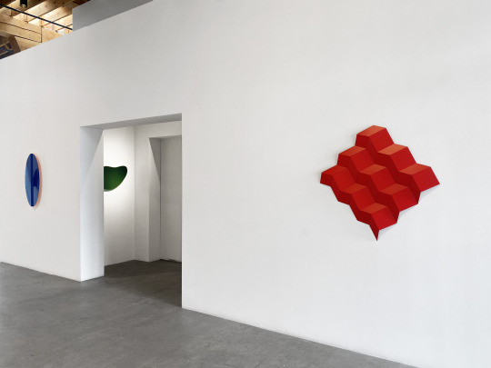
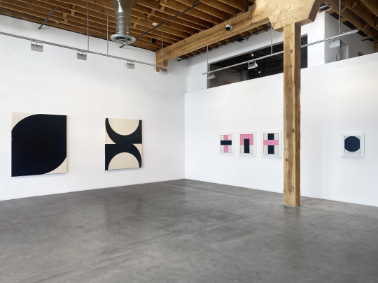
Embodying Colour - Outtakes: Michael Post, Heiner Thiel, & Peter Weber
July 28 - August 26, 2023
0 notes
Text
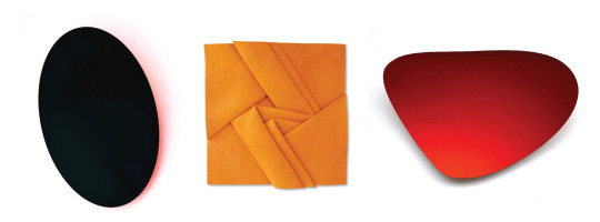
EMBODYING COLOUR - OUTTAKES
MICHAEL POST | HEINER THIEL | PETER WEBER
July 28 - August 26, 2023
Opening Reception for the Artists: Friday, July 28th, 5-7 PM
In a dark forest, a flash of white from a deer’s tail. In a golden field, the ultra-violet of a cluster of flowers. The black shadow of a large shape beneath green waves. The red flash of a wing spiraling against blue sky. It might not be too much to say that homo sapiens wouldn’t exist, at least not as we do now, without our ability to see colors. As quintessentially adaptable creatures, our brains developed around the talent for picking up complex patterns and colors, in our environment. It not only kept us alive but helped us thrive. It is a foundational part of who we are. One only needs to sit in a mono-color office building under fluorescent lighting to start to feel what it does to the body and mind to be denied our natural habitat of color.
But there is more to this foundational connection to color. Color is freighted with meaning. It provokes the nervous system, pricks us with emotion, it triggers emory,
elicits profound response. Personal, cultural, biological. We are alarmed and delighted and soothed by our colorful world, moment by moment.
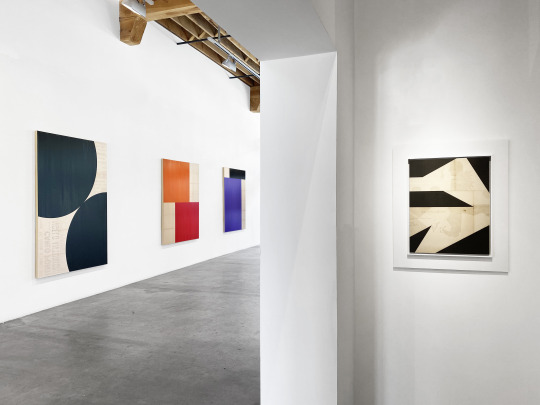
For German artists Heiner Thiel and Michael Post – color is all. For decades, their work has sought to explore both the tangible and ethereal qualities of color, abstracted from narrative or naturalistic form. Art focused on the perception and experience of color itself. In 2013 in Weisbaden, Germany, the artists conceived of the idea of a curated exhibition on the theme of Embodying Colour which would travel to both major cities and with “outtakes,” including fewer of the original artists, appearing worldwide in galleries. Over the years the exhibition has appeared in Germany, Switzerland, Hungary, and France, with this iteration at Charlotte Jackson Fine Art marking its first U.S. appearance, and including work from fellow German artist, Peter Weber.
Viewers will be familiar with the intense and intriguing effect of Heiner Thiel’s arced wall sculptures. The concave shapes are cut from aluminum and anodized through a painstaking industrial process which allows Thiel’s pieces to achieve a coating of color that is only 26 microns thick, thinner than a human hair. This intensely compacted color, combined with the concave shape of the work, creates a unique experience where the color will shift and change as the viewer moves around the piece. Sometimes it can even seem as if the color lifts off the piece itself, ghosting above the surface.
Michael Post’s exploration of color is twofold, with the surface color sometimes taking a backseat to the color he applies to the verso. These neon hues, canted with the shapes just off the wall, glow and reflect – casting colored “shadows” and painting on the wall. While previous works shown at Charlotte Jackson Fine Art have primarily had matte black or metallic surfaces, several of Post’s new pieces have added a new element, using lacquers polished to a high gloss to create a mirror-like surface. Here the viewer can find themselves reflected, embedded within the color of the piece itself.
What started out, for Peter Weber, as intricately folded paper invitations to his exhibitions, became the primary focus of his artistic work. Weber’s color-drenched three-dimensional wall-sculptures are intricately constructed from a single piece of felt cloth. Tucked and draped, folded and woven, these works create complex patterns that raise and disappear – with the light highlighting and shadowing the color, pulling the eye from one edge to another. The dense, compacted, blurred texture of the material adds an additional depth to the pieces, which allows the fabric color to shift with the light.
Embodying Colour - Outtakes provides viewers an opportunity to saturate themselves in a sensual experience of color.
- Michaela Kahn, Ph.D.
0 notes


Photo
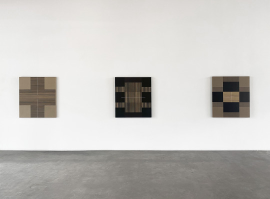
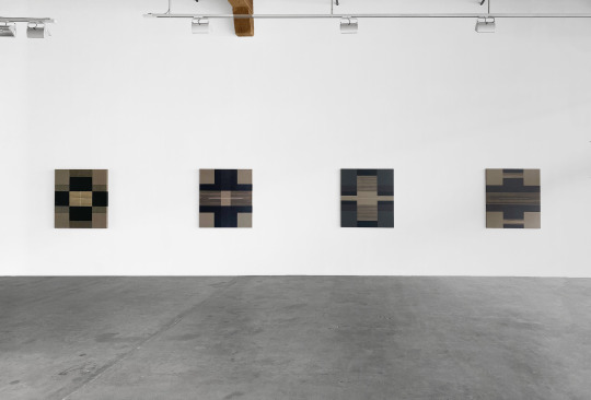
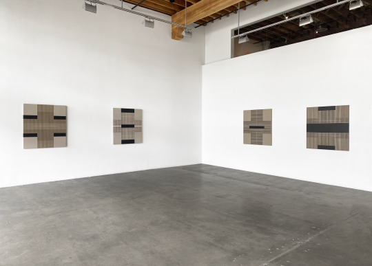
Max Cole: Breaking Day
June 30th - July 22nd, 2023
Opening Reception for the Artist: Friday, June 30th, 5 - 7 PM
The day-to-day fades over time. The intricate and intimate details recede, leaving only a broad sweep of experience. Patterns of a life lived. What remains that is bright? What remains that feels, in the remembering, more real than the next every-day before you?
A memory. The kind of memory where all the senses meet and converge: a piercing quality of the light, the smell of the air, the feel of the world intersecting on your skin, sound so pure and present that it is almost visible. That sharp intake of breath as you arrive in the past, firmly, for at least a breath or two, inhabiting a place where you once were. Vivid. Hyper-real. Memories that change, if only for a while, everything about how you see yourself, your life, the world.
Most of us don’t have very many of these sorts of memories. And retrieving them, finding the still and focused place where they can rise to the surface, can be perishingly difficult.
Max Cole’s paintings are pathways to these moments.
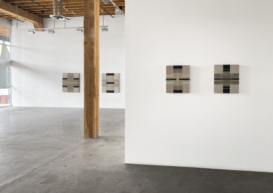
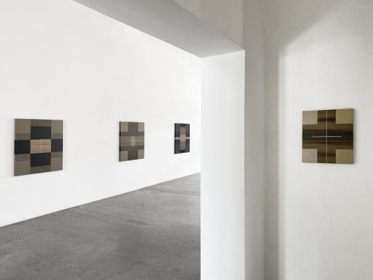
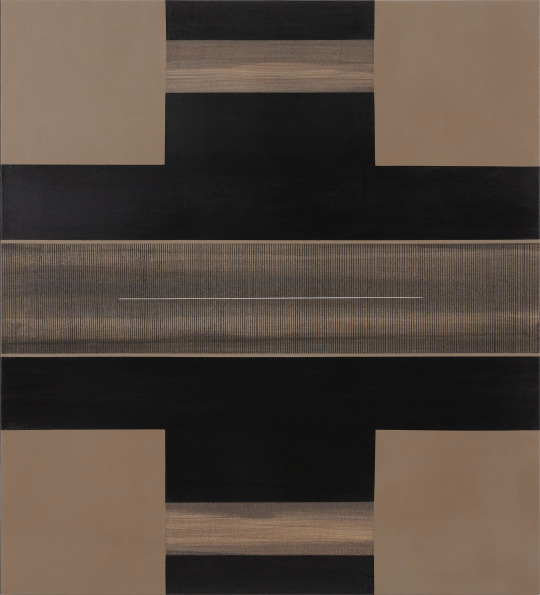
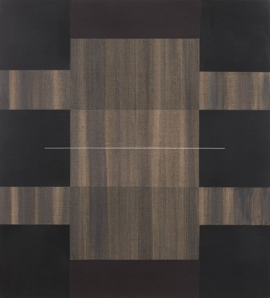
It is impossible to pin down precisely which element or quality of Cole’s paintings generates this perceptual magic – probably because these pieces are so much more than the sum of their parts. Cole’s paintings are studies in precision, in balance, in focus. Pared down to neutrals and earth tones, to the dialogue of vertical and horizontal, this austere vocabulary belies the rich and seemingly infinite language that Cole is able to create with her paintings.
In 2015, Cole was asked to participate in a centennial celebration of Malevich, which brought her to focus in on the form of the Greek Cross. The form, which Cole sees as expressing a perfect equilibrium, has continued to inspire Cole since. These new works, showing in Breaking Day, and painted since Cole’s move back to New Mexico, still reference the form – but seem to be in a process of cracking open the shape. In some of the pieces in the exhibition, such as Dreamer or Phantom, the cross remains omnipresent. However, others, like Haiku or Reflection seem to have broken and unlocked the form.
With their subtlety and quiet beauty, these paintings, despite their deceptive simplicity, present a continuous unfolding. There is a movement between each band of color, each fine line, which the eye follows – focusing first in, then out, detail and then whole, back to detail. And as the viewer eases into a relationship with the painting, sinks into sympathy with it, the quality of attention begins to shift, deepening, softening, expanding.
This is the pathway. Because what seems to lie beyond the sum of the paintings’ parts is a quality of presence, imparted during their creation. It is easy to make a correlation between Max Cole’s process, as an artist, and the objects that she creates. For Cole, art is a form of spiritual expression. If the world of artists had an official monastic order, Cole would be a member. She lives her life, wholly, according to art’s rhythms, in a constant state of mindful attention, contemplation, in quiet solitude and devotion to creation. The paradoxical state of soft and sharp focus, of vivid awareness, is what, slowly but surely, opens up a possibility of that state within the viewer.
From there, from that state of quiet immanence (of immanence as transcendence), those bright moments, those sharp-as-glass memories, rise up through us. Each memory a jewel in a chain of moments in our lives when we were vibrantly alive, the chain connecting us to now. Connecting us to the gallery, to the painting, to the brushstroke, to the breath, to the artist, to that something new, shining, awakening, breaking open over the horizon.
-Michaela Kahn
Photos: Brad Trone
0 notes
Photo
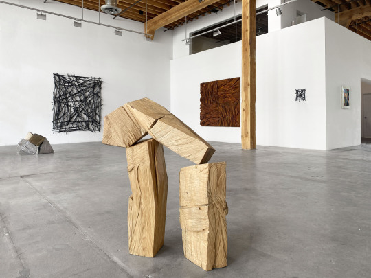
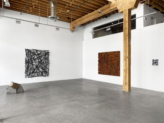
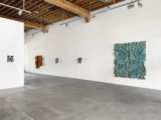
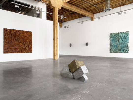
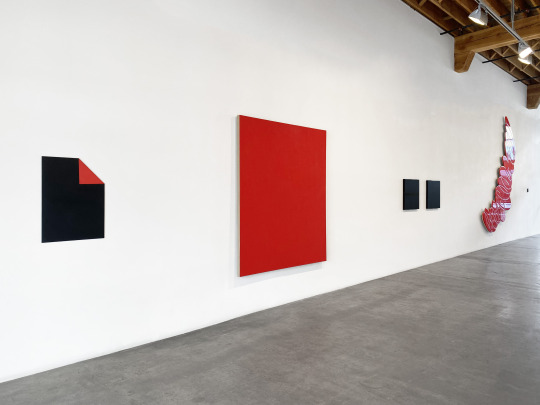
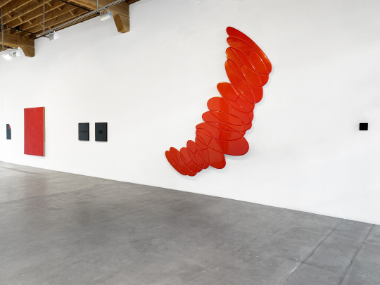
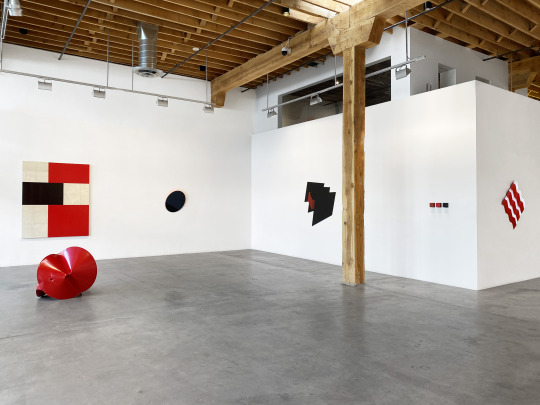
Charles Arnoldi: Rock, Paper, Scissors
May 26th - June 24th, 2023
0 notes
Photo

Charles Arnoldi: Rock, Paper, Scissors
May 26 - June 24, 2023
Opening Reception for the Artist: Friday, May 26th, 5-7 PM
"Stories from the Studio,” Artist Talk with Charles Arnoldi and David Chickey: Saturday, May 27th, 3 PM
Don’t hold your arms stiff and tight against your sides. As you walk through Charles Arnoldi’s exhibition of new work, Rock, Paper, Scissors, let yourself move freely. Let yourself feel the movement. You are a three-dimensional body in space. Yes, your eyes will soak up the lines, the intricate patterning overlap of Arnoldi’s latest explorations of Stick Paintings. You will see the rich patinas of copper and iron paint on examples of new Chainsaw pieces. And you will search for the ways that lines, cracks, texture and shadows interact on his puzzle-like stacked sculptural forms. But Arnoldi’s medium is more than visual, more than paint or metal, than sticks, wood, or foam. Arnoldi works with space. And more properly – with movement through space.
Arnoldi has never been one to let himself be pigeonholed or branded. His art is constantly shifting and evolving. In his fifth decade working as an artist, Arnoldi has used nearly any medium you could think of: metals, foam, plaster, wood, paint and beyond. He has drawn inspiration from the charcoal-line-like branches of forest fire burned trees, from the forms and formalities of architecture, from the vast and mysterious ruins of Machu Pichu, from fellow artists like Rauschenberg, Stella, and Johns, and even from the humble potato. Life and experience permeate and constantly shift his vision and his work. It is the interchange itself that seems to interest him: making an object, working on it until it has a life of its own, and then entering into a dialogue with it. Pushing that dialogue as far as it can go. Once Arnoldi gets a particular idea, he is prolific – exploring all the ways that he can approach that particular question or perspective. While artistic superstardom might have come sooner had he stuck to one primary visual vocabulary, for Arnoldi, it is the creativity, the energy of the exploration that drives him. As he says, “You have to have as much doubt as confidence in what you’re doing.”
However, with over five decades of work, what can at first seem to be very disparate visual expressions begin to collate. There are through lines to Arnoldi’s work, questions that seem to pull him back again and again. One of these elements is the exploration of space which is so palpably present in the work of Rock, Paper, Scissors.
Here we have a whole new re-engagement with the Stick Paintings – taking the idea of the line out into space with complex and elegant constructions of acrylic-painted sticks. The juxtaposition of these 3D lines is all the more apparent as they play off of the 2D shadows they cast on the gallery wall. The two large plaster and foam panel pieces take Arnoldi’s negative-space Chainsaw paintings and add new dimensions – not least that these are carved from a special kind of foam rather than from wood blocks or wood panels. Here those 3D lines are scratched out volumes of space rather than of physical matter. The Stackable sculptures combine elements of several of Arnoldi’s explorations: architectural, puzzle-pieced like the ever-evolving Machu Pichu series, aggregate panels/pieces that can inhabit space in multiple ways depending on arrangement.
Some have said that there is a sixth sense. Beyond sight, hearing, taste, touch, and smell, some scientists propose proprioception: the sense of self-movement, force, and body position. Knowing oneself as a three-dimensional body in space.
An interesting thing happens as you walk through the gallery among these pieces, you may begin to feel yourself inhabiting space, as these pieces do. The long, woven, sweep and return of the sticks becomes movement that you can feel as gesture. The deep scoring of the chain-sawed panels becomes an inward folding movement, the body curving itself around a central spine. The stacked sculptures, balanced so precariously - the movements of a complicated dance slowed down infinitely to near stillness.
Which brings us to the genius of Arnoldi’s work – the ability to translate his own quest, his ongoing dialogue with objects of art, to us, as viewers. We must engage these pieces in conversation, meet them on equal ground, give and ask: embodied form to embodied form.
-Michaela Kahn, PhD
0 notes