
chaoticresources
Where Design & Creatives Meet
Here you'll find a wide range of resources & tutorials for all your design needs.Tracking #ChaoticResources
16934 posts
Last active 60 minutes ago
Don't wanna be here? Send us removal request.
Last Seen Blogs


Text

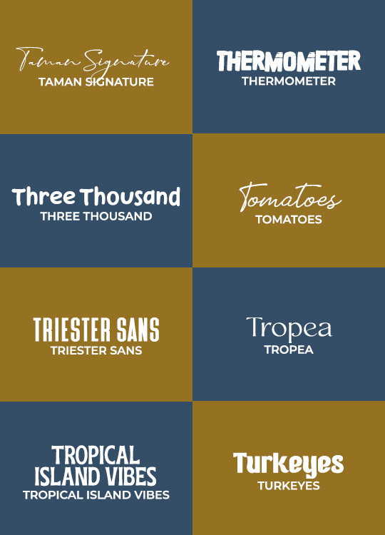
GIFMAKERRESOURCE/TORTUREDPOETS FONT PACK #21
I do not own these fonts, so there is no need to credit me, but please like or reblog if you found this helpful!
DOWNLOAD HERE
52 notes
·
View notes
Text


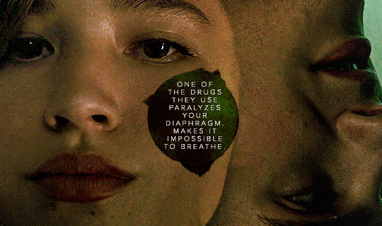

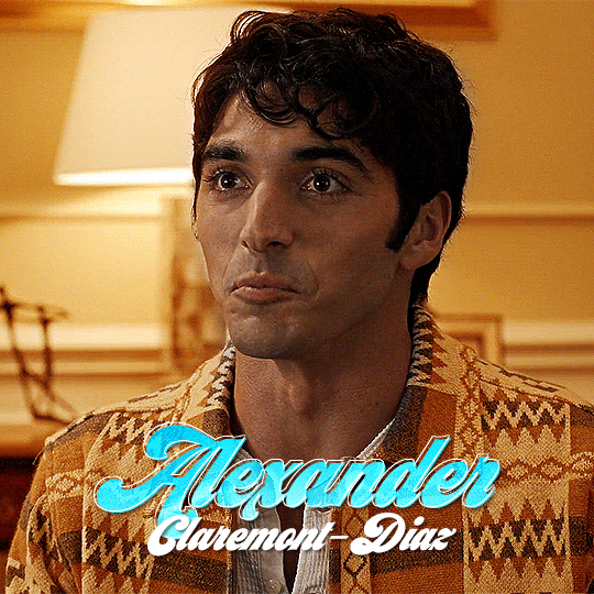
TRACY STEWART in every episode
5x12 "Damnatio Memoriae"
20 notes
·
View notes
Note
hi nik! i was wondering if you have different coloring settings for anime like jujitsu kaisen? i was wondering if you could do a tutorial for it?
hi!!! sorry this is 10 days late 😭 my coloring for anime is only two steps different from my normal coloring process, but what's very different are my sharpening settings! this won't be a lengthy tutorial since I ended up just making a downloadable action pack, but I'll still explain a few things below the cut. also, these actions work well for for any anime, including ghibli, or classic disney animated film with black outlines
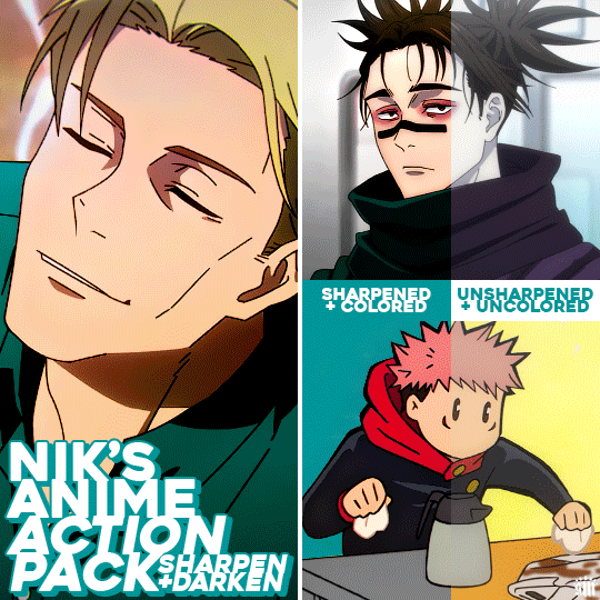
Get the free action pack via Ko-Fi!

ADDITIONAL RESOURCES:
– My basic gif-making tutorial
– My color manipulation tutorial via usergif
– Anime gif sharpening tutorial by aq2003
– How to load and use actions
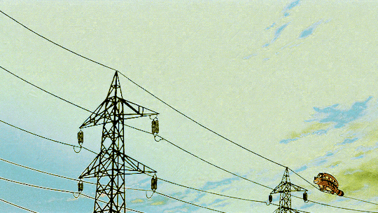
I should preface that I always gif footage that's 1080p or 4K. For JJK, it's always 1080p!
MY SHARPENING SETTINGS:
Firstly, shoutout to the tutorial above by aq2003 where I learned the minimum and surface blur filter trick! My sharpening actions use some of these tips mixed with my usual sharpening (with some slight modifications)! Here are my settings (click for higher quality):
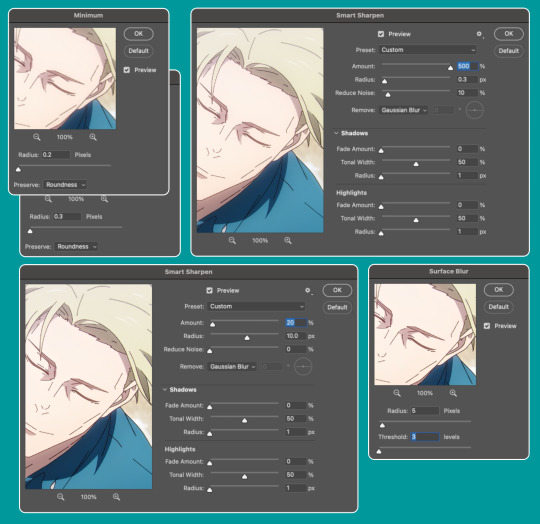
Also, I will very rarely increase the first sharpening radius to 0.4. I've only had to do that, like, twice when giffing anime.
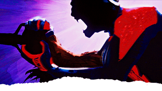
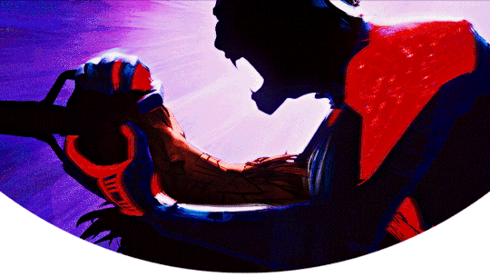
Here's how I used these actions in the Nanami gif:
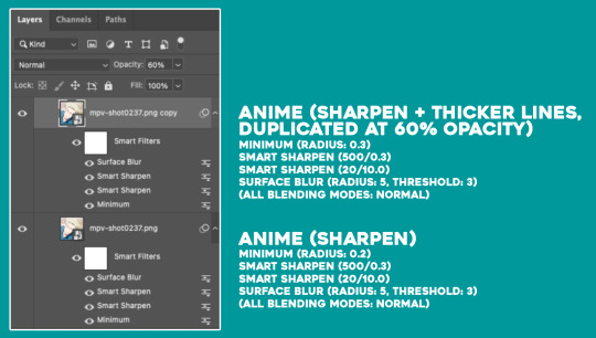
I typically only use Anime (Sharpen) since my usual anime gifs are small 268px wide gifs. But occasionally, depending on the scene and gif size, I'll duplicate the gif and use Sharpen + Thicker Lines set at an opacity between 40-60% if I want the black outlines to look smoother. I only use Sharpen + Thicker Lines at 100% opacity for chibi scenes (like the Yuji gif in the preview gif above) where the outlines are already very thick.
The differences between my actions and the tutorial I linked by aq2003 are my sharpening settings and that all of my filters' blending modes are Normal (whereas they used Darken on their sharpening filter).
MY COLORING AND DARKEN ACTION:
I'm not going to go too deep into coloring since my basic gif-making tutorial covers my usual steps, as does my color manipulation tutorial. My goals for anime gifs are to accurately represent character skin tones (especially taking care to NOT whitewash or color-wash, especially pink-wash, their skin tones since many anime characters are characters of color) and to feature vibrant backgrounds/accent colors.
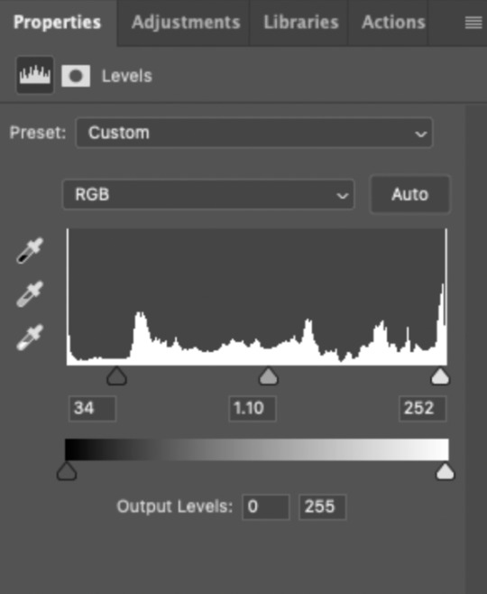
Two of the first adjustment layers I do for almost every anime gif are Levels (to darken) and Selective Color (to lower the white levels). I only do this for very bright anime scenes, which are many of the scenes I've giffed in my experience. Please note that my darken action won't suit every scene without tinkering with them yourself, and it definitely shouldn't be used on already dark scenes. You'll either need to lower the opacity of the layers or play with the sliders yourself.
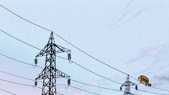
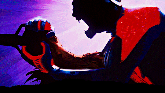
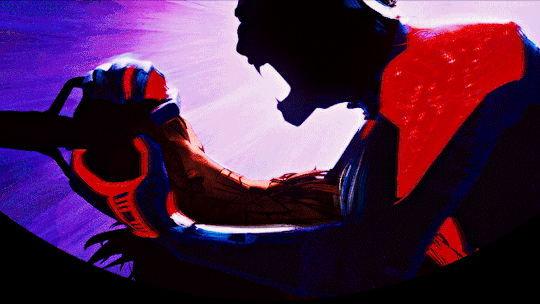
For example, the Nanami gif was VERY bright (almost over exposed) and uses my darken action as is:

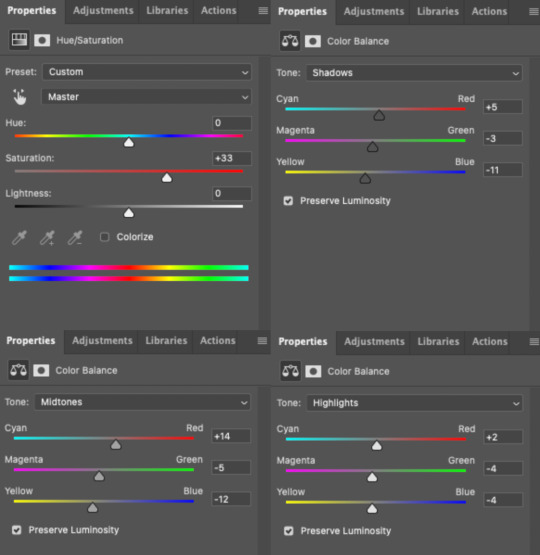
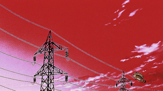
The Choso gif is also very bright AND washed-out; it needed both darkening and color correcting:

Notice the color sliders are also adjusted in Selective Color, Whites. This was to bring color back to Choso's skin which had been washed out due to the fluorescent lights in the Shibuya train station.
Here are some additional color-correcting adjustments I made before continuing on with my usual coloring process:
(Note that there were several more adjustment layers after these before I landed on my final Choso gif in the preview.)
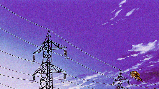
The Yuji gif is already at a good level and didn't need darkening, and I actually even brightened it a bit and increased the blacks:
That's as much as I'll explain about the basics of my anime colorings! Everything after these darkening steps follows my usual routine as laid out in my basic gif-making tutorial, even for dark scenes.
That's it, hope this helps! :)
100 notes
·
View notes
Text
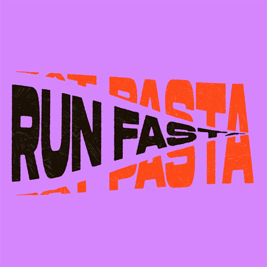
(instagram)
Tutorial in After Effects under the cut.
• Create a new composition and call it Split.
• Write your text, pre-comp it, call it Text or whatever you want.
• Create a mask from the center to one side (top/bottom), change anchor point to the top.
• Bring down Scale property and unlink it, keyframe the text to go from 100% to 0% in 1s towards the anchor point.
• Cut the layer at the end.
• Duplicate pre-comp.
• Select the bottom one, click M to bring down mask properties, invert the mask and move anchor point to the bottom (so the text scales to the bottom).
• Duplicate Text pre-comp one more time. Select it, press M and delete the mask, move anchor point to the center. Create new keyframes to scale it from 0 to 100 in 1s (properties unlinked). Select both keyframes and delay it by 1 frame. It makes the text look like it’s scaling from the center.
• Change bottom and top text color by adding Fill effect to the pre-comp.
• Easy ease all keyframes.
• Select all pre-comps and duplicate them, put them at the top and put them at the back to extend your animation (or arrange in your preferred order if you’re doing a phrase like me). So far it should look something like this:
• Create new comp Wave of 10s, add your Split comp.
• Create new Solid layer, call it Map, add Gradient Ramp effect, make white at the left, black at the right and hide the layer.
• Select Split pre-comp, Right-click → Time → Enable Time Remapping and extend the layer to the end.
• Add loopOut() expression to Time Remap.
• On Split pre-comp add the effect Time Displacement, on Time Displacement Layer select your Solid layer (Map), and on Source select Effects & Mask.
• Change Time Resolution (fps) to 250-300.
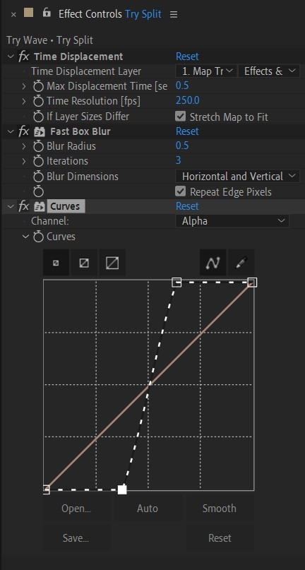
• Add Fast Box Blur effect, change Blur Radius to 0.5.
• To bring back the sharpness add Curves effect, change the Channel to Alpha and change values (see screenshot).
• Play around with Max Displacement Time [sec] on Time Displacement effect depending on the look you’re going for. I set it to 0.5.
• Now this whole animation is driven by our Solid layer (Map) we created. So if you make any changes to it, the animation changes too. For example, you can change Ramp Shape to Radial on Gradient Ramp effect, and see how it changes your animation.
• I additionally added some texture on the text, used Track Matte and added wiggle(5,500) expression to the Rotation property so texture would be constantly moving. Also added some additional effects to the new Adjustment Layer on top such as Roughen edges, Turbulent Displace, Posterize Time and Noise. Let your freak flag fly - it’s a matter of taste and creativity of what you do with it. Your animation should look something like this:
34 notes
·
View notes
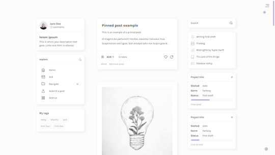
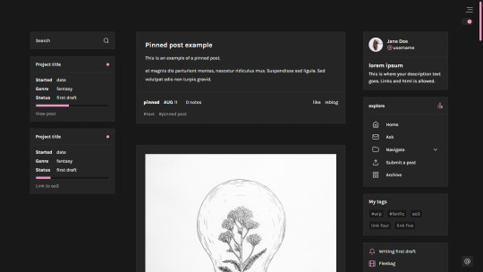
Photo
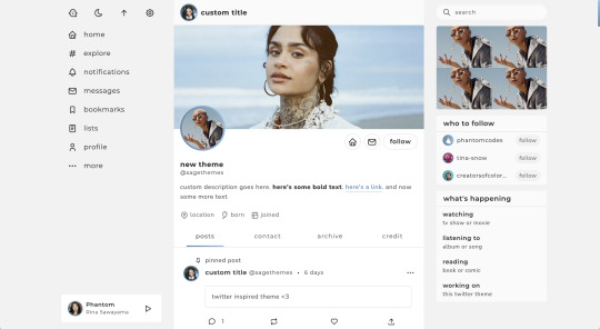
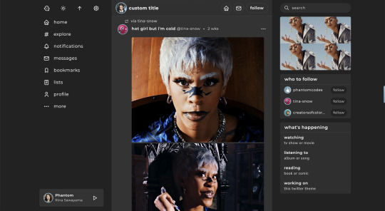
twitter | theme by sage
get the code: static preview / live preview (temporary)
inspired by twitter - free through dec 31st as part of my holiday sale ♡
features (more info below the cut):
optional: music player, featured posts, blogs, updates, tags on click, glow effect
customizable: description, colors, body & title fonts, font size, & blog title
search bar, day/night, tumblr controls, & scroll to top buttons
sticky top post info with a drop down menu
responsive design, 3 border radius (corners) options, uploadable profile & header images
this theme uses tabler icons
nothing needs to be changed in the code, everything can be changed in the customize panel!
terms:
reblog if using
do not touch the credit
view all terms
credits listed in the code / credits page
please consider supporting me ♡
make sure you read through this post before asking questions!!
Keep reading
2K notes
·
View notes
Text
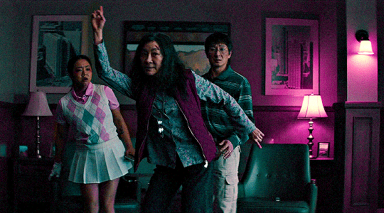

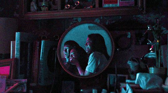

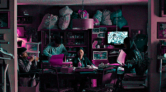
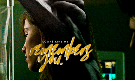
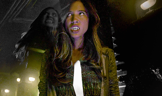
The only thing I do know is that we have to be kind. Please, be kind. Especially when we don’t know what’s going on.
Everything Everywhere All at Once (2022)
↳ @creatorsofcolornet event 21: Family
126 notes
·
View notes
Text
CATBUS — headers ≽ܫ≼
under the cut you'll fine seven more versions of this header, in different colours since i felt like playing around with photoshop. enjoy ♡
credit is not necessary


5 notes
·
View notes
Photo
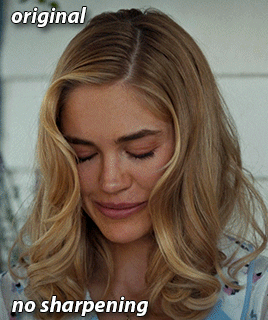

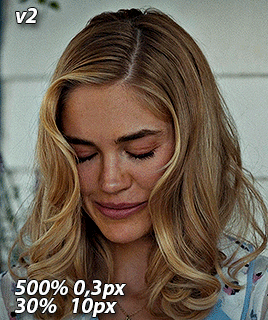
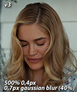
GIF SHARPENING ACTION PACK by @nina-zcnik
I’ve been getting a lot of questions lately about how I sharpen my gifs, so I decided to release an action pack of my 3 most used techniques. This pack only contains the sharpenings, so your gif should already be in timeline mode and converted into a smart object.
V1 - 500% amount 0,3 pixels & 10% amount 10 pixels
/works best on lower quality footage (e.g trailers) and scenes with bad lighting
V2 - 500% amount 0,3 pixels & 30% amount 10 pixels
/works best with high quality footage (1080p and above)
V3 - 500% amount 0,4 pixels & gaussian blur 0,7 pixels opacity on 40%
/works best for grapic gifsets, creates a smooth finish even with a lot of coloring layers
Don’t hesitate to reach out if you have any questions! If you download it, please reblog it as well so it can reach more people <3
[download] - [support me?]
951 notes
·
View notes
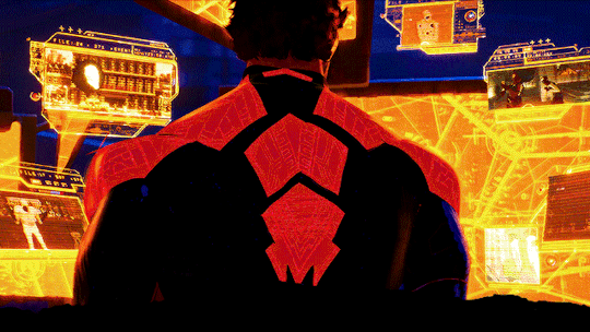
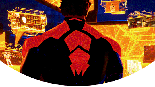
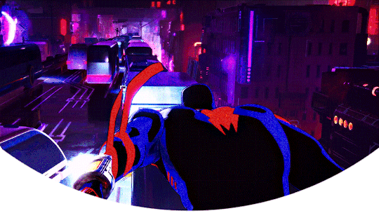
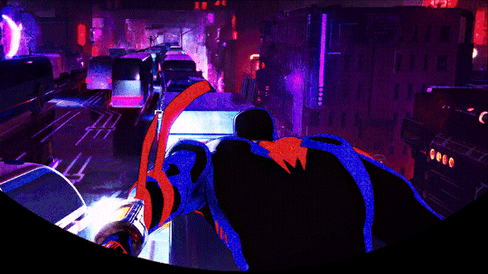
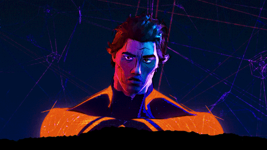
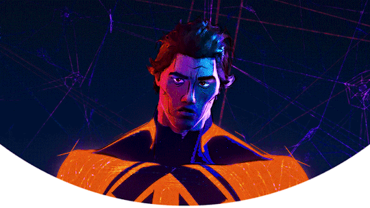
Text

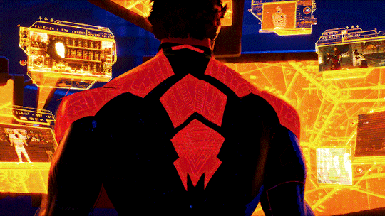
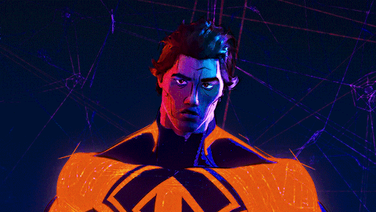
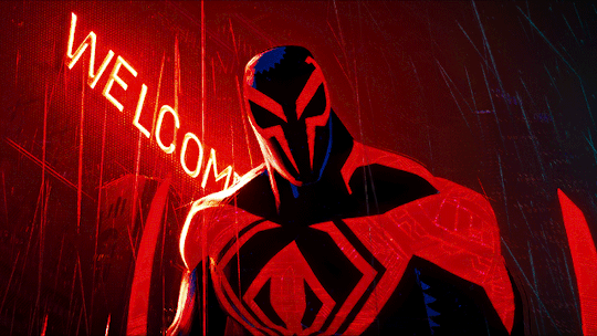
Spider-Man 2099/Miguel O'Hara Headers (requested by anon)
- 6 headers (640x360) | 4 different border versions under the cut
- all versions + 2 extra border options here
- please like or reblog if you take one
- credit isn’t required but it’s appreciated
- requests are open for other headers!


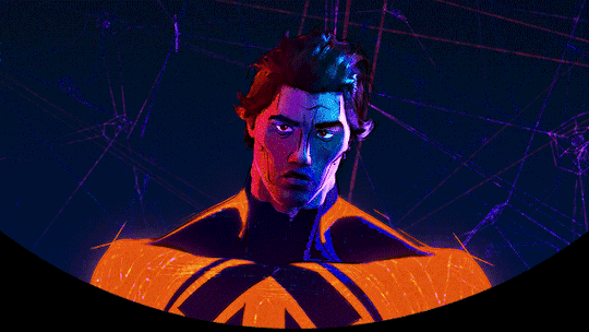
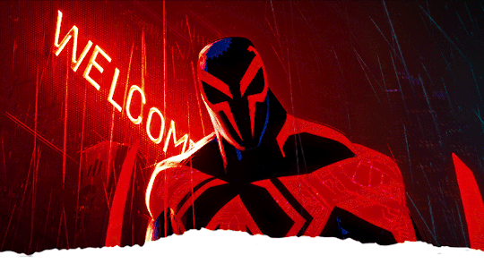
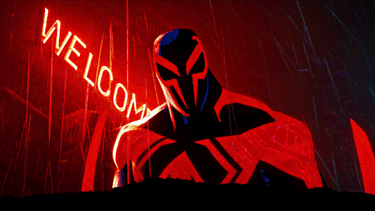
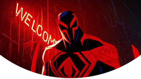

219 notes
·
View notes
Note
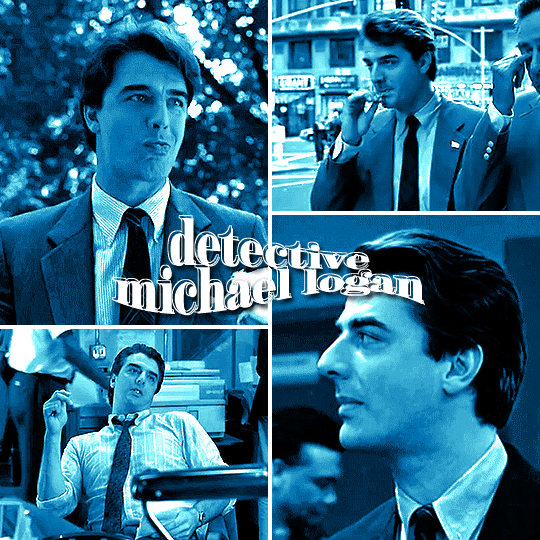
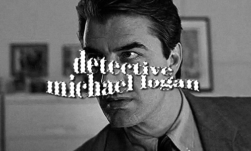
hi your edits are so so pretty!! I was wondering if you could please do a tutorial or give some tips on how you made this Typography? /post/716216798240980992/detective-michael-logan-leader-of-the-nypds
i'd be happy to! it's super easy and fun! ignoring the awful quality and slow framerate, i still love this set tbh
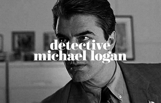
i still have the psd for this, but for some reason, i rasterized all the text layers, so i had to do everything from scratch anyway. i'm pretty sure this is the same font i used, so here are my settings for a 540px gif

so here's our starting point:
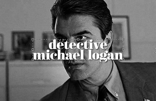
and add a drop shadow, though this will vary by font and gif
now for the fun part: the text warp tool! make sure you're still in the text menu for this to show up.

the dropdown menu gives you a bunch of different options to choose from. for this particular effect, i chose fish. some of my other favorites are flag, wave, and twist. here were the settings i used. i will say i rarely adjust anything but the bend just out of personal preference. i honestly recommend to just play around with the sliders and see what you like best!

as a side note, when warping text, you'll want to make sure your text box is as small as possible. i'm sure everyone does it differently, but when i make a text box, i start on the left edge of the gif and drag it all the way across to the right edge so it's centered vertically, so when i use text warp, i need to drag those ends back in once i have the size and font settings i want.
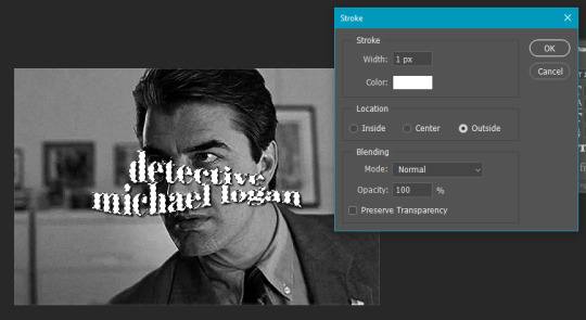
you could leave your text as is, but if you want that extra outline bit, it's also quick and easy! first, duplicate your text layer and then rasterize it (right click on the layer and select rasterize type). then, click on the little thumbnail the arrow is pointing to and click "select pixels"

this is what you'll see. you're selecting only the text on the layer rather than selecting the entire rectangle of your gif. then go to edit > stroke
i do this effect a LOT, and i almost always use 1px. i also usually use white, but that will totally depend on what you're going for. this color is going to determine the color of your outline, though you could always change it later with a color overlay layer style.
your text is still selected, but now you can see the outline we just created. this is the important part! use transform (ctrl+t) and move the selection somewhere else on the canvas where it's not touching your centered text and outline.
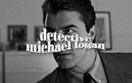
it's still selected (and this ended up being the part i always forgot when i first started doing this effect), so click anywhere on your gif to deselect it. the dotted lines will go away. then erase that text bc we don't need it.
it really doesn't matter when you do this, but switch off the effects on this new rasterized layer bc we don't want the outline to have a drop shadow, just the original text layer underneath.
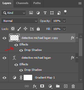
it totally doesn't matter in what direction you move your outline, but i almost always use ctrl+t and move the outline using my arrow keys up two and to the left two.
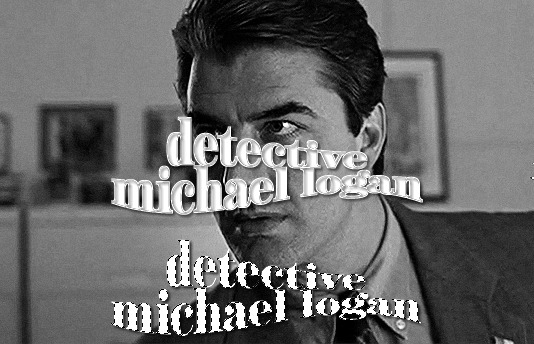
and we're left with the effect in my set you referenced! this effect looks even cooler when you change the original text layer's blend mode like in these gifs:
please let me know if you have any questions on this or anything else!
13 notes
·
View notes
Photo

Jude — a responsive, single-column theme
Updated: Version 2.0.0
Static previews:
Preview boxed (1)
Preview boxed (2)
Preview minimal
Download code: GitHub
This is a writer-friendly Tumblr theme, (it supports all post types, can easily be used with the writer features turned off), with 2 sidebars (that can switch positions), and a Google font of your choosing. Two layouts available: boxed or minimal. Included: Optional dark mode and update tab, two optional progress boxes. Supports NPF posts.
Read features and notes below the cut
Keep reading
2K notes
·
View notes
Note
hi! could you maybe do a guide how you do these kind of icons /post/742598459529494528/kate-siegel-lgbtqcreators-creator-bingo-celeb
i'm assuming you mean the little person, birthday cake, and location pin in the second gif of this set! if not, please let me know!
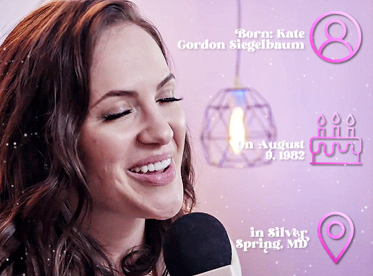
i get my icons from multiple different sites, but most frequently, i use freepik and phosphor icons
once you've found the icon(s) you want and download them, it's as simple as plopping them onto your photoshop canvas. now, you can totally leave them as is, but to get the effects that mine have above, follow these steps:
change the blending mode of the icon layer to difference or exclusion
double click (or right click > blending options) on your icon layer to bring up the layer style panel
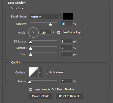
i applied a drop shadow set to multiply at 50% opacity at an angle of 130 and a distance, spread, and size of 3. you can leave the settings under quality as-is
then i applied a gradient overlay set to linear light at 100% opacity with a style of linear and an angle of 45. the gradient itself is 813f6a to ff91d9
obviously, you can play around with the settings for both of these styles, or you can substitute a color overlay for the gradient overlay if you want just a single color
and that's literally all there is to it! so the "hard" part is just finding the icons, but both freepik and phosphor are pretty easy to search with keywords of what you're looking for.
let me know if you have any additional questions or if you were asking about something different!
14 notes
·
View notes
Text
GIFMAKERRESOURCE/TORTUREDPOETS FONT PACK #20
I do not own these fonts, so there is no need to credit me, but please like or reblog if you found this helpful!
DOWNLOAD HERE
58 notes
·
View notes
Text
GIF COLORING TUTORIAL
Hello!! I had a few requests for an updated tutorial on how I color my gifs. I have a page for basic photoshop steps in case anyone was curious about that since this tutorial is going to focus on my coloring steps.
I will be turning this:

to this:

Disclaimer: This is just the settings that I made for this particular gif. The settings I used for this tutorial probably won’t work on a different scene but they are the steps/layers that I use regularly, so you can change up the settings if you like.
Disclaimer Part 2: I apologize in advance, this tutorial has 14 steps and is very detailed.
Keep reading
238 notes
·
View notes
Text
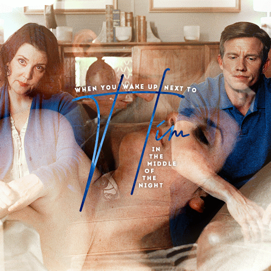
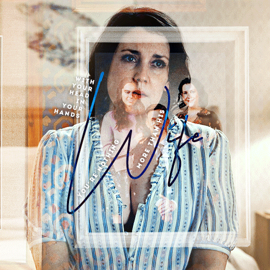

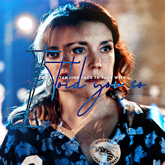
You know I hate to say it, but I told you so.
364 notes
·
View notes
Text
TTPD Icons
I made an icon for my new layout, decided to share the alternates


6 notes
·
View notes
Text
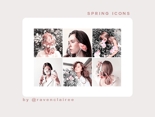
+ 130 spring icons requested by anon
> 200x200px
> reblog or like this post if using
> do not edit, steal or claim as your own
> find them here
87 notes
·
View notes