
Last Seen Blogs

zhhmi
잼

kizotolu-blog
your life is your own, ok?

sam-ce
Sam.Ce

dailydoseof-jaime
We Love Jaime!

fondoswallpapers
Fondos✌
Text
Journal 8
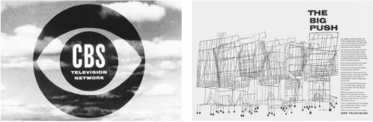
This week journal will cover a designer that I’m most impressed with in the reading. While there were a few and I usually select a few for different reason, this one deserves the mention. The designers name is Georg Olden and he worked for the Columbia Broadcasting System (CBS) as an Art Director for almost 20 years.
His work includes the following:
One of the most successful trademarks of the 20th century for CBS and the key contributor for the development of television broadcast graphics. He also worked an advertisement for a huge summers sales with what is called the “Big Push”. See below.
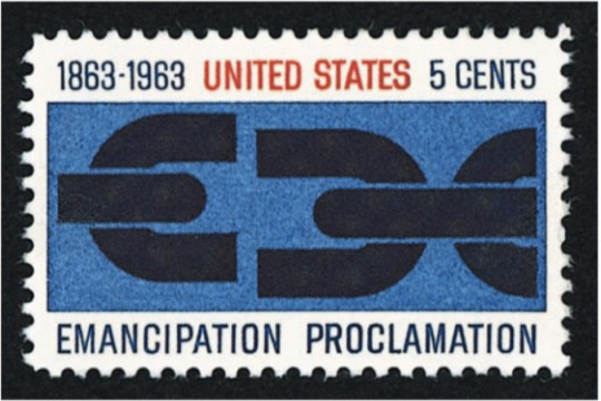
He also worked with the United States Postal Service to create a postage stamp for the one hundredth anniversary of the Emancipation Proclamation. See below.
His contributions earned him the mention in this journal. The reason I’m most impressed with him is because he did all of this as an African American from the 1940s-1960s. He is considered the first African American to achieve prominence as a graphic designer.
0 notes
Text
Journal 7
This week journal post will be about 1 designer that caught my attention during the reading. This artist goes by the name of Alexey Brodovitch. Brodovitch is a contemporary designer from Russia. He migrated to the United States and obtained a position as Art Director of the Hearst magazine Harpers Bazaar. He believed designs should have a “musical feeling” which means that there should be harmony between the text and the pictures. He has an affinity for white space and sharp type. Brodovitch was also teacher of photography.
*fun facts about Brodovitch: He faught in the WWI and then migrated in Paris. This is where he established himself as a designer.
The following are a few designs that he worked on as art director with Harpers Bazaar:


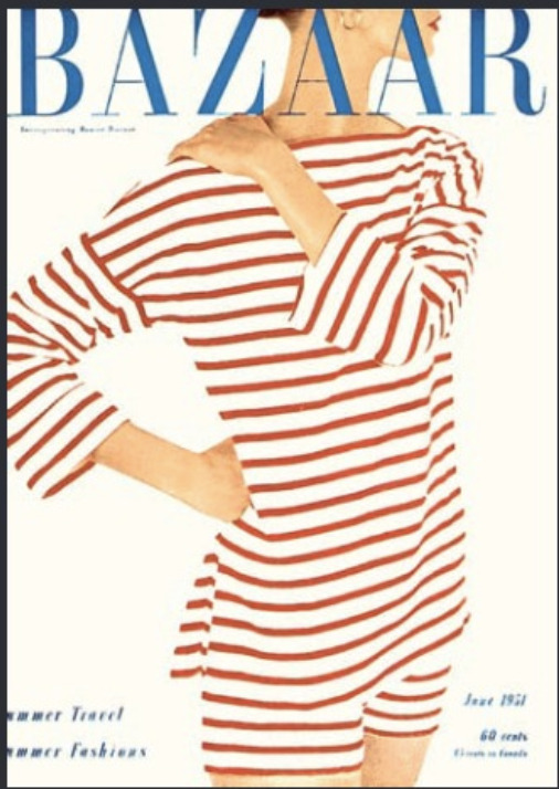
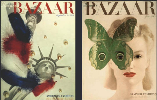
Viewers can see his Brodovitch beliefs in open space and sharp type in the design he worked on. His beliefs allows for an effective layout in the magazine without minimizing the visual. His use of color on a earth tone, white, or black canvas is amazing and captures the attention of viewers.
0 notes
Text
Journal 6
This week the focus will be on a specific artist by the name of Ludwig Hohlwein. I definitely put aside my feelings about his work and who he worked for/with to just look at his art for his work. Ludwig started his career as an illustrator. I always say that the best artist are the ones that can evolve and Ludwig did just that. He was able to apply the changing social conditions to his work. Ludwig started out working with clothing manufacturers and retail stores to later apply elements of the beginning stages of World War 1 to his work. Ludwig posters were so impactful in WW I that it caught the attention of Adolf Hitler and the Nazi party. Ludwig was commission and his work contributed to the success of Hitler and the start of World War II.
While Ludwig Hohlwein worked for clothing manufacturers and retail stores his designs resembles the images below:

(I love the closure techniques that Ludwig used in the image with the three gentlemen. I also love how he creates abstract elements in his work. The text in the purple design looks as if it is an extension to the image.)
During the wars Ludwig style changed to incorporate the changing social conditions. See some of his work after the change below:
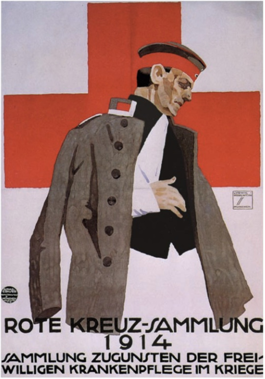
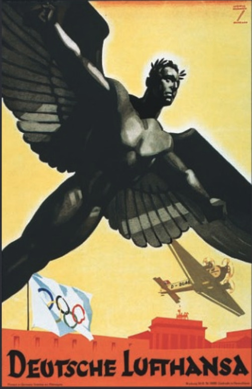
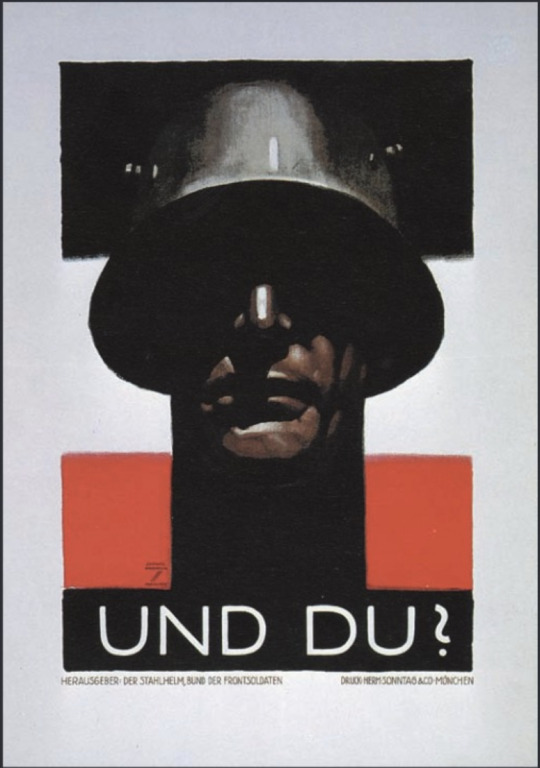
I absolutely love the designs he made even though he was making them for evil.
0 notes
Photo


These are some of the images I collected and wrote about in my blogs. I should probably post them while I’m writing. Chapter 1 - 12
0 notes
Text
Chapter 11 & 12
I had to take a little break from posting because I suffered a loss in the family (a really close family member).
Reading chapter 11, I began to see how the different forms of Art Nouveau. The period of the Art Nouveau movement flourished between 1890 and 1910. The different forms of Art Nouveau and the reasons they differ depends on the country. In the Asian countries the ukiyo-e became a prominent form of Art Nouveau. Art Nouveau made it to Paris; Jules Cheret and Eugene Grasset are listed as importation in this transition. The Art Nouveau movement made it to England primarily with the use of graphic design and illustration. Art Nouveau also made it to America by way of British and French graphic art. There were two forms of Art Nouveau that existed in the Netherlands called Nieuwe Kunst and Batikt. Nieuwe Kunst spanned from 1892 to 1906 and is described as more playful and diverse. Germany also had a form of Art Nouveau called Jugendstil.
Chapter 12 details the design in the turn of the century. In this chapter, readers are introduced to the Vienna Secession style of design. This style is the style that bridged the 19th century with the 20th century. Areas of change in the 20th century include designs for architecture, graphic, & typography. The text show that the worlds first underground electric rail system opened in London. This railway system was instrumental in visual design by being an area of free publicity to people that used the public transportation system.
**Notes**
It appears as though women was inspiration to many artist that contributed to the Art Nouveau. Western societies became engulfed with all things Japanese. The term for this mania is Japonsime. The spread of Art Nouveau became possible through advances in transportation and communication.
**People & Entities**
Hishikawa Moronobu: is the first master of the ukiyo-e print.
Kitagawa Utamaro: is called the supreme poet of Japanese Print. He specialized in the portraying nature and human expression such as insects, bird, flowers, and women of great beauty. He went to jail for his pettiness because he depicted military ruler Toyotomi Hideyoshi wife and concubines. hahhahaha so far he’s my fave of chapter 9.
Jules Cheret: Jules has many accomplishments. The reason for his mention here is because I think it is amazing that he completed his work directly on lithographic stones. He was also a man in support of feminism. He did this with his work by showing a new role for women. According to the text, these women are self assured, happy, wearing low cut dresses, dancing, drinking wine, and publicly smoking. He was named the Father of Women Liberation.
Eugene Grasset: Was inspired by medieval art and Asian art. He developed what is called the coloring book style of art. Grasset is also very important in spread of Art Nouveau in America.
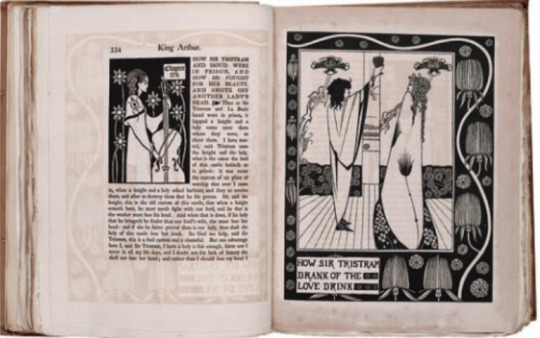
Aubrey Beardsley: Contribution includes work using a vibrant black and white art. This black and white art was coined “The Black Spot”. He continued his work despite being hated on by William Morris. He later was named Art Editor for the Yellow Book magazine.
Alphonse Mucha :is a very important person in the wide spread of Art Nouveau. He created art with women as the focus surrounded by stylized forms of plants and flowers. The women that is portrayed in Mucha’s work are what I call every kind of woman (basically a woman figure without specifics except European.)
Van de Velde: was an architect, painter, designer, and educator. His talents and accomplishments collectively established prominence to be mentioned in the text. Van de Velde used the human imagination to drive the points of his work. This is because he used abstract expression in his work. Instead of telling about the product or showing someone using the product, he would use abstract expressions to deliver messages to viewers. There is a quote from the text that stood out to me from Van de Velde that influenced the development of 20th century architecture and design theory: “He taught that all branches of art-from painting to graphic design, from industrial design to sculpture--share a common language of form and are of equal importance to the human community.”
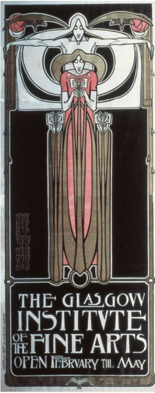
Glasgow school: consisted of a group of four designers: J Herbert McNair, Charles Rennie Mackintosh, and Margaret and Frances Mcdonald. The group collaborated on a number of designs , one of my favorites is the poster for Glasgow school. Though the four are all designers, they all have specialty areas in design such as Mackintosh specializing in the design of objects, chairs, and interiors.
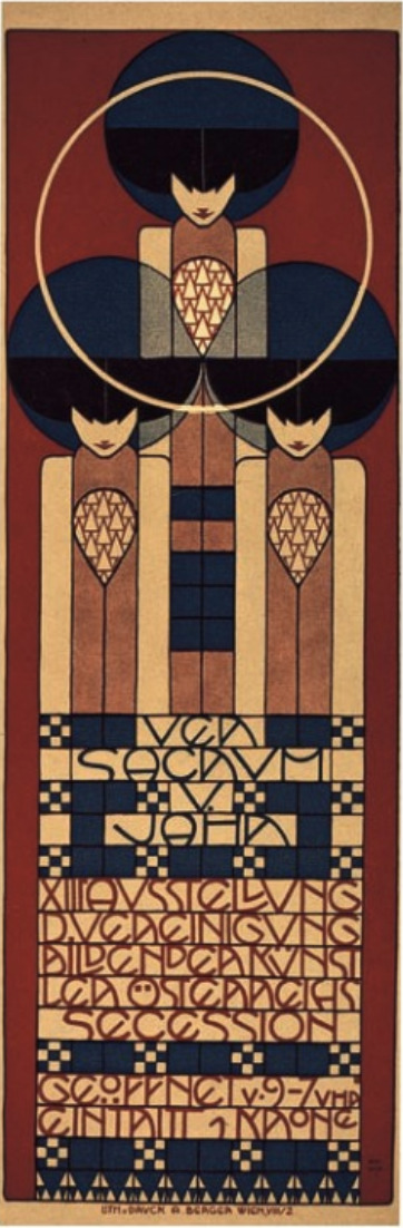
The Kunstlerhaus, the Viennese Creative Artist Association: The group consisted of Painter Gustav Klimt, architects Joseph Maria Olbrich and Josef Hoffman, and artist-designer Koloman Moser.
Ver Sacrum: is a magazine that displayed many designs by various artist. This is the magazine that businesses, writers, and artist alike wanted to be in.
Peter Behrens: was an artist, architect, and designer that sought typographic reform. He is also known as “the first industrial designer”. According to the text Behren believed that after architecture, typography provided “the most characteristic picture of a period, and the strongest testimonial of the spiritual progress and development of a people. (this last quote sums up the evolution of the alphabet and writing. I including this from the text because it sums up the first few chapters in a quote). Some of the designs Behren was responsible for designing include teakettles, fans, street-lamps, and industrial products.
Edward Johnston: is a calligrapher and teacher that designed a version of the Railway system in London that was established in 1890. His version of the stations signage and logo are still in use today.
Designs:
Salon Des Cent: I love the contrasting colors. The warm colors on the woman pop out more against the cool colors in the background. I also love the use of thick bold lines.
Tournee du Chat Noir dr Rodolphe Salis: I love this design. The use of warm colors allows this poster to stand out. The cat covers most of the left side of the poster extending from the top and the bottom of the poster.
General Electric trademark: I had to include this design mostly because of familiarity and the fact that I now understand why it was designed the way it is. I now know the styling of the design.
Poster for the Glasgow Institute of the Fine Arts: the design of this poster is beautiful. It gives a sense of direction by allowing white space to exist surrounding the figure. The figure is in a red color which grabs the viewer attention and the image is balanced. I think I love it because it seems as though the figure is becoming or is in touch with his/her higher self.
Poster for the thirteenth Vienna Secession exhibition: this poster is clearly inspired by the Poster for the Glasgow Institute of the Fine Arts. I love the use of the cool colors as accent colors in the warm colors and the fact that there are three figures. It creates a triangular illusion with the use of the three figures in the middle of the circle.
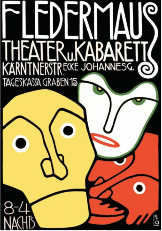
Poster for Fledermaus: This design was created by Berthold Loffler. Loffler did a great job with this. The use of colors pop on a black background, the warm colors red and yellow are attention grabbers, and the white mask is contrasting with the black background for its attention grabbing power.
Muthesius: believed in simplicity and exactness with the use of machinery. He wanted to elimiate all ornaments. I mentioned him because I wholeheartedly agree even though I also agree with Van de Veldes vision of expression.
AEG Electric Lamp Poster: The geometric elements in this poster makes this design stunning. The light bulbs is centered at the top of the triangle and appears to be emitting light in the form of small circles that are contained by the triangle as if it is a lamp shade. The light is flowing in the direction towards the text of the poster, driving the viewers attention to the name of the product. Brilliant!
**Religion** (You know I have to include that religion portion because the book tells it in the nicest way.)
Quoting from the text: Fearful of the potential impact of European colonial expansion and Christian Missionaries (take overs; Massacres) on Japanese culture, the shogun issued three decrees in the 1630′s excluding foreigners and adopted an official policy of national seclusion.
The above fears of the Asian people came to fruition. The text speaks of the Asian artifacts that were taken and place as trophies in museums.
2 notes
·
View notes
Text
Chapters 9-10
Hi Tumblr,
While reading chapter 9, I quickly started to understand that this chapter would be the evolution of printing during the industrial revolution. This period was important because the advancement of technology throughout the world and in graphic design.
The text accredit James Watt as an impactful person to graphic design because of his invention. This invention was the steam engine. Before this, the primary energy source were animals and human power. With this came a shift in politics, desires to integrate with the urban population, the workforce, and a change dominion over nature and faith to science. The investment in technology during this time created new jobs and opportunities for graphic designers as the demand for services increased. the change into the Industrial Revolution required a need to communication large amount of people at a faster pace. The demand for posters, large advertisements, new tactile and expressive characters increased.
The Industrial Revolution impact on Graphic Design is as follows:
the invention of photography (I found this topic to be most interesting)
The methods of lithographic coloring
More evolution of typography including typographic sizes and letterform styles.
This chapter also touch on topics such as the importance of San Serifs text in the twentieth century. Some of the designers and the types of text they design is as follows:
Caslon-Doric (There goes one of his contributions but it may be different William Caslon)
Blake and Stephenson-Sans-surryphs
US-Boston type and Stereotype Foundry.
In 1828, the American wood-type had taken over. As all things in life, we are always on a search to improve. This improvement resulted in the use of lithographic printing. Though lithographic printing is considered an improvement, wood types continued to be produced until the 1900′s.
There was also a revolution in printing. The handpress became the printing press (see Stanhope below) and later a steam powered printing press (see Koenig below) (James Watt impact.). Koenig was hired by times in London to build two double cylinder steam powered presses. He successfully build the machines and November 29, 1814, it was announced that the Times were printed by steam. William Cowper improved printing again by using a curved stereotypes that are wrapped around the cylinder. Then Cowper and Ambrose Applegath said, “By their powers combined” they made the four-cylinder steam-powered press using curved stereotyped plates.
The advances of printing made it cheaper and efficient. The problem then became the need for paper to print. Nicolas Louis Robert, developed a papermaking machine 1798.
Typography
In 1886 typography had a change. The creation of the Linotype arrived this year and take over. This impacted peoples lives because technology now alleviate the business of the need to pay for human power thus resulting in strikes and violence. This also reduced the cost of printing. Following the Linotype is the Monotype which allows kerning.
Photography
This is the best topic in this chapter. According to the text, the camera was known in the ancient world as early as the time of Aristotle. In 1665, a camera was developed but they were missing a light sensitive material (we know it as film). There was a “wet plate process” for obtain images that was developed by Frederick Archer. Archers process later have an impact on the world as we know it in graphic design.
THE INTRODUCTION TO THE KODAK CAMERA
(I just wanted it to stand out.) Photography is absolutely perfect for documenting history (well it depends on who is telling the story). It was even useful for documenting the Civil War in the US. The development of motion picture photography came from Leland Stanford. This happened because Stanford became interested in photographing a horse’s stride to see if there’s a point of time where the horse’s feet aren’t on the ground. In 1877 and 1878, Stanford was able to develop motion picture photography and captured the image he was searching for with 24 cameras.
Color
Color was an interesting topic primarily because highlights the Moorish culture. The introduction to Moorish ornaments came with the book Plans, Elevations, Sections, and Details of Alhambra as well as “The Grammar of Ornament”.
Lithography
This occurs when a stone can be used for printing with the use of oils. The first lithographic printing was done with the lithographic flatbed press and was later changed to the rotary lithographic press. Lithographic printing on tin became popular once it was developed. It became the standard for packages on food and tobacco products.
Continuing on to Chapter 10. I found it to be bad time for graphic design or a shift. We all know how painful change can be to a body of people. During the 19th century, there was a decline in book design and production. The book design resulted in the book design renaissance. This became a movement called “Art and Craft”. The most important person of this chapter seems to be William Morris. John Ruskin saw that there was a separation of Art and society after the Renaissance and this was because of industrialization and technology which would result in declines in creativity and designs being produced without a concern for appearance. With Ruskin idea in mind, Morris set out to combine industrialization with Art and Craft.
****************************************************************************************************
**First thoughts:
It’ll be interesting to see how the Industrial Revolution impacted graphic design.
Will I see more of an impact from women during this period?
Why is William Caslon important to graphic design? (maybe I will find out later in reading)
Fat Face Typestyle (FFT): According to the text FFT is a Roman face whose contrast and weight have been increased by expanding the thickness of heavy strokes.
Why is William Morris important here?
*****************************************************************************************************
**Favorite people and contributions
Robert Thorne: Give a person their flowers while they’re here. Unfortunately the world was not able to do that for Thorne because his work did not receive recognition until after he passed. William Thorowgood published Thorne’s 132 pg book of specimens that had been typeset. He was responsible for the fat face typestyle.
William Thorowgood: At first I didn’t believe he deserved a mention because I thought his claim to fame was publishing Thornes work. He also copyright Clarendon, a similar version of Egyptian typography.
Darius Wells: Invented wood types for display printing. The text states that these are durable, light, and less than half as expensive as large metal types. Durable, light, and cheap everything that most (co{crooked}ugh) cooperations love to hear.
Charles Stanhope & Friedrich Koenig: These two are positioned together because one persons (Koenig) claim to fame is riding off of the others (Stanhope) work. (JK) Koenig just made Stanhope idea better. The following is a list of contributions to printing from Koenig:
Steam Press: Prints 400 sheets per hour;
Double Cylinder Steam Powered Press: 1,100 impressions per hour;
William Cowper: created printing press using curved stereotyped plates wrapped around the cylinder. According to the text, it produced 2,400 impressions per hour and 1,200 sheets on both sides. He also worked with Ambrose Applegath to combine Cowpers idea with the ideas of Stanhope and Koenig. This resulted in the four-cylinder steam-powered press using curved stereotyped plates. It prints 4,000 shets per hour, on both sides.
Joseph Niepce: Produced the first photographic image. He discovered a way to capture images using a light sensitive asphalt (researched silver coated copper later).
Louis Jacques Daguerre: developed the daguerreotype prints and impressed others with ability to accurately capture an image. According to the text he used a silver plated copper sheet that was placed silver side down, and over a container of iodine crystals. The only limitations it had was that every image would be a one of a kind. It had a predetermined size and could glare after polishing.
William Henry Fox Talbot: Published “The Pencil of Nature”, the first book of 24 photographs. This book was illustrated completely with pictures.
John Herschel named negatives and positives.
George Eastman: The man. responsible for creating the Kodak cameras we all used to love before camera phones arrived. He gave citizens the opportunity to capture moments and record of their own lives.
Freedmen on the Canal Bank at Richmond: The comparison of the two pictures from Mathew Brady and John Macdonald is absolutely stunning. The shadows and highlights. The details of facial expressions. the drawing looks as good as the photograph from an artist perspective.
Mathew Brady: Was instrumental in the documentation of the Civil War. He was paid to capture images so the stories of war can be told by the authors of world history, the US Government. He was later hired by the government to document expeditions out west.
Eadweard Muybridge’s The Horse in Motion, 1883: I love this because it I learned of the origins of motion picture.
Owen Jones the Grammar of Ornament color plate. I love looking at this. Looking at each color pattern creates a different feeling and the colors are perfectly balanced. The spaces between give your eyes the break it needs before moving on to the next pattern.
Louis Prang: Is known for a number of his works including scraps (album cards), Civil War Maps, and art repoduction. His work with Christmas cards is what I’m most impressed with. (even though I do not subscribe to the holiday.) The Valentine Card, 1883 was absolutely stunning. I would just want for him to have incorporated a more diverse group of cupids.
Randolph Caldecott and Kate Greenaway: Both are designers that design for children or with children in mind. Caldecott had a way of creating worlds where faces are on plates and spoon like in the “Hey Diddle Diddle”. Greenaway created an experience use Victorian styling. She used soft colors, silhouettes, and white space creating a fantasy world.
Nast: was an artist that worked with Harpers Weekly. He was declared as the “best recruiting sergeant” by Ab Lincoln and have been said to have done as much as anyone to bring the conflict to a close by General Ulysses Grant. The reason he received this mention is because he took on corruption in the government with a political cartoon in Harpers Weekly in 1871 and 1872. The cartoon from 1871 shows a tiger attacking in the Roman Colosseum while the Roman emperor and his elected official witness the attack. In the political cartoon in 1872, you see a crowd of citizens hanging posters against corruption. He was later appointed as consul general to Ecuador and died six months later. (Call me a conspiracy theorist, but one doesn’t take on the government with that much traction and live much longer after.)
William Morris- is a leader in the Arts and Crafts movement. Hes worked on designs for wallpapers, textiles, carpet, created typeface(s), and tapestries. He has collaborated on with influential designers and outstanding projects. He also inspired many of the designer within this chapter such as Arthur Mackmurdo, He has a ton of work that earns a mention in this blog. He has a mention however the reader will not learn of his work here. He earned his mention because of his influence. Morris taught that design could be presented to the working class but contradicts himself due to the fact that neither of the businesses he operate with produce anything for the working class.
John Ruskin believe that beautiful things are valuable and useful just because they are beautiful.
Detail of a Peacock Design and Wren’s City Churches. I love these two pieces of work. The color selection is perfect and it keeps my attention. The use of design to feel the page helped the title of Wren’s City Church stand out. Both designs are trippy.
Arthur Mackmurdo: designed the two pieces that I love above. He also had an interest in politics. He was the leader of Century Guild. The members of the guild included Selwyn Image and Herbert Horne. The group incorporated Renaissance and Japanese designs in their work.
Hobby Horse: Designed in a collaborative effort between Horne and Image. It was the first work that introduced British Arts and Crafts to European audiences.
Selwyn Image: Worked on the Hoby Horse and also argues that every form of visual expression is art. Some of Image work includes designing typeface, illustrations, stained glass, and embroidery.
Charles Ashbee: Architect, graphic designer, jeweler, and silversmith are some of the professions that Ashbee has. He was part of a guild called “Guild of Handicraft” (GOH). GOH developed a plan for the “School of Handicraft”. This school was an attempt to restore experience of apprenticeships. The problem is that the school was not able to secure funding from the state and eventually closed. the GOH leased Essex House and Ashbee wanted to transfer Morris’s estate over to Essex House after Morris death. The negotiation ended up with the equipment for purchase, hiring of key personnel, and the formation of Essex House Press. Ashbee was a follower of Ruskins and knew Ruskins beliefs. He later became a voice for integrating art and industry.
Altar Book: Not really a fan of the image that is displayed in the book but I love that the borders are really busy thus creating direction and emphasis on the text and picture.
Edward Johnston: Master Calligrapher as well as a teacher and inspired by William Morris. He worked in medical (like me) and left that life to become a scribe.
Sjoerd H de Roos, Jav van Krimpen, and Charles Nypels: They too were impacted by the industrial revolution and did not think of it as a blessing because mass production.
De Roos: Designed the book Kunst en maatschappij, which according to the text is a translation of a collection of essays by William Morris. He also designed the De Roos’s Hollandsche Mediaeval typeface.
0 notes
Text
Chapters 5-8
So reading these chapters gave me an entirely different feel. I found myself trying zoom all the way in to read or at least clearly see with detail the different examples/displays of work in the text.
I think my readings made understand the importance of different time periods as it relates to graphic design. It also made me home in more of the different designers and their impact to the world of graphic design.
Very early in the readings of Chapter 5, it discuss typography. The invention of typographic was compared to writing as one of the most important advances in civilization. In the previous post, we see how important writing is and its impact on world. There was also start a change world over with the use of paper. Paper was created by the Chinese and was distributed by the Chinese for a while until other countries found a way to create their own. Along with the spread of paper was the spread of block printing in Europe. Though block printing had made it to Europe, block printing remained popular mostly in China. The importance of printing is evident in chapter 6. Printing is an extension of typography (writing) because like the typography or writing, it stabilized and unified languages. The impact of printing led to revolution because printing is a powerful tool to spread ideas and information. Learning the difference between broadside and broadsheet was interesting because I’m not sure why would anyone would ever only want to use one side of a canvas. Broadsheets were useful announcements of deformed births (which is really messed up. Why is this an announcement? What about the families?),advertisement, the lottery, politics, invasions, disasters, and, of course, religion. :-) The broadsides or broadsheets evolved over time from the folded sheets to some things that we are familiar with today such as pamphlets and newspapers. Chapter 7 details the state of graphic design in the Renaissance period.
The following includes a few of the designers I found to be interesting:
Gutenberg: he was responsible for teaching a secret process for mirror creation; He was responsible for inventing a type mold which allowed him to increase his speed and accuracy;
Erhard Reuwich: Contributed illustrations to the Peregrinationes in Montem Syon (Travels in Mount Zion). Reuwich created illustrations in the form of regional maps, important buildings, and major cities. His contributions made history as the first book to have fold out illustrations.
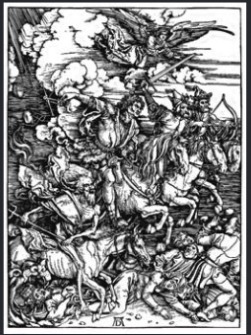
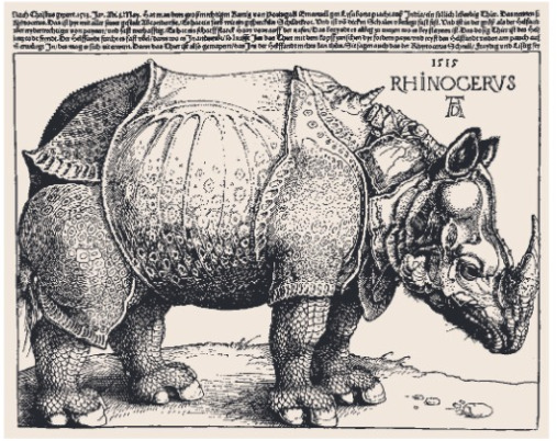
Albrecht Durer: Is the creator of The Apocalypse and the Rhinoceros. Durer is also a writer and created a book called Underweisung der Messung mit dem
Zirckel und Richtscheyt. This book touch on topics such as linear geometry, two dimensional geometric construction, the application of geometry to architecture, decorating, engineering, geometric solids, linear perspective, mechanical aids, and letterforms. Durer is so awesome, he created grids to assist with drawing and grids are still in use today!
Konrad Sweynheym and Arnold Pannart: created the double alphabet by combining the Roman alphabet with rounded minuscules. These two later designed a full Roman alphabet that is still in use today.
William Caxton: Caxton has a place on this blog because he translated first typographic book in English. :-)
Nicolas Jenson: Talk about perfect timing! This guy capitalized off the death of one person that had a monopoly on printing in Venice (hub). Some of his credits include designing outstanding roman, Greek, and Gothic fonts and published over 150 books. The text provides an example of Jensons publications called Marie virginus secundum consuetudinem romane curie where he displays decorated borders and initial letters reflect illuminated manuscripts.
Erhard Ratdolt: is the creator of the Calendarium by Regiomontanus, second version (that part is important). The Calendarium has sixty diagrams of solar and lunar eclipses. There’s also the three-part mathematical wheel charts. This guy is just awesome for socking it to religion and superstition with science and better help people predict an eclipse.
Francesco da Bologna (Griffo): He had a project called De Aetna. While working on this project, Griffo, produced roman scripts better than Jenson’s work. Griffo’s style was so effective that it remains a model for punch cutters and is still in book text face Bembo today! Griffo also had the brilliant idea to make the ascenders taller to the size of the capitals to provide balance something that the roman font was lacking.
Geoffroy Troy: has a ton of accomplishment that as do the previously mentioned individuals. The contribution that make him stand out from the rest is his introduction to the apostrophe, the accent, and the cedilla. He also created a series titled Horae. This gave Tory influence because of his work, so much so that King Francis named him imprimeur du roi (printer to the king). He is also named the most influential graphic designer of his century.
Oronce Fine: a mathematic professor and graphic artist. He combined his skills in both math and graphic design to illustrate math, geography, and astronomy. Being able to crossover into multiple field, put him on this list.
There were a few events/designs/time periods I found to be interesting as well:
Psalter: The first book that has the printers trademark and imprint, printed date of publication, and colophon.
Rationale Divinorum Officirum: The first book to save space by use of small sized typestyle.
Incunabula period: There were over thirty-five thousand editions-a total of nine million books-were printed.
Rhinoceros: Is a woodcut illustration from a sketch and description sent from Spain. Though the illustration fills the entire frame and it doesn’t have a defined background, I’m actually ok with that. Viewer can instantly forget that they don’t know where the rhino is standing because of the detail in the illustration.
The Apocalypse: (I’m in love this work. I just appreciate the detail considering that the technology that is around today was not available.) Durer earned his renown in Europe because of the volume and depth, light and shadow, texture and surface in this work.
De Natura Stirpium Libri Tres: is work completed by Simon de Colines. This one particularly stood out to me because it emphasized the title by making the rest of the cover busy and leaving the title in a blank space in the center. This is also another one that captures me with all of the details.
Some things that I wanted to take note of particularly about religions impact on graphic design (everything!!!!):
The text speak of how Pope Nicholas V issued a pardon of sins to all Christians who had given money to support the war against Turks.
The text speak of censorship and how difficult it was to control in the 1500′s. The only entities (ever) interested censoring anyone is the church and the state. Pg112 in the text.
See ya next time :-)
1 note
·
View note
Text
Meggs History of Graphic Design Chapters 1-4
Reading Chapter 1-4 was interesting. At first, I did not think I would be as interested in the evolution of visual communication but these chapters certainly proved those thoughts wrong.
I’ve taken notes on all of the information that I found interesting so I can remember to share with myself (as I read this in the future) and with all of my viewers. It appears as though the start of visual communication is in the ability to write.
Let’s start by determining how much more important visual communication is compared to oral communication. The people of Ancient Civilizations were brilliant people. They were communicating with each other and to use today by drawing pictures or pictographs. They used charcoal for black and iron oxides for warm tones, yellow or reds. They used natural materials to create a canvas (stone, tablets, papyrus, & parchment) for their writings. I loved how the Ancient people turned the task of developing language or visual communication into jobs for the people. On the flip side of that, due to lack of knowledge about these developments, the government and church held the power and maintain control due to the people lack of knowledge. It was also interesting to see how religion terribly impact the world on every level including the development of visual communication.
Some of the writing systems/peoples and their contributions to the development of writing systems that I was most impressed with are:
The Sumerians and the cuneiform of writing. They used pictures or pictographs to represent the words they are trying to express. The Sumerians go on to influence many other developed writing systems.
The Egyptians for using Hieroglyphics to expressed themselves. These hieroglyphs consisted of pictograms. The knowledge that Greece received came primarily from the Egyptians. The style of reading or writing from the Egyptians can be very confusing, especially if you haven’t studied it. Apparently, the lines for writing could occur horizontally or vertically, starting from any direction. The Egyptians are also noted as one of the first peoples to make use of papyrus as it relates to writing. The Egyptians contributions to visual communication is tremendous. They use some of the principles that we recently learned about such as emphasizing. The book speaks about the Egyptians drawing important persons much bigger than others or making the men darker than women. (I have my own theories about the larger figures such as the existence of giants but let’s just go with what the books says.)
The tribes from Aram developed the Aramaic alphabet. This communicating system was found throughout the East and influence modern Hebrew and Arabic systems today.
The Arabic alphabet is said to be one of the most used alphabets of today. It is said to be that because of the use of religion.
Greece adopted the Phoenician writing style and developed boustrophedon (which was a disaster). After this disaster, the Greeks decided to write and read from left to write which is a style we’re still using today. The Greek alphabet influenced other alphabets including the Etruscan, Latin, and Cyrillic.
*****break right here (I hope I wasn’t the only one that tried to perform the mouth and tongue positions when they are spoken! hahaha)
The Chinese contributions to the writing system of their own (completely visual) and other civilizations was tremendous as well. the Chinese writing system went through multiple phases. The first phase is the Chiaku-wen and I found this one most interesting because I saw the example in the book on Avatar the Last Airbender (I’m sure it was a loose interpretation but it made me think of the show.) The next phase was Chin-wen, followed by Hsiao chuan, Li-shu, and lastly, Chen-shu. From what I understand, China is the creator of paper along with other inventions helped the Europeans take over the world. China was also one of the first be become use paper money as a currency.
See you guys next time! :-)
1 note
·
View note
Text
Hi everyone (probably the professor and fellow students),
My name is Darrell and this is your formal welcome to my blog regarding the Graphic Design. I’m currently in the Graphic and Interactive Design program at Foothill College. The History of Graphic Design class is a requirement for completion of this program. I’ve recent decided to have a career change because I’ve always went the safe route (healthcare) and decided to explore my creative side more. I’ve basically come to a point where I want to do fun things as work. I’ve worked with the a few of Adobe software and I’m hoping to expand my skillset in this field with this program.
I’m not going to lie to any of you, I’m very nervous about taking the class but at the same time I feel a little excitement to actually be able to look deeper into art in general. I’ve read the preface and the First Edition preface. They both pretty much provide a short description and introduction to the book. It speaks about the history of Graphic Design and its evolution to what we understand graphic design to be today. The history of Graphic Design (much like all history) impacts the current day artwork because history is an awesome foundation to create master piece.
When thinking of Graphic Design, I immediately think visual communication. While reviewing the pictures in the book, you can see how the ancient peoples of the past used visual displays to communicate. They were communicating with visuals prior to the development of language systems or writing. The physical art with an ancient people is really impressive considering how far in the past that they were drawing and communicating with visuals.
I’ll see you all at the next post. :-)
1 note
·
View note