Text
Michael Craig Martin
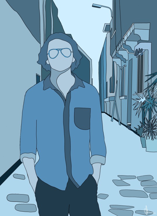

Michael Craig Martin inspired me to create these two pieces above. He uses fine lines and bright colour in order to illustrate his subjects. He interestingly uses subjects of very boring, everyday use like headphones or glasses. However, the way Martin uses colour creates this really bold and enticing atmosphere which really intrigues me as an illustrator myself.
0 notes
Text
Hannah Freya Niamh:
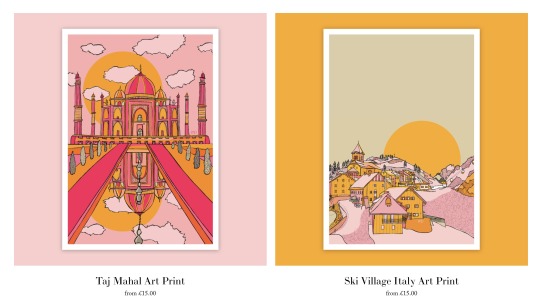
Freya is an illustrator based in New York who I have been following on instagram for quite some time. Her style of work is very distinct due to the shapes and most importantly colours that she uses distincty through her work. Myself, as an artist love colour and work really well with shapes and designs. I take alot of inspiration from Freya's work and have really enjoyed her journey into an illustrator who owns her own business.
The subject of much of her work is all to do with visual references. They range from places to people to animals. I love this randomness, it speaks to me as an artist and illustrator as I neither have no idea what I want to focus on, I like to incorporate a range of ideas.
Carla x
0 notes
Text
Working with monoprinting in a monochromatic style:
Pulling away from my comfort zone of oil painting, color and figuration, I experimented with the medium of monoprinting. I was limited to black ink and therefore worked with a monochromatic theme, which is quite different from my normal works, which are normally bright and colourful. However, despite this jump into the unknown, I found that my attempts were successful and that I really enjoyed this new style of work. I created two zines, one large and the other small. I played with collage, exploring the importance of contrast and composition.
Below, I have added images of the works I have created during this small project of mine. In these pieces, they show works from my larger and smaller zines. The smaller zine is looking at the cut out pieces from the larger zine. I was looking at the shapes, and how they compose themselves sitting on a page. I was looking at the significance of space against none.


The first 2 images are showing the smaller cut outs, sitting in the middle of the page. The contrast, shape and the composition works really well together. The white space allows the cut out time to breathe, and it therefore becomes more effective. I really love this outcome. Conversely, the bottom image shows two cut outs which are of a larger ration to the page, less shapely, minimal contrast and no spacial awareness. I don’t think they look bad, but I agree that they look out of place.
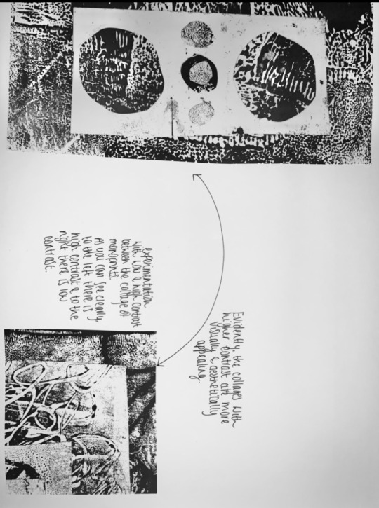
This is comparative research between contrasting.

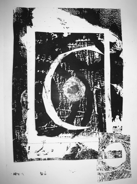
Both images above are successful outcomes from the larger zine. Both are collages that work successfully with shape, contrast and space. I think both of these collages are inviting and have a high level of aesthetic value.
0 notes
Text
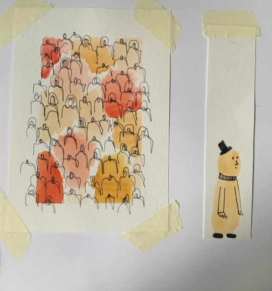
EXPERIMENTING: watercolour & fine art.
Looking into ways to express my identity through art and illustration. New project is due in three weeks, expressing our own identity.



0 notes
Text
Belonging: Image that Resonates.
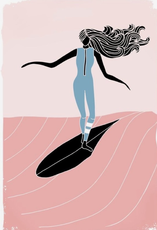
This piece is an illustrative piece created by a Portuguese artist Lizzy, who creates work based on her biggest inspiration growing up, the water.
She says ‘im developing some illustration work inspired in my simple life by the Ocean, and what it represents for me. I see surf as a way for the spiritual and self improvement, and the Ocean my great master. The ocean teaches me, and what I draw is a consequence of what I learn from it’.
I think what Lizzy has created is a story of her own self growth through the years she has had of surfing as a child, young adult and now artist. I think it’s really powerful, water is such a strong element and the way she has used it in her work really provokes this idea of, as Lizzy said, being taught by it. Learning from its beauty and power.
From this image and how it resonates with me is some what similar. Water is one of those elements that both scares and empowers me. I have surfed a little bit through travelling to Cornwall and through Bali. It was a sport I could get enough of. It made me feel strong which was something that is really encouraging for me to participate in. However, I did see through walking in surf shops that the posters or advertisement were mostly of men. If there were women they would mostly be wearing bikinis and running across the beach. They wouldn’t nessarily being doing these cool tricks that the men were doing. Now I promise I’m not gonna go all feminism on you! But it shouldn’t be like that. Women can be very good at sports and someone like me, who loves sports and competitions, wants something to look up to, those posters are it. This piece of work created by Lizzy really reminds me of that time and I think it really makes me want to use my art to push these ideas of encouraging and supporting women and people to become better and powerful by using sports as their catalyst.
0 notes
Text
History is not everything, but it’s a starting point. History is a clock that people use to tell their political and cultural time of day. It’s a compass they use to find themselves on the map of human geography. It tells them where they are, but more importantly what they must be.
John Henrick Clarke
0 notes
Text
23/09/20
Wednesday Talks:
Featuring Olivia Mathurun Essandoh (Olivia Twist).
OLIVIA TWSIT
I really loved both the illustrstion and context of Olivia’s work.
Through Olivias talk she explains the enjoyment that she gets through research, and this is really expressed through her extensive projects that are very community driven, looking at the importance and significance of identity, culture and pride. Olivia comments on how research helps you ‘become part of the furniture’ and I think that’s really important in terms of the understanding the real intentions behind the outcome of a project.
Olivias projects surround the idea of community and identity. Which really brings her back to her original heritage. She talks about how her grandparents moved to the UK in the 50s and how she has learned to take pride in her original heritage but also being British. In her talk she speaks about the working class, her relations with her brothers and family, the strength and the importance of communities, and the value of exchange. All of these topics are imperitive to her representation of mundanity and how these things are things to be proud of.
Olivia talks about where her work belongs, she says that she wants her work to be accessible. Therefore, inside galleries is can be used to teach, and for others to learn from, to fill the space. However, outside it is used to spark discussions, talk about the mundane topics. She says that in her community she would see people dress up only to sit on the balcony of their own homes. It would make her laugh. These things are almost small irrelevancies in a community that she will almost focus on.
She makes a few references to other artists, for instance Kano, a rap artist from East London, who are known as her inspirations for the work she does. She really puts forward that like Kano uses his music to exchange his standpoints, Olivia uses illustrstion. Something that really stood out to me in her talk was how this particular quote drives her practice ‘if you’re not making with them you’re not making for them’. She also states that her work ‘belongs to those who have inspired it’.
Olivia’s most touching project was one that she did in Hackney with the community. She used two baths which were thrown away to create small gardens by planting flowers in the tubs. She did this by gathering members of the community and using their ideas to collectively produce these miniature gardens. She did this due to the fact many members in this committee do not own gardens but instead balconies, which link to her earlier statement that people would dress up to go on their balconies as it was the only place they could take a good photo from outside. The outcome of this project really brought the community together which I think was a really beautiful thing to do.
-carlajanemartinart


Illustrations created by Olivia Twist.
0 notes
Text
This account is all about my journey through the Illustrstion Animation BA course at Kingston University. Part of my course is to create a blog, talking about the work I’m producing & the many artist talks that will shape my degree. I’m going to try to keep as active as possible on here, posting my progression through the years. Come along with me! X
ALL REFLECTIONS AND VIEWS ARE WRITTEN BY CARLAJANEMARTINART. These are written up from notes that I have made during lectures/ artist talks. Mistakes are and will be made. If anything you know to be wrong please feel free to message! Thanks x
1 note
·
View note