c-l-d-s
Design Survey 2021
Cole Lehto's ART 124-201 class journal
17 posts
Don't wanna be here? Send us removal request.
Last Seen Blogs

flamestar126
"insanity is doing the same thing over & over" A.E
end-my-chapter-blog
Minizinha Como Funciona Taxas

pyxell-petsite
actual mom
blodgmonster
The Blodg Blog

shadestar413
#1 yuri kagarin Simp, Family Tree Enthusaist
Text
Week 7- Architecture
There are several principals to Universal Design. One of them is Equitable Use, or equal use, meaning the design functions and can be used the same for people with differing degrees of capability. To elaborate, the design should not isolate or segregate any users, the design should be safe for all users, the way it is used should be identical if possible between users and if not possible it should be equal as can be. An example of a design for an environment that properly encompasses this principal is an elevator. An elevator can be used the same or basically the same for all people regardless of their ability, and is designed to accommodate the task of upward mobility for all people. Its existence is even more crucial for people who cannot safely use stairs or use stairs at all. An example of an object that encompasses the principal of Equitable Use is an iPhone (for the most part). The iPhone has features that make it accommodating to many kinds of people without being isolating, as it has talk to text features, audio reading features, subtitle capabilities, and somewhat customizable user experience.
Another principal of Universal Design is Simple and Intuitive use, meaning the design allows for people of different language perceptions, concentration levels, and sensory capabilities to easily and simply understand how to use or what the space is communicating. An example of a space that encompasses this principal is most public bathrooms. From before the moment one walks in, the sign indicating the gender of the bathroom typically has the word Men or Women, accompanied by a symbol of either a person in a dress or without a dress, and even can have braille on the signage. In a Universally designed bathroom the sinks would be at a height accessible to all with faucets that are straight forward and easy to use, and toilets that have a simple flushing mechanism. An object that encompasses this principal is a non- digital scale. The design is so simple (for most non- digital scales) that all someone has to do is have it on a level/flat surface and stand on it.
0 notes
Text
Week 6- Architecture
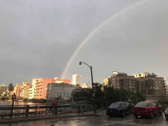
This is a photo from the river walk outside of the building I work at in the Third Ward in downtown Milwaukee. I took this photo (including the bonus rainbow) because all of the buildings in this picture were made with the modern aesthetic in mind. I say this because all of these structures are outfitted for function, lacking extra adornment and not attempting to imitate nature. While most of these buildings are now multi-unit homes, there is also the old Hoffco Shoe Polish factory, which is also outfitted for its use as a factory and doesn't speak much to aesthetics aside from functionality.

These are drawings and notes taken of the historically significant Turner Hall from downtown Milwaukee, and the ballroom within. The façade of the building follows a Victorian construction, or sort of Romanesque revival (I have taken art history in addition to now going through the architecture crash course on this classes canvas page). The outside is very elaborate with adornments at basically every turn, and is masonry constructed. The inside of the ballroom is lined with false columns (beams made to look like supporting columns but are not fully weight bearing like real columns) in a Corinthian style. There is a gallery along the back and right sides of the ballroom functioning as a balcony, and there are domes coming out of the ceiling giving the room a vaulted upward look. While I did not include this in my sketch, the walls and ceiling are lined with faded decoration with sort of leafy motifs from what I can tell, however it has not been restored in a long time or ever so it is quite difficult to make out. I'm sure it was beautiful in its heyday.
Aside from these two specific examples, my observations of the architecture around the city are mixed. There is almost every style of architecture one can think of throughout the city, which makes Milwaukee unique. Sadly, as time goes on and old buildings are torn down for a place for new buildings, some of the diversity diminishes to more modern styles. I hope that there continues to be an effort to preserve historically significant spaces, so that their unique architecture stays too.
0 notes
Text
Week 5

This is an energy drink can from a brand called Celsius. The can uses design elements from more than one of the design movements in the reading/lecture (particularly because the previous movements compounded into the Bauhaus/Modernist design). The can has clear, readable and understandable sans serif typeface, and uses the same typeface throughout the entire face of the can in varying boldness/size to create emphasis on different information, design principles first published by Jan Schichold in Die Neue Typographie. (information from lecture). The can also has a central image of berries to show the flavor (similar to Saul Bass using a central image for pictorially simplified information) as well as having the brands logo clearly and largely presented at the top of the can to give the brand a recognizable corporate identity, popularized and focused on in the 1950's/60's by different designers such as Paul Rand.
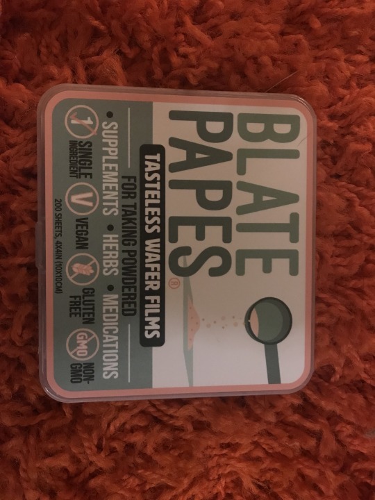
This is a hard case package of a product called Blate Papes, edible sheets of potato starch used to hold powdered products that makes taking such products easy, mess free, and tasteless (many powdered supplements/herbs taste kind of gross and are not necessarily fun to take in a smoothie or otherwise and eliminates the need for using capsules since most powdered products are cheaper in non-capsule form). Firstly, the design of this product outside of the graphic design part is simple and to the point, the case is a clear plastic with no excess adornments and functions perfectly and simply. The hard case is important to keep the papers in shape, when left loose they can get torn or misshapen and the case also protects them from environmental factors such as heat or moisture. It is easy to open and serves its purpose, following the guidelines of modernist design. The graphic design on the case uses asymmetry, consistent and clear typeface, and mathematical proportions to create a clear, pleasing design. All of these elements are central to Tschichold, Bauhaus, and modernist design in general.

(my dog ended up in this photo, you're welcome.)
This is a bottle of Fireball whiskey, a cinnamon whiskey that's known for its burn. The graphic design on the bottle reminds me of Herb Lublin's work, as it uses typeface and other means of visual communication like the illustrated logo of a devil to express the content of the product/brand. The typeface and logo communicate the "adventurous" or "dangerous" or dare I say hellish vibe that the flavored whiskey is now known for since it is spicy and burns.
0 notes
Text
WEEK 4 - Found Object
This is a chair in the outer lobby of the condo building I work in. I like the design of the chair for the setting and function. This chair is a minimalist, sleek chair. It fits the aesthetic of the building around it. It has 4 legs as chairs typically do, and they are made of chromed metal and meet each other underneath the seat. The seat and backrest of the chair are made of simple matte white plastic in round organic shapes. This chair is a good design for its function as it is lightweight, simple, and easy to clean. Since it sits in the outer lobby of the building, it is not meant to be a place to hang out for an extended period of time, and it is in a semi public area. That’s what makes it being lightweight and easy to clean pertinent for its function, cleaning public spaces is especially important during this time and can be moved out of the way if needed. The design of this differs from some of the other chairs in the building. While the other chairs in the building are similar aesthetically, they are larger and padded (I show the chairs in the dentist office and inner lobby of the building in the video above). Both sets of chairs are more comfortable and take up more space than the outer lobby chairs. This is because they are in more permanent seating areas, meant to be a place to relax. The outer lobby is not a place to relax but to maybe wait 5-10 min for a resident from the building to come down. The outer lobby chairs are also smaller than the other two sets of chairs, again because they have a different function. They are not meant to be the centerpiece of the room, they are simply there if someone needs to sit for a moment, not a place for gathering.
0 notes
Text
week 3- 10 observations
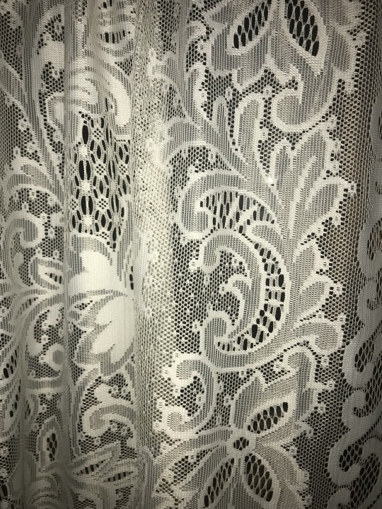
This ugly lace reminds me of Wornum’s criticism on mid-century design and its reckless and armature use of ornament derived from natural forms.
0 notes
Text
week 3- 10 observations
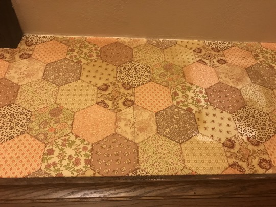
This ugly wallpaper in my kitchen could not have came to be (at least not cheaply) without the invention and design of modern day printing techniques. The design of the paper also seems to resemble many different historical tastes, which all together in one design makes it look tacky haha and reminiscent of the undisciplined eclecticism of Victorian design
0 notes
Text
week 3- observations
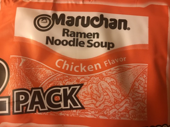
This package of ramen uses both different typefaces and graphic design principals, but also the illustrative print depicting the ramen reminds me of Gothic like design.
0 notes
Text
week 3- 10 observations
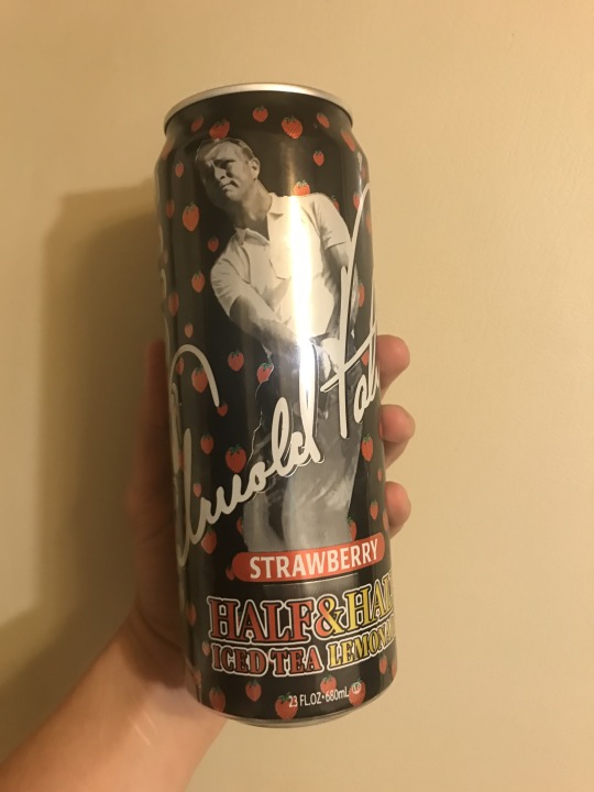
Similarly to other objects I have observed through the lens of the history of graphic design, the print on this Arizona can implements basic principals of graphic design created during the Art Nouveau movement, as well as influence of Japonisme through the use of the flat strawberries that don’t seem to be tethered to the realities of space naturally.
0 notes
Text
week 3- 10 observations
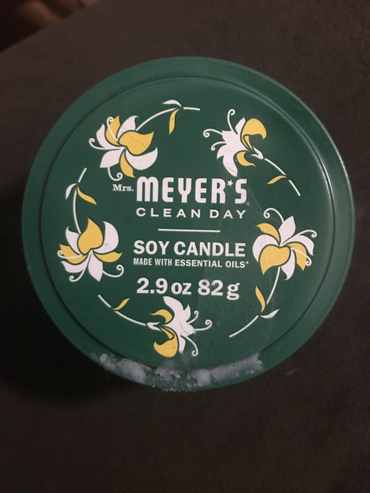
The lid of this candle uses different typefaces, as well as principals of graphic design, and the flat imagery of the flowers in a circular composition reminds me of the influence of Art Nouveau and Japonisme in the history of graphic design.
0 notes
Text
week 3- 10 observations
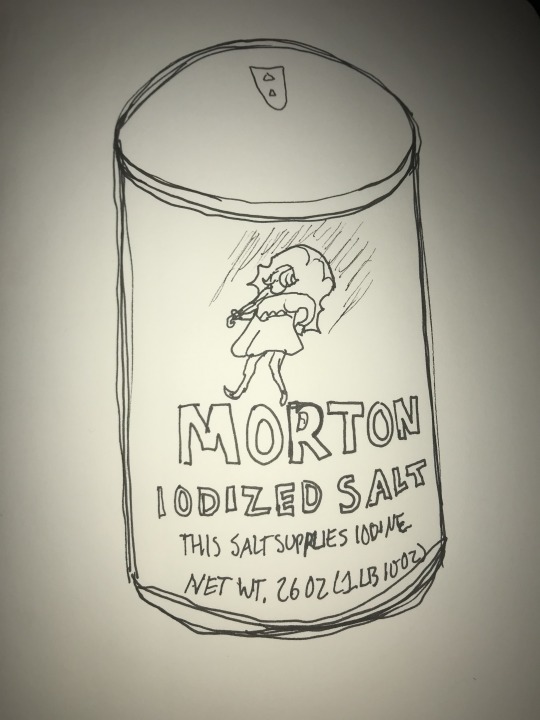
This is a drawing of the container of iodized salt from my kitchen. I feel like the graphics on the container not only employ basic principals of graphic design popularized by the Art Nouveau movement, but also has touches of Japonisme influence through the flattened image of a girl in the rain. There is no value in the design of the girl, but a simplified icon of sorts. I did not have color available at the time of drawing, but the container is a navy blue and the girl is white with striking yellow clothes and a lavender umbrella.
0 notes
Text
week 3- 10 observations
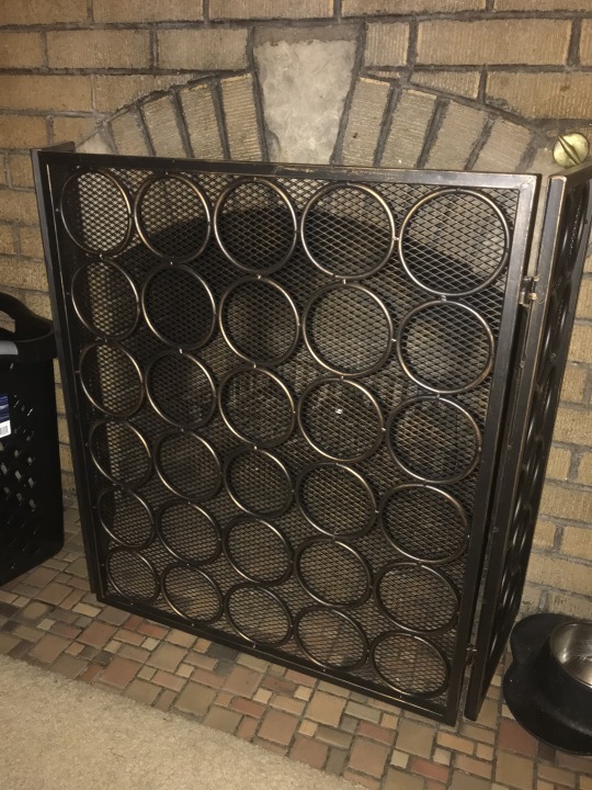
This is my fireplace cover, which is not only functional as a way to keep the fire within the fireplace (and keep my pets away from the fire) but also has repetitive geometric shapes for aesthetic purposes. This could be related to the concepts of Art Nouveau, or the attempt to make the mundane everyday objects in our world more beautiful (although it is not graphic design)
0 notes
Text
week 3- 10 observations
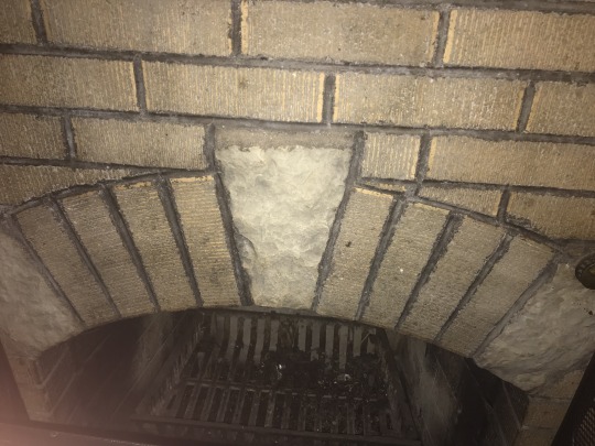
Although Roman architecture was not mentioned in this weeks reading, I observed that the arch of my fireplace has a keystone in the middle, which was first designed and implemented by the Romans as a way to build stronger, more weight bearing arches than had been available in the past.
0 notes
Text
week 3 -10 observations
This photo shows several different kinds of type face that are not representative of manuscript hand writing, due to the popularity and use of typography as its own language of sorts by Claude Garamont.
0 notes
Text
week 2 - Design Thinking
After reading Harvard Business Review’s “Design Thinking” I believe design is defined as a process to create innovative solutions driven by the needs and wants of people. A few examples of products I think involved “design thinking” in the process of being created are for one, a Keurig coffee maker. Why I attribute design thinking to a Keurig is that there are several ways of making coffee that have existed for a long time, but the Keurig makes it quick, easy, satisfying, and clean to make a single cup of coffee at a time. While one could make a single cup of coffee in a traditional coffee maker or a french press, one still would have to measure a single serving of ground coffee, use a filter for a regular coffee maker, or have to heat up water for a french press, and then after the coffee has been made there are coffee grounds to clean up and a pot to rinse. The Keurig has single servings of coffee grounds prepackaged that you just pop into the top of the machine, put in water that you measure from the cup you will drink the coffee from, and then you just press a button. The only clean-up is throwing away a little cartridge. Another product I would attribute design thinking to is my Yeti water bottle tumbler. There isn't many unordinary things about this water bottle, it is insulated but that is not unique. Where I think design thinking comes in is that the top of the bottle is shaped like a handle. This makes the bottle not only look unique- which is aesthetically pleasing but also functions as an easier way to carry it than any other 40oz plus sized water bottle I've ever had. These examples both encompass the elements from my proposed definition of design- innovative solutions aimed at the wants and needs of people who only want one cup of coffee or want to carry around over 40oz of water comfortably. The most significant concepts in the reading were open-ended solutions, made by people for people. By open-ended I mean that the reading emphasized not taking a linear approach to the process of design by bouncing around ideas that take different directions rather than having a pigeon-holed goal. Part of design thinking is to not build up one idea from the beginning but to have lots of different ideas compiled with a focused functional goal driving the best parts of the different ideas forward until they can come together to make the ultimately best solution. The reading also emphasized the idea that design thinking is driven by people, not one person but several people collaborating. This is important because no one person can know everything about every aspect of a problem, even as an expert in a specific topic. Thus having people collaborate in design, good ideas can be built upon from different perspectives effectively covering as many bases as possible leading up to the implementation of an idea. The emphasis on design thinking focusing on people was elaborated throughout the reading by describing the importance of considering what all people want and need, not catering to one demographic but trying to take into account as many different kinds of people as possible as needed for the specific product or process.
(Reading source: Harvard Business Review, June 2008, hbr.org)
(I don’t think I need to cite the products I described as I did not use outside information or photos)
(If viewing photo pictured below on a computer, hover mouse over photo and click on 0 notes to read the caption)
0 notes
Photo

My 46oz Yeti Rambler bottle that I mention as a product created with design thinking. The handle makes the bottle look unique while also making this the easiest to carry >40oz water bottle I have owned.
0 notes
Text
week 1 - about me
Hello, fellow design survey participants and instructor, my name is Cole. I am a 2nd year student (albeit I am a bit old at the ripe age of 21) I am majoring in design and visual communication here at UW Milwaukee. I have a job as a concierge at a condo building and for the summer I got a second job working at Purple Door Ice Cream in Walker's Point. I like to spend my free time tending to my plants (indoor and outdoor), walking my dog, listening to podcasts and music, and working on personal projects. I am taking this class because it is a requirement for my major, however, the reason I am studying design, in general, is that I believe in the importance of visual input in life as a human so it interests me greatly. I hope to pursue a career that focuses on design in some way but I have no specific path quite yet. My relevant experience comes from personal practice as well as education from my high school art classes, and some of the digital art classes offered here at UWM. I am inspired by many things, particularly nature / patterns found in nature, emotion, human cultures (ie religion, behaviors, and themes), and technology. An item I have recently purchased with design as the deciding factor was a dog leash, the one I bought came in a nice light cyan color and has a little built-in flashlight on the front for late night trips outside with my dog Howie. Competing products didn’t all come in that color which is what I liked the best to go with his orange harness and didn’t have the nifty flashlight which allows me to not have my phone flashlight in my hand when it’s dark out. Having light during our excursions at night is pertinent because there is a lot of litter on the ground where I live and I don’t want Howie to pick any up due to me not seeing it.
1 note
·
View note